


Ana Lucía González
@anlugonz.bsky.social
💼 Visual projects @theguardian.com https://www.theguardian.com/profile/ana-lucia-gonzalez-paz
🗺️ Maps shape you https://a-map-inside.webflow.io/
And more https://linktr.ee/analuciagonzalez
Hecha en 🇨🇴, formerly BBC
🗺️ Maps shape you https://a-map-inside.webflow.io/
And more https://linktr.ee/analuciagonzalez
Hecha en 🇨🇴, formerly BBC
Pinned
Ana Lucía González
@anlugonz.bsky.social
· Oct 16
New visual story: Bird migration is one of nature’s greatest spectacles — and scientists are uncovering extraordinary insights into how new threats are reshaping these epic journeys. Follow the remarkable travels of three birds as they fly across the planet. www.theguardian.com/environment/...
Reposted by Ana Lucía González

Then Josh has done a read with a great visual element from Anna zooming in on Newton Aycliffe - where the majority of the town centre is owned by one holding company:
www.theguardian.com/society/ng-i...
www.theguardian.com/society/ng-i...

‘You’d be ashamed to bring someone here’: The struggling billionaire-owned high street that shows Reform’s road to No 10
Newton Aycliffe was meant to be a model town for a fairer postwar Britain. But unaffordable rents on a high street amounting to 0.12% of its property tycoon owner’s holdings have made it a symbol of d...
www.theguardian.com
January 28, 2026 at 11:06 AM
Then Josh has done a read with a great visual element from Anna zooming in on Newton Aycliffe - where the majority of the town centre is owned by one holding company:
www.theguardian.com/society/ng-i...
www.theguardian.com/society/ng-i...
Reposted by Ana Lucía González
New with @ajwl.bsky.social - how does your high street compare to the rest of the country and how has it changed since 2019?

How has your local high street changed since 2019? Check your postcode
The makeup of Great Britain’s high streets has changed dramatically. See what the data says about where you live
www.theguardian.com
January 28, 2026 at 11:00 AM
New with @ajwl.bsky.social - how does your high street compare to the rest of the country and how has it changed since 2019?
Reposted by Ana Lucía González

“Design is analysis, performed through composition rather than computation.”
#maps #cartography #dataviz
www.esri.com/about/newsro...
#maps #cartography #dataviz
www.esri.com/about/newsro...
The Art of Persuasion in Cartography: Why Design Makes Maps Powerful | Winter 2026 | ArcNews
To design a powerful map is not merely to depict geography—it is to craft an argument about the world.
www.esri.com
January 21, 2026 at 4:54 PM
“Design is analysis, performed through composition rather than computation.”
#maps #cartography #dataviz
www.esri.com/about/newsro...
#maps #cartography #dataviz
www.esri.com/about/newsro...
Reposted by Ana Lucía González

Tonight we’re learning how to scrape the web with Beautiful Soup and Playwright!

January 14, 2026 at 8:17 PM
Tonight we’re learning how to scrape the web with Beautiful Soup and Playwright!
Reposted by Ana Lucía González

Happy winter solstice. 📊

December 21, 2025 at 3:15 PM
Happy winter solstice. 📊
"These are the stories of people who built modern China, but were rarely invited into its narrative. Zheng listens to them. And because she does, they enter the record not as anonymous labourers, but as full human beings." www.equator.org/articles/the...

The Makers of Modern China • EQUATOR
For many years, Zheng Xiaoqiong has collected the stories of the workers whose migration to Guangdong powered China’s manufacturing revolution
www.equator.org
December 10, 2025 at 1:02 PM
"These are the stories of people who built modern China, but were rarely invited into its narrative. Zheng listens to them. And because she does, they enter the record not as anonymous labourers, but as full human beings." www.equator.org/articles/the...
Reposted by Ana Lucía González

"an ideal of creative collaboration: positive enthusiasm while engaging with the nitty-gritty." How @rsimmon.bsky.social and I made Earth Biomes: www.chartography.net/p/the-living...

The Living Planet at Arm’s Reach
How we made Earth Biomes, a world map for kids.
www.chartography.net
December 9, 2025 at 3:29 PM
"an ideal of creative collaboration: positive enthusiasm while engaging with the nitty-gritty." How @rsimmon.bsky.social and I made Earth Biomes: www.chartography.net/p/the-living...
"We live in a difficult but inspiring world" RIP Martin Parr www.theguardian.com/artanddesign...

‘There’s something very interesting about boring’: Martin Parr on his life in pictures
From Benidorm sunbathers to British birdwatchers, for nearly 70 years the photographer has captured the magic of the mundane. As he publishes his life in pictures, he recalls what drew him to his s...
www.theguardian.com
December 7, 2025 at 5:33 PM
"We live in a difficult but inspiring world" RIP Martin Parr www.theguardian.com/artanddesign...
Reposted by Ana Lucía González

I've spent the last year looking into women in prison around the world, with help from so many people. We @theguardian.com are running a series on the topic. Here is the first piece revealing some of what women, many of whom are ignored and forgotten, face. www.theguardian.com/global-devel...

Experts warn of ‘global crisis’ as number of women in prison nears one million
Number of women incarcerated around the world rising at nearly three times the rate of men, with female prisoners often subjected to sexual violence and forced labour
www.theguardian.com
November 27, 2025 at 11:18 AM
I've spent the last year looking into women in prison around the world, with help from so many people. We @theguardian.com are running a series on the topic. Here is the first piece revealing some of what women, many of whom are ignored and forgotten, face. www.theguardian.com/global-devel...
Reposted by Ana Lucía González


November 24, 2025 at 7:07 PM
Reposted by Ana Lucía González

@attilabatorfy.bsky.social delights #dataviz with:
Pie chart frenzy from Brazil
open.substack.com/pub/attilaba...
Pie chart frenzy from Brazil
open.substack.com/pub/attilaba...

Pie chart frenzy from Brazil
The illustrations of the "Little Atlas of Coffee" from the early 1940s.
open.substack.com
November 24, 2025 at 2:48 PM
@attilabatorfy.bsky.social delights #dataviz with:
Pie chart frenzy from Brazil
open.substack.com/pub/attilaba...
Pie chart frenzy from Brazil
open.substack.com/pub/attilaba...
Reposted by Ana Lucía González

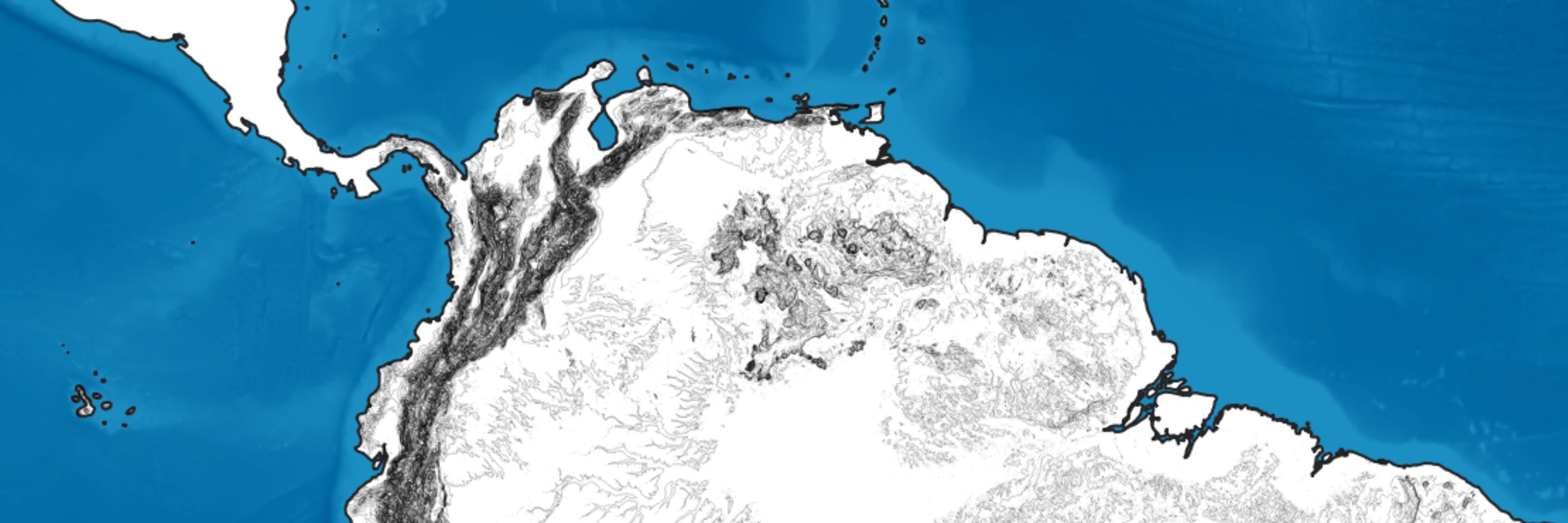
A visual guide to the deadly airstrikes and military buildup: how the US ‘war on drugs’ has unfolded in the Caribbean
US has used claims of a drug route to justify its attacks, which have resulted in 83 deaths that the UN has called extrajudicial executions
www.theguardian.com/us-news/2025...
US has used claims of a drug route to justify its attacks, which have resulted in 83 deaths that the UN has called extrajudicial executions
www.theguardian.com/us-news/2025...

Deadly airstrikes and a military buildup: how the US ‘war on drugs’ has unfolded in the Caribbean
US has used claims of a drug route to justify its attacks, which have resulted in 83 deaths that the UN has called extrajudicial executions
www.theguardian.com
November 24, 2025 at 1:46 PM
A visual guide to the deadly airstrikes and military buildup: how the US ‘war on drugs’ has unfolded in the Caribbean
US has used claims of a drug route to justify its attacks, which have resulted in 83 deaths that the UN has called extrajudicial executions
www.theguardian.com/us-news/2025...
US has used claims of a drug route to justify its attacks, which have resulted in 83 deaths that the UN has called extrajudicial executions
www.theguardian.com/us-news/2025...
Try your hand at delivering a budget that keeps your MPs and markets happy, and the books balanced - while checking notes from your PM and Treasury. Fun, informative (did you know about budget whiskey?) game from @seanclarke.bsky.social @rjpartington.bsky.social
www.theguardian.com/politics/ng-...
www.theguardian.com/politics/ng-...

Could you do better than Reeves as chancellor? Play our interactive budget game
Can you pull the levers of power to deliver a successful budget? Can you keep backbenchers happy without upsetting the bond markets? And can you do it all while keeping the books balanced? Try our bud...
www.theguardian.com
November 20, 2025 at 11:13 PM
Try your hand at delivering a budget that keeps your MPs and markets happy, and the books balanced - while checking notes from your PM and Treasury. Fun, informative (did you know about budget whiskey?) game from @seanclarke.bsky.social @rjpartington.bsky.social
www.theguardian.com/politics/ng-...
www.theguardian.com/politics/ng-...
Reposted by Ana Lucía González


Reposted by Ana Lucía González

Very happy to make the shortlist alongside brilliant colleagues @robevansgdn.bsky.social @rowenamason.bsky.social @michaelgoodier.bsky.social David Conn @anlugonz.bsky.social for this year's Public Service Journalism category at the British Journalism Awards for our project The Lords Debate.

UK public service journalism heroes recognised at British Journalism Awards
Express, FT, Guardian, The i, Standard and Eastern Eye make public service shortlist.
pressgazette.co.uk
November 20, 2025 at 12:50 PM
Very happy to make the shortlist alongside brilliant colleagues @robevansgdn.bsky.social @rowenamason.bsky.social @michaelgoodier.bsky.social David Conn @anlugonz.bsky.social for this year's Public Service Journalism category at the British Journalism Awards for our project The Lords Debate.
Reposted by Ana Lucía González

#30DayMapChallenge Day 14-OpenStreetMap
Here is a 3D OpenStreetMap visualization of Osogbo, capturing the city’s building footprints and road network from an elevated perspective. The model highlights the density, structure, and spatial patterns that define the urban landscape.
Here is a 3D OpenStreetMap visualization of Osogbo, capturing the city’s building footprints and road network from an elevated perspective. The model highlights the density, structure, and spatial patterns that define the urban landscape.


November 14, 2025 at 11:22 AM
#30DayMapChallenge Day 14-OpenStreetMap
Here is a 3D OpenStreetMap visualization of Osogbo, capturing the city’s building footprints and road network from an elevated perspective. The model highlights the density, structure, and spatial patterns that define the urban landscape.
Here is a 3D OpenStreetMap visualization of Osogbo, capturing the city’s building footprints and road network from an elevated perspective. The model highlights the density, structure, and spatial patterns that define the urban landscape.
Reposted by Ana Lucía González

#30DayMapChallenge day 8: Urban
Chae Won Lee uses the Overpass API to visualize current coffee shop density in New York with an interactive map. Here's a snippet.
Chae Won Lee uses the Overpass API to visualize current coffee shop density in New York with an interactive map. Here's a snippet.

November 14, 2025 at 5:09 PM
#30DayMapChallenge day 8: Urban
Chae Won Lee uses the Overpass API to visualize current coffee shop density in New York with an interactive map. Here's a snippet.
Chae Won Lee uses the Overpass API to visualize current coffee shop density in New York with an interactive map. Here's a snippet.
This collection of stories around the photobooth is so uplifting www.theguardian.com/lifeandstyle... and it also reminds me of one of the most beautiful digital stories ever www.danielmeadows.co.uk/gallery/vide... - Polyfoto by Daniel Meadows. It will warm your heart. 📷
November 14, 2025 at 10:24 AM
This collection of stories around the photobooth is so uplifting www.theguardian.com/lifeandstyle... and it also reminds me of one of the most beautiful digital stories ever www.danielmeadows.co.uk/gallery/vide... - Polyfoto by Daniel Meadows. It will warm your heart. 📷
Reposted by Ana Lucía González

This is a great article by @anlugonz.bsky.social and @ashleyjkirk.bsky.social analysing the Reform vote. Excellent use of visualisations to bring home the central point of just how disparate a bunch they are.
www.theguardian.com/politics/202...
www.theguardian.com/politics/202...

Who supports Reform and why? The charts that show who favours Farage’s party
Based on largest poll of supporters, these charts and maps show five distinct groups that could hand Reform a majority
www.theguardian.com
November 13, 2025 at 10:02 AM
This is a great article by @anlugonz.bsky.social and @ashleyjkirk.bsky.social analysing the Reform vote. Excellent use of visualisations to bring home the central point of just how disparate a bunch they are.
www.theguardian.com/politics/202...
www.theguardian.com/politics/202...
Reposted by Ana Lucía González

#30DayMapChallenge Day 10: Air
🌪️ Animated mesh layers of #hurricane tracks resembling Vincent van Gogh’s Starry Night.
#HurricaneMelissa #Jamaica.
Made with #QGIS. Data from #Copernicus #ECMWF
🌪️ Animated mesh layers of #hurricane tracks resembling Vincent van Gogh’s Starry Night.
#HurricaneMelissa #Jamaica.
Made with #QGIS. Data from #Copernicus #ECMWF
November 10, 2025 at 8:00 PM
#30DayMapChallenge Day 10: Air
🌪️ Animated mesh layers of #hurricane tracks resembling Vincent van Gogh’s Starry Night.
#HurricaneMelissa #Jamaica.
Made with #QGIS. Data from #Copernicus #ECMWF
🌪️ Animated mesh layers of #hurricane tracks resembling Vincent van Gogh’s Starry Night.
#HurricaneMelissa #Jamaica.
Made with #QGIS. Data from #Copernicus #ECMWF
Reposted by Ana Lucía González

A minimal map of the world's population for day 11 of the #30DayMapChallenge!
#RStats #ggplot2 #DataViz
#RStats #ggplot2 #DataViz

November 11, 2025 at 10:02 AM
A minimal map of the world's population for day 11 of the #30DayMapChallenge!
#RStats #ggplot2 #DataViz
#RStats #ggplot2 #DataViz
Reposted by Ana Lucía González

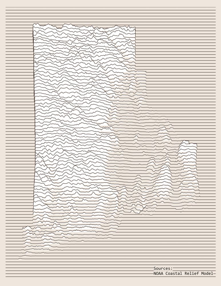
Day 11 - Minimal
Rhode Island Elevation Joy Plot Map
I made a Joy Plot map years ago in ArcPro, but I am using QGIS these days, so I figured this would be a great time to learn a new workflow. I will be posting the workflow on Day 23 - Process.
#30DayMapChallenge
Rhode Island Elevation Joy Plot Map
I made a Joy Plot map years ago in ArcPro, but I am using QGIS these days, so I figured this would be a great time to learn a new workflow. I will be posting the workflow on Day 23 - Process.
#30DayMapChallenge
November 11, 2025 at 3:09 PM
Day 11 - Minimal
Rhode Island Elevation Joy Plot Map
I made a Joy Plot map years ago in ArcPro, but I am using QGIS these days, so I figured this would be a great time to learn a new workflow. I will be posting the workflow on Day 23 - Process.
#30DayMapChallenge
Rhode Island Elevation Joy Plot Map
I made a Joy Plot map years ago in ArcPro, but I am using QGIS these days, so I figured this would be a great time to learn a new workflow. I will be posting the workflow on Day 23 - Process.
#30DayMapChallenge
Reposted by Ana Lucía González

#30DayMapChallenge - Minimal
✈️ A (very minimal) real-time flight-tracking map.
googlemapsmania.blogspot.com/2025/11/a-mi...
✈️ A (very minimal) real-time flight-tracking map.
googlemapsmania.blogspot.com/2025/11/a-mi...
November 11, 2025 at 4:39 PM
#30DayMapChallenge - Minimal
✈️ A (very minimal) real-time flight-tracking map.
googlemapsmania.blogspot.com/2025/11/a-mi...
✈️ A (very minimal) real-time flight-tracking map.
googlemapsmania.blogspot.com/2025/11/a-mi...
Reposted by Ana Lucía González

If you care about the BBC, stand up and defend it: this could be the beginning of the end | Polly Toynbee

If you care about the BBC, stand up and defend it: this could be the beginning of the end | Polly Toynbee
Replacing the TV licence with a means-tested alternative may help disarm the right of one of its most effective weapons, says Guardian columnist Polly Toynbee
www.theguardian.com
November 10, 2025 at 4:32 PM
If you care about the BBC, stand up and defend it: this could be the beginning of the end | Polly Toynbee
Reposted by Ana Lucía González
#30DayMapchallenge Day 8, Urban.
People don't realise what a big deal it is for acceptance of place names to change in such a short time without wars/dictators/invasion/etc. Just people, within a generation, deciding it is the right thing to do. mapdata::NZHires baseman + Affinity Publisher.
People don't realise what a big deal it is for acceptance of place names to change in such a short time without wars/dictators/invasion/etc. Just people, within a generation, deciding it is the right thing to do. mapdata::NZHires baseman + Affinity Publisher.

November 8, 2025 at 12:53 AM
#30DayMapchallenge Day 8, Urban.
People don't realise what a big deal it is for acceptance of place names to change in such a short time without wars/dictators/invasion/etc. Just people, within a generation, deciding it is the right thing to do. mapdata::NZHires baseman + Affinity Publisher.
People don't realise what a big deal it is for acceptance of place names to change in such a short time without wars/dictators/invasion/etc. Just people, within a generation, deciding it is the right thing to do. mapdata::NZHires baseman + Affinity Publisher.