


Michael Friendly
@datavisfriendly.bsky.social
ASA Fellow; #rstats developer of graphical methods for categorical and multivariate data; #datavis history of data visualization; #historicaldatavis; Milestones project
Web: www.datavis.ca
GitHub: github.com/friendly
Web: www.datavis.ca
GitHub: github.com/friendly
Pinned


Reposted by Michael Friendly

The 1.3.0 version of my {brms} + {tidyverse} translation of Kruschke's "Doing Bayesian data analysis" is up!
solomon.quarto.pub/dbda2
#rstats
1/8
solomon.quarto.pub/dbda2
#rstats
1/8
Doing Bayesian Data Analysis in brms and the tidyverse
solomon.quarto.pub
January 2, 2026 at 5:00 PM
The 1.3.0 version of my {brms} + {tidyverse} translation of Kruschke's "Doing Bayesian data analysis" is up!
solomon.quarto.pub/dbda2
#rstats
1/8
solomon.quarto.pub/dbda2
#rstats
1/8
Reposted by Michael Friendly

Quintile area plot: this seemed like a great idea as I lay awake thinking about box plot alternatives. But now I see it's terrible for most distributions, like this random Gaussian sample. It draws too much attention to the meaningless variation. Now at xangregg.github.io/data-strips/ #dataviz

December 31, 2025 at 7:06 PM
Quintile area plot: this seemed like a great idea as I lay awake thinking about box plot alternatives. But now I see it's terrible for most distributions, like this random Gaussian sample. It draws too much attention to the meaningless variation. Now at xangregg.github.io/data-strips/ #dataviz
Interesting read!

"Here’s the main problem I’ve found with generative AI, and with 'vibe coding' in general: it completely sucks out the joy of software development for me."
Hard same, and it's a reason I was so unsatisfied with my job this past year. Great piece by @nolanlawson.com
nolanlawson.com/2025/04/02/a...
Hard same, and it's a reason I was so unsatisfied with my job this past year. Great piece by @nolanlawson.com
nolanlawson.com/2025/04/02/a...

AI ambivalence
I’ve avoided writing this post for a long time, partly because I try to avoid controversial topics these days, and partly because I was waiting to make my mind up about the current, all-consu…
nolanlawson.com
January 2, 2026 at 3:22 AM
Interesting read!
Need a little treat to soothe the nerds in your circle?

January 2, 2026 at 2:43 AM
Need a little treat to soothe the nerds in your circle?
ggCheysson is based on colors, patterns of these _Albums_ maps collected by @infowetrust.com
Cheysson fonts by @kennethfield.bsky.social
Cheysson fonts by @kennethfield.bsky.social


January 2, 2026 at 2:19 AM
ggCheysson is based on colors, patterns of these _Albums_ maps collected by @infowetrust.com
Cheysson fonts by @kennethfield.bsky.social
Cheysson fonts by @kennethfield.bsky.social
#rstats ANNOUNCE:
The {ggCheysson} 📦 brings the graphical styles of the Albums de Statistique Graphique to R and ggplot2.
Not yet on CRAN, and still under development.
friendly.github.io/ggCheysson/
The {ggCheysson} 📦 brings the graphical styles of the Albums de Statistique Graphique to R and ggplot2.
Not yet on CRAN, and still under development.
friendly.github.io/ggCheysson/

Graphic Styles of Emile Cheysson for ggplot2
Implements for ggplot2 the stylistic elements (fonts, hatched patterns, color palettes) used by Emile Cheysson in the Albums de Statistique Graphique, sometimes called the pinnacle of the Golden Age o...
friendly.github.io
January 2, 2026 at 2:08 AM
#rstats ANNOUNCE:
The {ggCheysson} 📦 brings the graphical styles of the Albums de Statistique Graphique to R and ggplot2.
Not yet on CRAN, and still under development.
friendly.github.io/ggCheysson/
The {ggCheysson} 📦 brings the graphical styles of the Albums de Statistique Graphique to R and ggplot2.
Not yet on CRAN, and still under development.
friendly.github.io/ggCheysson/
#TodayinHistory #dataviz #Onthisday #OTD 📊
💀Jan 1, 1992 Grace Hopper died in Arlington, Virginia, USA 🇺🇸
1944: With Howard Aiken, Harvard's Mark I, the first digital computer, put in service, with Hopper a programmer.
The Mark I was 50 feet long and weighed about 5 tons.
💀Jan 1, 1992 Grace Hopper died in Arlington, Virginia, USA 🇺🇸
1944: With Howard Aiken, Harvard's Mark I, the first digital computer, put in service, with Hopper a programmer.
The Mark I was 50 feet long and weighed about 5 tons.


January 2, 2026 at 1:21 AM
#TodayinHistory #dataviz #Onthisday #OTD 📊
💀Jan 1, 1992 Grace Hopper died in Arlington, Virginia, USA 🇺🇸
1944: With Howard Aiken, Harvard's Mark I, the first digital computer, put in service, with Hopper a programmer.
The Mark I was 50 feet long and weighed about 5 tons.
💀Jan 1, 1992 Grace Hopper died in Arlington, Virginia, USA 🇺🇸
1944: With Howard Aiken, Harvard's Mark I, the first digital computer, put in service, with Hopper a programmer.
The Mark I was 50 feet long and weighed about 5 tons.
#rstats #dataviz #psy6136
Nice separation of greater / less words.
What other way of sorting the words would make any pattern clearer?
Nice separation of greater / less words.
What other way of sorting the words would make any pattern clearer?

My submission for #TidyTuesday, Week 52 on Christmas Novels. I explore term frequency changes from authors born before 1850 to those born after 1850.
Code: github.com/mitsuoxv/tid...
Code: github.com/mitsuoxv/tid...

December 30, 2025 at 2:57 AM
#TodayinHistory #dataviz #Onthisday #OTD 📊
🎂Dec 28, 1804 Alexander Keith Johnston born in Kirkhill, Scotland 🏴
1843: Ethnographic maps showing distribution of ethnic groups throughout the world
1850: Atlas of distributions of plants
🎂Dec 28, 1804 Alexander Keith Johnston born in Kirkhill, Scotland 🏴
1843: Ethnographic maps showing distribution of ethnic groups throughout the world
1850: Atlas of distributions of plants


December 29, 2025 at 3:30 AM
#TodayinHistory #dataviz #Onthisday #OTD 📊
🎂Dec 28, 1804 Alexander Keith Johnston born in Kirkhill, Scotland 🏴
1843: Ethnographic maps showing distribution of ethnic groups throughout the world
1850: Atlas of distributions of plants
🎂Dec 28, 1804 Alexander Keith Johnston born in Kirkhill, Scotland 🏴
1843: Ethnographic maps showing distribution of ethnic groups throughout the world
1850: Atlas of distributions of plants
#TodayinHistory #dataviz #Onthisday #OTD 📊
🎂Dec 27, 1654 Jacob Bernoulli born in Basel, Switzerland 🇨🇭
1691. Jacob Bernoulli published a derivation of the idea of the use of polar coordinates for the representation of functions, simplifying beautiful curves
🎂Dec 27, 1654 Jacob Bernoulli born in Basel, Switzerland 🇨🇭
1691. Jacob Bernoulli published a derivation of the idea of the use of polar coordinates for the representation of functions, simplifying beautiful curves


December 29, 2025 at 3:20 AM
#TodayinHistory #dataviz #Onthisday #OTD 📊
🎂Dec 27, 1654 Jacob Bernoulli born in Basel, Switzerland 🇨🇭
1691. Jacob Bernoulli published a derivation of the idea of the use of polar coordinates for the representation of functions, simplifying beautiful curves
🎂Dec 27, 1654 Jacob Bernoulli born in Basel, Switzerland 🇨🇭
1691. Jacob Bernoulli published a derivation of the idea of the use of polar coordinates for the representation of functions, simplifying beautiful curves

Flashback: Your Weekly History Quiz, Dec. 27, 2025
Can you sort 8 historical events?
www.nytimes.com
December 28, 2025 at 8:51 PM
Reposted by Michael Friendly

Want a look behind the scenes? People are curious about how we come up with (good) ideas at Voilà:. Here are five examples in a blog post. 🐝 📊

Eureka! 5 information design solutions - Voilà:
Where do good ideas come from? How do they emerge? And most importantly, when? Here is a our set of creative choices.
chezvoila.com
December 22, 2025 at 3:46 PM
Want a look behind the scenes? People are curious about how we come up with (good) ideas at Voilà:. Here are five examples in a blog post. 🐝 📊
Reposted by Michael Friendly

"By year’s end Mr. Trump’s popularity had sunk to historical lows, as many Americans recoiled from his brutality and his extremism," writes Steven Rattner. These 10 charts illustrate the president's first year back in office.

Opinion | Trump’s First Year Back, in 10 Charts
Steven Rattner recaps the year of Trump in charts.
nyti.ms
December 27, 2025 at 8:20 PM
"By year’s end Mr. Trump’s popularity had sunk to historical lows, as many Americans recoiled from his brutality and his extremism," writes Steven Rattner. These 10 charts illustrate the president's first year back in office.
Reposted by Michael Friendly

A comprehensive list in chronological order of the 500 Worst Things the Trump Admin Did in 2025.
Here is Part 1: 1-100. Jan-Feb 2025. open.substack.com/pub/meidasto...
Here is Part 1: 1-100. Jan-Feb 2025. open.substack.com/pub/meidasto...

500 Worst Things Trump Did in 2025
Part 1-100, January-March 2025.
open.substack.com
December 27, 2025 at 9:24 PM
A comprehensive list in chronological order of the 500 Worst Things the Trump Admin Did in 2025.
Here is Part 1: 1-100. Jan-Feb 2025. open.substack.com/pub/meidasto...
Here is Part 1: 1-100. Jan-Feb 2025. open.substack.com/pub/meidasto...
#TodayinHistory #dataviz #Onthisday #OTD 📊
🎂Dec 26, 1791 Charles Babbage born in London, England 🏴
1822: Invented a mechanical device for calculating mathematical tables (the Difference Engine)
The idea of "programming" was on the cusp.
🎂Dec 26, 1791 Charles Babbage born in London, England 🏴
1822: Invented a mechanical device for calculating mathematical tables (the Difference Engine)
The idea of "programming" was on the cusp.


December 28, 2025 at 1:44 AM
#TodayinHistory #dataviz #Onthisday #OTD 📊
🎂Dec 26, 1791 Charles Babbage born in London, England 🏴
1822: Invented a mechanical device for calculating mathematical tables (the Difference Engine)
The idea of "programming" was on the cusp.
🎂Dec 26, 1791 Charles Babbage born in London, England 🏴
1822: Invented a mechanical device for calculating mathematical tables (the Difference Engine)
The idea of "programming" was on the cusp.
#TodayinHistory #dataviz #Onthisday #OTD 📊
📅Dec 25, 1758 Edmond Halley --- Halley accurately predicts that a comet would reappear in 1758, 15 years after his death. It was the only short period comet that is visible from earth to the naked eye.
📅Dec 25, 1758 Edmond Halley --- Halley accurately predicts that a comet would reappear in 1758, 15 years after his death. It was the only short period comet that is visible from earth to the naked eye.


December 28, 2025 at 1:34 AM
#TodayinHistory #dataviz #Onthisday #OTD 📊
📅Dec 25, 1758 Edmond Halley --- Halley accurately predicts that a comet would reappear in 1758, 15 years after his death. It was the only short period comet that is visible from earth to the naked eye.
📅Dec 25, 1758 Edmond Halley --- Halley accurately predicts that a comet would reappear in 1758, 15 years after his death. It was the only short period comet that is visible from earth to the naked eye.
If you've got nothing better to celebrate today, you can celebrate Recursive History with:
The Toronto Recursive History Project of Toronto's Recursive History
readtheplaque.com/plaque/the-t...
Only in 🇨🇦
The Toronto Recursive History Project of Toronto's Recursive History
readtheplaque.com/plaque/the-t...
Only in 🇨🇦

The Toronto Recursive History Project
THE TORONTO RECURSIVE HISTORY PROJECT OF TORONTO'S RECURSIVE HISTORY This plaque was commemorated on October 10, 2018, commemorate its own commemoration. Plaques like this one are an integral part of ...
readtheplaque.com
December 27, 2025 at 9:15 PM
If you've got nothing better to celebrate today, you can celebrate Recursive History with:
The Toronto Recursive History Project of Toronto's Recursive History
readtheplaque.com/plaque/the-t...
Only in 🇨🇦
The Toronto Recursive History Project of Toronto's Recursive History
readtheplaque.com/plaque/the-t...
Only in 🇨🇦
Guerry is one of my main graphics heroes, partly bc he was generally unrecognized for his contributions
I also credit him as an originator of radial diagrams and parallel coordinate plots
👀🔗 bit.ly/3zLqlZS
I also credit him as an originator of radial diagrams and parallel coordinate plots
👀🔗 bit.ly/3zLqlZS
December 27, 2025 at 1:23 AM
Guerry is one of my main graphics heroes, partly bc he was generally unrecognized for his contributions
I also credit him as an originator of radial diagrams and parallel coordinate plots
👀🔗 bit.ly/3zLqlZS
I also credit him as an originator of radial diagrams and parallel coordinate plots
👀🔗 bit.ly/3zLqlZS
#TodayinHistory #dataviz #Onthisday #OTD 📊
🎂Dec 24, 1802 André Michel Guerry born in Tours, France 🇫🇷
1833: The first comprehensive analysis of data on "moral statistics'' (crimes, suicide, literacy, etc.) shown on comparative thematic unclassed choropleth maps
🎂Dec 24, 1802 André Michel Guerry born in Tours, France 🇫🇷
1833: The first comprehensive analysis of data on "moral statistics'' (crimes, suicide, literacy, etc.) shown on comparative thematic unclassed choropleth maps


December 27, 2025 at 1:22 AM
#TodayinHistory #dataviz #Onthisday #OTD 📊
🎂Dec 24, 1802 André Michel Guerry born in Tours, France 🇫🇷
1833: The first comprehensive analysis of data on "moral statistics'' (crimes, suicide, literacy, etc.) shown on comparative thematic unclassed choropleth maps
🎂Dec 24, 1802 André Michel Guerry born in Tours, France 🇫🇷
1833: The first comprehensive analysis of data on "moral statistics'' (crimes, suicide, literacy, etc.) shown on comparative thematic unclassed choropleth maps
And somewhere I recall reading that 'famous people' were much more likely to die after a birthday than the same number of days before it. Does this ring a bell for anyone?

I am now curious to know what the empricial answer to the birthday problem is? Since birthdays are unevenly distributed, the probability of a collision should rise faster as the number of people in the group increases

I made in 2017 mimicking a Scientific America Style article on the birthdate topic. This article notes the commonest birth period is late September/ early October, but does not note the gestational relationship to the topical Christmas/ New Years period.
www.rnz.co.nz/life/Christm...
www.rnz.co.nz/life/Christm...
December 26, 2025 at 4:29 AM
And somewhere I recall reading that 'famous people' were much more likely to die after a birthday than the same number of days before it. Does this ring a bell for anyone?
Bon appétit !

magret de canard, pommes de terre sarladaises, good burgundy


December 25, 2025 at 4:25 AM
Bon appétit !
#TodayinHistory #dataviz #Onthisday #OTD 📊
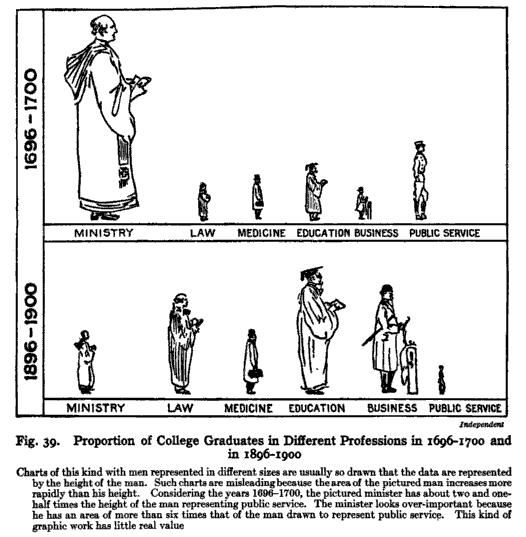
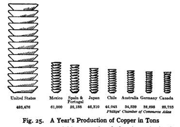
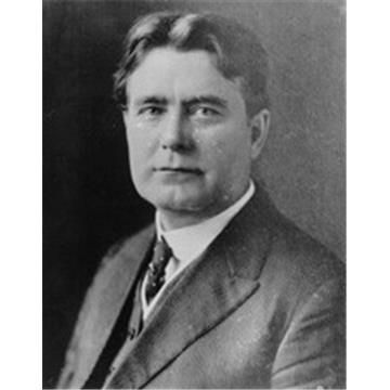
🎂Dec 22, 1880 Willard Cope Brinton born in West Chester, PA, USA 🇺🇸
1914: Developed Pictogram to represent a series of numbers by icons (combining concepts of the bar graph and pictogram of varying size)
🎂Dec 22, 1880 Willard Cope Brinton born in West Chester, PA, USA 🇺🇸
1914: Developed Pictogram to represent a series of numbers by icons (combining concepts of the bar graph and pictogram of varying size)
December 23, 2025 at 2:17 AM
#TodayinHistory #dataviz #Onthisday #OTD 📊
🎂Dec 22, 1880 Willard Cope Brinton born in West Chester, PA, USA 🇺🇸
1914: Developed Pictogram to represent a series of numbers by icons (combining concepts of the bar graph and pictogram of varying size)
🎂Dec 22, 1880 Willard Cope Brinton born in West Chester, PA, USA 🇺🇸
1914: Developed Pictogram to represent a series of numbers by icons (combining concepts of the bar graph and pictogram of varying size)
Reposted by Michael Friendly

This year, our collection of visual stories is grouped by coverage themes. Besides lifestyle, I collaborated on all the other areas tinyurl.com/e4vh7nm7 | @nytimes.com 2025 in Graphics

2025: The Year in Visual Stories and Graphics (Gift Article)
Selected Times graphics, visualizations and multimedia stories published this year.
tinyurl.com
December 23, 2025 at 12:17 AM
This year, our collection of visual stories is grouped by coverage themes. Besides lifestyle, I collaborated on all the other areas tinyurl.com/e4vh7nm7 | @nytimes.com 2025 in Graphics
#rstats
Just added a {tinytable} method for printing collinearity diagnostics in my {VisCollin} pkg.
It uses background colors to show warning levels for condition indices and for the associated variance proportions
Only in the dev version, 0.1-4, friendly.r-universe.dev/VisCollin
Just added a {tinytable} method for printing collinearity diagnostics in my {VisCollin} pkg.
It uses background colors to show warning levels for condition indices and for the associated variance proportions
Only in the dev version, 0.1-4, friendly.r-universe.dev/VisCollin

December 23, 2025 at 12:36 AM
#rstats
Just added a {tinytable} method for printing collinearity diagnostics in my {VisCollin} pkg.
It uses background colors to show warning levels for condition indices and for the associated variance proportions
Only in the dev version, 0.1-4, friendly.r-universe.dev/VisCollin
Just added a {tinytable} method for printing collinearity diagnostics in my {VisCollin} pkg.
It uses background colors to show warning levels for condition indices and for the associated variance proportions
Only in the dev version, 0.1-4, friendly.r-universe.dev/VisCollin