


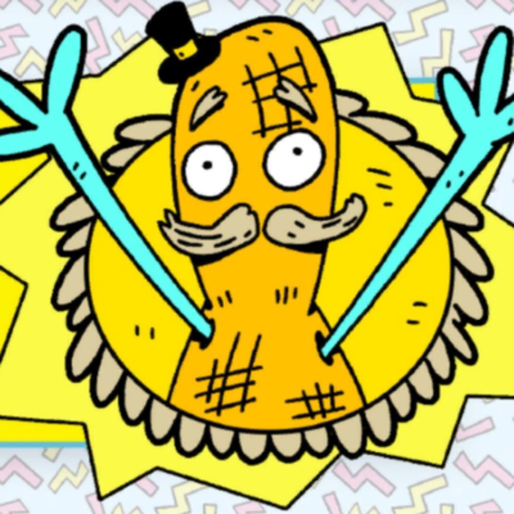
www.dandad.org/work/d-ad-aw... A beautiful open source font with a unique story. You’ll probably notice it being used in the streets on your next Katmandu visit.

November 5, 2025 at 7:00 PM
www.dandad.org/work/d-ad-aw... A beautiful open source font with a unique story. You’ll probably notice it being used in the streets on your next Katmandu visit.
Last couple reposts, I don’t do typography-based logos, I do pictorial logos with optional licensed font placement, so I’m keen on referring people to folks who can do custom wordmarks way better than I can!
November 3, 2025 at 7:44 PM
Last couple reposts, I don’t do typography-based logos, I do pictorial logos with optional licensed font placement, so I’m keen on referring people to folks who can do custom wordmarks way better than I can!
Okay, so, I went and looked for the original image now that I know what Discmaster is. Found it on an Amiga GIGA Graphic CD, enabling me to read the signature, "MGC" - that's Amiga artist Mike Crossmire, whose work can be seen at the Amiga Graphics Archive: amiga.lychesis.net/artists/Mike...

October 27, 2025 at 5:50 AM
Okay, so, I went and looked for the original image now that I know what Discmaster is. Found it on an Amiga GIGA Graphic CD, enabling me to read the signature, "MGC" - that's Amiga artist Mike Crossmire, whose work can be seen at the Amiga Graphics Archive: amiga.lychesis.net/artists/Mike...
Ambigram are visual palindromes that are perfectly symmetrical, can be read the same in any direction.
A fun thing about this is that playing cards in general are more or less Ambigrams when you think about the face card illustrations and reading the cards in either direction.
The wordmarks:
A fun thing about this is that playing cards in general are more or less Ambigrams when you think about the face card illustrations and reading the cards in either direction.
The wordmarks:


November 25, 2024 at 5:46 PM
Ambigram are visual palindromes that are perfectly symmetrical, can be read the same in any direction.
A fun thing about this is that playing cards in general are more or less Ambigrams when you think about the face card illustrations and reading the cards in either direction.
The wordmarks:
A fun thing about this is that playing cards in general are more or less Ambigrams when you think about the face card illustrations and reading the cards in either direction.
The wordmarks:
"MINIMALISTIC FONT-BASED WORDMARKS ARE WOKE . . . "
"ANOTHER MASSIVE WIN FOR PATRIOTS . . . "
creepy old cosplay clowns posse con-sequences #CCCP
"ANOTHER MASSIVE WIN FOR PATRIOTS . . . "
creepy old cosplay clowns posse con-sequences #CCCP
August 29, 2025 at 6:25 PM
"MINIMALISTIC FONT-BASED WORDMARKS ARE WOKE . . . "
"ANOTHER MASSIVE WIN FOR PATRIOTS . . . "
creepy old cosplay clowns posse con-sequences #CCCP
"ANOTHER MASSIVE WIN FOR PATRIOTS . . . "
creepy old cosplay clowns posse con-sequences #CCCP
"MINIMALISTIC FONT-BASED WORDMARKS ARE WOKE . . . "
"THANKS CALIFORNIA GOVERNOR GAVIN NEWSOM . . . "
"A MASSIVE WIN FOR PATRIOTS . . . "
META META META
MAGA MAGA MAGA
ANOTHER SUMMER
MADE IN USA 2025
"THANKS CALIFORNIA GOVERNOR GAVIN NEWSOM . . . "
"A MASSIVE WIN FOR PATRIOTS . . . "
META META META
MAGA MAGA MAGA
ANOTHER SUMMER
MADE IN USA 2025
August 28, 2025 at 2:27 PM
"MINIMALISTIC FONT-BASED WORDMARKS ARE WOKE . . . "
"THANKS CALIFORNIA GOVERNOR GAVIN NEWSOM . . . "
"A MASSIVE WIN FOR PATRIOTS . . . "
META META META
MAGA MAGA MAGA
ANOTHER SUMMER
MADE IN USA 2025
"THANKS CALIFORNIA GOVERNOR GAVIN NEWSOM . . . "
"A MASSIVE WIN FOR PATRIOTS . . . "
META META META
MAGA MAGA MAGA
ANOTHER SUMMER
MADE IN USA 2025

It's not going to revert at this point but one obnoxious fallout of the 2024 Nike MLB fiasco is that sleeve patches are smaller than they used to be, and they end up drowned out by the typically much larger front-uni wordmarks and ultimately look cheaper than before, even w/ the return of embroidery
May 31, 2025 at 3:00 AM
It's not going to revert at this point but one obnoxious fallout of the 2024 Nike MLB fiasco is that sleeve patches are smaller than they used to be, and they end up drowned out by the typically much larger front-uni wordmarks and ultimately look cheaper than before, even w/ the return of embroidery
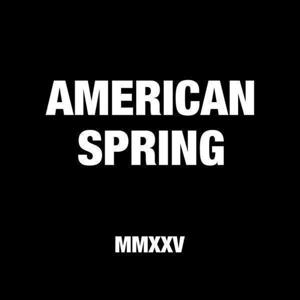
"MINIMALISTIC FONT-BASED WORDMARKS ARE WOKE . . . "
AMERICAN SPRING
MADE USA MMXXV
AMERICAN SPRING
MADE USA MMXXV
August 27, 2025 at 12:07 AM
"MINIMALISTIC FONT-BASED WORDMARKS ARE WOKE . . . "
AMERICAN SPRING
MADE USA MMXXV
AMERICAN SPRING
MADE USA MMXXV
"MINIMALISTIC FONT-BASED WORDMARKS ARE WOKE . . . "
"THANKS CALIFORNIA GOVERNOR GAVIN NEWSOM . . . "
"WE SAID WE WOULD LISTEN AND WE HAVE . . . "
"THANK YOU GOVERNOR GAVIN NEWSOM . . . "
"A MASSIVE WIN FOR PATRIOTS . . . "
"THANKS CALIFORNIA GOVERNOR GAVIN NEWSOM . . . "
"WE SAID WE WOULD LISTEN AND WE HAVE . . . "
"THANK YOU GOVERNOR GAVIN NEWSOM . . . "
"A MASSIVE WIN FOR PATRIOTS . . . "
August 27, 2025 at 8:10 PM
"MINIMALISTIC FONT-BASED WORDMARKS ARE WOKE . . . "
"THANKS CALIFORNIA GOVERNOR GAVIN NEWSOM . . . "
"WE SAID WE WOULD LISTEN AND WE HAVE . . . "
"THANK YOU GOVERNOR GAVIN NEWSOM . . . "
"A MASSIVE WIN FOR PATRIOTS . . . "
"THANKS CALIFORNIA GOVERNOR GAVIN NEWSOM . . . "
"WE SAID WE WOULD LISTEN AND WE HAVE . . . "
"THANK YOU GOVERNOR GAVIN NEWSOM . . . "
"A MASSIVE WIN FOR PATRIOTS . . . "
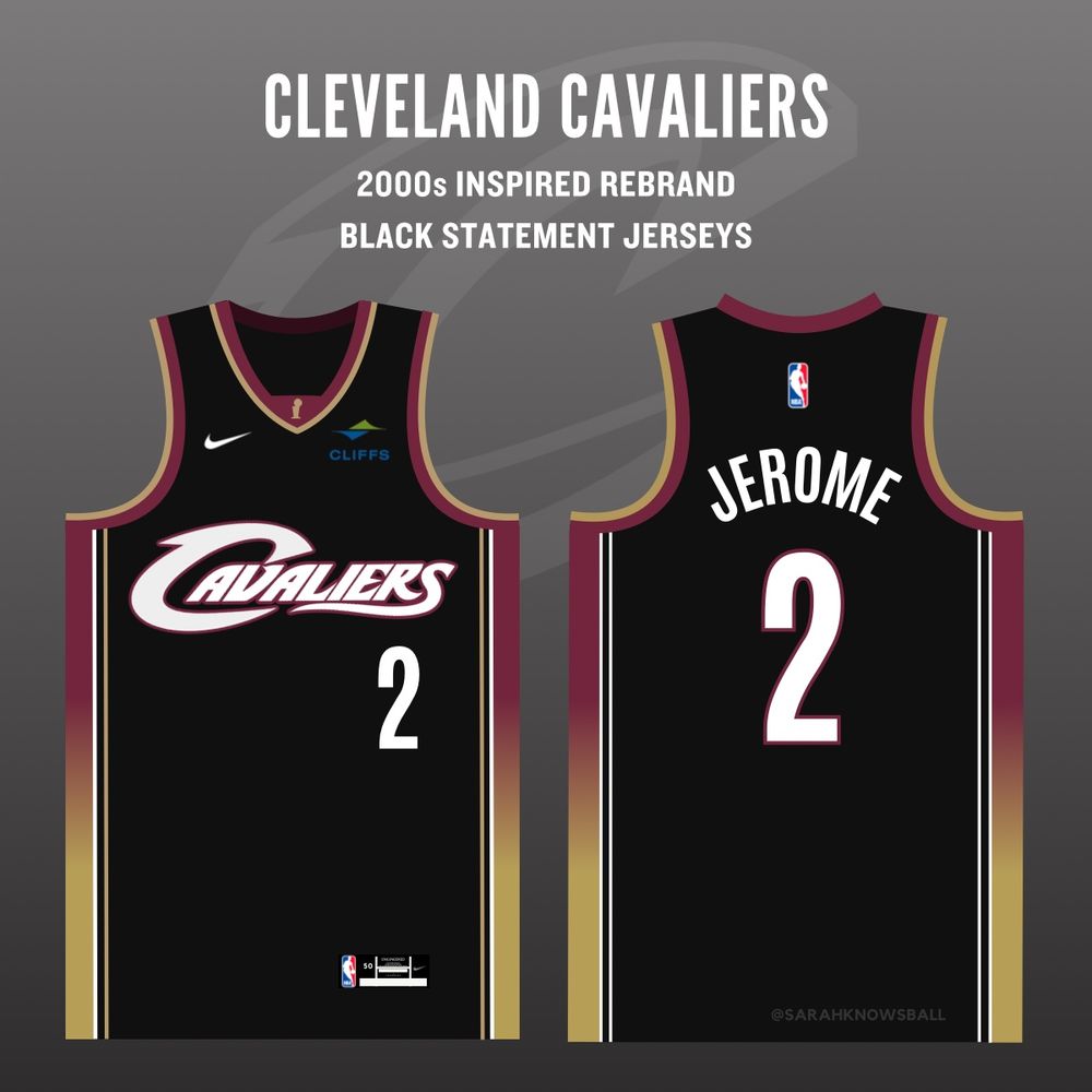
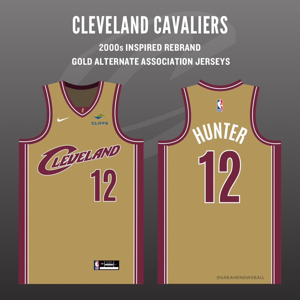
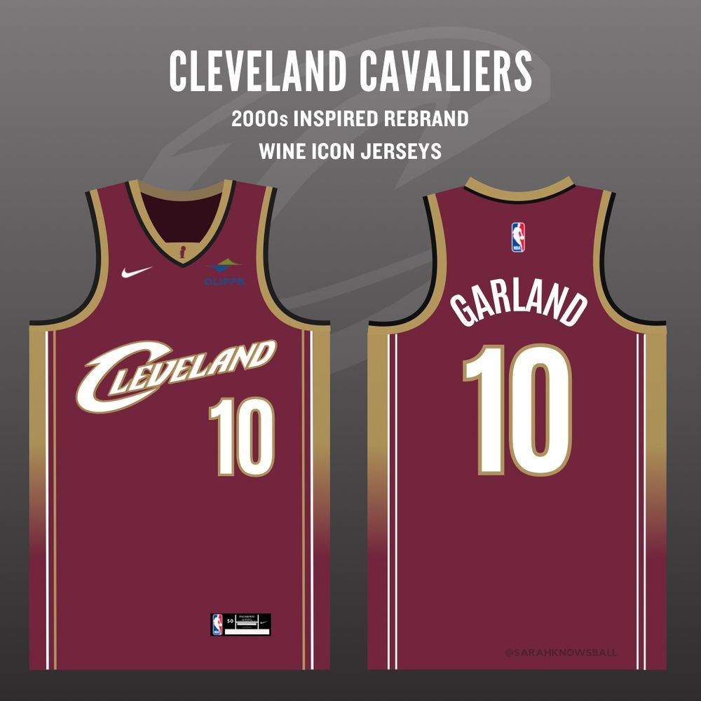
Reimagined 2000s inspired rebrand for the Cleveland Cavaliers ⚔️
This uniform era is arguably my favorite in all of sports. The classic wordmarks combined with the current wine & gold colors combine for a seamless blend between old & new.
#LetEmKnow
This uniform era is arguably my favorite in all of sports. The classic wordmarks combined with the current wine & gold colors combine for a seamless blend between old & new.
#LetEmKnow
February 15, 2025 at 5:19 PM
Reimagined 2000s inspired rebrand for the Cleveland Cavaliers ⚔️
This uniform era is arguably my favorite in all of sports. The classic wordmarks combined with the current wine & gold colors combine for a seamless blend between old & new.
#LetEmKnow
This uniform era is arguably my favorite in all of sports. The classic wordmarks combined with the current wine & gold colors combine for a seamless blend between old & new.
#LetEmKnow
The ball logos are growing on me. I’m not thrilled about the stars, but the smaller the logo then the less of a problem.
Wordmarks/font are the biggest problem with this rebrand.
Wordmarks/font are the biggest problem with this rebrand.

June 3, 2025 at 5:42 PM
The ball logos are growing on me. I’m not thrilled about the stars, but the smaller the logo then the less of a problem.
Wordmarks/font are the biggest problem with this rebrand.
Wordmarks/font are the biggest problem with this rebrand.

Hi, I specialize in creating custom logos, icons, and wordmarks. I can design something professional and brand-focused. Happy to discuss your vision and ideas.
August 18, 2025 at 7:12 PM
Hi, I specialize in creating custom logos, icons, and wordmarks. I can design something professional and brand-focused. Happy to discuss your vision and ideas.
"MINIMALISTIC FONT-BASED WORDMARKS ARE WOKE . . . "
AMERICAN SPRING
MADE USA MMXXV
AMERICAN SPRING
MADE USA MMXXV
August 27, 2025 at 4:13 AM
"MINIMALISTIC FONT-BASED WORDMARKS ARE WOKE . . . "
AMERICAN SPRING
MADE USA MMXXV
AMERICAN SPRING
MADE USA MMXXV

RCAF Snowbird
Canadair CT-114 Tutor
Reg. 114050
Red Deer Regional Airshow 2023
July 29, 2023 🛩️⚔️📸
Canadair CT-114 Tutor
Reg. 114050
Red Deer Regional Airshow 2023
July 29, 2023 🛩️⚔️📸

April 28, 2025 at 11:07 PM
RCAF Snowbird
Canadair CT-114 Tutor
Reg. 114050
Red Deer Regional Airshow 2023
July 29, 2023 🛩️⚔️📸
Canadair CT-114 Tutor
Reg. 114050
Red Deer Regional Airshow 2023
July 29, 2023 🛩️⚔️📸
This upcoming Kickstarter has one of the best wordmarks I've seen in a while. It's almost like an easter egg hunt to see all the nods to its infamous Questing Beast.
www.kickstarter.com/projects/gra...
www.kickstarter.com/projects/gra...

Coming soon: Glatisant: A Two-player Arthurian TTRPG
A duet game of purpose, pursuit, and guidance
www.kickstarter.com
June 13, 2025 at 6:25 PM
This upcoming Kickstarter has one of the best wordmarks I've seen in a while. It's almost like an easter egg hunt to see all the nods to its infamous Questing Beast.
www.kickstarter.com/projects/gra...
www.kickstarter.com/projects/gra...
@caseyvitelli.bsky.social the king of wordmarks
January 16, 2025 at 9:30 PM
@caseyvitelli.bsky.social the king of wordmarks

I know I'm late to this but I am choking laughing

March 12, 2025 at 8:10 PM
I know I'm late to this but I am choking laughing
"MINIMALISTIC FONT-BASED WORDMARKS ARE WOKE . . . "
"WE SAID WE WOULD LISTEN AND WE HAVE . . . "
"THANK YOU GOVERNOR GAVIN NEWSOM . . . "
"A MASSIVE WIN FOR PATRIOTS . . . "
"WE SAID WE WOULD LISTEN AND WE HAVE . . . "
"THANK YOU GOVERNOR GAVIN NEWSOM . . . "
"A MASSIVE WIN FOR PATRIOTS . . . "
August 27, 2025 at 2:26 PM
"MINIMALISTIC FONT-BASED WORDMARKS ARE WOKE . . . "
"WE SAID WE WOULD LISTEN AND WE HAVE . . . "
"THANK YOU GOVERNOR GAVIN NEWSOM . . . "
"A MASSIVE WIN FOR PATRIOTS . . . "
"WE SAID WE WOULD LISTEN AND WE HAVE . . . "
"THANK YOU GOVERNOR GAVIN NEWSOM . . . "
"A MASSIVE WIN FOR PATRIOTS . . . "
I would say this is easily the best court the Clippers have had in the last 35 years of their franchise except that it has both “San Diego” and “Los Angeles” wordmarks on the floor
November 13, 2025 at 3:48 AM
I would say this is easily the best court the Clippers have had in the last 35 years of their franchise except that it has both “San Diego” and “Los Angeles” wordmarks on the floor

Here's the full logo set. Lots to like about it!
- Clear and legible, the most important qualities a logo should have
- Evocative of brackets, a very basketball-y thing
- The motion lines are similar but different to the Raptors' claw marks logo. Good synergy without being a direct ripoff
- Clear and legible, the most important qualities a logo should have
- Evocative of brackets, a very basketball-y thing
- The motion lines are similar but different to the Raptors' claw marks logo. Good synergy without being a direct ripoff

December 5, 2024 at 4:00 PM
Here's the full logo set. Lots to like about it!
- Clear and legible, the most important qualities a logo should have
- Evocative of brackets, a very basketball-y thing
- The motion lines are similar but different to the Raptors' claw marks logo. Good synergy without being a direct ripoff
- Clear and legible, the most important qualities a logo should have
- Evocative of brackets, a very basketball-y thing
- The motion lines are similar but different to the Raptors' claw marks logo. Good synergy without being a direct ripoff
Your premise is assuming the conclusion though.
The entire work is in the public domain. The work includes the cover. Could you just throw the Superman logo or Action Comics #1 on any random piece? No. But the work as a whole, which includes the wordmarks, would be public domain.
The entire work is in the public domain. The work includes the cover. Could you just throw the Superman logo or Action Comics #1 on any random piece? No. But the work as a whole, which includes the wordmarks, would be public domain.
November 28, 2023 at 2:20 AM
Your premise is assuming the conclusion though.
The entire work is in the public domain. The work includes the cover. Could you just throw the Superman logo or Action Comics #1 on any random piece? No. But the work as a whole, which includes the wordmarks, would be public domain.
The entire work is in the public domain. The work includes the cover. Could you just throw the Superman logo or Action Comics #1 on any random piece? No. But the work as a whole, which includes the wordmarks, would be public domain.
Names of metro stations, highway signage or airport directions are compactly spaced with a high x-height and distinctive letterforms just like wordmarks. RT Rondelle uses these principles as a basis for its design.

April 22, 2025 at 6:53 AM
Names of metro stations, highway signage or airport directions are compactly spaced with a high x-height and distinctive letterforms just like wordmarks. RT Rondelle uses these principles as a basis for its design.
Recommendations pls:
Using AI daily in all sorts of mundane ways now. Midjourney for avatars and fake products. ChatGPT to write copy for products, and to make my own comms more concise. Perplexity for information gathering.
I’m missing AI that can produce great logos and wordmarks. #design
Using AI daily in all sorts of mundane ways now. Midjourney for avatars and fake products. ChatGPT to write copy for products, and to make my own comms more concise. Perplexity for information gathering.
I’m missing AI that can produce great logos and wordmarks. #design
November 20, 2024 at 7:30 PM
Recommendations pls:
Using AI daily in all sorts of mundane ways now. Midjourney for avatars and fake products. ChatGPT to write copy for products, and to make my own comms more concise. Perplexity for information gathering.
I’m missing AI that can produce great logos and wordmarks. #design
Using AI daily in all sorts of mundane ways now. Midjourney for avatars and fake products. ChatGPT to write copy for products, and to make my own comms more concise. Perplexity for information gathering.
I’m missing AI that can produce great logos and wordmarks. #design
I had no problems whatsoever with the current Bluenote we’ve had since 1998, but this is solid rebrand. Especially love the new wordmarks and the fact they’re keeping the past home sweater as a third. My only compliant: the lack of bordering on the numbers seems… odd?

June 24, 2025 at 2:10 PM
I had no problems whatsoever with the current Bluenote we’ve had since 1998, but this is solid rebrand. Especially love the new wordmarks and the fact they’re keeping the past home sweater as a third. My only compliant: the lack of bordering on the numbers seems… odd?
@LillyHerself Since I figured out that Microsoft's wordmarks of the 90s are just Arial Black with drastically reduced letter spacing, I can't stop. 😆
April 26, 2025 at 9:02 AM
@LillyHerself Since I figured out that Microsoft's wordmarks of the 90s are just Arial Black with drastically reduced letter spacing, I can't stop. 😆