


Lisa Hornung
@lisahornung.bsky.social
Data Visualisation Manager at a health think tank 👩💻 Mostly talk about data, #dataviz, #opendata, #maps, #python and #data4good 📈 Into cycling, yoga, sourdough, puns and more. Views my own.
Also active on Mastodon + Linkedin
Also active on Mastodon + Linkedin
Pinned
Lisa Hornung
@lisahornung.bsky.social
· Oct 22
Just launched Lazy Cats, a visual exploration of cat behaviour. Meet Lily + 27 other cats and find out what they do all day (spoiler: they mostly chill) 🐱🐾 Does your cat fit their profile?
Very proud to share my first interactive #dataviz project built with Svelte + D3! 📊
lazy-cats.netlify.app
Very proud to share my first interactive #dataviz project built with Svelte + D3! 📊
lazy-cats.netlify.app
Minimal map of central London underground network for #30DayMapChallenge Day11 (also includes some overground stations).
Made in Figma, based on London Tube Map 2025 www.londontubemap.org/maps/London-...
#dataviz
Made in Figma, based on London Tube Map 2025 www.londontubemap.org/maps/London-...
#dataviz

November 12, 2025 at 9:50 AM
Minimal map of central London underground network for #30DayMapChallenge Day11 (also includes some overground stations).
Made in Figma, based on London Tube Map 2025 www.londontubemap.org/maps/London-...
#dataviz
Made in Figma, based on London Tube Map 2025 www.londontubemap.org/maps/London-...
#dataviz
Reposted by Lisa Hornung

#Dataviz newsletters! Here are the ones you shouldn't miss:
📩 Data Vis Dispatch, by Datawrapper - this is the one I never miss - my Nobel Prize visual was featured in a recent edition, I'm always super proud when that happens!
www.datawrapper.de/blog/newslet...
1/5
📩 Data Vis Dispatch, by Datawrapper - this is the one I never miss - my Nobel Prize visual was featured in a recent edition, I'm always super proud when that happens!
www.datawrapper.de/blog/newslet...
1/5

October 31, 2025 at 9:36 AM
#Dataviz newsletters! Here are the ones you shouldn't miss:
📩 Data Vis Dispatch, by Datawrapper - this is the one I never miss - my Nobel Prize visual was featured in a recent edition, I'm always super proud when that happens!
www.datawrapper.de/blog/newslet...
1/5
📩 Data Vis Dispatch, by Datawrapper - this is the one I never miss - my Nobel Prize visual was featured in a recent edition, I'm always super proud when that happens!
www.datawrapper.de/blog/newslet...
1/5
This year I joined @healthfoundation.bsky.social as their first Data Visualisation Manager. As part of a 6-month discovery phase, I audited 244 charts📊we published to better understand what we were doing.
Read how it has improved our #dataviz in my behind-the-scenes blog medium.com/healthfdn-da...
Read how it has improved our #dataviz in my behind-the-scenes blog medium.com/healthfdn-da...

November 10, 2025 at 12:08 PM
This year I joined @healthfoundation.bsky.social as their first Data Visualisation Manager. As part of a 6-month discovery phase, I audited 244 charts📊we published to better understand what we were doing.
Read how it has improved our #dataviz in my behind-the-scenes blog medium.com/healthfdn-da...
Read how it has improved our #dataviz in my behind-the-scenes blog medium.com/healthfdn-da...
#30DayMapChallenge Day3 Polygons – Google search interest in 🐱cat vs 🐶dog.
Map shows if search volumes are higher for cat (blue), dog (red) or same (grey). Light colours mean low search volumes. Data from Google Trends, Oct 2024-Oct 2025.
Made in #python + Figma, code github.com/Lisa-Ho/30-d...
Map shows if search volumes are higher for cat (blue), dog (red) or same (grey). Light colours mean low search volumes. Data from Google Trends, Oct 2024-Oct 2025.
Made in #python + Figma, code github.com/Lisa-Ho/30-d...

November 9, 2025 at 12:43 PM
#30DayMapChallenge Day3 Polygons – Google search interest in 🐱cat vs 🐶dog.
Map shows if search volumes are higher for cat (blue), dog (red) or same (grey). Light colours mean low search volumes. Data from Google Trends, Oct 2024-Oct 2025.
Made in #python + Figma, code github.com/Lisa-Ho/30-d...
Map shows if search volumes are higher for cat (blue), dog (red) or same (grey). Light colours mean low search volumes. Data from Google Trends, Oct 2024-Oct 2025.
Made in #python + Figma, code github.com/Lisa-Ho/30-d...
#30DayMapChallenge Day1 Points – slow start this year with a remake. Birthplaces of UK prime ministers (did you know Boris was born in New York?)
This was the first python map in 2022, now my first one in #Svelte + maplibre. Interactive version here 30-day-map-challenge-2025.netlify.app//day1
This was the first python map in 2022, now my first one in #Svelte + maplibre. Interactive version here 30-day-map-challenge-2025.netlify.app//day1

November 7, 2025 at 11:35 AM
#30DayMapChallenge Day1 Points – slow start this year with a remake. Birthplaces of UK prime ministers (did you know Boris was born in New York?)
This was the first python map in 2022, now my first one in #Svelte + maplibre. Interactive version here 30-day-map-challenge-2025.netlify.app//day1
This was the first python map in 2022, now my first one in #Svelte + maplibre. Interactive version here 30-day-map-challenge-2025.netlify.app//day1
Reposted by Lisa Hornung


November 2, 2025 at 12:38 PM
Best time of the year for map lovers! Watch out for all the awesome, creative contributions. Follow @ansgarw.bsky.social handy feed to not miss any. 🙌🤩🗺️

The #30DayMapChallenge starts today! 🗺️
If you want to follow the posts shared on Bluesky, here is a feed which captures all the posts:
bsky.app/profile/ansg...
#GIS #GISChat #Maps
If you want to follow the posts shared on Bluesky, here is a feed which captures all the posts:
bsky.app/profile/ansg...
#GIS #GISChat #Maps
November 1, 2025 at 9:13 AM
Best time of the year for map lovers! Watch out for all the awesome, creative contributions. Follow @ansgarw.bsky.social handy feed to not miss any. 🙌🤩🗺️
Reposted by Lisa Hornung

This is absolutely fascinating: you can put your postcode in and see relative levels of deprivation (and the opposite) where you live in detail. I live where I grew up, so I could spend days doing this as I know the town so well. www.ft.com/content/9a1c... Huge congrats to @amyborrett.ft.com et al.

Interactive: explore England’s new deprivation map
Data analysis reveals ‘cheek by jowl’ inequalities in first study of country’s disadvantaged areas since pandemic
www.ft.com
October 31, 2025 at 7:21 AM
This is absolutely fascinating: you can put your postcode in and see relative levels of deprivation (and the opposite) where you live in detail. I live where I grew up, so I could spend days doing this as I know the town so well. www.ft.com/content/9a1c... Huge congrats to @amyborrett.ft.com et al.
Reposted by Lisa Hornung

Can you predict when Lou Bega's greatest hit, Mambo No. 5, was released based on the names of all the women mentioned in the song?
Weirdly yes.
yawpr.substack.com/p/project-a-...
#databs #rstats
Weirdly yes.
yawpr.substack.com/p/project-a-...
#databs #rstats
October 21, 2025 at 8:24 PM
Can you predict when Lou Bega's greatest hit, Mambo No. 5, was released based on the names of all the women mentioned in the song?
Weirdly yes.
yawpr.substack.com/p/project-a-...
#databs #rstats
Weirdly yes.
yawpr.substack.com/p/project-a-...
#databs #rstats
Just launched Lazy Cats, a visual exploration of cat behaviour. Meet Lily + 27 other cats and find out what they do all day (spoiler: they mostly chill) 🐱🐾 Does your cat fit their profile?
Very proud to share my first interactive #dataviz project built with Svelte + D3! 📊
lazy-cats.netlify.app
Very proud to share my first interactive #dataviz project built with Svelte + D3! 📊
lazy-cats.netlify.app
October 22, 2025 at 7:46 AM
Just launched Lazy Cats, a visual exploration of cat behaviour. Meet Lily + 27 other cats and find out what they do all day (spoiler: they mostly chill) 🐱🐾 Does your cat fit their profile?
Very proud to share my first interactive #dataviz project built with Svelte + D3! 📊
lazy-cats.netlify.app
Very proud to share my first interactive #dataviz project built with Svelte + D3! 📊
lazy-cats.netlify.app
Reposted by Lisa Hornung

🍩 What if climate looked like a donut? 🌍
Here’s a bunch of cities turned into a sweet dataviz experiment.
🟡 → comfy zone
🔴 → hot
🔵 → cold
Why a donut? Let me explain 👇
Here’s a bunch of cities turned into a sweet dataviz experiment.
🟡 → comfy zone
🔴 → hot
🔵 → cold
Why a donut? Let me explain 👇
September 29, 2025 at 11:29 PM
🍩 What if climate looked like a donut? 🌍
Here’s a bunch of cities turned into a sweet dataviz experiment.
🟡 → comfy zone
🔴 → hot
🔵 → cold
Why a donut? Let me explain 👇
Here’s a bunch of cities turned into a sweet dataviz experiment.
🟡 → comfy zone
🔴 → hot
🔵 → cold
Why a donut? Let me explain 👇
What if all munros (mountains in Scotland > 3000ft or 914.4m) were on a single munro? 🗻
Fun visual experiment for #TidyTuesday / #PydyTuesday using python, pandas, matplotlib, pyfonts. Thanks to @nrennie.bsky.social for collating the dataset 🙏
Code github.com/Lisa-Ho/smal...
Fun visual experiment for #TidyTuesday / #PydyTuesday using python, pandas, matplotlib, pyfonts. Thanks to @nrennie.bsky.social for collating the dataset 🙏
Code github.com/Lisa-Ho/smal...

August 22, 2025 at 7:33 AM
What if all munros (mountains in Scotland > 3000ft or 914.4m) were on a single munro? 🗻
Fun visual experiment for #TidyTuesday / #PydyTuesday using python, pandas, matplotlib, pyfonts. Thanks to @nrennie.bsky.social for collating the dataset 🙏
Code github.com/Lisa-Ho/smal...
Fun visual experiment for #TidyTuesday / #PydyTuesday using python, pandas, matplotlib, pyfonts. Thanks to @nrennie.bsky.social for collating the dataset 🙏
Code github.com/Lisa-Ho/smal...
I just found out about 'Spreadsheet Champions' - a first of a kind documentary about people competing in an official Microsoft #Excel competition 😯😱 I so want to watch this!!!
Might be difficult to find a place to stream it, any ideas, send them my way 🙏
www.theguardian.com/film/2025/au...
Might be difficult to find a place to stream it, any ideas, send them my way 🙏
www.theguardian.com/film/2025/au...

Excelling in … Excel? Inside the high-stakes, secretive world of competitive spreadsheeting
New documentary Spreadsheet Champions follows six competitors as they head to the Microsoft Office Specialist world championship in Florida
www.theguardian.com
August 2, 2025 at 10:02 AM
I just found out about 'Spreadsheet Champions' - a first of a kind documentary about people competing in an official Microsoft #Excel competition 😯😱 I so want to watch this!!!
Might be difficult to find a place to stream it, any ideas, send them my way 🙏
www.theguardian.com/film/2025/au...
Might be difficult to find a place to stream it, any ideas, send them my way 🙏
www.theguardian.com/film/2025/au...

Reposted by Lisa Hornung

Data in a csv format
which we converted to a pdf
which we printed
which we then scanned
which we embedded in a slide deck
which we then encrypted
which we lost the password to
and cited as “available upon request”
which we converted to a pdf
which we printed
which we then scanned
which we embedded in a slide deck
which we then encrypted
which we lost the password to
and cited as “available upon request”
July 15, 2025 at 7:27 AM
Data in a csv format
which we converted to a pdf
which we printed
which we then scanned
which we embedded in a slide deck
which we then encrypted
which we lost the password to
and cited as “available upon request”
which we converted to a pdf
which we printed
which we then scanned
which we embedded in a slide deck
which we then encrypted
which we lost the password to
and cited as “available upon request”

People in some areas of England and Wales are almost twice as likely to die before 75 (premature mortality).
Out latest analysis shows rates are highest in the North East, the North West and Yorkshire and the Humber, and lowest in London (> Richmond)
Learn more www.health.org.uk/reports-and-...
Out latest analysis shows rates are highest in the North East, the North West and Yorkshire and the Humber, and lowest in London (> Richmond)
Learn more www.health.org.uk/reports-and-...

July 10, 2025 at 9:15 AM
People in some areas of England and Wales are almost twice as likely to die before 75 (premature mortality).
Out latest analysis shows rates are highest in the North East, the North West and Yorkshire and the Humber, and lowest in London (> Richmond)
Learn more www.health.org.uk/reports-and-...
Out latest analysis shows rates are highest in the North East, the North West and Yorkshire and the Humber, and lowest in London (> Richmond)
Learn more www.health.org.uk/reports-and-...
Reposted by Lisa Hornung

I appreciate the optimism of this parking validation machine
July 9, 2025 at 3:00 PM
I appreciate the optimism of this parking validation machine
Had some fun plotting colors in 3D for #TidyTuesday #PydyTuesday
The top 100 color names in the 2010 xkcd color name survey by hue, lightness and saturation. Interactive chart made with python + plotly + quarto inside-numbers.quarto.pub/top-100-colo...
Code: github.com/Lisa-Ho/smal...
The top 100 color names in the 2010 xkcd color name survey by hue, lightness and saturation. Interactive chart made with python + plotly + quarto inside-numbers.quarto.pub/top-100-colo...
Code: github.com/Lisa-Ho/smal...

July 9, 2025 at 10:18 AM
Had some fun plotting colors in 3D for #TidyTuesday #PydyTuesday
The top 100 color names in the 2010 xkcd color name survey by hue, lightness and saturation. Interactive chart made with python + plotly + quarto inside-numbers.quarto.pub/top-100-colo...
Code: github.com/Lisa-Ho/smal...
The top 100 color names in the 2010 xkcd color name survey by hue, lightness and saturation. Interactive chart made with python + plotly + quarto inside-numbers.quarto.pub/top-100-colo...
Code: github.com/Lisa-Ho/smal...

Reposted by Lisa Hornung

Our website has a new chart gallery! 📈📊📉
You can now browse through almost every chart from all our projects & filter them by chart function. Whether you’d like to draw inspiration, explore our projects, or just because you love charts. Stop by revisual.co/chart-gallery/ & look around! 👀
You can now browse through almost every chart from all our projects & filter them by chart function. Whether you’d like to draw inspiration, explore our projects, or just because you love charts. Stop by revisual.co/chart-gallery/ & look around! 👀
June 17, 2025 at 9:56 AM
Our website has a new chart gallery! 📈📊📉
You can now browse through almost every chart from all our projects & filter them by chart function. Whether you’d like to draw inspiration, explore our projects, or just because you love charts. Stop by revisual.co/chart-gallery/ & look around! 👀
You can now browse through almost every chart from all our projects & filter them by chart function. Whether you’d like to draw inspiration, explore our projects, or just because you love charts. Stop by revisual.co/chart-gallery/ & look around! 👀
Reposted by Lisa Hornung

In these turbulent times—while the galaxy reels from crisis to crisis—sometimes the only way forward… is sideways, into Star Wars canon. A timeline of every Star Wars show, charted in story-order from the dawn of the Republic to the First Order. #DarthJarJar #StarWars #MayThe4th #Andor #dataviz
April 23, 2025 at 11:56 AM
In these turbulent times—while the galaxy reels from crisis to crisis—sometimes the only way forward… is sideways, into Star Wars canon. A timeline of every Star Wars show, charted in story-order from the dawn of the Republic to the First Order. #DarthJarJar #StarWars #MayThe4th #Andor #dataviz
Reposted by Lisa Hornung

We have a "never use yellow if you can help it" rule for our charts. We couldn't help it on this one
www.economist.com/united-state...
www.economist.com/united-state...
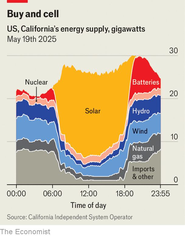
May 23, 2025 at 4:39 PM
We have a "never use yellow if you can help it" rule for our charts. We couldn't help it on this one
www.economist.com/united-state...
www.economist.com/united-state...
Reposted by Lisa Hornung

Last week I had the pleasure of finally releasing the #SveltePlot alpha version during my talk at the #SvelteSummit in Barcelona. It's a new visualization framework for @svelte.dev that I've been working on for the past 18 months, so it's about time for a 🧵
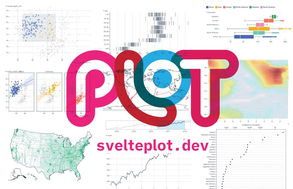
May 13, 2025 at 11:21 AM
Last week I had the pleasure of finally releasing the #SveltePlot alpha version during my talk at the #SvelteSummit in Barcelona. It's a new visualization framework for @svelte.dev that I've been working on for the past 18 months, so it's about time for a 🧵
How much should #NHS staff be paid?
Only 32% of NHS staff are satisfied with their pay, a relatively consistent trend.
But what is the right rate for NHS jobs? How do you judge if people are over/underpaid?
A thread based on our latest analysis 📊👇 1/ www.health.org.uk/reports-and-...
Only 32% of NHS staff are satisfied with their pay, a relatively consistent trend.
But what is the right rate for NHS jobs? How do you judge if people are over/underpaid?
A thread based on our latest analysis 📊👇 1/ www.health.org.uk/reports-and-...

May 19, 2025 at 11:50 AM
How much should #NHS staff be paid?
Only 32% of NHS staff are satisfied with their pay, a relatively consistent trend.
But what is the right rate for NHS jobs? How do you judge if people are over/underpaid?
A thread based on our latest analysis 📊👇 1/ www.health.org.uk/reports-and-...
Only 32% of NHS staff are satisfied with their pay, a relatively consistent trend.
But what is the right rate for NHS jobs? How do you judge if people are over/underpaid?
A thread based on our latest analysis 📊👇 1/ www.health.org.uk/reports-and-...