


Karim Douieb
@karimdouieb.bsky.social
Data visualization designer & data scientist
Co-founder of Jetpack.AI
Co-founder of Jetpack.AI
Went to the Kikk Festival in Namur a few weeks ago and loved it. Such an inspiring event for anyone into digital and creative culture. They just released some of the talks online, check them out!
My favorite is this one from @roberthodgin.bsky.social 👇
My favorite is this one from @roberthodgin.bsky.social 👇

Robert Hodgin - Why Bother? Making Art in the Age of AI
YouTube video by KIKK
www.youtube.com
December 1, 2025 at 8:40 PM
Went to the Kikk Festival in Namur a few weeks ago and loved it. Such an inspiring event for anyone into digital and creative culture. They just released some of the talks online, check them out!
My favorite is this one from @roberthodgin.bsky.social 👇
My favorite is this one from @roberthodgin.bsky.social 👇
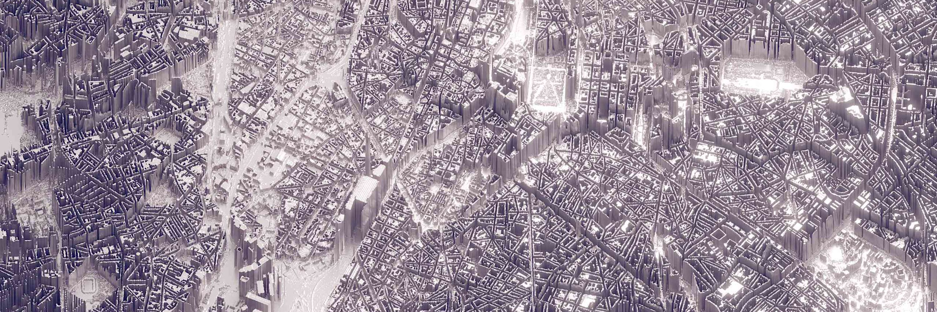
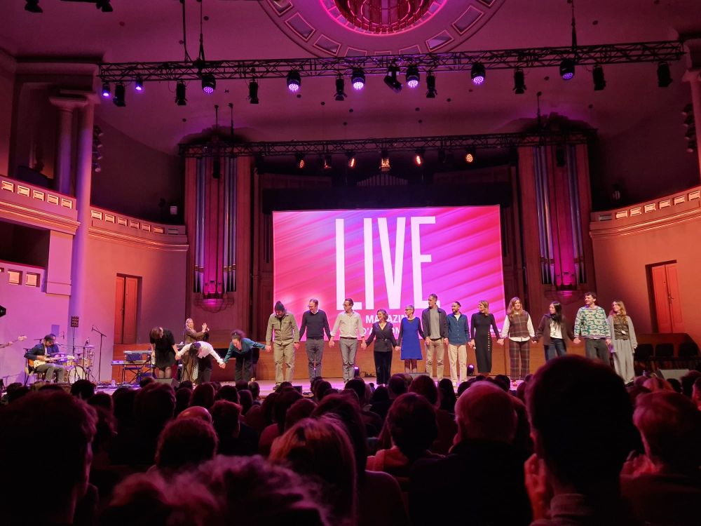
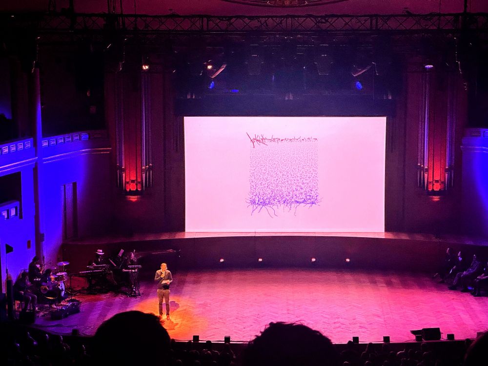
Still buzzing after speaking at LIVE Magazine in Bozar. Sharing stories of Brussels through maps and visuals in front of more than 4300 people was unforgettable. Grateful for the energy, the audience and the amazing team behind the show.


November 27, 2025 at 9:51 AM
Still buzzing after speaking at LIVE Magazine in Bozar. Sharing stories of Brussels through maps and visuals in front of more than 4300 people was unforgettable. Grateful for the energy, the audience and the amazing team behind the show.
I did a short interview with @observablehq.com about keeping visuals simple, clear, and easy to connect with. I also touched on curiosity, emotion, and what I’m still figuring out. Grateful for the conversation. 👇

Creator spotlight: The anatomy of an impactful data visualization with Karim Douieb
Explore how data viz designer Karim Douieb creates impactful data visualizations. Learn his five principles behind visuals that clarify, connect, and spark insight.
observablehq.com
November 21, 2025 at 12:55 PM
I did a short interview with @observablehq.com about keeping visuals simple, clear, and easy to connect with. I also touched on curiosity, emotion, and what I’m still figuring out. Grateful for the conversation. 👇
I love every little details of this work! 🤩
November 17, 2025 at 7:33 PM
I love every little details of this work! 🤩
🍩 What if climate looked like a donut? 🌍
Here’s a bunch of cities turned into a sweet dataviz experiment.
🟡 → comfy zone
🔴 → hot
🔵 → cold
Why a donut? Let me explain 👇
Here’s a bunch of cities turned into a sweet dataviz experiment.
🟡 → comfy zone
🔴 → hot
🔵 → cold
Why a donut? Let me explain 👇
September 29, 2025 at 11:29 PM
🍩 What if climate looked like a donut? 🌍
Here’s a bunch of cities turned into a sweet dataviz experiment.
🟡 → comfy zone
🔴 → hot
🔵 → cold
Why a donut? Let me explain 👇
Here’s a bunch of cities turned into a sweet dataviz experiment.
🟡 → comfy zone
🔴 → hot
🔵 → cold
Why a donut? Let me explain 👇
Reposted by Karim Douieb
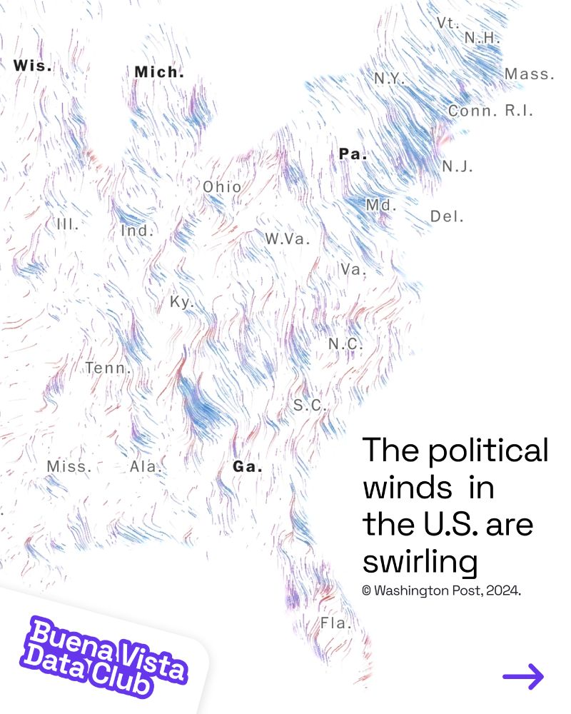
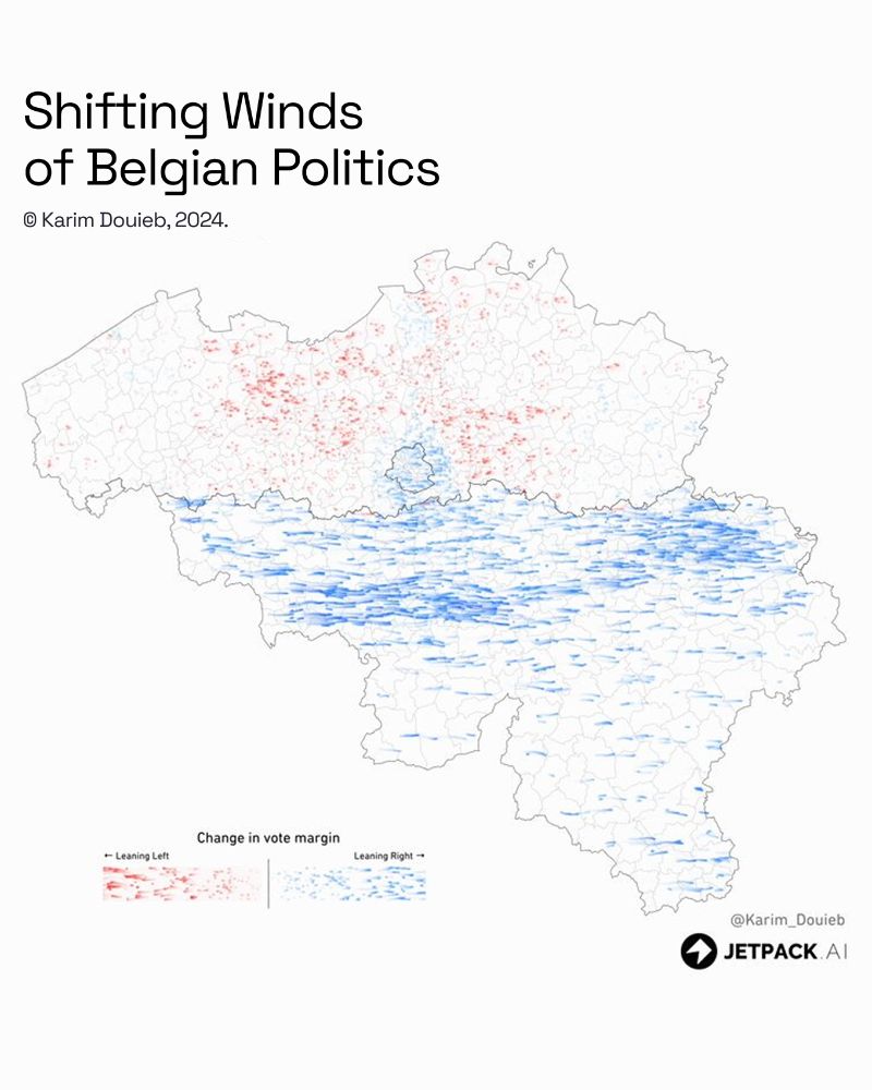
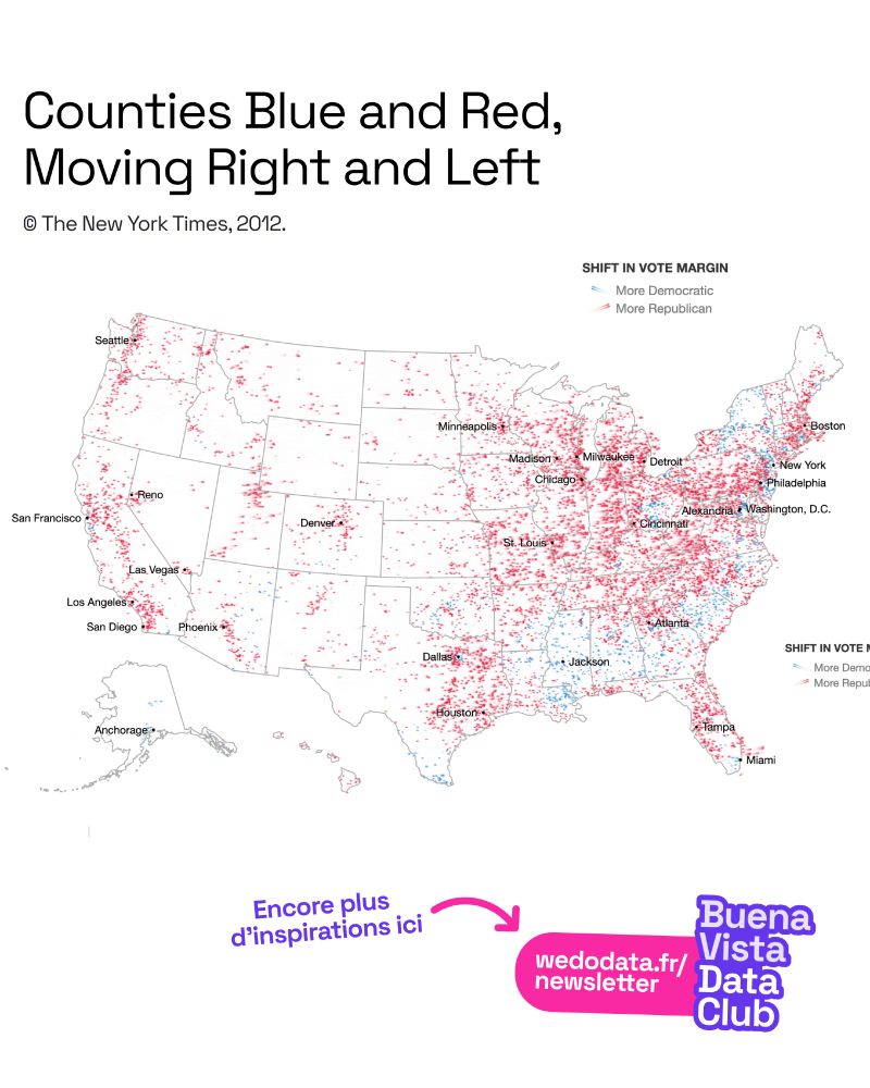
Des cartes inspirantes ! Voici des cartes qui utilisent la métaphore du vent pour illustrer la dynamique électorale entre deux dates. La direction et la couleur montrent le changement du vote sur une période donnée, la longueur du trait son intensité.
#dataviz #data #cartographie #map #carte
#dataviz #data #cartographie #map #carte
July 28, 2025 at 8:37 AM
Des cartes inspirantes ! Voici des cartes qui utilisent la métaphore du vent pour illustrer la dynamique électorale entre deux dates. La direction et la couleur montrent le changement du vote sur une période donnée, la longueur du trait son intensité.
#dataviz #data #cartographie #map #carte
#dataviz #data #cartographie #map #carte
📈 Can Belgium reach 80% employment by 2030?
We created an interactive visual storytelling piece showing how age, gender, and location shape job opportunities.
Take a look 👉 itinera-emploi80.s3-website-eu-west-1.amazonaws.com?lang=en
We created an interactive visual storytelling piece showing how age, gender, and location shape job opportunities.
Take a look 👉 itinera-emploi80.s3-website-eu-west-1.amazonaws.com?lang=en
June 17, 2025 at 7:47 AM
📈 Can Belgium reach 80% employment by 2030?
We created an interactive visual storytelling piece showing how age, gender, and location shape job opportunities.
Take a look 👉 itinera-emploi80.s3-website-eu-west-1.amazonaws.com?lang=en
We created an interactive visual storytelling piece showing how age, gender, and location shape job opportunities.
Take a look 👉 itinera-emploi80.s3-website-eu-west-1.amazonaws.com?lang=en
Fil's maps don’t just show places, they tell powerful stories. Always inspiring to see his work and grateful for his contribution to the community. Give him a follow and read his interview:

AMA about my love of maps
observablehq.com/blog/maps-an...
thanks @allisonhorst.bsky.social for the cosy chat
observablehq.com/blog/maps-an...
thanks @allisonhorst.bsky.social for the cosy chat
We can always talk about maps
Fil Rivière, Data Visualization Engineer at Observable, describes his path into data visualization, what he likes in a map, what’s hard about mapmaking, and why he’s asking if we need a “slow cartogra...
observablehq.com
February 24, 2025 at 3:06 PM
Fil's maps don’t just show places, they tell powerful stories. Always inspiring to see his work and grateful for his contribution to the community. Give him a follow and read his interview:
Hey #dataviz folks! I’m looking for fun, hands-on workshop ideas to introduce art students (no coding skills) to data visualization. Any favorite exercises that blend creativity & data in an engaging way? Open to all suggestions! 🎨📊
February 7, 2025 at 7:54 AM
Hey #dataviz folks! I’m looking for fun, hands-on workshop ideas to introduce art students (no coding skills) to data visualization. Any favorite exercises that blend creativity & data in an engaging way? Open to all suggestions! 🎨📊
Another fantastic roundup of datavis! Thrilled to see my wild creations making an appearance! 👀

A tragic plane crash, a turnaround for Barnes & Noble, and political drama in Germany — find these and more covered in our Data Vis Dispatch this week 📈
➡️ https://blog.datawrapper.de/data-vis-dispatch-february-4-2025/
➡️ https://blog.datawrapper.de/data-vis-dispatch-february-4-2025/
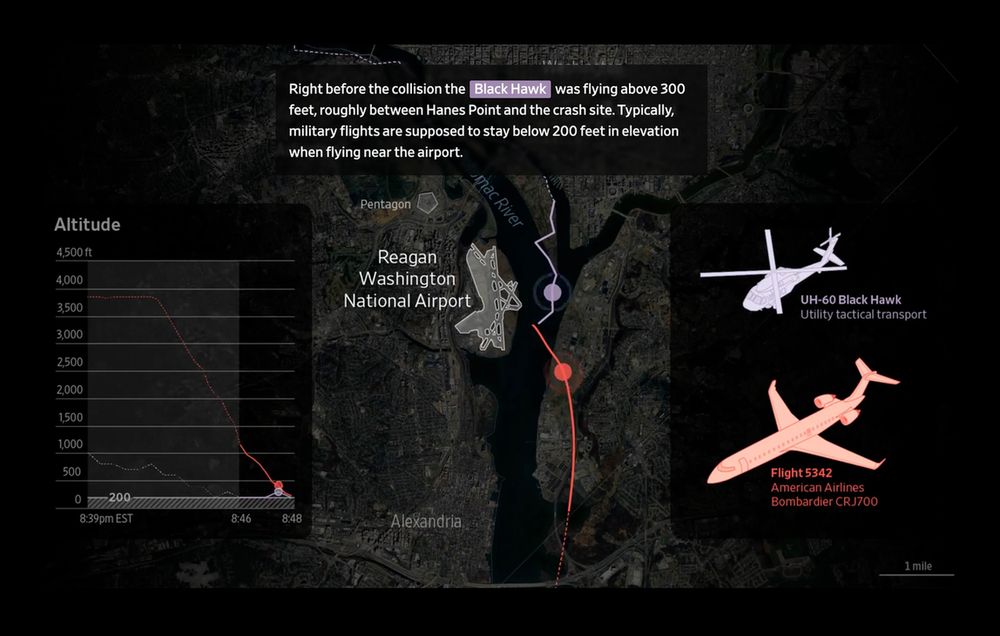
February 6, 2025 at 2:02 PM
Another fantastic roundup of datavis! Thrilled to see my wild creations making an appearance! 👀
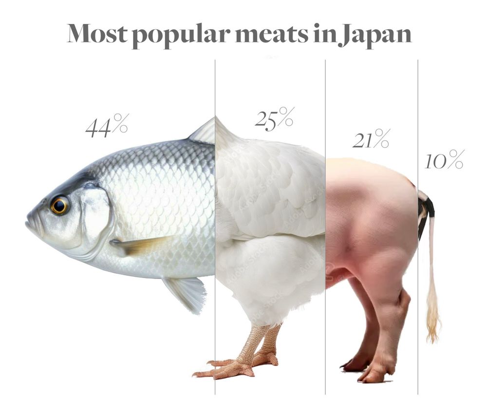
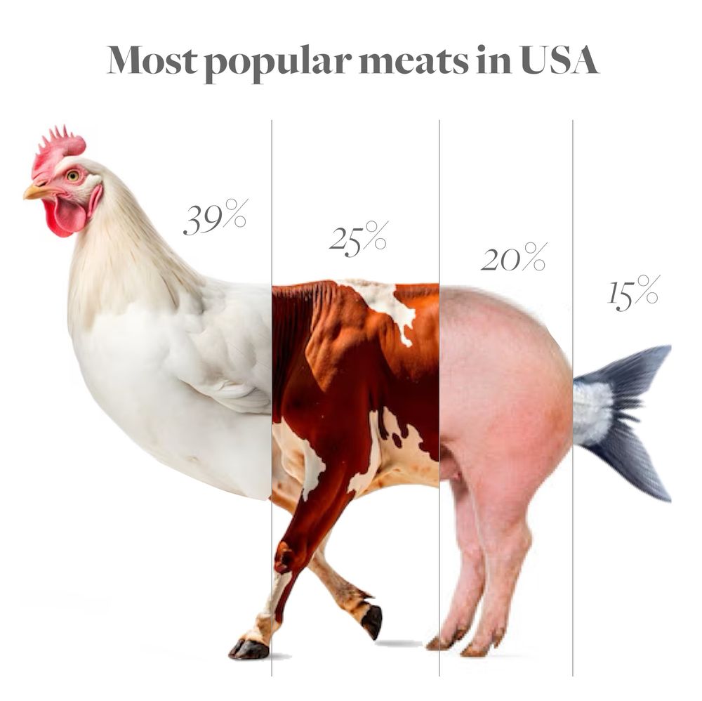
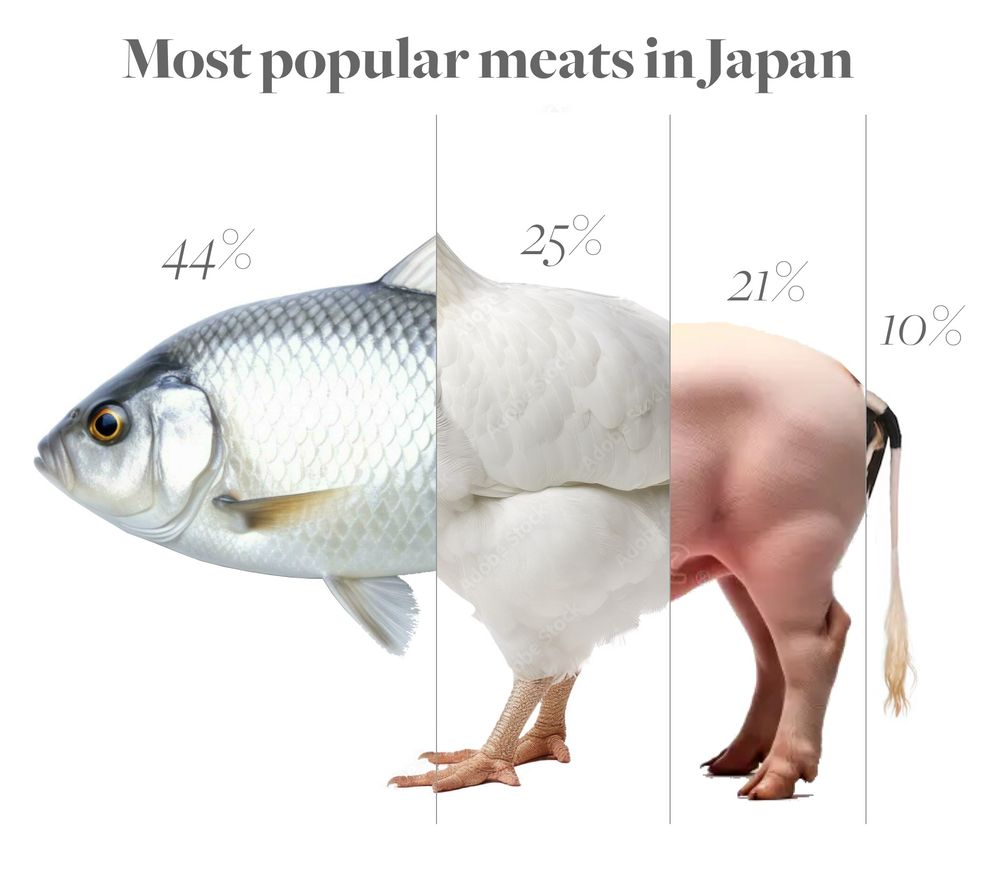
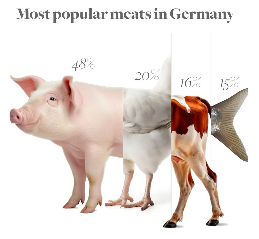
Ever wondered what a country’s meat supply looks like? 🍗🐄🐖🐟
Here’s a breakdown of meat preferences in Japan, the US & Germany—visualized as hybrid animals! A fun (and slightly cursed) way to see food stats. 🧵👇
Here’s a breakdown of meat preferences in Japan, the US & Germany—visualized as hybrid animals! A fun (and slightly cursed) way to see food stats. 🧵👇
February 2, 2025 at 11:24 AM
Ever wondered what a country’s meat supply looks like? 🍗🐄🐖🐟
Here’s a breakdown of meat preferences in Japan, the US & Germany—visualized as hybrid animals! A fun (and slightly cursed) way to see food stats. 🧵👇
Here’s a breakdown of meat preferences in Japan, the US & Germany—visualized as hybrid animals! A fun (and slightly cursed) way to see food stats. 🧵👇
Reposted by Karim Douieb

L'association @toulousedataviz.bsky.social a publié la vidéo du #meetup de @karimdouieb.bsky.social. Un partage d'experience très enrichissant avec des réalisations de #dataviz captivantes. A voir assurément ! youtu.be/2Zp3Vp4WHg8
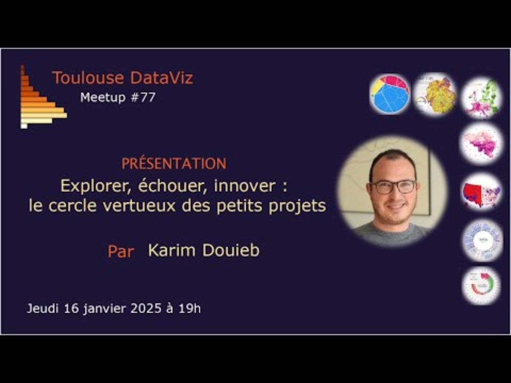
Explorer, échouer, innover : le cercle vertueux des petits projets
YouTube video by Toulouse DataViz
youtu.be
January 20, 2025 at 8:11 AM
L'association @toulousedataviz.bsky.social a publié la vidéo du #meetup de @karimdouieb.bsky.social. Un partage d'experience très enrichissant avec des réalisations de #dataviz captivantes. A voir assurément ! youtu.be/2Zp3Vp4WHg8
Reposted by Karim Douieb

Learn why and how @karimdouieb.bsky.social (data scientist and co-founder of Jetpack.ai) used Observable to re-envision U.S. election maps using a dynamic cartogram, for a more intuitive, representative, and engaging view of election results: https://buff.ly/41P9vZg
December 30, 2024 at 4:54 PM
Learn why and how @karimdouieb.bsky.social (data scientist and co-founder of Jetpack.ai) used Observable to re-envision U.S. election maps using a dynamic cartogram, for a more intuitive, representative, and engaging view of election results: https://buff.ly/41P9vZg
Thanks Philip for including my little dataviz experiment in the latest edition of "How to read this chart" newsletter. 🙏 Subscribe for your weekly dose of data insights and creative visuals.

Lots of good stuff in the (free to read) newsletter, including not one but two interactive tools to appeal to your vanity.
s2.washingtonpost.com/camp-rw/?tra...
s2.washingtonpost.com/camp-rw/?tra...


December 14, 2024 at 10:20 PM
Thanks Philip for including my little dataviz experiment in the latest edition of "How to read this chart" newsletter. 🙏 Subscribe for your weekly dose of data insights and creative visuals.
Animation in dataviz has been my secret recipe for years—not just to help people understand my charts but to make them fun, engaging, and impactful. It’s often overlooked, yet easy to do with D3 transitions and super powerful. Thrilled to see my U.S. election map featured in this must-read article!
Animation can be a gimmicky distraction in data visualization. But when used with care, animation can improve user experiences and help viewers track patterns across charts and metrics. We share five ways you can use animation for more effective data viz: https://buff.ly/3ZDT3tp

December 5, 2024 at 9:02 PM
Animation in dataviz has been my secret recipe for years—not just to help people understand my charts but to make them fun, engaging, and impactful. It’s often overlooked, yet easy to do with D3 transitions and super powerful. Thrilled to see my U.S. election map featured in this must-read article!
Trop chouette de voir ma petite expérience visuelle mentionnée dans la dernière édition de la newsletter de @wedodata.bsky.social ! Un grand merci à eux pour cette belle mise en avant. 🙏 Abonnez-vous pour découvrir plein de projets inspirants. 🙌
📬Plus que quelques heures pour vous inscrire et recevoir - gratuitement - dans votre boîte mail LA newsletter qui visualise la data ! wedodata.fr/newsletter

Buena Vista Data Club
“Buena Vista Data Club” vous offre chaque mois des liens vers la crème de la dataviz, des tutos pour créer ses dataviz, des récits de projets innovants…
wedodata.fr
December 5, 2024 at 12:19 PM
Trop chouette de voir ma petite expérience visuelle mentionnée dans la dernière édition de la newsletter de @wedodata.bsky.social ! Un grand merci à eux pour cette belle mise en avant. 🙏 Abonnez-vous pour découvrir plein de projets inspirants. 🙌
They say every true ceramist must make a porcelain teapot to earn their stripes... So, does this count? 🫖
#porcelain #teapot #ceramics #pottery #projection #shadow
#porcelain #teapot #ceramics #pottery #projection #shadow
December 4, 2024 at 10:21 PM
They say every true ceramist must make a porcelain teapot to earn their stripes... So, does this count? 🫖
#porcelain #teapot #ceramics #pottery #projection #shadow
#porcelain #teapot #ceramics #pottery #projection #shadow
Reposted by Karim Douieb

The name shaping trend thing by @karimdouieb.bsky.social is a fun treat baby-names.jetpack.ai
For the time series dataset that keeps on giving, get it on SSA: www.ssa.gov/oact/babynam...
For the time series dataset that keeps on giving, get it on SSA: www.ssa.gov/oact/babynam...
December 4, 2024 at 7:38 PM
The name shaping trend thing by @karimdouieb.bsky.social is a fun treat baby-names.jetpack.ai
For the time series dataset that keeps on giving, get it on SSA: www.ssa.gov/oact/babynam...
For the time series dataset that keeps on giving, get it on SSA: www.ssa.gov/oact/babynam...
Lovely to see my baby names little experiment being mentioned in the latest Data Vis Dispatch. Thanks @datawrapper.de
👉 baby-names.jetpack.ai
👉 baby-names.jetpack.ai
It's the final week of the #30DayMapChallenge! 🗾🗺️📍 Explore the latest Data Vis Dispatch to discover our favorites, along with many more maps and other visualizations.
👉 https://blog.datawrapper.de/data-vis-dispatch-december-3-2024/
👉 https://blog.datawrapper.de/data-vis-dispatch-december-3-2024/


December 3, 2024 at 8:49 PM
Lovely to see my baby names little experiment being mentioned in the latest Data Vis Dispatch. Thanks @datawrapper.de
👉 baby-names.jetpack.ai
👉 baby-names.jetpack.ai
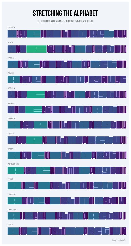
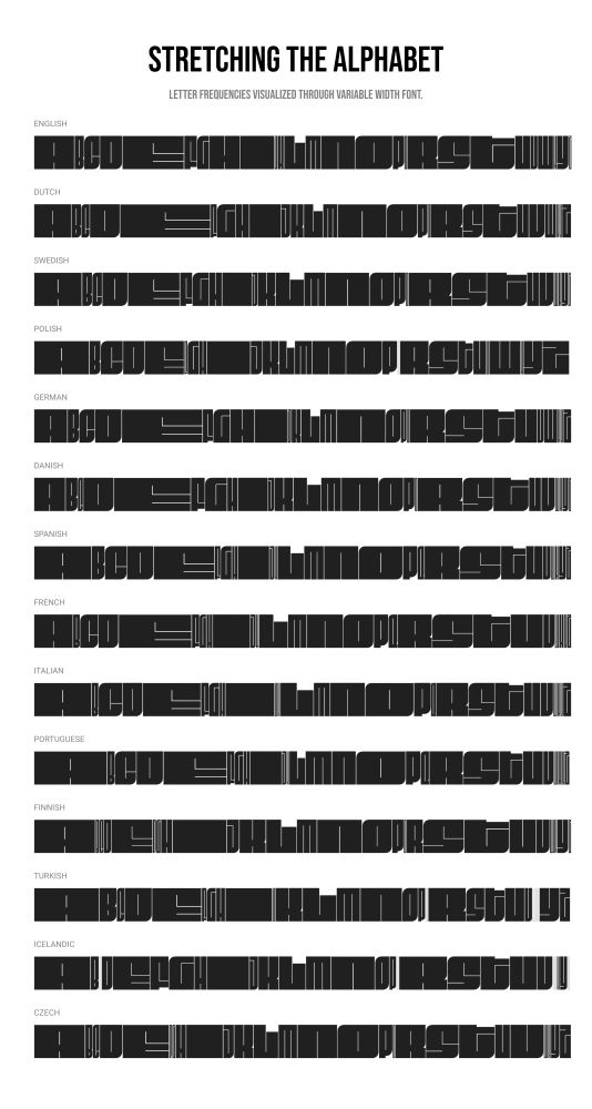
Here’s a new dataviz experiment: exploring letter frequencies in different languages using variable fonts. The width of each letter stretches with its usage frequency. Not sure how I feel about the result—kind of cool, kind of meh. 🤔 What do you think? #dataviz #experiments
December 1, 2024 at 4:57 PM
Here’s a new dataviz experiment: exploring letter frequencies in different languages using variable fonts. The width of each letter stretches with its usage frequency. Not sure how I feel about the result—kind of cool, kind of meh. 🤔 What do you think? #dataviz #experiments
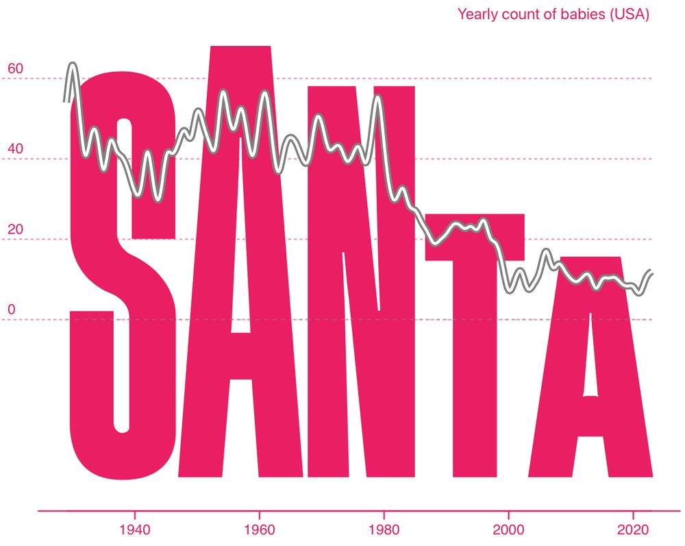
Here are the all-time most popular baby names in the US (male & female)! 👶 Each letter's height shows how trendy the name was over time. 📈✨
Check for yourself and search your name 👉 baby-names.jetpack.ai
Check for yourself and search your name 👉 baby-names.jetpack.ai


November 25, 2024 at 10:32 PM
Here are the all-time most popular baby names in the US (male & female)! 👶 Each letter's height shows how trendy the name was over time. 📈✨
Check for yourself and search your name 👉 baby-names.jetpack.ai
Check for yourself and search your name 👉 baby-names.jetpack.ai
I built a fun little app to explore baby name trends over time! 👶📈 Type your name, watch its popularity evolve, and create a unique visual. Give it a try and let me know what you think!
👉 baby-names.jetpack.ai
#BabyNames #DataViz #typography
👉 baby-names.jetpack.ai
#BabyNames #DataViz #typography
November 25, 2024 at 12:01 PM
I built a fun little app to explore baby name trends over time! 👶📈 Type your name, watch its popularity evolve, and create a unique visual. Give it a try and let me know what you think!
👉 baby-names.jetpack.ai
#BabyNames #DataViz #typography
👉 baby-names.jetpack.ai
#BabyNames #DataViz #typography
Great starting pack to (re)connect with the #dataviz community!

Here you go. 🫡
Please share widely to help develop the dataviz community of Bluesky. 📊
go.bsky.app/R3nSyyy
Please share widely to help develop the dataviz community of Bluesky. 📊
go.bsky.app/R3nSyyy
November 14, 2024 at 9:31 AM
Great starting pack to (re)connect with the #dataviz community!
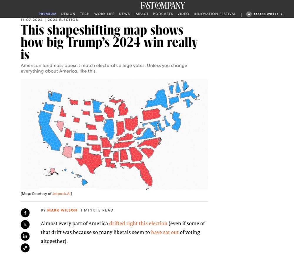
Honored to see my election map featured in @fastcompany.bsky.social Huge thanks to Mark Wilson for spotlighting this approach to visualizing election results—thrilled to see it resonate!
👉 www.fastcompany.com/91224561/how...
👉 www.fastcompany.com/91224561/how...

November 7, 2024 at 8:16 PM
Honored to see my election map featured in @fastcompany.bsky.social Huge thanks to Mark Wilson for spotlighting this approach to visualizing election results—thrilled to see it resonate!
👉 www.fastcompany.com/91224561/how...
👉 www.fastcompany.com/91224561/how...
For what it’s worth: an alternative view on the 2024 U.S. Election Map 🗳️
This map scales states by electoral weight, preserving the U.S. shape for recognition. Voronoi-based shapes within each state show exact elector counts, with an animation transitioning from the traditional map to this cartogram
This map scales states by electoral weight, preserving the U.S. shape for recognition. Voronoi-based shapes within each state show exact elector counts, with an animation transitioning from the traditional map to this cartogram
November 6, 2024 at 10:16 PM
For what it’s worth: an alternative view on the 2024 U.S. Election Map 🗳️
This map scales states by electoral weight, preserving the U.S. shape for recognition. Voronoi-based shapes within each state show exact elector counts, with an animation transitioning from the traditional map to this cartogram
This map scales states by electoral weight, preserving the U.S. shape for recognition. Voronoi-based shapes within each state show exact elector counts, with an animation transitioning from the traditional map to this cartogram