

Karim Douieb
@karimdouieb.bsky.social
Data visualization designer & data scientist
Co-founder of Jetpack.AI
Co-founder of Jetpack.AI
Interesting 🤔 That could work really well...
September 30, 2025 at 5:47 PM
Interesting 🤔 That could work really well...
Totally, it is interactive and you could interact with it on a browser (not deployed yet).
September 30, 2025 at 2:23 PM
Totally, it is interactive and you could interact with it on a browser (not deployed yet).
I like that idea 😉
September 30, 2025 at 1:02 PM
I like that idea 😉
I was thinking about doing it like a coiled phone cable and animate it with a camera movement from the center.

September 30, 2025 at 1:01 PM
I was thinking about doing it like a coiled phone cable and animate it with a camera movement from the center.
Would love to see that actually 😛
September 30, 2025 at 12:28 PM
Would love to see that actually 😛
Hi Ian, do you have a picture of how the Climate Explorer does it? I curious to see how they have approached the issue 👀
September 30, 2025 at 9:54 AM
Hi Ian, do you have a picture of how the Climate Explorer does it? I curious to see how they have approached the issue 👀
Thanks Ed! Brilliant idea 🔥 I could animate the donuts over time to show warming trends. I’ll see how far back open-meteo.com goes. Do you know any other free datasets with long-term city-level climate records?
🌤️ Free Open-Source Weather API | Open-Meteo.com
Open-Source ☀️️️️️️️️️️️️️️️️️️️️️️️️️️️️️ Weather API with free access for non-commercial use. No API Key required ✅. Accurate weather forecasts for any location. Open-Meteo provides high-resolution ...
open-meteo.com
September 30, 2025 at 8:45 AM
Thanks Ed! Brilliant idea 🔥 I could animate the donuts over time to show warming trends. I’ll see how far back open-meteo.com goes. Do you know any other free datasets with long-term city-level climate records?
Exactly! Weird + challenging is where the good stuff happens 😅
September 30, 2025 at 7:13 AM
Exactly! Weird + challenging is where the good stuff happens 😅
Built in the new @observablehq desktop app, using @threejs


September 29, 2025 at 11:29 PM
Built in the new @observablehq desktop app, using @threejs
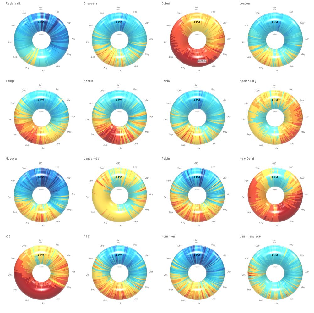
So here it is: my dumb data viz experiment. 🍩
✔️ Solves the continuity problem
❌ Harder to spot patterns
❌ Hours are visually distorted
But hey… not everything has to be practical, sometimes it’s just fun! 😅 Also: how cool would it be to create a physical object like this?
✔️ Solves the continuity problem
❌ Harder to spot patterns
❌ Hours are visually distorted
But hey… not everything has to be practical, sometimes it’s just fun! 😅 Also: how cool would it be to create a physical object like this?

September 29, 2025 at 11:29 PM
So here it is: my dumb data viz experiment. 🍩
✔️ Solves the continuity problem
❌ Harder to spot patterns
❌ Hours are visually distorted
But hey… not everything has to be practical, sometimes it’s just fun! 😅 Also: how cool would it be to create a physical object like this?
✔️ Solves the continuity problem
❌ Harder to spot patterns
❌ Hours are visually distorted
But hey… not everything has to be practical, sometimes it’s just fun! 😅 Also: how cool would it be to create a physical object like this?
I came across those flat climate charts where x = day of year & y = hour of day. They’re neat, but the "cut" at January & midnight always felt arbitrary. 🤔
So I thought… what if we used a torus? The perfect loop for time & seasons!
So I thought… what if we used a torus? The perfect loop for time & seasons!


September 29, 2025 at 11:29 PM
I came across those flat climate charts where x = day of year & y = hour of day. They’re neat, but the "cut" at January & midnight always felt arbitrary. 🤔
So I thought… what if we used a torus? The perfect loop for time & seasons!
So I thought… what if we used a torus? The perfect loop for time & seasons!
Pretty cool indeed 😉
May 21, 2025 at 2:41 PM
Pretty cool indeed 😉
Thanks for the addition 🙏
February 23, 2025 at 3:45 PM
Thanks for the addition 🙏
Thanks for this idea! They do have some graphical skills, so this could be a great way to quickly create an original design based on data and then explore their own ways to physicalize it using a variety of materials.
February 7, 2025 at 11:17 AM
Thanks for this idea! They do have some graphical skills, so this could be a great way to quickly create an original design based on data and then explore their own ways to physicalize it using a variety of materials.
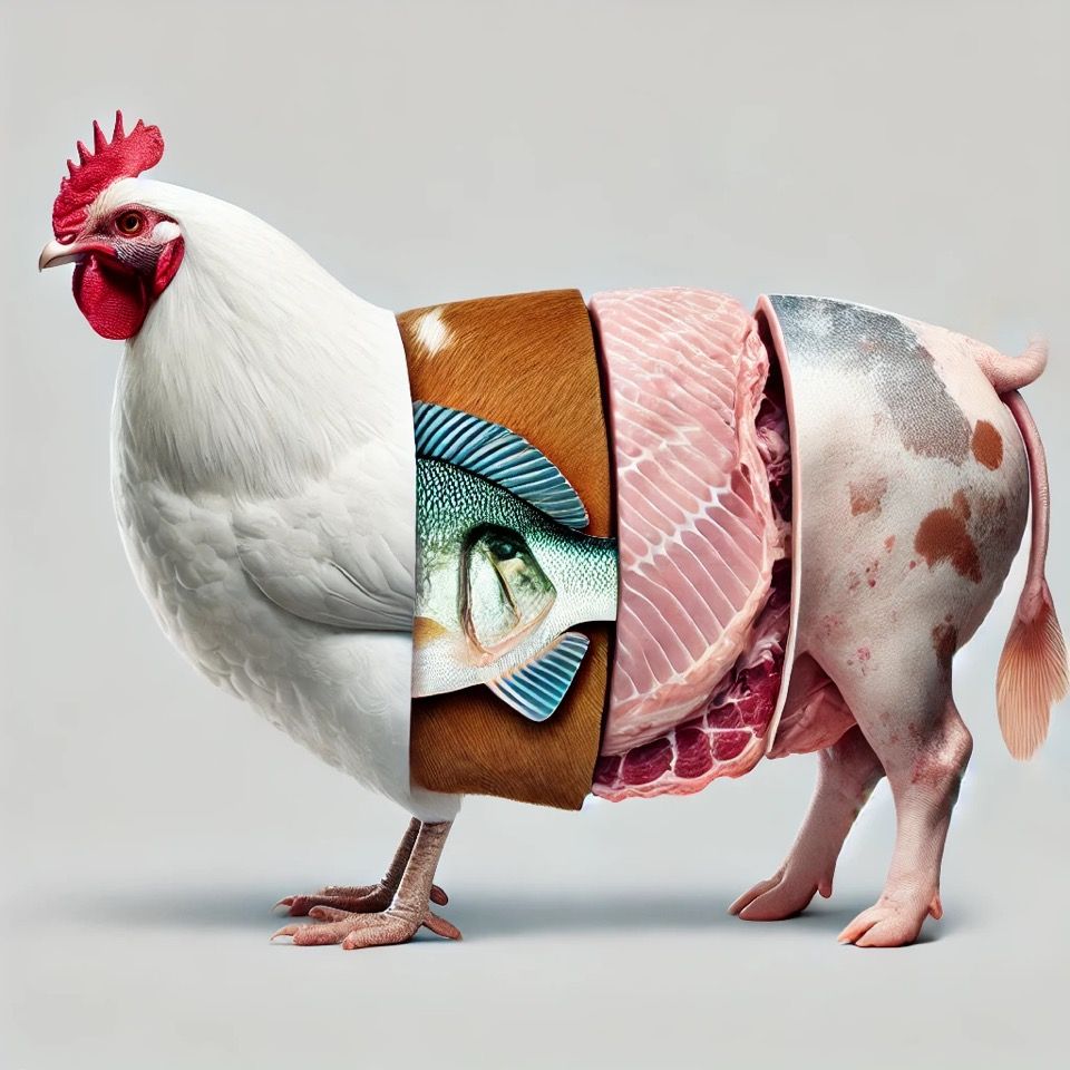
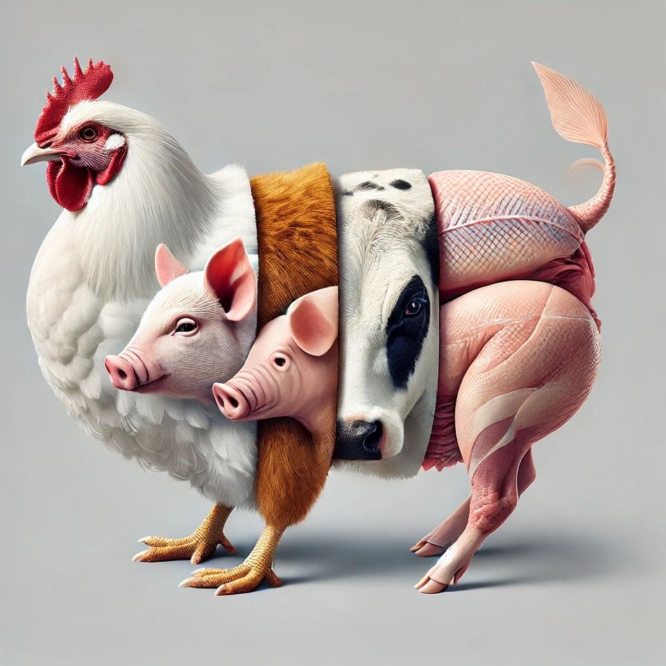
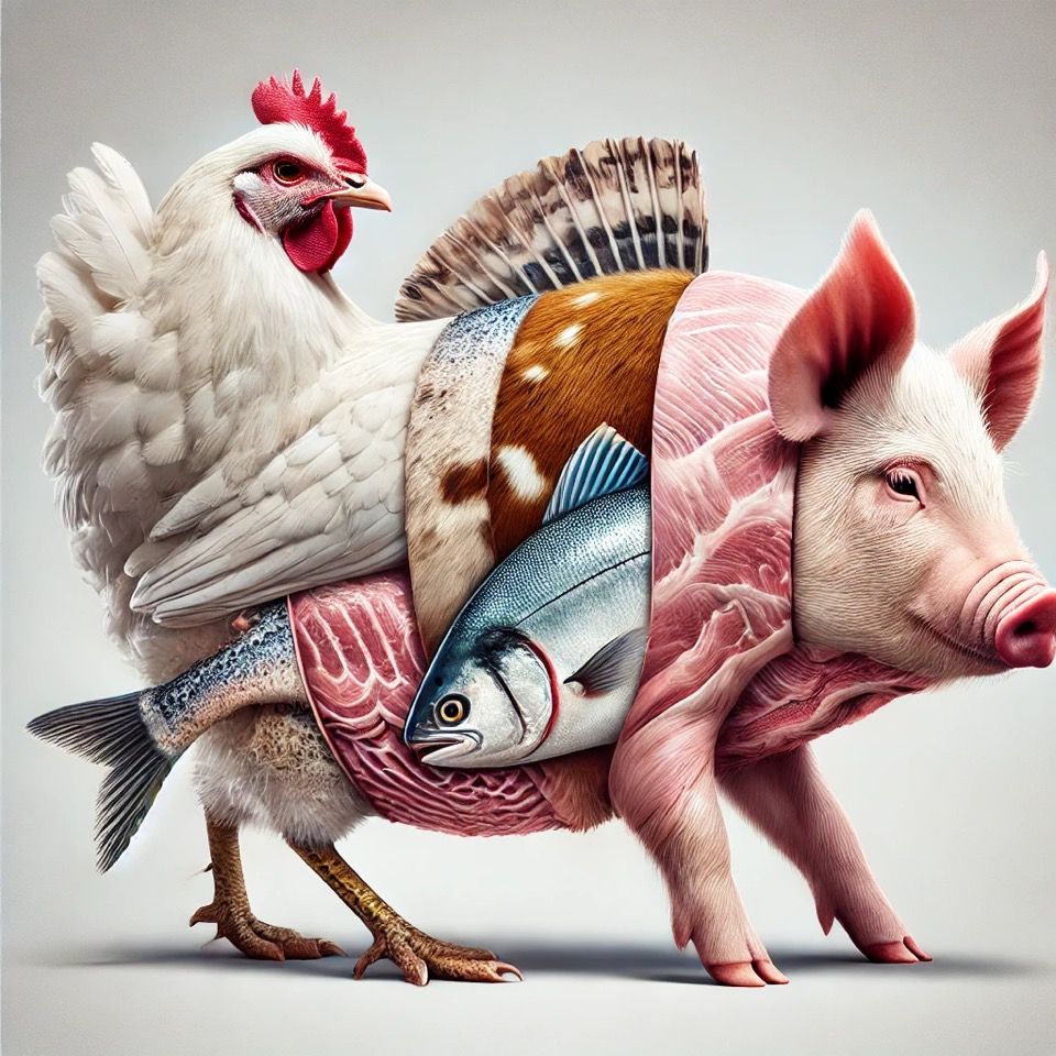
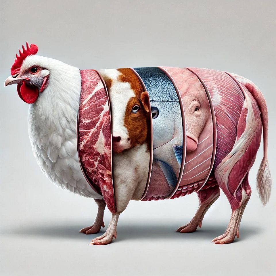
I tried using AI to make these hybrid animals look more realistic… and failed spectacularly. 🤦♂️
It kept messing up the proportions, swapping animal parts randomly, or just refusing to follow the sequence. Maybe I just suck at prompting? 😅
It kept messing up the proportions, swapping animal parts randomly, or just refusing to follow the sequence. Maybe I just suck at prompting? 😅
February 2, 2025 at 11:24 AM
I tried using AI to make these hybrid animals look more realistic… and failed spectacularly. 🤦♂️
It kept messing up the proportions, swapping animal parts randomly, or just refusing to follow the sequence. Maybe I just suck at prompting? 😅
It kept messing up the proportions, swapping animal parts randomly, or just refusing to follow the sequence. Maybe I just suck at prompting? 😅
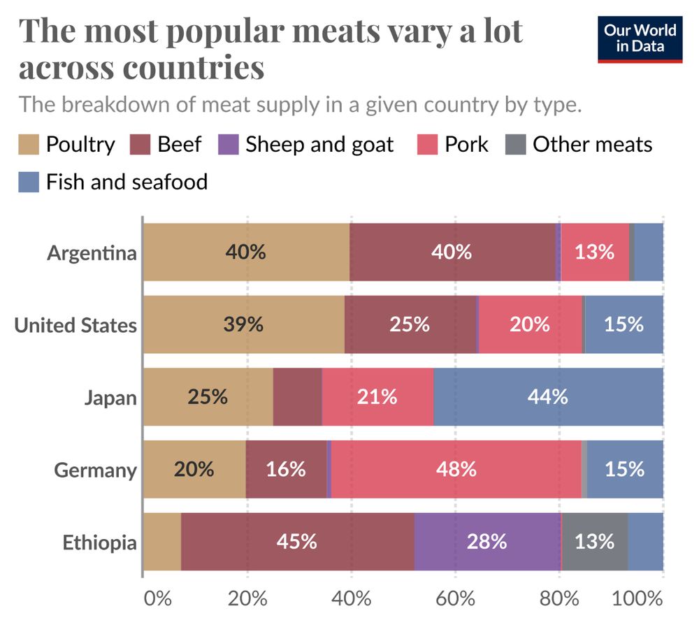
I recently revisited @ourworldindata.org after learning that @maxroser.bsky.social received honorary doctorates from KU Leuven & UC Louvain for his work in making global trends more accessible (Congrats for that!). This viz by @hannahritchie.bsky.social caught my eye—and inspired my own take on it!
February 2, 2025 at 11:24 AM
I recently revisited @ourworldindata.org after learning that @maxroser.bsky.social received honorary doctorates from KU Leuven & UC Louvain for his work in making global trends more accessible (Congrats for that!). This viz by @hannahritchie.bsky.social caught my eye—and inspired my own take on it!