

Karim Douieb
@karimdouieb.bsky.social
Data visualization designer & data scientist
Co-founder of Jetpack.AI
Co-founder of Jetpack.AI
I was thinking about doing it like a coiled phone cable and animate it with a camera movement from the center.

September 30, 2025 at 1:01 PM
I was thinking about doing it like a coiled phone cable and animate it with a camera movement from the center.
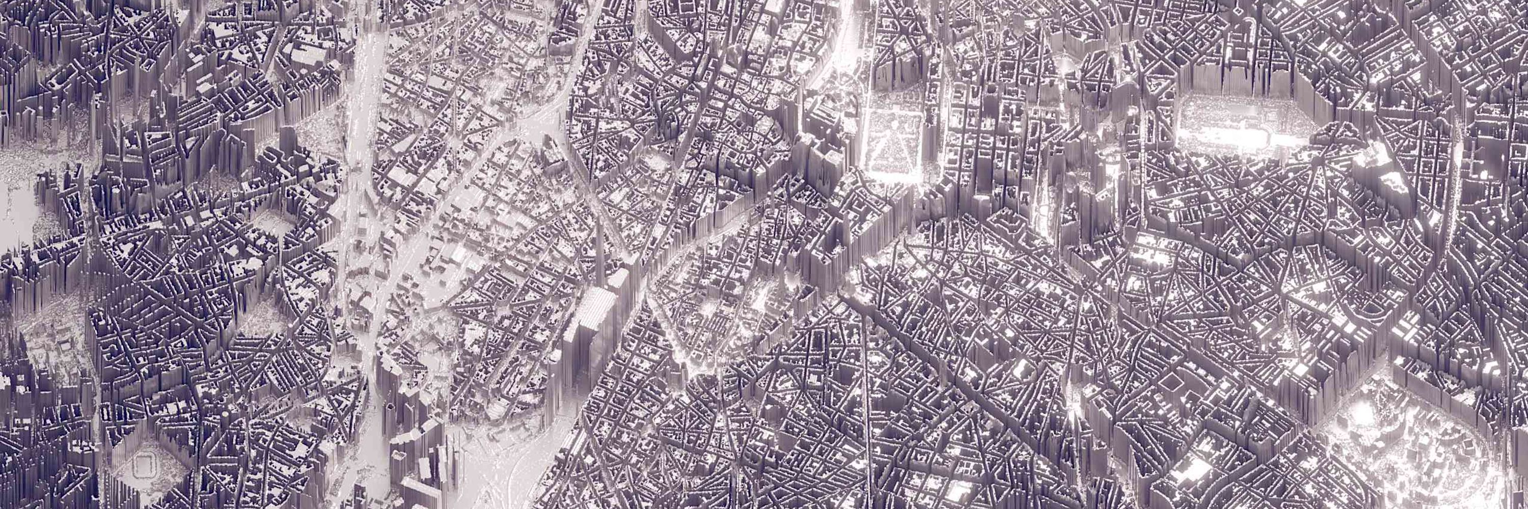
Built in the new @observablehq desktop app, using @threejs


September 29, 2025 at 11:29 PM
Built in the new @observablehq desktop app, using @threejs
So here it is: my dumb data viz experiment. 🍩
✔️ Solves the continuity problem
❌ Harder to spot patterns
❌ Hours are visually distorted
But hey… not everything has to be practical, sometimes it’s just fun! 😅 Also: how cool would it be to create a physical object like this?
✔️ Solves the continuity problem
❌ Harder to spot patterns
❌ Hours are visually distorted
But hey… not everything has to be practical, sometimes it’s just fun! 😅 Also: how cool would it be to create a physical object like this?

September 29, 2025 at 11:29 PM
So here it is: my dumb data viz experiment. 🍩
✔️ Solves the continuity problem
❌ Harder to spot patterns
❌ Hours are visually distorted
But hey… not everything has to be practical, sometimes it’s just fun! 😅 Also: how cool would it be to create a physical object like this?
✔️ Solves the continuity problem
❌ Harder to spot patterns
❌ Hours are visually distorted
But hey… not everything has to be practical, sometimes it’s just fun! 😅 Also: how cool would it be to create a physical object like this?
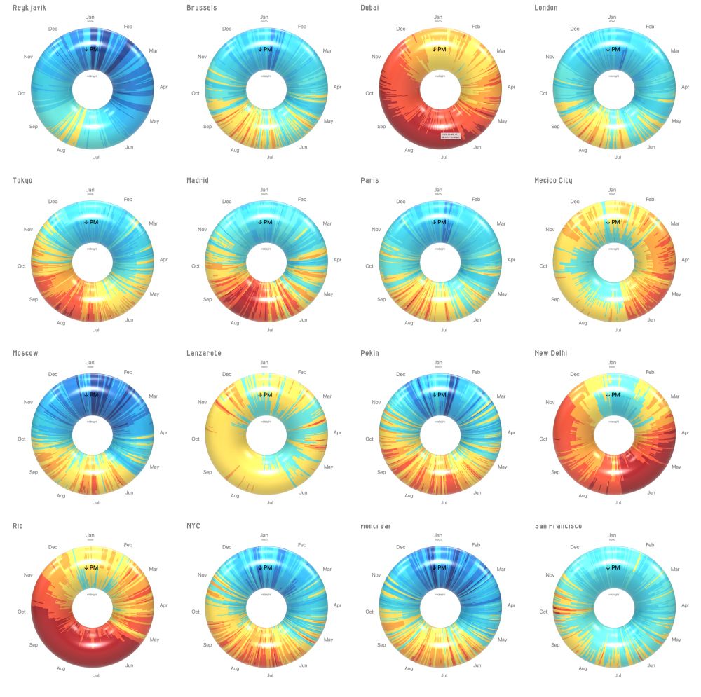
I came across those flat climate charts where x = day of year & y = hour of day. They’re neat, but the "cut" at January & midnight always felt arbitrary. 🤔
So I thought… what if we used a torus? The perfect loop for time & seasons!
So I thought… what if we used a torus? The perfect loop for time & seasons!


September 29, 2025 at 11:29 PM
I came across those flat climate charts where x = day of year & y = hour of day. They’re neat, but the "cut" at January & midnight always felt arbitrary. 🤔
So I thought… what if we used a torus? The perfect loop for time & seasons!
So I thought… what if we used a torus? The perfect loop for time & seasons!
🍩 What if climate looked like a donut? 🌍
Here’s a bunch of cities turned into a sweet dataviz experiment.
🟡 → comfy zone
🔴 → hot
🔵 → cold
Why a donut? Let me explain 👇
Here’s a bunch of cities turned into a sweet dataviz experiment.
🟡 → comfy zone
🔴 → hot
🔵 → cold
Why a donut? Let me explain 👇
September 29, 2025 at 11:29 PM
🍩 What if climate looked like a donut? 🌍
Here’s a bunch of cities turned into a sweet dataviz experiment.
🟡 → comfy zone
🔴 → hot
🔵 → cold
Why a donut? Let me explain 👇
Here’s a bunch of cities turned into a sweet dataviz experiment.
🟡 → comfy zone
🔴 → hot
🔵 → cold
Why a donut? Let me explain 👇
📈 Can Belgium reach 80% employment by 2030?
We created an interactive visual storytelling piece showing how age, gender, and location shape job opportunities.
Take a look 👉 itinera-emploi80.s3-website-eu-west-1.amazonaws.com?lang=en
We created an interactive visual storytelling piece showing how age, gender, and location shape job opportunities.
Take a look 👉 itinera-emploi80.s3-website-eu-west-1.amazonaws.com?lang=en
June 17, 2025 at 7:47 AM
📈 Can Belgium reach 80% employment by 2030?
We created an interactive visual storytelling piece showing how age, gender, and location shape job opportunities.
Take a look 👉 itinera-emploi80.s3-website-eu-west-1.amazonaws.com?lang=en
We created an interactive visual storytelling piece showing how age, gender, and location shape job opportunities.
Take a look 👉 itinera-emploi80.s3-website-eu-west-1.amazonaws.com?lang=en
I tried using AI to make these hybrid animals look more realistic… and failed spectacularly. 🤦♂️
It kept messing up the proportions, swapping animal parts randomly, or just refusing to follow the sequence. Maybe I just suck at prompting? 😅
It kept messing up the proportions, swapping animal parts randomly, or just refusing to follow the sequence. Maybe I just suck at prompting? 😅
February 2, 2025 at 11:24 AM
I tried using AI to make these hybrid animals look more realistic… and failed spectacularly. 🤦♂️
It kept messing up the proportions, swapping animal parts randomly, or just refusing to follow the sequence. Maybe I just suck at prompting? 😅
It kept messing up the proportions, swapping animal parts randomly, or just refusing to follow the sequence. Maybe I just suck at prompting? 😅
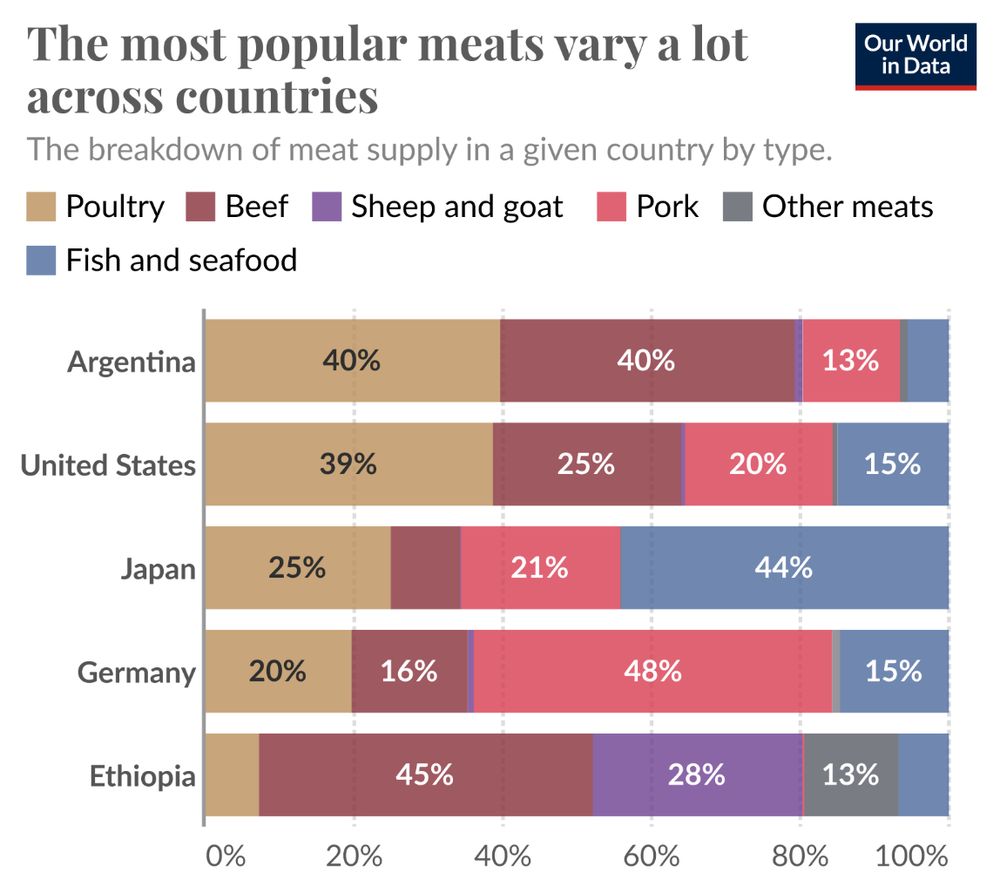
I recently revisited @ourworldindata.org after learning that @maxroser.bsky.social received honorary doctorates from KU Leuven & UC Louvain for his work in making global trends more accessible (Congrats for that!). This viz by @hannahritchie.bsky.social caught my eye—and inspired my own take on it!
February 2, 2025 at 11:24 AM
I recently revisited @ourworldindata.org after learning that @maxroser.bsky.social received honorary doctorates from KU Leuven & UC Louvain for his work in making global trends more accessible (Congrats for that!). This viz by @hannahritchie.bsky.social caught my eye—and inspired my own take on it!
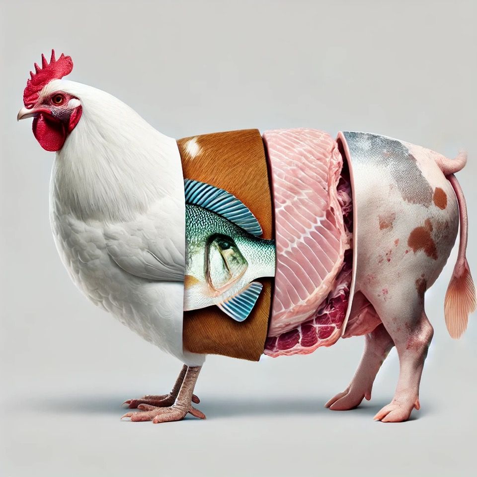
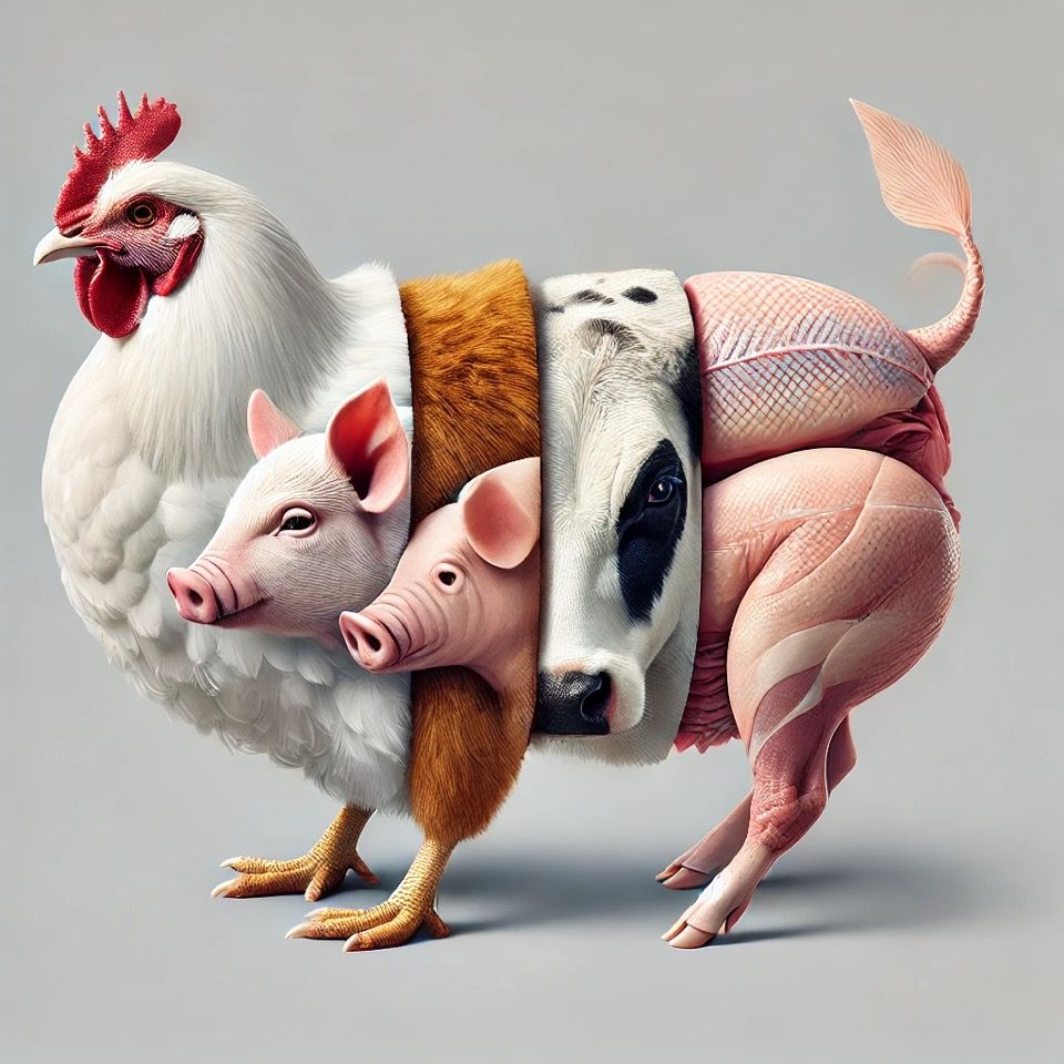
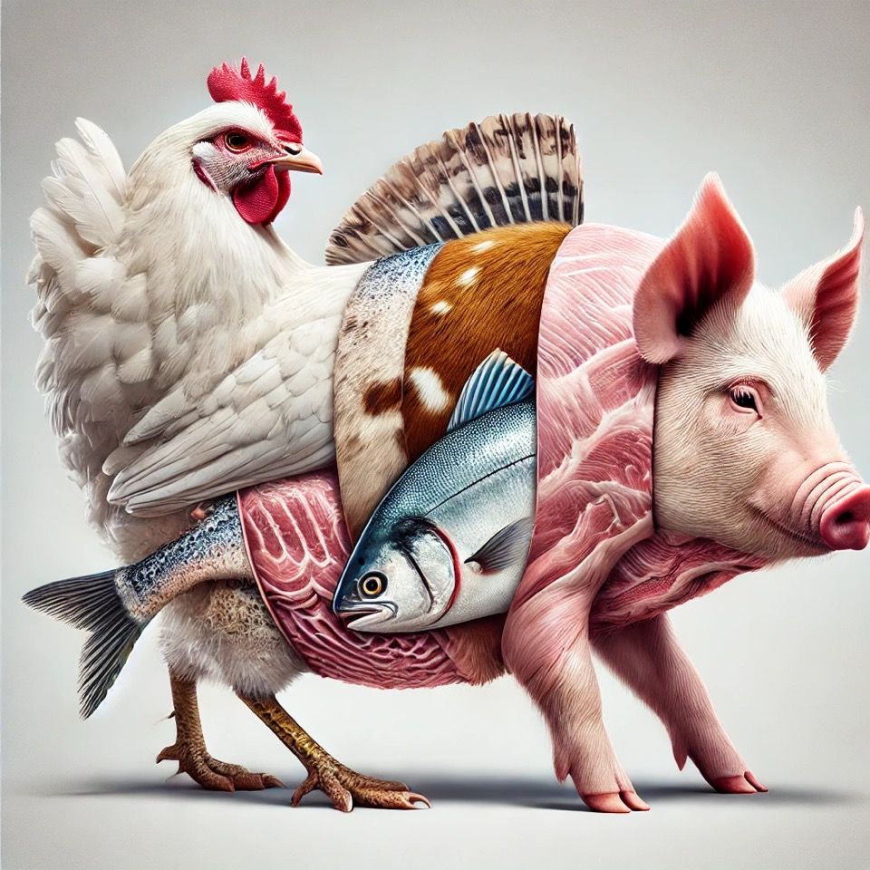
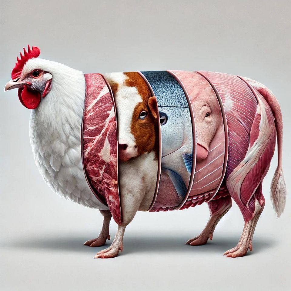
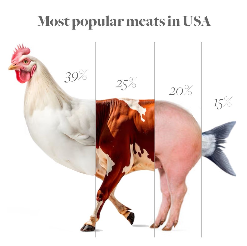
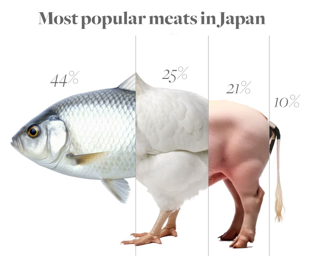
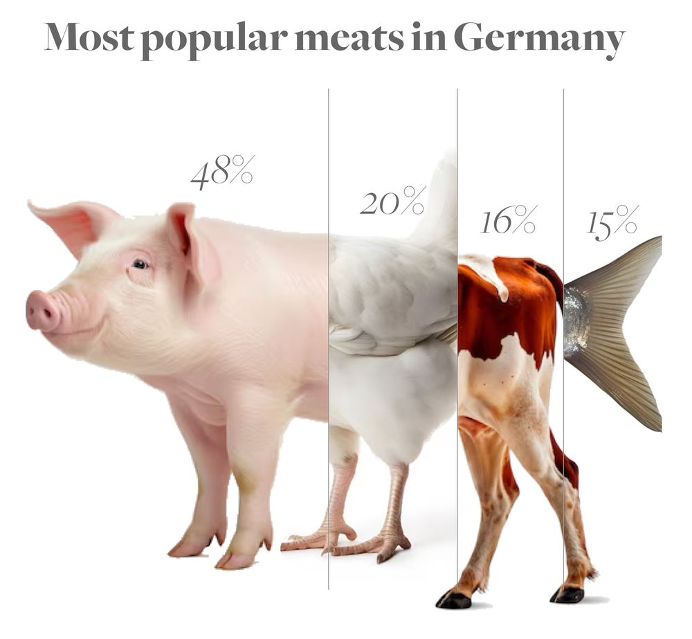
Ever wondered what a country’s meat supply looks like? 🍗🐄🐖🐟
Here’s a breakdown of meat preferences in Japan, the US & Germany—visualized as hybrid animals! A fun (and slightly cursed) way to see food stats. 🧵👇
Here’s a breakdown of meat preferences in Japan, the US & Germany—visualized as hybrid animals! A fun (and slightly cursed) way to see food stats. 🧵👇
February 2, 2025 at 11:24 AM
Ever wondered what a country’s meat supply looks like? 🍗🐄🐖🐟
Here’s a breakdown of meat preferences in Japan, the US & Germany—visualized as hybrid animals! A fun (and slightly cursed) way to see food stats. 🧵👇
Here’s a breakdown of meat preferences in Japan, the US & Germany—visualized as hybrid animals! A fun (and slightly cursed) way to see food stats. 🧵👇
They say every true ceramist must make a porcelain teapot to earn their stripes... So, does this count? 🫖
#porcelain #teapot #ceramics #pottery #projection #shadow
#porcelain #teapot #ceramics #pottery #projection #shadow
December 4, 2024 at 10:21 PM
They say every true ceramist must make a porcelain teapot to earn their stripes... So, does this count? 🫖
#porcelain #teapot #ceramics #pottery #projection #shadow
#porcelain #teapot #ceramics #pottery #projection #shadow
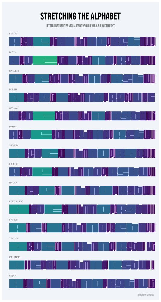
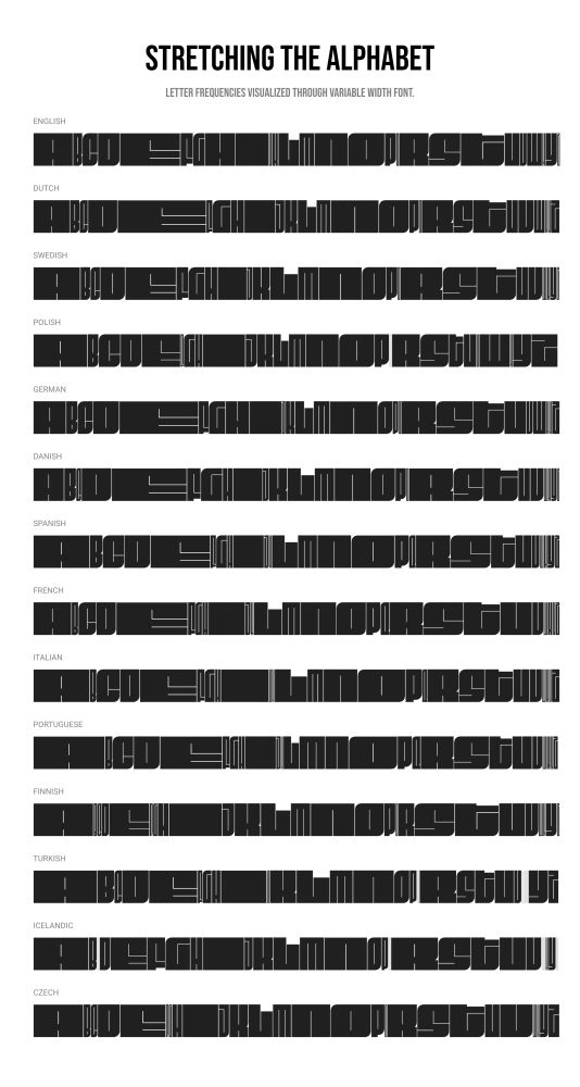
Here’s a new dataviz experiment: exploring letter frequencies in different languages using variable fonts. The width of each letter stretches with its usage frequency. Not sure how I feel about the result—kind of cool, kind of meh. 🤔 What do you think? #dataviz #experiments
December 1, 2024 at 4:57 PM
Here’s a new dataviz experiment: exploring letter frequencies in different languages using variable fonts. The width of each letter stretches with its usage frequency. Not sure how I feel about the result—kind of cool, kind of meh. 🤔 What do you think? #dataviz #experiments
Here are the all-time most popular baby names in the US (male & female)! 👶 Each letter's height shows how trendy the name was over time. 📈✨
Check for yourself and search your name 👉 baby-names.jetpack.ai
Check for yourself and search your name 👉 baby-names.jetpack.ai


November 25, 2024 at 10:32 PM
Here are the all-time most popular baby names in the US (male & female)! 👶 Each letter's height shows how trendy the name was over time. 📈✨
Check for yourself and search your name 👉 baby-names.jetpack.ai
Check for yourself and search your name 👉 baby-names.jetpack.ai
I built a fun little app to explore baby name trends over time! 👶📈 Type your name, watch its popularity evolve, and create a unique visual. Give it a try and let me know what you think!
👉 baby-names.jetpack.ai
#BabyNames #DataViz #typography
👉 baby-names.jetpack.ai
#BabyNames #DataViz #typography
November 25, 2024 at 12:01 PM
I built a fun little app to explore baby name trends over time! 👶📈 Type your name, watch its popularity evolve, and create a unique visual. Give it a try and let me know what you think!
👉 baby-names.jetpack.ai
#BabyNames #DataViz #typography
👉 baby-names.jetpack.ai
#BabyNames #DataViz #typography
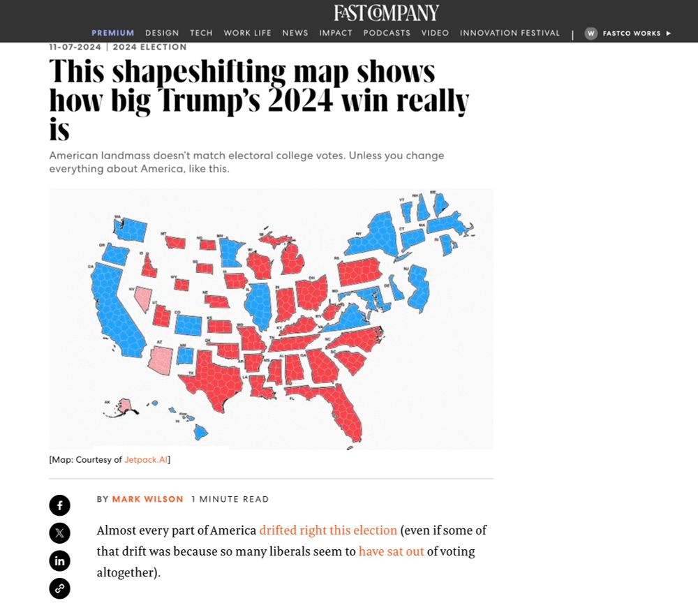
Honored to see my election map featured in @fastcompany.bsky.social Huge thanks to Mark Wilson for spotlighting this approach to visualizing election results—thrilled to see it resonate!
👉 www.fastcompany.com/91224561/how...
👉 www.fastcompany.com/91224561/how...

November 7, 2024 at 8:16 PM
Honored to see my election map featured in @fastcompany.bsky.social Huge thanks to Mark Wilson for spotlighting this approach to visualizing election results—thrilled to see it resonate!
👉 www.fastcompany.com/91224561/how...
👉 www.fastcompany.com/91224561/how...
For what it’s worth: an alternative view on the 2024 U.S. Election Map 🗳️
This map scales states by electoral weight, preserving the U.S. shape for recognition. Voronoi-based shapes within each state show exact elector counts, with an animation transitioning from the traditional map to this cartogram
This map scales states by electoral weight, preserving the U.S. shape for recognition. Voronoi-based shapes within each state show exact elector counts, with an animation transitioning from the traditional map to this cartogram
November 6, 2024 at 10:16 PM
For what it’s worth: an alternative view on the 2024 U.S. Election Map 🗳️
This map scales states by electoral weight, preserving the U.S. shape for recognition. Voronoi-based shapes within each state show exact elector counts, with an animation transitioning from the traditional map to this cartogram
This map scales states by electoral weight, preserving the U.S. shape for recognition. Voronoi-based shapes within each state show exact elector counts, with an animation transitioning from the traditional map to this cartogram