


Between AI advances and rising stakeholder expectations, the BI and data analysis landscape is changing fast. What can data teams do to adapt? In a recent fireside chat, our CEO and Director of Research unpacked what these changes mean for data teams:

Webinar recap: The evolving data analysis landscape
A recap of our webinar on the evolving data analysis and BI landscape, covering AI’s impact on analyst workflows, changing, stakeholder expectations, and what’s next for data teams.
buff.ly
February 12, 2026 at 10:07 PM
Between AI advances and rising stakeholder expectations, the BI and data analysis landscape is changing fast. What can data teams do to adapt? In a recent fireside chat, our CEO and Director of Research unpacked what these changes mean for data teams:
Missed our webinar on the evolving data analysis & BI landscape? Observable’s Director of Research Marisa Morby and co-CEO Julio Avalos discuss AI’s impact and opportunity in data analysis, shifting stakeholder expectations, and why advanced data viz matters. 🎥
buff.ly/cIgk3o2
buff.ly/cIgk3o2
February 10, 2026 at 8:30 PM
Missed our webinar on the evolving data analysis & BI landscape? Observable’s Director of Research Marisa Morby and co-CEO Julio Avalos discuss AI’s impact and opportunity in data analysis, shifting stakeholder expectations, and why advanced data viz matters. 🎥
buff.ly/cIgk3o2
buff.ly/cIgk3o2
It's great to move fast in data analysis, but not if that means skipping important steps to ensure your work is accurate and useful. In our new post, we share 4 practical habits to avoid common gotchas in data analysis 👉 buff.ly/aYJqkvW

February 5, 2026 at 11:00 PM
It's great to move fast in data analysis, but not if that means skipping important steps to ensure your work is accurate and useful. In our new post, we share 4 practical habits to avoid common gotchas in data analysis 👉 buff.ly/aYJqkvW
🔍 Observable AI works transparently so you can inspect and verify AI-generated outputs. See 3 ways we use AI in exploratory data analysis for quick data profiling, data wrangling with text-to-SQL, and drafting interactive charts 👉 buff.ly/aSKDUHg
February 3, 2026 at 11:30 PM
🔍 Observable AI works transparently so you can inspect and verify AI-generated outputs. See 3 ways we use AI in exploratory data analysis for quick data profiling, data wrangling with text-to-SQL, and drafting interactive charts 👉 buff.ly/aSKDUHg
Our webinar on the evolving landscape of data analysis and visualization is tomorrow at 1PM ET / 10AM PT! Register now and bring questions for the live Q&A:

The evolving data analysis landscape: How data teams can stay competitive in 2026
The data analysis and visualization landscape is currently undergoing a seismic shift. Analysts need tools that can keep pace with ballooning volumes of data in their company’s data warehouse. AI is…
buff.ly
February 3, 2026 at 5:07 PM
Our webinar on the evolving landscape of data analysis and visualization is tomorrow at 1PM ET / 10AM PT! Register now and bring questions for the live Q&A:
🗺️ Comparing values by region can be tricky with spatial data due to vastly different geographies. Enter the grid cartogram: an engaging map type that represents subregions using uniform tiles, while avoiding overlap. Learn more 👇
buff.ly/D9k4Bq4
buff.ly/D9k4Bq4

February 2, 2026 at 8:30 PM
🗺️ Comparing values by region can be tricky with spatial data due to vastly different geographies. Enter the grid cartogram: an engaging map type that represents subregions using uniform tiles, while avoiding overlap. Learn more 👇
buff.ly/D9k4Bq4
buff.ly/D9k4Bq4
Verifiable, spatial AI can help you get you from big, complex data to trusted insights — faster. Learn about Observable's approach to AI 👉 buff.ly/tN3Z6Rq
January 29, 2026 at 6:30 PM
Verifiable, spatial AI can help you get you from big, complex data to trusted insights — faster. Learn about Observable's approach to AI 👉 buff.ly/tN3Z6Rq
If you’re on a data team, you’re probably being asked for more insights — faster. AI is reshaping BI & analytics, but it’s not without challenges. Join Observable Co-CEO Julio Avalos and Director of Research Marisa Morby for a conversation on what data teams are learning. Register:
The evolving data analysis landscape: How data teams can stay competitive in 2026
The data analysis and visualization landscape is currently undergoing a seismic shift. Analysts need tools that can keep pace with ballooning volumes of data in their company’s data warehouse. AI is…
buff.ly
January 27, 2026 at 7:37 PM
If you’re on a data team, you’re probably being asked for more insights — faster. AI is reshaping BI & analytics, but it’s not without challenges. Join Observable Co-CEO Julio Avalos and Director of Research Marisa Morby for a conversation on what data teams are learning. Register:
🔮 The BI and analytics landscape is rapidly changing. While we may not be able to precisely predict the future, we have a pretty good sense of where the industry is going. Read our POV and see how you can take advantage of these shifts. buff.ly/j0LWAc4

January 27, 2026 at 12:00 AM
🔮 The BI and analytics landscape is rapidly changing. While we may not be able to precisely predict the future, we have a pretty good sense of where the industry is going. Read our POV and see how you can take advantage of these shifts. buff.ly/j0LWAc4
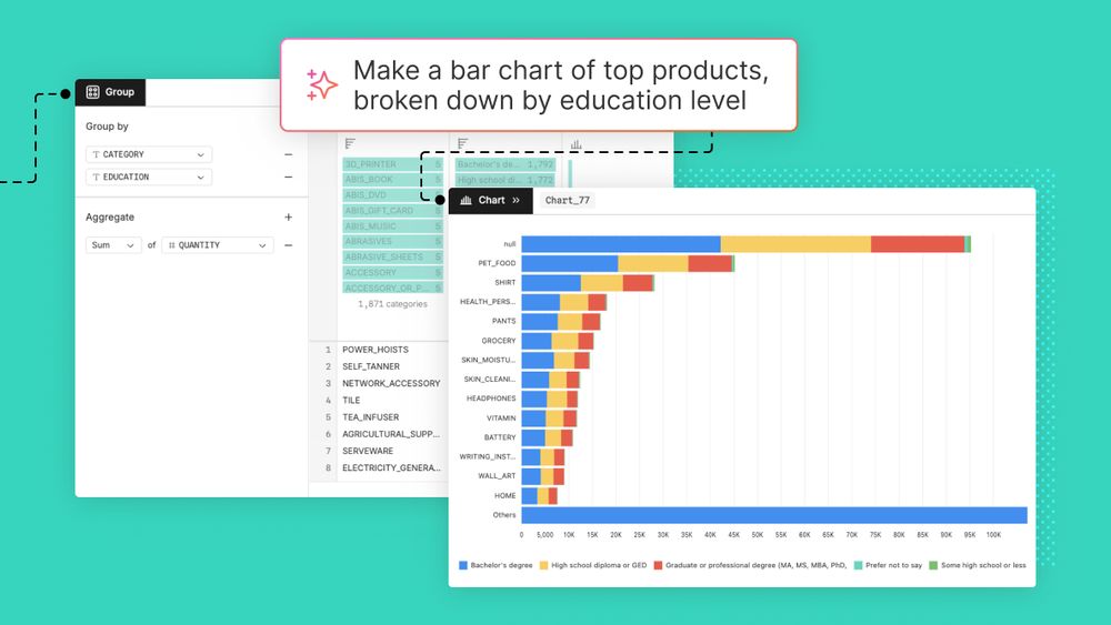
At Observable, we think rich, interactive charts shouldn’t be limited to expert developers. That’s why the Observable Canvases chart library includes advanced features like visual filtering, responsiveness, and extreme value handling by default.
📈 Learn more 👉 buff.ly/NpzeXwH
📈 Learn more 👉 buff.ly/NpzeXwH
January 23, 2026 at 4:31 PM
At Observable, we think rich, interactive charts shouldn’t be limited to expert developers. That’s why the Observable Canvases chart library includes advanced features like visual filtering, responsiveness, and extreme value handling by default.
📈 Learn more 👉 buff.ly/NpzeXwH
📈 Learn more 👉 buff.ly/NpzeXwH
🚀 Now in Observable Canvases: AI-powered text-to-SQL, directly in the SQL node. Generate and edit queries, then inspect and verify with clear visual diffs so there's never a doubt about what's happening with your code. Learn more and see the updates in action: observablehq.com/blog/draft-a...

Draft and customize queries even faster with streamlined text-to-SQL
Learn how we’ve upgraded AI integration for fluid, inspectable text-to-SQL that accelerates data wrangling and analysis in Observable Canvases.
observablehq.com
January 22, 2026 at 6:08 PM
🚀 Now in Observable Canvases: AI-powered text-to-SQL, directly in the SQL node. Generate and edit queries, then inspect and verify with clear visual diffs so there's never a doubt about what's happening with your code. Learn more and see the updates in action: observablehq.com/blog/draft-a...
Visual data exploration can uncover patterns and questions in business data. But big data can bring charts to a crawl, which disincentivizes exploration and hinders insight discovery. Learn how we deliver rich, performant charts in Observable Canvases 👇
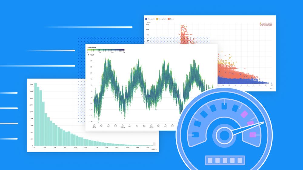
Big data, fast data visualizations
In Observable Canvases, charts representing millions of records are generated almost instantaneously. Learn how we keep data visualizations fast by limiting data returned by SQL queries and giving…
buff.ly
January 21, 2026 at 8:30 PM
Visual data exploration can uncover patterns and questions in business data. But big data can bring charts to a crawl, which disincentivizes exploration and hinders insight discovery. Learn how we deliver rich, performant charts in Observable Canvases 👇
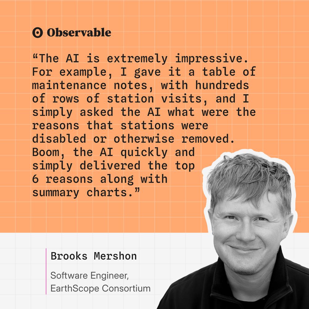
Agropatterns relies on AI to process & uncover insights in crop monitoring data. When even small mistakes can be catastrophic for crop health, trust in AI outputs is critical. Learn how we keep analysts confident, and in control, with verifiable AI in Observable: buff.ly/tSofCVa

January 20, 2026 at 4:30 PM
Agropatterns relies on AI to process & uncover insights in crop monitoring data. When even small mistakes can be catastrophic for crop health, trust in AI outputs is critical. Learn how we keep analysts confident, and in control, with verifiable AI in Observable: buff.ly/tSofCVa
The features that define modern, high-impact data visualizations — like responsiveness, visual filtering, and extreme value handling — are often the hardest to build from scratch. In Observable Canvases, we’re democratizing advanced, interactive charts. Learn how 👇

5 ways we’re democratizing advanced data visualization in Observable Canvases
Learn about the expert-level chart types and features you get for free in Observable Canvases including automatic responsiveness, extreme value handling, built-in visual filtering, and performant…
buff.ly
January 16, 2026 at 5:01 PM
The features that define modern, high-impact data visualizations — like responsiveness, visual filtering, and extreme value handling — are often the hardest to build from scratch. In Observable Canvases, we’re democratizing advanced, interactive charts. Learn how 👇
We sat down with Observable Data Visualization Engineer Fil Rivière to talk all about maps. Read our interview for Fil's perspective on what makes maps meaningful, where spatial data viz is headed, and why he's hoping for a "slow cartography movement." Read more: buff.ly/9VdsetY

January 15, 2026 at 5:15 PM
We sat down with Observable Data Visualization Engineer Fil Rivière to talk all about maps. Read our interview for Fil's perspective on what makes maps meaningful, where spatial data viz is headed, and why he's hoping for a "slow cartography movement." Read more: buff.ly/9VdsetY
The nature of data analysis and visualization is changing rapidly, and data teams are being asked to deliver more insights, faster than ever. Register now for a webinar on Feb 4 at 1PM ET / 10AM PT unpacking these changes, and how your data team can adapt:
buff.ly/FfMhC0U
buff.ly/FfMhC0U
The evolving data analysis landscape: How data teams can stay competitive in 2026
The data analysis and visualization landscape is currently undergoing a seismic shift. Analysts need tools that can keep pace with ballooning volumes of data in their company’s data warehouse. AI is…
streamyard.com
January 14, 2026 at 11:37 PM
The nature of data analysis and visualization is changing rapidly, and data teams are being asked to deliver more insights, faster than ever. Register now for a webinar on Feb 4 at 1PM ET / 10AM PT unpacking these changes, and how your data team can adapt:
buff.ly/FfMhC0U
buff.ly/FfMhC0U
AI can fast-track data analysis and visualization, but only if you can trust its outputs. In Observable Canvases, AI is fully verifiable every step of the way. Learn more: buff.ly/XscWHgt

January 14, 2026 at 5:53 PM
AI can fast-track data analysis and visualization, but only if you can trust its outputs. In Observable Canvases, AI is fully verifiable every step of the way. Learn more: buff.ly/XscWHgt
AI is reshaping how we work with data. But, as Ben Welsh (Data Editor, Reuters) shared in our December webinar, AI won’t replace the creativity behind great graphics anytime soon.
Watch the recording for more insights from top data journalists: buff.ly/Y8ZrG0a
Watch the recording for more insights from top data journalists: buff.ly/Y8ZrG0a
January 12, 2026 at 5:01 PM
AI is reshaping how we work with data. But, as Ben Welsh (Data Editor, Reuters) shared in our December webinar, AI won’t replace the creativity behind great graphics anytime soon.
Watch the recording for more insights from top data journalists: buff.ly/Y8ZrG0a
Watch the recording for more insights from top data journalists: buff.ly/Y8ZrG0a
We ❤️ this Observable Notebook from @rreusser.bsky.social exploring yoga class attendance, with calendars and charts made with Observable Plot! Read Ricky's reflections, and see how they use a notebook import to repurpose an existing Plot component: buff.ly/nRync53

January 9, 2026 at 8:30 PM
We ❤️ this Observable Notebook from @rreusser.bsky.social exploring yoga class attendance, with calendars and charts made with Observable Plot! Read Ricky's reflections, and see how they use a notebook import to repurpose an existing Plot component: buff.ly/nRync53
Happy 2026 from the Observable team!
With the start of the new year, we're reminded that time flies and there's always a need to understand how things change as it does. Learn about 8 charts that clarify patterns, reveal anomalies, and help you track performance with time series data👇
With the start of the new year, we're reminded that time flies and there's always a need to understand how things change as it does. Learn about 8 charts that clarify patterns, reveal anomalies, and help you track performance with time series data👇
January 7, 2026 at 9:31 PM
Happy 2026 from the Observable team!
With the start of the new year, we're reminded that time flies and there's always a need to understand how things change as it does. Learn about 8 charts that clarify patterns, reveal anomalies, and help you track performance with time series data👇
With the start of the new year, we're reminded that time flies and there's always a need to understand how things change as it does. Learn about 8 charts that clarify patterns, reveal anomalies, and help you track performance with time series data👇
✨ As 2025 comes to a close, we’re celebrating a big year at Observable — new products (Observable Canvases & Notebooks 2.0!), inspiring events, and innovative work from our community.
Read our 2025 Year in Review for highlights, and to hear what we’re excited about in 2026 🎉
👉
Read our 2025 Year in Review for highlights, and to hear what we’re excited about in 2026 🎉
👉

Observable’s 2025 year in review
It’s been a transformative and inspiring year here at Observable! Read our recap of major product launches, live events, and top community highlights, plus hear what our team is looking forward to in…
buff.ly
December 31, 2025 at 4:30 PM
✨ As 2025 comes to a close, we’re celebrating a big year at Observable — new products (Observable Canvases & Notebooks 2.0!), inspiring events, and innovative work from our community.
Read our 2025 Year in Review for highlights, and to hear what we’re excited about in 2026 🎉
👉
Read our 2025 Year in Review for highlights, and to hear what we’re excited about in 2026 🎉
👉
🥧 We're not saying you're sick of pie (charts) these days, but there are other appetizing ways to visualize parts of a whole. In Observable Canvases, it's just a few clicks to advanced, interactive charts like treemaps, circle packing charts, and more: buff.ly/pI8mYII
December 29, 2025 at 8:30 PM
🥧 We're not saying you're sick of pie (charts) these days, but there are other appetizing ways to visualize parts of a whole. In Observable Canvases, it's just a few clicks to advanced, interactive charts like treemaps, circle packing charts, and more: buff.ly/pI8mYII
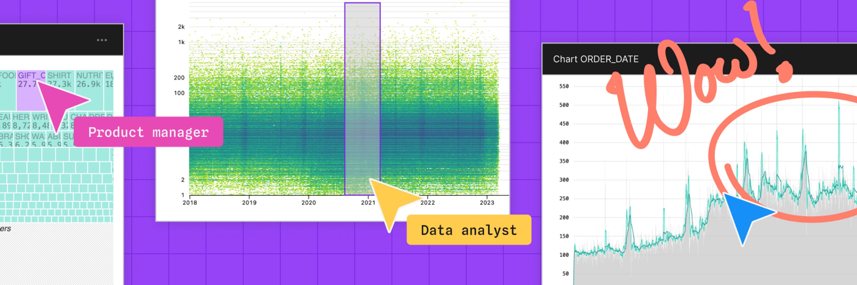
🔎 Exploratory data analysis (EDA) is a critical part of any data workflow, but it can also be time consuming.
Learn how our transparent, verifiable AI speeds up EDA in Observable Canvases by quickly profiling data, automating data wrangling, & prototyping charts 👇
Learn how our transparent, verifiable AI speeds up EDA in Observable Canvases by quickly profiling data, automating data wrangling, & prototyping charts 👇
Three ways to use AI for exploratory data analysis
Data teams are rapidly adopting AI tools to boost analysis workflows, from exploration to dashboard development. Learn three ways that AI can improve exploratory data analysis.
buff.ly
December 22, 2025 at 8:30 PM
🔎 Exploratory data analysis (EDA) is a critical part of any data workflow, but it can also be time consuming.
Learn how our transparent, verifiable AI speeds up EDA in Observable Canvases by quickly profiling data, automating data wrangling, & prototyping charts 👇
Learn how our transparent, verifiable AI speeds up EDA in Observable Canvases by quickly profiling data, automating data wrangling, & prototyping charts 👇
✨ Observable’s Year in Review ✨
2025 was a big year at Observable, with new launches like Observable Canvases and Notebooks 2.0, inspiring events, and incredible work from our community. As we head into 2026, here's a look back at highlights from the past year:
2025 was a big year at Observable, with new launches like Observable Canvases and Notebooks 2.0, inspiring events, and incredible work from our community. As we head into 2026, here's a look back at highlights from the past year:
Observable’s 2025 year in review
It’s been a transformative and inspiring year here at Observable! Read our recap of major product launches, live events, and top community highlights, plus hear what our team is looking forward to in…
buff.ly
December 18, 2025 at 8:30 PM
✨ Observable’s Year in Review ✨
2025 was a big year at Observable, with new launches like Observable Canvases and Notebooks 2.0, inspiring events, and incredible work from our community. As we head into 2026, here's a look back at highlights from the past year:
2025 was a big year at Observable, with new launches like Observable Canvases and Notebooks 2.0, inspiring events, and incredible work from our community. As we head into 2026, here's a look back at highlights from the past year:
Before diving headfirst into a new dataset, Jared Whalen (The Pudding) reminds us to first ask why the data exists, & how it’s already been used.
Catch more expert insights from top data journalists in our recent “Storytelling with Graphics” webinar 👉 buff.ly/6PmuD06
Catch more expert insights from top data journalists in our recent “Storytelling with Graphics” webinar 👉 buff.ly/6PmuD06
December 16, 2025 at 4:31 PM
Before diving headfirst into a new dataset, Jared Whalen (The Pudding) reminds us to first ask why the data exists, & how it’s already been used.
Catch more expert insights from top data journalists in our recent “Storytelling with Graphics” webinar 👉 buff.ly/6PmuD06
Catch more expert insights from top data journalists in our recent “Storytelling with Graphics” webinar 👉 buff.ly/6PmuD06