Fil
banner
fil.rezo.net
Fil
@fil.rezo.net
maps | data | code | journalism
#D3 & #Observable
👁️‍🗨️ https://observablehq.com/@fil
🌍 https://visionscarto.net/
Pinned
Fil @fil.rezo.net · Jan 3
How to: reproduce this lovely Bivariate Map with Observable Plot
(original by Muhammad Mohsin Raza)
observablehq.observablehq.cloud/pangea/plot/...
UK Bivariate Map
observablehq.observablehq.cloud
…published a new version of d3-tricontour
observablehq.com/@fil/multipo...
Multipolygon tricontour
Since v1.1.0 d3-tricontour can compute multipolygonal contours.
observablehq.com
October 5, 2025 at 7:09 PM
Reposted by Fil
Reminded me of this (if you think of structural breaks as shifting between equilibria on an S-curve).

observablehq.com/@fil/fitting...

web.archive.org/web/20220523...

Also shows why historical/domain-specific intuition is so important.

HT @fil.rezo.net and Constance Crozier
August 28, 2025 at 6:17 PM
Reposted by Fil
Big fan of @observablehq.com and since their preview release of Observable Notebooks 2.0 my team at Fora Health have integrated Notebook Kit into our app. Works really well so far. Quick demo ⬇️

screen.studio/share/TqvyfFbU
Observable Notebooks 2.0 in Fora Health — Screen Studio
Observable Notebooks 2.0 in Fora Health — Created and shared with Screen Studio
screen.studio
September 9, 2025 at 2:28 PM
Reposted by Fil
Observable Notebook Kit and Desktop 1.1 are out. Headline feature: database connectors! 🎉 You can now query DuckDB, SQLite, Postgres, and Snowflake directly from notebooks. And it’s self-hosted. And it saves results automatically for performance and stable analysis. observablehq.com/notebook-kit...
Observable Notebooks Database connectors | Observable
observablehq.com
August 27, 2025 at 2:04 PM
Reposted by Fil
charts you hate to see
June 17, 2025 at 11:30 PM
Reposted by Fil
Very interesting open access article about the "Long-term impact and biological recovery in a deep-sea mining track" by D.O.B. Jones and colleagues. Their photos of the ocean floor after mining, before and after, are simply shocking. #geoscience

www.nature.com/articles/s41...
June 16, 2025 at 8:32 AM
Reposted by Fil
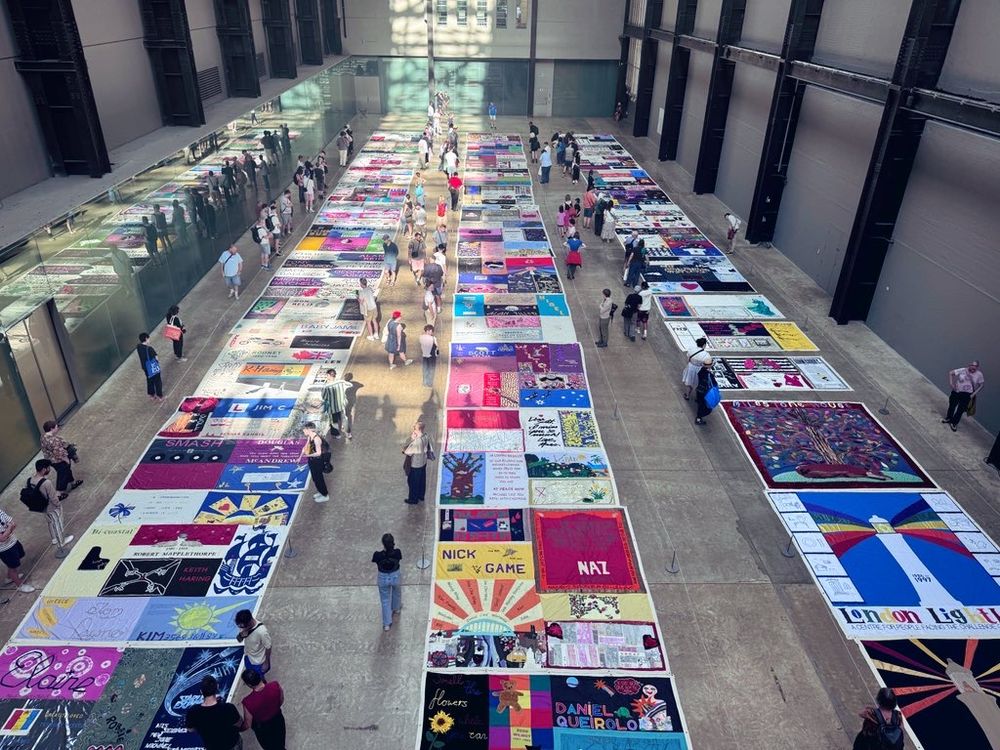
If you want to go, there’s just one more day of viewing (Monday 16th). Bring tissues.
June 15, 2025 at 6:04 PM
Reposted by Fil
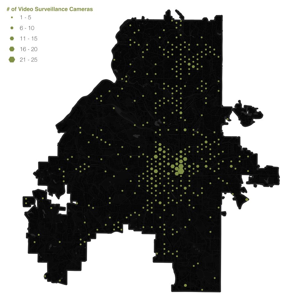
Atlanta is the most surveilled city in the United States.

But because the Atlanta Police Department claims that releasing the locations of these 60,000+ cameras will lead to terrorism, we’ve not been able to map their locations...

Until now. Read more 👇👇
City of Cameras
Atlanta is the most surveilled city in the United States. With 124.14 surveillance cameras per 1,000 people, we not only lead the country, we have more than twice as many cameras per capita as 2nd …
mappingatlanta.org
June 9, 2025 at 5:01 PM
Reposted by Fil
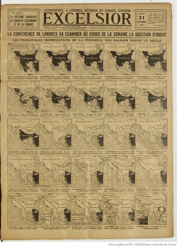
Fut un temps où les questions géopolitiques avaient une place de premier plan dans l'espace public en France, y compris avec de fantastiques efforts carto & dataviz
Les modifications de #frontières dans les Balkans à la Une du journal Excelsior, 21/2/1921
June 5, 2025 at 6:45 PM
Reposted by Fil
As the United States vetoes another Israel-Palestine ceasefire resolution at the UN Security Council, here's a graphic I made for @afp.com showing every veto on a similar resolution since 1970.
June 4, 2025 at 8:20 PM
bump bump
New on The New York Times : “Do You See Craters or Bumps on the Moon’s Surface?”
Do You See Craters or Bumps on the Moon’s Surface?
www.nytimes.com
June 4, 2025 at 8:27 PM
Reposted by Fil
"The 1930’s International Atlas of Clouds + of States of the Sky... provides a detailed textual description of different kinds of clouds, their shapes, the occurrences of the clouds, their behaviour, and a description of the disturbances the clouds indicate." socks-studio.com/2024/03/24/o...
May 20, 2025 at 2:29 AM
Reposted by Fil
Vous n'aimez pas le covid ? 😷

Vous aimez bien les cartes ? 📍

Ce fil est fait pour vous ! ⤵️

#AutoDéfenseSanitaire
#CovidIsNotOver
May 19, 2025 at 3:54 PM
Reposted by Fil
A trick for fitting world maps on phones:

Stack two azimuthal equal-area projections, clipped at 90° longitude, each one rotated 180° from the other.

The bottom map covers the top's Antarctica, which reduces the total height and looks nice.

As seen in www.nytimes.com/2025/04/25/c...
April 27, 2025 at 1:23 AM
On the love ⟷ hate gradient for marmite maps I'm firmly on the right hand side
May 17, 2025 at 4:19 PM
Reposted by Fil
A blog by Chris Wesson and me on the new contiguous cartogram functionality in ArcGIS Pro www.esri.com/arcgis-blog/...
Marmite maps: now available in ArcGIS Pro!
Love them or hate them, contiguous cartograms become the first of a new cartogram specific toolset in ArcGIS Pro.
www.esri.com
May 15, 2025 at 11:51 PM
Reposted by Fil
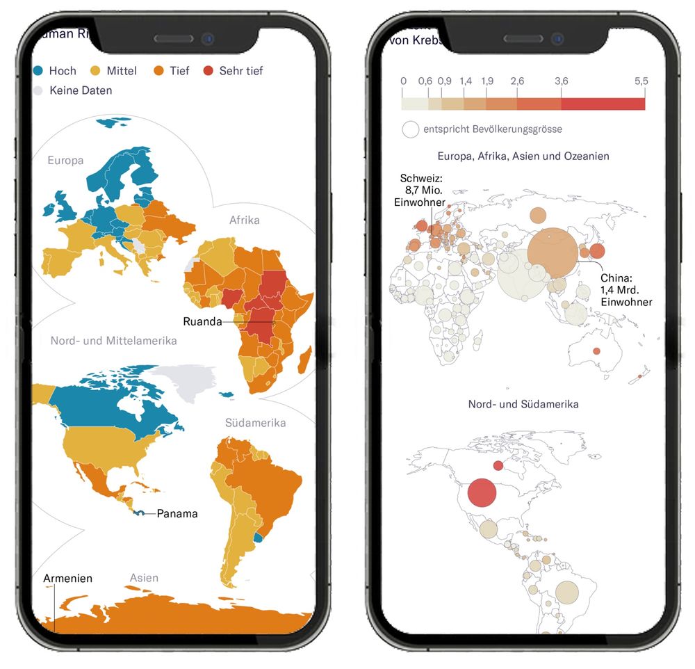
Better world maps for mobile!
Despite years of mobile-first design, there’s been little experimentation in this area. So we designed our own at NZZ – and validated it in a large user study.
Summary of the paper: jonasoesch.ch/articles/the... 1/3
May 14, 2025 at 9:38 AM
Reposted by Fil
I am speechless...
>> First fault movement ever filmed. M7.9 surface rupture filmed near Thazi, Myanmar
m.youtube.com/watch?v=77ub...
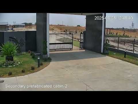
First fault movement ever filmed. M7.9 surface rupture filmed near Thazi, Myanmar
YouTube video by 2025 Sagaing Earthquake Archive
m.youtube.com
May 12, 2025 at 1:17 AM
Reposted by Fil
I love these!
Yellow fields or dark green fields? 💛💚 These are the other two aerial embroidery landscapes that will be available on my site later - and I couldn't resist more oilseed fields! The right one started with the fun path shapes :) all here: victoriaroserichards.co.uk/collection/a...
May 10, 2025 at 2:35 PM
Reposted by Fil
A detail to love in these maps by @naemas.bsky.social: the palette is asymmetric (subsiding values go to -8, uplifting values to +2), underscoring how land in many American cities is sinking much faster than it is rising. wapo.st/3F586ov

#dataviz 📊 #maps #cartography 🗺️
May 8, 2025 at 6:29 PM
Reposted by Fil
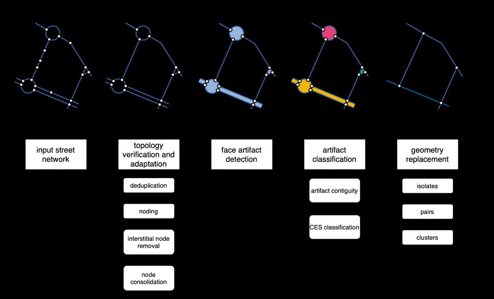
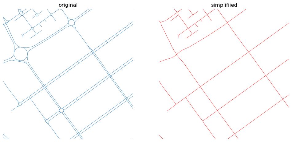
Ever needed to simplify street networks? I did. And it is a pain. So we wrote an algorithm that does that for us. And can do for you, as it is available as a Python package called `neatnet`.

Here's a short blog about it - martinfleischmann.net/simplificati... and package - uscuni.org/neatnet
April 28, 2025 at 8:45 PM
Reposted by Fil
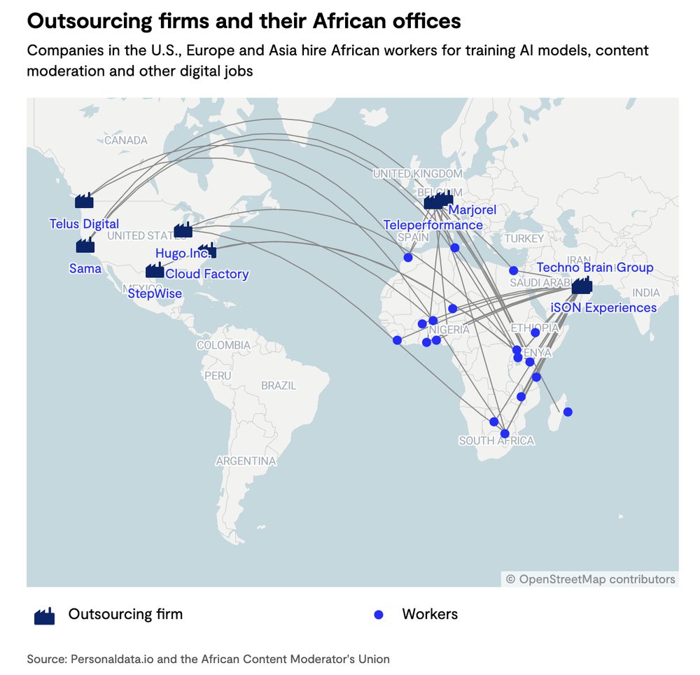
"A new dataset, visualized as maps, reveals the extent to which African workers are indirectly employed in the tech sector, doing content moderation, customer service, and data annotation for AI models, among other jobs." restofworld.org/2025/big-tec...
April 28, 2025 at 11:50 AM
Reposted by Fil
#MapMonday On this day in 1986, 2 days after the nuclear accident at Chernobyl power station, Soviet TV news show, Vremya, announced the event.

This map graphic from www.bbc.co.uk/news/science... shows radiation levels after a study in 2019
April 28, 2025 at 7:01 AM
I tried out A5 and I liked it
observablehq.com/@fil/a5-dggs
April 20, 2025 at 3:10 PM
Reposted by Fil
New project! Made a tool lets you explore, subset and summarize over 10M rows of data from the Time Use Survey of India in your browser. How people in different states, professions and groups spend their time? And then export your findings for #dataviz too!

diagramchasing.fun/2025/time-us...
April 20, 2025 at 1:13 PM