


Ralph Spandl
@spandl.ca
data visualization designer and founder of r42.ca
#dataviz · #LookerStudio · #PowerBI · #d3js · #measure – 🇨🇦 🇩🇪
#dataviz · #LookerStudio · #PowerBI · #d3js · #measure – 🇨🇦 🇩🇪
Pinned
Ralph Spandl
@spandl.ca
· 2d


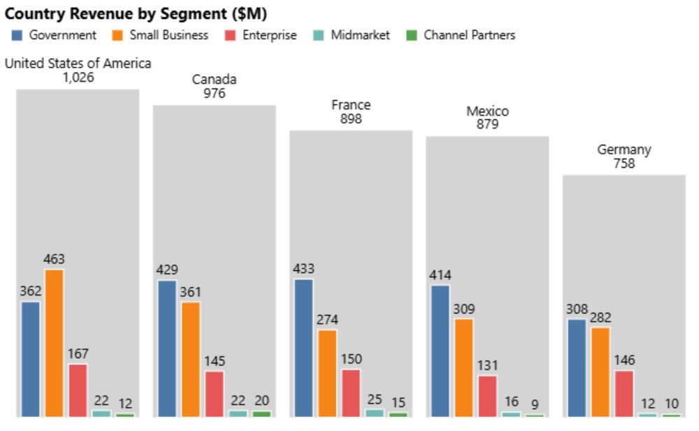
It’s been quite a journey, but I’m happy to share that three new custom visuals for #PowerBI — free to download.
AppSource:
lnkd.in/e-demPik
web:
lnkd.in/eBCnUa8G
AppSource:
lnkd.in/e-demPik
web:
lnkd.in/eBCnUa8G
It’s been quite a journey, but I’m happy to share that three new custom visuals for #PowerBI — free to download.
AppSource:
lnkd.in/e-demPik
web:
lnkd.in/eBCnUa8G
AppSource:
lnkd.in/e-demPik
web:
lnkd.in/eBCnUa8G
November 12, 2025 at 5:56 PM
It’s been quite a journey, but I’m happy to share that three new custom visuals for #PowerBI — free to download.
AppSource:
lnkd.in/e-demPik
web:
lnkd.in/eBCnUa8G
AppSource:
lnkd.in/e-demPik
web:
lnkd.in/eBCnUa8G
A fine article on design I found on BS a few weeks ago:
www.ft.com/content/e637...
And don't miss out on this response letter, which I pretty mcuh agree with:
www.ft.com/content/4554...
There is no single discipline that can save the world on its own.
Great read, #FoodForThoughts
www.ft.com/content/e637...
And don't miss out on this response letter, which I pretty mcuh agree with:
www.ft.com/content/4554...
There is no single discipline that can save the world on its own.
Great read, #FoodForThoughts

Why designers abandoned their dreams of changing the world
Design was once seen as a tool to improve lives — but as modernism has become marketing, that sense of social purpose has drifted away
www.ft.com
October 26, 2025 at 2:36 PM
A fine article on design I found on BS a few weeks ago:
www.ft.com/content/e637...
And don't miss out on this response letter, which I pretty mcuh agree with:
www.ft.com/content/4554...
There is no single discipline that can save the world on its own.
Great read, #FoodForThoughts
www.ft.com/content/e637...
And don't miss out on this response letter, which I pretty mcuh agree with:
www.ft.com/content/4554...
There is no single discipline that can save the world on its own.
Great read, #FoodForThoughts
Super nice!

For the purpose of more practicing with #D3js and #Svelte made an interactive version of one of the previous infographics:
yanouski.com/projects/xfi...
#datavis #datavisualization #informationdesign #xfiles #tv
yanouski.com/projects/xfi...
#datavis #datavisualization #informationdesign #xfiles #tv

Every Writer of Chris Carter's TV Shows | Ihar Yanouski
Interactive data visualization is dedicated to the TV shows created by Chris Carter: The X-Files, Millennium, Harsh Realm, The Lone Gunmen, and The After. It features a comprehensive list of all scree...
yanouski.com
October 23, 2025 at 3:35 PM
Super nice!
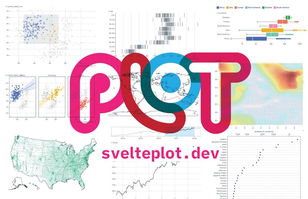
Great to see @driven-by-data.net adding new visual types to SveltePlot:
svelteplot.dev/transforms/s...
SveltePlot is like Observable Plot, but obviously based on Svelte, what makes it much easier to extent functionalities.
svelteplot.dev/transforms/s...
SveltePlot is like Observable Plot, but obviously based on Svelte, what makes it much easier to extent functionalities.
svelteplot.dev
September 9, 2025 at 12:18 PM
Great to see @driven-by-data.net adding new visual types to SveltePlot:
svelteplot.dev/transforms/s...
SveltePlot is like Observable Plot, but obviously based on Svelte, what makes it much easier to extent functionalities.
svelteplot.dev/transforms/s...
SveltePlot is like Observable Plot, but obviously based on Svelte, what makes it much easier to extent functionalities.
Strong signal - take a break.

August 13, 2025 at 11:40 PM
Strong signal - take a break.
Reposted by Ralph Spandl

"It is time to stop pretending that we are just one more model away from magic. We are not. The magic trick is over. The rabbit is not coming out of the hat."
codemanship.wordpress.com/2025/08/08/t...
codemanship.wordpress.com/2025/08/08/t...

The LLM In The Room: ChatGPT Speaks
With the long-awaited and much anticipated launch yesterday of the mythical GPT-5, and observing the widespread disappointment that it isn’t just not the superintelligence we were promised, b…
codemanship.wordpress.com
August 8, 2025 at 6:37 AM
"It is time to stop pretending that we are just one more model away from magic. We are not. The magic trick is over. The rabbit is not coming out of the hat."
codemanship.wordpress.com/2025/08/08/t...
codemanship.wordpress.com/2025/08/08/t...
😂
It is actually surprising that there aren't any good visual tools out there that know how we use Git.
It works so well, until you hit VIM.
It is actually surprising that there aren't any good visual tools out there that know how we use Git.
It works so well, until you hit VIM.


July 3, 2025 at 12:27 AM
😂
It is actually surprising that there aren't any good visual tools out there that know how we use Git.
It works so well, until you hit VIM.
It is actually surprising that there aren't any good visual tools out there that know how we use Git.
It works so well, until you hit VIM.
Reposted by Ralph Spandl

Here's the link. newsinteractives.cbc.ca/features/202...
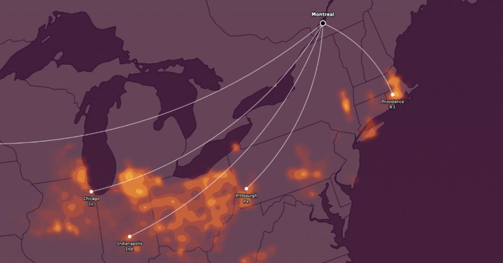
See what summer in your city could feel like by the end of the century | CBC News
Compare your city's future summers to today's climate in other North American communities.
newsinteractives.cbc.ca
June 26, 2025 at 1:21 PM
Here's the link. newsinteractives.cbc.ca/features/202...
Pretty amazed, how well #storybook integrates with #svelte. Using configuration JSON files to create test controls / interactive playground: ✅ check.
Everything is super fast. Absolutely fantastic to develop visuals with many variables.
Everything is super fast. Absolutely fantastic to develop visuals with many variables.
June 12, 2025 at 3:42 AM
Pretty amazed, how well #storybook integrates with #svelte. Using configuration JSON files to create test controls / interactive playground: ✅ check.
Everything is super fast. Absolutely fantastic to develop visuals with many variables.
Everything is super fast. Absolutely fantastic to develop visuals with many variables.
Reposted by Ralph Spandl

Voilà: is hiring a graphic designer for the first time in 4 years. Rare opportunity to join the team.
The job is in Montreal (no remote) and the ad is in French because we work in French and half our projects are in French.
Happy to answer questions!
The job is in Montreal (no remote) and the ad is in French because we work in French and half our projects are in French.
Happy to answer questions!

Graphic designer - Voilà:
Nous recrutons un(e) designer graphique avec une réelle compétence en design éditorial, à Montréal. Opportunité à ne pas manquer !
chezvoila.com
June 5, 2025 at 1:50 PM
Voilà: is hiring a graphic designer for the first time in 4 years. Rare opportunity to join the team.
The job is in Montreal (no remote) and the ad is in French because we work in French and half our projects are in French.
Happy to answer questions!
The job is in Montreal (no remote) and the ad is in French because we work in French and half our projects are in French.
Happy to answer questions!
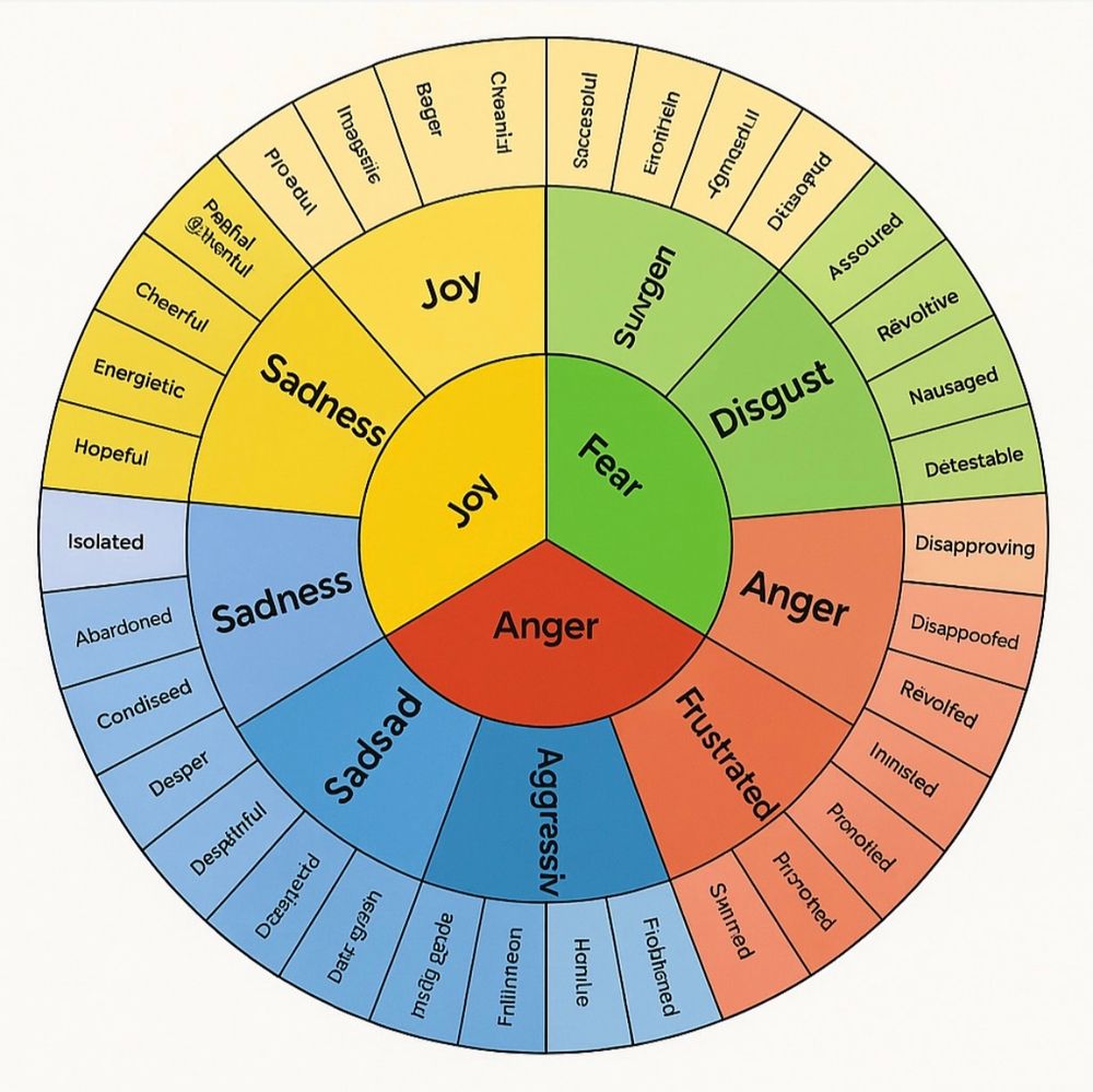
Excellent example to showcase, that AI doesn't understand but just guesses the shit out of it.

a friend of mine shared this ai-generated "emotion wheel" and unfortunately i have been laughing my ass off at it for like 15 minutes now. today i am feeling Fnliinneon
June 5, 2025 at 3:47 PM
Excellent example to showcase, that AI doesn't understand but just guesses the shit out of it.
Wow, there is even a smoke forecast website now:
firesmoke.ca/forecasts/cu...
firesmoke.ca/forecasts/cu...

June 4, 2025 at 12:44 AM
Wow, there is even a smoke forecast website now:
firesmoke.ca/forecasts/cu...
firesmoke.ca/forecasts/cu...
Looks like the Weather Network has now a new icon when the air is foggy from forest fires... #climatechange
June 3, 2025 at 10:54 PM
Looks like the Weather Network has now a new icon when the air is foggy from forest fires... #climatechange
Reposted by Ralph Spandl

I think the @storybook.js.org team wins the best major announcement page ever price. Stunning. And good that it is like that, because they moved mountains with this release. Kudos to everyone involved!

Introducing Storybook 9 • Storybook
The lean, mean component testing machine. We combined the best of frontend testing into one unified workflow. Test just as your users would across key dimensions like interactions, accessibility, and ...
storybook.js.org
June 3, 2025 at 7:58 PM
I think the @storybook.js.org team wins the best major announcement page ever price. Stunning. And good that it is like that, because they moved mountains with this release. Kudos to everyone involved!
This was my personal favorite of the Svelte Summit.
If you are looking to combine #Svelte and #ObservablePlot for #dataviz projects, this is a must see.
According to the author not production ready yet, but something to keep an eye on.
If you are looking to combine #Svelte and #ObservablePlot for #dataviz projects, this is a must see.
According to the author not production ready yet, but something to keep an eye on.

Introduction to SveltePlot, a layered grammar of graphics visualization framework for Svelte from Svelte Summit Spring 2025, by @driven-by-data.net is now available on our YouTube channel.
youtu.be/Lqkx-RO6PEs
youtu.be/Lqkx-RO6PEs

Introduction to SveltePlot, Gregor Aisch — Svelte Summit Spring 2025
YouTube video by Svelte Society
youtu.be
June 1, 2025 at 3:47 PM
This was my personal favorite of the Svelte Summit.
If you are looking to combine #Svelte and #ObservablePlot for #dataviz projects, this is a must see.
According to the author not production ready yet, but something to keep an eye on.
If you are looking to combine #Svelte and #ObservablePlot for #dataviz projects, this is a must see.
According to the author not production ready yet, but something to keep an eye on.
This was one of the best presentation of the Svelte Summit. I'm really looking forward to use Storybook 9 in my next project.
The next talk from Svelte Summit Spring 2025 by @reinhold.is is also related to testing — Strike the Perfect Balance: Component Testing with Storybook, Svelte, and Vitest.
youtu.be/mdyRQDDp28s
youtu.be/mdyRQDDp28s

Component Testing with Storybook, Svelte, and Vitest — Svelte Summit Spring 2025
YouTube video by Svelte Society
youtu.be
May 30, 2025 at 1:25 PM
This was one of the best presentation of the Svelte Summit. I'm really looking forward to use Storybook 9 in my next project.
This is why I love @observablehq.com !

Most BI and data viz tools let you make histograms with a single click or command. So, you might think that designing good default histograms is simple. Turns out, it's harder than it sounds. Learn how we handle common challenges to make better out-of-the-box histograms in canvases:
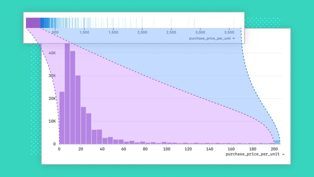
Designing better out-of-the-box histograms
Given how common histograms are in BI tools, you might think they’re easy to design. Think again. We share challenges we encountered, and how we handled them, while designing better out-of-the-box…
buff.ly
May 24, 2025 at 12:36 AM
This is why I love @observablehq.com !
I did buy a virtual ticket to the Svelte summit just to watch this presentation (free videos shall be released soon).
Amazing work.
I love Observable Plot, but it is very hard to get the marks animated.
I hope this one will survive!
Amazing work.
I love Observable Plot, but it is very hard to get the marks animated.
I hope this one will survive!

Last week I had the pleasure of finally releasing the #SveltePlot alpha version during my talk at the #SvelteSummit in Barcelona. It's a new visualization framework for @svelte.dev that I've been working on for the past 18 months, so it's about time for a 🧵
May 22, 2025 at 2:56 PM
I did buy a virtual ticket to the Svelte summit just to watch this presentation (free videos shall be released soon).
Amazing work.
I love Observable Plot, but it is very hard to get the marks animated.
I hope this one will survive!
Amazing work.
I love Observable Plot, but it is very hard to get the marks animated.
I hope this one will survive!
Always a pleasure to listen to @jburnmurdoch.ft.com that just gave another fantastic presentation about how to tell better data stories. Watch again here on YouTube:
www.youtube.com/watch?v=uRRO...
www.youtube.com/watch?v=uRRO...
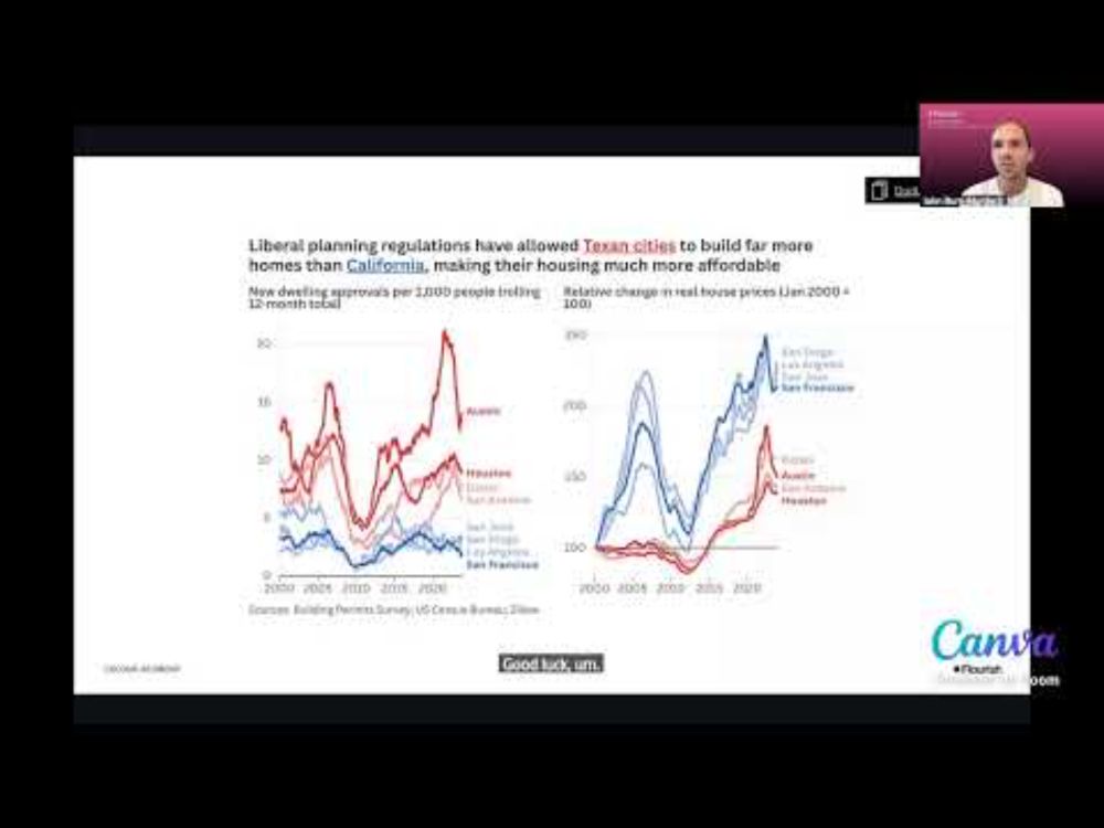
Designing for impact with John Burn-Murdoch
YouTube video by Flourish
www.youtube.com
May 21, 2025 at 5:18 PM
Always a pleasure to listen to @jburnmurdoch.ft.com that just gave another fantastic presentation about how to tell better data stories. Watch again here on YouTube:
www.youtube.com/watch?v=uRRO...
www.youtube.com/watch?v=uRRO...
Reposted by Ralph Spandl

@erindataviz.bsky.social absolutely nailed the smart brevity #dataviz thing with this unconventional bar chart. Sometimes, rules are meant to be broken.

Visual journalist @erindataviz.bsky.social shows just how much a $400m Qatari jet stacks up against other gifts received by modern presidents.
See the thread to see the #dataviz unfold 👇
See the thread to see the #dataviz unfold 👇
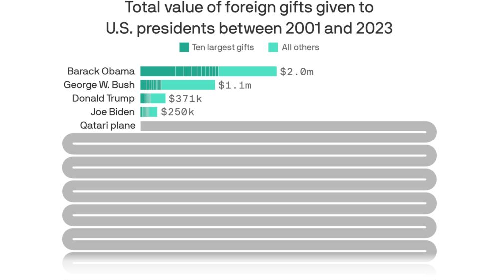
$400 million Air Force One gift would smash presidential records
U.S. presidents have been presented with gifts ranging from books to diamonds, and even animals.
www.axios.com
May 15, 2025 at 2:05 PM
@erindataviz.bsky.social absolutely nailed the smart brevity #dataviz thing with this unconventional bar chart. Sometimes, rules are meant to be broken.
Thread with some substance. Plot + Svelte = SveltePlot
Last week I had the pleasure of finally releasing the #SveltePlot alpha version during my talk at the #SvelteSummit in Barcelona. It's a new visualization framework for @svelte.dev that I've been working on for the past 18 months, so it's about time for a 🧵
May 13, 2025 at 9:21 PM
Thread with some substance. Plot + Svelte = SveltePlot
Reposted by Ralph Spandl
So much to love in the scrollytelling — the ternary plot, the depth of the data, the findings — but my favourite part is the explanation and the text in general. 📊
Remember, a chart doesn't have to be understood in 3 seconds. It should reward the effort you put into understanding it.
Remember, a chart doesn't have to be understood in 3 seconds. It should reward the effort you put into understanding it.
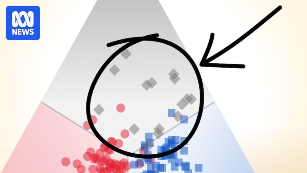
This triangle helps explain a titanic shift in how Australia votes
This triangle is going to help us explain how Australian politics has fundamentally changed over the past five decades.
www.abc.net.au
April 26, 2025 at 8:17 PM
So much to love in the scrollytelling — the ternary plot, the depth of the data, the findings — but my favourite part is the explanation and the text in general. 📊
Remember, a chart doesn't have to be understood in 3 seconds. It should reward the effort you put into understanding it.
Remember, a chart doesn't have to be understood in 3 seconds. It should reward the effort you put into understanding it.
Last week, #Observable announced the deprecation of its Cloud service. This means developers of Observable Framework data apps loose their option to quickly deploy and protect their data apps. Here is a quick overview about alternatives.
www.linkedin.com/pulse/protec...
www.linkedin.com/pulse/protec...

April 21, 2025 at 9:55 AM
Last week, #Observable announced the deprecation of its Cloud service. This means developers of Observable Framework data apps loose their option to quickly deploy and protect their data apps. Here is a quick overview about alternatives.
www.linkedin.com/pulse/protec...
www.linkedin.com/pulse/protec...
I like this overlay concept.

I saw a really neat take on an alternative approach for stacked bar charts in #Tableau over on the Flerlage Twins blog.
Naturally, I wanted to try it for #VegaLite and #Deneb in #PowerBI, so I wrote up how I might approach it (with some downloadable stuffs):
deneb-viz.github.io/blog/stacked...
Naturally, I wanted to try it for #VegaLite and #Deneb in #PowerBI, so I wrote up how I might approach it (with some downloadable stuffs):
deneb-viz.github.io/blog/stacked...
How-To: The Stacked Bar Alternative | Deneb
Using Vega-Lite to replicate a more readable alternative to a stacked bar chart.
deneb-viz.github.io
April 8, 2025 at 6:10 AM
I like this overlay concept.
Wow, amazing tutorial. This opens up even more possibilities with #ObservablePlot!

Want to create your own custom marks in @observablehq.com Plot, but don't want to go full D3?
I've created a guide with 6 approaches of varying sophistication for specifying reusable custom marks:
observablehq.com/@jwolondon/h...
I've created a guide with 6 approaches of varying sophistication for specifying reusable custom marks:
observablehq.com/@jwolondon/h...
April 1, 2025 at 10:34 AM
Wow, amazing tutorial. This opens up even more possibilities with #ObservablePlot!