


Jonas Parnow
@jonasparnow.com
Information design and data visualisation. Cares about the climate crisis, post-digital media and technological justice. I like code and smoothies.
https://links.jonasparnow.com
📍Berlin
https://links.jonasparnow.com
📍Berlin
Reposted by Jonas Parnow

The risk of an #AMOC shutdown - explained in 15 minutes at the Arctic Circle in Reykjavik on Saturday.
I had the honor of presenting a letter by 44 experts warning of that underestimated risk to the Icelandic 🇮🇸 climate minister Guðlaugur Þór Þórðarson.
youtu.be/k0FUZKQhU6U?...
I had the honor of presenting a letter by 44 experts warning of that underestimated risk to the Icelandic 🇮🇸 climate minister Guðlaugur Þór Þórðarson.
youtu.be/k0FUZKQhU6U?...
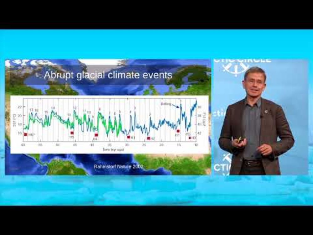
Is the AMOC Shutting Down? - Atlantic Meridional Overturning Circulation
YouTube video by Arctic Circle
youtu.be
October 25, 2024 at 8:01 AM
The risk of an #AMOC shutdown - explained in 15 minutes at the Arctic Circle in Reykjavik on Saturday.
I had the honor of presenting a letter by 44 experts warning of that underestimated risk to the Icelandic 🇮🇸 climate minister Guðlaugur Þór Þórðarson.
youtu.be/k0FUZKQhU6U?...
I had the honor of presenting a letter by 44 experts warning of that underestimated risk to the Icelandic 🇮🇸 climate minister Guðlaugur Þór Þórðarson.
youtu.be/k0FUZKQhU6U?...
Reposted by Jonas Parnow

read our report which uses satellite imagery to map environmental catastrophe in gaza
with @denisedslu.bsky.social
🎁: www.bloomberg.com/graphics/202...
with @denisedslu.bsky.social
🎁: www.bloomberg.com/graphics/202...

July 29, 2025 at 3:40 PM
read our report which uses satellite imagery to map environmental catastrophe in gaza
with @denisedslu.bsky.social
🎁: www.bloomberg.com/graphics/202...
with @denisedslu.bsky.social
🎁: www.bloomberg.com/graphics/202...
Reposted by Jonas Parnow

Data visualizations are some of the most powerful tools in a climate science communicator’s playbook. However, designing visuals that are clear to the public and policy makers is not a straightforward task, writes @rachitdubey.bsky.social .
So, what works?
So, what works?
How clear and simple data visualizations bring the climate crisis home
Climate change is a slow-moving disaster. We need graphics that capture both its pace and its impact.
thebulletin.org
July 25, 2025 at 2:55 PM
Data visualizations are some of the most powerful tools in a climate science communicator’s playbook. However, designing visuals that are clear to the public and policy makers is not a straightforward task, writes @rachitdubey.bsky.social .
So, what works?
So, what works?
Reposted by Jonas Parnow

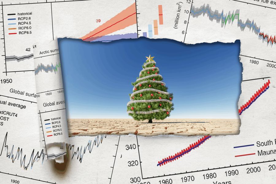
People tell me nobody wants to look at climate curves anymore, yet here we are!!! Please enjoy our interactive journey through 485 million years of climate history and dive into the fascinating and important work of paleoclimate scientists.
🎁 www.zeit.de/wissen/umwel...
🎁 www.zeit.de/wissen/umwel...
June 20, 2025 at 9:32 AM
People tell me nobody wants to look at climate curves anymore, yet here we are!!! Please enjoy our interactive journey through 485 million years of climate history and dive into the fascinating and important work of paleoclimate scientists.
🎁 www.zeit.de/wissen/umwel...
🎁 www.zeit.de/wissen/umwel...
Reposted by Jonas Parnow
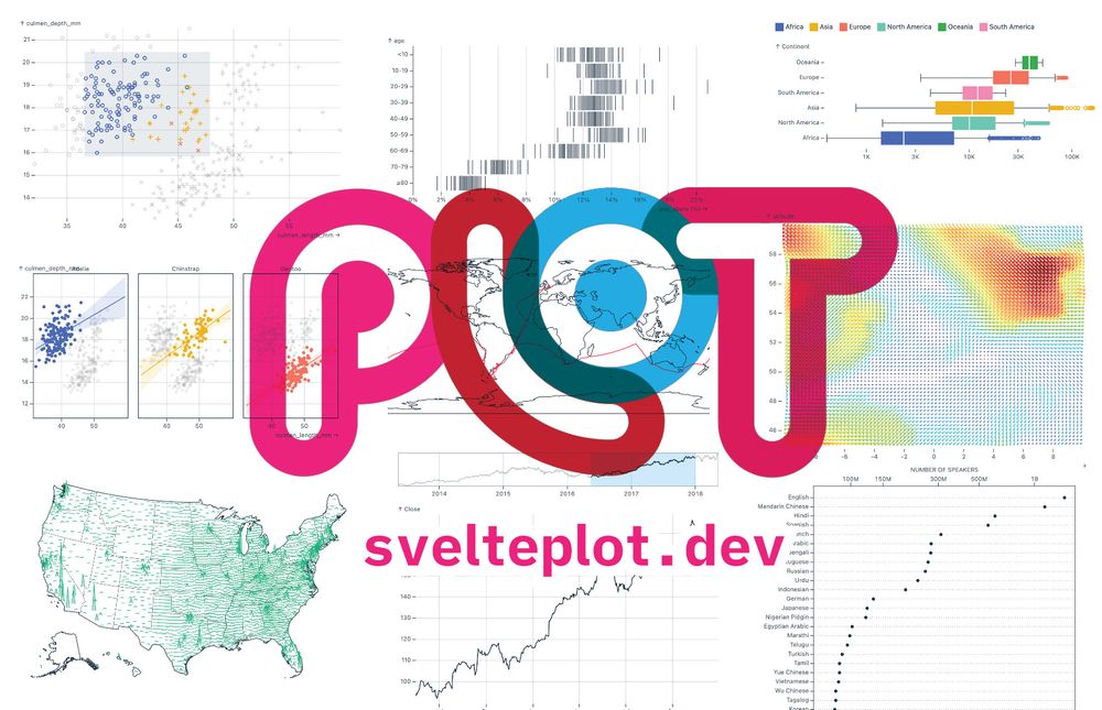
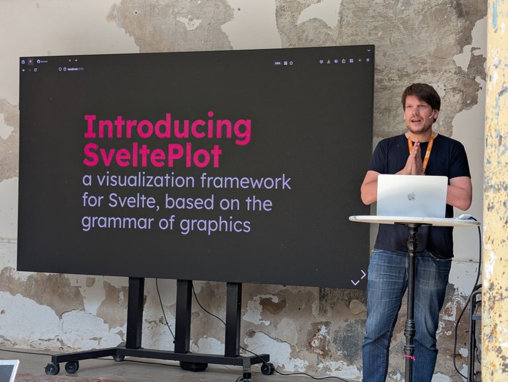
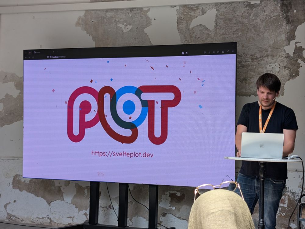
Last week I had the pleasure of finally releasing the #SveltePlot alpha version during my talk at the #SvelteSummit in Barcelona. It's a new visualization framework for @svelte.dev that I've been working on for the past 18 months, so it's about time for a 🧵
May 13, 2025 at 11:21 AM
Last week I had the pleasure of finally releasing the #SveltePlot alpha version during my talk at the #SvelteSummit in Barcelona. It's a new visualization framework for @svelte.dev that I've been working on for the past 18 months, so it's about time for a 🧵
Reposted by Jonas Parnow
May 8, 2025 at 1:52 PM
Reposted by Jonas Parnow

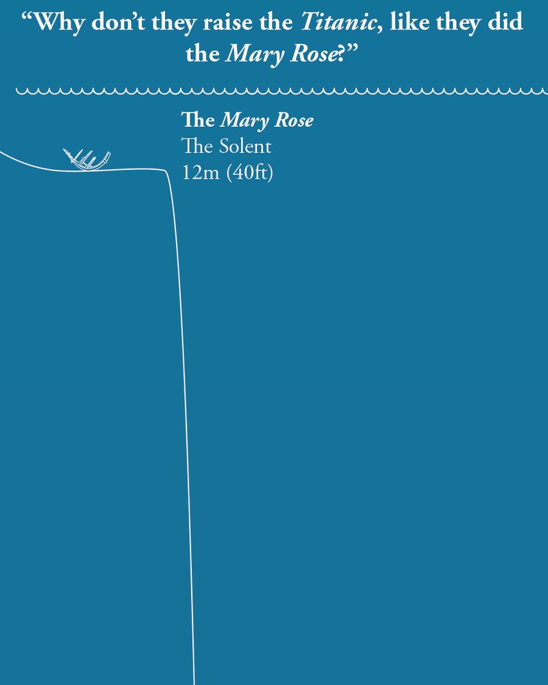
On the anniversary of the sinking of the Titanic, we thought we'd answer a question that's often asked,
"If they raised the Mary Rose, why not raise the Titanic?"
Allow our scaled diagram to explain...
"If they raised the Mary Rose, why not raise the Titanic?"
Allow our scaled diagram to explain...
April 15, 2025 at 8:21 AM
On the anniversary of the sinking of the Titanic, we thought we'd answer a question that's often asked,
"If they raised the Mary Rose, why not raise the Titanic?"
Allow our scaled diagram to explain...
"If they raised the Mary Rose, why not raise the Titanic?"
Allow our scaled diagram to explain...
Reposted by Jonas Parnow

I'm very pleased to share Tunnel & Fortress, a new live coached training series bringing the art of system administration to those with no prior experience in the field. Participants will deploy, garden & harden servers to keep their communities safe.
video.nikau.io/w/sXj2kQ8vQo...
#exitbigtech
video.nikau.io/w/sXj2kQ8vQo...
#exitbigtech
Introducing Tunnel and Fortress
A brief introduction to the new Tunnel and Fortress training series, hosted by Nīkau, and instructed by Julian Oliver. Please see here for more information: https://learn.nikau.io
video.nikau.io
April 2, 2025 at 6:59 PM
I'm very pleased to share Tunnel & Fortress, a new live coached training series bringing the art of system administration to those with no prior experience in the field. Participants will deploy, garden & harden servers to keep their communities safe.
video.nikau.io/w/sXj2kQ8vQo...
#exitbigtech
video.nikau.io/w/sXj2kQ8vQo...
#exitbigtech
Reposted by Jonas Parnow

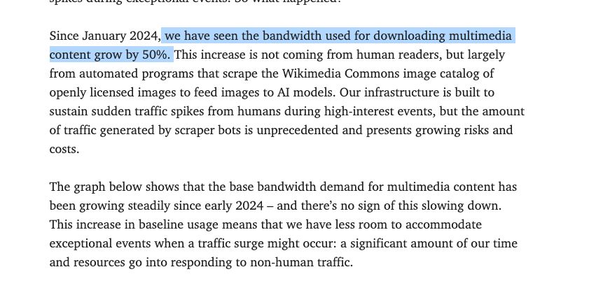
The Wikimedia Foundation, which owns Wikipedia, says its bandwidth costs have gone up 50% since Jan 2024 — a rise they attribute to AI crawlers.
AI companies are killing the open web by stealing visitors from the sources of information and making them pay for the privilege
AI companies are killing the open web by stealing visitors from the sources of information and making them pay for the privilege
April 2, 2025 at 9:12 AM
The Wikimedia Foundation, which owns Wikipedia, says its bandwidth costs have gone up 50% since Jan 2024 — a rise they attribute to AI crawlers.
AI companies are killing the open web by stealing visitors from the sources of information and making them pay for the privilege
AI companies are killing the open web by stealing visitors from the sources of information and making them pay for the privilege
Reposted by Jonas Parnow

I’m thrilled to bring together two institutions that shaped my work: BarabásiLab & metaLAB (at) Harvard.
On June 11–12, 2025, we’re hosting Data | Art—a conference on how data entangles with artistic, scientific & curatorial practices.
We have a stellar lineup of speakers! More soon: data-art.info
On June 11–12, 2025, we’re hosting Data | Art—a conference on how data entangles with artistic, scientific & curatorial practices.
We have a stellar lineup of speakers! More soon: data-art.info
March 10, 2025 at 3:18 PM
I’m thrilled to bring together two institutions that shaped my work: BarabásiLab & metaLAB (at) Harvard.
On June 11–12, 2025, we’re hosting Data | Art—a conference on how data entangles with artistic, scientific & curatorial practices.
We have a stellar lineup of speakers! More soon: data-art.info
On June 11–12, 2025, we’re hosting Data | Art—a conference on how data entangles with artistic, scientific & curatorial practices.
We have a stellar lineup of speakers! More soon: data-art.info
Reposted by Jonas Parnow
Join us online on Thu 20 March 18:00–19:00 CET:
*Visualising climate science*
by Angela Morelli
Visualisation is a powerful tool for navigating the complexity of climate change. However, visualising climate science can confuse, misinform or polarise.
Register at: www.eventbrite.at/e/iiid-conve...
*Visualising climate science*
by Angela Morelli
Visualisation is a powerful tool for navigating the complexity of climate change. However, visualising climate science can confuse, misinform or polarise.
Register at: www.eventbrite.at/e/iiid-conve...

March 1, 2025 at 8:45 AM
Join us online on Thu 20 March 18:00–19:00 CET:
*Visualising climate science*
by Angela Morelli
Visualisation is a powerful tool for navigating the complexity of climate change. However, visualising climate science can confuse, misinform or polarise.
Register at: www.eventbrite.at/e/iiid-conve...
*Visualising climate science*
by Angela Morelli
Visualisation is a powerful tool for navigating the complexity of climate change. However, visualising climate science can confuse, misinform or polarise.
Register at: www.eventbrite.at/e/iiid-conve...
Reposted by Jonas Parnow
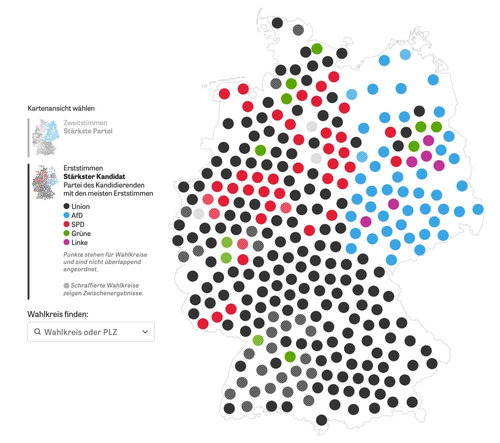
For the German election we wanted to use a cartogram of German election districts but didn't find anything good, so we created our own. Here's a little nerd thread how the final algorithm worked 🤓 🧵 #gis #cartogram #election #datavis #cartography
February 27, 2025 at 4:48 PM
For the German election we wanted to use a cartogram of German election districts but didn't find anything good, so we created our own. Here's a little nerd thread how the final algorithm worked 🤓 🧵 #gis #cartogram #election #datavis #cartography
Reposted by Jonas Parnow

I am very excited to announce Unpic 1.0 🎉
As easy as an <img> tag but generates all the right attributes and styles for a responsive image. No downloading and no build-time resize
• Components for ten frontend frameworks
• Support for 26 image providers, now with type-safe transforms for every one
As easy as an <img> tag but generates all the right attributes and styles for a responsive image. No downloading and no build-time resize
• Components for ten frontend frameworks
• Support for 26 image providers, now with type-safe transforms for every one
Unpic 1.0 – Unpic
Introducing the first version of Unpic: image components for every framework
unpic.pics
January 20, 2025 at 10:11 AM
I am very excited to announce Unpic 1.0 🎉
As easy as an <img> tag but generates all the right attributes and styles for a responsive image. No downloading and no build-time resize
• Components for ten frontend frameworks
• Support for 26 image providers, now with type-safe transforms for every one
As easy as an <img> tag but generates all the right attributes and styles for a responsive image. No downloading and no build-time resize
• Components for ten frontend frameworks
• Support for 26 image providers, now with type-safe transforms for every one
Reposted by Jonas Parnow

this is so good. this is so so so good. i'm running around my office screaming the lev manovich quote about how software is ideology

January 15, 2025 at 3:35 PM
this is so good. this is so so so good. i'm running around my office screaming the lev manovich quote about how software is ideology
Reposted by Jonas Parnow

Lovely example of how weird real-world data is. I put all 55 million points in Overture maps into a Nomic Atlas map. Lots of points spuriously appearing in the ocean. But the 1° square around 'null island' (0° lat, 0° long) is suspiciously clear -- someone has cleared out bad data just there.
January 6, 2025 at 2:37 AM
Lovely example of how weird real-world data is. I put all 55 million points in Overture maps into a Nomic Atlas map. Lots of points spuriously appearing in the ocean. But the 1° square around 'null island' (0° lat, 0° long) is suspiciously clear -- someone has cleared out bad data just there.
Reposted by Jonas Parnow
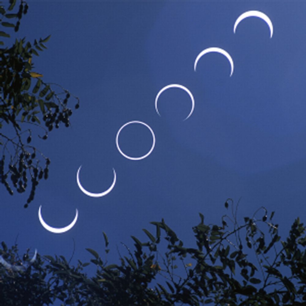
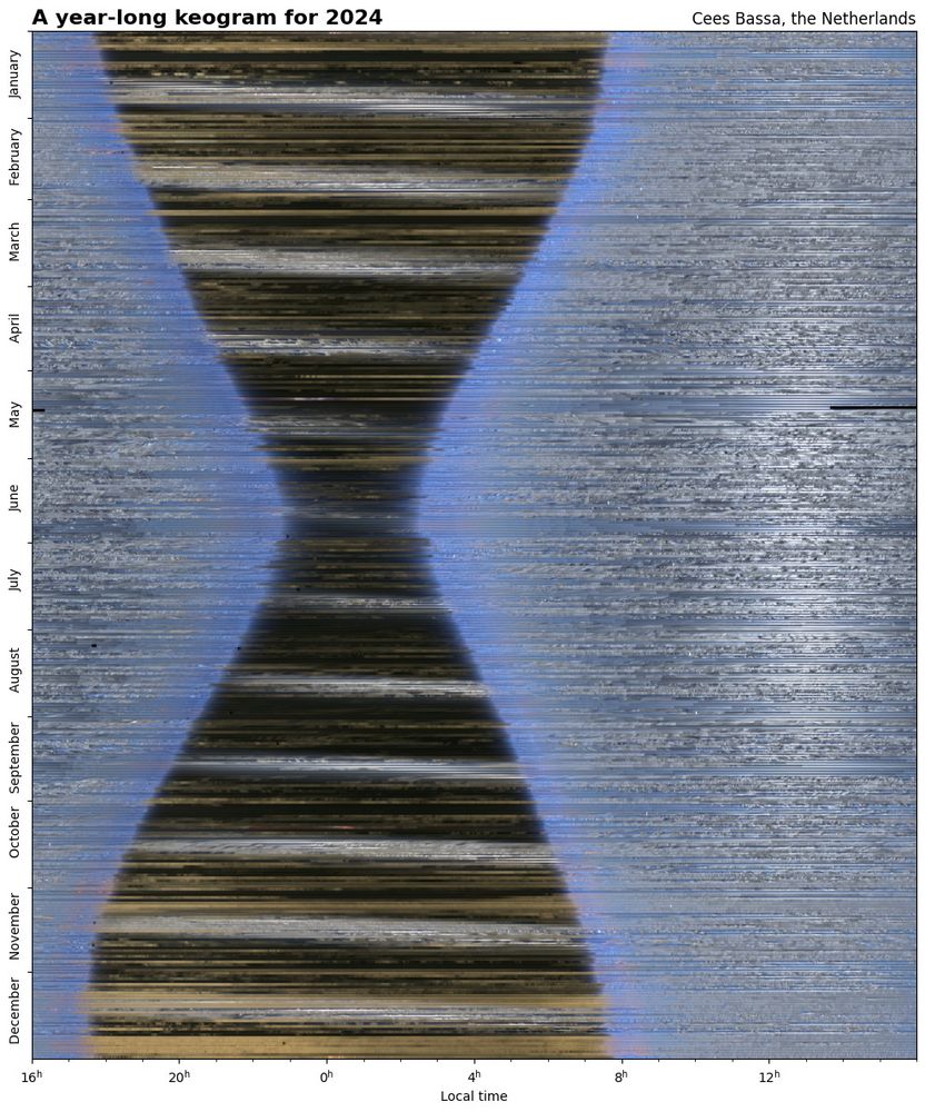
For the 4th year in a row, my all-sky camera has been taking an image of the sky above the Netherlands every 15 seconds. Combining these images reveal the length of the night changing throughout the year, the passage of clouds and the motion of the Moon and the Sun through the sky. #astrophotography
January 4, 2025 at 1:27 PM
For the 4th year in a row, my all-sky camera has been taking an image of the sky above the Netherlands every 15 seconds. Combining these images reveal the length of the night changing throughout the year, the passage of clouds and the motion of the Moon and the Sun through the sky. #astrophotography
Reposted by Jonas Parnow

Anne Telnaes, Pulitzer-winning editorial cartoonist for the Washington Post, has resigned.
The paper censored a cartoon that criticized billionaires.
Democracy dies in broad daylight, too.
anntelnaes.substack.com/p/why-im-qui...
The paper censored a cartoon that criticized billionaires.
Democracy dies in broad daylight, too.
anntelnaes.substack.com/p/why-im-qui...

Why I'm quitting the Washington Post
Democracy can't function without a free press
anntelnaes.substack.com
January 4, 2025 at 1:03 AM
Anne Telnaes, Pulitzer-winning editorial cartoonist for the Washington Post, has resigned.
The paper censored a cartoon that criticized billionaires.
Democracy dies in broad daylight, too.
anntelnaes.substack.com/p/why-im-qui...
The paper censored a cartoon that criticized billionaires.
Democracy dies in broad daylight, too.
anntelnaes.substack.com/p/why-im-qui...
Reposted by Jonas Parnow

Do you want the GOOD news or the BAD news?
2024 in charts, by Just Have a Think
#climatechange #climate
www.youtube.com/watch?v=VG-x...
2024 in charts, by Just Have a Think
#climatechange #climate
www.youtube.com/watch?v=VG-x...

Do you want the GOOD news or the BAD news?
YouTube video by Just Have a Think
www.youtube.com
December 22, 2024 at 10:56 PM
Do you want the GOOD news or the BAD news?
2024 in charts, by Just Have a Think
#climatechange #climate
www.youtube.com/watch?v=VG-x...
2024 in charts, by Just Have a Think
#climatechange #climate
www.youtube.com/watch?v=VG-x...
Reposted by Jonas Parnow

Wenn ihr mit einer hoffnungsfrohen Karte aus dem Jahr gehen wollt: 2.500 neue Windräder haben 2024 eine Baugenehmigung bekommen, laut unserer Zählung @zeit.de. Die meisten davon gehen in den nächsten Jahren ans Netz und liefern grünen Strom. Die Energiewende geht voran!
zeit.de/energiemonitor
zeit.de/energiemonitor

December 31, 2024 at 6:31 PM
Wenn ihr mit einer hoffnungsfrohen Karte aus dem Jahr gehen wollt: 2.500 neue Windräder haben 2024 eine Baugenehmigung bekommen, laut unserer Zählung @zeit.de. Die meisten davon gehen in den nächsten Jahren ans Netz und liefern grünen Strom. Die Energiewende geht voran!
zeit.de/energiemonitor
zeit.de/energiemonitor
Reposted by Jonas Parnow
2024 geht zuende - das heißeste Jahr weltweit & in Deutschland. Die Folge: krasse, teure Wetterextreme.
Schaut den Jahresrückblick.
Wir dürfen die #Klimakrise nicht weiter als Nebensache behandeln!
Dafür würden wir & unsere Kinder & Enkel bitter bezahlen.
youtu.be/XEH3NZkTdNI?...
Schaut den Jahresrückblick.
Wir dürfen die #Klimakrise nicht weiter als Nebensache behandeln!
Dafür würden wir & unsere Kinder & Enkel bitter bezahlen.
youtu.be/XEH3NZkTdNI?...

Jahresrückblick: Wetterextreme im Jahr 2024
YouTube video by tagesschau
youtu.be
December 31, 2024 at 10:26 AM
2024 geht zuende - das heißeste Jahr weltweit & in Deutschland. Die Folge: krasse, teure Wetterextreme.
Schaut den Jahresrückblick.
Wir dürfen die #Klimakrise nicht weiter als Nebensache behandeln!
Dafür würden wir & unsere Kinder & Enkel bitter bezahlen.
youtu.be/XEH3NZkTdNI?...
Schaut den Jahresrückblick.
Wir dürfen die #Klimakrise nicht weiter als Nebensache behandeln!
Dafür würden wir & unsere Kinder & Enkel bitter bezahlen.
youtu.be/XEH3NZkTdNI?...
Reposted by Jonas Parnow

Fascinating exploration of entropy as a measure of ignorance. Researchers are attempting to capitalize on the apparent subjectivity of that ignorance. By @zacksavitsky.bsky.social with terrific interactive graphics by Jonas Parnow and @markabelan.bsky.social: www.quantamagazine.org/what-is-entr...

What Is Entropy? A Measure of Just How Little We Really Know. | Quanta Magazine
Exactly 200 years ago, a French engineer introduced an idea that would quantify the universe’s inexorable slide into decay. But entropy, as it’s currently understood, is less a fact about the world th...
www.quantamagazine.org
December 13, 2024 at 5:27 PM
Fascinating exploration of entropy as a measure of ignorance. Researchers are attempting to capitalize on the apparent subjectivity of that ignorance. By @zacksavitsky.bsky.social with terrific interactive graphics by Jonas Parnow and @markabelan.bsky.social: www.quantamagazine.org/what-is-entr...
Reposted by Jonas Parnow

this year's @bandcamp.com wrapped! (this is not an official thing but i hacked together something to make it work and wrote it on val.town) macwright.com/2024/12/06/b...

December 6, 2024 at 4:58 PM
this year's @bandcamp.com wrapped! (this is not an official thing but i hacked together something to make it work and wrote it on val.town) macwright.com/2024/12/06/b...
Reposted by Jonas Parnow

New blog post out (first one in over a year 🥵): I tested how well different election dashboards implemented common dataviz accessibility principles, and explained where things went wrong, including lots of demos.
fossheim.io/writing/post...
fossheim.io/writing/post...

Dataviz accessibility principles, demonstrated by the 2024 presidential election dashboards. by Sarah L. Fossheim
I tested how well different election dashboards implemented common dataviz accessibility princples, and explained where things went wrong (including lots of demos).
fossheim.io
December 2, 2024 at 8:35 PM
New blog post out (first one in over a year 🥵): I tested how well different election dashboards implemented common dataviz accessibility principles, and explained where things went wrong, including lots of demos.
fossheim.io/writing/post...
fossheim.io/writing/post...
Reposted by Jonas Parnow

🎅🎄🎁 ADVENT OF SVELTE 🎅🎄🎁
We're going to ship one thing a day every day from now until Christmas. Wish us luck! svelte.dev/blog/advent-...
First up...
We're going to ship one thing a day every day from now until Christmas. Wish us luck! svelte.dev/blog/advent-...
First up...

Advent of Svelte
Twenty-four days, twenty-four features
svelte.dev
December 1, 2024 at 3:15 PM
🎅🎄🎁 ADVENT OF SVELTE 🎅🎄🎁
We're going to ship one thing a day every day from now until Christmas. Wish us luck! svelte.dev/blog/advent-...
First up...
We're going to ship one thing a day every day from now until Christmas. Wish us luck! svelte.dev/blog/advent-...
First up...
Reposted by Jonas Parnow

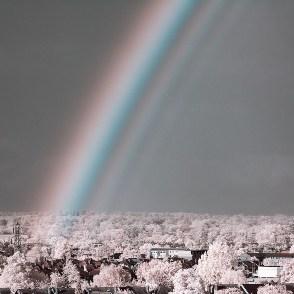
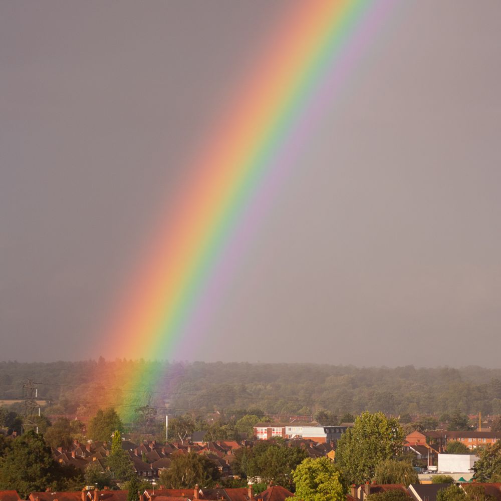
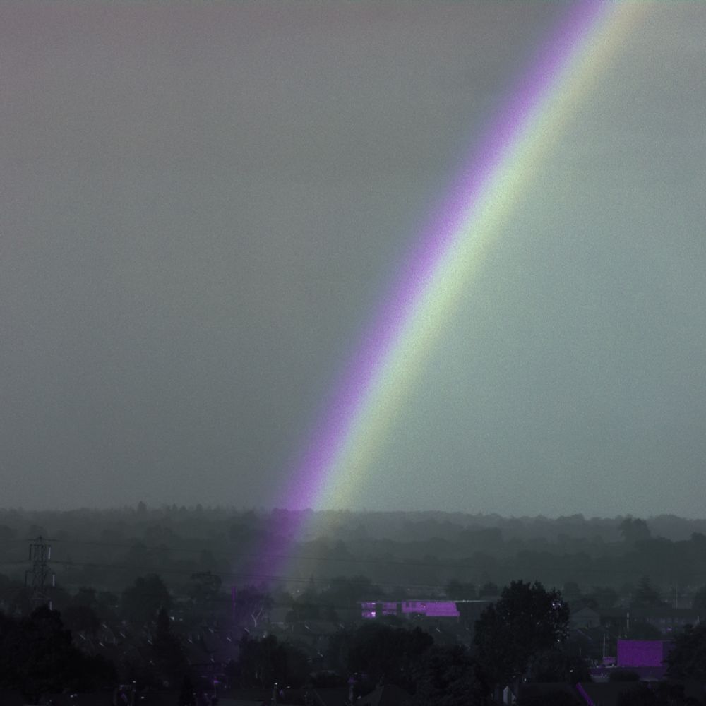
There’s more to rainbows than the human eye can see: here’s how a rainbow extends into the infrared and ultraviolet.
Photos:
1. Infrared
2. Visible (obviously)
3. Ultraviolet, and
4. A composite showing how UV is beyond the violet in a rainbow, and IR beyond the red end.
🧪 #photography
Photos:
1. Infrared
2. Visible (obviously)
3. Ultraviolet, and
4. A composite showing how UV is beyond the violet in a rainbow, and IR beyond the red end.
🧪 #photography

November 21, 2024 at 10:35 AM
There’s more to rainbows than the human eye can see: here’s how a rainbow extends into the infrared and ultraviolet.
Photos:
1. Infrared
2. Visible (obviously)
3. Ultraviolet, and
4. A composite showing how UV is beyond the violet in a rainbow, and IR beyond the red end.
🧪 #photography
Photos:
1. Infrared
2. Visible (obviously)
3. Ultraviolet, and
4. A composite showing how UV is beyond the violet in a rainbow, and IR beyond the red end.
🧪 #photography