Yuri Engelhardt 🌱
@yuriengelhardt.bsky.social
Information Visualisation 📊📉✍🏼 and Climate @ University of Twente
Core projects:
The Languages of Visualization, with Clive Richards
UT Climate Centre @utclimate.bsky.social
LinkedIn: https://linkedin.com/in/yuriengelhardt
Mastodon: https://vis.social/@yuri
Core projects:
The Languages of Visualization, with Clive Richards
UT Climate Centre @utclimate.bsky.social
LinkedIn: https://linkedin.com/in/yuriengelhardt
Mastodon: https://vis.social/@yuri
Pinned
We are organising a conference!
visualisingclimate.com
visualisingclimate.com
Reposted by Yuri Engelhardt 🌱

1) The conference logo was designed by Dr Anna Lombardi @annalombardi.bsky.social, Climate Data Visualiser at the Copernicus Climate Change Service (Copernicus ECMWF @copernicusecmwf.bsky.social ). Her aim: to create an image that sparks curiosity and gently invites people in.

February 11, 2026 at 10:13 AM
1) The conference logo was designed by Dr Anna Lombardi @annalombardi.bsky.social, Climate Data Visualiser at the Copernicus Climate Change Service (Copernicus ECMWF @copernicusecmwf.bsky.social ). Her aim: to create an image that sparks curiosity and gently invites people in.
Bringing science, media, design and art together, for climate crisis awareness:
1) Visualising Climate 2026 is the first global conference dedicated to data visualisation and climate change. 📊🌍
#VisualisingClimate2026
📍 Bologna, Italy 🇮🇹
🗓️ 4–6 November 2026
What is this conference about? 👇
#VisualisingClimate2026
📍 Bologna, Italy 🇮🇹
🗓️ 4–6 November 2026
What is this conference about? 👇
February 4, 2026 at 5:45 PM
Bringing science, media, design and art together, for climate crisis awareness:
Estoy muy emocionado de ser parte de esto!
📊 #VisualisingClimate2026
📊 #VisualisingClimate2026

January 31, 2026 at 11:57 AM
Estoy muy emocionado de ser parte de esto!
📊 #VisualisingClimate2026
📊 #VisualisingClimate2026
Reposted by Yuri Engelhardt 🌱

I am thrilled to co‑organise Visualising Climate with colleagues from Copernicus/ECMWF, BSC, BC3 and the University of Miami—the first global conference at the intersection of climate change and data visualisation, at a moment when clear, actionable communication is essential.
#dataviz #datavis
#dataviz #datavis
Join us in Bologna, Italy, 4–6 Nov 2026 for Visualising Climate — the first global conference fully dedicated to climate data visualization and its power to transform public understanding of a changing planet. Come see the data.
visualisingclimate.org
#VisualisingClimate2026 #DataVis #ClimateCrisis
visualisingclimate.org
#VisualisingClimate2026 #DataVis #ClimateCrisis
January 28, 2026 at 11:11 AM
Reposted by Yuri Engelhardt 🌱

I'm so be happy to be part of the organizing committee of this conference. Join us in Bologna! #dataViz #infographics #dataVisualization #dataJournalism You can submit a proposal for a talk, paper, workshop, etc: visualisingclimate.com/submissions/
January 28, 2026 at 11:09 AM
I'm so be happy to be part of the organizing committee of this conference. Join us in Bologna! #dataViz #infographics #dataVisualization #dataJournalism You can submit a proposal for a talk, paper, workshop, etc: visualisingclimate.com/submissions/
Reposted by Yuri Engelhardt 🌱
Join us in Bologna, Italy, 4–6 Nov 2026 for Visualising Climate — the first global conference fully dedicated to climate data visualization and its power to transform public understanding of a changing planet. Come see the data.
visualisingclimate.org
#VisualisingClimate2026 #DataVis #ClimateCrisis
visualisingclimate.org
#VisualisingClimate2026 #DataVis #ClimateCrisis
January 28, 2026 at 11:01 AM
Join us in Bologna, Italy, 4–6 Nov 2026 for Visualising Climate — the first global conference fully dedicated to climate data visualization and its power to transform public understanding of a changing planet. Come see the data.
visualisingclimate.org
#VisualisingClimate2026 #DataVis #ClimateCrisis
visualisingclimate.org
#VisualisingClimate2026 #DataVis #ClimateCrisis
Reposted by Yuri Engelhardt 🌱

It's official 🎉
Visualising Climate 2026 is here! visualisingclimate.com
First international conference of its kind, it'll bring together artists, scientists, journalists all moved by the same desire to better communicate our changing climate 🌍
🗓️ Join us in Bologna, Nov 4-6
#dataviz #climatecrisis
Visualising Climate 2026 is here! visualisingclimate.com
First international conference of its kind, it'll bring together artists, scientists, journalists all moved by the same desire to better communicate our changing climate 🌍
🗓️ Join us in Bologna, Nov 4-6
#dataviz #climatecrisis
January 28, 2026 at 1:17 PM
It's official 🎉
Visualising Climate 2026 is here! visualisingclimate.com
First international conference of its kind, it'll bring together artists, scientists, journalists all moved by the same desire to better communicate our changing climate 🌍
🗓️ Join us in Bologna, Nov 4-6
#dataviz #climatecrisis
Visualising Climate 2026 is here! visualisingclimate.com
First international conference of its kind, it'll bring together artists, scientists, journalists all moved by the same desire to better communicate our changing climate 🌍
🗓️ Join us in Bologna, Nov 4-6
#dataviz #climatecrisis
Reposted by Yuri Engelhardt 🌱

This will be an excellent conference for anyone interested in climate data and data visualisation.
Join us in Bologna, Italy, 4–6 Nov 2026 for Visualising Climate — the first global conference fully dedicated to climate data visualization and its power to transform public understanding of a changing planet. Come see the data.
visualisingclimate.org
#VisualisingClimate2026 #DataVis #ClimateCrisis
visualisingclimate.org
#VisualisingClimate2026 #DataVis #ClimateCrisis
January 28, 2026 at 1:19 PM
This will be an excellent conference for anyone interested in climate data and data visualisation.
We are organising a conference!
visualisingclimate.com
visualisingclimate.com
January 28, 2026 at 11:21 AM
We are organising a conference!
visualisingclimate.com
visualisingclimate.com
Back from an inspiring week @dagstuhl.de 🏰 castle. 🙏
We explored many aspects of the 🧠 psychology of 📊📈 (climate) visualizations.
I enjoyed fun conversations 💬 with @thoughtafox.bsky.social @drpi.bsky.social @windhagr.bsky.social and many other castle dwellers. 😃
See www.linkedin.com/posts/yurien...
We explored many aspects of the 🧠 psychology of 📊📈 (climate) visualizations.
I enjoyed fun conversations 💬 with @thoughtafox.bsky.social @drpi.bsky.social @windhagr.bsky.social and many other castle dwellers. 😃
See www.linkedin.com/posts/yurien...

December 21, 2025 at 9:09 PM
Back from an inspiring week @dagstuhl.de 🏰 castle. 🙏
We explored many aspects of the 🧠 psychology of 📊📈 (climate) visualizations.
I enjoyed fun conversations 💬 with @thoughtafox.bsky.social @drpi.bsky.social @windhagr.bsky.social and many other castle dwellers. 😃
See www.linkedin.com/posts/yurien...
We explored many aspects of the 🧠 psychology of 📊📈 (climate) visualizations.
I enjoyed fun conversations 💬 with @thoughtafox.bsky.social @drpi.bsky.social @windhagr.bsky.social and many other castle dwellers. 😃
See www.linkedin.com/posts/yurien...
Reposted by Yuri Engelhardt 🌱

Never forget: At breakneck speed we are leaving the stable Holocene climate in which human society developed and thrived. Weather extremes are outside historical experience. Sea-level rise is accelerating. Dangerous tipping points are ahead.
Graph: ed-hawkins.github.io/climate-visu...
Graph: ed-hawkins.github.io/climate-visu...

November 13, 2025 at 11:52 AM
Never forget: At breakneck speed we are leaving the stable Holocene climate in which human society developed and thrived. Weather extremes are outside historical experience. Sea-level rise is accelerating. Dangerous tipping points are ahead.
Graph: ed-hawkins.github.io/climate-visu...
Graph: ed-hawkins.github.io/climate-visu...
How can relationships between different types of visualization be represented visually? How can we visualize the information visualization ‘design space’? This is Bryan Chen's Master thesis project – you can help by exploring the visuals & answering the questions at: forms.fillout.com/t/sYLcKghThrus


August 19, 2025 at 5:00 AM
How can relationships between different types of visualization be represented visually? How can we visualize the information visualization ‘design space’? This is Bryan Chen's Master thesis project – you can help by exploring the visuals & answering the questions at: forms.fillout.com/t/sYLcKghThrus
An alternative to plotting time: instead, use the horizontal axis to plot a second variable, and animate the chart to show changes over time (also used by the great Hans Rosling)

A long long time ago, in a far away galaxy... the US used to tax the rich
May 24, 2025 at 2:39 PM
An alternative to plotting time: instead, use the horizontal axis to plot a second variable, and animate the chart to show changes over time (also used by the great Hans Rosling)
Visualizing abstract numbers / actual human beings ... visualizingpalestine.org/gaza-names/e...

Remember their names
Naming the Palestinians who have been killed in Gaza
visualizingpalestine.org
May 23, 2025 at 12:24 PM
Visualizing abstract numbers / actual human beings ... visualizingpalestine.org/gaza-names/e...
Reposted by Yuri Engelhardt 🌱
The European State of the Climate 2024 report is OUT!
A joint effort by @copernicusecmwf.bsky.social & @wmo-global.bsky.social
Read it & explore all additional resources which include a Graphics gallery, infographics, animations! Enjoy 😊 climate.copernicus.eu/esotc/2024
#dataviz #climate #ESOTC2024
A joint effort by @copernicusecmwf.bsky.social & @wmo-global.bsky.social
Read it & explore all additional resources which include a Graphics gallery, infographics, animations! Enjoy 😊 climate.copernicus.eu/esotc/2024
#dataviz #climate #ESOTC2024


April 15, 2025 at 6:50 AM
The European State of the Climate 2024 report is OUT!
A joint effort by @copernicusecmwf.bsky.social & @wmo-global.bsky.social
Read it & explore all additional resources which include a Graphics gallery, infographics, animations! Enjoy 😊 climate.copernicus.eu/esotc/2024
#dataviz #climate #ESOTC2024
A joint effort by @copernicusecmwf.bsky.social & @wmo-global.bsky.social
Read it & explore all additional resources which include a Graphics gallery, infographics, animations! Enjoy 😊 climate.copernicus.eu/esotc/2024
#dataviz #climate #ESOTC2024
Reposted by Yuri Engelhardt 🌱

Hello, Bluesky! 👋 I'm an HCI & data visualization researcher, currently exploring AI-driven climate communication. Looking to connect with folks in #HCI, #DataViz, #ClimateChange, and #Academia. Who else is here?

March 27, 2025 at 8:09 PM
Hello, Bluesky! 👋 I'm an HCI & data visualization researcher, currently exploring AI-driven climate communication. Looking to connect with folks in #HCI, #DataViz, #ClimateChange, and #Academia. Who else is here?
Reposted by Yuri Engelhardt 🌱

There are a few days left to apply for The Club of Rome Communication Fellowship, a remote, paid 7-month opportunity for early-career professionals interested in sustainability and systems change. Apply now ➡️ shorturl.at/rRMpw
#Communications #Fellowship
#Communications #Fellowship

March 4, 2025 at 10:00 AM
There are a few days left to apply for The Club of Rome Communication Fellowship, a remote, paid 7-month opportunity for early-career professionals interested in sustainability and systems change. Apply now ➡️ shorturl.at/rRMpw
#Communications #Fellowship
#Communications #Fellowship
Reposted by Yuri Engelhardt 🌱

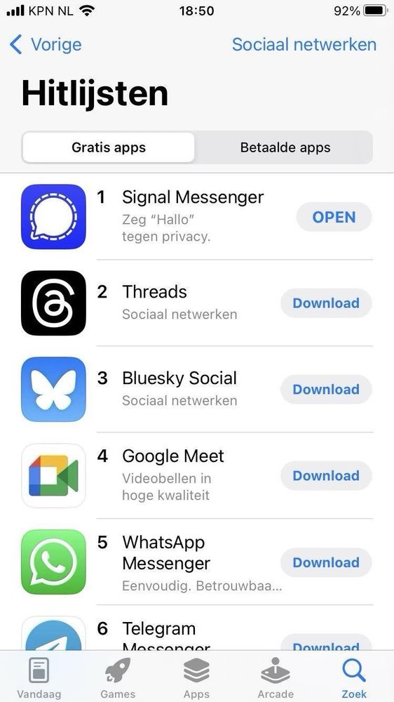
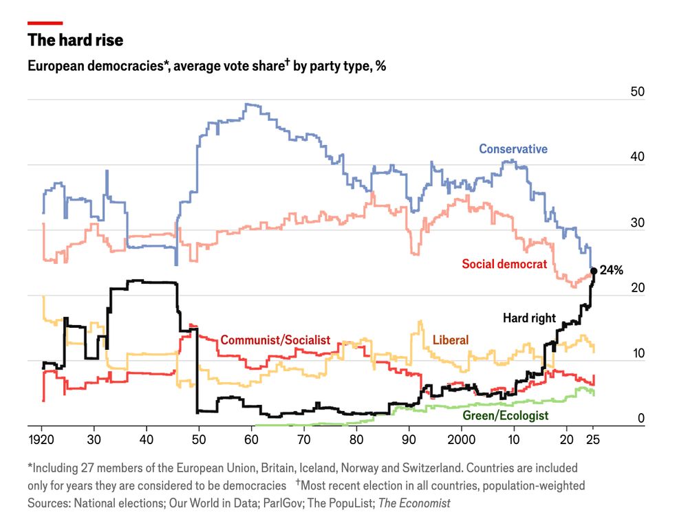
After the AfD's surge on Sunday, far right parties are the most voted-for of any grouping in Europe, for the first time in history: www.economist.com/graphic-deta...
February 28, 2025 at 5:32 PM
After the AfD's surge on Sunday, far right parties are the most voted-for of any grouping in Europe, for the first time in history: www.economist.com/graphic-deta...
Join us online on Thu 20 March 18:00–19:00 CET:
*Visualising climate science*
by Angela Morelli
Visualisation is a powerful tool for navigating the complexity of climate change. However, visualising climate science can confuse, misinform or polarise.
Register at: www.eventbrite.at/e/iiid-conve...
*Visualising climate science*
by Angela Morelli
Visualisation is a powerful tool for navigating the complexity of climate change. However, visualising climate science can confuse, misinform or polarise.
Register at: www.eventbrite.at/e/iiid-conve...

March 1, 2025 at 8:45 AM
Join us online on Thu 20 March 18:00–19:00 CET:
*Visualising climate science*
by Angela Morelli
Visualisation is a powerful tool for navigating the complexity of climate change. However, visualising climate science can confuse, misinform or polarise.
Register at: www.eventbrite.at/e/iiid-conve...
*Visualising climate science*
by Angela Morelli
Visualisation is a powerful tool for navigating the complexity of climate change. However, visualising climate science can confuse, misinform or polarise.
Register at: www.eventbrite.at/e/iiid-conve...
Reposted by Yuri Engelhardt 🌱

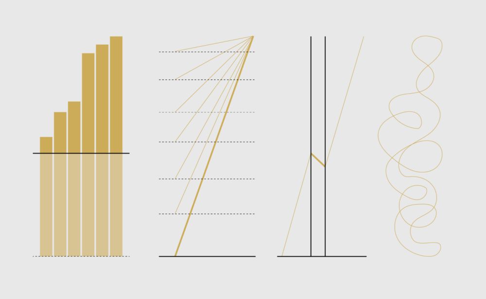
Dishonest charts are coming from all directions, and they're only going to hit harder. Unless we push back. So, an interactive guide: Defense Against Dishonest Charts flowingdata.com/projects/dis...
Defense Against Dishonest Charts
This is a guide to protect ourselves and to preserve what is good about turning data into visual things.
flowingdata.com
February 13, 2025 at 9:45 PM
Dishonest charts are coming from all directions, and they're only going to hit harder. Unless we push back. So, an interactive guide: Defense Against Dishonest Charts flowingdata.com/projects/dis...
Reposted by Yuri Engelhardt 🌱

“Never before has the danger of climate change been so evident and the response so cavalier.”

The great climate disconnect
New attempts to prolong the fossil fuel era have come at precisely the wrong time
on.ft.com
February 12, 2025 at 7:30 AM
“Never before has the danger of climate change been so evident and the response so cavalier.”
Reposted by Yuri Engelhardt 🌱
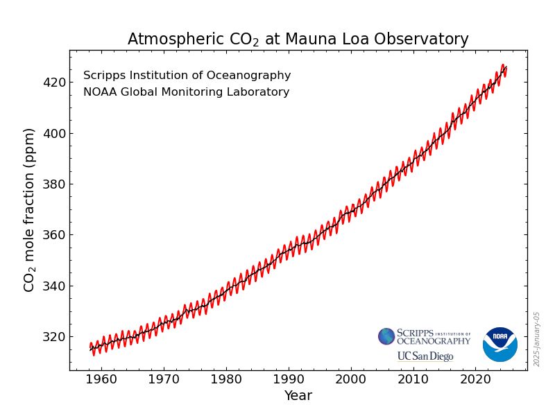
The most iconic figure in the environmental sciences is the Keeling Curve, the CO₂ record from Mauna Loa, Hawaii.
@noaa.gov had a wonderful site where you could visualize and download these data, and now it's just gone. These data belong to us and we should not let this happen!
@noaa.gov had a wonderful site where you could visualize and download these data, and now it's just gone. These data belong to us and we should not let this happen!
February 5, 2025 at 11:38 AM
The most iconic figure in the environmental sciences is the Keeling Curve, the CO₂ record from Mauna Loa, Hawaii.
@noaa.gov had a wonderful site where you could visualize and download these data, and now it's just gone. These data belong to us and we should not let this happen!
@noaa.gov had a wonderful site where you could visualize and download these data, and now it's just gone. These data belong to us and we should not let this happen!
Reposted by Yuri Engelhardt 🌱
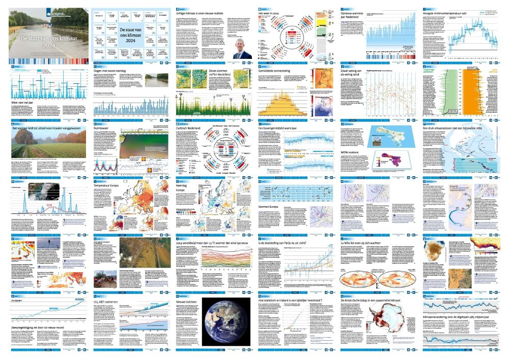
The Dutch @knmi.bsky.social Institute has just published ‘De Staat van het Klimaat 2024’, showing worrisome climate-related developments in very good visualizations.
You can flip through (and download) the full report here: cdn.knmi.nl/system/data_...
@maartenvanaalst.bsky.social @fruys.bsky.social
You can flip through (and download) the full report here: cdn.knmi.nl/system/data_...
@maartenvanaalst.bsky.social @fruys.bsky.social
January 31, 2025 at 8:49 PM
The Dutch @knmi.bsky.social Institute has just published ‘De Staat van het Klimaat 2024’, showing worrisome climate-related developments in very good visualizations.
You can flip through (and download) the full report here: cdn.knmi.nl/system/data_...
@maartenvanaalst.bsky.social @fruys.bsky.social
You can flip through (and download) the full report here: cdn.knmi.nl/system/data_...
@maartenvanaalst.bsky.social @fruys.bsky.social
Reposted by Yuri Engelhardt 🌱