


Aman Bhargava
@aman.bh
data/dev/design/map enthusiast
Data viz and development @revisual.co, interned @graphics.reuters.com
Bangalore, India
#dataviz #rstats #svelte #maps
🔗 https://aman.bh
Data viz and development @revisual.co, interned @graphics.reuters.com
Bangalore, India
#dataviz #rstats #svelte #maps
🔗 https://aman.bh
Pinned
Aman Bhargava
@aman.bh
· Dec 10

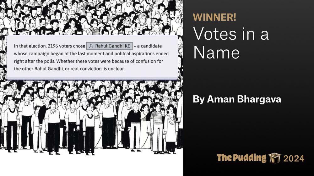
Well wow. This is my first award and I'm so happy it comes from people I've looked up to for many years, who are also a big reason I'm interested in all of this to begin with.
Have a read 🙂
Have a read 🙂
Can Bangalore's bus service be better? Of course. But as it stands right now, for me, it is the best invitation into the city. A few words of praise.
aman.bh/blog/2025/pr...
aman.bh/blog/2025/pr...

Praise be to the BMTC | Aman Bhargava
Praise be to the BMTC, for I am roaming the city more.
aman.bh
November 18, 2025 at 4:49 PM
Can Bangalore's bus service be better? Of course. But as it stands right now, for me, it is the best invitation into the city. A few words of praise.
aman.bh/blog/2025/pr...
aman.bh/blog/2025/pr...
I jumped from my chair
⛰️🏔️ Episode 20 is now available for all subscribers! 🏔️⛰️
In this episode, we look at the amazing story of the Achaemenid Persian Empire.
With readings in Old Persian and Ancient Greek, find out how the world's largest empire rose, flourished, and finally fell in ash and flame.
In this episode, we look at the amazing story of the Achaemenid Persian Empire.
With readings in Old Persian and Ancient Greek, find out how the world's largest empire rose, flourished, and finally fell in ash and flame.

20. Persia - An Empire in Ashes **Now available for subscribers!** | Fall of Civilizations Podcast
Get more from Fall of Civilizations Podcast on Patreon
www.patreon.com
November 6, 2025 at 11:20 AM
I jumped from my chair
Could someone help me understand why most of Manhattan has no color in this map by @nytimes.com, showing Mamdani and Cuomo voters by 'commute type'? Is it not either public transit or cars, why is most blank? Can I find this broken down by type of transit (subway, buses) for these areas? #dataviz

November 5, 2025 at 11:02 AM
Could someone help me understand why most of Manhattan has no color in this map by @nytimes.com, showing Mamdani and Cuomo voters by 'commute type'? Is it not either public transit or cars, why is most blank? Can I find this broken down by type of transit (subway, buses) for these areas? #dataviz
"Their timing proved crucial. Had they started even a few months later, years of censorship data would have vanished".
A nice profile of our project in The Frontline. This wasn't just #dataviz but also data acquisition, which is a painful process in India.
frontline.thehindu.com/arts-and-cul...
A nice profile of our project in The Frontline. This wasn't just #dataviz but also data acquisition, which is a painful process in India.
frontline.thehindu.com/arts-and-cul...
October 31, 2025 at 3:40 PM
"Their timing proved crucial. Had they started even a few months later, years of censorship data would have vanished".
A nice profile of our project in The Frontline. This wasn't just #dataviz but also data acquisition, which is a painful process in India.
frontline.thehindu.com/arts-and-cul...
A nice profile of our project in The Frontline. This wasn't just #dataviz but also data acquisition, which is a painful process in India.
frontline.thehindu.com/arts-and-cul...
A thread of some design/code highlights for me from our 'How Bangalore Uses the Metro' 📊 project.
1. The header sign is fully HTML/CSS. 'Go Down Take Up For Toilet' is real signage at one of our biggest stations (pic below) :P
1. The header sign is fully HTML/CSS. 'Go Down Take Up For Toilet' is real signage at one of our biggest stations (pic below) :P
October 3, 2025 at 4:17 PM
A thread of some design/code highlights for me from our 'How Bangalore Uses the Metro' 📊 project.
1. The header sign is fully HTML/CSS. 'Go Down Take Up For Toilet' is real signage at one of our biggest stations (pic below) :P
1. The header sign is fully HTML/CSS. 'Go Down Take Up For Toilet' is real signage at one of our biggest stations (pic below) :P
Filed a Right to Information request with Bangalore's metro authority asking how many people traveled on the metro and got a file with 1.2M rows of data! We break our findings down in this story on how Bangalore uses the metro. w/
@vonter.bsky.social #dataviz
diagramchasing.fun/2025/how-ban...
@vonter.bsky.social #dataviz
diagramchasing.fun/2025/how-ban...


October 1, 2025 at 5:29 PM
Filed a Right to Information request with Bangalore's metro authority asking how many people traveled on the metro and got a file with 1.2M rows of data! We break our findings down in this story on how Bangalore uses the metro. w/
@vonter.bsky.social #dataviz
diagramchasing.fun/2025/how-ban...
@vonter.bsky.social #dataviz
diagramchasing.fun/2025/how-ban...
Reposted by Aman Bhargava

A great post from @djnavarro.net, providing an accessible explanation of why statistics that can appear to reveal our ignorance may actually do the opposite. Makes excellent use of #datavis to provide visual support for the argument.
blog.djnavarro.net/posts/2025-0...
blog.djnavarro.net/posts/2025-0...

Some notes on probability judgement – Notes from a data witch
For the love of fuck, literally nobody thinks that 20% of the population is transgender. Please stop sharing that ridiculous YouGov statistic
blog.djnavarro.net
September 28, 2025 at 7:04 AM
A great post from @djnavarro.net, providing an accessible explanation of why statistics that can appear to reveal our ignorance may actually do the opposite. Makes excellent use of #datavis to provide visual support for the argument.
blog.djnavarro.net/posts/2025-0...
blog.djnavarro.net/posts/2025-0...
Experiments in visualizing crowds in Bangalore's metro station. The floor plans come in SVG formats, so I solved this by managing to constrain rendering clusters within a polygon with a certain color code (platform color is always consistent) :P
September 25, 2025 at 2:15 PM
Experiments in visualizing crowds in Bangalore's metro station. The floor plans come in SVG formats, so I solved this by managing to constrain rendering clusters within a polygon with a certain color code (platform color is always consistent) :P
Today, @vonter.bsky.social and I launched cbfc.watch, an archive of over 100k censorship records for ~18k movies released in India since 2017. For the first time, you can search for any movie and see how they were modified before release.
The site is fun to explore, but here's some #dataviz in it!
The site is fun to explore, but here's some #dataviz in it!


September 14, 2025 at 6:33 PM
Today, @vonter.bsky.social and I launched cbfc.watch, an archive of over 100k censorship records for ~18k movies released in India since 2017. For the first time, you can search for any movie and see how they were modified before release.
The site is fun to explore, but here's some #dataviz in it!
The site is fun to explore, but here's some #dataviz in it!
Reposted by Aman Bhargava

I've written a short blog post introducing "The Art of Visualization with ggplot2"!
This book is all about the end-to-end process of creating charts with #ggplot2 📊 including data wrangling, sketching, and styling your plots!
nrennie.rbind.io/blog/art-of-...
#RStats #DataViz #TidyTuesday
This book is all about the end-to-end process of creating charts with #ggplot2 📊 including data wrangling, sketching, and styling your plots!
nrennie.rbind.io/blog/art-of-...
#RStats #DataViz #TidyTuesday

Introducing The Art of Visualization with ggplot2 – Nicola Rennie
I’ve written a book! This blog post gives a brief introduction to The Art of Visualization with ggplot2, a book of data visualization case studies showing the end-to-end process of building charts, st...
nrennie.rbind.io
September 11, 2025 at 2:32 PM
I've written a short blog post introducing "The Art of Visualization with ggplot2"!
This book is all about the end-to-end process of creating charts with #ggplot2 📊 including data wrangling, sketching, and styling your plots!
nrennie.rbind.io/blog/art-of-...
#RStats #DataViz #TidyTuesday
This book is all about the end-to-end process of creating charts with #ggplot2 📊 including data wrangling, sketching, and styling your plots!
nrennie.rbind.io/blog/art-of-...
#RStats #DataViz #TidyTuesday
Reposted by Aman Bhargava

The Art of Data Visualization with ggplot2: A free online book by @nrennie.bsky.social that guides us through the entire process of creating plots, including why certain decisions were made, using real datasets that have been part of #TidyTuesday. Very excited to get stuck into this one. #rstats

The Art of Data Visualization with ggplot2
The TidyTuesday Cookbook
nrennie.rbind.io
September 11, 2025 at 8:41 PM
The Art of Data Visualization with ggplot2: A free online book by @nrennie.bsky.social that guides us through the entire process of creating plots, including why certain decisions were made, using real datasets that have been part of #TidyTuesday. Very excited to get stuck into this one. #rstats
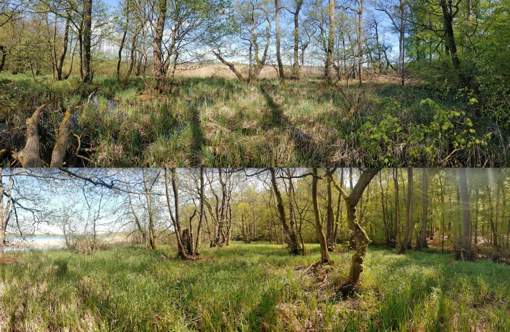
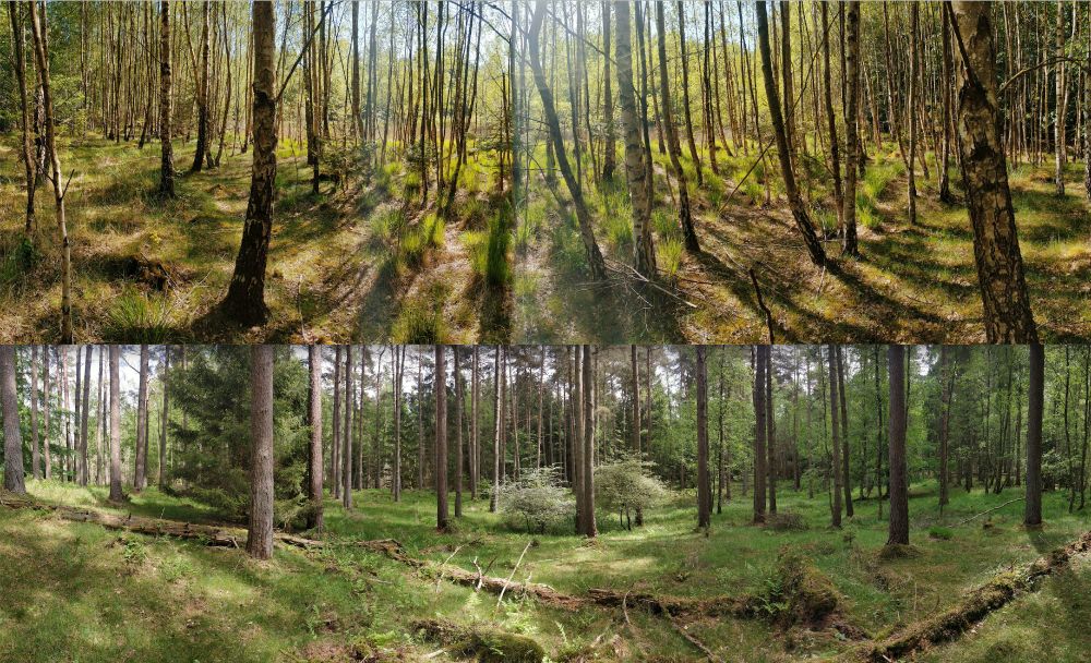
Big into doing long walks now. This is a 31 km walk I did from central Bangalore through the peripheries so I could get to the other end of a newly opened metro line and ride it back.

September 2, 2025 at 11:42 AM
Big into doing long walks now. This is a 31 km walk I did from central Bangalore through the peripheries so I could get to the other end of a newly opened metro line and ride it back.
Reposted by Aman Bhargava
Frog calling patterns (as recorded by app users) for this week's #tidytuesday
Highly recommend curating data if you haven't already - I thought it would be tricky but it was straightforward! Just follow these steps dslc-io.github.io/tidytuesdayR...
Code: jessjep.github.io/blog/posts/t...
#frogID
Highly recommend curating data if you haven't already - I thought it would be tricky but it was straightforward! Just follow these steps dslc-io.github.io/tidytuesdayR...
Code: jessjep.github.io/blog/posts/t...
#frogID

September 2, 2025 at 3:59 AM
Frog calling patterns (as recorded by app users) for this week's #tidytuesday
Highly recommend curating data if you haven't already - I thought it would be tricky but it was straightforward! Just follow these steps dslc-io.github.io/tidytuesdayR...
Code: jessjep.github.io/blog/posts/t...
#frogID
Highly recommend curating data if you haven't already - I thought it would be tricky but it was straightforward! Just follow these steps dslc-io.github.io/tidytuesdayR...
Code: jessjep.github.io/blog/posts/t...
#frogID
Hmm, is it possible for people like me who graduated with a degree in design but want to do a master's in something like statistics? I have a deep interest in data and some experience building and doing stuff, like at diagramchasing.fun and aman.bh but I would love to study the core subject more.
August 26, 2025 at 5:53 PM
Hmm, is it possible for people like me who graduated with a degree in design but want to do a master's in something like statistics? I have a deep interest in data and some experience building and doing stuff, like at diagramchasing.fun and aman.bh but I would love to study the core subject more.
Reposted by Aman Bhargava

(kindly share)
I'm selling photos to raise money private medical help for a severe - quite lifeshortening - immune damaging disease I have, #MECFS, outside the coverage of public health.
There are some good nature photos in any event ;)
More info here:
payhip.com/MiskaKnapek/...
I'm selling photos to raise money private medical help for a severe - quite lifeshortening - immune damaging disease I have, #MECFS, outside the coverage of public health.
There are some good nature photos in any event ;)
More info here:
payhip.com/MiskaKnapek/...

July 27, 2025 at 8:36 AM
(kindly share)
I'm selling photos to raise money private medical help for a severe - quite lifeshortening - immune damaging disease I have, #MECFS, outside the coverage of public health.
There are some good nature photos in any event ;)
More info here:
payhip.com/MiskaKnapek/...
I'm selling photos to raise money private medical help for a severe - quite lifeshortening - immune damaging disease I have, #MECFS, outside the coverage of public health.
There are some good nature photos in any event ;)
More info here:
payhip.com/MiskaKnapek/...
Reposted by Aman Bhargava
Would be interesting to see how you did that.
I can see uses in my courses
I can see uses in my courses
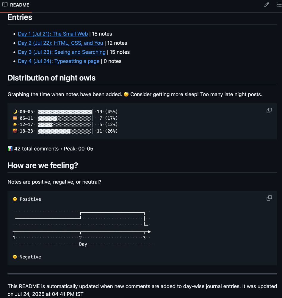
Can a README file become a "dashboard" with #dataviz? Maybe.
My web design module has students submitting daily journal entries as Github Issues, which means I can use the API and Github Actions to do all sorts of neat stuff. Simple processing and throw in some ASCII charts, you have a live dash.
My web design module has students submitting daily journal entries as Github Issues, which means I can use the API and Github Actions to do all sorts of neat stuff. Simple processing and throw in some ASCII charts, you have a live dash.
July 25, 2025 at 1:32 AM
Would be interesting to see how you did that.
I can see uses in my courses
I can see uses in my courses
Can a README file become a "dashboard" with #dataviz? Maybe.
My web design module has students submitting daily journal entries as Github Issues, which means I can use the API and Github Actions to do all sorts of neat stuff. Simple processing and throw in some ASCII charts, you have a live dash.
My web design module has students submitting daily journal entries as Github Issues, which means I can use the API and Github Actions to do all sorts of neat stuff. Simple processing and throw in some ASCII charts, you have a live dash.
July 24, 2025 at 3:42 PM
Can a README file become a "dashboard" with #dataviz? Maybe.
My web design module has students submitting daily journal entries as Github Issues, which means I can use the API and Github Actions to do all sorts of neat stuff. Simple processing and throw in some ASCII charts, you have a live dash.
My web design module has students submitting daily journal entries as Github Issues, which means I can use the API and Github Actions to do all sorts of neat stuff. Simple processing and throw in some ASCII charts, you have a live dash.
Love the real-use examples!!

Since you folks seem to like lengthy threads, let's look at visualizing distributions. I'll visualize one data set 16 ways and give some other examples of each chart type. #dataViz
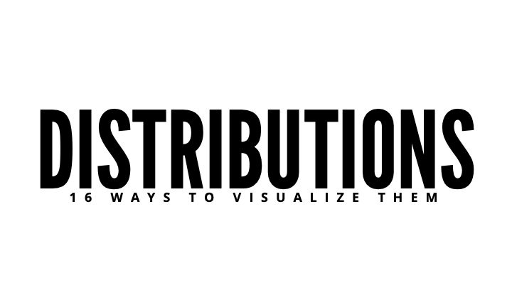
July 17, 2025 at 12:10 PM
Love the real-use examples!!
I'm collecting examples of beautiful/unique/well-made personal sites for a class on web design. Preferably sites of non-tech folks (writers, artists, designers), any suggestions? #indieweb
July 16, 2025 at 1:48 PM
I'm collecting examples of beautiful/unique/well-made personal sites for a class on web design. Preferably sites of non-tech folks (writers, artists, designers), any suggestions? #indieweb
Reposted by Aman Bhargava

the 200th edition of. the Dataviz Dispatch from @datawrapper.de features a history of the series, how they choose figures, and why they link to paywalled articles. Well worth a read, as always: www.datawrapper.de/blog/data-vi...
📊
📊

Data Vis Dispatch, July 8: 200th edition â behind the scenes, Q&A, and new features | Datawrapper Blog
The best of last weekâs big and small data visualizations
www.datawrapper.de
July 11, 2025 at 5:49 PM
the 200th edition of. the Dataviz Dispatch from @datawrapper.de features a history of the series, how they choose figures, and why they link to paywalled articles. Well worth a read, as always: www.datawrapper.de/blog/data-vi...
📊
📊
Reposted by Aman Bhargava

I've written an explainer blog post for my "data strips" #dataviz workbench web app, trying alternative 1-D distribution summary plots. rawdatastudies.com/2025/07/05/d...

Data Strips Experiment
I built a “Data Strips” app to experiment with new ways of graphically summarizing the distribution of a single variable.. You can try it out or access the code on GitHub. This post wil…
rawdatastudies.com
July 6, 2025 at 3:52 PM
I've written an explainer blog post for my "data strips" #dataviz workbench web app, trying alternative 1-D distribution summary plots. rawdatastudies.com/2025/07/05/d...

July 2, 2025 at 6:54 PM
Reposted by Aman Bhargava

I especially enjoy (?) UEFA and their bizarre tournament structures, makes for a fun sankey:

June 30, 2025 at 5:24 PM
I especially enjoy (?) UEFA and their bizarre tournament structures, makes for a fun sankey:
In 2025 for a course on web design should someone be learning js/css/html specifics from scratch, or focus more on or design thinking/judgment/intuition + enough code to get you started.
How would you rather learn? I am not against LLMs for code (only PMF, imo) so trying to understand the balance.
How would you rather learn? I am not against LLMs for code (only PMF, imo) so trying to understand the balance.
July 2, 2025 at 2:23 PM
In 2025 for a course on web design should someone be learning js/css/html specifics from scratch, or focus more on or design thinking/judgment/intuition + enough code to get you started.
How would you rather learn? I am not against LLMs for code (only PMF, imo) so trying to understand the balance.
How would you rather learn? I am not against LLMs for code (only PMF, imo) so trying to understand the balance.
Reposted by Aman Bhargava

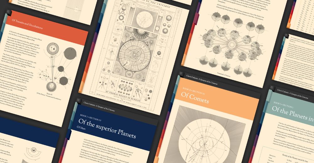
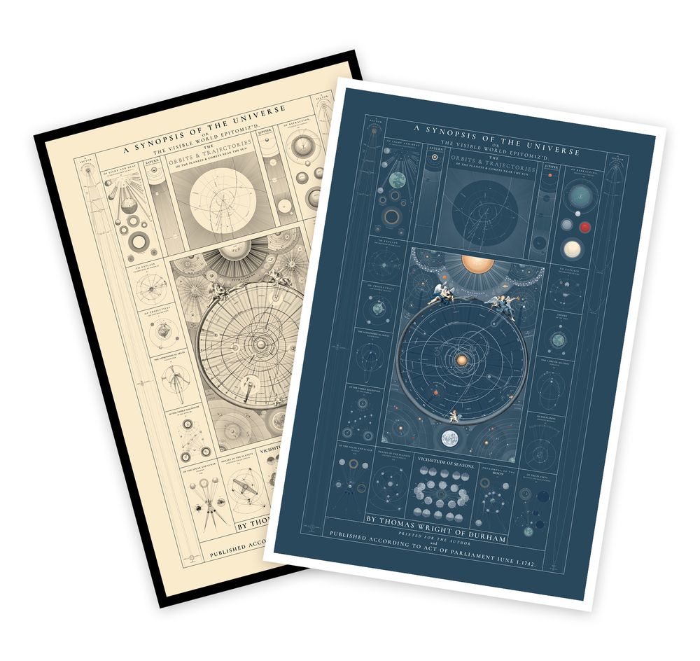
New: I recreated Tomas Wright’s 1742 astronomical treatise, Clavis Cælestis, and its accompanying sheets titled A Synopsis of the Universe. New posters are available in antique style and modern colors.
Explore: www.c82.net/clavis-caele...
How it was made: www.c82.net/blog/?id=99
Explore: www.c82.net/clavis-caele...
How it was made: www.c82.net/blog/?id=99


May 24, 2025 at 7:01 PM
New: I recreated Tomas Wright’s 1742 astronomical treatise, Clavis Cælestis, and its accompanying sheets titled A Synopsis of the Universe. New posters are available in antique style and modern colors.
Explore: www.c82.net/clavis-caele...
How it was made: www.c82.net/blog/?id=99
Explore: www.c82.net/clavis-caele...
How it was made: www.c82.net/blog/?id=99