


Daniel Zvinca
@danz68.bsky.social
A bit of everything, recreational math, mechanical engineer, programmer, statistics, dataviz.
Monotonizing data.
Classical PAV: monotone but step-flattened.
TPM: monotone and trend-faithful, maintaining readable dynamics such as endpoints, mass, slope continuity, inflection timing, and relative growth/decay patterns.
Classical PAV: monotone but step-flattened.
TPM: monotone and trend-faithful, maintaining readable dynamics such as endpoints, mass, slope continuity, inflection timing, and relative growth/decay patterns.

October 20, 2025 at 7:30 PM
Monotonizing data.
Classical PAV: monotone but step-flattened.
TPM: monotone and trend-faithful, maintaining readable dynamics such as endpoints, mass, slope continuity, inflection timing, and relative growth/decay patterns.
Classical PAV: monotone but step-flattened.
TPM: monotone and trend-faithful, maintaining readable dynamics such as endpoints, mass, slope continuity, inflection timing, and relative growth/decay patterns.
Are you aware of any data visualization designs that use optical illusions to enhance the intended message?

May 27, 2025 at 10:55 AM
Are you aware of any data visualization designs that use optical illusions to enhance the intended message?
The Point Frequency Histogram (PFH) is a novel (??), simple, and highly effective visual method for accurately estimating the local density of data points.
www.linkedin.com/posts/daniel...
www.linkedin.com/posts/daniel...

Point Frequency Histogram: a bias-free, per-point density estimator | Daniel Zvinca
The Point Frequency Histogram (PFH) is a simple, and highly effective visual method for accurately estimating the local density of data points. By defining a window around each data point and counting...
www.linkedin.com
April 13, 2025 at 12:44 AM
The Point Frequency Histogram (PFH) is a novel (??), simple, and highly effective visual method for accurately estimating the local density of data points.
www.linkedin.com/posts/daniel...
www.linkedin.com/posts/daniel...
It was an exciting experience meeting so many statistical geeks in one place. Meeting @xangregg.bsky.social in person after more than a decade of social media debates was a particular delight. As he said, we could have talked forever.

Back home after a few busy days in Berlin.
1. Presented at JMP Discovery Summit Europe
2. Met density dots inventor @danz68.bsky.social in person
3. Attended excellent Einstein Award colloquium featuring @elisabethbik.bsky.social @brandonstell.bsky.social @helenajambor.bsky.social
1. Presented at JMP Discovery Summit Europe
2. Met density dots inventor @danz68.bsky.social in person
3. Attended excellent Einstein Award colloquium featuring @elisabethbik.bsky.social @brandonstell.bsky.social @helenajambor.bsky.social

March 15, 2025 at 1:02 PM
It was an exciting experience meeting so many statistical geeks in one place. Meeting @xangregg.bsky.social in person after more than a decade of social media debates was a particular delight. As he said, we could have talked forever.
Reposted by Daniel Zvinca

Should we restart the debate about smoothed lines?

The rest of our peers are making progress to cut emissions while Canada is uniquely behind. We need to dispense with this idea emissions reductions are too difficult to do fast & the idea international climate diplomacy is pointless. It's working elsewhere.
www.nationalobserver.com/2024/11/18/a...
www.nationalobserver.com/2024/11/18/a...
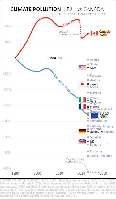
November 18, 2024 at 5:22 PM
Should we restart the debate about smoothed lines?
Joe Rogan and Donald Trump talking over a connected scatter plot. Didn't expect that. Anyway, triggered by a this thread www.linkedin.com/posts/merod_...
I decided to reinterpret the same data without using the time connected scatterplot designed by Max Roser ourworldindata.org/us-life-expe....
I decided to reinterpret the same data without using the time connected scatterplot designed by Max Roser ourworldindata.org/us-life-expe....


October 29, 2024 at 4:06 PM
Joe Rogan and Donald Trump talking over a connected scatter plot. Didn't expect that. Anyway, triggered by a this thread www.linkedin.com/posts/merod_...
I decided to reinterpret the same data without using the time connected scatterplot designed by Max Roser ourworldindata.org/us-life-expe....
I decided to reinterpret the same data without using the time connected scatterplot designed by Max Roser ourworldindata.org/us-life-expe....
I spent quite a bit of time developing the density dots plot graphics. Originally intended as a replacement for the beeswarms, it soon evolved into a complex graphical encoding technique.
A bridge between the descriptive and inferential aspects of distributions, a quantile and a density estimator.
A bridge between the descriptive and inferential aspects of distributions, a quantile and a density estimator.

September 10, 2024 at 9:37 PM
I spent quite a bit of time developing the density dots plot graphics. Originally intended as a replacement for the beeswarms, it soon evolved into a complex graphical encoding technique.
A bridge between the descriptive and inferential aspects of distributions, a quantile and a density estimator.
A bridge between the descriptive and inferential aspects of distributions, a quantile and a density estimator.
A place to resurrect my dataviz hobby.
Here you go. 🫡
Please share widely to help develop the dataviz community of Bluesky. 📊
go.bsky.app/R3nSyyy
Please share widely to help develop the dataviz community of Bluesky. 📊
go.bsky.app/R3nSyyy
September 2, 2024 at 4:04 AM
A place to resurrect my dataviz hobby.
Looking into the evolution of the relationship between two variables. Using the normalized covariance parts to encode the systematic relationship (how the change of one is reflected in the change of the other). Using different smoothing degrees for interpretation.


March 24, 2024 at 2:08 PM
Looking into the evolution of the relationship between two variables. Using the normalized covariance parts to encode the systematic relationship (how the change of one is reflected in the change of the other). Using different smoothing degrees for interpretation.
Triggered by Carlos Barboza LinkedIn post,
www.linkedin.com/feed/update/...
this is how a density dots plot design looks using the very same data (yearly cycle perspective).
www.linkedin.com/feed/update/...
this is how a density dots plot design looks using the very same data (yearly cycle perspective).

March 11, 2024 at 1:19 PM
Triggered by Carlos Barboza LinkedIn post,
www.linkedin.com/feed/update/...
this is how a density dots plot design looks using the very same data (yearly cycle perspective).
www.linkedin.com/feed/update/...
this is how a density dots plot design looks using the very same data (yearly cycle perspective).
Reposted by Daniel Zvinca
World Geo Histogram ??
Not exactly a histogram and the geo is only West -- East, but this timeline of civilizations/dynasties has a sort of organic flow. Note how the USSR is handled.
From: www.pinterest.ca/pin/14080623...
Not exactly a histogram and the geo is only West -- East, but this timeline of civilizations/dynasties has a sort of organic flow. Note how the USSR is handled.
From: www.pinterest.ca/pin/14080623...

December 18, 2023 at 12:55 AM
World Geo Histogram ??
Not exactly a histogram and the geo is only West -- East, but this timeline of civilizations/dynasties has a sort of organic flow. Note how the USSR is handled.
From: www.pinterest.ca/pin/14080623...
Not exactly a histogram and the geo is only West -- East, but this timeline of civilizations/dynasties has a sort of organic flow. Note how the USSR is handled.
From: www.pinterest.ca/pin/14080623...
Reposted by Daniel Zvinca

I'm happy to welcome you at bsky @xangregg.bsky.social 🙌
In the best days of Twitter, Xan was sharing exceptionally deep #dataviz takes (I never understood why he didn't amass x10 or x100 followers)
Just look at one of the many cool explorations he shared spontaneously 🤩
x.com/xangregg/sta...
In the best days of Twitter, Xan was sharing exceptionally deep #dataviz takes (I never understood why he didn't amass x10 or x100 followers)
Just look at one of the many cool explorations he shared spontaneously 🤩
x.com/xangregg/sta...
x.com
November 4, 2023 at 2:09 PM
I'm happy to welcome you at bsky @xangregg.bsky.social 🙌
In the best days of Twitter, Xan was sharing exceptionally deep #dataviz takes (I never understood why he didn't amass x10 or x100 followers)
Just look at one of the many cool explorations he shared spontaneously 🤩
x.com/xangregg/sta...
In the best days of Twitter, Xan was sharing exceptionally deep #dataviz takes (I never understood why he didn't amass x10 or x100 followers)
Just look at one of the many cool explorations he shared spontaneously 🤩
x.com/xangregg/sta...