


Daniel Zvinca
@danz68.bsky.social
A bit of everything, recreational math, mechanical engineer, programmer, statistics, dataviz.
Monotonizing data.
Classical PAV: monotone but step-flattened.
TPM: monotone and trend-faithful, maintaining readable dynamics such as endpoints, mass, slope continuity, inflection timing, and relative growth/decay patterns.
Classical PAV: monotone but step-flattened.
TPM: monotone and trend-faithful, maintaining readable dynamics such as endpoints, mass, slope continuity, inflection timing, and relative growth/decay patterns.

October 20, 2025 at 7:30 PM
Monotonizing data.
Classical PAV: monotone but step-flattened.
TPM: monotone and trend-faithful, maintaining readable dynamics such as endpoints, mass, slope continuity, inflection timing, and relative growth/decay patterns.
Classical PAV: monotone but step-flattened.
TPM: monotone and trend-faithful, maintaining readable dynamics such as endpoints, mass, slope continuity, inflection timing, and relative growth/decay patterns.
Are you aware of any data visualization designs that use optical illusions to enhance the intended message?

May 27, 2025 at 10:55 AM
Are you aware of any data visualization designs that use optical illusions to enhance the intended message?
Here is the result of my NEW frequency dot plot, an arrangement based on data density calculation using the dot size as resolution (granularity). This result actually validates the basic beeswarm packing for this dataset. Beeswarms are often poor density estimators due to their packing artifacts.

May 6, 2025 at 9:50 AM
Here is the result of my NEW frequency dot plot, an arrangement based on data density calculation using the dot size as resolution (granularity). This result actually validates the basic beeswarm packing for this dataset. Beeswarms are often poor density estimators due to their packing artifacts.
My "best" guess is in the first image (truly, just a guess, no idea how good that is). Then I try to fit the dots as good as I consider is needed, starting from the optimal pack (hexagonal) to no errors at all. The final shape resemblances my "best" guess, an 0.2x error looking like this:

February 20, 2025 at 4:14 PM
My "best" guess is in the first image (truly, just a guess, no idea how good that is). Then I try to fit the dots as good as I consider is needed, starting from the optimal pack (hexagonal) to no errors at all. The final shape resemblances my "best" guess, an 0.2x error looking like this:
I think that the exploratory phase ends when we are confident enough that we found the density shape (iteratively challenging continuity, gaps, tails). Once we get there, we do our best to fit the available data by minimizing the error placement and/or overlapping, depending on the method.

February 20, 2025 at 4:06 PM
I think that the exploratory phase ends when we are confident enough that we found the density shape (iteratively challenging continuity, gaps, tails). Once we get there, we do our best to fit the available data by minimizing the error placement and/or overlapping, depending on the method.
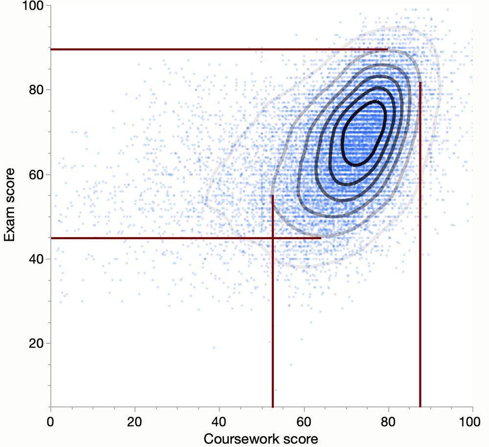
In a scatterplot, the visual shape of the distribution (ellipse or circle) is influenced by the scaling of the axes. Adjusting the scales can transform a 0 or 90deg oriented ellipse into a circle. This means the elongation might be a plotting artifact rather than a true feature of the data.
December 8, 2024 at 7:18 PM
In a scatterplot, the visual shape of the distribution (ellipse or circle) is influenced by the scaling of the axes. Adjusting the scales can transform a 0 or 90deg oriented ellipse into a circle. This means the elongation might be a plotting artifact rather than a true feature of the data.
Joe Rogan and Donald Trump talking over a connected scatter plot. Didn't expect that. Anyway, triggered by a this thread www.linkedin.com/posts/merod_...
I decided to reinterpret the same data without using the time connected scatterplot designed by Max Roser ourworldindata.org/us-life-expe....
I decided to reinterpret the same data without using the time connected scatterplot designed by Max Roser ourworldindata.org/us-life-expe....


October 29, 2024 at 4:06 PM
Joe Rogan and Donald Trump talking over a connected scatter plot. Didn't expect that. Anyway, triggered by a this thread www.linkedin.com/posts/merod_...
I decided to reinterpret the same data without using the time connected scatterplot designed by Max Roser ourworldindata.org/us-life-expe....
I decided to reinterpret the same data without using the time connected scatterplot designed by Max Roser ourworldindata.org/us-life-expe....
I admit, I feel a bit rusty. Positions need a bit of rework, better randomization, better surrounding spaces, etc.
Main idea, several perspectives (different contexts) of the same world (of 100 people).
Main idea, several perspectives (different contexts) of the same world (of 100 people).

September 26, 2024 at 9:58 PM
I admit, I feel a bit rusty. Positions need a bit of rework, better randomization, better surrounding spaces, etc.
Main idea, several perspectives (different contexts) of the same world (of 100 people).
Main idea, several perspectives (different contexts) of the same world (of 100 people).
(last one, I promise)
If is possible to trade some vertical space (or dot size) the overlapping can be improved even further.
If is possible to trade some vertical space (or dot size) the overlapping can be improved even further.


September 12, 2024 at 10:21 AM
(last one, I promise)
If is possible to trade some vertical space (or dot size) the overlapping can be improved even further.
If is possible to trade some vertical space (or dot size) the overlapping can be improved even further.
The beeswarm does an acceptable job for this dataset, and other layering technique will also work because of its nature.
Attached another arrangement (same dot size and space), with precise encoding of both the distribution shape and the dots position, without noticeable visual patterns/artifacts.
Attached another arrangement (same dot size and space), with precise encoding of both the distribution shape and the dots position, without noticeable visual patterns/artifacts.

September 12, 2024 at 10:00 AM
The beeswarm does an acceptable job for this dataset, and other layering technique will also work because of its nature.
Attached another arrangement (same dot size and space), with precise encoding of both the distribution shape and the dots position, without noticeable visual patterns/artifacts.
Attached another arrangement (same dot size and space), with precise encoding of both the distribution shape and the dots position, without noticeable visual patterns/artifacts.
A direct comparison between the adjusted by tolerance shape (colored area made of 25k dots) and the theoretical KDE (the line). Local modes are maintained (different heights, though), boundaries are adjusted according with the tolerance constraint, lovely smoothness.
The tradeoff? See below.
The tradeoff? See below.

September 12, 2024 at 7:22 AM
A direct comparison between the adjusted by tolerance shape (colored area made of 25k dots) and the theoretical KDE (the line). Local modes are maintained (different heights, though), boundaries are adjusted according with the tolerance constraint, lovely smoothness.
The tradeoff? See below.
The tradeoff? See below.
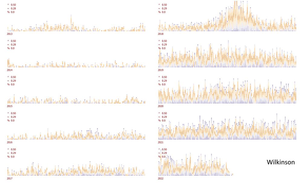
I have nothing against small multiples with different scales.
One technique I've suggested in the past is a heatmap/line chart combo, which, besides individual decoding improvement, it also makes the scale distinction clear and it guards against magnitude comparison.
(see the attached sequence)
One technique I've suggested in the past is a heatmap/line chart combo, which, besides individual decoding improvement, it also makes the scale distinction clear and it guards against magnitude comparison.
(see the attached sequence)


September 11, 2024 at 5:28 PM
I have nothing against small multiples with different scales.
One technique I've suggested in the past is a heatmap/line chart combo, which, besides individual decoding improvement, it also makes the scale distinction clear and it guards against magnitude comparison.
(see the attached sequence)
One technique I've suggested in the past is a heatmap/line chart combo, which, besides individual decoding improvement, it also makes the scale distinction clear and it guards against magnitude comparison.
(see the attached sequence)
For comparison, the same dataset without tolerance adjustment (max error 2.15 dots, one dot=20).

September 10, 2024 at 10:11 PM
For comparison, the same dataset without tolerance adjustment (max error 2.15 dots, one dot=20).
Another real life dataset (25000 values, I don't remember the meaning of the values, I used it for testing for so long), color encoding the dots tolerance. The top graphs encode the distribution of the quantile error BEFORE (left) and AFTER (right) applying the tolerance constraint of one dot.

September 10, 2024 at 10:08 PM
Another real life dataset (25000 values, I don't remember the meaning of the values, I used it for testing for so long), color encoding the dots tolerance. The top graphs encode the distribution of the quantile error BEFORE (left) and AFTER (right) applying the tolerance constraint of one dot.
Each dot encodes a price with a tolerance of 500 rupees (the data set contains rental prices in one region of India).
A seriously vertically squeezed Wilkinson dot plot (unit histogram) for comparison (the dot piles are much higher).
A seriously vertically squeezed Wilkinson dot plot (unit histogram) for comparison (the dot piles are much higher).

September 10, 2024 at 9:52 PM
Each dot encodes a price with a tolerance of 500 rupees (the data set contains rental prices in one region of India).
A seriously vertically squeezed Wilkinson dot plot (unit histogram) for comparison (the dot piles are much higher).
A seriously vertically squeezed Wilkinson dot plot (unit histogram) for comparison (the dot piles are much higher).
I spent quite a bit of time developing the density dots plot graphics. Originally intended as a replacement for the beeswarms, it soon evolved into a complex graphical encoding technique.
A bridge between the descriptive and inferential aspects of distributions, a quantile and a density estimator.
A bridge between the descriptive and inferential aspects of distributions, a quantile and a density estimator.

September 10, 2024 at 9:37 PM
I spent quite a bit of time developing the density dots plot graphics. Originally intended as a replacement for the beeswarms, it soon evolved into a complex graphical encoding technique.
A bridge between the descriptive and inferential aspects of distributions, a quantile and a density estimator.
A bridge between the descriptive and inferential aspects of distributions, a quantile and a density estimator.
A tuned version: less long vertical gaps, smoother shape, more symmetrical. Each dot encodes precisely the value, it uses a minimal overlapping optimizer (regular random approach doesn't work) shape accurately (in statistical sense) encodes the population distribution.

September 10, 2024 at 4:32 PM
A tuned version: less long vertical gaps, smoother shape, more symmetrical. Each dot encodes precisely the value, it uses a minimal overlapping optimizer (regular random approach doesn't work) shape accurately (in statistical sense) encodes the population distribution.
I am not sure that this variation using low discrepancy quasirandom placement of the dots requires a dedicated name. But tuning the dots placement within a small tolerance, can improve the selectivity (more evenly distributed dots).
(matching the Winkinson dots plot precision of 0.5x dot size)
(matching the Winkinson dots plot precision of 0.5x dot size)

September 9, 2024 at 6:27 PM
I am not sure that this variation using low discrepancy quasirandom placement of the dots requires a dedicated name. But tuning the dots placement within a small tolerance, can improve the selectivity (more evenly distributed dots).
(matching the Winkinson dots plot precision of 0.5x dot size)
(matching the Winkinson dots plot precision of 0.5x dot size)
An enlarged size of the dot, introduces unavoidable overlap, yet totally readable, each dot being individually accessible.

September 9, 2024 at 6:08 PM
An enlarged size of the dot, introduces unavoidable overlap, yet totally readable, each dot being individually accessible.
This version trades off the packing compactness. For the given dataset, there is no overlapping because the available space is enough. If the available space becomes narrower, then overlapping is unavoidable.

September 9, 2024 at 5:59 PM
This version trades off the packing compactness. For the given dataset, there is no overlapping because the available space is enough. If the available space becomes narrower, then overlapping is unavoidable.
The density dots plot follows closely the population density, much closer than Wilkinson dots plot, trading off the values precision which, in my implementation, cannot go below the packing grid specs (hexagonal or rectangular packing).
(attached a max one dot size placement error on an hex-layout)
(attached a max one dot size placement error on an hex-layout)

September 9, 2024 at 5:45 PM
The density dots plot follows closely the population density, much closer than Wilkinson dots plot, trading off the values precision which, in my implementation, cannot go below the packing grid specs (hexagonal or rectangular packing).
(attached a max one dot size placement error on an hex-layout)
(attached a max one dot size placement error on an hex-layout)
The "visual artifact of U-shaped dot stacks that misrepresent the structure of the data" was one of the triggers for creating the Density Dots Plot.
Read Leland Wilkinson's reply to Beeswarm Plot article (www.r-statistics.com/2011/03/bees...).
Read Leland Wilkinson's reply to Beeswarm Plot article (www.r-statistics.com/2011/03/bees...).

September 9, 2024 at 5:36 PM
The "visual artifact of U-shaped dot stacks that misrepresent the structure of the data" was one of the triggers for creating the Density Dots Plot.
Read Leland Wilkinson's reply to Beeswarm Plot article (www.r-statistics.com/2011/03/bees...).
Read Leland Wilkinson's reply to Beeswarm Plot article (www.r-statistics.com/2011/03/bees...).

Looking into the evolution of the relationship between two variables. Using the normalized covariance parts to encode the systematic relationship (how the change of one is reflected in the change of the other). Using different smoothing degrees for interpretation.


March 24, 2024 at 2:08 PM
Looking into the evolution of the relationship between two variables. Using the normalized covariance parts to encode the systematic relationship (how the change of one is reflected in the change of the other). Using different smoothing degrees for interpretation.
KDE encoding wins by a serious margin to Wilkinson, KDE's max error placement is a half and average error is a quarter from Wilkinson's stats. The 5% overlapping dots area trade-off is almost unnoticeable.

March 11, 2024 at 10:17 PM
KDE encoding wins by a serious margin to Wilkinson, KDE's max error placement is a half and average error is a quarter from Wilkinson's stats. The 5% overlapping dots area trade-off is almost unnoticeable.