


Cédric Scherer
@cedricscherer.com
🧙♂️✨📊
Independent Data Visualization Designer, Consultant & Instructor | available for projects and workshops
All things data & design with #rstats, #ggplot2, #Figma, #DataWrapper, #Flourish, and more
Co-Founder of the #30DayChartChallenge
Independent Data Visualization Designer, Consultant & Instructor | available for projects and workshops
All things data & design with #rstats, #ggplot2, #Figma, #DataWrapper, #Flourish, and more
Co-Founder of the #30DayChartChallenge
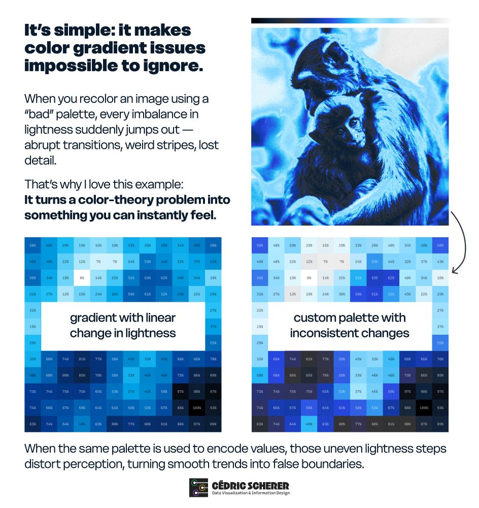
The magick package to load the image and extract the channels. And then ggplot to draw the pixels and map the color to the lightness values.
October 28, 2025 at 7:31 PM
The magick package to load the image and extract the channels. And then ggplot to draw the pixels and map the color to the lightness values.
I first saw it when Fabio recolored his friend Phil 😅
bsky.app/profile/cedr...
bsky.app/profile/cedr...
The first time I saw this approach was this post by @fabiocrameri.ch: x.com/fcrameri/sta...
Some more serious examples are featured in his paper "The misuse of colour in science communication"
👉 www.nature.com/articles/s41...
Some more serious examples are featured in his paper "The misuse of colour in science communication"
👉 www.nature.com/articles/s41...

The misuse of colour in science communication - Nature Communications
The accurate representation of data is essential in science communication, however, colour maps that visually distort data through uneven colour gradients or are unreadable to those with colour vision...
www.nature.com
October 28, 2025 at 4:47 PM
I first saw it when Fabio recolored his friend Phil 😅
bsky.app/profile/cedr...
bsky.app/profile/cedr...
The first time I saw this approach was this post by @fabiocrameri.ch: x.com/fcrameri/sta...
Some more serious examples are featured in his paper "The misuse of colour in science communication"
👉 www.nature.com/articles/s41...
Some more serious examples are featured in his paper "The misuse of colour in science communication"
👉 www.nature.com/articles/s41...
The misuse of colour in science communication - Nature Communications
The accurate representation of data is essential in science communication, however, colour maps that visually distort data through uneven colour gradients or are unreadable to those with colour vision...
www.nature.com
October 28, 2025 at 4:46 PM
The first time I saw this approach was this post by @fabiocrameri.ch: x.com/fcrameri/sta...
Some more serious examples are featured in his paper "The misuse of colour in science communication"
👉 www.nature.com/articles/s41...
Some more serious examples are featured in his paper "The misuse of colour in science communication"
👉 www.nature.com/articles/s41...
Richard takes wonderful photographs!
More here: www.instagram.com/richard.stro...
More here: www.instagram.com/richard.stro...

October 28, 2025 at 4:44 PM
Richard takes wonderful photographs!
More here: www.instagram.com/richard.stro...
More here: www.instagram.com/richard.stro...

Today, I extended my framework: the template now also shows the lightness profile and a generic heatmap using the same palette.
The latter is inspired by the Palette Finder from Yan, that is integrated into our latest #ggplot2 [un]charted lesson.
👉 www.ggplot2-uncharted.com/module2/pale...
The latter is inspired by the Palette Finder from Yan, that is integrated into our latest #ggplot2 [un]charted lesson.
👉 www.ggplot2-uncharted.com/module2/pale...

October 28, 2025 at 4:40 PM
Today, I extended my framework: the template now also shows the lightness profile and a generic heatmap using the same palette.
The latter is inspired by the Palette Finder from Yan, that is integrated into our latest #ggplot2 [un]charted lesson.
👉 www.ggplot2-uncharted.com/module2/pale...
The latter is inspired by the Palette Finder from Yan, that is integrated into our latest #ggplot2 [un]charted lesson.
👉 www.ggplot2-uncharted.com/module2/pale...
It’s simple: applying the palette to the lightness values of a photo makes color gradient issues impossible to ignore.
A corporate palette that looks great in a brand guide can quickly fall apart on an image: abrupt jumps, lost detail, strange banding.
A corporate palette that looks great in a brand guide can quickly fall apart on an image: abrupt jumps, lost detail, strange banding.
October 28, 2025 at 4:35 PM
It’s simple: applying the palette to the lightness values of a photo makes color gradient issues impossible to ignore.
A corporate palette that looks great in a brand guide can quickly fall apart on an image: abrupt jumps, lost detail, strange banding.
A corporate palette that looks great in a brand guide can quickly fall apart on an image: abrupt jumps, lost detail, strange banding.
I completely missed that you wrote a TidyTuesday book! Congrats!!
October 24, 2025 at 10:16 AM
I completely missed that you wrote a TidyTuesday book! Congrats!!
Wonderful colors, but be careful as many of them are not working well in a dataviz context due to several limitations for both, numeric and categorical encodings 😢
October 24, 2025 at 10:10 AM
Wonderful colors, but be careful as many of them are not working well in a dataviz context due to several limitations for both, numeric and categorical encodings 😢
Sorry! For some reason, it included a quotation mark mistakenly. Here is the correct URL: www.ggplot2-uncharted.com/module2/colo...
(And yes, it's the course together I develop together with Yan Holtz)
(And yes, it's the course together I develop together with Yan Holtz)

Color Choice | ggplot2 Uncharted
Master color choice for data visualizations: palette types, purposes, and accessibility tips for clear, inclusive charts.
www.ggplot2-uncharted.com
October 23, 2025 at 4:27 PM
Sorry! For some reason, it included a quotation mark mistakenly. Here is the correct URL: www.ggplot2-uncharted.com/module2/colo...
(And yes, it's the course together I develop together with Yan Holtz)
(And yes, it's the course together I develop together with Yan Holtz)
The one featured in the photograph is called Bonnie 🐱
October 19, 2025 at 9:33 AM
The one featured in the photograph is called Bonnie 🐱
The inconsistency of spaces is bothering me much more 😅
September 25, 2025 at 8:34 AM
The inconsistency of spaces is bothering me much more 😅
While they look great, be careful — several palettes are not colorblind-friendly or lack perceptual uniformity.
August 18, 2025 at 8:50 AM
While they look great, be careful — several palettes are not colorblind-friendly or lack perceptual uniformity.
ggiraph-user-2025
Plot Twist: Adding Interactivity to the Elegance of ggplot2 with ggiraph
z3tt.github.io
August 2, 2025 at 12:26 PM
Now also linked in the repository, together with a gallery image showcasing the featured examples and direct links to the codes.
August 2, 2025 at 12:23 PM
Now also linked in the repository, together with a gallery image showcasing the featured examples and direct links to the codes.
Yes, they are!
z3tt.github.io/ggiraph-user...
z3tt.github.io/ggiraph-user...
Plot Twist
z3tt.github.io
August 2, 2025 at 11:49 AM
Yes, they are!
z3tt.github.io/ggiraph-user...
z3tt.github.io/ggiraph-user...
Slides are available, too - see my other comment :)
August 2, 2025 at 11:37 AM
Slides are available, too - see my other comment :)