


Cédric Scherer
@cedricscherer.com
🧙♂️✨📊
Independent Data Visualization Designer, Consultant & Instructor | available for projects and workshops
All things data & design with #rstats, #ggplot2, #Figma, #DataWrapper, #Flourish, and more
Co-Founder of the #30DayChartChallenge
Independent Data Visualization Designer, Consultant & Instructor | available for projects and workshops
All things data & design with #rstats, #ggplot2, #Figma, #DataWrapper, #Flourish, and more
Co-Founder of the #30DayChartChallenge
Richard takes wonderful photographs!
More here: www.instagram.com/richard.stro...
More here: www.instagram.com/richard.stro...

October 28, 2025 at 4:44 PM
Richard takes wonderful photographs!
More here: www.instagram.com/richard.stro...
More here: www.instagram.com/richard.stro...

Today, I extended my framework: the template now also shows the lightness profile and a generic heatmap using the same palette.
The latter is inspired by the Palette Finder from Yan, that is integrated into our latest #ggplot2 [un]charted lesson.
👉 www.ggplot2-uncharted.com/module2/pale...
The latter is inspired by the Palette Finder from Yan, that is integrated into our latest #ggplot2 [un]charted lesson.
👉 www.ggplot2-uncharted.com/module2/pale...

October 28, 2025 at 4:40 PM
Today, I extended my framework: the template now also shows the lightness profile and a generic heatmap using the same palette.
The latter is inspired by the Palette Finder from Yan, that is integrated into our latest #ggplot2 [un]charted lesson.
👉 www.ggplot2-uncharted.com/module2/pale...
The latter is inspired by the Palette Finder from Yan, that is integrated into our latest #ggplot2 [un]charted lesson.
👉 www.ggplot2-uncharted.com/module2/pale...
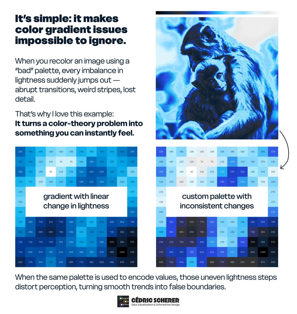
It’s simple: applying the palette to the lightness values of a photo makes color gradient issues impossible to ignore.
A corporate palette that looks great in a brand guide can quickly fall apart on an image: abrupt jumps, lost detail, strange banding.
A corporate palette that looks great in a brand guide can quickly fall apart on an image: abrupt jumps, lost detail, strange banding.
October 28, 2025 at 4:35 PM
It’s simple: applying the palette to the lightness values of a photo makes color gradient issues impossible to ignore.
A corporate palette that looks great in a brand guide can quickly fall apart on an image: abrupt jumps, lost detail, strange banding.
A corporate palette that looks great in a brand guide can quickly fall apart on an image: abrupt jumps, lost detail, strange banding.
🦧📉 Why are there colorful apes in my #dataviz workshops?
📸 The photo taken years ago by my friend Richard Strozynski has become a tradition in my client projects and courses.
I like to recolor it with different palettes to show how palette design affects perception.
Thread 👇
📸 The photo taken years ago by my friend Richard Strozynski has become a tradition in my client projects and courses.
I like to recolor it with different palettes to show how palette design affects perception.
Thread 👇

October 28, 2025 at 4:32 PM
🦧📉 Why are there colorful apes in my #dataviz workshops?
📸 The photo taken years ago by my friend Richard Strozynski has become a tradition in my client projects and courses.
I like to recolor it with different palettes to show how palette design affects perception.
Thread 👇
📸 The photo taken years ago by my friend Richard Strozynski has become a tradition in my client projects and courses.
I like to recolor it with different palettes to show how palette design affects perception.
Thread 👇
🌏 A compact snapshot on where people live around the globe (2023 data) — over 60% of #humans live in #Asia!
I originally created a more basic version for our new #ggplot2 [un]charted lesson on 🎨 "Color Choice" to discuss color accessibility:
👉 www.ggplot2-uncharted.com/module2/colo...
I originally created a more basic version for our new #ggplot2 [un]charted lesson on 🎨 "Color Choice" to discuss color accessibility:
👉 www.ggplot2-uncharted.com/module2/colo...

October 22, 2025 at 3:56 PM
🌏 A compact snapshot on where people live around the globe (2023 data) — over 60% of #humans live in #Asia!
I originally created a more basic version for our new #ggplot2 [un]charted lesson on 🎨 "Color Choice" to discuss color accessibility:
👉 www.ggplot2-uncharted.com/module2/colo...
I originally created a more basic version for our new #ggplot2 [un]charted lesson on 🎨 "Color Choice" to discuss color accessibility:
👉 www.ggplot2-uncharted.com/module2/colo...
📸 Fun photoshoot yesterday!
Finally updating the profile pic and those “hard at work” photos.
Behind-the-scenes outtake: new office, new favorite mug, new kitten… and me, mid-shrug, wondering how people do this gracefully 😄🤷
Finally updating the profile pic and those “hard at work” photos.
Behind-the-scenes outtake: new office, new favorite mug, new kitten… and me, mid-shrug, wondering how people do this gracefully 😄🤷

October 17, 2025 at 12:43 PM
📸 Fun photoshoot yesterday!
Finally updating the profile pic and those “hard at work” photos.
Behind-the-scenes outtake: new office, new favorite mug, new kitten… and me, mid-shrug, wondering how people do this gracefully 😄🤷
Finally updating the profile pic and those “hard at work” photos.
Behind-the-scenes outtake: new office, new favorite mug, new kitten… and me, mid-shrug, wondering how people do this gracefully 😄🤷
Chart crimes are everywhere. I ate it.

August 18, 2025 at 8:46 AM
Chart crimes are everywhere. I ate it.
July 25, 2025 at 11:37 AM
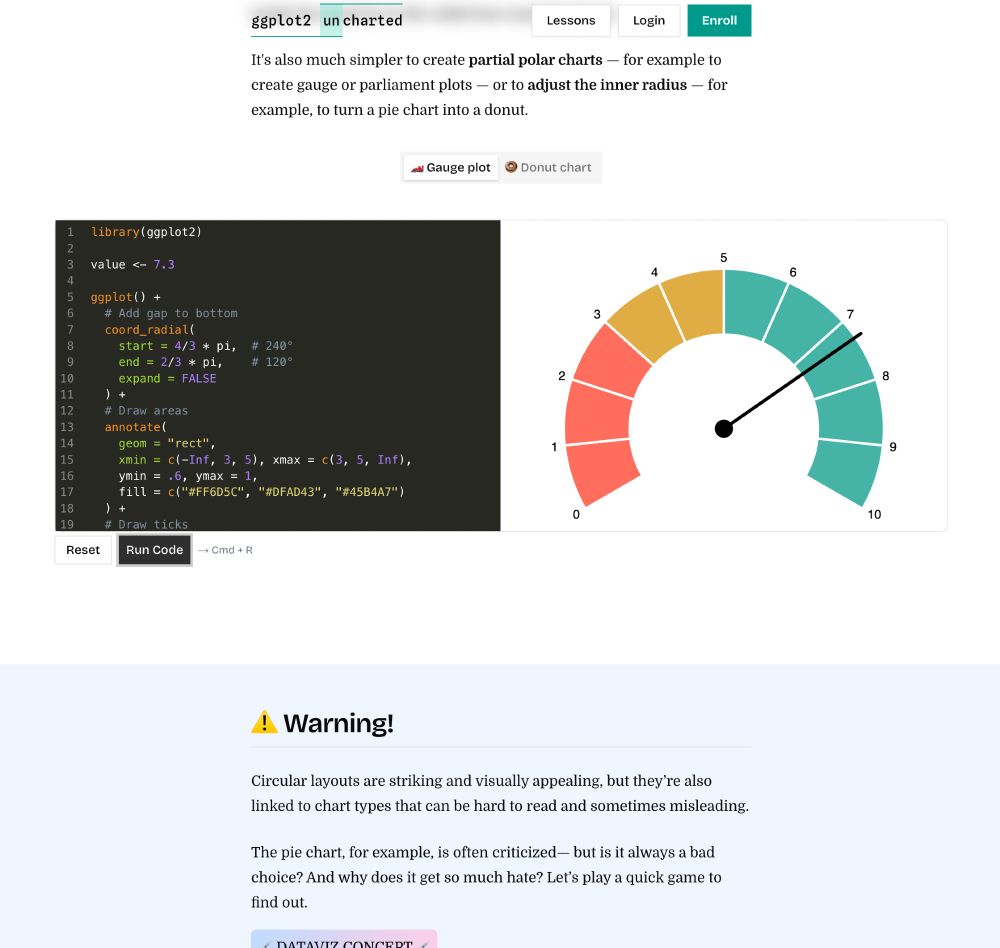
The version in our online "ggplot2 [un]charted" workshop to illustrate how to create partial radial plots with #ggplot2 — part of the lesson "Coordinate Systems: Setting the Stage for Your Plot"
www.ggplot2-uncharted.com/module1/coor...
www.ggplot2-uncharted.com/module1/coor...
July 23, 2025 at 3:48 PM
The version in our online "ggplot2 [un]charted" workshop to illustrate how to create partial radial plots with #ggplot2 — part of the lesson "Coordinate Systems: Setting the Stage for Your Plot"
www.ggplot2-uncharted.com/module1/coor...
www.ggplot2-uncharted.com/module1/coor...
Last week, I crafted my first-ever gauge chart 🏎️ to showcase partial radial plots for our #ggplot2 [un]charted lesson on "coordinate systems"
Thanks to coord_radial(), partial circles like those are super easy now — and of course I couldn’t resist making a polished and animated version 💅📽️ #rstats
Thanks to coord_radial(), partial circles like those are super easy now — and of course I couldn’t resist making a polished and animated version 💅📽️ #rstats
July 23, 2025 at 3:43 PM
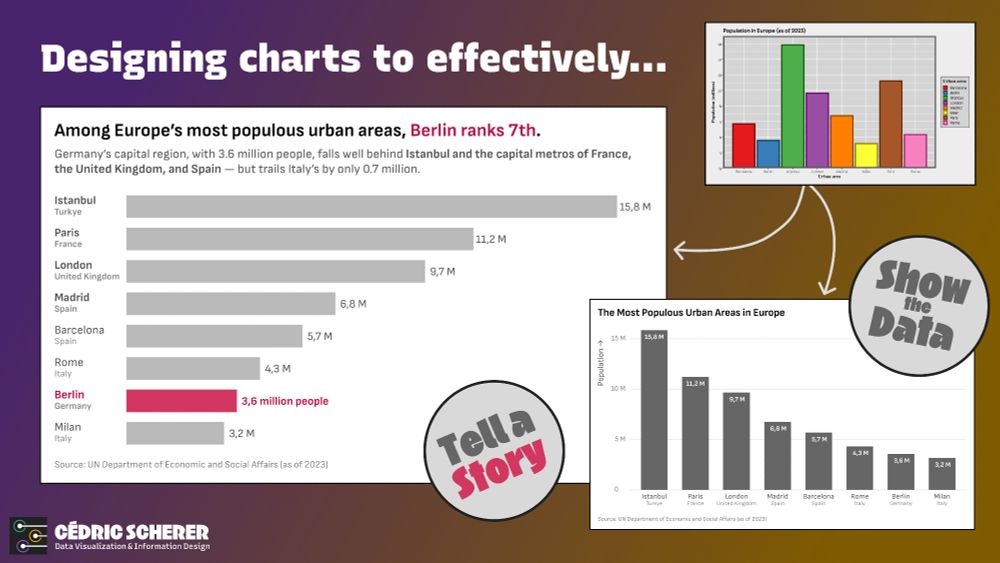
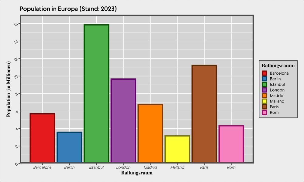
Two redesigns of the cluttered bar chart on Europe’s largest urban areas 📊
Two reworked variants — same data, different goals:
show the data vs. tell a story.
Decluttering, refocusing, adding context, and using visual emphasis can turn a chart into insight.
#dataviz #ggplot2 #rstats #tidyverse
Two reworked variants — same data, different goals:
show the data vs. tell a story.
Decluttering, refocusing, adding context, and using visual emphasis can turn a chart into insight.
#dataviz #ggplot2 #rstats #tidyverse
July 18, 2025 at 2:57 PM
Two redesigns of the cluttered bar chart on Europe’s largest urban areas 📊
Two reworked variants — same data, different goals:
show the data vs. tell a story.
Decluttering, refocusing, adding context, and using visual emphasis can turn a chart into insight.
#dataviz #ggplot2 #rstats #tidyverse
Two reworked variants — same data, different goals:
show the data vs. tell a story.
Decluttering, refocusing, adding context, and using visual emphasis can turn a chart into insight.
#dataviz #ggplot2 #rstats #tidyverse
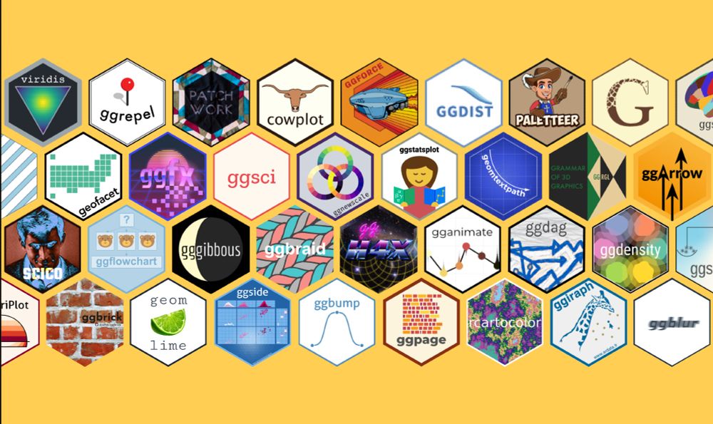
Why do we 💙 #ggplot2?
Yes, it's for the Grammar!
But also for the passionate and supportive community — and their steady contributions to the ggplot2 universe: all the extension packages 🧩 that take its impressive flexibility even further, making it more powerful and beautiful 🙌
#rstats #tidyverse
Yes, it's for the Grammar!
But also for the passionate and supportive community — and their steady contributions to the ggplot2 universe: all the extension packages 🧩 that take its impressive flexibility even further, making it more powerful and beautiful 🙌
#rstats #tidyverse
July 14, 2025 at 4:04 PM
Why do we 💙 #ggplot2?
Yes, it's for the Grammar!
But also for the passionate and supportive community — and their steady contributions to the ggplot2 universe: all the extension packages 🧩 that take its impressive flexibility even further, making it more powerful and beautiful 🙌
#rstats #tidyverse
Yes, it's for the Grammar!
But also for the passionate and supportive community — and their steady contributions to the ggplot2 universe: all the extension packages 🧩 that take its impressive flexibility even further, making it more powerful and beautiful 🙌
#rstats #tidyverse
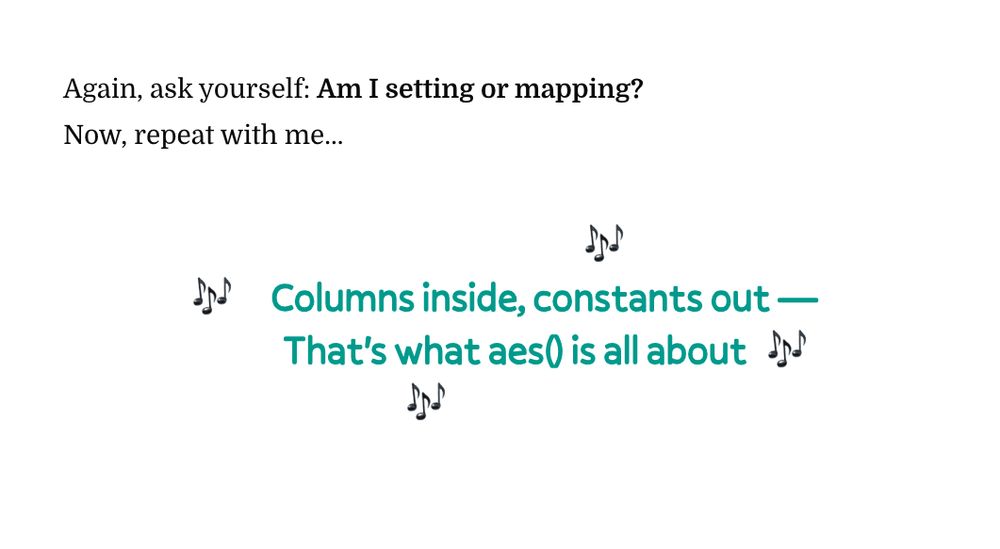
Working on the latest #ggplot2 [un]charted lesson about “Handling Caveats When Mapping Variables,” I let loose a bit
The sections ended up fun — yes, and maybe a bit silly at times 🤡
Highlight:
a new #aesthetics anthem as a memorable mnemonic 🎶
Out now for members!
www.ggplot2-uncharted.com
The sections ended up fun — yes, and maybe a bit silly at times 🤡
Highlight:
a new #aesthetics anthem as a memorable mnemonic 🎶
Out now for members!
www.ggplot2-uncharted.com
June 6, 2025 at 3:21 PM
Working on the latest #ggplot2 [un]charted lesson about “Handling Caveats When Mapping Variables,” I let loose a bit
The sections ended up fun — yes, and maybe a bit silly at times 🤡
Highlight:
a new #aesthetics anthem as a memorable mnemonic 🎶
Out now for members!
www.ggplot2-uncharted.com
The sections ended up fun — yes, and maybe a bit silly at times 🤡
Highlight:
a new #aesthetics anthem as a memorable mnemonic 🎶
Out now for members!
www.ggplot2-uncharted.com
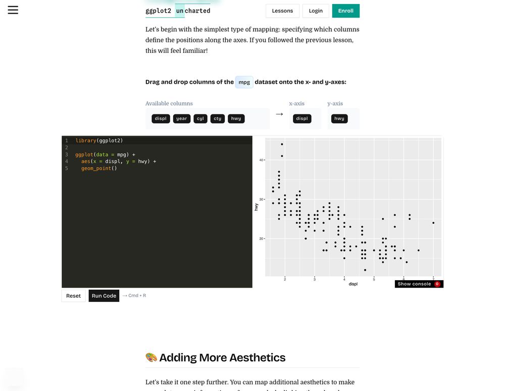
New interactive lesson live! 🎉
🎨 Aesthetics: Mapping Data to Visual Properties is now live for members of our #ggplot2 [un]charted workshop!
🎮 Drag-and-drop aes game
🔍 Aesthetics Explorer
🏆 6 exercises
Learn now 👉 ggplot2-uncharted.com/module1/aest...
#dataviz #datavis #rstats #tidyverse
🎨 Aesthetics: Mapping Data to Visual Properties is now live for members of our #ggplot2 [un]charted workshop!
🎮 Drag-and-drop aes game
🔍 Aesthetics Explorer
🏆 6 exercises
Learn now 👉 ggplot2-uncharted.com/module1/aest...
#dataviz #datavis #rstats #tidyverse
![Screenshot of the header of the third lesson in module 1, "Foundations of ggplot2", of our interactive online course ggplot2 [un]charted.](https://cdn.bsky.app/img/feed_thumbnail/plain/did:plc:p5uwbdiuszqu53dn5b52i4ic/bafkreigyqi3lnonnffhaxfpegh6spamohp6u7vpsp4ei6qxrkh2jm2wdcm@jpeg)


June 4, 2025 at 9:14 AM
New interactive lesson live! 🎉
🎨 Aesthetics: Mapping Data to Visual Properties is now live for members of our #ggplot2 [un]charted workshop!
🎮 Drag-and-drop aes game
🔍 Aesthetics Explorer
🏆 6 exercises
Learn now 👉 ggplot2-uncharted.com/module1/aest...
#dataviz #datavis #rstats #tidyverse
🎨 Aesthetics: Mapping Data to Visual Properties is now live for members of our #ggplot2 [un]charted workshop!
🎮 Drag-and-drop aes game
🔍 Aesthetics Explorer
🏆 6 exercises
Learn now 👉 ggplot2-uncharted.com/module1/aest...
#dataviz #datavis #rstats #tidyverse
New bonus lesson out now! 🎉
"A Quick Introduction to R" is for all course members that are new to #rstats or need a refresher 🧑💻
➕ 7 exercises and lots of in-browser code examples
Part of our interactive workshop #ggplot2 [un]charted 💙
Get access 👉 www.ggplot2-uncharted.com
#dataviz #datascience
"A Quick Introduction to R" is for all course members that are new to #rstats or need a refresher 🧑💻
➕ 7 exercises and lots of in-browser code examples
Part of our interactive workshop #ggplot2 [un]charted 💙
Get access 👉 www.ggplot2-uncharted.com
#dataviz #datascience

May 23, 2025 at 3:08 PM
New bonus lesson out now! 🎉
"A Quick Introduction to R" is for all course members that are new to #rstats or need a refresher 🧑💻
➕ 7 exercises and lots of in-browser code examples
Part of our interactive workshop #ggplot2 [un]charted 💙
Get access 👉 www.ggplot2-uncharted.com
#dataviz #datascience
"A Quick Introduction to R" is for all course members that are new to #rstats or need a refresher 🧑💻
➕ 7 exercises and lots of in-browser code examples
Part of our interactive workshop #ggplot2 [un]charted 💙
Get access 👉 www.ggplot2-uncharted.com
#dataviz #datascience
🚀 We'll continuously add new lessons to our interactive online workshop on #ggplot2 💙
We're currently wrapping up “Principles of ggplot2” with fantastic widgets to explore plot components 🖥️
💸 Early-bird discount still on — check it out + share feedback:
www.ggplot2-uncharted.com
#rstats #dataviz
We're currently wrapping up “Principles of ggplot2” with fantastic widgets to explore plot components 🖥️
💸 Early-bird discount still on — check it out + share feedback:
www.ggplot2-uncharted.com
#rstats #dataviz

May 16, 2025 at 3:42 PM
🚀 We'll continuously add new lessons to our interactive online workshop on #ggplot2 💙
We're currently wrapping up “Principles of ggplot2” with fantastic widgets to explore plot components 🖥️
💸 Early-bird discount still on — check it out + share feedback:
www.ggplot2-uncharted.com
#rstats #dataviz
We're currently wrapping up “Principles of ggplot2” with fantastic widgets to explore plot components 🖥️
💸 Early-bird discount still on — check it out + share feedback:
www.ggplot2-uncharted.com
#rstats #dataviz
Our ggplot2 [un]charted course is live! 🎉
Lesson 1, “Why R and ggplot2?”, is free to explore — short, thoughtful & a bit different.
Get the early-supporter price!
👉 ggplot2-uncharted.com
Follow along as new content drops and learn while running your code in the browser 👩💻
Lesson 1, “Why R and ggplot2?”, is free to explore — short, thoughtful & a bit different.
Get the early-supporter price!
👉 ggplot2-uncharted.com
Follow along as new content drops and learn while running your code in the browser 👩💻


May 13, 2025 at 3:03 PM
Our ggplot2 [un]charted course is live! 🎉
Lesson 1, “Why R and ggplot2?”, is free to explore — short, thoughtful & a bit different.
Get the early-supporter price!
👉 ggplot2-uncharted.com
Follow along as new content drops and learn while running your code in the browser 👩💻
Lesson 1, “Why R and ggplot2?”, is free to explore — short, thoughtful & a bit different.
Get the early-supporter price!
👉 ggplot2-uncharted.com
Follow along as new content drops and learn while running your code in the browser 👩💻
I hope it's fine like this–let me know if you'd like to have some adjustments. And thanks again!

May 13, 2025 at 9:35 AM
I hope it's fine like this–let me know if you'd like to have some adjustments. And thanks again!
Excited to launch "ggplot2 [un]charted" with @yan-holtz.bsky.social! 🎉
An online course to master #ggplot2 with exercises, quizzes, and modules—and hands-on code running in your browser!
Still WIP—sign up now for a limited discount:
👉 www.ggplot2-uncharted.com
#rstats #DataViz #DataVisualization
An online course to master #ggplot2 with exercises, quizzes, and modules—and hands-on code running in your browser!
Still WIP—sign up now for a limited discount:
👉 www.ggplot2-uncharted.com
#rstats #DataViz #DataVisualization
May 12, 2025 at 3:58 PM
Excited to launch "ggplot2 [un]charted" with @yan-holtz.bsky.social! 🎉
An online course to master #ggplot2 with exercises, quizzes, and modules—and hands-on code running in your browser!
Still WIP—sign up now for a limited discount:
👉 www.ggplot2-uncharted.com
#rstats #DataViz #DataVisualization
An online course to master #ggplot2 with exercises, quizzes, and modules—and hands-on code running in your browser!
Still WIP—sign up now for a limited discount:
👉 www.ggplot2-uncharted.com
#rstats #DataViz #DataVisualization
Rest well, lovely Lotte ♥️
You brought so much joy, warmth, and love to our home. We’re grateful for all the years we had together and will miss you forever.
You brought so much joy, warmth, and love to our home. We’re grateful for all the years we had together and will miss you forever.

April 22, 2025 at 5:30 PM
Rest well, lovely Lotte ♥️
You brought so much joy, warmth, and love to our home. We’re grateful for all the years we had together and will miss you forever.
You brought so much joy, warmth, and love to our home. We’re grateful for all the years we had together and will miss you forever.
Thanks for the note, we forgot to add it to the readme. Just fixed it!

April 3, 2025 at 1:03 PM
Thanks for the note, we forgot to add it to the readme. Just fixed it!
#30DayChartChallenge 2025 — #Day2: Slope
📉 Quick #DataViz for the second day, highlighting the steep drop in favorability of the #USA according to YouGov's EuroTrack survey.
Made in #rstats with #ggplot2 💙
#DataVisualization #Politics #SurveyData #Europe #US #YouGov
📉 Quick #DataViz for the second day, highlighting the steep drop in favorability of the #USA according to YouGov's EuroTrack survey.
Made in #rstats with #ggplot2 💙
#DataVisualization #Politics #SurveyData #Europe #US #YouGov

April 2, 2025 at 8:16 PM
#30DayChartChallenge 2025 — #Day2: Slope
📉 Quick #DataViz for the second day, highlighting the steep drop in favorability of the #USA according to YouGov's EuroTrack survey.
Made in #rstats with #ggplot2 💙
#DataVisualization #Politics #SurveyData #Europe #US #YouGov
📉 Quick #DataViz for the second day, highlighting the steep drop in favorability of the #USA according to YouGov's EuroTrack survey.
Made in #rstats with #ggplot2 💙
#DataVisualization #Politics #SurveyData #Europe #US #YouGov