


Nadieh Bremer
@nadiehbremer.com
Award-winning Data Visualization Designer & Data Artist | Founder of Visual Cinnamon | Graduated Astronomer ✨ | Author of "CHART" & "Data Sketches" | 🇳🇱
VisualCinnamon.com
VisualCinnamon.com
🎉 New work!
Two large-scale data artworks (3×4 m each!) to fit entire walls.
Abstract, water-inspired spirals showing past + future energy use (2000–2050) and maritime energy demand.
Colored streams = energy types, stream density = usage.
👉 Details + legend: www.visualcinnamon.com/art/dnv-wall...
Two large-scale data artworks (3×4 m each!) to fit entire walls.
Abstract, water-inspired spirals showing past + future energy use (2000–2050) and maritime energy demand.
Colored streams = energy types, stream density = usage.
👉 Details + legend: www.visualcinnamon.com/art/dnv-wall...


December 15, 2025 at 3:22 PM
🎉 New work!
Two large-scale data artworks (3×4 m each!) to fit entire walls.
Abstract, water-inspired spirals showing past + future energy use (2000–2050) and maritime energy demand.
Colored streams = energy types, stream density = usage.
👉 Details + legend: www.visualcinnamon.com/art/dnv-wall...
Two large-scale data artworks (3×4 m each!) to fit entire walls.
Abstract, water-inspired spirals showing past + future energy use (2000–2050) and maritime energy demand.
Colored streams = energy types, stream density = usage.
👉 Details + legend: www.visualcinnamon.com/art/dnv-wall...
Just stumbled across this wonderful FREE book on "Engineers of Map Art" documenting over a decade of cartography at ETH Zurich.
A quick scroll shows amazing maps 😍
👉 ebook: www.research-collection.ethz.ch/entities/pub...
👉 physical copy: karto.ethz.ch/en/publicati...
Have fun reading!
A quick scroll shows amazing maps 😍
👉 ebook: www.research-collection.ethz.ch/entities/pub...
👉 physical copy: karto.ethz.ch/en/publicati...
Have fun reading!


December 5, 2025 at 9:14 AM
Just stumbled across this wonderful FREE book on "Engineers of Map Art" documenting over a decade of cartography at ETH Zurich.
A quick scroll shows amazing maps 😍
👉 ebook: www.research-collection.ethz.ch/entities/pub...
👉 physical copy: karto.ethz.ch/en/publicati...
Have fun reading!
A quick scroll shows amazing maps 😍
👉 ebook: www.research-collection.ethz.ch/entities/pub...
👉 physical copy: karto.ethz.ch/en/publicati...
Have fun reading!
Had a great time talking with Jon Schwabish from the PolicyViz Podcast about my new book CHART 😃 We talked about a lot different dataviz topics. From straightforward charts to data art. My design process, the importance of sketching, and my client work.
Listen to it here: zencastr.com/z/m5zj5cnD
Listen to it here: zencastr.com/z/m5zj5cnD

December 1, 2025 at 10:11 AM
Had a great time talking with Jon Schwabish from the PolicyViz Podcast about my new book CHART 😃 We talked about a lot different dataviz topics. From straightforward charts to data art. My design process, the importance of sketching, and my client work.
Listen to it here: zencastr.com/z/m5zj5cnD
Listen to it here: zencastr.com/z/m5zj5cnD
Anybody else going to the "Information Design Conference" this Friday? I have some copies of my book CHART left that I can bring in case anybody would like to buy a copy? (€35) I can sign it right there for you as a bonus 😉


October 29, 2025 at 9:18 AM
Anybody else going to the "Information Design Conference" this Friday? I have some copies of my book CHART left that I can bring in case anybody would like to buy a copy? (€35) I can sign it right there for you as a bonus 😉
Just released my newsletter with new projects and updates, such as a data art collection about food and voronoi treemaps about health and death. Read it in full here:
visualcinnamon.substack.com/p/2025-q4-ne...
visualcinnamon.substack.com/p/2025-q4-ne...

A Data Art Collection About the Foods We Eat, Voronoi Treemaps about Health and Death and more...
I got to work on another Data Art collection again! This time visualizing the foods we eat. But I also create nine charts for the European Union, wrote a new blog and have some updates to share about ...
visualcinnamon.substack.com
October 14, 2025 at 9:14 AM
Just released my newsletter with new projects and updates, such as a data art collection about food and voronoi treemaps about health and death. Read it in full here:
visualcinnamon.substack.com/p/2025-q4-ne...
visualcinnamon.substack.com/p/2025-q4-ne...
📣 NEW WORK! Excited to share my latest work with the Publications Office of the European Union 🇪🇺
I got to create 9 dataviz for 3 of the EU's monthly Data Stories, covering fascinating topics, from leisure, health and the future.
See all the visuals here: www.visualcinnamon.com/portfolio/eu...
I got to create 9 dataviz for 3 of the EU's monthly Data Stories, covering fascinating topics, from leisure, health and the future.
See all the visuals here: www.visualcinnamon.com/portfolio/eu...


September 25, 2025 at 1:27 PM
📣 NEW WORK! Excited to share my latest work with the Publications Office of the European Union 🇪🇺
I got to create 9 dataviz for 3 of the EU's monthly Data Stories, covering fascinating topics, from leisure, health and the future.
See all the visuals here: www.visualcinnamon.com/portfolio/eu...
I got to create 9 dataviz for 3 of the EU's monthly Data Stories, covering fascinating topics, from leisure, health and the future.
See all the visuals here: www.visualcinnamon.com/portfolio/eu...
Heading into the @datawrapper.de DataViz Book Club notes. If you have any questions about CHART, feel free to join and post them there in the next 30-45mins :)
notes.dw.tools/p/chart
notes.dw.tools/p/chart

August 18, 2025 at 4:45 PM
Heading into the @datawrapper.de DataViz Book Club notes. If you have any questions about CHART, feel free to join and post them there in the next 30-45mins :)
notes.dw.tools/p/chart
notes.dw.tools/p/chart
Reposted by Nadieh Bremer

🎉 Today's the day! We are finally discussing "CHART" by @nadiehbremer.com!
You can join us here at 4pm UTC: notes.dw.tools/p/chart
👉 Find more info on our blog: www.datawrapper.de/blog/chart-n...
You can join us here at 4pm UTC: notes.dw.tools/p/chart
👉 Find more info on our blog: www.datawrapper.de/blog/chart-n...
August 18, 2025 at 6:01 AM
🎉 Today's the day! We are finally discussing "CHART" by @nadiehbremer.com!
You can join us here at 4pm UTC: notes.dw.tools/p/chart
👉 Find more info on our blog: www.datawrapper.de/blog/chart-n...
You can join us here at 4pm UTC: notes.dw.tools/p/chart
👉 Find more info on our blog: www.datawrapper.de/blog/chart-n...
The DataViz Book Club will be discussing my book CHART on Monday! 🙌 In written-only style, so you can discuss at your own pace ^_^ I'll be there as well toward the end to answer any questions posted. Come join me! 😃
www.datawrapper.de/blog/chart-n...
📅 Monday, August 18th at 6pm CEST/noon ET
www.datawrapper.de/blog/chart-n...
📅 Monday, August 18th at 6pm CEST/noon ET

August 15, 2025 at 9:36 AM
The DataViz Book Club will be discussing my book CHART on Monday! 🙌 In written-only style, so you can discuss at your own pace ^_^ I'll be there as well toward the end to answer any questions posted. Come join me! 😃
www.datawrapper.de/blog/chart-n...
📅 Monday, August 18th at 6pm CEST/noon ET
www.datawrapper.de/blog/chart-n...
📅 Monday, August 18th at 6pm CEST/noon ET
Looking forward to discussing CHART in the upcoming DataVis Book Club on August 18th! ^_^
If you like stunning visualizations, then you'll certainly enjoy "CHART" by @nadiehbremer.com! You’ll find yourself flipping through every page, stopping to admire the designs again and again. 📚
We'll discuss it on August 18th here: notes.dw.tools/p/chart
www.datawrapper.de/blog/chart-n...
We'll discuss it on August 18th here: notes.dw.tools/p/chart
www.datawrapper.de/blog/chart-n...

Read “CHART” by Nadieh Bremer with us! | Datawrapper Blog
We’re very excited to announce the next book for our book club: Read “CHART” by Nadieh Bremer with us!
www.datawrapper.de
July 28, 2025 at 8:04 AM
Looking forward to discussing CHART in the upcoming DataVis Book Club on August 18th! ^_^
Reposted by Nadieh Bremer
NEW: Questions in Dataviz: When does a Chart become Art?
@nadiehbremer.com's book is a beautifully documented invitation to data visualisers new and experienced alike to follow her into creative areas where she has been the first to tread.
questionsindataviz.com/2025/07/03/w...
@nadiehbremer.com's book is a beautifully documented invitation to data visualisers new and experienced alike to follow her into creative areas where she has been the first to tread.
questionsindataviz.com/2025/07/03/w...

When does a Chart become Art?
ChART is Nadieh Bremer’s second book, following on from Data Sketches, co-authored with Shirley Wu and released in 2021. The simple title is explained by the subtitle: Designing Creative Data Visua…
questionsindataviz.com
July 3, 2025 at 10:27 PM
NEW: Questions in Dataviz: When does a Chart become Art?
@nadiehbremer.com's book is a beautifully documented invitation to data visualisers new and experienced alike to follow her into creative areas where she has been the first to tread.
questionsindataviz.com/2025/07/03/w...
@nadiehbremer.com's book is a beautifully documented invitation to data visualisers new and experienced alike to follow her into creative areas where she has been the first to tread.
questionsindataviz.com/2025/07/03/w...
Reposted by Nadieh Bremer
📚 Ready for the next book club discussion? We are!
📆 On August 18th at 4pm UTC, we’ll be diving into "CHART" by @nadiehbremer.com. Join us here on this notepad: notes.dw.tools/p/chart
All the details for this session 👇
www.datawrapper.de/blog/chart-n...
📆 On August 18th at 4pm UTC, we’ll be diving into "CHART" by @nadiehbremer.com. Join us here on this notepad: notes.dw.tools/p/chart
All the details for this session 👇
www.datawrapper.de/blog/chart-n...
Read “CHART” by Nadieh Bremer with us! | Datawrapper Blog
We’re very excited to announce the next book for our book club: Read “CHART” by Nadieh Bremer with us!
www.datawrapper.de
July 2, 2025 at 1:01 PM
📚 Ready for the next book club discussion? We are!
📆 On August 18th at 4pm UTC, we’ll be diving into "CHART" by @nadiehbremer.com. Join us here on this notepad: notes.dw.tools/p/chart
All the details for this session 👇
www.datawrapper.de/blog/chart-n...
📆 On August 18th at 4pm UTC, we’ll be diving into "CHART" by @nadiehbremer.com. Join us here on this notepad: notes.dw.tools/p/chart
All the details for this session 👇
www.datawrapper.de/blog/chart-n...
Reposted by Nadieh Bremer

Enjoying @nadiehbremer.com's CHART (and the sun 😁). It's a great book — Nadieh's work is amazing anyways, and I love how generously she shares her tricks and recipes. www.routledge.com/CHART-Design...


June 19, 2025 at 4:06 PM
Enjoying @nadiehbremer.com's CHART (and the sun 😁). It's a great book — Nadieh's work is amazing anyways, and I love how generously she shares her tricks and recipes. www.routledge.com/CHART-Design...
Honored to get such a joyful reaction from @tulpinteractive.com about receiving my new book, especially as I name him as one of my main sources of inspiration at the start of the book 😊

Whether you have a good day or a bad day, receiving a copy of @nadiehbremer.com 's new book will make your day better, guaranteed! What a delightful and well crafted book! Love it! Buy it! CHART: Designing Creative Data Visualizations from Charts to Art - 1st share.google/eFmY2D3luvr1... #dataviz


June 18, 2025 at 8:46 AM
Honored to get such a joyful reaction from @tulpinteractive.com about receiving my new book, especially as I name him as one of my main sources of inspiration at the start of the book 😊
Reposted by Nadieh Bremer

Congrats to @nadiehbremer.com on her successful launch at Outlier yesterday! I can't wait to see more people fall in love with this book.
From seeing the mock ups to holding it in my hand, I don't think this book could have come out any more beautiful.
From seeing the mock ups to holding it in my hand, I don't think this book could have come out any more beautiful.


June 12, 2025 at 6:05 PM
Congrats to @nadiehbremer.com on her successful launch at Outlier yesterday! I can't wait to see more people fall in love with this book.
From seeing the mock ups to holding it in my hand, I don't think this book could have come out any more beautiful.
From seeing the mock ups to holding it in my hand, I don't think this book could have come out any more beautiful.
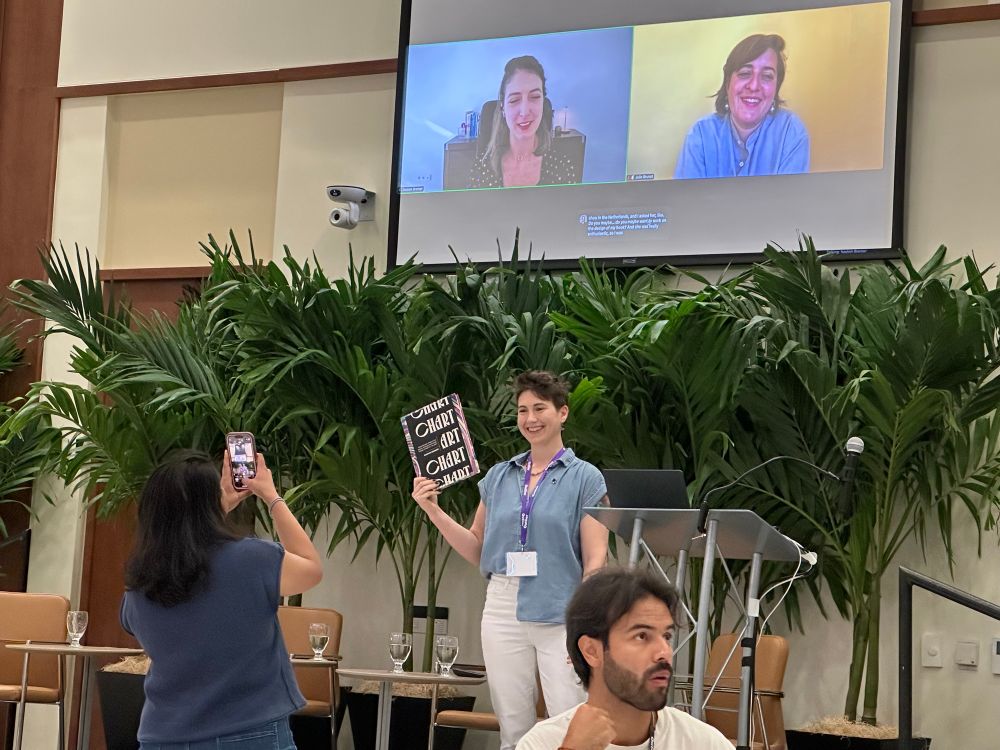
I just had my virtual book launch for CHART at Outlier!! ✨😃 (together with @datacitron.bsky.social who did the whole layout design)
It’s the chART virtual book launch at #outlier2025 - here’s @nadiehbremer.com and @juliebrunet.bsky.social appearing remotely, with @zanewolf.bsky.social proudly displaying the real book! Can’t wait to get hold of my copy (frustratingly 3000 miles away from me at home right now!)
June 11, 2025 at 5:31 PM
I just had my virtual book launch for CHART at Outlier!! ✨😃 (together with @datacitron.bsky.social who did the whole layout design)
ICYMI but "CHART: Designing Creative Data Visualizations from Charts to Art" is officially released and I'm having a virtual launch party tomorrow at Outlier conference 🎉 Come join me tomorrow at June 11th, at 09:30 PST / 12:30PM EDT / 18:30 CEST! 😃
🧵👇
🧵👇

June 10, 2025 at 1:05 PM
ICYMI but "CHART: Designing Creative Data Visualizations from Charts to Art" is officially released and I'm having a virtual launch party tomorrow at Outlier conference 🎉 Come join me tomorrow at June 11th, at 09:30 PST / 12:30PM EDT / 18:30 CEST! 😃
🧵👇
🧵👇
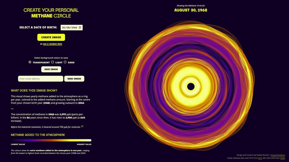
📣 NEW WORK!
Making the invisible visible. I'm thrilled to share the data art system I created for the Environmental Defense Fund that reveals how much methane was added to the atmosphere for each year that you've been alive.
Create your personal Methane circle: timeforch4nge.org/methane-circ...
Making the invisible visible. I'm thrilled to share the data art system I created for the Environmental Defense Fund that reveals how much methane was added to the atmosphere for each year that you've been alive.
Create your personal Methane circle: timeforch4nge.org/methane-circ...
April 24, 2025 at 8:09 AM
📣 NEW WORK!
Making the invisible visible. I'm thrilled to share the data art system I created for the Environmental Defense Fund that reveals how much methane was added to the atmosphere for each year that you've been alive.
Create your personal Methane circle: timeforch4nge.org/methane-circ...
Making the invisible visible. I'm thrilled to share the data art system I created for the Environmental Defense Fund that reveals how much methane was added to the atmosphere for each year that you've been alive.
Create your personal Methane circle: timeforch4nge.org/methane-circ...
It’s #TimeForCH4nge ✨
Excited to speak at the launch of the European Civil Society Observatory on Methane on 7 April and show you the new data art system I created!
Exploring how data, science & art can drive action to cut methane & slow #GlobalWarming
🔗 Register timeforch4nge.splashthat.com
Excited to speak at the launch of the European Civil Society Observatory on Methane on 7 April and show you the new data art system I created!
Exploring how data, science & art can drive action to cut methane & slow #GlobalWarming
🔗 Register timeforch4nge.splashthat.com

April 2, 2025 at 5:32 PM
It’s #TimeForCH4nge ✨
Excited to speak at the launch of the European Civil Society Observatory on Methane on 7 April and show you the new data art system I created!
Exploring how data, science & art can drive action to cut methane & slow #GlobalWarming
🔗 Register timeforch4nge.splashthat.com
Excited to speak at the launch of the European Civil Society Observatory on Methane on 7 April and show you the new data art system I created!
Exploring how data, science & art can drive action to cut methane & slow #GlobalWarming
🔗 Register timeforch4nge.splashthat.com
NEW WORK! ✨
I got to create this 2-page spread for an article in @sciam.bsky.social on the puzzling lack of worlds outside our solar system in a certain size range; the "Radius Gap."
Visualizing several hundred exoplanets as a polar plot + contours.
www.scientificamerican.com/article/exop...
I got to create this 2-page spread for an article in @sciam.bsky.social on the puzzling lack of worlds outside our solar system in a certain size range; the "Radius Gap."
Visualizing several hundred exoplanets as a polar plot + contours.
www.scientificamerican.com/article/exop...

March 25, 2025 at 2:49 PM
NEW WORK! ✨
I got to create this 2-page spread for an article in @sciam.bsky.social on the puzzling lack of worlds outside our solar system in a certain size range; the "Radius Gap."
Visualizing several hundred exoplanets as a polar plot + contours.
www.scientificamerican.com/article/exop...
I got to create this 2-page spread for an article in @sciam.bsky.social on the puzzling lack of worlds outside our solar system in a certain size range; the "Radius Gap."
Visualizing several hundred exoplanets as a polar plot + contours.
www.scientificamerican.com/article/exop...
It's apparently been over a year, but I just published a newsletter again! Read about several of the new projects I've released since then (and then there's the new book of course, minor thing ;) )
open.substack.com/pub/visualci...
open.substack.com/pub/visualci...

I wrote a second book! But also GitHub Networks, Exoplanets and Startups
From an elaborate interactive network exploring GitHub repositories for Mozilla, to visualizing exoplanets for Scientific American, and more. Oh right, before I forget, I’ve written a new dataviz book...
open.substack.com
March 25, 2025 at 11:04 AM
It's apparently been over a year, but I just published a newsletter again! Read about several of the new projects I've released since then (and then there's the new book of course, minor thing ;) )
open.substack.com/pub/visualci...
open.substack.com/pub/visualci...
Reposted by Nadieh Bremer

Later today I'll be pushing out the latest monthly newsletter to subscribers with 50 of the best data viz related things I encountered during January.
(And so there's still time to subscribe: visualisingdata.com/newsletter/)
(And so there's still time to subscribe: visualisingdata.com/newsletter/)

February 28, 2025 at 10:18 AM
Later today I'll be pushing out the latest monthly newsletter to subscribers with 50 of the best data viz related things I encountered during January.
(And so there's still time to subscribe: visualisingdata.com/newsletter/)
(And so there's still time to subscribe: visualisingdata.com/newsletter/)
Working on a new project where I want to take these rings and make them flow together a bit as if each ring is made from gas & interacts (along its edges) with the next ring(s)
Now starting an hour-long Fluid Simulation video by The Coding Train 😃💪
Any info is appreciated! 🙏
Now starting an hour-long Fluid Simulation video by The Coding Train 😃💪
Any info is appreciated! 🙏

February 27, 2025 at 1:38 PM
Working on a new project where I want to take these rings and make them flow together a bit as if each ring is made from gas & interacts (along its edges) with the next ring(s)
Now starting an hour-long Fluid Simulation video by The Coding Train 😃💪
Any info is appreciated! 🙏
Now starting an hour-long Fluid Simulation video by The Coding Train 😃💪
Any info is appreciated! 🙏
It's been a _very_ long time, but I finally wrote an extensive full dataviz design creation blog post again! 🙌
You can read about all the ups and downs, what worked, when it spectacularly failed, of trying to create the GitHub Top Contributor Network here: www.visualcinnamon.com/2025/01/gith...
You can read about all the ups and downs, what worked, when it spectacularly failed, of trying to create the GitHub Top Contributor Network here: www.visualcinnamon.com/2025/01/gith...

Visualizing the Top Contributor Network of Any GitHub Repo
Revealing the design process of this elaborate network visualization of top contributors to any GitHub repository
www.visualcinnamon.com
February 27, 2025 at 9:30 AM
It's been a _very_ long time, but I finally wrote an extensive full dataviz design creation blog post again! 🙌
You can read about all the ups and downs, what worked, when it spectacularly failed, of trying to create the GitHub Top Contributor Network here: www.visualcinnamon.com/2025/01/gith...
You can read about all the ups and downs, what worked, when it spectacularly failed, of trying to create the GitHub Top Contributor Network here: www.visualcinnamon.com/2025/01/gith...
Reposted by Nadieh Bremer
On the communication side of dataviz — what would you say, were the "hits" in the last few years? Pieces that went viral, found wide adoption, opened new audiences, were shared a lot.
February 21, 2025 at 9:54 AM
On the communication side of dataviz — what would you say, were the "hits" in the last few years? Pieces that went viral, found wide adoption, opened new audiences, were shared a lot.