


Nadieh Bremer
@nadiehbremer.com
Award-winning Data Visualization Designer & Data Artist | Founder of Visual Cinnamon | Graduated Astronomer ✨ | Author of "CHART" & "Data Sketches" | 🇳🇱
VisualCinnamon.com
VisualCinnamon.com
Anybody else going to the "Information Design Conference" this Friday? I have some copies of my book CHART left that I can bring in case anybody would like to buy a copy? (€35) I can sign it right there for you as a bonus 😉


October 29, 2025 at 9:18 AM
Anybody else going to the "Information Design Conference" this Friday? I have some copies of my book CHART left that I can bring in case anybody would like to buy a copy? (€35) I can sign it right there for you as a bonus 😉
📣 NEW WORK! Excited to share my latest work with the Publications Office of the European Union 🇪🇺
I got to create 9 dataviz for 3 of the EU's monthly Data Stories, covering fascinating topics, from leisure, health and the future.
See all the visuals here: www.visualcinnamon.com/portfolio/eu...
I got to create 9 dataviz for 3 of the EU's monthly Data Stories, covering fascinating topics, from leisure, health and the future.
See all the visuals here: www.visualcinnamon.com/portfolio/eu...


September 25, 2025 at 1:27 PM
📣 NEW WORK! Excited to share my latest work with the Publications Office of the European Union 🇪🇺
I got to create 9 dataviz for 3 of the EU's monthly Data Stories, covering fascinating topics, from leisure, health and the future.
See all the visuals here: www.visualcinnamon.com/portfolio/eu...
I got to create 9 dataviz for 3 of the EU's monthly Data Stories, covering fascinating topics, from leisure, health and the future.
See all the visuals here: www.visualcinnamon.com/portfolio/eu...
Heading into the @datawrapper.de DataViz Book Club notes. If you have any questions about CHART, feel free to join and post them there in the next 30-45mins :)
notes.dw.tools/p/chart
notes.dw.tools/p/chart

August 18, 2025 at 4:45 PM
Heading into the @datawrapper.de DataViz Book Club notes. If you have any questions about CHART, feel free to join and post them there in the next 30-45mins :)
notes.dw.tools/p/chart
notes.dw.tools/p/chart
The DataViz Book Club will be discussing my book CHART on Monday! 🙌 In written-only style, so you can discuss at your own pace ^_^ I'll be there as well toward the end to answer any questions posted. Come join me! 😃
www.datawrapper.de/blog/chart-n...
📅 Monday, August 18th at 6pm CEST/noon ET
www.datawrapper.de/blog/chart-n...
📅 Monday, August 18th at 6pm CEST/noon ET

August 15, 2025 at 9:36 AM
The DataViz Book Club will be discussing my book CHART on Monday! 🙌 In written-only style, so you can discuss at your own pace ^_^ I'll be there as well toward the end to answer any questions posted. Come join me! 😃
www.datawrapper.de/blog/chart-n...
📅 Monday, August 18th at 6pm CEST/noon ET
www.datawrapper.de/blog/chart-n...
📅 Monday, August 18th at 6pm CEST/noon ET
As I do not yet have my own copy of the book, in case any of you have received it already, I would LOVE it if you could send me some photos of how it looks, so I can share these during the party as well! 🤗
Hopefully see you tomorrow!
Hopefully see you tomorrow!

June 10, 2025 at 1:05 PM
As I do not yet have my own copy of the book, in case any of you have received it already, I would LOVE it if you could send me some photos of how it looks, so I can share these during the party as well! 🤗
Hopefully see you tomorrow!
Hopefully see you tomorrow!
I'll show you more from the book's inside, talk about the different lessons, and Julie Brunet will make a guest appearance and show never-before-seen works in progress on the design of the book. And you're free to ask questions of course!

June 10, 2025 at 1:05 PM
I'll show you more from the book's inside, talk about the different lessons, and Julie Brunet will make a guest appearance and show never-before-seen works in progress on the design of the book. And you're free to ask questions of course!
As CHART began as a keynote talk for Outlier conference in 2023, it felt fitting to have a little (virtual) launch party as Outlier is happing this week as well.

June 10, 2025 at 1:05 PM
As CHART began as a keynote talk for Outlier conference in 2023, it felt fitting to have a little (virtual) launch party as Outlier is happing this week as well.
ICYMI but "CHART: Designing Creative Data Visualizations from Charts to Art" is officially released and I'm having a virtual launch party tomorrow at Outlier conference 🎉 Come join me tomorrow at June 11th, at 09:30 PST / 12:30PM EDT / 18:30 CEST! 😃
🧵👇
🧵👇

June 10, 2025 at 1:05 PM
ICYMI but "CHART: Designing Creative Data Visualizations from Charts to Art" is officially released and I'm having a virtual launch party tomorrow at Outlier conference 🎉 Come join me tomorrow at June 11th, at 09:30 PST / 12:30PM EDT / 18:30 CEST! 😃
🧵👇
🧵👇
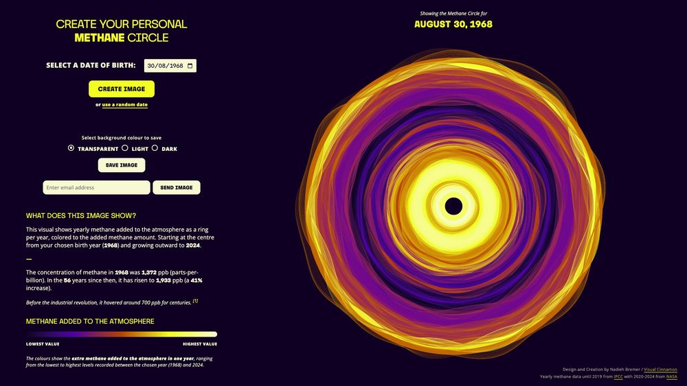
📣 NEW WORK!
Making the invisible visible. I'm thrilled to share the data art system I created for the Environmental Defense Fund that reveals how much methane was added to the atmosphere for each year that you've been alive.
Create your personal Methane circle: timeforch4nge.org/methane-circ...
Making the invisible visible. I'm thrilled to share the data art system I created for the Environmental Defense Fund that reveals how much methane was added to the atmosphere for each year that you've been alive.
Create your personal Methane circle: timeforch4nge.org/methane-circ...
April 24, 2025 at 8:09 AM
📣 NEW WORK!
Making the invisible visible. I'm thrilled to share the data art system I created for the Environmental Defense Fund that reveals how much methane was added to the atmosphere for each year that you've been alive.
Create your personal Methane circle: timeforch4nge.org/methane-circ...
Making the invisible visible. I'm thrilled to share the data art system I created for the Environmental Defense Fund that reveals how much methane was added to the atmosphere for each year that you've been alive.
Create your personal Methane circle: timeforch4nge.org/methane-circ...
It’s #TimeForCH4nge ✨
Excited to speak at the launch of the European Civil Society Observatory on Methane on 7 April and show you the new data art system I created!
Exploring how data, science & art can drive action to cut methane & slow #GlobalWarming
🔗 Register timeforch4nge.splashthat.com
Excited to speak at the launch of the European Civil Society Observatory on Methane on 7 April and show you the new data art system I created!
Exploring how data, science & art can drive action to cut methane & slow #GlobalWarming
🔗 Register timeforch4nge.splashthat.com

April 2, 2025 at 5:32 PM
It’s #TimeForCH4nge ✨
Excited to speak at the launch of the European Civil Society Observatory on Methane on 7 April and show you the new data art system I created!
Exploring how data, science & art can drive action to cut methane & slow #GlobalWarming
🔗 Register timeforch4nge.splashthat.com
Excited to speak at the launch of the European Civil Society Observatory on Methane on 7 April and show you the new data art system I created!
Exploring how data, science & art can drive action to cut methane & slow #GlobalWarming
🔗 Register timeforch4nge.splashthat.com
NEW WORK! ✨
I got to create this 2-page spread for an article in @sciam.bsky.social on the puzzling lack of worlds outside our solar system in a certain size range; the "Radius Gap."
Visualizing several hundred exoplanets as a polar plot + contours.
www.scientificamerican.com/article/exop...
I got to create this 2-page spread for an article in @sciam.bsky.social on the puzzling lack of worlds outside our solar system in a certain size range; the "Radius Gap."
Visualizing several hundred exoplanets as a polar plot + contours.
www.scientificamerican.com/article/exop...

March 25, 2025 at 2:49 PM
NEW WORK! ✨
I got to create this 2-page spread for an article in @sciam.bsky.social on the puzzling lack of worlds outside our solar system in a certain size range; the "Radius Gap."
Visualizing several hundred exoplanets as a polar plot + contours.
www.scientificamerican.com/article/exop...
I got to create this 2-page spread for an article in @sciam.bsky.social on the puzzling lack of worlds outside our solar system in a certain size range; the "Radius Gap."
Visualizing several hundred exoplanets as a polar plot + contours.
www.scientificamerican.com/article/exop...
Working on a new project where I want to take these rings and make them flow together a bit as if each ring is made from gas & interacts (along its edges) with the next ring(s)
Now starting an hour-long Fluid Simulation video by The Coding Train 😃💪
Any info is appreciated! 🙏
Now starting an hour-long Fluid Simulation video by The Coding Train 😃💪
Any info is appreciated! 🙏

February 27, 2025 at 1:38 PM
Working on a new project where I want to take these rings and make them flow together a bit as if each ring is made from gas & interacts (along its edges) with the next ring(s)
Now starting an hour-long Fluid Simulation video by The Coding Train 😃💪
Any info is appreciated! 🙏
Now starting an hour-long Fluid Simulation video by The Coding Train 😃💪
Any info is appreciated! 🙏
For this project, I collaborated with Mozilla Builders & Adam Bouhenguel, the creator of ORCA (Open Retrospective Compensation Agreement). ORCA enables businesses to share a portion of their revenue with contributors of the open-source projects they rely on: future.mozilla.org/projects/ope...

January 31, 2025 at 2:24 PM
For this project, I collaborated with Mozilla Builders & Adam Bouhenguel, the creator of ORCA (Open Retrospective Compensation Agreement). ORCA enables businesses to share a portion of their revenue with contributors of the open-source projects they rely on: future.mozilla.org/projects/ope...
This visual shows how contributors deeply involved in one repository often play key roles in other important projects. By awarding ORCA benefits (next post) to these impactful contributors, the hope is to create a ripple effect. Giving them the time to improve even more open-source projects.
🧵👇
🧵👇


January 31, 2025 at 2:24 PM
This visual shows how contributors deeply involved in one repository often play key roles in other important projects. By awarding ORCA benefits (next post) to these impactful contributors, the hope is to create a ripple effect. Giving them the time to improve even more open-source projects.
🧵👇
🧵👇
📣 NEW WORK - Part II! 📣
Another GitHub-focused visualization. This time revealing the top contributors to any repository and the other projects they’ve worked on, highlighting synergies across repos: nbremer.github.io/ORCA/top-con...
🧵👇
Another GitHub-focused visualization. This time revealing the top contributors to any repository and the other projects they’ve worked on, highlighting synergies across repos: nbremer.github.io/ORCA/top-con...
🧵👇

January 31, 2025 at 2:24 PM
📣 NEW WORK - Part II! 📣
Another GitHub-focused visualization. This time revealing the top contributors to any repository and the other projects they’ve worked on, highlighting synergies across repos: nbremer.github.io/ORCA/top-con...
🧵👇
Another GitHub-focused visualization. This time revealing the top contributors to any repository and the other projects they’ve worked on, highlighting synergies across repos: nbremer.github.io/ORCA/top-con...
🧵👇
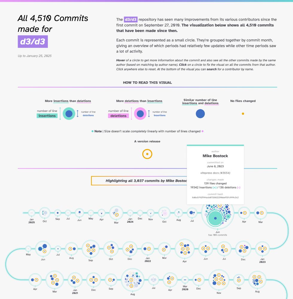
My latest project lets you explore the entire commit history of any GitHub repo ✨
Obviously, D3.js was one of the 1st repos I tested. You can clearly see the 3000+ commits made by its creator @ocks.org! But also @fil.rezo.net & many others.
nbremer.github.io/ORCA/commit-...
Obviously, D3.js was one of the 1st repos I tested. You can clearly see the 3000+ commits made by its creator @ocks.org! But also @fil.rezo.net & many others.
nbremer.github.io/ORCA/commit-...
January 28, 2025 at 2:53 PM
My latest project lets you explore the entire commit history of any GitHub repo ✨
Obviously, D3.js was one of the 1st repos I tested. You can clearly see the 3000+ commits made by its creator @ocks.org! But also @fil.rezo.net & many others.
nbremer.github.io/ORCA/commit-...
Obviously, D3.js was one of the 1st repos I tested. You can clearly see the 3000+ commits made by its creator @ocks.org! But also @fil.rezo.net & many others.
nbremer.github.io/ORCA/commit-...
Mozilla naturally wanted this project to become open, and thus, I tried my best to create an algorithm that works for any GitHub repository (e.g., this is how it looks for d3: nbremer.github.io/ORCA/commit-...)
The code + docs for this visualization can be found here: github.com/nbremer/ORCA...
The code + docs for this visualization can be found here: github.com/nbremer/ORCA...

January 28, 2025 at 2:44 PM
Mozilla naturally wanted this project to become open, and thus, I tried my best to create an algorithm that works for any GitHub repository (e.g., this is how it looks for d3: nbremer.github.io/ORCA/commit-...)
The code + docs for this visualization can be found here: github.com/nbremer/ORCA...
The code + docs for this visualization can be found here: github.com/nbremer/ORCA...
The example repository used reveals how all contributors have had a hand in shaping PDF.js, but shines a little spotlight on the work of Jonas Jenwald and Tim van der Meij, who Mozilla has awarded ORCA funding for their contribution to PDF.js 🙌


January 28, 2025 at 2:44 PM
The example repository used reveals how all contributors have had a hand in shaping PDF.js, but shines a little spotlight on the work of Jonas Jenwald and Tim van der Meij, who Mozilla has awarded ORCA funding for their contribution to PDF.js 🙌
📣 NEW WORK 📣
nbremer.github.io/ORCA/commit-...
I worked with Mozilla Builders and created 2 interactive visuals around GitHub repositories and the contributors who are working hard to improve these projects. This 1st visual reveals the entire commit history, clustered per month.
nbremer.github.io/ORCA/commit-...
I worked with Mozilla Builders and created 2 interactive visuals around GitHub repositories and the contributors who are working hard to improve these projects. This 1st visual reveals the entire commit history, clustered per month.


January 28, 2025 at 2:44 PM
📣 NEW WORK 📣
nbremer.github.io/ORCA/commit-...
I worked with Mozilla Builders and created 2 interactive visuals around GitHub repositories and the contributors who are working hard to improve these projects. This 1st visual reveals the entire commit history, clustered per month.
nbremer.github.io/ORCA/commit-...
I worked with Mozilla Builders and created 2 interactive visuals around GitHub repositories and the contributors who are working hard to improve these projects. This 1st visual reveals the entire commit history, clustered per month.
📣 NEW WORK!
I just added my latest project to my portfolio 🙌 I got to create a data art collection of six pieces for the "Global Diet Quality Score" report published by Intake; a main piece and five chapter covers, using data on what people ate during a day
www.visualcinnamon.com/art/gdqs/
I just added my latest project to my portfolio 🙌 I got to create a data art collection of six pieces for the "Global Diet Quality Score" report published by Intake; a main piece and five chapter covers, using data on what people ate during a day
www.visualcinnamon.com/art/gdqs/

January 8, 2025 at 7:42 AM
📣 NEW WORK!
I just added my latest project to my portfolio 🙌 I got to create a data art collection of six pieces for the "Global Diet Quality Score" report published by Intake; a main piece and five chapter covers, using data on what people ate during a day
www.visualcinnamon.com/art/gdqs/
I just added my latest project to my portfolio 🙌 I got to create a data art collection of six pieces for the "Global Diet Quality Score" report published by Intake; a main piece and five chapter covers, using data on what people ate during a day
www.visualcinnamon.com/art/gdqs/
For some Friday fun, a mesmerizing video breaking down the most iconic music samples between 1990-2024. The (data) animations visualizing exactly what is done to each sample (speed, pitch, etc.) are very well executed
Check out 1999 (±9:00) for a 🤯 moment
www.youtube.com/watch?v=Fpao...
Check out 1999 (±9:00) for a 🤯 moment
www.youtube.com/watch?v=Fpao...


December 6, 2024 at 8:26 AM
For some Friday fun, a mesmerizing video breaking down the most iconic music samples between 1990-2024. The (data) animations visualizing exactly what is done to each sample (speed, pitch, etc.) are very well executed
Check out 1999 (±9:00) for a 🤯 moment
www.youtube.com/watch?v=Fpao...
Check out 1999 (±9:00) for a 🤯 moment
www.youtube.com/watch?v=Fpao...
The final result of the week I gave myself to learn and create a data visualization using Blender.
The visual shows the top 10 best-selling Nintendo Switch games according to release data, scaled by the number of copies sold (by 2D area as seen from top down), and "colored" by genre.
The visual shows the top 10 best-selling Nintendo Switch games according to release data, scaled by the number of copies sold (by 2D area as seen from top down), and "colored" by genre.

September 3, 2024 at 5:07 AM
The final result of the week I gave myself to learn and create a data visualization using Blender.
The visual shows the top 10 best-selling Nintendo Switch games according to release data, scaled by the number of copies sold (by 2D area as seen from top down), and "colored" by genre.
The visual shows the top 10 best-selling Nintendo Switch games according to release data, scaled by the number of copies sold (by 2D area as seen from top down), and "colored" by genre.
This was not what I was going for while working on a data art collection. But I saved the code in my pen plotting folder instead to try it out in the future! 😆

April 30, 2024 at 9:16 AM
This was not what I was going for while working on a data art collection. But I saved the code in my pen plotting folder instead to try it out in the future! 😆
I was extremely happy to hear back from a client a year after I created 2 extensive animations to learn that they're still using them across the company in their pursuit of expanding solar panels! ✨
You can see larger 📷 from both animations in my portfolio: www.visualcinnamon.com/portfolio/sw...
You can see larger 📷 from both animations in my portfolio: www.visualcinnamon.com/portfolio/sw...

March 14, 2024 at 3:52 PM
I was extremely happy to hear back from a client a year after I created 2 extensive animations to learn that they're still using them across the company in their pursuit of expanding solar panels! ✨
You can see larger 📷 from both animations in my portfolio: www.visualcinnamon.com/portfolio/sw...
You can see larger 📷 from both animations in my portfolio: www.visualcinnamon.com/portfolio/sw...
Loved the little deep dive into the career of Bob Chapin, TIME's chief cartographer during some pivotal moments in the previous century in @infowetrust.com "Chartography" newsletter:
charts.substack.com/p/accent-the...
charts.substack.com/p/accent-the...


February 7, 2024 at 8:47 AM
Loved the little deep dive into the career of Bob Chapin, TIME's chief cartographer during some pivotal moments in the previous century in @infowetrust.com "Chartography" newsletter:
charts.substack.com/p/accent-the...
charts.substack.com/p/accent-the...