


Marco Cortella
@mcx83.bsky.social
📊 #BI and #dataViz Consultant |
😱 #horrorchart collector |
💡Insights & Data @Capgemini | socio @ondatait.bsky.social
Torino, Italy.
😱 #horrorchart collector |
💡Insights & Data @Capgemini | socio @ondatait.bsky.social
Torino, Italy.
Reposted by Marco Cortella

📊 I dati sulla violenza di genere in Italia sono incompleti, frammentati, quasi invisibili.
Per questo abbiamo lanciato una campagna: oltre 24.000 firme raccolte.
Ma non è solo questo. Ecco cosa c'è nella newsletter di gennaio 👇
open.substack.com/pub/ondata/p...
Per questo abbiamo lanciato una campagna: oltre 24.000 firme raccolte.
Ma non è solo questo. Ecco cosa c'è nella newsletter di gennaio 👇
open.substack.com/pub/ondata/p...

📣 Associazione onData - Newsletter #37
Dati violenza di genere, Normattiva open data, richieste dati PA: strumenti, novità e diritti per il riutilizzo dei dati pubblici in Italia
open.substack.com
January 7, 2026 at 7:08 AM
📊 I dati sulla violenza di genere in Italia sono incompleti, frammentati, quasi invisibili.
Per questo abbiamo lanciato una campagna: oltre 24.000 firme raccolte.
Ma non è solo questo. Ecco cosa c'è nella newsletter di gennaio 👇
open.substack.com/pub/ondata/p...
Per questo abbiamo lanciato una campagna: oltre 24.000 firme raccolte.
Ma non è solo questo. Ecco cosa c'è nella newsletter di gennaio 👇
open.substack.com/pub/ondata/p...
Reposted by Marco Cortella
Un numero speciale di "Liberiamoli tutti!" per dare senso e valore alla campagna di #DatiBeneComune sulla richiesta di pubblicazione dei dati sulla violenza di genere
open.substack.com/pub/datibene...
open.substack.com/pub/datibene...

Liberiamoli tutti! | Dati sulla violenza di genere
Chiediamo al Governo l'attuazione della legge 53/2022. Petizione + 2 dataset aperti!
open.substack.com
December 15, 2025 at 8:10 AM
Un numero speciale di "Liberiamoli tutti!" per dare senso e valore alla campagna di #DatiBeneComune sulla richiesta di pubblicazione dei dati sulla violenza di genere
open.substack.com/pub/datibene...
open.substack.com/pub/datibene...
Reposted by Marco Cortella
"Quante volte i deputati di un certo partito hanno parlato di mafia, di aborto o di altri temi rilevanti nel corso del tempo?"
Grazie a "ItaParlCorpus", la banca dati sui resoconti stenografici dei dibattiti parlamentari, è possibile scoprirlo.
open.substack.com/pub/datibene...
Grazie a "ItaParlCorpus", la banca dati sui resoconti stenografici dei dibattiti parlamentari, è possibile scoprirlo.
open.substack.com/pub/datibene...

Liberiamoli tutti #15: i dibattiti parlamentari italiani
Dal 1848 al 2022, i resoconti stenografici della Camera dei Deputati trasformati in dati strutturati: interventi, deputati, partiti. Database ItaParlCorpus.
open.substack.com
December 4, 2025 at 5:34 PM
"Quante volte i deputati di un certo partito hanno parlato di mafia, di aborto o di altri temi rilevanti nel corso del tempo?"
Grazie a "ItaParlCorpus", la banca dati sui resoconti stenografici dei dibattiti parlamentari, è possibile scoprirlo.
open.substack.com/pub/datibene...
Grazie a "ItaParlCorpus", la banca dati sui resoconti stenografici dei dibattiti parlamentari, è possibile scoprirlo.
open.substack.com/pub/datibene...
Reposted by Marco Cortella
I dati sulla classifica annuale 2025 sulla qualità della vita nelle province italiane del Il Sole 24Ore sono disponibili su GitHub
github.com/IlSole24ORE/...
github.com/IlSole24ORE/...

GitHub - IlSole24ORE/QDV2025: I dati dell'edizione 2025 della Qualità della vita de Il Sole 24Ore
I dati dell'edizione 2025 della Qualità della vita de Il Sole 24Ore - IlSole24ORE/QDV2025
github.com
December 2, 2025 at 7:36 AM
I dati sulla classifica annuale 2025 sulla qualità della vita nelle province italiane del Il Sole 24Ore sono disponibili su GitHub
github.com/IlSole24ORE/...
github.com/IlSole24ORE/...
Reposted by Marco Cortella

The first edition of the new newsletter is out! Check it out IF YOU DARE (halloween)
www.howtoreadthisch.art/the-glorious...
www.howtoreadthisch.art/the-glorious...

The glorious return of How To Read This Chart
Chapter 1
So, uh, what have you been up to?
The last time anyone received an issue of "How To Read This Chart," President Trump hadn't yet deployed the military to D.C., the Mets were only a game-and...
www.howtoreadthisch.art
October 11, 2025 at 3:44 PM
The first edition of the new newsletter is out! Check it out IF YOU DARE (halloween)
www.howtoreadthisch.art/the-glorious...
www.howtoreadthisch.art/the-glorious...
Reposted by Marco Cortella
Dataset sulla Palestina: per aiutarti a raccontare la loro storia
data.techforpalestine.org
data.techforpalestine.org

Palestine Datasets
Helping you tell their story. We provide datasets relevant to the ongoing human catastrophe in Palestine since October 7.
data.techforpalestine.org
September 23, 2025 at 10:53 AM
Dataset sulla Palestina: per aiutarti a raccontare la loro storia
data.techforpalestine.org
data.techforpalestine.org
Reposted by Marco Cortella

The only way to close off this long, rich thread is with a picture of my #OpenData friends in Italy! @dennisangemi.bsky.social @aborruso.bsky.social @mcx83.bsky.social @puntofisso.bsky.social @ingmmo.bsky.social @matteofortini.bsky.social @giorgialodi.bsky.social
Thank you, #csvconf ❤️🔥
Thank you, #csvconf ❤️🔥

September 11, 2025 at 2:34 PM
The only way to close off this long, rich thread is with a picture of my #OpenData friends in Italy! @dennisangemi.bsky.social @aborruso.bsky.social @mcx83.bsky.social @puntofisso.bsky.social @ingmmo.bsky.social @matteofortini.bsky.social @giorgialodi.bsky.social
Thank you, #csvconf ❤️🔥
Thank you, #csvconf ❤️🔥
Italian #opendata legends @aborruso.bsky.social and @giorgialodi.bsky.social
now at #csvconfv9 talking about 15 years of Open data in Italy.
@csvconf.bsky.social
now at #csvconfv9 talking about 15 years of Open data in Italy.
@csvconf.bsky.social

September 11, 2025 at 11:23 AM
Italian #opendata legends @aborruso.bsky.social and @giorgialodi.bsky.social
now at #csvconfv9 talking about 15 years of Open data in Italy.
@csvconf.bsky.social
now at #csvconfv9 talking about 15 years of Open data in Italy.
@csvconf.bsky.social
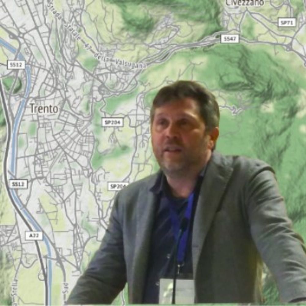
Nice to be in Bologna today for #csvconfv9 and starting with a talk by @rahulbot.bsky.social!
@csvconf.bsky.social
@csvconf.bsky.social
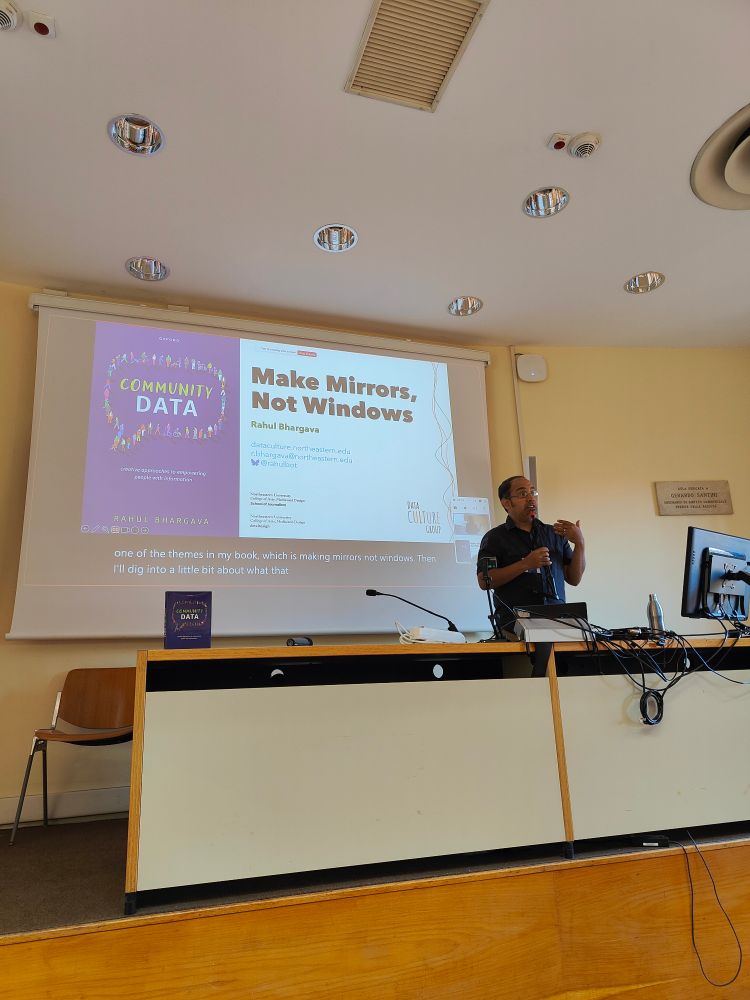
September 11, 2025 at 8:33 AM
Nice to be in Bologna today for #csvconfv9 and starting with a talk by @rahulbot.bsky.social!
@csvconf.bsky.social
@csvconf.bsky.social
Reposted by Marco Cortella
#csvconfv9 is ready to kick off! The venue is stunning, coffee is flowing, and talks are gonna be beautiful! Stay tuned, as I'll try to post here and there :) @csvconf.bsky.social
September 10, 2025 at 7:34 AM
#csvconfv9 is ready to kick off! The venue is stunning, coffee is flowing, and talks are gonna be beautiful! Stay tuned, as I'll try to post here and there :) @csvconf.bsky.social
After the #GPT5 chart failure, I also discovered that Anthropic is promoting benchmark increases with... a truncated y-axis bar chart.
#dataviz #horrorchart
#dataviz #horrorchart
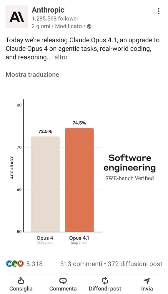
August 8, 2025 at 7:04 AM
After the #GPT5 chart failure, I also discovered that Anthropic is promoting benchmark increases with... a truncated y-axis bar chart.
#dataviz #horrorchart
#dataviz #horrorchart
GPT-5 is so amazing it can make 52.8 higher than 69.1 on a bar chart
It can even make 69.1 and 30.8 THE SAME SIZE
It can even make 69.1 and 30.8 THE SAME SIZE
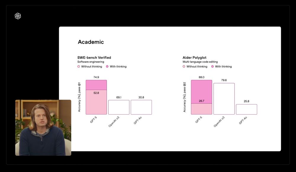
August 8, 2025 at 6:13 AM
Reposted by Marco Cortella

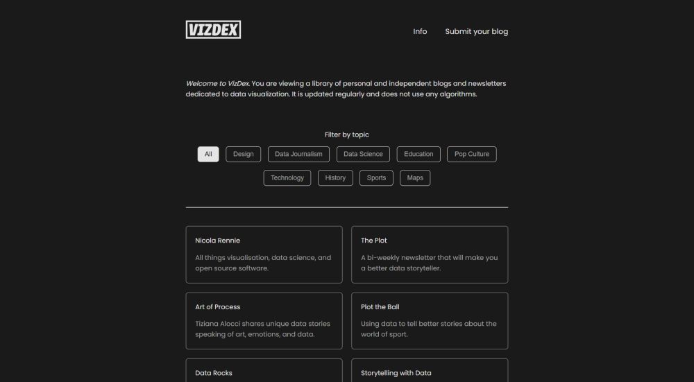
Introducing VizDex!
An ever-growing library of personal and independent blogs and newsletters dedicated to data visualization.
vizdexproject.com
An ever-growing library of personal and independent blogs and newsletters dedicated to data visualization.
vizdexproject.com
VizDex
A library of personal and independent blogs and newsletters dedicated to data visualization.
vizdexproject.com
June 20, 2025 at 3:31 PM
Introducing VizDex!
An ever-growing library of personal and independent blogs and newsletters dedicated to data visualization.
vizdexproject.com
An ever-growing library of personal and independent blogs and newsletters dedicated to data visualization.
vizdexproject.com
Just a reminder: #dataviz isn't intrinsically good or bad. Like other forms of communication, it can -and will- be used for propaganda as well.
By the way, the photo is from 2012.
By the way, the photo is from 2012.

June 19, 2025 at 7:56 AM
Just a reminder: #dataviz isn't intrinsically good or bad. Like other forms of communication, it can -and will- be used for propaganda as well.
By the way, the photo is from 2012.
By the way, the photo is from 2012.
Reposted by Marco Cortella

OMG #visualized will be back!! Visualized share.google/tOOaw9XSEVa4...
Visualized
share.google
June 15, 2025 at 6:27 PM
OMG #visualized will be back!! Visualized share.google/tOOaw9XSEVa4...
Reposted by Marco Cortella

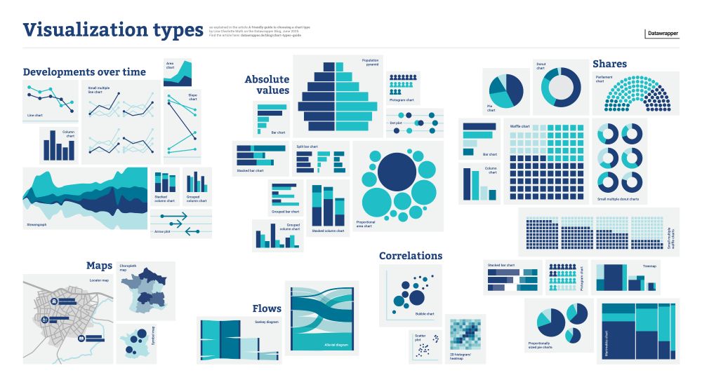
📊 There are *so* many chart types out there. Which one should you use for what kind of data and goal?
I tried to answer the question in a new blog post (and poster!): www.datawrapper.de/blog/chart-t...
I tried to answer the question in a new blog post (and poster!): www.datawrapper.de/blog/chart-t...
June 16, 2025 at 7:14 PM
📊 There are *so* many chart types out there. Which one should you use for what kind of data and goal?
I tried to answer the question in a new blog post (and poster!): www.datawrapper.de/blog/chart-t...
I tried to answer the question in a new blog post (and poster!): www.datawrapper.de/blog/chart-t...
Reposted by Marco Cortella

We’re thrilled to unveil the winners of the 2024 #IIBAwards! These works stand out not just for their mastery of #dataviz and storytelling, but for their impact and innovation. See the winners: www.informationisbeautifulawards.com/news/680-ann...
June 14, 2025 at 9:40 PM
We’re thrilled to unveil the winners of the 2024 #IIBAwards! These works stand out not just for their mastery of #dataviz and storytelling, but for their impact and innovation. See the winners: www.informationisbeautifulawards.com/news/680-ann...
Reposted by Marco Cortella

Visualizing abstract numbers / actual human beings ... visualizingpalestine.org/gaza-names/e...

Remember their names
Naming the Palestinians who have been killed in Gaza
visualizingpalestine.org
May 23, 2025 at 12:24 PM
Visualizing abstract numbers / actual human beings ... visualizingpalestine.org/gaza-names/e...

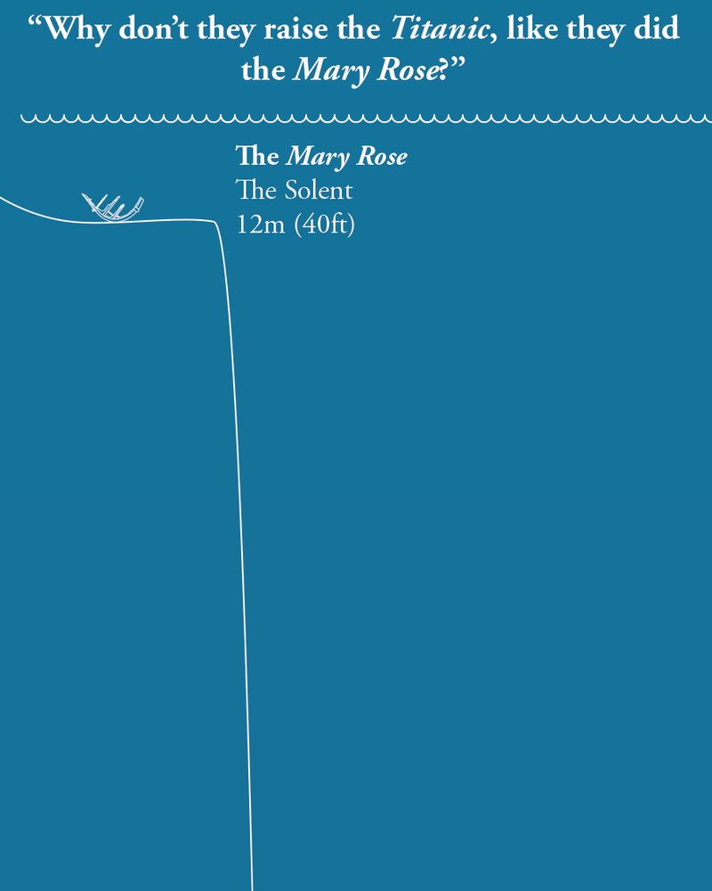
Not sure if this falls into the #scrollytelling category, but this is a very clever way to use social media to show a #dataviz.

On the anniversary of the sinking of the Titanic, we thought we'd answer a question that's often asked,
"If they raised the Mary Rose, why not raise the Titanic?"
Allow our scaled diagram to explain...
"If they raised the Mary Rose, why not raise the Titanic?"
Allow our scaled diagram to explain...
May 13, 2025 at 12:58 PM
Not sure if this falls into the #scrollytelling category, but this is a very clever way to use social media to show a #dataviz.
Reposted by Marco Cortella
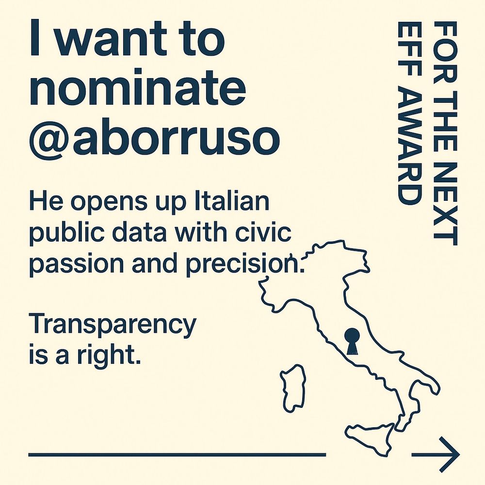
I want to nominate @aborruso.bsky.social for the next @eff.org award.
He opens up Italian public data with civic passion and precision.
Transparency is a right.
www.eff.org/nominate-nex...
#EFFAward #OpenData #CivicTech
He opens up Italian public data with civic passion and precision.
Transparency is a right.
www.eff.org/nominate-nex...
#EFFAward #OpenData #CivicTech
May 9, 2025 at 7:56 AM
I want to nominate @aborruso.bsky.social for the next @eff.org award.
He opens up Italian public data with civic passion and precision.
Transparency is a right.
www.eff.org/nominate-nex...
#EFFAward #OpenData #CivicTech
He opens up Italian public data with civic passion and precision.
Transparency is a right.
www.eff.org/nominate-nex...
#EFFAward #OpenData #CivicTech
Reposted by Marco Cortella

Our new interactive work is out! The New Pope. This is How the Catholic Church elects. #dataviz #interactive #infograohics #3D #datavisualization atlo.team/wp-content/u...

Az új pápa
Így választ magának vezetőt a katolikus egyház
atlo.team
May 5, 2025 at 7:21 AM
Our new interactive work is out! The New Pope. This is How the Catholic Church elects. #dataviz #interactive #infograohics #3D #datavisualization atlo.team/wp-content/u...
🎲 Data: The Game - Have fun with #data!
If you're into data or just curious, try this unique game by Luca Bolognini. Be a "Data-Tycoon": collect datasets, fend off cyber attacks, and manage risks. Available in physical form and free online.
👉 Try it now: data.game
#dataviz
If you're into data or just curious, try this unique game by Luca Bolognini. Be a "Data-Tycoon": collect datasets, fend off cyber attacks, and manage risks. Available in physical form and free online.
👉 Try it now: data.game
#dataviz
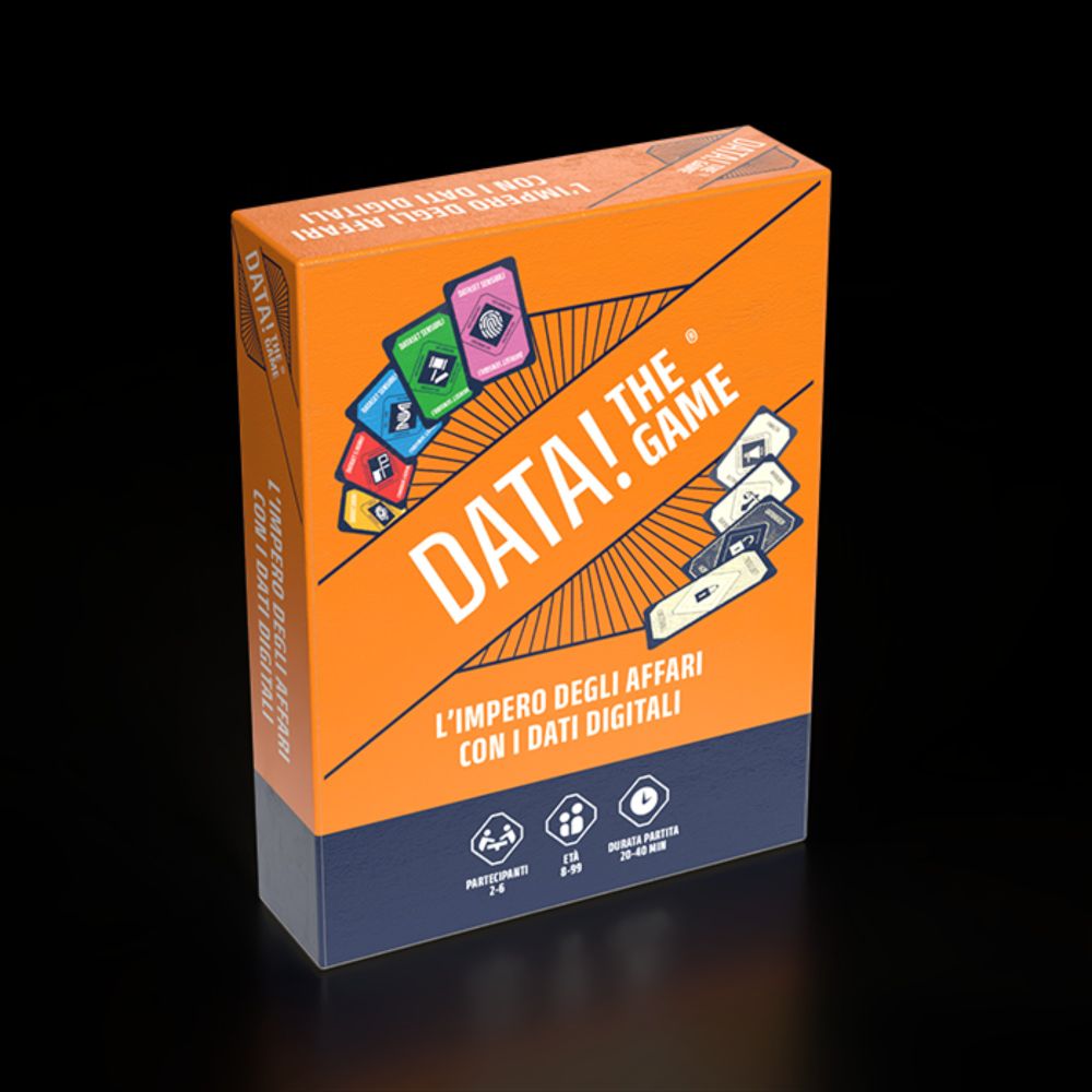
Data! The game - DATA! The Game
DATA! THE GAME - L’impero degli affari con i dati digitali - Diventa Data-Tycoon, creando un impero con i dati sensibili e i Data-Tesori
data.game
April 28, 2025 at 9:53 AM
Reposted by Marco Cortella

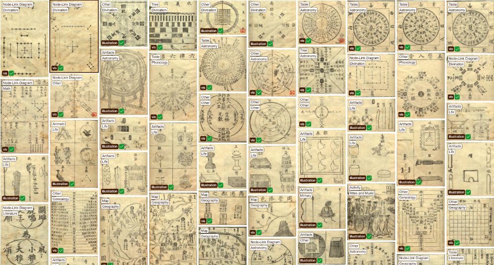
This collection of ancient Chinese visualizations deserves some of your time. It's another example that visualization isn't a Western world invention.
Thanks to @infowetrust.com for highlighting this gem.
zuantuset.github.io/gallery/#/
#dataviz
Thanks to @infowetrust.com for highlighting this gem.
zuantuset.github.io/gallery/#/
#dataviz
April 23, 2025 at 3:26 PM
This collection of ancient Chinese visualizations deserves some of your time. It's another example that visualization isn't a Western world invention.
Thanks to @infowetrust.com for highlighting this gem.
zuantuset.github.io/gallery/#/
#dataviz
Thanks to @infowetrust.com for highlighting this gem.
zuantuset.github.io/gallery/#/
#dataviz