


doublearrow.co.uk
@doublearrow64.bsky.social
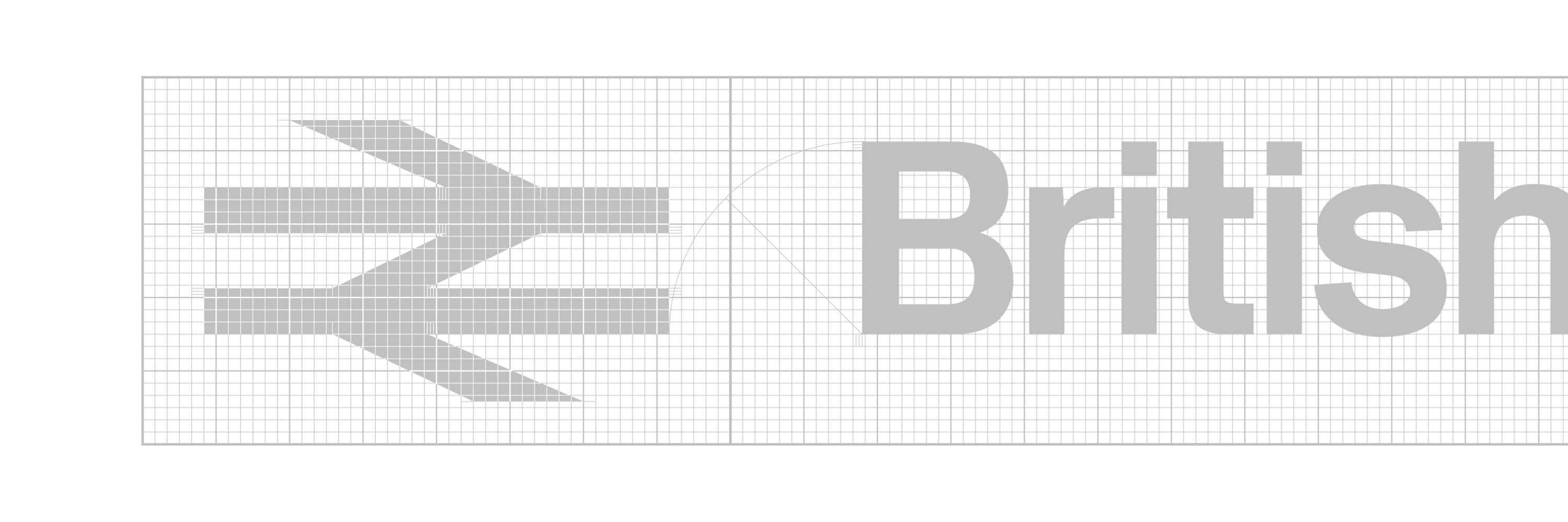
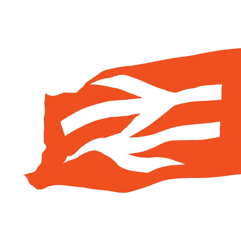
British Rail Corporate Identity 1965-1994
Pinned

‘Arrows of desire’, a book all about the illustrious British Rail symbol, published by the modernist® is now available for pre-order at…
the-modernist.org/products/arr...
the-modernist.org/products/arr...
Reposted by doublearrow.co.uk

Reposted by doublearrow.co.uk
Our Zeelander with his 'links' across the sea goes back a long way! Here he is in cahoots with the LNER in 1930.
flic.kr/p/2pL5Z7w
flic.kr/p/2pL5Z7w

February 12, 2026 at 10:54 PM
Our Zeelander with his 'links' across the sea goes back a long way! Here he is in cahoots with the LNER in 1930.
flic.kr/p/2pL5Z7w
flic.kr/p/2pL5Z7w
Unusual ferryman bloke with a skipping rope which actually turns out to be a map of the Channel with London, Harwich and Hook of Holland marked; not an ideal foil to the double arrow!

February 12, 2026 at 10:15 PM
Unusual ferryman bloke with a skipping rope which actually turns out to be a map of the Channel with London, Harwich and Hook of Holland marked; not an ideal foil to the double arrow!
Lovely
Though I do wonder how many people notice that thanks to the GNER-era Project Delta refit and addition of an extra vent on the one side that the original livery didn't have to cater for, the InterCity logo and Swallow emblem on one side are smaller and closer together than they are on the other 🧐
February 12, 2026 at 9:52 AM
Lovely
Nice work, Gareth :)
Some gratuitous depot photos from the final stage of 91119's re-livery, in November 2022.


February 12, 2026 at 9:50 AM
Nice work, Gareth :)
Type 5, 58036 and classmate soak up the sun outside Toton TMD. Very much the home for the locos serving the Nottinghamshire coalfields. The loco was one of many exported to France to see out its days.
#Class58 #Bone #RedStripeRailfreight #Toton #BritishRail #TO
#Class58 #Bone #RedStripeRailfreight #Toton #BritishRail #TO

February 2, 2026 at 5:32 PM
Please not red


February 2, 2026 at 5:26 PM
Please not red
Mmmm, imaginary trains (done properly)

How did we possibly manage five years ago? Or forty years ago? BETTER is how!


February 2, 2026 at 5:14 PM
Mmmm, imaginary trains (done properly)
Fair point
Top tip: to avoid having the British Union of Fascists logo on the side of your mock-up train, don't use horrible text-to-image AI slop instead of actual designers and artists.
www.scotsman.com/news/transpo...
www.scotsman.com/news/transpo...


February 2, 2026 at 5:12 PM
Fair point
This can go back to where it came from…

Oh dear @doublearrow64.bsky.social it was going so well. Not sure what guidelines these have come from at Manc Vicc?! The grey dividers, the odd extra blank boxes and those arena ads can get in the bin 🙄🤦♂️ And yet Salford Central is point 🤷♂️


February 2, 2026 at 5:01 PM
This can go back to where it came from…
Will never understand why the stripes are a different depth on locomotives #NetworkSouthEast #NSE

January 30, 2026 at 3:07 PM
Will never understand why the stripes are a different depth on locomotives #NetworkSouthEast #NSE
I can forgive that, partly because silver (‘Argent’) and white are equivalents in heraldic terms) 😬
Agree! I think white might look better here too (Leicester)?

January 29, 2026 at 7:52 PM
I can forgive that, partly because silver (‘Argent’) and white are equivalents in heraldic terms) 😬
Spectacular; a simple, single, white double arrow is so effective; only muppets would want this to be red on that backdrop
Kingston upon Thames station (1935). Designed and built by The Southern Railway.

January 29, 2026 at 6:01 PM
Spectacular; a simple, single, white double arrow is so effective; only muppets would want this to be red on that backdrop
Reposted by doublearrow.co.uk
Three transport logotype/symbols in a row at Manchester Piccadilly station in 1986 on a saggy banner. #logo #manchester #transport @doublearrow64.bsky.social @richardprice.bsky.social #transport #manchester

January 29, 2026 at 10:12 AM
Three transport logotype/symbols in a row at Manchester Piccadilly station in 1986 on a saggy banner. #logo #manchester #transport @doublearrow64.bsky.social @richardprice.bsky.social #transport #manchester
Mmmm, tripe :)
@richardprice.bsky.social
@richardprice.bsky.social
I can do tripe. I won't buy from anywhere other than the UCP. And I've 99 ways of preparing & serving tripe & cowheel thanks to this 1929 recipe book. @robertwoolley.bsky.social @tripeuk.bsky.social
↘️ flic.kr/p/UyP8tW
↘️ flic.kr/p/UyP8tW

January 28, 2026 at 7:45 PM
Mmmm, tripe :)
@richardprice.bsky.social
@richardprice.bsky.social
Reposted by doublearrow.co.uk

And of course because I like to have a bit of fun....

January 26, 2026 at 9:13 PM
And of course because I like to have a bit of fun....
Reposted by doublearrow.co.uk
One for @doublearrow64.bsky.social - extant Rail Alphabet usage in Denmark
I wonder if there's a Dansk wayfinding/publicity specialist tearing their hair out considering DSB have their own set of specific, bespoke (and quite attractive IMHO) fonts/typefaces.
I wonder if there's a Dansk wayfinding/publicity specialist tearing their hair out considering DSB have their own set of specific, bespoke (and quite attractive IMHO) fonts/typefaces.


January 26, 2026 at 7:09 PM
One for @doublearrow64.bsky.social - extant Rail Alphabet usage in Denmark
I wonder if there's a Dansk wayfinding/publicity specialist tearing their hair out considering DSB have their own set of specific, bespoke (and quite attractive IMHO) fonts/typefaces.
I wonder if there's a Dansk wayfinding/publicity specialist tearing their hair out considering DSB have their own set of specific, bespoke (and quite attractive IMHO) fonts/typefaces.
Happy 50th birthday Birmingham International!

#OnThisDay 50 years ago Birmingham International opened, serving Birmingham Airport and the National Exhibition Centre, which opened a week later on 2nd February 1976. Not the most inspiring station, the big BR double arrow is for me the only redeeming feature of Ray Moorcroft's design.

January 26, 2026 at 1:27 PM
Happy 50th birthday Birmingham International!
Reposted by doublearrow.co.uk
I know the GLA, who issued this, don't use TfL's Johnston - but boy, this shows why TfL do. Talk about looking 'wrong'. #typography #design @doublearrow64.bsky.social

📍🚍New Superloop route unlocked in South East London.
The SL11 is now live, bringing quicker journeys and better connections with the Tube and Elizabeth line.
Free to ride for the first week. Hop on now.
The SL11 is now live, bringing quicker journeys and better connections with the Tube and Elizabeth line.
Free to ride for the first week. Hop on now.

January 24, 2026 at 2:05 PM
I know the GLA, who issued this, don't use TfL's Johnston - but boy, this shows why TfL do. Talk about looking 'wrong'. #typography #design @doublearrow64.bsky.social
Large logo, revised blue, call it what you will, in my opinion the greatest livery of the British Rail era. These two giants of their time prove the point! 47593 ‘Galloway Princess’ and 37401 ‘Mary Queen of Scots’ at York a couple of years ago.
#Class47 #Class37 #BritishRail
#Class47 #Class37 #BritishRail

January 24, 2026 at 11:07 AM
Who is propagating this nonsense? Apart from always having been distinctly nondescript, those Network Rail major station icons are now obsolete and bear absolutely no relation to the new wayfinding design idiom

Gawd that is all so wrong - that thing should not have been attached to TfL signage at all and overage certainly should no solid back shading / reversal
And then we the Old Railtrack station emblems refuse to die - given they are no longer in the manual - like these new additions 😖
And then we the Old Railtrack station emblems refuse to die - given they are no longer in the manual - like these new additions 😖

January 22, 2026 at 12:05 PM
Who is propagating this nonsense? Apart from always having been distinctly nondescript, those Network Rail major station icons are now obsolete and bear absolutely no relation to the new wayfinding design idiom
Reposted by doublearrow.co.uk
No missing the BR van @doublearrow64.bsky.social - from a video on FB about Eastern Scottish buses & in the very year, 1979, I was conductor Ashworth of New St garage who worked duties on this type of bus through this type of town!
(Richard Bache/Facebook)
(Richard Bache/Facebook)

January 21, 2026 at 6:15 PM
No missing the BR van @doublearrow64.bsky.social - from a video on FB about Eastern Scottish buses & in the very year, 1979, I was conductor Ashworth of New St garage who worked duties on this type of bus through this type of town!
(Richard Bache/Facebook)
(Richard Bache/Facebook)
Intercity Pullman carriage names were aligned very oddly; the Flame Red stripe was 180mm deep, the x-height was 80mm, the gap below was 35mm and the gap above 65mm and I have absolutely no idea why, text was usually centred on x-height
flic.kr/p/2jjGiEj (Michael J Collins)
flic.kr/p/2jjGiEj (Michael J Collins)


January 19, 2026 at 7:59 PM
Intercity Pullman carriage names were aligned very oddly; the Flame Red stripe was 180mm deep, the x-height was 80mm, the gap below was 35mm and the gap above 65mm and I have absolutely no idea why, text was usually centred on x-height
flic.kr/p/2jjGiEj (Michael J Collins)
flic.kr/p/2jjGiEj (Michael J Collins)
Admittedly this is only temporary but “We’ll do our own thing, thanks” is the scourge of wayfinding across the British rail network…

@doublearrow64.bsky.social Have you seen the temporary signs in RA2 at Waterloo? Escalators out of service so an alternative route is signposted in what looks like the new wayfinding style - but all on LU property! One is on an existing LU sign so uses New Johnston.


January 19, 2026 at 11:54 AM
Admittedly this is only temporary but “We’ll do our own thing, thanks” is the scourge of wayfinding across the British rail network…
Reposted by doublearrow.co.uk
Morning all. A bitterly cold morning as I recall, as 37408 ‘Loch Rannoch’ traversed the Oban line with the Grangemouth to Connell Ferry oil train. Another service that was lost to road transport shortly after. Hope you all have a great day.
#Class37 #Tractor #LargeLogo
#Class37 #Tractor #LargeLogo

January 18, 2026 at 6:28 AM
Morning all. A bitterly cold morning as I recall, as 37408 ‘Loch Rannoch’ traversed the Oban line with the Grangemouth to Connell Ferry oil train. Another service that was lost to road transport shortly after. Hope you all have a great day.
#Class37 #Tractor #LargeLogo
#Class37 #Tractor #LargeLogo