


Koen Van den Eeckhout
@vandeneeckhoutkoen.bsky.social
📊 Turning complex data into powerful visual stories!
Author of 'Powerful Charts'. Ex-physicist. He/him 🏳️🌈
Author of 'Powerful Charts'. Ex-physicist. He/him 🏳️🌈
They often don't feel comfortable when it comes to creativity and design, but in vector illustration their analytical mindset is a huge bonus. Illustration exercises become small algorithmic puzzles. And the barrier between analytical skills and creative skills is shattered.
4/4
4/4
November 21, 2025 at 8:30 AM
They often don't feel comfortable when it comes to creativity and design, but in vector illustration their analytical mindset is a huge bonus. Illustration exercises become small algorithmic puzzles. And the barrier between analytical skills and creative skills is shattered.
4/4
4/4
📐 Creating an illustrations is very much like developing an algorithm: which shapes do we need, in what order, and how are they going to interact?
That's why I'm always very passionate when I have the opportunity to teach vector images to researchers or engineers.
3/4
That's why I'm always very passionate when I have the opportunity to teach vector images to researchers or engineers.
3/4
November 21, 2025 at 8:30 AM
📐 Creating an illustrations is very much like developing an algorithm: which shapes do we need, in what order, and how are they going to interact?
That's why I'm always very passionate when I have the opportunity to teach vector images to researchers or engineers.
3/4
That's why I'm always very passionate when I have the opportunity to teach vector images to researchers or engineers.
3/4
But personally, I like vector images because it's a highly analytical way of creating visuals.
📐 The shapes are mathematically defined. It's all about Bézier curves, control points, curvature radii, and splines.
2/4
📐 The shapes are mathematically defined. It's all about Bézier curves, control points, curvature radii, and splines.
2/4
November 21, 2025 at 8:30 AM
But personally, I like vector images because it's a highly analytical way of creating visuals.
📐 The shapes are mathematically defined. It's all about Bézier curves, control points, curvature radii, and splines.
2/4
📐 The shapes are mathematically defined. It's all about Bézier curves, control points, curvature radii, and splines.
2/4
Combined with their color blindness simulator, this makes Coolors one of the most valuable color tools for a lot of my projects 💪
3/3
3/3

November 14, 2025 at 12:09 PM
Combined with their color blindness simulator, this makes Coolors one of the most valuable color tools for a lot of my projects 💪
3/3
3/3
This will help you to quickly check whether your accent color is prominent enough, whether colors are distinguishable enough, and what the overall look and feel of your visual will be.
2/3
2/3
November 14, 2025 at 12:09 PM
This will help you to quickly check whether your accent color is prominent enough, whether colors are distinguishable enough, and what the overall look and feel of your visual will be.
2/3
2/3
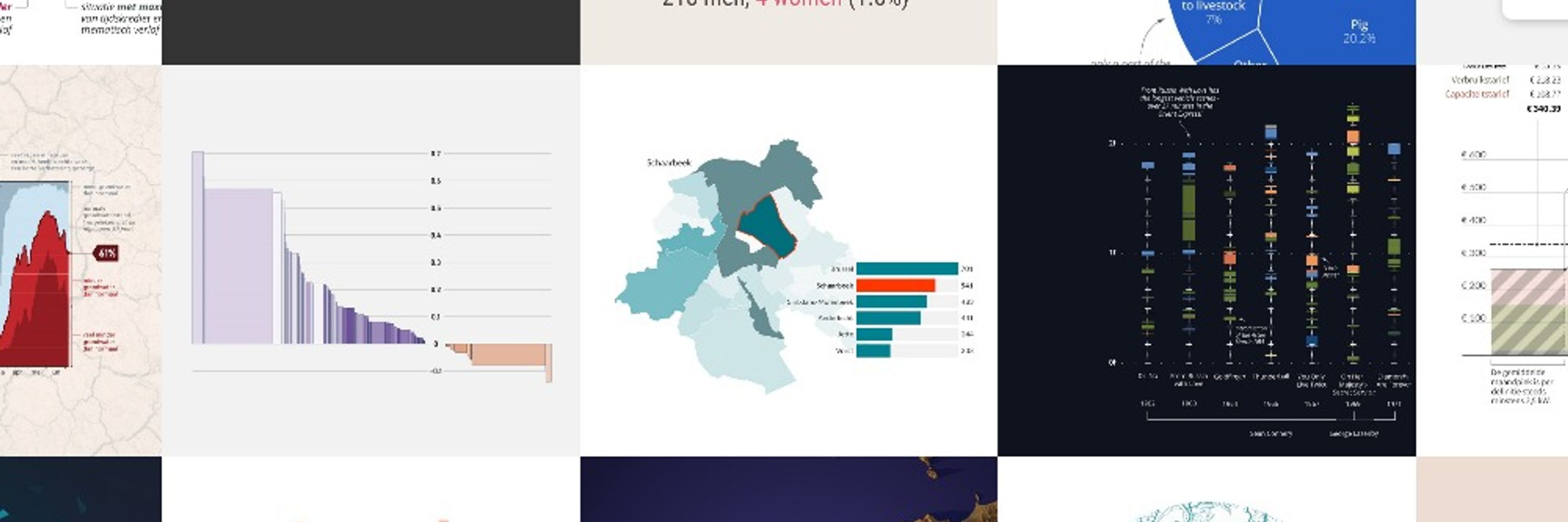
Such a complicated topic sometimes requires more out-of-the-box charts. But with careful design choices, even an uncommon chart can become easy to understand!
5/5
5/5
November 7, 2025 at 4:12 PM
Such a complicated topic sometimes requires more out-of-the-box charts. But with careful design choices, even an uncommon chart can become easy to understand!
5/5
5/5
This is one of the visuals I created for the book 'Wat als?' by Niel Hens and Christel Faes, which talks about the mathematical models used in monitoring and predicting the spread of Covid.
4/5
4/5

November 7, 2025 at 4:12 PM
This is one of the visuals I created for the book 'Wat als?' by Niel Hens and Christel Faes, which talks about the mathematical models used in monitoring and predicting the spread of Covid.
4/5
4/5
⭐ No visual overload - make sure we're telling only 1 story at a time
⭐ Helpful annotations - use arrows and labels to guide people through the visual
⭐ Helpful visual cues - use color and brightness to show what different sections of the chart actually mean
3/5
⭐ Helpful annotations - use arrows and labels to guide people through the visual
⭐ Helpful visual cues - use color and brightness to show what different sections of the chart actually mean
3/5

November 7, 2025 at 4:12 PM
⭐ No visual overload - make sure we're telling only 1 story at a time
⭐ Helpful annotations - use arrows and labels to guide people through the visual
⭐ Helpful visual cues - use color and brightness to show what different sections of the chart actually mean
3/5
⭐ Helpful annotations - use arrows and labels to guide people through the visual
⭐ Helpful visual cues - use color and brightness to show what different sections of the chart actually mean
3/5
Does that mean we should never use such a chart? No - but it does mean we have to be very careful how we present it.
2/5
2/5
November 7, 2025 at 4:12 PM
Does that mean we should never use such a chart? No - but it does mean we have to be very careful how we present it.
2/5
2/5
I'm sure there are many more great ones out there... which ones should I add to the list?
And oh - I'm building my own short and snappy newsletter as well. It's a work in progress, but if you want to join, head over to baryon.be/newsletter
5/5
And oh - I'm building my own short and snappy newsletter as well. It's a work in progress, but if you want to join, head over to baryon.be/newsletter
5/5
Newsletter – Baryon
Every now and then we send out a newsletter with latest work, handpicked inspirational infographics, must-read blog posts, upcoming dates for workshops and presentations, and links to useful tools…
baryon.be
October 31, 2025 at 9:36 AM
I'm sure there are many more great ones out there... which ones should I add to the list?
And oh - I'm building my own short and snappy newsletter as well. It's a work in progress, but if you want to join, head over to baryon.be/newsletter
5/5
And oh - I'm building my own short and snappy newsletter as well. It's a work in progress, but if you want to join, head over to baryon.be/newsletter
5/5
📩 Quantum of Sollazzo, by Guiseppe Sollazzo - a curated set of data and dataviz topics
quantumofsollazzo.com
📩 Dataviz Universe, by Yan Holtz - by one of the absolute masters of our craft
www.yan-holtz.com
4/5
quantumofsollazzo.com
📩 Dataviz Universe, by Yan Holtz - by one of the absolute masters of our craft
www.yan-holtz.com
4/5
October 31, 2025 at 9:36 AM
📩 Quantum of Sollazzo, by Guiseppe Sollazzo - a curated set of data and dataviz topics
quantumofsollazzo.com
📩 Dataviz Universe, by Yan Holtz - by one of the absolute masters of our craft
www.yan-holtz.com
4/5
quantumofsollazzo.com
📩 Dataviz Universe, by Yan Holtz - by one of the absolute masters of our craft
www.yan-holtz.com
4/5
📩 Evergreen Data, by Stephanie Evergreen - a more analytical approach to dataviz
stephanieevergreen.com/newsletter-s...
📩 This Week in Data Viz - if you're a member of the Data Visualization Society
www.datavisualizationsociety.org
3/5
stephanieevergreen.com/newsletter-s...
📩 This Week in Data Viz - if you're a member of the Data Visualization Society
www.datavisualizationsociety.org
3/5
October 31, 2025 at 9:36 AM
📩 Evergreen Data, by Stephanie Evergreen - a more analytical approach to dataviz
stephanieevergreen.com/newsletter-s...
📩 This Week in Data Viz - if you're a member of the Data Visualization Society
www.datavisualizationsociety.org
3/5
stephanieevergreen.com/newsletter-s...
📩 This Week in Data Viz - if you're a member of the Data Visualization Society
www.datavisualizationsociety.org
3/5
📩 Chartography, by RJ Andrews - one of the more inspirational newsletters out there
www.chartography.net
📩 The Plot, by Evelina Parrou - more in-depth stories on specific topics and projects
www.theplot.media
2/5
www.chartography.net
📩 The Plot, by Evelina Parrou - more in-depth stories on specific topics and projects
www.theplot.media
2/5
October 31, 2025 at 9:36 AM
📩 Chartography, by RJ Andrews - one of the more inspirational newsletters out there
www.chartography.net
📩 The Plot, by Evelina Parrou - more in-depth stories on specific topics and projects
www.theplot.media
2/5
www.chartography.net
📩 The Plot, by Evelina Parrou - more in-depth stories on specific topics and projects
www.theplot.media
2/5
Source of the original visual: Recent Advantages and challenges in uncertainty visualization: A survey, by Aasim Kamal et al., Journal of Visualization 24 (2021) p861
8/8
8/8
October 28, 2025 at 2:26 PM
Source of the original visual: Recent Advantages and challenges in uncertainty visualization: A survey, by Aasim Kamal et al., Journal of Visualization 24 (2021) p861
8/8
8/8
The end result is a content overview that provides structure and insight, rather than feeling cramped and cluttered. Does it take up more space? Yes, but in an article of 30 pages that will hardly matter.
7/8
7/8

October 28, 2025 at 2:26 PM
The end result is a content overview that provides structure and insight, rather than feeling cramped and cluttered. Does it take up more space? Yes, but in an article of 30 pages that will hardly matter.
7/8
7/8
☑️ Emphasis: highlight important elements by using accent colors, more contrast, or an impactful icon
☑️ Whitespace: use empty space to provide ample room for the elements to breathe
☑️ Proximity: place related items or topics closer together
6/8
☑️ Whitespace: use empty space to provide ample room for the elements to breathe
☑️ Proximity: place related items or topics closer together
6/8
October 28, 2025 at 2:26 PM
☑️ Emphasis: highlight important elements by using accent colors, more contrast, or an impactful icon
☑️ Whitespace: use empty space to provide ample room for the elements to breathe
☑️ Proximity: place related items or topics closer together
6/8
☑️ Whitespace: use empty space to provide ample room for the elements to breathe
☑️ Proximity: place related items or topics closer together
6/8
☑️ Functional colors: don't use your colors for decoration, use them to sparingly to distinguish between important chunks of your content
☑️ Alignment: nicely align elements (horizontally or vertically) for a less cluttered look
5/8
☑️ Alignment: nicely align elements (horizontally or vertically) for a less cluttered look
5/8
October 28, 2025 at 2:26 PM
☑️ Functional colors: don't use your colors for decoration, use them to sparingly to distinguish between important chunks of your content
☑️ Alignment: nicely align elements (horizontally or vertically) for a less cluttered look
5/8
☑️ Alignment: nicely align elements (horizontally or vertically) for a less cluttered look
5/8
☑️ Hierarchy: make what's most important (chapter titles, highlights) more prominent (bolder, larger font), send what's less important to the background (smaller text, gray). For example: if every word is capitalized, none of them will really stand out!
4/8
4/8
October 28, 2025 at 2:26 PM
☑️ Hierarchy: make what's most important (chapter titles, highlights) more prominent (bolder, larger font), send what's less important to the background (smaller text, gray). For example: if every word is capitalized, none of them will really stand out!
4/8
4/8
The key is always in applying the design principles:
☑️ Flow: don't just position elements where they fit - provide a clear flow from start to finish. Numbers and a clear path to follow can help.
3/8
☑️ Flow: don't just position elements where they fit - provide a clear flow from start to finish. Numbers and a clear path to follow can help.
3/8
October 28, 2025 at 2:26 PM
The key is always in applying the design principles:
☑️ Flow: don't just position elements where they fit - provide a clear flow from start to finish. Numbers and a clear path to follow can help.
3/8
☑️ Flow: don't just position elements where they fit - provide a clear flow from start to finish. Numbers and a clear path to follow can help.
3/8
Even an ordinary table of contents or article summary can be redesigned into a helpful, insightful overview of the structure.
2/8
2/8

October 28, 2025 at 2:26 PM
Even an ordinary table of contents or article summary can be redesigned into a helpful, insightful overview of the structure.
2/8
2/8