


Koen Van den Eeckhout
@vandeneeckhoutkoen.bsky.social
📊 Turning complex data into powerful visual stories!
Author of 'Powerful Charts'. Ex-physicist. He/him 🏳️🌈
Author of 'Powerful Charts'. Ex-physicist. He/him 🏳️🌈
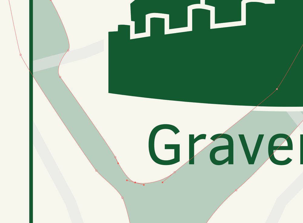
But personally, I like vector images because it's a highly analytical way of creating visuals.
📐 The shapes are mathematically defined. It's all about Bézier curves, control points, curvature radii, and splines.
2/4
📐 The shapes are mathematically defined. It's all about Bézier curves, control points, curvature radii, and splines.
2/4
November 21, 2025 at 8:30 AM
But personally, I like vector images because it's a highly analytical way of creating visuals.
📐 The shapes are mathematically defined. It's all about Bézier curves, control points, curvature radii, and splines.
2/4
📐 The shapes are mathematically defined. It's all about Bézier curves, control points, curvature radii, and splines.
2/4
I love vector images. But not for the obvious reasons.
The obvious benefits are well known:
✅ they're infinitely scalable without worries about the resolution
✅ they're easy and fast to edit
1/4
#informationdesign
The obvious benefits are well known:
✅ they're infinitely scalable without worries about the resolution
✅ they're easy and fast to edit
1/4
#informationdesign

November 21, 2025 at 8:30 AM
I love vector images. But not for the obvious reasons.
The obvious benefits are well known:
✅ they're infinitely scalable without worries about the resolution
✅ they're easy and fast to edit
1/4
#informationdesign
The obvious benefits are well known:
✅ they're infinitely scalable without worries about the resolution
✅ they're easy and fast to edit
1/4
#informationdesign
Combined with their color blindness simulator, this makes Coolors one of the most valuable color tools for a lot of my projects 💪
3/3
3/3

November 14, 2025 at 12:09 PM
Combined with their color blindness simulator, this makes Coolors one of the most valuable color tools for a lot of my projects 💪
3/3
3/3
🎨 Not sure how your color combination will look like in real life?
I love how Coolors' "Palette Visualizer" helps you with exactly that in a fast and simple way: pick any color combination and see it applied in illustrations, typography, and even a dashboard.
1/3
I love how Coolors' "Palette Visualizer" helps you with exactly that in a fast and simple way: pick any color combination and see it applied in illustrations, typography, and even a dashboard.
1/3

November 14, 2025 at 12:09 PM
🎨 Not sure how your color combination will look like in real life?
I love how Coolors' "Palette Visualizer" helps you with exactly that in a fast and simple way: pick any color combination and see it applied in illustrations, typography, and even a dashboard.
1/3
I love how Coolors' "Palette Visualizer" helps you with exactly that in a fast and simple way: pick any color combination and see it applied in illustrations, typography, and even a dashboard.
1/3
This is one of the visuals I created for the book 'Wat als?' by Niel Hens and Christel Faes, which talks about the mathematical models used in monitoring and predicting the spread of Covid.
4/5
4/5

November 7, 2025 at 4:12 PM
This is one of the visuals I created for the book 'Wat als?' by Niel Hens and Christel Faes, which talks about the mathematical models used in monitoring and predicting the spread of Covid.
4/5
4/5
⭐ No visual overload - make sure we're telling only 1 story at a time
⭐ Helpful annotations - use arrows and labels to guide people through the visual
⭐ Helpful visual cues - use color and brightness to show what different sections of the chart actually mean
3/5
⭐ Helpful annotations - use arrows and labels to guide people through the visual
⭐ Helpful visual cues - use color and brightness to show what different sections of the chart actually mean
3/5

November 7, 2025 at 4:12 PM
⭐ No visual overload - make sure we're telling only 1 story at a time
⭐ Helpful annotations - use arrows and labels to guide people through the visual
⭐ Helpful visual cues - use color and brightness to show what different sections of the chart actually mean
3/5
⭐ Helpful annotations - use arrows and labels to guide people through the visual
⭐ Helpful visual cues - use color and brightness to show what different sections of the chart actually mean
3/5
It's fine to have an unusual chart type. But you might consider giving your audience some help interpreting it.
A connected scatter plot, for example, is not the most common type of chart. And when one dimension is the derivative of the other it gets even more complicated.
1/5
A connected scatter plot, for example, is not the most common type of chart. And when one dimension is the derivative of the other it gets even more complicated.
1/5

November 7, 2025 at 4:12 PM
It's fine to have an unusual chart type. But you might consider giving your audience some help interpreting it.
A connected scatter plot, for example, is not the most common type of chart. And when one dimension is the derivative of the other it gets even more complicated.
1/5
A connected scatter plot, for example, is not the most common type of chart. And when one dimension is the derivative of the other it gets even more complicated.
1/5
#Dataviz newsletters! Here are the ones you shouldn't miss:
📩 Data Vis Dispatch, by Datawrapper - this is the one I never miss - my Nobel Prize visual was featured in a recent edition, I'm always super proud when that happens!
www.datawrapper.de/blog/newslet...
1/5
📩 Data Vis Dispatch, by Datawrapper - this is the one I never miss - my Nobel Prize visual was featured in a recent edition, I'm always super proud when that happens!
www.datawrapper.de/blog/newslet...
1/5

October 31, 2025 at 9:36 AM
#Dataviz newsletters! Here are the ones you shouldn't miss:
📩 Data Vis Dispatch, by Datawrapper - this is the one I never miss - my Nobel Prize visual was featured in a recent edition, I'm always super proud when that happens!
www.datawrapper.de/blog/newslet...
1/5
📩 Data Vis Dispatch, by Datawrapper - this is the one I never miss - my Nobel Prize visual was featured in a recent edition, I'm always super proud when that happens!
www.datawrapper.de/blog/newslet...
1/5
The end result is a content overview that provides structure and insight, rather than feeling cramped and cluttered. Does it take up more space? Yes, but in an article of 30 pages that will hardly matter.
7/8
7/8

October 28, 2025 at 2:26 PM
The end result is a content overview that provides structure and insight, rather than feeling cramped and cluttered. Does it take up more space? Yes, but in an article of 30 pages that will hardly matter.
7/8
7/8
Even an ordinary table of contents or article summary can be redesigned into a helpful, insightful overview of the structure.
2/8
2/8

October 28, 2025 at 2:26 PM
Even an ordinary table of contents or article summary can be redesigned into a helpful, insightful overview of the structure.
2/8
2/8
Qualitative information design: don't underestimate how much you can design with only text!
1/8
1/8

October 28, 2025 at 2:26 PM
Qualitative information design: don't underestimate how much you can design with only text!
1/8
1/8
That's why it's my pleasure to give several guest lectures to students in wildly different disciplines. Yesterday I introduced students in Sports Performance Data Analysis into the wonderful world of dumbbell charts, small multiples and data-ink ratio. Always fun and rewarding! #dataviz

October 22, 2025 at 8:15 AM
That's why it's my pleasure to give several guest lectures to students in wildly different disciplines. Yesterday I introduced students in Sports Performance Data Analysis into the wonderful world of dumbbell charts, small multiples and data-ink ratio. Always fun and rewarding! #dataviz
The Nobel Prize exists since 1901. In those 125 years, the Prize was awarded 927 times to a man, but only 68 times to a woman. 2009 was a record year, with 5 women winning the Prize.
4/4
4/4

October 14, 2025 at 8:26 AM
The Nobel Prize exists since 1901. In those 125 years, the Prize was awarded 927 times to a man, but only 68 times to a woman. 2009 was a record year, with 5 women winning the Prize.
4/4
4/4
Maria Corina Machado wins the Peace Prize for promoting democratic rights for the people of Venezuela.
3/4
3/4

October 14, 2025 at 8:26 AM
Maria Corina Machado wins the Peace Prize for promoting democratic rights for the people of Venezuela.
3/4
3/4
Mary E. Brunkow wins the Nobel Prize in Medicine for her discovery of peripheral immune tolerance, together with Frederick J. Ramsdell and Shimon Sakaguchi. They each receive 1/3rd of the award.
2/4
2/4

October 14, 2025 at 8:26 AM
Mary E. Brunkow wins the Nobel Prize in Medicine for her discovery of peripheral immune tolerance, together with Frederick J. Ramsdell and Shimon Sakaguchi. They each receive 1/3rd of the award.
2/4
2/4
Now that all the Nobel laureates for 2025 are known, it's time to update my 'Women of the Nobel Prize' visual!
This year, 2 women received the Prize.
1/4
#nobelprize #infographic
This year, 2 women received the Prize.
1/4
#nobelprize #infographic

October 14, 2025 at 8:26 AM
Now that all the Nobel laureates for 2025 are known, it's time to update my 'Women of the Nobel Prize' visual!
This year, 2 women received the Prize.
1/4
#nobelprize #infographic
This year, 2 women received the Prize.
1/4
#nobelprize #infographic
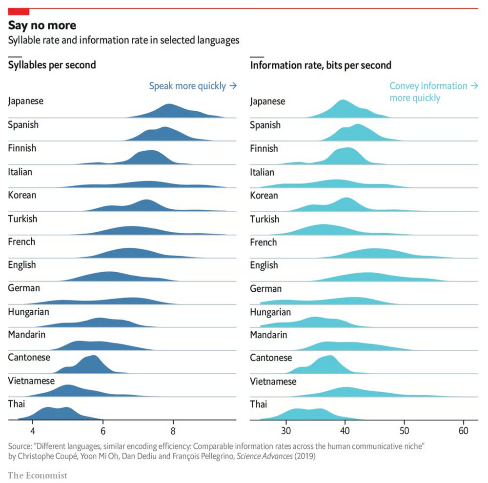
Some languages are spoken faster, but most languages have similar information rates.
When it comes to insightful data visuals, The Economist is a source of inspiration you shouldn't miss. Their 'Graphic Detail' section is a goldmine of charts:
www.economist.com/topics/graph...
1/2
When it comes to insightful data visuals, The Economist is a source of inspiration you shouldn't miss. Their 'Graphic Detail' section is a goldmine of charts:
www.economist.com/topics/graph...
1/2
October 7, 2025 at 2:44 PM
Some languages are spoken faster, but most languages have similar information rates.
When it comes to insightful data visuals, The Economist is a source of inspiration you shouldn't miss. Their 'Graphic Detail' section is a goldmine of charts:
www.economist.com/topics/graph...
1/2
When it comes to insightful data visuals, The Economist is a source of inspiration you shouldn't miss. Their 'Graphic Detail' section is a goldmine of charts:
www.economist.com/topics/graph...
1/2
Why do some infographics feel very professional, while yours feels amateurish?
There are 3 essential keys you might be missing:
🔑 Sketching: never start creating an infographic without working on paper first. Sketch ideas, explore layouts, iterate!
1/3
There are 3 essential keys you might be missing:
🔑 Sketching: never start creating an infographic without working on paper first. Sketch ideas, explore layouts, iterate!
1/3

September 30, 2025 at 8:04 AM
Why do some infographics feel very professional, while yours feels amateurish?
There are 3 essential keys you might be missing:
🔑 Sketching: never start creating an infographic without working on paper first. Sketch ideas, explore layouts, iterate!
1/3
There are 3 essential keys you might be missing:
🔑 Sketching: never start creating an infographic without working on paper first. Sketch ideas, explore layouts, iterate!
1/3
Of course, that’s something not every #dataviz tool will allow, so that’s only for when you’re willing to make some final custom modifications for your report.
Here’s the full comparison between our original visual, and the reworked chart.
13/15
Here’s the full comparison between our original visual, and the reworked chart.
13/15

September 25, 2025 at 7:51 AM
Of course, that’s something not every #dataviz tool will allow, so that’s only for when you’re willing to make some final custom modifications for your report.
Here’s the full comparison between our original visual, and the reworked chart.
13/15
Here’s the full comparison between our original visual, and the reworked chart.
13/15
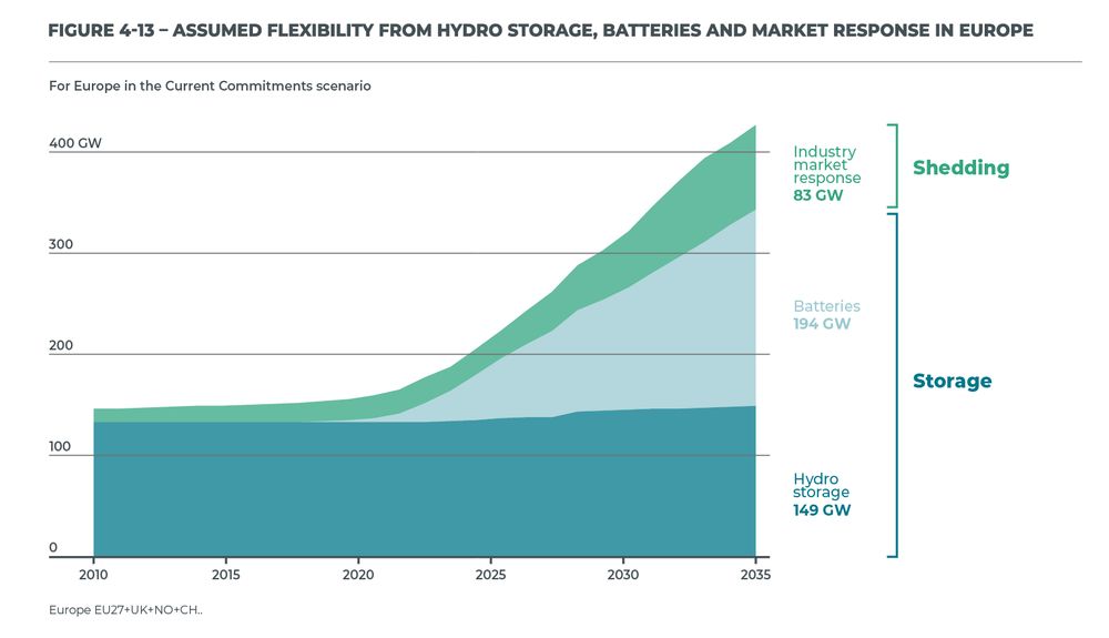
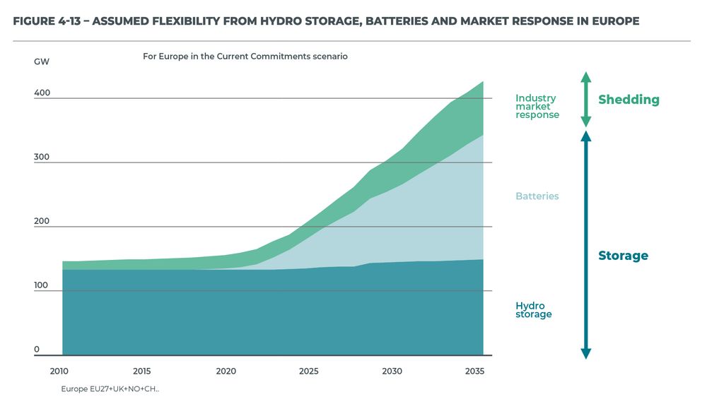
Finally, a small bonus tip. If you’re tight on space, you don’t have to make your gridlines go all the way from left to right. You could consider only adding them when they’re needed. That would give you some extra whitespace to fit, for example, your title and subtitle:
12/15
12/15

September 25, 2025 at 7:51 AM
Finally, a small bonus tip. If you’re tight on space, you don’t have to make your gridlines go all the way from left to right. You could consider only adding them when they’re needed. That would give you some extra whitespace to fit, for example, your title and subtitle:
12/15
12/15
Some final cleanup stuff:
- align the subtitle and note, move the GW label
- add ticks to the horizontal axis as well
- optimize the annotation to the right, brackets make more sense here than arrows
- add explicit data values for 2035 to further increase precision
11/15
- align the subtitle and note, move the GW label
- add ticks to the horizontal axis as well
- optimize the annotation to the right, brackets make more sense here than arrows
- add explicit data values for 2035 to further increase precision
11/15
September 25, 2025 at 7:51 AM
Some final cleanup stuff:
- align the subtitle and note, move the GW label
- add ticks to the horizontal axis as well
- optimize the annotation to the right, brackets make more sense here than arrows
- add explicit data values for 2035 to further increase precision
11/15
- align the subtitle and note, move the GW label
- add ticks to the horizontal axis as well
- optimize the annotation to the right, brackets make more sense here than arrows
- add explicit data values for 2035 to further increase precision
11/15
✅ more precision if you’re trying to estimate data values
✅ this precision boost impacts all parts of the visual: left, middle, and right
Here’s how that looks like for our visual.
9/15
✅ this precision boost impacts all parts of the visual: left, middle, and right
Here’s how that looks like for our visual.
9/15
September 25, 2025 at 7:51 AM
✅ more precision if you’re trying to estimate data values
✅ this precision boost impacts all parts of the visual: left, middle, and right
Here’s how that looks like for our visual.
9/15
✅ this precision boost impacts all parts of the visual: left, middle, and right
Here’s how that looks like for our visual.
9/15
This is a clean, strong visual thanks to the use of direct labels and some helpful annotations. The only thing I don’t like is that vertical axis sticking out like a sore thumb at the left side. However, the labels and annotations are in the way when we want to move it.
7/15
7/15

September 25, 2025 at 7:51 AM
This is a clean, strong visual thanks to the use of direct labels and some helpful annotations. The only thing I don’t like is that vertical axis sticking out like a sore thumb at the left side. However, the labels and annotations are in the way when we want to move it.
7/15
7/15
However, moving the vertical axis to the right hand side is not always an option. Often, we’ll have some direct labels or annotations on that side that make it harder to fit in the axis. It would create too much of a barrier between the data and the text.
6/15
6/15

September 25, 2025 at 7:51 AM
However, moving the vertical axis to the right hand side is not always an option. Often, we’ll have some direct labels or annotations on that side that make it harder to fit in the axis. It would create too much of a barrier between the data and the text.
6/15
6/15
A simple compromise is to move the axis to the right hand side of the visual, where it’s much closer to the ‘action’ — the values we’re actually most interested in.
4/15
4/15

September 25, 2025 at 7:51 AM
A simple compromise is to move the axis to the right hand side of the visual, where it’s much closer to the ‘action’ — the values we’re actually most interested in.
4/15
4/15