


Typofonderie: fonts & typography
@typofonderie.com
https://typofonderie.com/links
Join any graphic designer, art director, web designer who use our fonts! Buy the best quality typefaces you need. Est. 1994.
👋 Annual graphic & typography design conference + learn type design @typeparis.com
Join any graphic designer, art director, web designer who use our fonts! Buy the best quality typefaces you need. Est. 1994.
👋 Annual graphic & typography design conference + learn type design @typeparis.com
Reposted by Typofonderie: fonts & typography
Contrasts!

November 16, 2025 at 10:20 AM
Contrasts!
Contrasts!
November 16, 2025 at 10:20 AM
Contrasts!
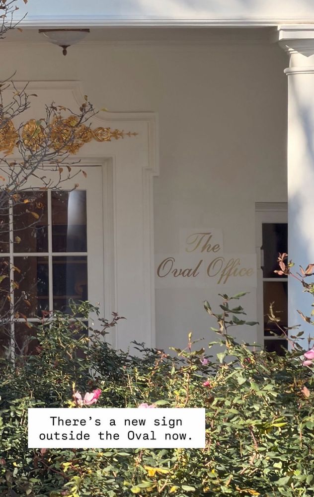
“OCR Scanning” 🤗

The Galveston Daily News
Galveston, Texas
Tuesday, November 15, 1994
Galveston, Texas
Tuesday, November 15, 1994

November 16, 2025 at 6:56 AM
“OCR Scanning” 🤗
A great type project done last summer.
Have a look to Guimart by Mathis Payet from France who received his #typeparis25 diploma with distinction. 🤩 typeparis.com/attendees
➽ TypeParis Summer26: Apply before 14 march 2026 to learn type design in Paris.
Discover typeparis.com/summer26
➽ TypeParis Summer26: Apply before 14 march 2026 to learn type design in Paris.
Discover typeparis.com/summer26

November 15, 2025 at 7:26 AM
A great type project done last summer.
Reposted by Typofonderie: fonts & typography
🐪Akhen, the Egypto-typographic remix
➽ typofonderie.com/gazette/Akhe...
Akhen pays homage to French égyptienne typefaces, offering versatility with OpenType features for stylistic combinations and a comprehensive glyph set. Discover the history of the first slab serifs and the references of Akhen.
➽ typofonderie.com/gazette/Akhe...
Akhen pays homage to French égyptienne typefaces, offering versatility with OpenType features for stylistic combinations and a comprehensive glyph set. Discover the history of the first slab serifs and the references of Akhen.

November 13, 2025 at 6:21 PM
🐪Akhen, the Egypto-typographic remix
➽ typofonderie.com/gazette/Akhe...
Akhen pays homage to French égyptienne typefaces, offering versatility with OpenType features for stylistic combinations and a comprehensive glyph set. Discover the history of the first slab serifs and the references of Akhen.
➽ typofonderie.com/gazette/Akhe...
Akhen pays homage to French égyptienne typefaces, offering versatility with OpenType features for stylistic combinations and a comprehensive glyph set. Discover the history of the first slab serifs and the references of Akhen.
Avant Garde, Alphatype, featuring its ligatures, Herb Lubalin.

November 14, 2025 at 9:22 AM
Avant Garde, Alphatype, featuring its ligatures, Herb Lubalin.
🐪Akhen, the Egypto-typographic remix
➽ typofonderie.com/gazette/Akhe...
Akhen pays homage to French égyptienne typefaces, offering versatility with OpenType features for stylistic combinations and a comprehensive glyph set. Discover the history of the first slab serifs and the references of Akhen.
➽ typofonderie.com/gazette/Akhe...
Akhen pays homage to French égyptienne typefaces, offering versatility with OpenType features for stylistic combinations and a comprehensive glyph set. Discover the history of the first slab serifs and the references of Akhen.
November 13, 2025 at 6:21 PM
🐪Akhen, the Egypto-typographic remix
➽ typofonderie.com/gazette/Akhe...
Akhen pays homage to French égyptienne typefaces, offering versatility with OpenType features for stylistic combinations and a comprehensive glyph set. Discover the history of the first slab serifs and the references of Akhen.
➽ typofonderie.com/gazette/Akhe...
Akhen pays homage to French égyptienne typefaces, offering versatility with OpenType features for stylistic combinations and a comprehensive glyph set. Discover the history of the first slab serifs and the references of Akhen.
Reposted by Typofonderie: fonts & typography
@mjskay.com
As typeface designer of Altesse used by Palais de l’Élysée, I can tell you that a good copperplate should be programmed to have letters to connect contextuallly: 👀 Line 2.
In Altesse Pro, I have created 1500 glyphs to make this happen. @jf.porchez.com
typofonderie.com/fonts/altesse
As typeface designer of Altesse used by Palais de l’Élysée, I can tell you that a good copperplate should be programmed to have letters to connect contextuallly: 👀 Line 2.
In Altesse Pro, I have created 1500 glyphs to make this happen. @jf.porchez.com
typofonderie.com/fonts/altesse

November 12, 2025 at 7:48 AM
@mjskay.com
As typeface designer of Altesse used by Palais de l’Élysée, I can tell you that a good copperplate should be programmed to have letters to connect contextuallly: 👀 Line 2.
In Altesse Pro, I have created 1500 glyphs to make this happen. @jf.porchez.com
typofonderie.com/fonts/altesse
As typeface designer of Altesse used by Palais de l’Élysée, I can tell you that a good copperplate should be programmed to have letters to connect contextuallly: 👀 Line 2.
In Altesse Pro, I have created 1500 glyphs to make this happen. @jf.porchez.com
typofonderie.com/fonts/altesse
Reposted by Typofonderie: fonts & typography
Collection of very typographic travel labels seen at the 1925-2025 Art Deco exhibition at the MAD, Paris.
madparis.fr/1925-2025-Ce...
madparis.fr/1925-2025-Ce...


November 9, 2025 at 4:50 PM
Collection of very typographic travel labels seen at the 1925-2025 Art Deco exhibition at the MAD, Paris.
madparis.fr/1925-2025-Ce...
madparis.fr/1925-2025-Ce...
Collection of very typographic travel labels seen at the 1925-2025 Art Deco exhibition at the MAD, Paris.
madparis.fr/1925-2025-Ce...
madparis.fr/1925-2025-Ce...
November 9, 2025 at 4:50 PM
Collection of very typographic travel labels seen at the 1925-2025 Art Deco exhibition at the MAD, Paris.
madparis.fr/1925-2025-Ce...
madparis.fr/1925-2025-Ce...
Reposted by Typofonderie: fonts & typography
Why more narrow and lighter?
— Because it helps differentiation with roman.
Why the Bézier points aren't on extremes on italic?
— It's less crucial than it was in the 90s low screen resolution. And much more adapted to Italic design!
— Because it helps differentiation with roman.
Why the Bézier points aren't on extremes on italic?
— It's less crucial than it was in the 90s low screen resolution. And much more adapted to Italic design!
September 19, 2025 at 8:31 AM
Why more narrow and lighter?
— Because it helps differentiation with roman.
Why the Bézier points aren't on extremes on italic?
— It's less crucial than it was in the 90s low screen resolution. And much more adapted to Italic design!
— Because it helps differentiation with roman.
Why the Bézier points aren't on extremes on italic?
— It's less crucial than it was in the 90s low screen resolution. And much more adapted to Italic design!
Reposted by Typofonderie: fonts & typography
Designing italic cap O in three steps:
1. Narrow them between 88-95% (but see horizontal weight proportionally)
2. Slant here 50% half of the H slant, because it's more easy to refine round letters from that than the font slant.
3. Redraw until it match your required in term of style. Here it's WIP.
1. Narrow them between 88-95% (but see horizontal weight proportionally)
2. Slant here 50% half of the H slant, because it's more easy to refine round letters from that than the font slant.
3. Redraw until it match your required in term of style. Here it's WIP.


September 19, 2025 at 8:28 AM
Designing italic cap O in three steps:
1. Narrow them between 88-95% (but see horizontal weight proportionally)
2. Slant here 50% half of the H slant, because it's more easy to refine round letters from that than the font slant.
3. Redraw until it match your required in term of style. Here it's WIP.
1. Narrow them between 88-95% (but see horizontal weight proportionally)
2. Slant here 50% half of the H slant, because it's more easy to refine round letters from that than the font slant.
3. Redraw until it match your required in term of style. Here it's WIP.
You are a student (FR or EN) in a graphic design school, or type design specialized school, apply for a paid internship at Typofonderie.
➽ typofonderie.com/help/interns
From January 2026 for 2 months or more.
➽ typofonderie.com/help/interns
From January 2026 for 2 months or more.

November 7, 2025 at 2:27 PM
You are a student (FR or EN) in a graphic design school, or type design specialized school, apply for a paid internship at Typofonderie.
➽ typofonderie.com/help/interns
From January 2026 for 2 months or more.
➽ typofonderie.com/help/interns
From January 2026 for 2 months or more.
Reposted by Typofonderie: fonts & typography
🐪Let’s show you how Akhen g was designed!
Akhen, is our NEW Egypto-Slab remixed
➽ typofonderie.com/fonts/akhen-...
Akhen designed by Jean François Porchez, is new typeface family inspired by French 19th-century metal and wood types, featuring three narrow widths and a large range of weights.
Akhen, is our NEW Egypto-Slab remixed
➽ typofonderie.com/fonts/akhen-...
Akhen designed by Jean François Porchez, is new typeface family inspired by French 19th-century metal and wood types, featuring three narrow widths and a large range of weights.
November 4, 2025 at 4:11 PM
🐪Let’s show you how Akhen g was designed!
Akhen, is our NEW Egypto-Slab remixed
➽ typofonderie.com/fonts/akhen-...
Akhen designed by Jean François Porchez, is new typeface family inspired by French 19th-century metal and wood types, featuring three narrow widths and a large range of weights.
Akhen, is our NEW Egypto-Slab remixed
➽ typofonderie.com/fonts/akhen-...
Akhen designed by Jean François Porchez, is new typeface family inspired by French 19th-century metal and wood types, featuring three narrow widths and a large range of weights.
Reposted by Typofonderie: fonts & typography
James Mosley (1935–2025)
In memory of our departed librarian, scholar and teacher. By Riccardo Olocco.
On @fontstand.com fontstand.com/news/essays/...
In memory of our departed librarian, scholar and teacher. By Riccardo Olocco.
On @fontstand.com fontstand.com/news/essays/...
November 5, 2025 at 1:12 PM
James Mosley (1935–2025)
In memory of our departed librarian, scholar and teacher. By Riccardo Olocco.
On @fontstand.com fontstand.com/news/essays/...
In memory of our departed librarian, scholar and teacher. By Riccardo Olocco.
On @fontstand.com fontstand.com/news/essays/...
Original ATypI membership card of José Mendoza. Note he was member #23. ATypI logotype set in Meridien.


November 6, 2025 at 2:45 PM
Original ATypI membership card of José Mendoza. Note he was member #23. ATypI logotype set in Meridien.

James Mosley (1935–2025)
In memory of our departed librarian, scholar and teacher. By Riccardo Olocco.
On @fontstand.com fontstand.com/news/essays/...
In memory of our departed librarian, scholar and teacher. By Riccardo Olocco.
On @fontstand.com fontstand.com/news/essays/...
November 5, 2025 at 1:12 PM
James Mosley (1935–2025)
In memory of our departed librarian, scholar and teacher. By Riccardo Olocco.
On @fontstand.com fontstand.com/news/essays/...
In memory of our departed librarian, scholar and teacher. By Riccardo Olocco.
On @fontstand.com fontstand.com/news/essays/...
🐪Let’s show you how Akhen g was designed!
Akhen, is our NEW Egypto-Slab remixed
➽ typofonderie.com/fonts/akhen-...
Akhen designed by Jean François Porchez, is new typeface family inspired by French 19th-century metal and wood types, featuring three narrow widths and a large range of weights.
Akhen, is our NEW Egypto-Slab remixed
➽ typofonderie.com/fonts/akhen-...
Akhen designed by Jean François Porchez, is new typeface family inspired by French 19th-century metal and wood types, featuring three narrow widths and a large range of weights.
November 4, 2025 at 4:11 PM
🐪Let’s show you how Akhen g was designed!
Akhen, is our NEW Egypto-Slab remixed
➽ typofonderie.com/fonts/akhen-...
Akhen designed by Jean François Porchez, is new typeface family inspired by French 19th-century metal and wood types, featuring three narrow widths and a large range of weights.
Akhen, is our NEW Egypto-Slab remixed
➽ typofonderie.com/fonts/akhen-...
Akhen designed by Jean François Porchez, is new typeface family inspired by French 19th-century metal and wood types, featuring three narrow widths and a large range of weights.
Reposted by Typofonderie: fonts & typography
FontJit is a small utility to efficiently lazy-load fonts! 🚀
FontJit gives you full control over how and when your fonts are loaded, and what should happen before, during and after.
Useful if you're working on font specimen sites, minisites, or huge font collections!
➡️ github.com/RoelN/FontJit
FontJit gives you full control over how and when your fonts are loaded, and what should happen before, during and after.
Useful if you're working on font specimen sites, minisites, or huge font collections!
➡️ github.com/RoelN/FontJit
GitHub - RoelN/FontJit: Lazy loading fonts via JavaScript
Lazy loading fonts via JavaScript. Contribute to RoelN/FontJit development by creating an account on GitHub.
github.com
October 30, 2025 at 9:59 AM
FontJit is a small utility to efficiently lazy-load fonts! 🚀
FontJit gives you full control over how and when your fonts are loaded, and what should happen before, during and after.
Useful if you're working on font specimen sites, minisites, or huge font collections!
➡️ github.com/RoelN/FontJit
FontJit gives you full control over how and when your fonts are loaded, and what should happen before, during and after.
Useful if you're working on font specimen sites, minisites, or huge font collections!
➡️ github.com/RoelN/FontJit
Reposted by Typofonderie: fonts & typography

Have a look to Airlie by Terrence Gillespie from Australia who received his #typeparis25 diploma with distinction. 🤩 typeparis.com/attendees
➽ TypeParis Summer26: Discover typeparis.com/summer25 + typeparis.com/faq
➽ TypeParis Summer26: Discover typeparis.com/summer25 + typeparis.com/faq

October 30, 2025 at 12:48 PM
Have a look to Airlie by Terrence Gillespie from Australia who received his #typeparis25 diploma with distinction. 🤩 typeparis.com/attendees
➽ TypeParis Summer26: Discover typeparis.com/summer25 + typeparis.com/faq
➽ TypeParis Summer26: Discover typeparis.com/summer25 + typeparis.com/faq
Reposted by Typofonderie: fonts & typography
Still time to book to hear Dr David Osbaldestin's talk 'Birmingham as seen through its display typography'. David Osbaldestin will present a range of interconnecting stories told through the display typefaces and jobbing printers of the city. www.cphc.org.uk/events/2025/...

Birmingham as seen through its display typography — CPHC
Part of the Baskerville 250 lecture series
www.cphc.org.uk
October 28, 2025 at 7:58 AM
Still time to book to hear Dr David Osbaldestin's talk 'Birmingham as seen through its display typography'. David Osbaldestin will present a range of interconnecting stories told through the display typefaces and jobbing printers of the city. www.cphc.org.uk/events/2025/...
Reposted by Typofonderie: fonts & typography
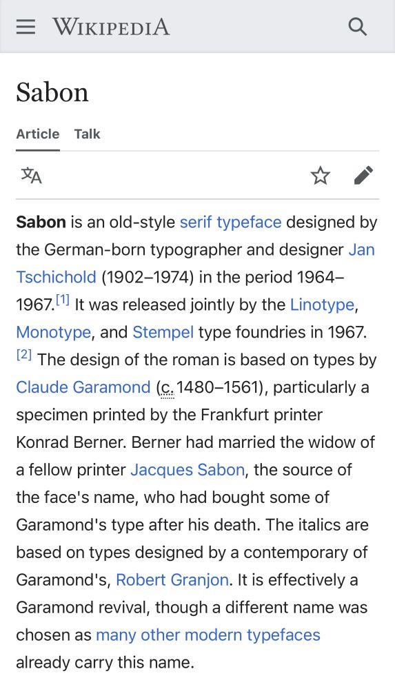
The original Wikipedia article about Sabon and the copy by Musk on Grokipedia.
The later copy should be renamed Copypedia?!
The later copy should be renamed Copypedia?!

October 28, 2025 at 8:25 AM
The original Wikipedia article about Sabon and the copy by Musk on Grokipedia.
The later copy should be renamed Copypedia?!
The later copy should be renamed Copypedia?!
The original Wikipedia article about Sabon and the copy by Musk on Grokipedia.
The later copy should be renamed Copypedia?!
The later copy should be renamed Copypedia?!
October 28, 2025 at 8:25 AM
The original Wikipedia article about Sabon and the copy by Musk on Grokipedia.
The later copy should be renamed Copypedia?!
The later copy should be renamed Copypedia?!