


simranparwani.bsky.social
@simranparwani.bsky.social
📊🪴☕️🏈🤷🏽♀️
unlearning && reframing && making charts // “sim-rin” she/her
// prev nurtured by axiosvisuals, fivethirtyeight, datavizsociety board
unlearning && reframing && making charts // “sim-rin” she/her
// prev nurtured by axiosvisuals, fivethirtyeight, datavizsociety board
Reposted by simranparwani.bsky.social

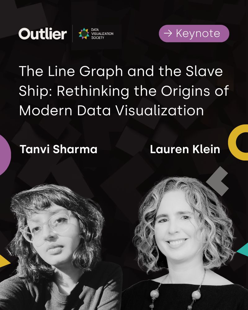
Meet Lauren Klein & Tanvi Sharma from Emory University.
Lauren and Tanvi will deliver the opening Keynote at #Outlier2025:
“The Line Graph and the Slave Ship: Rethinking the Origins of Modern Data Visualization”
Explore the agenda: www.accelevents.com/e/outlier-20...
#dataviz #datavisualization
Lauren and Tanvi will deliver the opening Keynote at #Outlier2025:
“The Line Graph and the Slave Ship: Rethinking the Origins of Modern Data Visualization”
Explore the agenda: www.accelevents.com/e/outlier-20...
#dataviz #datavisualization
May 7, 2025 at 3:05 PM
Meet Lauren Klein & Tanvi Sharma from Emory University.
Lauren and Tanvi will deliver the opening Keynote at #Outlier2025:
“The Line Graph and the Slave Ship: Rethinking the Origins of Modern Data Visualization”
Explore the agenda: www.accelevents.com/e/outlier-20...
#dataviz #datavisualization
Lauren and Tanvi will deliver the opening Keynote at #Outlier2025:
“The Line Graph and the Slave Ship: Rethinking the Origins of Modern Data Visualization”
Explore the agenda: www.accelevents.com/e/outlier-20...
#dataviz #datavisualization
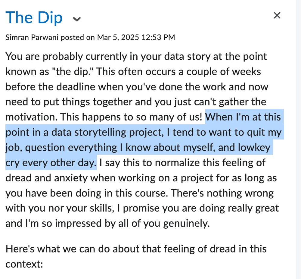
actual email i sent my data storytelling students today iykyk 🤷🏽♀️
March 6, 2025 at 1:56 AM
actual email i sent my data storytelling students today iykyk 🤷🏽♀️
Reposted by simranparwani.bsky.social

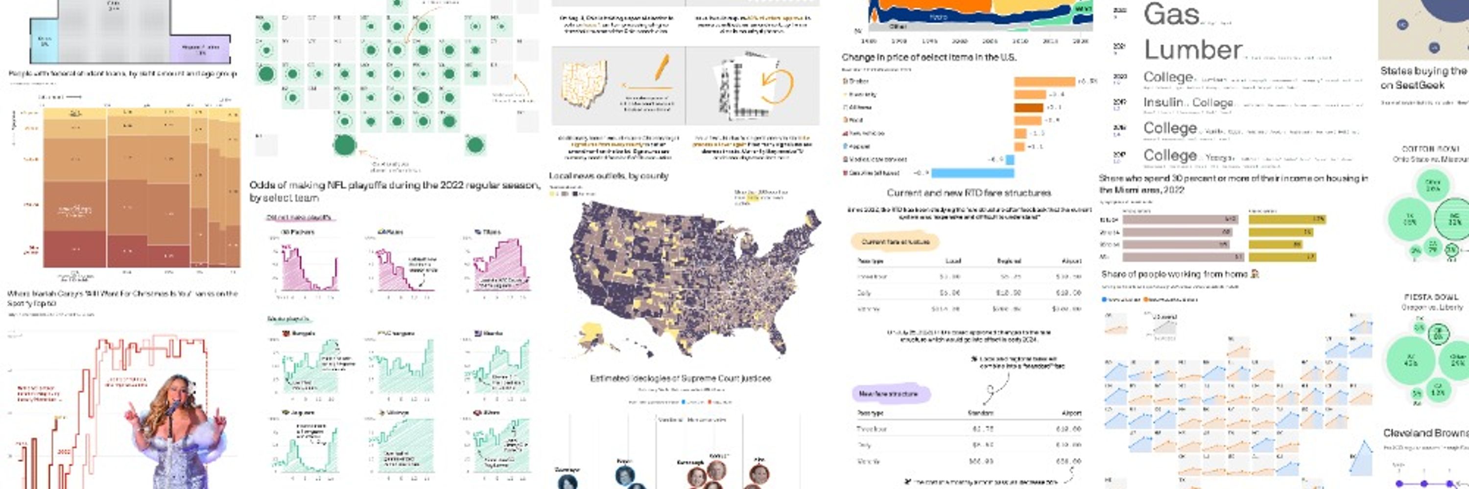
FiveThirtyEight inspired me to make interactive data viz. Working there was my dream job. Even after leaving for a different dream, I relied on their reporting and analysis frequently. FiveThirtyEight was full of immensely talented, kind-hearted people. I learned so much there. 💔
March 5, 2025 at 4:56 PM
FiveThirtyEight inspired me to make interactive data viz. Working there was my dream job. Even after leaving for a different dream, I relied on their reporting and analysis frequently. FiveThirtyEight was full of immensely talented, kind-hearted people. I learned so much there. 💔
Reposted by simranparwani.bsky.social

Our NFL playoff "trees," an Upshot tradition like no other.
www.nytimes.com/interactive/...
www.nytimes.com/interactive/...
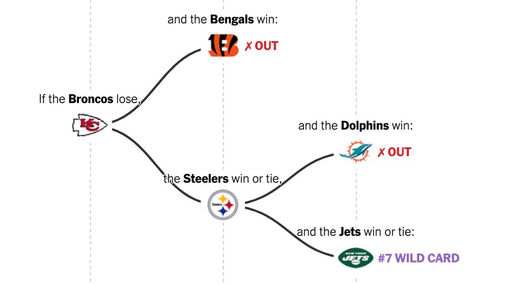
January 2, 2025 at 5:14 PM
Our NFL playoff "trees," an Upshot tradition like no other.
www.nytimes.com/interactive/...
www.nytimes.com/interactive/...
Reposted by simranparwani.bsky.social

with Christmas over, decor is starting to come down, and hopefully *carefully* 🎄🎄🎄
👉 accidents related to Christmas trees, lights and ornaments send thousands of Americans to emergency departments each year
👉 accidents related to Christmas trees, lights and ornaments send thousands of Americans to emergency departments each year
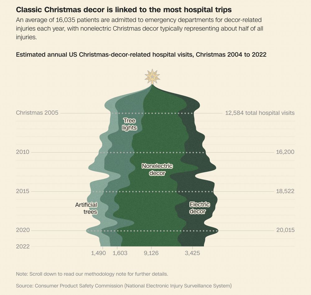
December 29, 2024 at 5:59 PM
with Christmas over, decor is starting to come down, and hopefully *carefully* 🎄🎄🎄
👉 accidents related to Christmas trees, lights and ornaments send thousands of Americans to emergency departments each year
👉 accidents related to Christmas trees, lights and ornaments send thousands of Americans to emergency departments each year
Reposted by simranparwani.bsky.social

There's lots of conversation about weddings during college football season, but I wanted to see if a team's schedule *actually* made a difference in the number of weddings in a region on a date.
Bye weeks? Big games? Home vs. away? SEC vs. everyone else?
A data-driven analysis:
bit.ly/4iIBuzV
Bye weeks? Big games? Home vs. away? SEC vs. everyone else?
A data-driven analysis:
bit.ly/4iIBuzV

Will you marry me? During the bye week, obviously.
The Washington Post, smitten with football and love stories, analyzed data from The Knot to see how college football schedules impact wedding planning.
www.washingtonpost.com
December 17, 2024 at 1:45 PM
There's lots of conversation about weddings during college football season, but I wanted to see if a team's schedule *actually* made a difference in the number of weddings in a region on a date.
Bye weeks? Big games? Home vs. away? SEC vs. everyone else?
A data-driven analysis:
bit.ly/4iIBuzV
Bye weeks? Big games? Home vs. away? SEC vs. everyone else?
A data-driven analysis:
bit.ly/4iIBuzV
Reposted by simranparwani.bsky.social

Very insightful post at the #a11y (or lack thereof) of U.S. 2024 elections #dataviz. I referenced Sarah’s 2020 review post several times while working on our visuals at Axios, and can already tell the 2024 version will be another reference for me on future visuals.
New blog post out (first one in over a year 🥵): I tested how well different election dashboards implemented common dataviz accessibility principles, and explained where things went wrong, including lots of demos.
fossheim.io/writing/post...
fossheim.io/writing/post...

Dataviz accessibility principles, demonstrated by the 2024 presidential election dashboards. by Sarah L. Fossheim
I tested how well different election dashboards implemented common dataviz accessibility princples, and explained where things went wrong (including lots of demos).
fossheim.io
December 3, 2024 at 2:03 AM
Reposted by simranparwani.bsky.social

Web accessibility is about building apps with all of your potential users in mind — and it doesn't have to be hard! Our developer Toni shares seven practical tips for more accessible SvelteKit applications 🎓
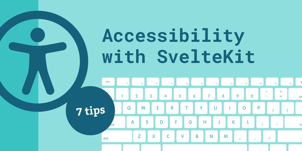
Building accessible sites with SvelteKit: seven practical tips - Datawrapper Blog
Hi, I’m Toni, a developer at Datawrapper, and today I’ll be showing you that you don’t have to be a web accessibility expert to make your SvelteKit app more
blog.datawrapper.de
November 25, 2024 at 3:49 PM
Web accessibility is about building apps with all of your potential users in mind — and it doesn't have to be hard! Our developer Toni shares seven practical tips for more accessible SvelteKit applications 🎓
Reposted by simranparwani.bsky.social

I learned lots about mucosal immunity while working on @sutherlandphd.bsky.social’s article “New Nasal Vaccines Offer Better Protection from COVID and Flu—No Needle Required.” Here’s a peek at how the graphics plan developed. www.scientificamerican.com/article/new-... 🧪🐡 #SciArt
November 17, 2024 at 8:52 PM
I learned lots about mucosal immunity while working on @sutherlandphd.bsky.social’s article “New Nasal Vaccines Offer Better Protection from COVID and Flu—No Needle Required.” Here’s a peek at how the graphics plan developed. www.scientificamerican.com/article/new-... 🧪🐡 #SciArt
Reposted by simranparwani.bsky.social

BTS #dataviz 🧵: multiple chart versions for a 2021 story on “dead money” in college sports, showing totals by sport and conference. 📊
My first try was this. Visually compelling, but maybe more complex than our gen-pop ESPN audience is used to seeing.
My first try was this. Visually compelling, but maybe more complex than our gen-pop ESPN audience is used to seeing.
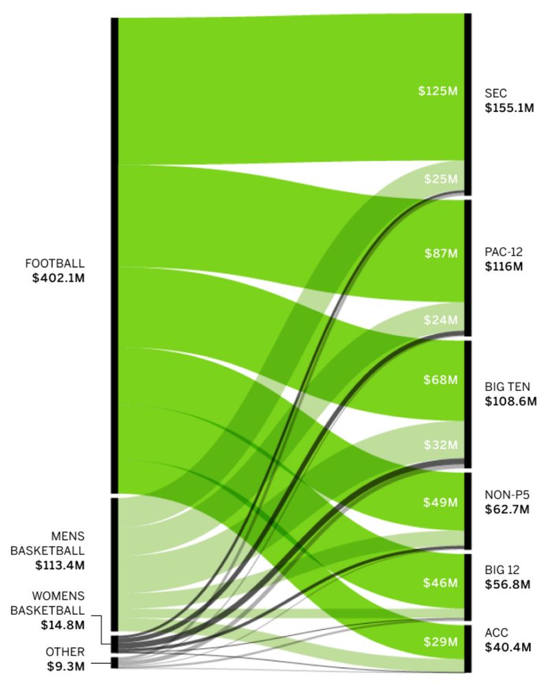
November 17, 2024 at 4:22 PM
BTS #dataviz 🧵: multiple chart versions for a 2021 story on “dead money” in college sports, showing totals by sport and conference. 📊
My first try was this. Visually compelling, but maybe more complex than our gen-pop ESPN audience is used to seeing.
My first try was this. Visually compelling, but maybe more complex than our gen-pop ESPN audience is used to seeing.
Reposted by simranparwani.bsky.social


November 14, 2024 at 5:28 PM
Reposted by simranparwani.bsky.social

Ella Brockway, Artur Galocha and Alvaro Valiño combined to explain Trinity Rodman’s ‘Trin Spin’ and I’m all for soccer graphics all the time
www.washingtonpost.com/sports/inter...
www.washingtonpost.com/sports/inter...
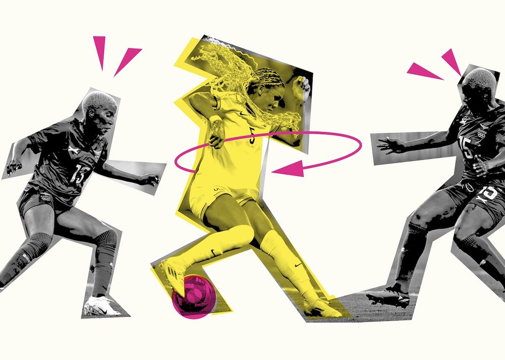
How Trinity Rodman does the ‘Trin Spin,’ her dazzling signature move
The “Trin Spin” encapsulates what has made Trinity Rodman one of the most exciting players in soccer and put her on a trajectory, her coaches say, to be the best player in the world.
www.washingtonpost.com
November 11, 2024 at 2:29 AM
Ella Brockway, Artur Galocha and Alvaro Valiño combined to explain Trinity Rodman’s ‘Trin Spin’ and I’m all for soccer graphics all the time
www.washingtonpost.com/sports/inter...
www.washingtonpost.com/sports/inter...
Reposted by simranparwani.bsky.social
It’s almost Nobel time! @sarahexplains.bsky.social and I investigated the research awarded for this dataviz project—a comprehensive look at sub disciplines through the years, and the time that passed between research and recognition 🧪 📊 www.scientificamerican.com/article/hidd...
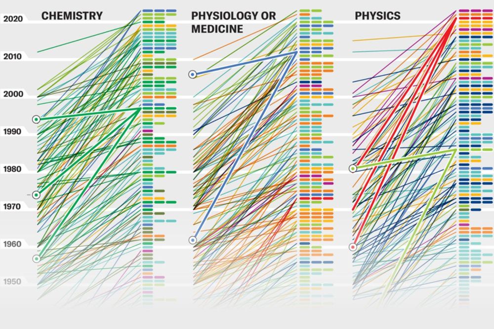
Hidden Patterns Show Nobel Prize Science Trends
Time lags between discoveries and awards show how the Nobel Prizes reward science
www.scientificamerican.com
September 24, 2024 at 2:13 PM
It’s almost Nobel time! @sarahexplains.bsky.social and I investigated the research awarded for this dataviz project—a comprehensive look at sub disciplines through the years, and the time that passed between research and recognition 🧪 📊 www.scientificamerican.com/article/hidd...
Reposted by simranparwani.bsky.social

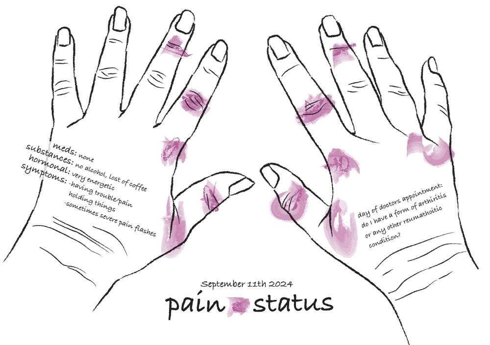
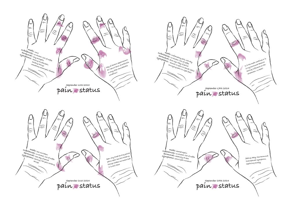
Like a true self reporting data illustrator I started tracking the pain in the joints of my hands. I am looking for a relation between my perimenopause/fluctuation in hormones and possible arthritis or arthrosis. Hope it will gain insight and ease my mind a bit (yes I am scared 😔).
#dataviz
#dataviz
September 25, 2024 at 9:03 AM
Like a true self reporting data illustrator I started tracking the pain in the joints of my hands. I am looking for a relation between my perimenopause/fluctuation in hormones and possible arthritis or arthrosis. Hope it will gain insight and ease my mind a bit (yes I am scared 😔).
#dataviz
#dataviz
Reposted by simranparwani.bsky.social

From the Times Insider, here's a behind-the-scenes on how our journalism comes together. This time about these little animations our team does and how the readers have reacted to them: bit.ly/3AbplBM 🏊♀️ #animation 🏃
August 7, 2024 at 7:48 PM
From the Times Insider, here's a behind-the-scenes on how our journalism comes together. This time about these little animations our team does and how the readers have reacted to them: bit.ly/3AbplBM 🏊♀️ #animation 🏃
Reposted by simranparwani.bsky.social
Two weeks ago I put together this #dataviz of uniquely popular ice cream flavors from Instacart data. It was a fun one, and a good example of how my process for chart creation works. 1/
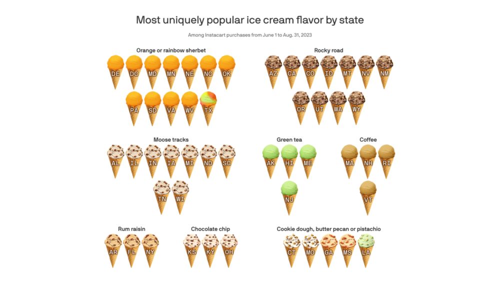
🍦America's favorite special scoops
Orange sherbet, rocky road, and moose tracks are most uniquely popular ice cream flavors.
www.axios.com
July 30, 2024 at 1:45 PM
Two weeks ago I put together this #dataviz of uniquely popular ice cream flavors from Instacart data. It was a fun one, and a good example of how my process for chart creation works. 1/
Reposted by simranparwani.bsky.social

BLOG VERSION - 10 THINGS I'VE CHANGE MY MIND ABOUT
Very grateful for the engagement here in the last two weeks about these 10 things.
Here they are, all in one place. 📊
chezvoila.com/blog/10things/
Very grateful for the engagement here in the last two weeks about these 10 things.
Here they are, all in one place. 📊
chezvoila.com/blog/10things/

10 things I've changed my mind about - Voilà:
To celebrate 10 years of Voilà:, here are 10 things I've changed my mind about since I started out as an information designer.
chezvoila.com
July 31, 2024 at 1:42 PM
BLOG VERSION - 10 THINGS I'VE CHANGE MY MIND ABOUT
Very grateful for the engagement here in the last two weeks about these 10 things.
Here they are, all in one place. 📊
chezvoila.com/blog/10things/
Very grateful for the engagement here in the last two weeks about these 10 things.
Here they are, all in one place. 📊
chezvoila.com/blog/10things/
Reposted by simranparwani.bsky.social

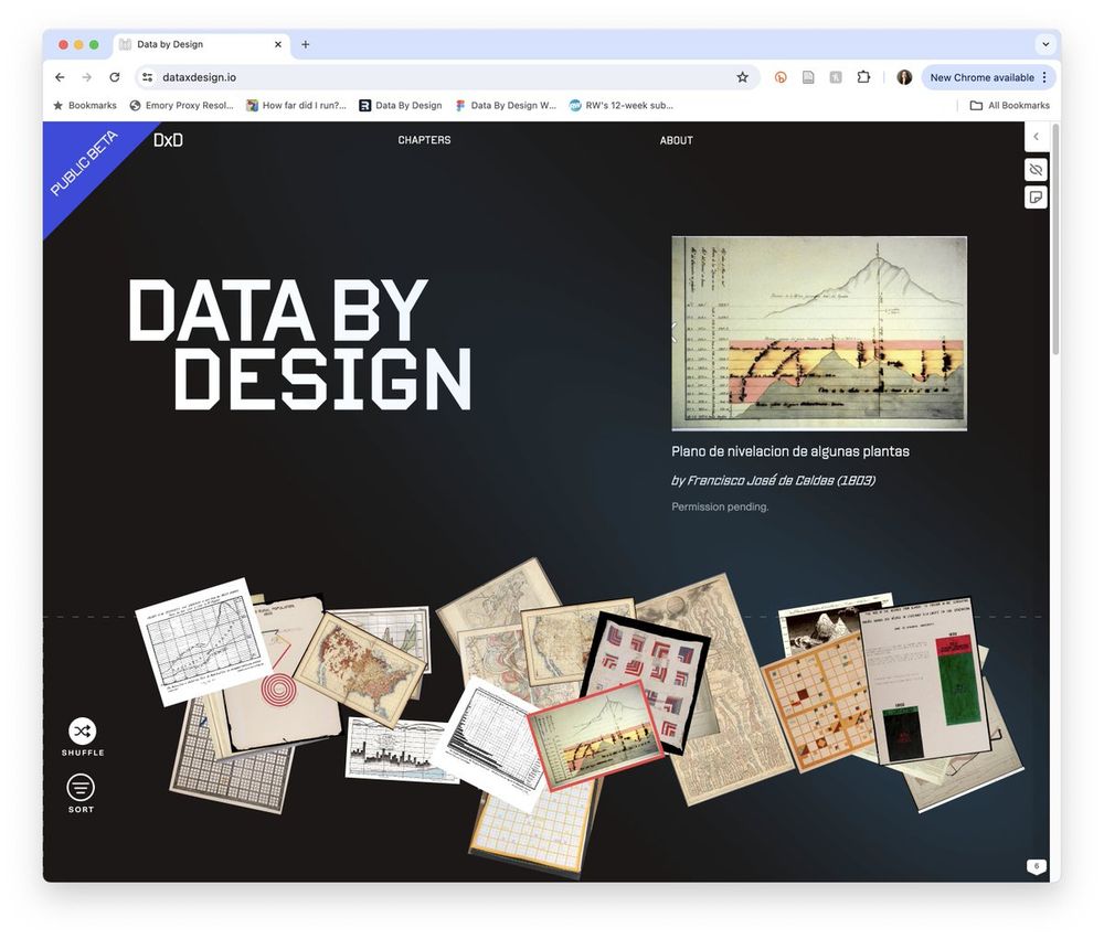
I am beyond thrilled to share that DATA BY DESIGN: AN INTERACTIVE HISTORY OF DATA VISUALIZATION, 1789-1900 is now open for community review at 💚 📊 dataxdesign.io 📊 💙. It's the work of 15+ people across 5 institutions, 2 continents, 2 babies, and a global pandemic. A 🧵 but first:
May 21, 2024 at 2:32 PM
I am beyond thrilled to share that DATA BY DESIGN: AN INTERACTIVE HISTORY OF DATA VISUALIZATION, 1789-1900 is now open for community review at 💚 📊 dataxdesign.io 📊 💙. It's the work of 15+ people across 5 institutions, 2 continents, 2 babies, and a global pandemic. A 🧵 but first:
Reposted by simranparwani.bsky.social
Another stunning take on the upcoming eclipse! Probably the most comprehensive series of maps I’ve seen yet 📊

the second installment in my Eclipse Beat:
On April 8, a total solar eclipse will occur across North America. There won’t be another total eclipse going across such a large swath of the continent until 2045. See what the conditions will be like for your city: www.bloomberg.com/graphics/202...
On April 8, a total solar eclipse will occur across North America. There won’t be another total eclipse going across such a large swath of the continent until 2045. See what the conditions will be like for your city: www.bloomberg.com/graphics/202...

How to Find the Best Cities to Watch the Solar Eclipse
From Mazatlan to Montreal, our interactive map reveals the best cities to see the total eclipse of the sun on April 8.
www.bloomberg.com
March 4, 2024 at 11:55 PM
Another stunning take on the upcoming eclipse! Probably the most comprehensive series of maps I’ve seen yet 📊
Reposted by simranparwani.bsky.social

Gabby Merite and I are doing a newsletter! We're calling it Effect+Affect. You can sign up at effaff.com
The idea: We think 📊 data design research is super cool. We use it in our own design work. But academic papers are Zzz and intimidating. So we're attempting to translate our favorites into...
The idea: We think 📊 data design research is super cool. We use it in our own design work. But academic papers are Zzz and intimidating. So we're attempting to translate our favorites into...
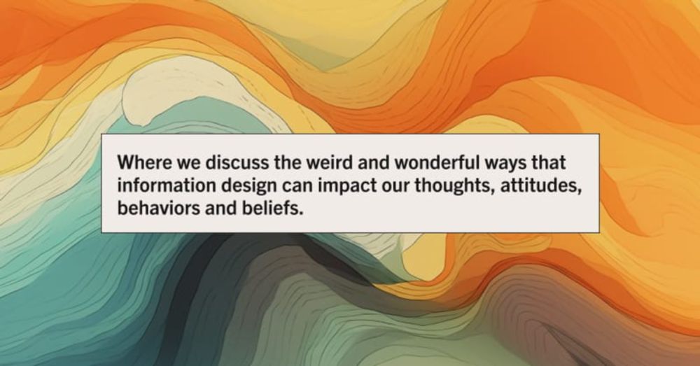
Effect & Affect
Where we discuss the weird and wonderful ways that information design can impact our thoughts, attitudes, behaviors and beliefs. A newsletter by Gabrielle Merite and Eli Holder.
effaff.com
February 9, 2024 at 9:39 PM
Gabby Merite and I are doing a newsletter! We're calling it Effect+Affect. You can sign up at effaff.com
The idea: We think 📊 data design research is super cool. We use it in our own design work. But academic papers are Zzz and intimidating. So we're attempting to translate our favorites into...
The idea: We think 📊 data design research is super cool. We use it in our own design work. But academic papers are Zzz and intimidating. So we're attempting to translate our favorites into...
Reposted by simranparwani.bsky.social

A new study used data from 170,000 groundwater monitoring wells worldwide and found widespread depletion, but also interesting case studies where levels are slowing or recovering
www.nytimes.com/2024/01/24/c... w/ @edelger.bsky.social!
www.nytimes.com/2024/01/24/c... w/ @edelger.bsky.social!
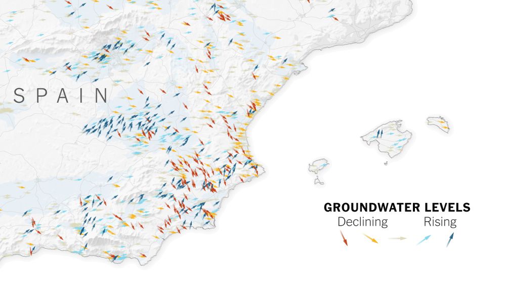
Where Groundwater Levels Are Falling, and Rising, Worldwide
Data from more than 1,000 aquifers reveal widespread decline, but improvement in some places shows the trend can be reversed.
www.nytimes.com
January 24, 2024 at 6:53 PM
A new study used data from 170,000 groundwater monitoring wells worldwide and found widespread depletion, but also interesting case studies where levels are slowing or recovering
www.nytimes.com/2024/01/24/c... w/ @edelger.bsky.social!
www.nytimes.com/2024/01/24/c... w/ @edelger.bsky.social!
Reposted by simranparwani.bsky.social
What a great opportunity for someone looking to learn from some of the best in the field. 📊

We’re excited to announce The Pudding’s 2024 Cohort, a 10-week summer fellowship for aspiring visual storytellers.
🧑🎓 Open to college/graduate-level students and recent grads
🗓️ June 18 – Sept 1
💰 $7,200 stipend
📝 More details at this link!
pudding.cool/career/cohort/
🧑🎓 Open to college/graduate-level students and recent grads
🗓️ June 18 – Sept 1
💰 $7,200 stipend
📝 More details at this link!
pudding.cool/career/cohort/
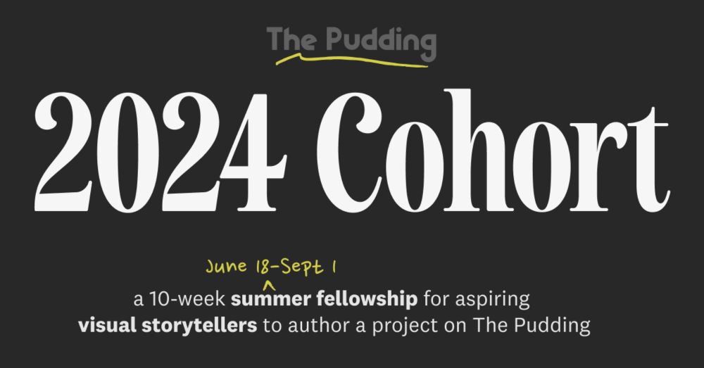
Join Our 2024 Cohort
We created a summer fellowship for aspiring visual storytellers to author a project on The Pudding
pudding.cool
January 25, 2024 at 8:57 PM
What a great opportunity for someone looking to learn from some of the best in the field. 📊