


2nd & 10
@secondand10.bsky.social
Designers/Art Directors. Super Bowl logos should be fun. So that’s what we do.
secondand10.com
secondand10.com
If any of these schools are run by awful people (like Baylor!), we swear we didn’t know, but tell us and we’ll yell about it.
March 20, 2025 at 4:41 PM
If any of these schools are run by awful people (like Baylor!), we swear we didn’t know, but tell us and we’ll yell about it.
7. Montana. The NEW vanguard of vintage varsity script. Wonderful.

March 20, 2025 at 4:41 PM
7. Montana. The NEW vanguard of vintage varsity script. Wonderful.
6. UCLA. The old vanguard of vintage varsity script. Wonderful.

March 20, 2025 at 4:41 PM
6. UCLA. The old vanguard of vintage varsity script. Wonderful.
5. Nebraska-Omaha. Ooh, this is daring. It’s a drop shadow but it’s not. Gotta love smaller schools going for something, anything.

March 20, 2025 at 4:41 PM
5. Nebraska-Omaha. Ooh, this is daring. It’s a drop shadow but it’s not. Gotta love smaller schools going for something, anything.
4. Grand Canyon. Bit of an LA ‘84 Olympics vibe. Yes please.

March 20, 2025 at 4:41 PM
4. Grand Canyon. Bit of an LA ‘84 Olympics vibe. Yes please.
3. Lipscomb. It takes stones to be an athletic entity and walk around with a big L as your logo.

March 20, 2025 at 4:41 PM
3. Lipscomb. It takes stones to be an athletic entity and walk around with a big L as your logo.
2. Akron. Sorry, the Zips?! Hell yes. ZIPS. Love this vintage-ish A.

March 20, 2025 at 4:41 PM
2. Akron. Sorry, the Zips?! Hell yes. ZIPS. Love this vintage-ish A.
If any of these schools are run by horrible people (looking at you, Liberty) tell us so we can yell about them.
March 20, 2025 at 3:05 PM
If any of these schools are run by horrible people (looking at you, Liberty) tell us so we can yell about them.
8. FGCU. Is there another logo with a heavier graffiti vibe? Doubt it.

March 20, 2025 at 2:46 PM
8. FGCU. Is there another logo with a heavier graffiti vibe? Doubt it.
7. Murray St. Love that the angle is straight on. Another great nickname. The RACERS.

March 20, 2025 at 2:46 PM
7. Murray St. Love that the angle is straight on. Another great nickname. The RACERS.
6. South Dakota St. The Jackrabbits. The JACKS. Has the common hard shadow motif, but it’s still unique within that vibe.

March 20, 2025 at 2:46 PM
6. South Dakota St. The Jackrabbits. The JACKS. Has the common hard shadow motif, but it’s still unique within that vibe.
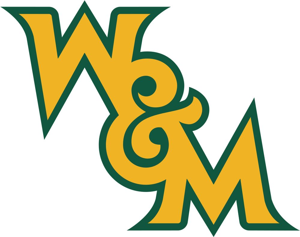
5. William & Mary. Gorgeous monogram (is it a triogram?). Even the over-busy griffon lockup is nice. Always get points for good nicknames. TRIBE.

March 20, 2025 at 2:46 PM
5. William & Mary. Gorgeous monogram (is it a triogram?). Even the over-busy griffon lockup is nice. Always get points for good nicknames. TRIBE.
4. High Point. All chaos all the time. Got a tiny Leeroy Jenkins vibe. They’re going for the vibe and they aren’t stopping.

March 20, 2025 at 2:46 PM
4. High Point. All chaos all the time. Got a tiny Leeroy Jenkins vibe. They’re going for the vibe and they aren’t stopping.
3. Fairleigh Dickinson. SWORDS! Right on. Let’s goooooooooooo.

March 20, 2025 at 2:46 PM
3. Fairleigh Dickinson. SWORDS! Right on. Let’s goooooooooooo.
2. Southern. A liiiiitle too much “fuck it, YOLO” in those Bézier curves, but it’s hard not to fall for that color scheme.

March 20, 2025 at 2:46 PM
2. Southern. A liiiiitle too much “fuck it, YOLO” in those Bézier curves, but it’s hard not to fall for that color scheme.
It’s a missed opportunity. With the call for the return of classic logos growing every year, it would have been good timing to go in a new direction with a nice round number. (4/4)
February 10, 2025 at 9:32 PM
It’s a missed opportunity. With the call for the return of classic logos growing every year, it would have been good timing to go in a new direction with a nice round number. (4/4)
In this era of logos, it should’ve been a layup to keep the typography consistent year-to-year, especially considering the post-SB XLIV goals. This whole suite held itself back. (3/4)

February 10, 2025 at 9:32 PM
In this era of logos, it should’ve been a layup to keep the typography consistent year-to-year, especially considering the post-SB XLIV goals. This whole suite held itself back. (3/4)
The wideness of the composition results in it feeling unnaturally expanded.
The colors are likely a reaction to the “colors predict the teams” insanity. Can’t accuse them of fixing the season if they use 32 colors! (2/4)
The colors are likely a reaction to the “colors predict the teams” insanity. Can’t accuse them of fixing the season if they use 32 colors! (2/4)

February 10, 2025 at 9:32 PM
The wideness of the composition results in it feeling unnaturally expanded.
The colors are likely a reaction to the “colors predict the teams” insanity. Can’t accuse them of fixing the season if they use 32 colors! (2/4)
The colors are likely a reaction to the “colors predict the teams” insanity. Can’t accuse them of fixing the season if they use 32 colors! (2/4)
That’s awfully kind. Thanks for the bump!
February 10, 2025 at 8:57 PM
That’s awfully kind. Thanks for the bump!