


Mathieu Guglielmino
@guglimat.bsky.social
Data scientist @lincoln
📩 VDS Digest, a weekly #viz #design and #data newsletter: https://visualdatastorytelling.com/vds/reviews
🌈
📩 VDS Digest, a weekly #viz #design and #data newsletter: https://visualdatastorytelling.com/vds/reviews
🌈
🚨 Wow, after three weeks off, I sent the 29th #VisualDataStorytelling newsletter this Monday, trying to answer:
Is audio a legitimate medium for knowledge?
➡️ Read it online (and subscribe): www.visualdatastorytelling.com/vds/reviews/...
Is audio a legitimate medium for knowledge?
➡️ Read it online (and subscribe): www.visualdatastorytelling.com/vds/reviews/...

[Visual Data Storytelling #29] You Have One New Message
Is audio a relevant medium to create knowledge? Is there a chance to turn every reader into a creator of audiobooks? What can we learn from the Bible app? These are some questions I will try to answer...
www.visualdatastorytelling.com
March 20, 2024 at 9:21 AM
🚨 Wow, after three weeks off, I sent the 29th #VisualDataStorytelling newsletter this Monday, trying to answer:
Is audio a legitimate medium for knowledge?
➡️ Read it online (and subscribe): www.visualdatastorytelling.com/vds/reviews/...
Is audio a legitimate medium for knowledge?
➡️ Read it online (and subscribe): www.visualdatastorytelling.com/vds/reviews/...
Splendid work about sports visualization 📊 by Krisztina Szűcs.
krisztinaszucs.com/blog/2022082...
#dataviz #viz
krisztinaszucs.com/blog/2022082...
#dataviz #viz


February 20, 2024 at 6:48 PM
Splendid work about sports visualization 📊 by Krisztina Szűcs.
krisztinaszucs.com/blog/2022082...
#dataviz #viz
krisztinaszucs.com/blog/2022082...
#dataviz #viz
Outstanding work of art.
(via @timleunig on twitter)
(via @timleunig on twitter)
February 14, 2024 at 6:11 PM
Outstanding work of art.
(via @timleunig on twitter)
(via @timleunig on twitter)
Reposted by Mathieu Guglielmino

Re-upping this now that Bluesky is open to all. Want to share & discuss all things data viz? Join our dedicated feed! 📊

Step 5: ADD YOURSELF TO THIS DATAVIZ LIST 📊
Curated by @jacqueschrag.com, you need fill a short form to be added first, and then to include this emoji 📊 in your posts.
You can also "pin" the list to your page, which will add a shortcut to see its feed on the homepage.
bsky.app/profile/jacq...
Curated by @jacqueschrag.com, you need fill a short form to be added first, and then to include this emoji 📊 in your posts.
You can also "pin" the list to your page, which will add a shortcut to see its feed on the homepage.
bsky.app/profile/jacq...
It's here! Check out the data viz feed below, open to sharing work & all kinds of discussion related to the field. To participate in the feed you must:
- Include 📊 in your post
- Be added to the account list. Sign up here: forms.gle/4iVMTBgTycXW...
Excited to continued discussions with you!
- Include 📊 in your post
- Be added to the account list. Sign up here: forms.gle/4iVMTBgTycXW...
Excited to continued discussions with you!
February 7, 2024 at 12:00 AM
Re-upping this now that Bluesky is open to all. Want to share & discuss all things data viz? Join our dedicated feed! 📊
me this afternoon

February 7, 2024 at 3:33 PM
me this afternoon
wait where is the bookmark button
February 7, 2024 at 2:52 PM
wait where is the bookmark button
Reposted by Mathieu Guglielmino

"Let's do something more positive this time"

February 5, 2024 at 3:17 PM
"Let's do something more positive this time"
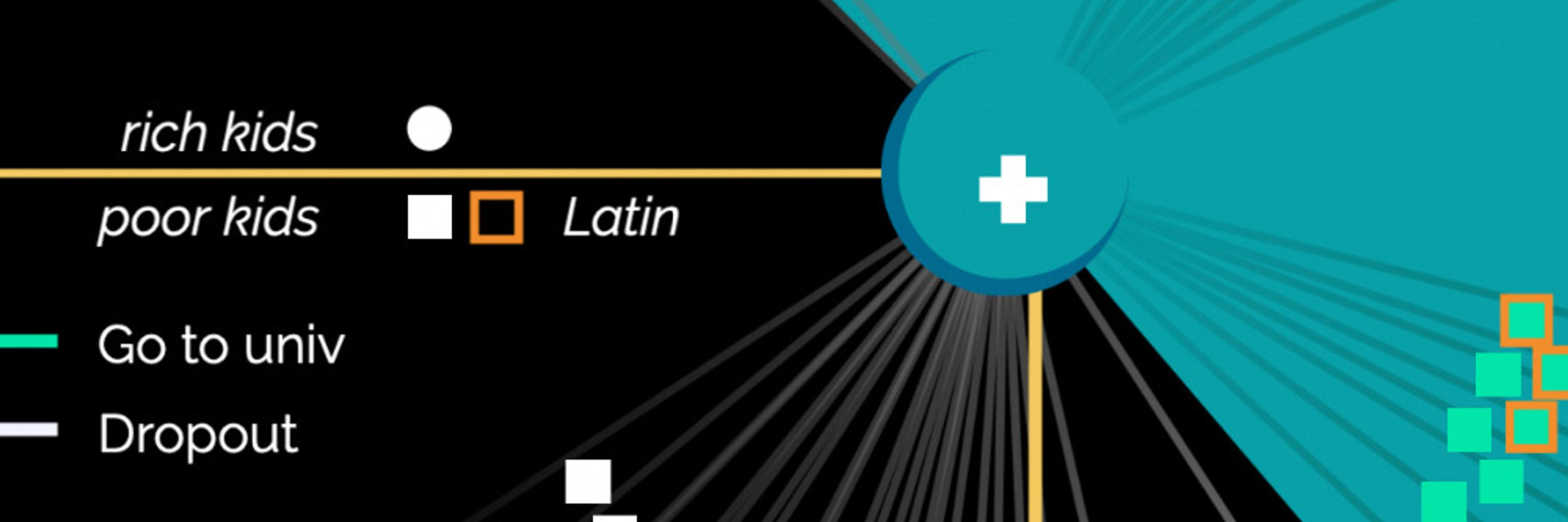
Index charts are a blessing and a curse.
A blessing because they can:
- provide comparison of time series with different scales,
- highlight the relative change rather than absolute,
- spot the correlation of different series over time.
This was one of my favorite chart from last year.
1/3
A blessing because they can:
- provide comparison of time series with different scales,
- highlight the relative change rather than absolute,
- spot the correlation of different series over time.
This was one of my favorite chart from last year.
1/3

February 7, 2024 at 12:54 PM
Index charts are a blessing and a curse.
A blessing because they can:
- provide comparison of time series with different scales,
- highlight the relative change rather than absolute,
- spot the correlation of different series over time.
This was one of my favorite chart from last year.
1/3
A blessing because they can:
- provide comparison of time series with different scales,
- highlight the relative change rather than absolute,
- spot the correlation of different series over time.
This was one of my favorite chart from last year.
1/3
🚨 This week in the #VDS digest 🚨
- A bad chart published in #TheEconomist,
- Prosperity and equity for Black people #McKinsey,
- War in Gaza #AlJazeera,
- And more!
Read it online: www.visualdatastorytelling.com/vds/reviews/...
#VisualDataStorytelling #VDS
- A bad chart published in #TheEconomist,
- Prosperity and equity for Black people #McKinsey,
- War in Gaza #AlJazeera,
- And more!
Read it online: www.visualdatastorytelling.com/vds/reviews/...
#VisualDataStorytelling #VDS


February 5, 2024 at 6:31 AM
🚨 This week in the #VDS digest 🚨
- A bad chart published in #TheEconomist,
- Prosperity and equity for Black people #McKinsey,
- War in Gaza #AlJazeera,
- And more!
Read it online: www.visualdatastorytelling.com/vds/reviews/...
#VisualDataStorytelling #VDS
- A bad chart published in #TheEconomist,
- Prosperity and equity for Black people #McKinsey,
- War in Gaza #AlJazeera,
- And more!
Read it online: www.visualdatastorytelling.com/vds/reviews/...
#VisualDataStorytelling #VDS