


Mathieu Guglielmino
@guglimat.bsky.social
Data scientist @lincoln
📩 VDS Digest, a weekly #viz #design and #data newsletter: https://visualdatastorytelling.com/vds/reviews
🌈
📩 VDS Digest, a weekly #viz #design and #data newsletter: https://visualdatastorytelling.com/vds/reviews
🌈
Splendid work about sports visualization 📊 by Krisztina Szűcs.
krisztinaszucs.com/blog/2022082...
#dataviz #viz
krisztinaszucs.com/blog/2022082...
#dataviz #viz


February 20, 2024 at 6:48 PM
Splendid work about sports visualization 📊 by Krisztina Szűcs.
krisztinaszucs.com/blog/2022082...
#dataviz #viz
krisztinaszucs.com/blog/2022082...
#dataviz #viz
Outstanding work of art.
(via @timleunig on twitter)
(via @timleunig on twitter)
February 14, 2024 at 6:11 PM
Outstanding work of art.
(via @timleunig on twitter)
(via @timleunig on twitter)
me this afternoon

February 7, 2024 at 3:33 PM
me this afternoon
To not fall in one of these traps, I say index charts are most useful when:
- comparing ONE thing over MULTIPLE metrics: price and purity of cocaine,
- comparing MANY things since ONE origin (many prime ministers, one debut)
- comparing ONE thing with ONE metric: cumulative fires by year
- comparing ONE thing over MULTIPLE metrics: price and purity of cocaine,
- comparing MANY things since ONE origin (many prime ministers, one debut)
- comparing ONE thing with ONE metric: cumulative fires by year


February 7, 2024 at 1:04 PM
To not fall in one of these traps, I say index charts are most useful when:
- comparing ONE thing over MULTIPLE metrics: price and purity of cocaine,
- comparing MANY things since ONE origin (many prime ministers, one debut)
- comparing ONE thing with ONE metric: cumulative fires by year
- comparing ONE thing over MULTIPLE metrics: price and purity of cocaine,
- comparing MANY things since ONE origin (many prime ministers, one debut)
- comparing ONE thing with ONE metric: cumulative fires by year
However, these blessings can be used for mischievous framing, like this recent example in The Economist.
Why mischievous?
Because 2007, the starting date, is also Japan's peak exports to China.
The data shows the actual opposite, with Japan's being more dependent on China's than Germany.
2/3
Why mischievous?
Because 2007, the starting date, is also Japan's peak exports to China.
The data shows the actual opposite, with Japan's being more dependent on China's than Germany.
2/3


February 7, 2024 at 12:57 PM
However, these blessings can be used for mischievous framing, like this recent example in The Economist.
Why mischievous?
Because 2007, the starting date, is also Japan's peak exports to China.
The data shows the actual opposite, with Japan's being more dependent on China's than Germany.
2/3
Why mischievous?
Because 2007, the starting date, is also Japan's peak exports to China.
The data shows the actual opposite, with Japan's being more dependent on China's than Germany.
2/3
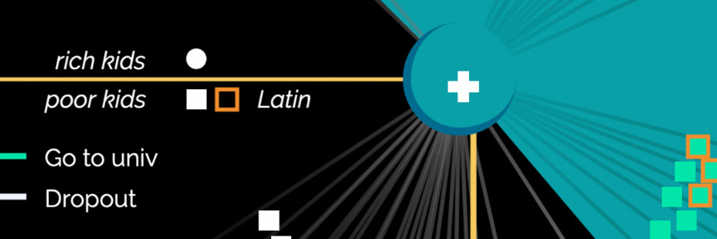
Index charts are a blessing and a curse.
A blessing because they can:
- provide comparison of time series with different scales,
- highlight the relative change rather than absolute,
- spot the correlation of different series over time.
This was one of my favorite chart from last year.
1/3
A blessing because they can:
- provide comparison of time series with different scales,
- highlight the relative change rather than absolute,
- spot the correlation of different series over time.
This was one of my favorite chart from last year.
1/3

February 7, 2024 at 12:54 PM
Index charts are a blessing and a curse.
A blessing because they can:
- provide comparison of time series with different scales,
- highlight the relative change rather than absolute,
- spot the correlation of different series over time.
This was one of my favorite chart from last year.
1/3
A blessing because they can:
- provide comparison of time series with different scales,
- highlight the relative change rather than absolute,
- spot the correlation of different series over time.
This was one of my favorite chart from last year.
1/3
🚨 This week in the #VDS digest 🚨
- A bad chart published in #TheEconomist,
- Prosperity and equity for Black people #McKinsey,
- War in Gaza #AlJazeera,
- And more!
Read it online: www.visualdatastorytelling.com/vds/reviews/...
#VisualDataStorytelling #VDS
- A bad chart published in #TheEconomist,
- Prosperity and equity for Black people #McKinsey,
- War in Gaza #AlJazeera,
- And more!
Read it online: www.visualdatastorytelling.com/vds/reviews/...
#VisualDataStorytelling #VDS


February 5, 2024 at 6:31 AM
🚨 This week in the #VDS digest 🚨
- A bad chart published in #TheEconomist,
- Prosperity and equity for Black people #McKinsey,
- War in Gaza #AlJazeera,
- And more!
Read it online: www.visualdatastorytelling.com/vds/reviews/...
#VisualDataStorytelling #VDS
- A bad chart published in #TheEconomist,
- Prosperity and equity for Black people #McKinsey,
- War in Gaza #AlJazeera,
- And more!
Read it online: www.visualdatastorytelling.com/vds/reviews/...
#VisualDataStorytelling #VDS