


Dr. Dominic Royé
@drxeo.eu
-Mapping the world- Dr. in Physical Geography | Environmental Health - bioclimatology - geography. RC Researcher from 🇩🇪 at @mbgcsic.bsky.social @csic.es in 🇪🇸 #rstats #dataviz
Secretary of the @aeclim.org
📍Galicia
ℹ️ https://dominicroye.github.io
Secretary of the @aeclim.org
📍Galicia
ℹ️ https://dominicroye.github.io
Pinned
Dr. Dominic Royé
@drxeo.eu
· Jan 6

Always normalize you data
I recently came across a map from the National Atlas of Spain showing the number of libraries by municipality. However, one thing directly caught my attention. There’s a saying that many maps show onl...
dominicroye.github.io
I am starting 2025 with a completely renewed blog based on Quarto. I have also updated all the previous posts. The first post addresses the issue of the lack of data normalization I observed in the Spanish National Atlas.
#rstats #dataviz
dominicroye.github.io/blog/2025-01...
#rstats #dataviz
dominicroye.github.io/blog/2025-01...
Reposted by Dr. Dominic Royé

#30DayMapChallenge 10 Nov – Air
Graph showing race-day accumulated precipitation at the Interlagos Circuit (Brazil GP) from 1990 to 2024, together with the inferred likelihood of using slick, intermediate, or wet tyres during the race 🌧🏎️
#F1 #BrazilGP #DataViz #Python
Graph showing race-day accumulated precipitation at the Interlagos Circuit (Brazil GP) from 1990 to 2024, together with the inferred likelihood of using slick, intermediate, or wet tyres during the race 🌧🏎️
#F1 #BrazilGP #DataViz #Python

November 10, 2025 at 12:16 PM
#30DayMapChallenge 10 Nov – Air
Graph showing race-day accumulated precipitation at the Interlagos Circuit (Brazil GP) from 1990 to 2024, together with the inferred likelihood of using slick, intermediate, or wet tyres during the race 🌧🏎️
#F1 #BrazilGP #DataViz #Python
Graph showing race-day accumulated precipitation at the Interlagos Circuit (Brazil GP) from 1990 to 2024, together with the inferred likelihood of using slick, intermediate, or wet tyres during the race 🌧🏎️
#F1 #BrazilGP #DataViz #Python
New study out! 🌍💧 “The Association between Total Precipitation and Diarrhea Morbidity” — a multicountry analysis across climate zones. Both dry & wet extremes raise health risks. 📖 Read journals.lww.com/environepide...
#ClimateHealth #GlobalHealth #Diarrhea #Precipitation
#ClimateHealth #GlobalHealth #Diarrhea #Precipitation


November 10, 2025 at 8:43 AM
New study out! 🌍💧 “The Association between Total Precipitation and Diarrhea Morbidity” — a multicountry analysis across climate zones. Both dry & wet extremes raise health risks. 📖 Read journals.lww.com/environepide...
#ClimateHealth #GlobalHealth #Diarrhea #Precipitation
#ClimateHealth #GlobalHealth #Diarrhea #Precipitation
Reposted by Dr. Dominic Royé
New #dataviz on summer heat-stress anomalies in Europe, 1950–2025. 🥵
This map shows hours with WBGT > 29.5 °C—extreme stress where work should be limited. Since 2010, positive anomalies dominate. 300h = 12.5 days of danger. It’s important to focus on the sub-daily exposure.
#rstats #climatechange
This map shows hours with WBGT > 29.5 °C—extreme stress where work should be limited. Since 2010, positive anomalies dominate. 300h = 12.5 days of danger. It’s important to focus on the sub-daily exposure.
#rstats #climatechange

November 8, 2025 at 2:13 PM
New #dataviz on summer heat-stress anomalies in Europe, 1950–2025. 🥵
This map shows hours with WBGT > 29.5 °C—extreme stress where work should be limited. Since 2010, positive anomalies dominate. 300h = 12.5 days of danger. It’s important to focus on the sub-daily exposure.
#rstats #climatechange
This map shows hours with WBGT > 29.5 °C—extreme stress where work should be limited. Since 2010, positive anomalies dominate. 300h = 12.5 days of danger. It’s important to focus on the sub-daily exposure.
#rstats #climatechange
November 8, 2025 at 2:13 PM
New #dataviz on summer heat-stress anomalies in Europe, 1950–2025. 🥵
This map shows hours with WBGT > 29.5 °C—extreme stress where work should be limited. Since 2010, positive anomalies dominate. 300h = 12.5 days of danger. It’s important to focus on the sub-daily exposure.
#rstats #climatechange
This map shows hours with WBGT > 29.5 °C—extreme stress where work should be limited. Since 2010, positive anomalies dominate. 300h = 12.5 days of danger. It’s important to focus on the sub-daily exposure.
#rstats #climatechange
Reposted by Dr. Dominic Royé

Yesterday we counted +900 flight cancellations across the US: tinyurl.com/3sddyscd –One of the most affected was Ronald Reagan Washington National Airport (DCA) with 17% of its flights cancelled ✈️

November 8, 2025 at 1:49 PM
Yesterday we counted +900 flight cancellations across the US: tinyurl.com/3sddyscd –One of the most affected was Ronald Reagan Washington National Airport (DCA) with 17% of its flights cancelled ✈️
Reposted by Dr. Dominic Royé

Dass die Regierung Gaskunden mit 3,4 Milliarden Euro pro Jahr subventionieren will, ist in Zeiten der Klimakrise ein Skandal. Aber dass dies mit Geldern geschehen soll, die zur Finanzierung der Energiewende und des Klimaschutzes vorgesehen sind, schlägt dem Fass den Boden aus.

Gasspeicherumlage: Bundestag beschließt Entlastung für Gasverbraucher
Haushalte und Unternehmen müssen ab 2026 keine Gasspeicherumlage mehr zahlen. Der Bund finanziert die jährlichen Kosten künftig aus dem Klima- und Transformationsfonds.
www.zeit.de
November 8, 2025 at 6:24 AM
Dass die Regierung Gaskunden mit 3,4 Milliarden Euro pro Jahr subventionieren will, ist in Zeiten der Klimakrise ein Skandal. Aber dass dies mit Geldern geschehen soll, die zur Finanzierung der Energiewende und des Klimaschutzes vorgesehen sind, schlägt dem Fass den Boden aus.
Reposted by Dr. Dominic Royé

📈 Los jóvenes españoles giran a la derecha.
Es un vuelco histórico: nunca en 40 años se habían ubicado tan a la derecha. Nunca habían sido el grupo más de derechas.
Hasta ahora. Hilo 👇
Es un vuelco histórico: nunca en 40 años se habían ubicado tan a la derecha. Nunca habían sido el grupo más de derechas.
Hasta ahora. Hilo 👇

November 8, 2025 at 8:57 AM
📈 Los jóvenes españoles giran a la derecha.
Es un vuelco histórico: nunca en 40 años se habían ubicado tan a la derecha. Nunca habían sido el grupo más de derechas.
Hasta ahora. Hilo 👇
Es un vuelco histórico: nunca en 40 años se habían ubicado tan a la derecha. Nunca habían sido el grupo más de derechas.
Hasta ahora. Hilo 👇
Reposted by Dr. Dominic Royé

How long does it take your kid to get to their secondary school in Cologne?
It depends on where you (and your child) live and what type of secondary school your child attends. (Path times to the nearest school by bike.)
#30DayMapChallenge | Day 03 - Polygons #rstats #ggplot2
It depends on where you (and your child) live and what type of secondary school your child attends. (Path times to the nearest school by bike.)
#30DayMapChallenge | Day 03 - Polygons #rstats #ggplot2

November 7, 2025 at 6:22 PM
How long does it take your kid to get to their secondary school in Cologne?
It depends on where you (and your child) live and what type of secondary school your child attends. (Path times to the nearest school by bike.)
#30DayMapChallenge | Day 03 - Polygons #rstats #ggplot2
It depends on where you (and your child) live and what type of secondary school your child attends. (Path times to the nearest school by bike.)
#30DayMapChallenge | Day 03 - Polygons #rstats #ggplot2
Reposted by Dr. Dominic Royé
#30DayMapChallenge 7 Nov - Accessibility
This map shows the weather stations operated by the Spanish Met Service and regions where there is a lack of stations.
𝗧𝗵𝗲 𝗹𝗮𝗰𝗸 𝗼𝗳 𝘄𝗲𝗮𝘁𝗵𝗲𝗿 𝘀𝘁𝗮𝘁𝗶𝗼𝗻 𝗰𝗼𝘃𝗲𝗿𝗮𝗴𝗲 𝗹𝗶𝗺𝗶𝘁𝘀 𝘁𝗵𝗲 𝗮𝗯𝗶𝗹𝗶𝘁𝘆 𝘁𝗼 𝗱𝗲𝘁𝗲𝗰𝘁 𝗮𝗻𝗱 𝗮𝗻𝘁𝗶𝗰𝗶𝗽𝗮𝘁𝗲 𝗲𝘅𝘁𝗿𝗲𝗺𝗲 𝗲𝘃𝗲𝗻𝘁𝘀.
#aemet #geopandas #cartopy
This map shows the weather stations operated by the Spanish Met Service and regions where there is a lack of stations.
𝗧𝗵𝗲 𝗹𝗮𝗰𝗸 𝗼𝗳 𝘄𝗲𝗮𝘁𝗵𝗲𝗿 𝘀𝘁𝗮𝘁𝗶𝗼𝗻 𝗰𝗼𝘃𝗲𝗿𝗮𝗴𝗲 𝗹𝗶𝗺𝗶𝘁𝘀 𝘁𝗵𝗲 𝗮𝗯𝗶𝗹𝗶𝘁𝘆 𝘁𝗼 𝗱𝗲𝘁𝗲𝗰𝘁 𝗮𝗻𝗱 𝗮𝗻𝘁𝗶𝗰𝗶𝗽𝗮𝘁𝗲 𝗲𝘅𝘁𝗿𝗲𝗺𝗲 𝗲𝘃𝗲𝗻𝘁𝘀.
#aemet #geopandas #cartopy

November 7, 2025 at 8:57 AM
#30DayMapChallenge 7 Nov - Accessibility
This map shows the weather stations operated by the Spanish Met Service and regions where there is a lack of stations.
𝗧𝗵𝗲 𝗹𝗮𝗰𝗸 𝗼𝗳 𝘄𝗲𝗮𝘁𝗵𝗲𝗿 𝘀𝘁𝗮𝘁𝗶𝗼𝗻 𝗰𝗼𝘃𝗲𝗿𝗮𝗴𝗲 𝗹𝗶𝗺𝗶𝘁𝘀 𝘁𝗵𝗲 𝗮𝗯𝗶𝗹𝗶𝘁𝘆 𝘁𝗼 𝗱𝗲𝘁𝗲𝗰𝘁 𝗮𝗻𝗱 𝗮𝗻𝘁𝗶𝗰𝗶𝗽𝗮𝘁𝗲 𝗲𝘅𝘁𝗿𝗲𝗺𝗲 𝗲𝘃𝗲𝗻𝘁𝘀.
#aemet #geopandas #cartopy
This map shows the weather stations operated by the Spanish Met Service and regions where there is a lack of stations.
𝗧𝗵𝗲 𝗹𝗮𝗰𝗸 𝗼𝗳 𝘄𝗲𝗮𝘁𝗵𝗲𝗿 𝘀𝘁𝗮𝘁𝗶𝗼𝗻 𝗰𝗼𝘃𝗲𝗿𝗮𝗴𝗲 𝗹𝗶𝗺𝗶𝘁𝘀 𝘁𝗵𝗲 𝗮𝗯𝗶𝗹𝗶𝘁𝘆 𝘁𝗼 𝗱𝗲𝘁𝗲𝗰𝘁 𝗮𝗻𝗱 𝗮𝗻𝘁𝗶𝗰𝗶𝗽𝗮𝘁𝗲 𝗲𝘅𝘁𝗿𝗲𝗺𝗲 𝗲𝘃𝗲𝗻𝘁𝘀.
#aemet #geopandas #cartopy
Reposted by Dr. Dominic Royé
𝟲𝘁𝗵 𝗡𝗼𝘃𝗲𝗺𝗯𝗲𝗿 𝟮𝟬𝟮𝟱 — 𝗗𝗶𝗺𝗲𝗻𝘀𝗶𝗼𝗻𝘀 3D bubbles showing Arctic sea ice loss VS CO2 rise
🔴 CO2 concentration from Mauna Loa
🔵 Arctic sea ice extent from Copernicus Marine Service
#30DayMapChallenge #python #pyvista #co2 #seaice #climatechange
🔴 CO2 concentration from Mauna Loa
🔵 Arctic sea ice extent from Copernicus Marine Service
#30DayMapChallenge #python #pyvista #co2 #seaice #climatechange
November 6, 2025 at 9:09 PM
𝟲𝘁𝗵 𝗡𝗼𝘃𝗲𝗺𝗯𝗲𝗿 𝟮𝟬𝟮𝟱 — 𝗗𝗶𝗺𝗲𝗻𝘀𝗶𝗼𝗻𝘀 3D bubbles showing Arctic sea ice loss VS CO2 rise
🔴 CO2 concentration from Mauna Loa
🔵 Arctic sea ice extent from Copernicus Marine Service
#30DayMapChallenge #python #pyvista #co2 #seaice #climatechange
🔴 CO2 concentration from Mauna Loa
🔵 Arctic sea ice extent from Copernicus Marine Service
#30DayMapChallenge #python #pyvista #co2 #seaice #climatechange
#30DayMapChallenge
Day 7: Accessibility
Frequency of routes to the nearest park in Santiago de Compostela. 🗺️
#rstats #dataviz
Day 7: Accessibility
Frequency of routes to the nearest park in Santiago de Compostela. 🗺️
#rstats #dataviz

November 7, 2025 at 3:25 PM
#30DayMapChallenge
Day 7: Accessibility
Frequency of routes to the nearest park in Santiago de Compostela. 🗺️
#rstats #dataviz
Day 7: Accessibility
Frequency of routes to the nearest park in Santiago de Compostela. 🗺️
#rstats #dataviz
Reposted by Dr. Dominic Royé
Los tres años más calurosos registrados hasta ahora en el planeta son 2023, 2024 y 2025.
#CumbreClimática #Belém #CambioClimático
#CumbreClimática #Belém #CambioClimático

Los tres años más calurosos registrados hasta ahora en el planeta son 2023, 2024 y 2025
La cumbre climática de Belém se inicia con la advertencia de António Guterres (ONU) contra los “líderes” que están “cautivos de los intereses de los combustibles fósiles”
elpais.com
November 6, 2025 at 3:14 PM
Los tres años más calurosos registrados hasta ahora en el planeta son 2023, 2024 y 2025.
#CumbreClimática #Belém #CambioClimático
#CumbreClimática #Belém #CambioClimático
Reposted by Dr. Dominic Royé
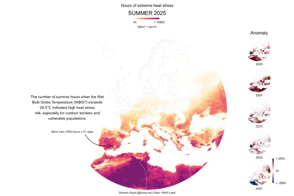
New #dataviz on heat stress in Europe, summer 2025.
This map shows total summer hours with WBGT > 29.5°C — a threshold for extreme heat stress. In parts of Spain, values exceed 1,000 hours (41 days).
#rstats #climatechange #health
This map shows total summer hours with WBGT > 29.5°C — a threshold for extreme heat stress. In parts of Spain, values exceed 1,000 hours (41 days).
#rstats #climatechange #health
November 3, 2025 at 9:48 AM
New #dataviz on heat stress in Europe, summer 2025.
This map shows total summer hours with WBGT > 29.5°C — a threshold for extreme heat stress. In parts of Spain, values exceed 1,000 hours (41 days).
#rstats #climatechange #health
This map shows total summer hours with WBGT > 29.5°C — a threshold for extreme heat stress. In parts of Spain, values exceed 1,000 hours (41 days).
#rstats #climatechange #health
Reposted by Dr. Dominic Royé

Ya queda muy poco para las II Jornadas de Jóvenes Investigadores del Clima.
Todavía estáis a tiempo de inscribiros y participar
👉 forms.gle/ie8DhArUPPDg...
@aeclim.org @unizar.es @csicaragon.bsky.social
Todavía estáis a tiempo de inscribiros y participar
👉 forms.gle/ie8DhArUPPDg...
@aeclim.org @unizar.es @csicaragon.bsky.social


November 5, 2025 at 10:53 PM
Ya queda muy poco para las II Jornadas de Jóvenes Investigadores del Clima.
Todavía estáis a tiempo de inscribiros y participar
👉 forms.gle/ie8DhArUPPDg...
@aeclim.org @unizar.es @csicaragon.bsky.social
Todavía estáis a tiempo de inscribiros y participar
👉 forms.gle/ie8DhArUPPDg...
@aeclim.org @unizar.es @csicaragon.bsky.social
Reposted by Dr. Dominic Royé

‼️Estamos de enhorabuena‼️
Nuestra participación en el proyecto #ARSINOE a través de la plataforma #SICMA-Canarias, realizada en colaboración con la @ull.es, #Meteogrid e #Ingenia ha sido reconocida recientemente como caso de éxito por la #ComisiónEuropea 🔝
Para más información tira del hilo 🧵
Nuestra participación en el proyecto #ARSINOE a través de la plataforma #SICMA-Canarias, realizada en colaboración con la @ull.es, #Meteogrid e #Ingenia ha sido reconocida recientemente como caso de éxito por la #ComisiónEuropea 🔝
Para más información tira del hilo 🧵

November 5, 2025 at 6:43 PM
‼️Estamos de enhorabuena‼️
Nuestra participación en el proyecto #ARSINOE a través de la plataforma #SICMA-Canarias, realizada en colaboración con la @ull.es, #Meteogrid e #Ingenia ha sido reconocida recientemente como caso de éxito por la #ComisiónEuropea 🔝
Para más información tira del hilo 🧵
Nuestra participación en el proyecto #ARSINOE a través de la plataforma #SICMA-Canarias, realizada en colaboración con la @ull.es, #Meteogrid e #Ingenia ha sido reconocida recientemente como caso de éxito por la #ComisiónEuropea 🔝
Para más información tira del hilo 🧵
Reposted by Dr. Dominic Royé

La clave en la victoria de la izquierda en Nueva York ha sido la alta participación.
Hay que ir a votar, que somos más y ganamos.
Hay que ir a votar, que somos más y ganamos.
November 5, 2025 at 12:21 PM
La clave en la victoria de la izquierda en Nueva York ha sido la alta participación.
Hay que ir a votar, que somos más y ganamos.
Hay que ir a votar, que somos más y ganamos.
Reposted by Dr. Dominic Royé

🔬El CSIC en Galicia inicia un amplio programa de actividades de divulgación por la "Semana de la Ciencia y la Tecnología 2025" y el "Mes da Ciencia en Galego nas Bibliotecas"
📍Se desarrollarán durante el mes de noviembre en diversas localidades
👉http://tiny.cc/j4nu001
📍Se desarrollarán durante el mes de noviembre en diversas localidades
👉http://tiny.cc/j4nu001

November 5, 2025 at 1:53 PM
🔬El CSIC en Galicia inicia un amplio programa de actividades de divulgación por la "Semana de la Ciencia y la Tecnología 2025" y el "Mes da Ciencia en Galego nas Bibliotecas"
📍Se desarrollarán durante el mes de noviembre en diversas localidades
👉http://tiny.cc/j4nu001
📍Se desarrollarán durante el mes de noviembre en diversas localidades
👉http://tiny.cc/j4nu001
Reposted by Dr. Dominic Royé

"Esa estrategia ha logrado movilizar a más de 90.000 personas voluntarias, que a lo largo de la ciudad, han llamado puerta a puerta, hasta 3 millones de casas."
Cuatro lecciones que aprender de la victoria de Mamdani en Nueva York. Por @pablomtz.bsky.social
www.elsaltodiario.com/opinion/cuat...
Cuatro lecciones que aprender de la victoria de Mamdani en Nueva York. Por @pablomtz.bsky.social
www.elsaltodiario.com/opinion/cuat...

Cuatro lecciones que aprender de la victoria de Zohran Mamdani en Nueva York
Se ha hablado mucho de los videos de Zohran Mamdani y su papel para ganar la alcaldía. Pero, ¿qué hay más allá de esta esperanzadora victoria?
www.elsaltodiario.com
November 5, 2025 at 8:16 AM
"Esa estrategia ha logrado movilizar a más de 90.000 personas voluntarias, que a lo largo de la ciudad, han llamado puerta a puerta, hasta 3 millones de casas."
Cuatro lecciones que aprender de la victoria de Mamdani en Nueva York. Por @pablomtz.bsky.social
www.elsaltodiario.com/opinion/cuat...
Cuatro lecciones que aprender de la victoria de Mamdani en Nueva York. Por @pablomtz.bsky.social
www.elsaltodiario.com/opinion/cuat...
🗺️✨ #30DayMapChallenge
Do you want to know how to create hillshade effects with #rstats?
🔗 dominicroye.github.io/blog/hillsha...
It is very common to see relief maps with shadow effects, also known as ‘hillshade’, which generates visual depth.
💡 Built with #ggplot2!
#dataviz #cartography #GIS
Do you want to know how to create hillshade effects with #rstats?
🔗 dominicroye.github.io/blog/hillsha...
It is very common to see relief maps with shadow effects, also known as ‘hillshade’, which generates visual depth.
💡 Built with #ggplot2!
#dataviz #cartography #GIS

Hillshade effects
It is very common to see relief maps with shadow effects, also known as ‘hillshade’, which generates visual depth. How can we create these effects in R and how to include them in ggplot2?
dominicroye.github.io
November 5, 2025 at 8:40 AM
🗺️✨ #30DayMapChallenge
Do you want to know how to create hillshade effects with #rstats?
🔗 dominicroye.github.io/blog/hillsha...
It is very common to see relief maps with shadow effects, also known as ‘hillshade’, which generates visual depth.
💡 Built with #ggplot2!
#dataviz #cartography #GIS
Do you want to know how to create hillshade effects with #rstats?
🔗 dominicroye.github.io/blog/hillsha...
It is very common to see relief maps with shadow effects, also known as ‘hillshade’, which generates visual depth.
💡 Built with #ggplot2!
#dataviz #cartography #GIS
Reposted by Dr. Dominic Royé

Esto de Manuel Rico sobre Almudena Lastra, fiscal superior de Madrid: "Tienes que tener el alma muy negra para que se te quede clavado quién pudo filtrar un correo y haya tenido la actitud que ha tenido con las 7.291 víctimas de las residencias de Madrid".
November 4, 2025 at 8:20 AM
Esto de Manuel Rico sobre Almudena Lastra, fiscal superior de Madrid: "Tienes que tener el alma muy negra para que se te quede clavado quién pudo filtrar un correo y haya tenido la actitud que ha tenido con las 7.291 víctimas de las residencias de Madrid".
Reposted by Dr. Dominic Royé

EUROPE HISTORIC NOVEMBER WARMTH
An exceptional warm week is kicking off with widespread abnormal warmth allover Europe,except for Central Mediterranean
Hundreds of records of November warm nights can fall with
MINIMUMS locally >15C in UK and >13C in Scandinavia,typical of June!
An exceptional warm week is kicking off with widespread abnormal warmth allover Europe,except for Central Mediterranean
Hundreds of records of November warm nights can fall with
MINIMUMS locally >15C in UK and >13C in Scandinavia,typical of June!

November 4, 2025 at 10:21 AM
EUROPE HISTORIC NOVEMBER WARMTH
An exceptional warm week is kicking off with widespread abnormal warmth allover Europe,except for Central Mediterranean
Hundreds of records of November warm nights can fall with
MINIMUMS locally >15C in UK and >13C in Scandinavia,typical of June!
An exceptional warm week is kicking off with widespread abnormal warmth allover Europe,except for Central Mediterranean
Hundreds of records of November warm nights can fall with
MINIMUMS locally >15C in UK and >13C in Scandinavia,typical of June!
Reposted by Dr. Dominic Royé
🗺️✨ #30DayMapChallenge
Time to let your maps glow! 🌌
Want to create stunning firefly-style maps that blend data density with visual magic?
Check out this fantastic tutorial
🔗 dominicroye.github.io/blog/firefly...
💡 Built with #rstats and #ggplot2!
#dataviz #cartography #GIS
Time to let your maps glow! 🌌
Want to create stunning firefly-style maps that blend data density with visual magic?
Check out this fantastic tutorial
🔗 dominicroye.github.io/blog/firefly...
💡 Built with #rstats and #ggplot2!
#dataviz #cartography #GIS
Firefly cartography
Firefly maps are promoted and described by John Nelson who published a post in 2016 about its characteristics. However, these types of maps are linked to ArcGIS, which has led me to try to recreate th...
dominicroye.github.io
November 1, 2025 at 5:54 PM
🗺️✨ #30DayMapChallenge
Time to let your maps glow! 🌌
Want to create stunning firefly-style maps that blend data density with visual magic?
Check out this fantastic tutorial
🔗 dominicroye.github.io/blog/firefly...
💡 Built with #rstats and #ggplot2!
#dataviz #cartography #GIS
Time to let your maps glow! 🌌
Want to create stunning firefly-style maps that blend data density with visual magic?
Check out this fantastic tutorial
🔗 dominicroye.github.io/blog/firefly...
💡 Built with #rstats and #ggplot2!
#dataviz #cartography #GIS
New #dataviz on heat stress in Europe, summer 2025.
This map shows total summer hours with WBGT > 29.5°C — a threshold for extreme heat stress. In parts of Spain, values exceed 1,000 hours (41 days).
#rstats #climatechange #health
This map shows total summer hours with WBGT > 29.5°C — a threshold for extreme heat stress. In parts of Spain, values exceed 1,000 hours (41 days).
#rstats #climatechange #health
November 3, 2025 at 9:48 AM
New #dataviz on heat stress in Europe, summer 2025.
This map shows total summer hours with WBGT > 29.5°C — a threshold for extreme heat stress. In parts of Spain, values exceed 1,000 hours (41 days).
#rstats #climatechange #health
This map shows total summer hours with WBGT > 29.5°C — a threshold for extreme heat stress. In parts of Spain, values exceed 1,000 hours (41 days).
#rstats #climatechange #health
🗺️✨ #30DayMapChallenge
Time to let your maps glow! 🌌
Want to create stunning firefly-style maps that blend data density with visual magic?
Check out this fantastic tutorial
🔗 dominicroye.github.io/blog/firefly...
💡 Built with #rstats and #ggplot2!
#dataviz #cartography #GIS
Time to let your maps glow! 🌌
Want to create stunning firefly-style maps that blend data density with visual magic?
Check out this fantastic tutorial
🔗 dominicroye.github.io/blog/firefly...
💡 Built with #rstats and #ggplot2!
#dataviz #cartography #GIS
Firefly cartography
Firefly maps are promoted and described by John Nelson who published a post in 2016 about its characteristics. However, these types of maps are linked to ArcGIS, which has led me to try to recreate th...
dominicroye.github.io
November 1, 2025 at 5:54 PM
🗺️✨ #30DayMapChallenge
Time to let your maps glow! 🌌
Want to create stunning firefly-style maps that blend data density with visual magic?
Check out this fantastic tutorial
🔗 dominicroye.github.io/blog/firefly...
💡 Built with #rstats and #ggplot2!
#dataviz #cartography #GIS
Time to let your maps glow! 🌌
Want to create stunning firefly-style maps that blend data density with visual magic?
Check out this fantastic tutorial
🔗 dominicroye.github.io/blog/firefly...
💡 Built with #rstats and #ggplot2!
#dataviz #cartography #GIS
Reposted by Dr. Dominic Royé

#30DayMapChallenge starts tomorrow: 30 days, 30 map ideas.
If you’re using R, Python, or Julia, consider sharing open-source examples or tutorials. 🧭
30daymapchallenge.com
#GeoData #DataViz #Maps #SpatialViz
If you’re using R, Python, or Julia, consider sharing open-source examples or tutorials. 🧭
30daymapchallenge.com
#GeoData #DataViz #Maps #SpatialViz

30DayMapChallenge
Daily mapping challenge happening every November!
30daymapchallenge.com
October 31, 2025 at 3:02 PM
#30DayMapChallenge starts tomorrow: 30 days, 30 map ideas.
If you’re using R, Python, or Julia, consider sharing open-source examples or tutorials. 🧭
30daymapchallenge.com
#GeoData #DataViz #Maps #SpatialViz
If you’re using R, Python, or Julia, consider sharing open-source examples or tutorials. 🧭
30daymapchallenge.com
#GeoData #DataViz #Maps #SpatialViz