


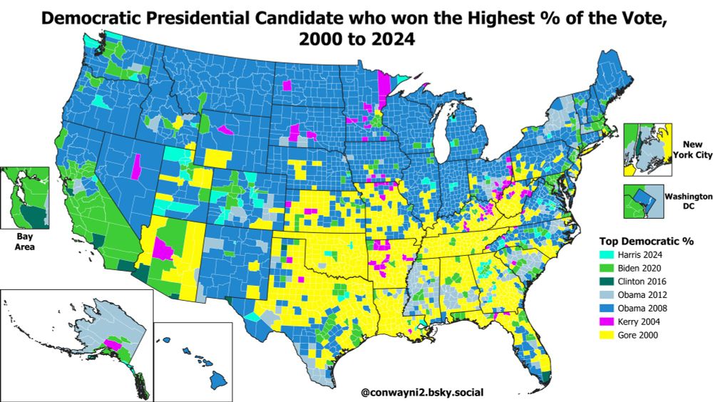
Here's the same map but restricted to which Democrat got the highest % of the vote in the 21st Century (2000-2024).
Gore 2000 (yellow) takes up much of the space in the South where Clinton had done best in 1992/1996 on the previous map.
Gore 2000 (yellow) takes up much of the space in the South where Clinton had done best in 1992/1996 on the previous map.
April 1, 2025 at 5:46 PM
Here's the same map but restricted to which Democrat got the highest % of the vote in the 21st Century (2000-2024).
Gore 2000 (yellow) takes up much of the space in the South where Clinton had done best in 1992/1996 on the previous map.
Gore 2000 (yellow) takes up much of the space in the South where Clinton had done best in 1992/1996 on the previous map.
LaGrange County, Indiana has the highest % with no health insurance, at 44%. LaGrange has a significant Amish population.
Chattahoochee County, Georgia, home of the Fort Moore military base, has the highest % on TRICARE/Military/VA Health Insurance at 42%:
Chattahoochee County, Georgia, home of the Fort Moore military base, has the highest % on TRICARE/Military/VA Health Insurance at 42%:


February 26, 2025 at 7:01 PM
LaGrange County, Indiana has the highest % with no health insurance, at 44%. LaGrange has a significant Amish population.
Chattahoochee County, Georgia, home of the Fort Moore military base, has the highest % on TRICARE/Military/VA Health Insurance at 42%:
Chattahoochee County, Georgia, home of the Fort Moore military base, has the highest % on TRICARE/Military/VA Health Insurance at 42%:
Sumter County, Florida had the highest % with coverage through Medicare, at 48% of the population
Slope County, North Dakota had the highest % with "direct-purchase" coverage, at 40% of the population. This is probably mostly farmers directly buying their own health insurance?
Slope County, North Dakota had the highest % with "direct-purchase" coverage, at 40% of the population. This is probably mostly farmers directly buying their own health insurance?


February 26, 2025 at 7:01 PM
Sumter County, Florida had the highest % with coverage through Medicare, at 48% of the population
Slope County, North Dakota had the highest % with "direct-purchase" coverage, at 40% of the population. This is probably mostly farmers directly buying their own health insurance?
Slope County, North Dakota had the highest % with "direct-purchase" coverage, at 40% of the population. This is probably mostly farmers directly buying their own health insurance?
The county with the highest % of the population getting their coverage through their employers is Los Alamos, New Mexico (76%).
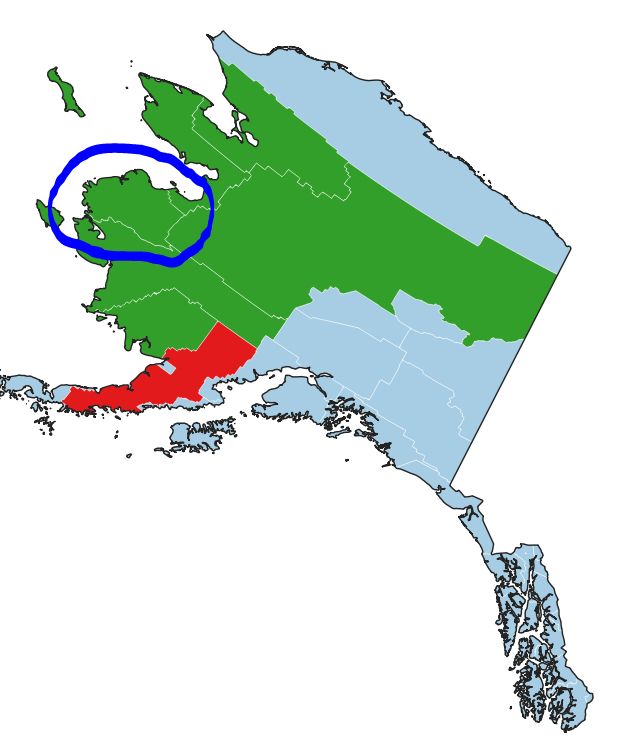
The county with the highest % of the population receiving Medicaid or other means-tested healthcare (CHIPS for example) is Kusilvak, Alaska (66%):
The county with the highest % of the population receiving Medicaid or other means-tested healthcare (CHIPS for example) is Kusilvak, Alaska (66%):

February 26, 2025 at 7:01 PM
The county with the highest % of the population getting their coverage through their employers is Los Alamos, New Mexico (76%).
The county with the highest % of the population receiving Medicaid or other means-tested healthcare (CHIPS for example) is Kusilvak, Alaska (66%):
The county with the highest % of the population receiving Medicaid or other means-tested healthcare (CHIPS for example) is Kusilvak, Alaska (66%):
By state the highest % of households on Food Stamps was New Mexico at 18.7%, followed by West Virginia (17.2%), Louisiana (16.5%), Oregon (15.4%), & New York (15%)
The state with the lowest % of households on SNAP was Wyoming at 5.0%, followed by Utah (5.3%) & New Hampshire (6%):
The state with the lowest % of households on SNAP was Wyoming at 5.0%, followed by Utah (5.3%) & New Hampshire (6%):

February 22, 2025 at 9:05 PM
By state the highest % of households on Food Stamps was New Mexico at 18.7%, followed by West Virginia (17.2%), Louisiana (16.5%), Oregon (15.4%), & New York (15%)
The state with the lowest % of households on SNAP was Wyoming at 5.0%, followed by Utah (5.3%) & New Hampshire (6%):
The state with the lowest % of households on SNAP was Wyoming at 5.0%, followed by Utah (5.3%) & New Hampshire (6%):
The county with the highest estimated % on Food Stamps was Kusilvak Census Area, Alaska, at 51% of households. The next two were Oglala Lakota SD (48%) & Bethel AK (42%).
Outside of majority Native American counties the county with the top Food Stamps % was Starr County TX (41%):
Outside of majority Native American counties the county with the top Food Stamps % was Starr County TX (41%):


February 22, 2025 at 9:05 PM
The county with the highest estimated % on Food Stamps was Kusilvak Census Area, Alaska, at 51% of households. The next two were Oglala Lakota SD (48%) & Bethel AK (42%).
Outside of majority Native American counties the county with the top Food Stamps % was Starr County TX (41%):
Outside of majority Native American counties the county with the top Food Stamps % was Starr County TX (41%):
Reposted by Nick C

💙UTAH
-Only state where Harris improved on Biden %
-Harris highest Democratic vote share since LBJ in 1964
-Least Republican vs USA since 1972
-Most counties swung blue in 2024, see esp. suburban Davis & Utah co.
-Swung blue more than any other state vs 2004 or 2012
h/t @conwayni2.bsky.social US map
-Only state where Harris improved on Biden %
-Harris highest Democratic vote share since LBJ in 1964
-Least Republican vs USA since 1972
-Most counties swung blue in 2024, see esp. suburban Davis & Utah co.
-Swung blue more than any other state vs 2004 or 2012
h/t @conwayni2.bsky.social US map


February 15, 2025 at 3:20 AM
💙UTAH
-Only state where Harris improved on Biden %
-Harris highest Democratic vote share since LBJ in 1964
-Least Republican vs USA since 1972
-Most counties swung blue in 2024, see esp. suburban Davis & Utah co.
-Swung blue more than any other state vs 2004 or 2012
h/t @conwayni2.bsky.social US map
-Only state where Harris improved on Biden %
-Harris highest Democratic vote share since LBJ in 1964
-Least Republican vs USA since 1972
-Most counties swung blue in 2024, see esp. suburban Davis & Utah co.
-Swung blue more than any other state vs 2004 or 2012
h/t @conwayni2.bsky.social US map
Wolfe County KY has the highest % on public healthcare, at 73% of the population. Wolfe has the 2nd lowest median income by county in the US & voted 74% for Trump in 2024.
Falls Church City VA has the highest % on private healthcare, at 88%, & the 2nd highest median income. Voted 79% for Harris.
Falls Church City VA has the highest % on private healthcare, at 88%, & the 2nd highest median income. Voted 79% for Harris.


February 5, 2025 at 4:36 PM
Wolfe County KY has the highest % on public healthcare, at 73% of the population. Wolfe has the 2nd lowest median income by county in the US & voted 74% for Trump in 2024.
Falls Church City VA has the highest % on private healthcare, at 88%, & the 2nd highest median income. Voted 79% for Harris.
Falls Church City VA has the highest % on private healthcare, at 88%, & the 2nd highest median income. Voted 79% for Harris.
York County SC is a good example of how Jim Crow Voting Restrictions not only restricted African-American turnout in the South, but also led to lower White turnout.
York County was 66% White, but only around ~8% of adult voters turned out to vote:
York County was 66% White, but only around ~8% of adult voters turned out to vote:

February 4, 2025 at 11:27 PM
York County SC is a good example of how Jim Crow Voting Restrictions not only restricted African-American turnout in the South, but also led to lower White turnout.
York County was 66% White, but only around ~8% of adult voters turned out to vote:
York County was 66% White, but only around ~8% of adult voters turned out to vote:
Running a regression, we can see that the estimated effect of every 1% increase in the African-American population share is a 1.08% drop in the total turnout rate. Suggests that Jim Crow voter restrictions also led to lower White turnout and/or disenfranchisement of poor Whites:

February 4, 2025 at 11:27 PM
Running a regression, we can see that the estimated effect of every 1% increase in the African-American population share is a 1.08% drop in the total turnout rate. Suggests that Jim Crow voter restrictions also led to lower White turnout and/or disenfranchisement of poor Whites:
There is a strong correlation between Estimated 1940 Turnout & the Non-White % (R^2 = 0.539) of the population due to these restrictions.
The outlier counties with high non-white populations & high turnout are almost all heavily Native American counties located in the North:
The outlier counties with high non-white populations & high turnout are almost all heavily Native American counties located in the North:

February 4, 2025 at 11:27 PM
There is a strong correlation between Estimated 1940 Turnout & the Non-White % (R^2 = 0.539) of the population due to these restrictions.
The outlier counties with high non-white populations & high turnout are almost all heavily Native American counties located in the North:
The outlier counties with high non-white populations & high turnout are almost all heavily Native American counties located in the North:
I don't think I do, I've got 2004 to 2024 but not 2008 yet
February 4, 2025 at 10:32 PM
I don't think I do, I've got 2004 to 2024 but not 2008 yet
Here are state level maps of the 2012-2024 2-Party Swing & Trend* (*Swing adjusted by the national swing).


February 4, 2025 at 6:58 PM
Here are state level maps of the 2012-2024 2-Party Swing & Trend* (*Swing adjusted by the national swing).
Here's the 2012-2024 2-Party TREND map.
The trend map adjusts for the 5.4% swing towards Republicans nationwide from 2012 to 2024, so essentially the swing in every county is shifted 5.4 points to the left to show the swing RELATIVE to the whole nation:
The trend map adjusts for the 5.4% swing towards Republicans nationwide from 2012 to 2024, so essentially the swing in every county is shifted 5.4 points to the left to show the swing RELATIVE to the whole nation:

February 4, 2025 at 6:58 PM
Here's the 2012-2024 2-Party TREND map.
The trend map adjusts for the 5.4% swing towards Republicans nationwide from 2012 to 2024, so essentially the swing in every county is shifted 5.4 points to the left to show the swing RELATIVE to the whole nation:
The trend map adjusts for the 5.4% swing towards Republicans nationwide from 2012 to 2024, so essentially the swing in every county is shifted 5.4 points to the left to show the swing RELATIVE to the whole nation: