


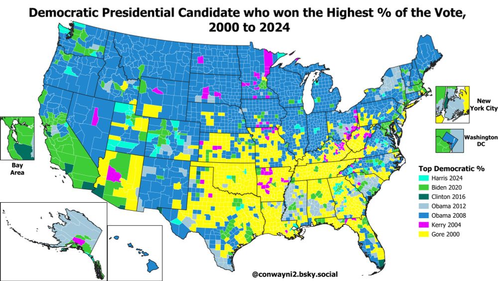
Here's the same map but restricted to which Democrat got the highest % of the vote in the 21st Century (2000-2024).
Gore 2000 (yellow) takes up much of the space in the South where Clinton had done best in 1992/1996 on the previous map.
Gore 2000 (yellow) takes up much of the space in the South where Clinton had done best in 1992/1996 on the previous map.
April 1, 2025 at 5:46 PM
Here's the same map but restricted to which Democrat got the highest % of the vote in the 21st Century (2000-2024).
Gore 2000 (yellow) takes up much of the space in the South where Clinton had done best in 1992/1996 on the previous map.
Gore 2000 (yellow) takes up much of the space in the South where Clinton had done best in 1992/1996 on the previous map.
Map of which Democrat got the highest % of the vote in each county, 1984-2024 Presidential Elections
Obama 2008 (blue) set the record in much of the Midwest and North-East, Clinton 1992/1996 (light pink/red) in many Southern areas, Dukakis 1988 (light orange) in most Great Plains counties:
Obama 2008 (blue) set the record in much of the Midwest and North-East, Clinton 1992/1996 (light pink/red) in many Southern areas, Dukakis 1988 (light orange) in most Great Plains counties:

April 1, 2025 at 12:08 AM
Map of which Democrat got the highest % of the vote in each county, 1984-2024 Presidential Elections
Obama 2008 (blue) set the record in much of the Midwest and North-East, Clinton 1992/1996 (light pink/red) in many Southern areas, Dukakis 1988 (light orange) in most Great Plains counties:
Obama 2008 (blue) set the record in much of the Midwest and North-East, Clinton 1992/1996 (light pink/red) in many Southern areas, Dukakis 1988 (light orange) in most Great Plains counties:
Map of the % of the population that receives Employer Health Insurance Coverage.
Nationwide 50.6% of the population is estimated to receive health insurance thru their employer. Counties with >50% receiving employer coverage are yellow, counties with less than 50% are green:
Nationwide 50.6% of the population is estimated to receive health insurance thru their employer. Counties with >50% receiving employer coverage are yellow, counties with less than 50% are green:

March 4, 2025 at 9:11 PM
Map of the % of the population that receives Employer Health Insurance Coverage.
Nationwide 50.6% of the population is estimated to receive health insurance thru their employer. Counties with >50% receiving employer coverage are yellow, counties with less than 50% are green:
Nationwide 50.6% of the population is estimated to receive health insurance thru their employer. Counties with >50% receiving employer coverage are yellow, counties with less than 50% are green:
LaGrange County, Indiana has the highest % with no health insurance, at 44%. LaGrange has a significant Amish population.
Chattahoochee County, Georgia, home of the Fort Moore military base, has the highest % on TRICARE/Military/VA Health Insurance at 42%:
Chattahoochee County, Georgia, home of the Fort Moore military base, has the highest % on TRICARE/Military/VA Health Insurance at 42%:


February 26, 2025 at 7:01 PM
LaGrange County, Indiana has the highest % with no health insurance, at 44%. LaGrange has a significant Amish population.
Chattahoochee County, Georgia, home of the Fort Moore military base, has the highest % on TRICARE/Military/VA Health Insurance at 42%:
Chattahoochee County, Georgia, home of the Fort Moore military base, has the highest % on TRICARE/Military/VA Health Insurance at 42%:
Sumter County, Florida had the highest % with coverage through Medicare, at 48% of the population
Slope County, North Dakota had the highest % with "direct-purchase" coverage, at 40% of the population. This is probably mostly farmers directly buying their own health insurance?
Slope County, North Dakota had the highest % with "direct-purchase" coverage, at 40% of the population. This is probably mostly farmers directly buying their own health insurance?


February 26, 2025 at 7:01 PM
Sumter County, Florida had the highest % with coverage through Medicare, at 48% of the population
Slope County, North Dakota had the highest % with "direct-purchase" coverage, at 40% of the population. This is probably mostly farmers directly buying their own health insurance?
Slope County, North Dakota had the highest % with "direct-purchase" coverage, at 40% of the population. This is probably mostly farmers directly buying their own health insurance?
The county with the highest % of the population getting their coverage through their employers is Los Alamos, New Mexico (76%).
The county with the highest % of the population receiving Medicaid or other means-tested healthcare (CHIPS for example) is Kusilvak, Alaska (66%):
The county with the highest % of the population receiving Medicaid or other means-tested healthcare (CHIPS for example) is Kusilvak, Alaska (66%):

February 26, 2025 at 7:01 PM
The county with the highest % of the population getting their coverage through their employers is Los Alamos, New Mexico (76%).
The county with the highest % of the population receiving Medicaid or other means-tested healthcare (CHIPS for example) is Kusilvak, Alaska (66%):
The county with the highest % of the population receiving Medicaid or other means-tested healthcare (CHIPS for example) is Kusilvak, Alaska (66%):
Map of the most common type of health insurance by county.
54% of Americans get healthcare thru their employers (blue), but in some counties the most common coverage is Medicaid (green), Medicare (orange), Direct-Purchase (purple), no health insurance (red), or Military (yellow):
54% of Americans get healthcare thru their employers (blue), but in some counties the most common coverage is Medicaid (green), Medicare (orange), Direct-Purchase (purple), no health insurance (red), or Military (yellow):

February 26, 2025 at 7:01 PM
Map of the most common type of health insurance by county.
54% of Americans get healthcare thru their employers (blue), but in some counties the most common coverage is Medicaid (green), Medicare (orange), Direct-Purchase (purple), no health insurance (red), or Military (yellow):
54% of Americans get healthcare thru their employers (blue), but in some counties the most common coverage is Medicaid (green), Medicare (orange), Direct-Purchase (purple), no health insurance (red), or Military (yellow):
By state the highest % of households on Food Stamps was New Mexico at 18.7%, followed by West Virginia (17.2%), Louisiana (16.5%), Oregon (15.4%), & New York (15%)
The state with the lowest % of households on SNAP was Wyoming at 5.0%, followed by Utah (5.3%) & New Hampshire (6%):
The state with the lowest % of households on SNAP was Wyoming at 5.0%, followed by Utah (5.3%) & New Hampshire (6%):

February 22, 2025 at 9:05 PM
By state the highest % of households on Food Stamps was New Mexico at 18.7%, followed by West Virginia (17.2%), Louisiana (16.5%), Oregon (15.4%), & New York (15%)
The state with the lowest % of households on SNAP was Wyoming at 5.0%, followed by Utah (5.3%) & New Hampshire (6%):
The state with the lowest % of households on SNAP was Wyoming at 5.0%, followed by Utah (5.3%) & New Hampshire (6%):
The county with the highest estimated % on Food Stamps was Kusilvak Census Area, Alaska, at 51% of households. The next two were Oglala Lakota SD (48%) & Bethel AK (42%).
Outside of majority Native American counties the county with the top Food Stamps % was Starr County TX (41%):
Outside of majority Native American counties the county with the top Food Stamps % was Starr County TX (41%):


February 22, 2025 at 9:05 PM
The county with the highest estimated % on Food Stamps was Kusilvak Census Area, Alaska, at 51% of households. The next two were Oglala Lakota SD (48%) & Bethel AK (42%).
Outside of majority Native American counties the county with the top Food Stamps % was Starr County TX (41%):
Outside of majority Native American counties the county with the top Food Stamps % was Starr County TX (41%):
Republicans are looking to cut SNAP (Food Stamps) benefits in their upcoming budget reconciliation bill.
11.8% of households nationwide are on SNAP; the map below shows the estimated SNAP % by county with counties in green above the 11.8% average, counties in yellow are below average on Food Stamps:
11.8% of households nationwide are on SNAP; the map below shows the estimated SNAP % by county with counties in green above the 11.8% average, counties in yellow are below average on Food Stamps:

February 22, 2025 at 9:05 PM
Republicans are looking to cut SNAP (Food Stamps) benefits in their upcoming budget reconciliation bill.
11.8% of households nationwide are on SNAP; the map below shows the estimated SNAP % by county with counties in green above the 11.8% average, counties in yellow are below average on Food Stamps:
11.8% of households nationwide are on SNAP; the map below shows the estimated SNAP % by county with counties in green above the 11.8% average, counties in yellow are below average on Food Stamps:
Map of the estimated % of the population born in their state of residence, by county.
Counties in green have a majority of the population born outside their state of residence, counties in yellow a majority were born in-state. Nationwide 58.1% live in the state they were born:
Counties in green have a majority of the population born outside their state of residence, counties in yellow a majority were born in-state. Nationwide 58.1% live in the state they were born:

February 21, 2025 at 12:00 AM
Map of the estimated % of the population born in their state of residence, by county.
Counties in green have a majority of the population born outside their state of residence, counties in yellow a majority were born in-state. Nationwide 58.1% live in the state they were born:
Counties in green have a majority of the population born outside their state of residence, counties in yellow a majority were born in-state. Nationwide 58.1% live in the state they were born:
GIF Map of State Political Party Control by Year, from 2000 to 2025
February 8, 2025 at 12:48 AM
GIF Map of State Political Party Control by Year, from 2000 to 2025
Map of the median age of housing stock by county, as of 2019.
Housing is much newer in the South & Southwestern US, & older in the Northeast, Midwest, & Great Plains.
The oldest housing is in Pawnee County NE (median year built is 1940), newest housing in Sumter County FL (median year built 2004):
Housing is much newer in the South & Southwestern US, & older in the Northeast, Midwest, & Great Plains.
The oldest housing is in Pawnee County NE (median year built is 1940), newest housing in Sumter County FL (median year built 2004):

February 6, 2025 at 12:38 AM
Map of the median age of housing stock by county, as of 2019.
Housing is much newer in the South & Southwestern US, & older in the Northeast, Midwest, & Great Plains.
The oldest housing is in Pawnee County NE (median year built is 1940), newest housing in Sumter County FL (median year built 2004):
Housing is much newer in the South & Southwestern US, & older in the Northeast, Midwest, & Great Plains.
The oldest housing is in Pawnee County NE (median year built is 1940), newest housing in Sumter County FL (median year built 2004):
Wolfe County KY has the highest % on public healthcare, at 73% of the population. Wolfe has the 2nd lowest median income by county in the US & voted 74% for Trump in 2024.
Falls Church City VA has the highest % on private healthcare, at 88%, & the 2nd highest median income. Voted 79% for Harris.
Falls Church City VA has the highest % on private healthcare, at 88%, & the 2nd highest median income. Voted 79% for Harris.


February 5, 2025 at 4:36 PM
Wolfe County KY has the highest % on public healthcare, at 73% of the population. Wolfe has the 2nd lowest median income by county in the US & voted 74% for Trump in 2024.
Falls Church City VA has the highest % on private healthcare, at 88%, & the 2nd highest median income. Voted 79% for Harris.
Falls Church City VA has the highest % on private healthcare, at 88%, & the 2nd highest median income. Voted 79% for Harris.
Map of the estimated % of the population with "Private" vs "Public" healthcare coverage
Areas in yellow have more people on "Private" healthcare (employer-based, exchanges, etc), areas in green have more people on "Public" healthcare (Medicare, Medicaid, VA/military plans, etc). 2017-2021 estimates:
Areas in yellow have more people on "Private" healthcare (employer-based, exchanges, etc), areas in green have more people on "Public" healthcare (Medicare, Medicaid, VA/military plans, etc). 2017-2021 estimates:

February 5, 2025 at 4:36 PM
Map of the estimated % of the population with "Private" vs "Public" healthcare coverage
Areas in yellow have more people on "Private" healthcare (employer-based, exchanges, etc), areas in green have more people on "Public" healthcare (Medicare, Medicaid, VA/military plans, etc). 2017-2021 estimates:
Areas in yellow have more people on "Private" healthcare (employer-based, exchanges, etc), areas in green have more people on "Public" healthcare (Medicare, Medicaid, VA/military plans, etc). 2017-2021 estimates:
York County SC is a good example of how Jim Crow Voting Restrictions not only restricted African-American turnout in the South, but also led to lower White turnout.
York County was 66% White, but only around ~8% of adult voters turned out to vote:
York County was 66% White, but only around ~8% of adult voters turned out to vote:

February 4, 2025 at 11:27 PM
York County SC is a good example of how Jim Crow Voting Restrictions not only restricted African-American turnout in the South, but also led to lower White turnout.
York County was 66% White, but only around ~8% of adult voters turned out to vote:
York County was 66% White, but only around ~8% of adult voters turned out to vote:
Running a regression, we can see that the estimated effect of every 1% increase in the African-American population share is a 1.08% drop in the total turnout rate. Suggests that Jim Crow voter restrictions also led to lower White turnout and/or disenfranchisement of poor Whites:

February 4, 2025 at 11:27 PM
Running a regression, we can see that the estimated effect of every 1% increase in the African-American population share is a 1.08% drop in the total turnout rate. Suggests that Jim Crow voter restrictions also led to lower White turnout and/or disenfranchisement of poor Whites:
There is a strong correlation between Estimated 1940 Turnout & the Non-White % (R^2 = 0.539) of the population due to these restrictions.
The outlier counties with high non-white populations & high turnout are almost all heavily Native American counties located in the North:
The outlier counties with high non-white populations & high turnout are almost all heavily Native American counties located in the North:

February 4, 2025 at 11:27 PM
There is a strong correlation between Estimated 1940 Turnout & the Non-White % (R^2 = 0.539) of the population due to these restrictions.
The outlier counties with high non-white populations & high turnout are almost all heavily Native American counties located in the North:
The outlier counties with high non-white populations & high turnout are almost all heavily Native American counties located in the North:
Map of estimated turnout of the adult population in the 1940 US Presidential Election. The strong effects of Jim Crow voting restrictions & poll taxes are visible (see the WV/VA border), with less than 10% of the adult population voting in some Southern counties (dark orange):

February 4, 2025 at 11:27 PM
Map of estimated turnout of the adult population in the 1940 US Presidential Election. The strong effects of Jim Crow voting restrictions & poll taxes are visible (see the WV/VA border), with less than 10% of the adult population voting in some Southern counties (dark orange):
Here are state level maps of the 2012-2024 2-Party Swing & Trend* (*Swing adjusted by the national swing).


February 4, 2025 at 6:58 PM
Here are state level maps of the 2012-2024 2-Party Swing & Trend* (*Swing adjusted by the national swing).
Here's the 2012-2024 2-Party TREND map.
The trend map adjusts for the 5.4% swing towards Republicans nationwide from 2012 to 2024, so essentially the swing in every county is shifted 5.4 points to the left to show the swing RELATIVE to the whole nation:
The trend map adjusts for the 5.4% swing towards Republicans nationwide from 2012 to 2024, so essentially the swing in every county is shifted 5.4 points to the left to show the swing RELATIVE to the whole nation:

February 4, 2025 at 6:58 PM
Here's the 2012-2024 2-Party TREND map.
The trend map adjusts for the 5.4% swing towards Republicans nationwide from 2012 to 2024, so essentially the swing in every county is shifted 5.4 points to the left to show the swing RELATIVE to the whole nation:
The trend map adjusts for the 5.4% swing towards Republicans nationwide from 2012 to 2024, so essentially the swing in every county is shifted 5.4 points to the left to show the swing RELATIVE to the whole nation:
The biggest GOP swing from 2012 to 2024 was in Starr County TX, which went from D+74 in 2012 to R+16 in 2024, a 90 point swing in 2-party margin.
Biggest Dem gain was in Utah County, Utah, which went from R+80 in 2012 to only R+41 in 2024, a 39 point Dem swing:
Biggest Dem gain was in Utah County, Utah, which went from R+80 in 2012 to only R+41 in 2024, a 39 point Dem swing:


February 4, 2025 at 6:58 PM
The biggest GOP swing from 2012 to 2024 was in Starr County TX, which went from D+74 in 2012 to R+16 in 2024, a 90 point swing in 2-party margin.
Biggest Dem gain was in Utah County, Utah, which went from R+80 in 2012 to only R+41 in 2024, a 39 point Dem swing:
Biggest Dem gain was in Utah County, Utah, which went from R+80 in 2012 to only R+41 in 2024, a 39 point Dem swing:
Map of the 2-Party swing from the 2012 to 2024 US Presidential elections.
The familiar Democratic gains in the suburbs vs Republican gains in rural areas are still there, but after 2024 there are also big GOP swings in a few urban areas like NYC, Miami, & Detroit:
The familiar Democratic gains in the suburbs vs Republican gains in rural areas are still there, but after 2024 there are also big GOP swings in a few urban areas like NYC, Miami, & Detroit:

February 4, 2025 at 6:58 PM
Map of the 2-Party swing from the 2012 to 2024 US Presidential elections.
The familiar Democratic gains in the suburbs vs Republican gains in rural areas are still there, but after 2024 there are also big GOP swings in a few urban areas like NYC, Miami, & Detroit:
The familiar Democratic gains in the suburbs vs Republican gains in rural areas are still there, but after 2024 there are also big GOP swings in a few urban areas like NYC, Miami, & Detroit: