
www.nber.org/news/nber-la...
www.nber.org/news/nber-la...
It is now *much* easier to find what you want among the thousands of charts and hundreds of datasets we host
Really amazed by the colleagues who made this happen ✨
→ ourworldindata.org/search
With such a rich publication—nearly 14,000 charts and 100s of articles on 120+ topics—it can be hard to find what matters to you.
Now, finding what you’re looking for, or discovering something new, has never been easier.

It is now *much* easier to find what you want among the thousands of charts and hundreds of datasets we host
Really amazed by the colleagues who made this happen ✨
This tool lets you search the full text of papers from the American Economic Review, American Economic Journal series, and over 30,000 NBER working papers.
paulgp.com/econlit-pipe...

This tool lets you search the full text of papers from the American Economic Review, American Economic Journal series, and over 30,000 NBER working papers.
paulgp.com/econlit-pipe...
Check out our growing catalog of over 350 Data Insights (DIs) — which we’ve just made easier to explore and discover what matters to you!
Check out our growing catalog of over 350 Data Insights (DIs) — which we’ve just made easier to explore and discover what matters to you!
Another way to visualize this data is to measure how over- or underrepresented each cause is.
To do this, we calculate the ratio between a cause’s share of deaths and its share of news articles.

Another way to visualize this data is to measure how over- or underrepresented each cause is.
To do this, we calculate the ratio between a cause’s share of deaths and its share of news articles.

We’ve just released @chartlecc.bsky.social - a daily chart game!
Your job is to guess which country is represented by the red line in today's chart. You get 5 tries, no other clues!
Play today, come back tomorrow for a different chart with new data and share with your chart friends 📈

We’ve just released @chartlecc.bsky.social - a daily chart game!
Your job is to guess which country is represented by the red line in today's chart. You get 5 tries, no other clues!
Play today, come back tomorrow for a different chart with new data and share with your chart friends 📈

We’ve just released @chartlecc.bsky.social - a daily chart game!
Your job is to guess which country is represented by the red line in today's chart. You get 5 tries, no other clues!
Play today, come back tomorrow for a different chart with new data and share with your chart friends 📈
Our work is used in classrooms around the world — from top universities to local schools.

Our work is used in classrooms around the world — from top universities to local schools.
Our new article explains what changed in the World Bank's latest update and what the new data tells us about global poverty
⤵️
ourworldindata.org/new-internat...

Our new article explains what changed in the World Bank's latest update and what the new data tells us about global poverty
⤵️
ourworldindata.org/new-internat...
Two measures are often used: income *before* people have paid taxes and received benefits from the government, and income *after* government redistribution via taxes and benefits. 🧵

Two measures are often used: income *before* people have paid taxes and received benefits from the government, and income *after* government redistribution via taxes and benefits. 🧵
– Enhanced country/region selection with several sorting options and a bar chart preview
– Selecting a country highlights it and shows its value on the map
– Zooming to your selection brings up a 3D globe view 🌍
Today's data insight: ourworldindata.org/data-insight...
Data from @ember-energy.org.
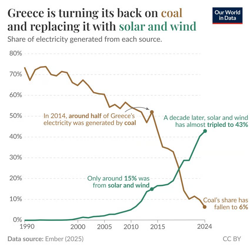
Today's data insight: ourworldindata.org/data-insight...
Data from @ember-energy.org.


They are a way to adjust for differences in the cost of living, helping us compare incomes and how far money goes in different countries.
Read our new explainer ⤵️
ourworldindata.org/internationa...

They are a way to adjust for differences in the cost of living, helping us compare incomes and how far money goes in different countries.
Read our new explainer ⤵️
ourworldindata.org/internationa...
Every £1 of up-front spending on Sure Start could generate around £2 in total benefits over the long run.
THREAD on our new @nuffieldfoundation.org-funded report:
[1/11]
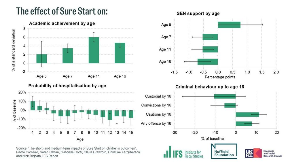
Every £1 of up-front spending on Sure Start could generate around £2 in total benefits over the long run.
THREAD on our new @nuffieldfoundation.org-funded report:
[1/11]
In this article @scientificdiscovery.dev & @spoonerf.bsky.social explain how vaccines were developed and their impact on saving lives. ourworldindata.org/measles-vacc...
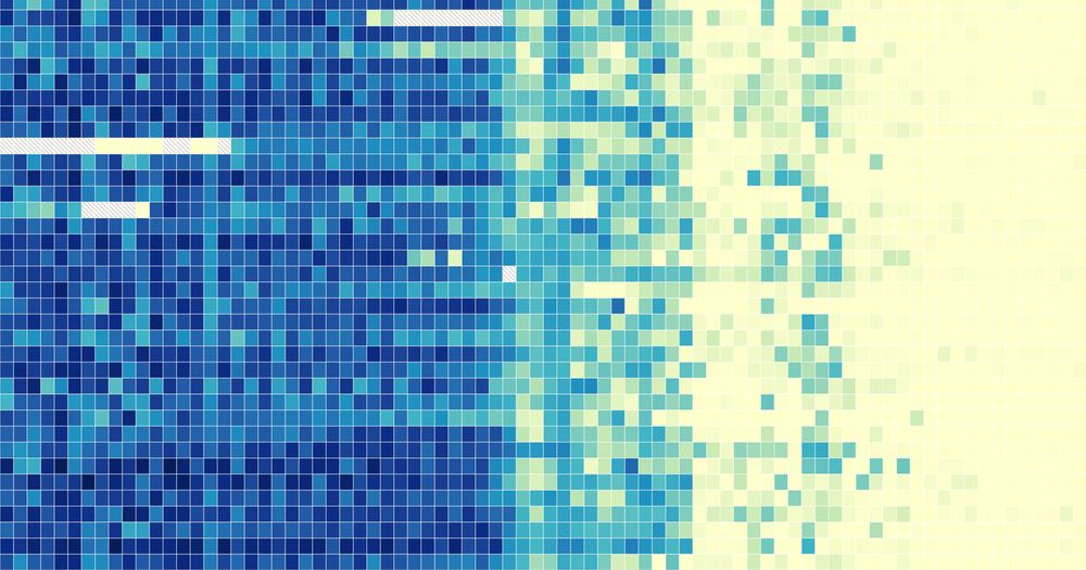
In this article @scientificdiscovery.dev & @spoonerf.bsky.social explain how vaccines were developed and their impact on saving lives. ourworldindata.org/measles-vacc...
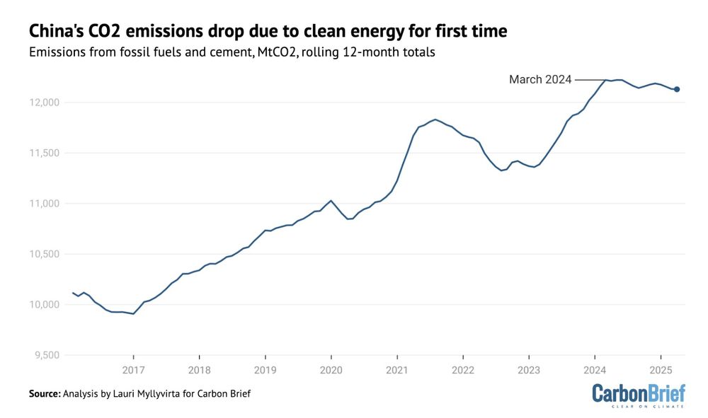
From the IEA's latest Global EV Outlook.
You can explore more data here:
ourworldindata.org/electric-car...
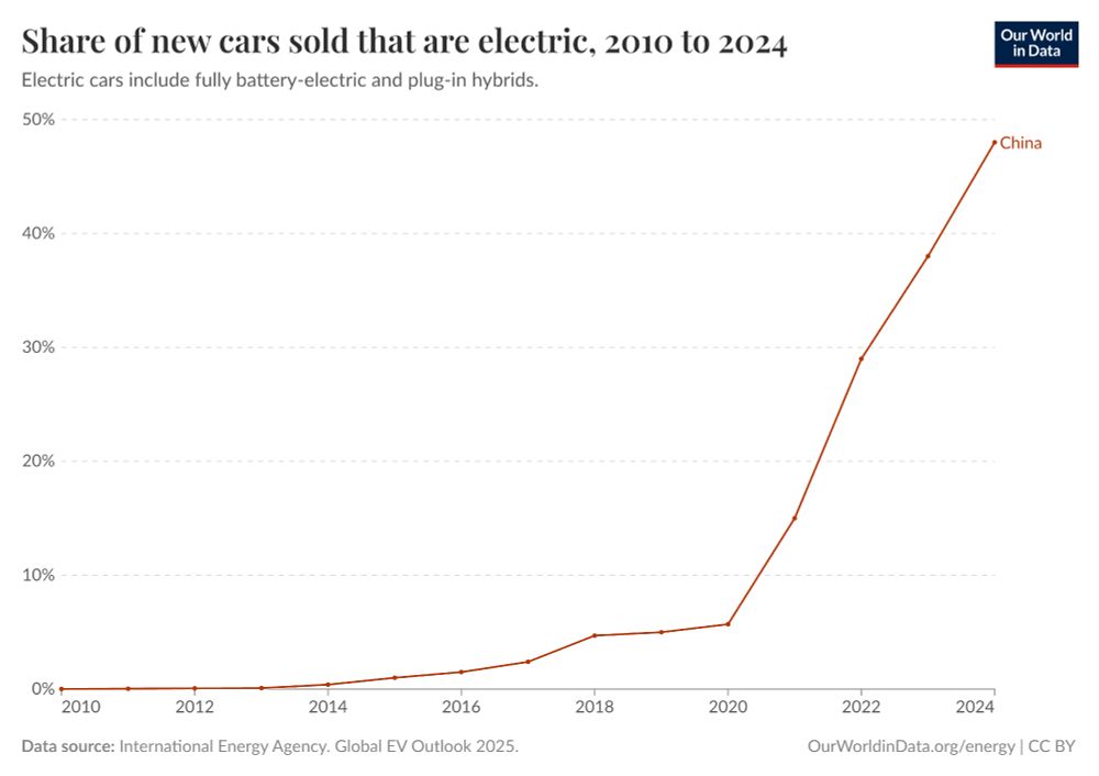
From the IEA's latest Global EV Outlook.
You can explore more data here:
ourworldindata.org/electric-car...

This includes observed data through 2024 as well as projections to 2030. This is the latest data from the IMF’s World Economic Outlook.


