


Bertha Rohenkohl
@bertharohenkohl.bsky.social
Research and Data Economics Lead @ Our World in Data | poverty, inequality, labor. Views my own.
Great to see the new search tool on Our World in Data!
It is now *much* easier to find what you want among the thousands of charts and hundreds of datasets we host
Really amazed by the colleagues who made this happen ✨
It is now *much* easier to find what you want among the thousands of charts and hundreds of datasets we host
Really amazed by the colleagues who made this happen ✨
🔍 Introducing our new, more powerful search!
→ ourworldindata.org/search
With such a rich publication—nearly 14,000 charts and 100s of articles on 120+ topics—it can be hard to find what matters to you.
Now, finding what you’re looking for, or discovering something new, has never been easier.
→ ourworldindata.org/search
With such a rich publication—nearly 14,000 charts and 100s of articles on 120+ topics—it can be hard to find what matters to you.
Now, finding what you’re looking for, or discovering something new, has never been easier.

November 6, 2025 at 11:11 PM
Great to see the new search tool on Our World in Data!
It is now *much* easier to find what you want among the thousands of charts and hundreds of datasets we host
Really amazed by the colleagues who made this happen ✨
It is now *much* easier to find what you want among the thousands of charts and hundreds of datasets we host
Really amazed by the colleagues who made this happen ✨
Reposted by Bertha Rohenkohl

Dropping a beta version of this page while everyone is up and processing baseball!
This tool lets you search the full text of papers from the American Economic Review, American Economic Journal series, and over 30,000 NBER working papers.
paulgp.com/econlit-pipe...
This tool lets you search the full text of papers from the American Economic Review, American Economic Journal series, and over 30,000 NBER working papers.
paulgp.com/econlit-pipe...

Economics Literature Search
Full-text search across 15,000+ papers from top economics journals and NBER working papers. Track how empirical methods have evolved over time.
paulgp.com
November 2, 2025 at 4:43 AM
Dropping a beta version of this page while everyone is up and processing baseball!
This tool lets you search the full text of papers from the American Economic Review, American Economic Journal series, and over 30,000 NBER working papers.
paulgp.com/econlit-pipe...
This tool lets you search the full text of papers from the American Economic Review, American Economic Journal series, and over 30,000 NBER working papers.
paulgp.com/econlit-pipe...
Reposted by Bertha Rohenkohl
Interested in bite-sized, data-driven insights on the world and how it’s changing?
Check out our growing catalog of over 350 Data Insights (DIs) — which we’ve just made easier to explore and discover what matters to you!
Check out our growing catalog of over 350 Data Insights (DIs) — which we’ve just made easier to explore and discover what matters to you!
October 28, 2025 at 9:31 AM
Interested in bite-sized, data-driven insights on the world and how it’s changing?
Check out our growing catalog of over 350 Data Insights (DIs) — which we’ve just made easier to explore and discover what matters to you!
Check out our growing catalog of over 350 Data Insights (DIs) — which we’ve just made easier to explore and discover what matters to you!
Reposted by Bertha Rohenkohl
How over- and underrepresented are different causes of death in the media?
Another way to visualize this data is to measure how over- or underrepresented each cause is.
To do this, we calculate the ratio between a cause’s share of deaths and its share of news articles.
Another way to visualize this data is to measure how over- or underrepresented each cause is.
To do this, we calculate the ratio between a cause’s share of deaths and its share of news articles.

October 9, 2025 at 5:08 PM
How over- and underrepresented are different causes of death in the media?
Another way to visualize this data is to measure how over- or underrepresented each cause is.
To do this, we calculate the ratio between a cause’s share of deaths and its share of news articles.
Another way to visualize this data is to measure how over- or underrepresented each cause is.
To do this, we calculate the ratio between a cause’s share of deaths and its share of news articles.
Reposted by Bertha Rohenkohl
In a new article, @hannahritchie.bsky.social explains the Wolbachia method and how it promises to finally give humanity an effective tool against several neglected tropical diseases: ourworldindata.org/wolbachia-ne...

How Wolbachia bacteria could help us tackle some of the world’s most neglected tropical diseases
A common bacterium can dramatically reduce the spread of dengue fever and other tropical diseases.
ourworldindata.org
September 23, 2025 at 11:05 AM
In a new article, @hannahritchie.bsky.social explains the Wolbachia method and how it promises to finally give humanity an effective tool against several neglected tropical diseases: ourworldindata.org/wolbachia-ne...
Reposted by Bertha Rohenkohl
A fun chart game that primarily sources its data from Our World in Data!
Launch day 🚀
We’ve just released @chartlecc.bsky.social - a daily chart game!
Your job is to guess which country is represented by the red line in today's chart. You get 5 tries, no other clues!
Play today, come back tomorrow for a different chart with new data and share with your chart friends 📈
We’ve just released @chartlecc.bsky.social - a daily chart game!
Your job is to guess which country is represented by the red line in today's chart. You get 5 tries, no other clues!
Play today, come back tomorrow for a different chart with new data and share with your chart friends 📈

Chartle - A daily chart game
Guess the country in red by analysing today's chart
chartle.cc
September 15, 2025 at 1:54 PM
A fun chart game that primarily sources its data from Our World in Data!
Reposted by Bertha Rohenkohl

Launch day 🚀
We’ve just released @chartlecc.bsky.social - a daily chart game!
Your job is to guess which country is represented by the red line in today's chart. You get 5 tries, no other clues!
Play today, come back tomorrow for a different chart with new data and share with your chart friends 📈
We’ve just released @chartlecc.bsky.social - a daily chart game!
Your job is to guess which country is represented by the red line in today's chart. You get 5 tries, no other clues!
Play today, come back tomorrow for a different chart with new data and share with your chart friends 📈
Chartle - A daily chart game
Guess the country in red by analysing today's chart
chartle.cc
September 12, 2025 at 1:41 PM
Launch day 🚀
We’ve just released @chartlecc.bsky.social - a daily chart game!
Your job is to guess which country is represented by the red line in today's chart. You get 5 tries, no other clues!
Play today, come back tomorrow for a different chart with new data and share with your chart friends 📈
We’ve just released @chartlecc.bsky.social - a daily chart game!
Your job is to guess which country is represented by the red line in today's chart. You get 5 tries, no other clues!
Play today, come back tomorrow for a different chart with new data and share with your chart friends 📈
Reposted by Bertha Rohenkohl
📚 The new school year is starting in many places. If you’re a teacher, student, or parent, here are a few ways Our World in Data might be useful to you right now 🧵
Our work is used in classrooms around the world — from top universities to local schools.
Our work is used in classrooms around the world — from top universities to local schools.

September 10, 2025 at 1:36 PM
📚 The new school year is starting in many places. If you’re a teacher, student, or parent, here are a few ways Our World in Data might be useful to you right now 🧵
Our work is used in classrooms around the world — from top universities to local schools.
Our work is used in classrooms around the world — from top universities to local schools.
The international poverty line has changed, it’s now $3 a day.
Our new article explains what changed in the World Bank's latest update and what the new data tells us about global poverty
⤵️
ourworldindata.org/new-internat...
Our new article explains what changed in the World Bank's latest update and what the new data tells us about global poverty
⤵️
ourworldindata.org/new-internat...
✍️ New article: “$3 a day: A new poverty line has shifted the World Bank’s data on extreme poverty. What changed, and why?” 🧵

August 12, 2025 at 8:04 AM
The international poverty line has changed, it’s now $3 a day.
Our new article explains what changed in the World Bank's latest update and what the new data tells us about global poverty
⤵️
ourworldindata.org/new-internat...
Our new article explains what changed in the World Bank's latest update and what the new data tells us about global poverty
⤵️
ourworldindata.org/new-internat...
Reposted by Bertha Rohenkohl
When discussing data on income inequality, it's important to be clear about what’s being shown.
Two measures are often used: income *before* people have paid taxes and received benefits from the government, and income *after* government redistribution via taxes and benefits. 🧵
Two measures are often used: income *before* people have paid taxes and received benefits from the government, and income *after* government redistribution via taxes and benefits. 🧵

August 1, 2025 at 4:14 PM
When discussing data on income inequality, it's important to be clear about what’s being shown.
Two measures are often used: income *before* people have paid taxes and received benefits from the government, and income *after* government redistribution via taxes and benefits. 🧵
Two measures are often used: income *before* people have paid taxes and received benefits from the government, and income *after* government redistribution via taxes and benefits. 🧵
Check out these really exciting new features! 🌎
💡 Very excited to announce new features: better interactive maps! 🗺️
– Enhanced country/region selection with several sorting options and a bar chart preview
– Selecting a country highlights it and shows its value on the map
– Zooming to your selection brings up a 3D globe view 🌍
– Enhanced country/region selection with several sorting options and a bar chart preview
– Selecting a country highlights it and shows its value on the map
– Zooming to your selection brings up a 3D globe view 🌍
June 5, 2025 at 4:56 PM
Check out these really exciting new features! 🌎
Reposted by Bertha Rohenkohl

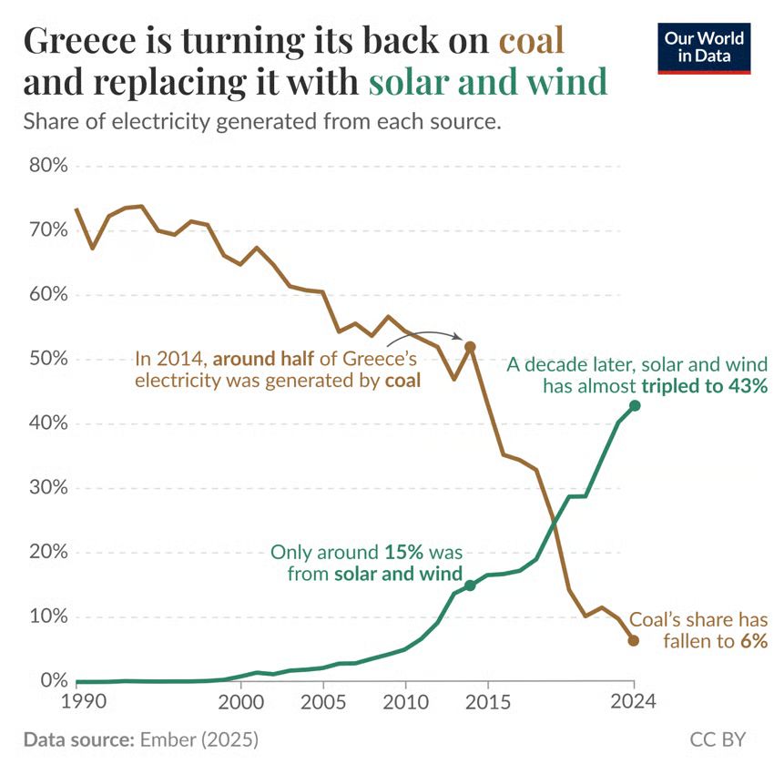
Greece is turning its back on coal and replacing it with solar and wind.
Today's data insight: ourworldindata.org/data-insight...
Data from @ember-energy.org.
Today's data insight: ourworldindata.org/data-insight...
Data from @ember-energy.org.
June 2, 2025 at 6:01 AM
Greece is turning its back on coal and replacing it with solar and wind.
Today's data insight: ourworldindata.org/data-insight...
Data from @ember-energy.org.
Today's data insight: ourworldindata.org/data-insight...
Data from @ember-energy.org.
Reposted by Bertha Rohenkohl

Lots of discussion today about regional investment. You can use our @theifs.bsky.social public spending tool to explore how much the government currently spends in each region of the UK, what it spends it on, and how that has changed over time: ifs.org.uk/calculators/...

May 30, 2025 at 1:41 PM
Lots of discussion today about regional investment. You can use our @theifs.bsky.social public spending tool to explore how much the government currently spends in each region of the UK, what it spends it on, and how that has changed over time: ifs.org.uk/calculators/...
Reposted by Bertha Rohenkohl
How can we compare people’s incomes across countries?

May 27, 2025 at 1:52 PM
How can we compare people’s incomes across countries?
International dollars show up a lot in global statistics. But they’re not an actual currency.
They are a way to adjust for differences in the cost of living, helping us compare incomes and how far money goes in different countries.
Read our new explainer ⤵️
ourworldindata.org/internationa...
They are a way to adjust for differences in the cost of living, helping us compare incomes and how far money goes in different countries.
Read our new explainer ⤵️
ourworldindata.org/internationa...

What are international dollars?
International dollars are used to compare incomes and purchasing power across countries and over time. Here, we explain how they’re calculated and why they’re used.
ourworldindata.org
May 26, 2025 at 10:20 AM
International dollars show up a lot in global statistics. But they’re not an actual currency.
They are a way to adjust for differences in the cost of living, helping us compare incomes and how far money goes in different countries.
Read our new explainer ⤵️
ourworldindata.org/internationa...
They are a way to adjust for differences in the cost of living, helping us compare incomes and how far money goes in different countries.
Read our new explainer ⤵️
ourworldindata.org/internationa...
Reposted by Bertha Rohenkohl

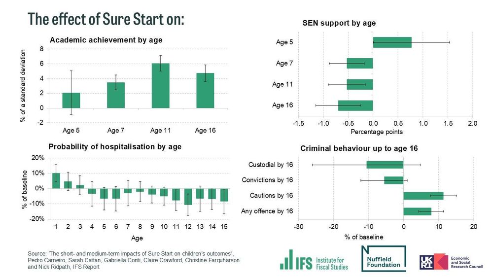
NEW: Sure Start generated widespread, long-lasting benefits for children in education, health, absences, and SEND.
Every £1 of up-front spending on Sure Start could generate around £2 in total benefits over the long run.
THREAD on our new @nuffieldfoundation.org-funded report:
[1/11]
Every £1 of up-front spending on Sure Start could generate around £2 in total benefits over the long run.
THREAD on our new @nuffieldfoundation.org-funded report:
[1/11]
May 22, 2025 at 6:30 AM
NEW: Sure Start generated widespread, long-lasting benefits for children in education, health, absences, and SEND.
Every £1 of up-front spending on Sure Start could generate around £2 in total benefits over the long run.
THREAD on our new @nuffieldfoundation.org-funded report:
[1/11]
Every £1 of up-front spending on Sure Start could generate around £2 in total benefits over the long run.
THREAD on our new @nuffieldfoundation.org-funded report:
[1/11]
Reposted by Bertha Rohenkohl
Measles once killed millions every year. Vaccines changed this, preventing disease, long-term immune damage and deadly outbreaks.
In this article @scientificdiscovery.dev & @spoonerf.bsky.social explain how vaccines were developed and their impact on saving lives. ourworldindata.org/measles-vacc...
In this article @scientificdiscovery.dev & @spoonerf.bsky.social explain how vaccines were developed and their impact on saving lives. ourworldindata.org/measles-vacc...

Measles vaccines save millions of lives each year
Measles once killed millions every year. Vaccines changed this, preventing disease, long-term immune damage, and deadly outbreaks.
ourworldindata.org
May 19, 2025 at 11:00 AM
Measles once killed millions every year. Vaccines changed this, preventing disease, long-term immune damage and deadly outbreaks.
In this article @scientificdiscovery.dev & @spoonerf.bsky.social explain how vaccines were developed and their impact on saving lives. ourworldindata.org/measles-vacc...
In this article @scientificdiscovery.dev & @spoonerf.bsky.social explain how vaccines were developed and their impact on saving lives. ourworldindata.org/measles-vacc...
Reposted by Bertha Rohenkohl

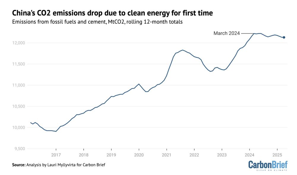
For the first time ever, China's CO₂ emissions are falling due to clean energy growth, rather than reduced power demand.
May 16, 2025 at 7:57 AM
For the first time ever, China's CO₂ emissions are falling due to clean energy growth, rather than reduced power demand.
Reposted by Bertha Rohenkohl
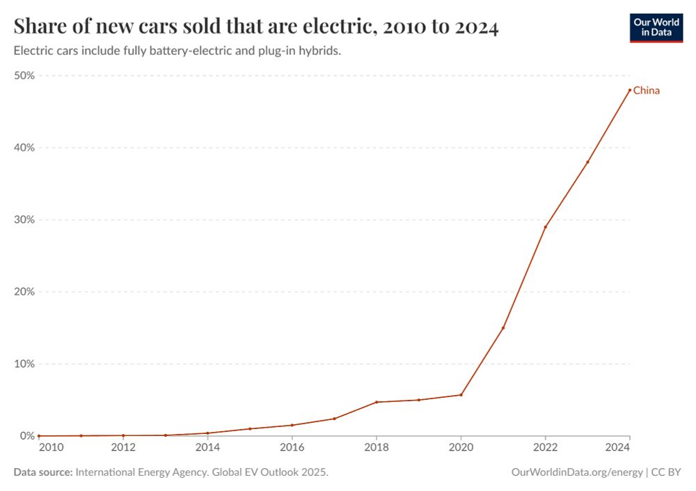
Almost half (48%) of new cars sold in China in 2024 were electric.
From the IEA's latest Global EV Outlook.
You can explore more data here:
ourworldindata.org/electric-car...
From the IEA's latest Global EV Outlook.
You can explore more data here:
ourworldindata.org/electric-car...
May 16, 2025 at 5:07 AM
Almost half (48%) of new cars sold in China in 2024 were electric.
From the IEA's latest Global EV Outlook.
You can explore more data here:
ourworldindata.org/electric-car...
From the IEA's latest Global EV Outlook.
You can explore more data here:
ourworldindata.org/electric-car...
Reposted by Bertha Rohenkohl
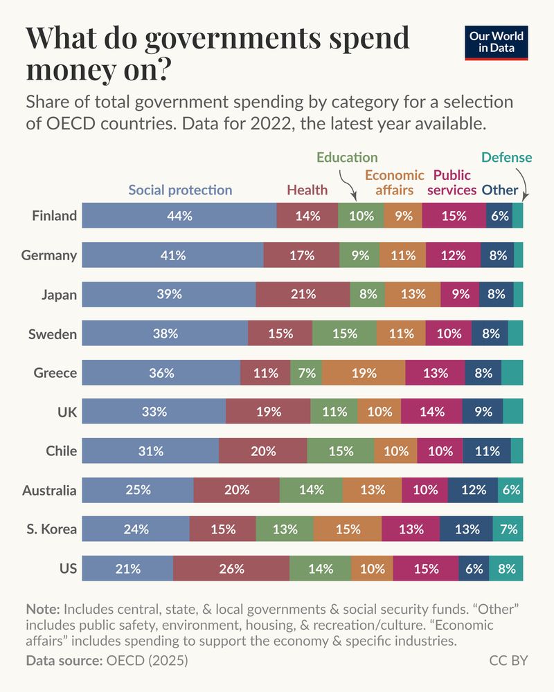
What do governments spend money on?
May 15, 2025 at 4:51 PM
What do governments spend money on?
Reposted by Bertha Rohenkohl
The length of software tasks AI systems can do on their own has been increasing quickly

May 14, 2025 at 4:05 PM
The length of software tasks AI systems can do on their own has been increasing quickly
Check out the updated econ data from the IMF on @ourworldindata.org ⬇️
📊 Data update: We've just updated the data in our charts on GDP growth and unemployment.
This includes observed data through 2024 as well as projections to 2030. This is the latest data from the IMF’s World Economic Outlook.
This includes observed data through 2024 as well as projections to 2030. This is the latest data from the IMF’s World Economic Outlook.

May 7, 2025 at 5:27 PM
Check out the updated econ data from the IMF on @ourworldindata.org ⬇️
Reposted by Bertha Rohenkohl
How many people died in the Spanish flu pandemic of 1918–1920?

April 29, 2025 at 2:52 PM
How many people died in the Spanish flu pandemic of 1918–1920?
Reposted by Bertha Rohenkohl
Did you know that many journalists around the world rely on our work for their stories?
Giving journalists and others what they need to do good work is a key part of our impact.
In a new article, we share how a data journalist at The Economist, @sondreus.bsky.social, uses Our World in Data:
Giving journalists and others what they need to do good work is a key part of our impact.
In a new article, we share how a data journalist at The Economist, @sondreus.bsky.social, uses Our World in Data:

How a data journalist at The Economist, Sondre Solstad, uses Our World in Data
A story of how our work helps journalists who use data.
ourworldindata.org
April 28, 2025 at 11:08 AM
Did you know that many journalists around the world rely on our work for their stories?
Giving journalists and others what they need to do good work is a key part of our impact.
In a new article, we share how a data journalist at The Economist, @sondreus.bsky.social, uses Our World in Data:
Giving journalists and others what they need to do good work is a key part of our impact.
In a new article, we share how a data journalist at The Economist, @sondreus.bsky.social, uses Our World in Data: