


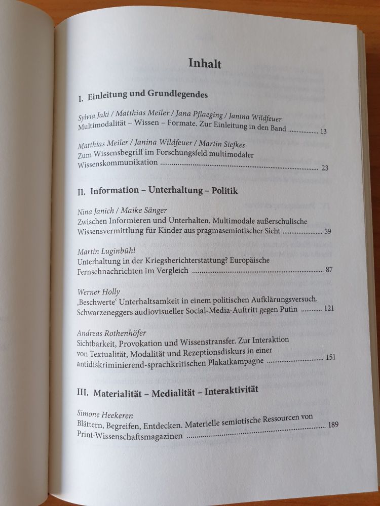
Susan Reichelt
@susanreichelt.bsky.social
she|her
sociolinguist interested in pop culture, digital media, and positioning
Data visualisation #ggplot2, mapping and cats.
@unigöttingen
#digitalhumanities
🏳️🌈💚
sociolinguist interested in pop culture, digital media, and positioning
Data visualisation #ggplot2, mapping and cats.
@unigöttingen
#digitalhumanities
🏳️🌈💚
Letzter Tag in Konstanz.
Ab morgen dann “in echt” in Göttingen, wo ich Anfang Oktober eine neue Stelle am Institut für Digital Humanities begonnen habe. 👋 Eine schöne und traurige und pläneschmiedende letzte Woche war es.
Ab morgen dann “in echt” in Göttingen, wo ich Anfang Oktober eine neue Stelle am Institut für Digital Humanities begonnen habe. 👋 Eine schöne und traurige und pläneschmiedende letzte Woche war es.

October 12, 2025 at 3:54 PM
Letzter Tag in Konstanz.
Ab morgen dann “in echt” in Göttingen, wo ich Anfang Oktober eine neue Stelle am Institut für Digital Humanities begonnen habe. 👋 Eine schöne und traurige und pläneschmiedende letzte Woche war es.
Ab morgen dann “in echt” in Göttingen, wo ich Anfang Oktober eine neue Stelle am Institut für Digital Humanities begonnen habe. 👋 Eine schöne und traurige und pläneschmiedende letzte Woche war es.
Reposted by Susan Reichelt

(und wenn du mehrfach betonen musst, dass man zum Gendern ja so oder so stehen kann, oder fragst, ob wir nicht dringlichere Themen haben, dann bist du im Jahr 2025 ein bisschen part of the problem)
August 4, 2025 at 7:28 AM
(und wenn du mehrfach betonen musst, dass man zum Gendern ja so oder so stehen kann, oder fragst, ob wir nicht dringlichere Themen haben, dann bist du im Jahr 2025 ein bisschen part of the problem)
Reposted by Susan Reichelt
Final guest lecture of the summer term: we are happy to welcome @susanreichelt.bsky.social, Research Associate in Digital Humanities at Konstanz University, to Heidelberg! Susan will speak about Experiential Authority as Stance Marking.
🗓 July 22, 2.15 PM
📍Room 110
✨ Listeners are warmly invited!
🗓 July 22, 2.15 PM
📍Room 110
✨ Listeners are warmly invited!

July 21, 2025 at 6:33 AM
Final guest lecture of the summer term: we are happy to welcome @susanreichelt.bsky.social, Research Associate in Digital Humanities at Konstanz University, to Heidelberg! Susan will speak about Experiential Authority as Stance Marking.
🗓 July 22, 2.15 PM
📍Room 110
✨ Listeners are warmly invited!
🗓 July 22, 2.15 PM
📍Room 110
✨ Listeners are warmly invited!
Reposted by Susan Reichelt

A new issue of the Journal of Language and Pop Culture is now available (benjamins.com/catalog/jlpo...), featuring contributions as shown below. We invite submissions (including interdisciplinary ones) on a rolling basis- see the JLPop website for further information: benjamins.com/catalog/jlpop


July 16, 2025 at 8:15 AM
A new issue of the Journal of Language and Pop Culture is now available (benjamins.com/catalog/jlpo...), featuring contributions as shown below. We invite submissions (including interdisciplinary ones) on a rolling basis- see the JLPop website for further information: benjamins.com/catalog/jlpop
Reposted by Susan Reichelt
Linke Haltungen gleichsetzen mit psychischer Erkrankung. Das ist nicht nur für einen möglichen Kanzler eine völlig disqualifizierende Aussage, das ist rechtsextreme Rhetorik, auf dem Rücken erkrankter Menschen. Er ist gefährlich - ohne Übertreibung.
Bitter, wenn er doch Kanzler werden sollte.
Bitter, wenn er doch Kanzler werden sollte.

February 22, 2025 at 7:25 PM
Linke Haltungen gleichsetzen mit psychischer Erkrankung. Das ist nicht nur für einen möglichen Kanzler eine völlig disqualifizierende Aussage, das ist rechtsextreme Rhetorik, auf dem Rücken erkrankter Menschen. Er ist gefährlich - ohne Übertreibung.
Bitter, wenn er doch Kanzler werden sollte.
Bitter, wenn er doch Kanzler werden sollte.
Early voting -> cake for breakfast. I don’t make the rules. 🧁
February 7, 2025 at 6:42 AM
Early voting -> cake for breakfast. I don’t make the rules. 🧁
Reposted by Susan Reichelt
There will be an online launch for the Journal of Language and Pop Culture on Friday (7 Feb) 1200-1300 UK time with an introduction from the editors and brief outlines of each chapter by their authors. All are welcome! LINK: shorturl.at/nrW1W
Join our Cloud HD Video Meeting
Zoom is the leader in modern enterprise video communications, with an easy, reliable cloud platform for video and audio conferencing, chat, and webinars across mobile, desktop, and room systems. Zoom ...
shorturl.at
February 3, 2025 at 8:48 AM
There will be an online launch for the Journal of Language and Pop Culture on Friday (7 Feb) 1200-1300 UK time with an introduction from the editors and brief outlines of each chapter by their authors. All are welcome! LINK: shorturl.at/nrW1W
Morgen letzte Sitzung zu meinem Data Feminism Seminar und ich versuche nicht unterzugehen in den vielen beängstigenden Beispielen aus der derzeitigen Timeline.
Lohnt es sich heute schon Folien vorzubereiten oder warte ich die Nachrichten morgen früh ab?
Immerhin: Semester fast rum.
Lohnt es sich heute schon Folien vorzubereiten oder warte ich die Nachrichten morgen früh ab?
Immerhin: Semester fast rum.
February 3, 2025 at 9:17 AM
Morgen letzte Sitzung zu meinem Data Feminism Seminar und ich versuche nicht unterzugehen in den vielen beängstigenden Beispielen aus der derzeitigen Timeline.
Lohnt es sich heute schon Folien vorzubereiten oder warte ich die Nachrichten morgen früh ab?
Immerhin: Semester fast rum.
Lohnt es sich heute schon Folien vorzubereiten oder warte ich die Nachrichten morgen früh ab?
Immerhin: Semester fast rum.
Halloween an der @unikonstanz.bsky.social ist, wenn die schwarze Campus Katze zu Besuch kommt.


October 31, 2024 at 1:22 PM
Halloween an der @unikonstanz.bsky.social ist, wenn die schwarze Campus Katze zu Besuch kommt.
Reposted by Susan Reichelt
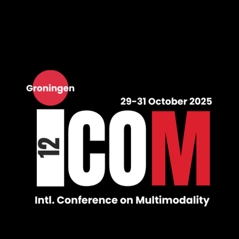
In exactly one year from now - on 29/10/2025 - we will
gather in Groningen for #12ICOM!
Mark your calendars and check out the call for papers (Deadline: 1 December):
bit.ly/12ICOM
#multimodality
gather in Groningen for #12ICOM!
Mark your calendars and check out the call for papers (Deadline: 1 December):
bit.ly/12ICOM
#multimodality

12ICOM Groningen
Submissions are open! | deadline 1 Dec '24
12th International Conference on Multimodality in Groningen
bit.ly
October 29, 2024 at 1:54 PM
In exactly one year from now - on 29/10/2025 - we will
gather in Groningen for #12ICOM!
Mark your calendars and check out the call for papers (Deadline: 1 December):
bit.ly/12ICOM
#multimodality
gather in Groningen for #12ICOM!
Mark your calendars and check out the call for papers (Deadline: 1 December):
bit.ly/12ICOM
#multimodality
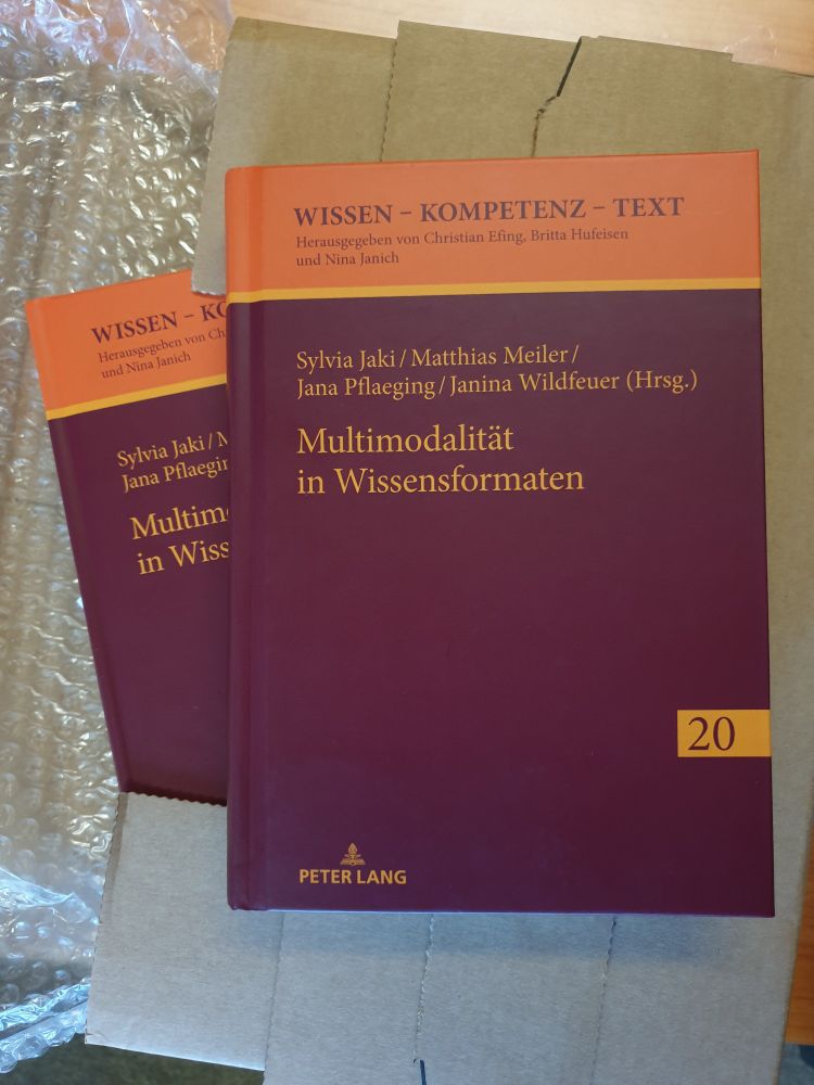
Reposted by Susan Reichelt
📖 Open Access!

Out now! "Multimodalität in Wissensformaten", hrsg. zus. mit den wunderbaren Kolleginnen @sjaki.bsky.social, @neous.bsky.social & @janapflaeging.bsky.social und mit sehr spannenden & facettenreichen Beiträgen aus Wissenschaft & Praxis #MWissFo #WissKom #Multimodalität #Medienlinguistik #openaccess
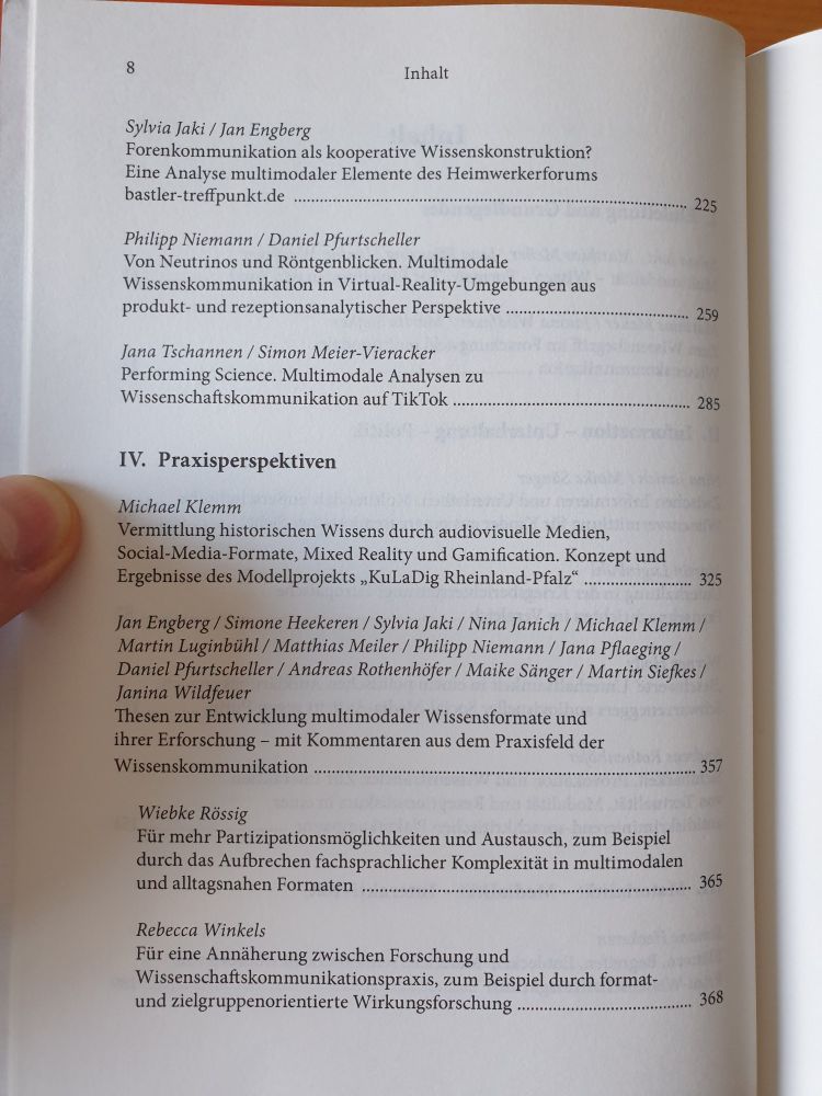
October 15, 2024 at 3:00 PM
📖 Open Access!
Reposted by Susan Reichelt
Proof received.
Special issue coming October 2024.
Special issue coming October 2024.

September 17, 2024 at 1:37 PM
Proof received.
Special issue coming October 2024.
Special issue coming October 2024.
Angst um Bahnanschluss gekonnt ignorieren mit Riegellinguistik

August 14, 2024 at 9:12 AM
Angst um Bahnanschluss gekonnt ignorieren mit Riegellinguistik


Reposted by Susan Reichelt
SAVE THE DATE
The 12th International Conference on Multimodality, #12ICOM, will take place on 29-31 October 2025 in Groningen!
Please spread the word. More updates soon via: bit.ly/12ICOM.
The #12ICOM organizing team can’t wait to host you in the capital of the north!
The 12th International Conference on Multimodality, #12ICOM, will take place on 29-31 October 2025 in Groningen!
Please spread the word. More updates soon via: bit.ly/12ICOM.
The #12ICOM organizing team can’t wait to host you in the capital of the north!
12ICOM Groningen 2025
SAVE THE DATE | 29-31 Oct. 2025
12th International Conference on Multimodality in Groningen
bit.ly
May 8, 2024 at 6:19 AM
SAVE THE DATE
The 12th International Conference on Multimodality, #12ICOM, will take place on 29-31 October 2025 in Groningen!
Please spread the word. More updates soon via: bit.ly/12ICOM.
The #12ICOM organizing team can’t wait to host you in the capital of the north!
The 12th International Conference on Multimodality, #12ICOM, will take place on 29-31 October 2025 in Groningen!
Please spread the word. More updates soon via: bit.ly/12ICOM.
The #12ICOM organizing team can’t wait to host you in the capital of the north!
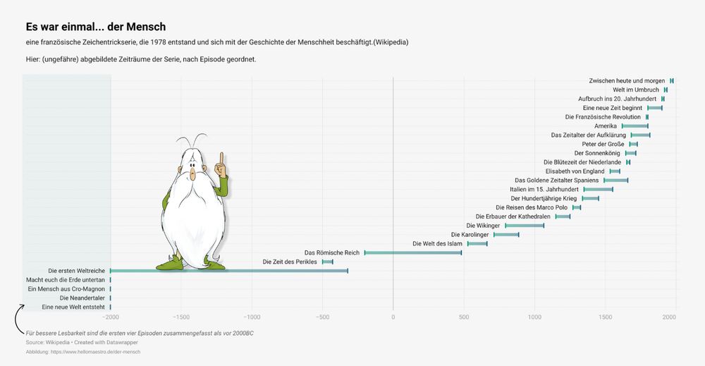
#30DayChartChallenge
and probably the only one I can fit in this week.
Day 15: historical
Tool: Datawrapper
Data: "Es war einmal ... der Mensch" and the rough time periods covered in each episode (wikipedia & IMDB)
and probably the only one I can fit in this week.
Day 15: historical
Tool: Datawrapper
Data: "Es war einmal ... der Mensch" and the rough time periods covered in each episode (wikipedia & IMDB)
April 15, 2024 at 2:24 PM
#30DayChartChallenge
and probably the only one I can fit in this week.
Day 15: historical
Tool: Datawrapper
Data: "Es war einmal ... der Mensch" and the rough time periods covered in each episode (wikipedia & IMDB)
and probably the only one I can fit in this week.
Day 15: historical
Tool: Datawrapper
Data: "Es war einmal ... der Mensch" and the rough time periods covered in each episode (wikipedia & IMDB)
#30DayChartChallenge
Day 12: Reuters Graphics
I took a paragraph from their "collapse of insects" story to create a small infographic 🐝. Full story here: www.reuters.com/graphics/GLO...
Tool: Canva
Day 12: Reuters Graphics
I took a paragraph from their "collapse of insects" story to create a small infographic 🐝. Full story here: www.reuters.com/graphics/GLO...
Tool: Canva

April 12, 2024 at 10:34 AM
#30DayChartChallenge
Day 12: Reuters Graphics
I took a paragraph from their "collapse of insects" story to create a small infographic 🐝. Full story here: www.reuters.com/graphics/GLO...
Tool: Canva
Day 12: Reuters Graphics
I took a paragraph from their "collapse of insects" story to create a small infographic 🐝. Full story here: www.reuters.com/graphics/GLO...
Tool: Canva

April 11, 2024 at 12:43 PM
#30DayChartChallenge
Day 10: Physical
Data: ifpi global music report 2024
Tools: R (ggplot column coord_polar())
Day 10: Physical
Data: ifpi global music report 2024
Tools: R (ggplot column coord_polar())

April 10, 2024 at 11:44 AM
#30DayChartChallenge
Day 10: Physical
Data: ifpi global music report 2024
Tools: R (ggplot column coord_polar())
Day 10: Physical
Data: ifpi global music report 2024
Tools: R (ggplot column coord_polar())
#30DayChartChallenge
Day 9 | Major/Minor
Data: Animal Farm (1945, Project Gutenberg)
Tools: AntConc (for distribution), RawGraphs.io
Pig illustration from the Penguin edition (2008)
Day 9 | Major/Minor
Data: Animal Farm (1945, Project Gutenberg)
Tools: AntConc (for distribution), RawGraphs.io
Pig illustration from the Penguin edition (2008)

April 9, 2024 at 7:42 AM
#30DayChartChallenge
Day 9 | Major/Minor
Data: Animal Farm (1945, Project Gutenberg)
Tools: AntConc (for distribution), RawGraphs.io
Pig illustration from the Penguin edition (2008)
Day 9 | Major/Minor
Data: Animal Farm (1945, Project Gutenberg)
Tools: AntConc (for distribution), RawGraphs.io
Pig illustration from the Penguin edition (2008)
#30DayChartChallenge
(#30DayChartChallengebutnoweekends)
Day 8 | Circular
(old!) data from kaggle
Tools: Rawgraphs.io & Canva
(#30DayChartChallengebutnoweekends)
Day 8 | Circular
(old!) data from kaggle
Tools: Rawgraphs.io & Canva

April 8, 2024 at 1:16 PM
#30DayChartChallenge
(#30DayChartChallengebutnoweekends)
Day 8 | Circular
(old!) data from kaggle
Tools: Rawgraphs.io & Canva
(#30DayChartChallengebutnoweekends)
Day 8 | Circular
(old!) data from kaggle
Tools: Rawgraphs.io & Canva
#30DayChartChallenge
Day 5: diverging
A very quick chart using some data from my PhD. This highlights a neat pattern I found across a number of features and tv series. Britishness in American tv goes with posh, conservative, upper class characters like Richard Gilmore.
Tool: Datawrapper
Day 5: diverging
A very quick chart using some data from my PhD. This highlights a neat pattern I found across a number of features and tv series. Britishness in American tv goes with posh, conservative, upper class characters like Richard Gilmore.
Tool: Datawrapper

April 5, 2024 at 10:06 AM
#30DayChartChallenge
Day 5: diverging
A very quick chart using some data from my PhD. This highlights a neat pattern I found across a number of features and tv series. Britishness in American tv goes with posh, conservative, upper class characters like Richard Gilmore.
Tool: Datawrapper
Day 5: diverging
A very quick chart using some data from my PhD. This highlights a neat pattern I found across a number of features and tv series. Britishness in American tv goes with posh, conservative, upper class characters like Richard Gilmore.
Tool: Datawrapper
#30DayChartChallenge
Day 4: Waffle
Data: All dialogue from Parks and Rec from kaggle
Tool: R, waffle package & Canva
Day 4: Waffle
Data: All dialogue from Parks and Rec from kaggle
Tool: R, waffle package & Canva

April 4, 2024 at 4:13 PM
#30DayChartChallenge
Day 4: Waffle
Data: All dialogue from Parks and Rec from kaggle
Tool: R, waffle package & Canva
Day 4: Waffle
Data: All dialogue from Parks and Rec from kaggle
Tool: R, waffle package & Canva
#30DayChartChallenge
Day 3: Makeover
I'm sticking with TV data and created a new version of a plot I first put together for one of my courses last year.
Ridgeline plot inspiration comes from r-graph-gallery's showcase (by Ansgar Wolsing)
data: bakeoff.netlify.app
tool: R (ggplot2)
Day 3: Makeover
I'm sticking with TV data and created a new version of a plot I first put together for one of my courses last year.
Ridgeline plot inspiration comes from r-graph-gallery's showcase (by Ansgar Wolsing)
data: bakeoff.netlify.app
tool: R (ggplot2)


April 3, 2024 at 6:57 PM
#30DayChartChallenge
Day 3: Makeover
I'm sticking with TV data and created a new version of a plot I first put together for one of my courses last year.
Ridgeline plot inspiration comes from r-graph-gallery's showcase (by Ansgar Wolsing)
data: bakeoff.netlify.app
tool: R (ggplot2)
Day 3: Makeover
I'm sticking with TV data and created a new version of a plot I first put together for one of my courses last year.
Ridgeline plot inspiration comes from r-graph-gallery's showcase (by Ansgar Wolsing)
data: bakeoff.netlify.app
tool: R (ggplot2)
#30DayChartChallenge
Day 2: neo
Sticking with TV!
Data: First broadcasts for ZDFneo's tv shows (min. 3 episodes) based on Wikipedia
Tool: Datawrapper
Chart: Mirrored Bar Chart
Day 2: neo
Sticking with TV!
Data: First broadcasts for ZDFneo's tv shows (min. 3 episodes) based on Wikipedia
Tool: Datawrapper
Chart: Mirrored Bar Chart

April 2, 2024 at 1:35 PM
#30DayChartChallenge
Day 2: neo
Sticking with TV!
Data: First broadcasts for ZDFneo's tv shows (min. 3 episodes) based on Wikipedia
Tool: Datawrapper
Chart: Mirrored Bar Chart
Day 2: neo
Sticking with TV!
Data: First broadcasts for ZDFneo's tv shows (min. 3 episodes) based on Wikipedia
Tool: Datawrapper
Chart: Mirrored Bar Chart