


Susan Reichelt
@susanreichelt.bsky.social
she|her
sociolinguist interested in pop culture, digital media, and positioning
Data visualisation #ggplot2, mapping and cats.
@unigöttingen
#digitalhumanities
🏳️🌈💚
sociolinguist interested in pop culture, digital media, and positioning
Data visualisation #ggplot2, mapping and cats.
@unigöttingen
#digitalhumanities
🏳️🌈💚
Letzter Tag in Konstanz.
Ab morgen dann “in echt” in Göttingen, wo ich Anfang Oktober eine neue Stelle am Institut für Digital Humanities begonnen habe. 👋 Eine schöne und traurige und pläneschmiedende letzte Woche war es.
Ab morgen dann “in echt” in Göttingen, wo ich Anfang Oktober eine neue Stelle am Institut für Digital Humanities begonnen habe. 👋 Eine schöne und traurige und pläneschmiedende letzte Woche war es.

October 12, 2025 at 3:54 PM
Letzter Tag in Konstanz.
Ab morgen dann “in echt” in Göttingen, wo ich Anfang Oktober eine neue Stelle am Institut für Digital Humanities begonnen habe. 👋 Eine schöne und traurige und pläneschmiedende letzte Woche war es.
Ab morgen dann “in echt” in Göttingen, wo ich Anfang Oktober eine neue Stelle am Institut für Digital Humanities begonnen habe. 👋 Eine schöne und traurige und pläneschmiedende letzte Woche war es.
Ich habe diese Woche meine erste Shiny App gebaut für ein kleines Methodenseminar und habe jetzt Angst, was das für andere Seminare in der Zukunft bedeutet ...

May 23, 2025 at 3:46 PM
Ich habe diese Woche meine erste Shiny App gebaut für ein kleines Methodenseminar und habe jetzt Angst, was das für andere Seminare in der Zukunft bedeutet ...
Heute gesehen und mich erinnert, falls du noch sammelst

March 15, 2025 at 3:01 PM
Heute gesehen und mich erinnert, falls du noch sammelst
Halloween an der @unikonstanz.bsky.social ist, wenn die schwarze Campus Katze zu Besuch kommt.


October 31, 2024 at 1:22 PM
Halloween an der @unikonstanz.bsky.social ist, wenn die schwarze Campus Katze zu Besuch kommt.
Angst um Bahnanschluss gekonnt ignorieren mit Riegellinguistik

August 14, 2024 at 9:12 AM
Angst um Bahnanschluss gekonnt ignorieren mit Riegellinguistik
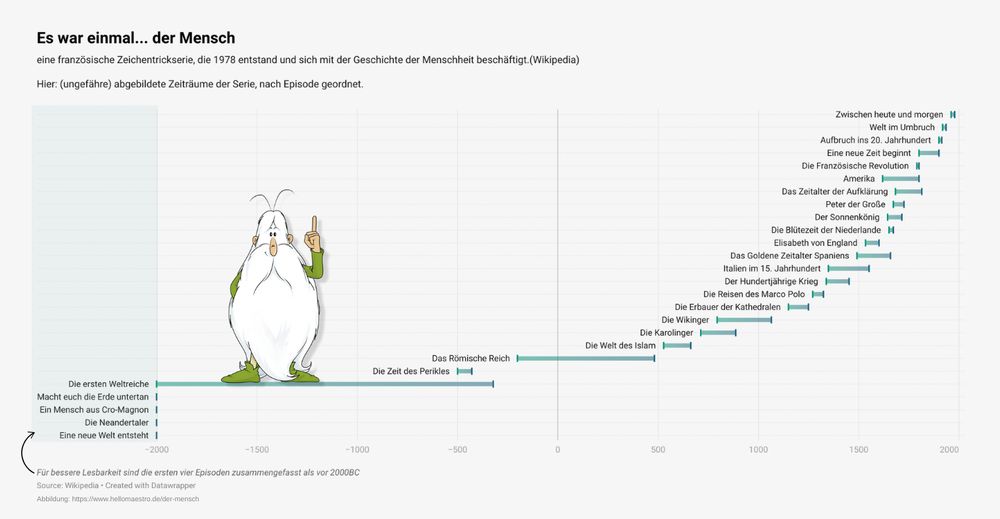
#30DayChartChallenge
and probably the only one I can fit in this week.
Day 15: historical
Tool: Datawrapper
Data: "Es war einmal ... der Mensch" and the rough time periods covered in each episode (wikipedia & IMDB)
and probably the only one I can fit in this week.
Day 15: historical
Tool: Datawrapper
Data: "Es war einmal ... der Mensch" and the rough time periods covered in each episode (wikipedia & IMDB)
April 15, 2024 at 2:24 PM
#30DayChartChallenge
and probably the only one I can fit in this week.
Day 15: historical
Tool: Datawrapper
Data: "Es war einmal ... der Mensch" and the rough time periods covered in each episode (wikipedia & IMDB)
and probably the only one I can fit in this week.
Day 15: historical
Tool: Datawrapper
Data: "Es war einmal ... der Mensch" and the rough time periods covered in each episode (wikipedia & IMDB)
#30DayChartChallenge
Day 12: Reuters Graphics
I took a paragraph from their "collapse of insects" story to create a small infographic 🐝. Full story here: www.reuters.com/graphics/GLO...
Tool: Canva
Day 12: Reuters Graphics
I took a paragraph from their "collapse of insects" story to create a small infographic 🐝. Full story here: www.reuters.com/graphics/GLO...
Tool: Canva

April 12, 2024 at 10:34 AM
#30DayChartChallenge
Day 12: Reuters Graphics
I took a paragraph from their "collapse of insects" story to create a small infographic 🐝. Full story here: www.reuters.com/graphics/GLO...
Tool: Canva
Day 12: Reuters Graphics
I took a paragraph from their "collapse of insects" story to create a small infographic 🐝. Full story here: www.reuters.com/graphics/GLO...
Tool: Canva

April 11, 2024 at 12:43 PM
#30DayChartChallenge
Day 10: Physical
Data: ifpi global music report 2024
Tools: R (ggplot column coord_polar())
Day 10: Physical
Data: ifpi global music report 2024
Tools: R (ggplot column coord_polar())

April 10, 2024 at 11:44 AM
#30DayChartChallenge
Day 10: Physical
Data: ifpi global music report 2024
Tools: R (ggplot column coord_polar())
Day 10: Physical
Data: ifpi global music report 2024
Tools: R (ggplot column coord_polar())
#30DayChartChallenge
Day 9 | Major/Minor
Data: Animal Farm (1945, Project Gutenberg)
Tools: AntConc (for distribution), RawGraphs.io
Pig illustration from the Penguin edition (2008)
Day 9 | Major/Minor
Data: Animal Farm (1945, Project Gutenberg)
Tools: AntConc (for distribution), RawGraphs.io
Pig illustration from the Penguin edition (2008)

April 9, 2024 at 7:42 AM
#30DayChartChallenge
Day 9 | Major/Minor
Data: Animal Farm (1945, Project Gutenberg)
Tools: AntConc (for distribution), RawGraphs.io
Pig illustration from the Penguin edition (2008)
Day 9 | Major/Minor
Data: Animal Farm (1945, Project Gutenberg)
Tools: AntConc (for distribution), RawGraphs.io
Pig illustration from the Penguin edition (2008)
#30DayChartChallenge
(#30DayChartChallengebutnoweekends)
Day 8 | Circular
(old!) data from kaggle
Tools: Rawgraphs.io & Canva
(#30DayChartChallengebutnoweekends)
Day 8 | Circular
(old!) data from kaggle
Tools: Rawgraphs.io & Canva

April 8, 2024 at 1:16 PM
#30DayChartChallenge
(#30DayChartChallengebutnoweekends)
Day 8 | Circular
(old!) data from kaggle
Tools: Rawgraphs.io & Canva
(#30DayChartChallengebutnoweekends)
Day 8 | Circular
(old!) data from kaggle
Tools: Rawgraphs.io & Canva
#30DayChartChallenge
Day 5: diverging
A very quick chart using some data from my PhD. This highlights a neat pattern I found across a number of features and tv series. Britishness in American tv goes with posh, conservative, upper class characters like Richard Gilmore.
Tool: Datawrapper
Day 5: diverging
A very quick chart using some data from my PhD. This highlights a neat pattern I found across a number of features and tv series. Britishness in American tv goes with posh, conservative, upper class characters like Richard Gilmore.
Tool: Datawrapper

April 5, 2024 at 10:06 AM
#30DayChartChallenge
Day 5: diverging
A very quick chart using some data from my PhD. This highlights a neat pattern I found across a number of features and tv series. Britishness in American tv goes with posh, conservative, upper class characters like Richard Gilmore.
Tool: Datawrapper
Day 5: diverging
A very quick chart using some data from my PhD. This highlights a neat pattern I found across a number of features and tv series. Britishness in American tv goes with posh, conservative, upper class characters like Richard Gilmore.
Tool: Datawrapper
#30DayChartChallenge
Day 4: Waffle
Data: All dialogue from Parks and Rec from kaggle
Tool: R, waffle package & Canva
Day 4: Waffle
Data: All dialogue from Parks and Rec from kaggle
Tool: R, waffle package & Canva

April 4, 2024 at 4:13 PM
#30DayChartChallenge
Day 4: Waffle
Data: All dialogue from Parks and Rec from kaggle
Tool: R, waffle package & Canva
Day 4: Waffle
Data: All dialogue from Parks and Rec from kaggle
Tool: R, waffle package & Canva
#30DayChartChallenge
Day 3: Makeover
I'm sticking with TV data and created a new version of a plot I first put together for one of my courses last year.
Ridgeline plot inspiration comes from r-graph-gallery's showcase (by Ansgar Wolsing)
data: bakeoff.netlify.app
tool: R (ggplot2)
Day 3: Makeover
I'm sticking with TV data and created a new version of a plot I first put together for one of my courses last year.
Ridgeline plot inspiration comes from r-graph-gallery's showcase (by Ansgar Wolsing)
data: bakeoff.netlify.app
tool: R (ggplot2)


April 3, 2024 at 6:57 PM
#30DayChartChallenge
Day 3: Makeover
I'm sticking with TV data and created a new version of a plot I first put together for one of my courses last year.
Ridgeline plot inspiration comes from r-graph-gallery's showcase (by Ansgar Wolsing)
data: bakeoff.netlify.app
tool: R (ggplot2)
Day 3: Makeover
I'm sticking with TV data and created a new version of a plot I first put together for one of my courses last year.
Ridgeline plot inspiration comes from r-graph-gallery's showcase (by Ansgar Wolsing)
data: bakeoff.netlify.app
tool: R (ggplot2)
#30DayChartChallenge
Day 2: neo
Sticking with TV!
Data: First broadcasts for ZDFneo's tv shows (min. 3 episodes) based on Wikipedia
Tool: Datawrapper
Chart: Mirrored Bar Chart
Day 2: neo
Sticking with TV!
Data: First broadcasts for ZDFneo's tv shows (min. 3 episodes) based on Wikipedia
Tool: Datawrapper
Chart: Mirrored Bar Chart

April 2, 2024 at 1:35 PM
#30DayChartChallenge
Day 2: neo
Sticking with TV!
Data: First broadcasts for ZDFneo's tv shows (min. 3 episodes) based on Wikipedia
Tool: Datawrapper
Chart: Mirrored Bar Chart
Day 2: neo
Sticking with TV!
Data: First broadcasts for ZDFneo's tv shows (min. 3 episodes) based on Wikipedia
Tool: Datawrapper
Chart: Mirrored Bar Chart
In an effort to become more active on here, I'm trying to join this year's #30DayChartChallenge
Day 1: Part-to-Whole
Data: my Netflix watch history (2013-2023)
Tool: RawGraphs.io
Chart: Voronoi Treemap
Day 1: Part-to-Whole
Data: my Netflix watch history (2013-2023)
Tool: RawGraphs.io
Chart: Voronoi Treemap

April 1, 2024 at 4:50 PM
In an effort to become more active on here, I'm trying to join this year's #30DayChartChallenge
Day 1: Part-to-Whole
Data: my Netflix watch history (2013-2023)
Tool: RawGraphs.io
Chart: Voronoi Treemap
Day 1: Part-to-Whole
Data: my Netflix watch history (2013-2023)
Tool: RawGraphs.io
Chart: Voronoi Treemap