


John Alexis Guerra Gomez
@johnguerra.bsky.social
Associate Teaching Professor Northeastern University, KhouryVis member
Research on #dataviz #a11y
Co-creator https://btactile.com https://navio.dev https://duto.org
https://johnguerra.co
Research on #dataviz #a11y
Co-creator https://btactile.com https://navio.dev https://duto.org
https://johnguerra.co
Pinned

Towards Reusable and Reactive Widgets for Information Visualization Research and Dissemination
This IEEEVIS 2024 short paper presents a design pattern for facilitating the creation, dissemination, and re-utilization of visualization techniques using reactive widgets.
johnguerra.co
Re-introducing Reactive Widgets 📣 a simple design pattern for developing and distributing interactive #dataviz widgets.
👉🏼 johnguerra.co/reactiveWidg... 📊
Inspired by @observablehq.com inputs and modern web standards, this pattern makes it easy to combine widgets into larger applications.
1/3
👉🏼 johnguerra.co/reactiveWidg... 📊
Inspired by @observablehq.com inputs and modern web standards, this pattern makes it easy to combine widgets into larger applications.
1/3
My #IEEEVIS 2025 paper explorer is live! 🎉
👉 johnguerra.co/viz/ieeevis2... 👈
An interactive #dataviz to explore 300+ papers by similarity. Perfect for:
✨ Discovering papers related to your interests
✨ Planning which sessions to attend
✨ Creating your own paper list (new!)
Pls help me distribute it
👉 johnguerra.co/viz/ieeevis2... 👈
An interactive #dataviz to explore 300+ papers by similarity. Perfect for:
✨ Discovering papers related to your interests
✨ Planning which sessions to attend
✨ Creating your own paper list (new!)
Pls help me distribute it
November 2, 2025 at 1:28 PM
My #IEEEVIS 2025 paper explorer is live! 🎉
👉 johnguerra.co/viz/ieeevis2... 👈
An interactive #dataviz to explore 300+ papers by similarity. Perfect for:
✨ Discovering papers related to your interests
✨ Planning which sessions to attend
✨ Creating your own paper list (new!)
Pls help me distribute it
👉 johnguerra.co/viz/ieeevis2... 👈
An interactive #dataviz to explore 300+ papers by similarity. Perfect for:
✨ Discovering papers related to your interests
✨ Planning which sessions to attend
✨ Creating your own paper list (new!)
Pls help me distribute it
Very interesting what you can do now with Visual Studio Code + Github Copilot Agent mode. Nice tutorial here by @burkeholland.bsky.social www.youtube.com/watch?v=duty...

VS Code Agent Mode Just Changed Everything
YouTube video by Visual Studio Code
www.youtube.com
May 31, 2025 at 6:18 PM
Very interesting what you can do now with Visual Studio Code + Github Copilot Agent mode. Nice tutorial here by @burkeholland.bsky.social www.youtube.com/watch?v=duty...
What a great summary history of JavaScript by deno deno.com/blog/history...

A brief history of JavaScript | Deno
In 30 years, JavaScript went from being a little scripting language to one of the world's most popular. Here are key moments to show how it has evolved and where it is headed.
deno.com
May 24, 2025 at 2:51 PM
What a great summary history of JavaScript by deno deno.com/blog/history...
Reposted by John Alexis Guerra Gomez

Thrilled to have played a part in this excellent story about the stock market during Trump's first 100 days
www.cnn.com/interactive/...
www.cnn.com/interactive/...

April 30, 2025 at 7:29 AM
Thrilled to have played a part in this excellent story about the stock market during Trump's first 100 days
www.cnn.com/interactive/...
www.cnn.com/interactive/...
To help me keep track of the #chi2025 papers that I don't want to miss I made this quick prototype:
👉🏼 johnguerra.co/viz/chi2025P... 👈🏼
* Search by semantic content
* Aggregate multiple searches
* Find papers by authors, institutions, types, awards...
* Quickly check where to go from your 📲
👉🏼 johnguerra.co/viz/chi2025P... 👈🏼
* Search by semantic content
* Aggregate multiple searches
* Find papers by authors, institutions, types, awards...
* Quickly check where to go from your 📲
April 26, 2025 at 3:12 AM
To help me keep track of the #chi2025 papers that I don't want to miss I made this quick prototype:
👉🏼 johnguerra.co/viz/chi2025P... 👈🏼
* Search by semantic content
* Aggregate multiple searches
* Find papers by authors, institutions, types, awards...
* Quickly check where to go from your 📲
👉🏼 johnguerra.co/viz/chi2025P... 👈🏼
* Search by semantic content
* Aggregate multiple searches
* Find papers by authors, institutions, types, awards...
* Quickly check where to go from your 📲
Reposted by John Alexis Guerra Gomez

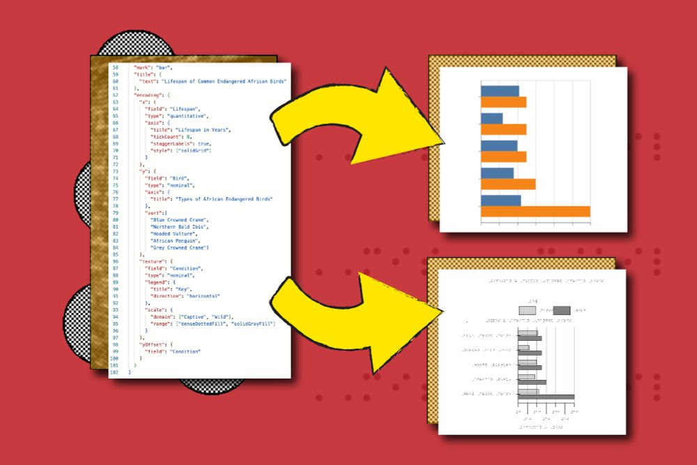
I wrote about the data-to-ink ratio and a new game I've invented called "ink golf" for data visualization.
I hope you enjoy:
www.frank.computer/blog/2025/04...
I hope you enjoy:
www.frank.computer/blog/2025/04...
Minimalism and the absurdity of the data-to-ink-ratio
How much minimalism is too much minimalism? I explore this question and propose the most minimalist, highest scoring data-to-ink ratio on a visualization ever made as a thought piece. Why? Well novice...
www.frank.computer
April 23, 2025 at 2:28 AM
I wrote about the data-to-ink ratio and a new game I've invented called "ink golf" for data visualization.
I hope you enjoy:
www.frank.computer/blog/2025/04...
I hope you enjoy:
www.frank.computer/blog/2025/04...
Here is my #chi2025 paper explorer. Visually explore papers by similarity, search for an specific topic or even find what specific sessions to attend. Please let me know what you think! #dataviz @chi.acm.org
👉🏼 johnguerra.co/viz/chi2025P... 👈🏼
👉🏼 johnguerra.co/viz/chi2025P... 👈🏼
April 16, 2025 at 2:22 PM
Here is my #chi2025 paper explorer. Visually explore papers by similarity, search for an specific topic or even find what specific sessions to attend. Please let me know what you think! #dataviz @chi.acm.org
👉🏼 johnguerra.co/viz/chi2025P... 👈🏼
👉🏼 johnguerra.co/viz/chi2025P... 👈🏼
Reposted by John Alexis Guerra Gomez

For @johnguerra.bsky.social's @northeasternu.bsky.social #ProgramDesignParadigms class I built an @observablehq reactive widget that lets users upload labeled photos and preview them! 📸 Great for family trees or user profiles.
👉 See demo: observablehq.com/@vinal-dsouz...
👉 See demo: observablehq.com/@vinal-dsouz...
April 15, 2025 at 8:41 PM
For @johnguerra.bsky.social's @northeasternu.bsky.social #ProgramDesignParadigms class I built an @observablehq reactive widget that lets users upload labeled photos and preview them! 📸 Great for family trees or user profiles.
👉 See demo: observablehq.com/@vinal-dsouz...
👉 See demo: observablehq.com/@vinal-dsouz...
Reposted by John Alexis Guerra Gomez

For @johnguerra.bsky.social's @northeasternu.bsky.social #ProgramDesignParadigms class, I built an @observablehq.com reactive input widget that allows selecting complex data objects from a custom list. See demo -> observablehq.com/d/1f822423aa...
SelectableListWidget
Selected Narrative: ** ** Documentation What it Does: The `SelectableListWidget` is a reusable Observable
reactive widget designed to display a list of complex data items (JavaScript
objects)....
observablehq.com
April 15, 2025 at 9:07 PM
For @johnguerra.bsky.social's @northeasternu.bsky.social #ProgramDesignParadigms class, I built an @observablehq.com reactive input widget that allows selecting complex data objects from a custom list. See demo -> observablehq.com/d/1f822423aa...
Reposted by John Alexis Guerra Gomez

For @johnguerra.bsky.social @northeasternu.bsky.social #ProgrammingParadigms class I built an @observablehq.com reactive input that allows users to plan their events efficiently and easily. See demo-> observablehq.com/@ryans-works...
Event Planner
📘 Event Planner – Reactive Weekly Event Scheduler What it does Event planning is an important thing in our life, so we need a light and powerful tool to plan our event. The weeklyPlanner is a custom r...
observablehq.com
April 15, 2025 at 10:21 PM
For @johnguerra.bsky.social @northeasternu.bsky.social #ProgrammingParadigms class I built an @observablehq.com reactive input that allows users to plan their events efficiently and easily. See demo-> observablehq.com/@ryans-works...
Reposted by John Alexis Guerra Gomez

For @johnguerra.bsky.social's @northeasternu.bsky.social #ProgramDesignParadigms class I built an @observablehq.com reactive input that allows users to log an emotion associated with a selected activity. See demo -> observablehq.com/@tian5252/em...
EmotionLogger
CS5010 Homework5 - Emotion Logger Widget 1. What it does This is an Emotion Logger widget that allows users to: Select an emotion (with emoji), Choose a related activity (from a database), Specify the...
observablehq.com
April 15, 2025 at 10:31 PM
For @johnguerra.bsky.social's @northeasternu.bsky.social #ProgramDesignParadigms class I built an @observablehq.com reactive input that allows users to log an emotion associated with a selected activity. See demo -> observablehq.com/@tian5252/em...
Reposted by John Alexis Guerra Gomez

For @johnguerra.bsky.social's @northeasternu.bsky.social #ProgramDesignParadigms class I built an observablehq.com reactive(MiningMonitorWidget) input that allows users to filter mining machine data by status and visualize summaries in real time.
See demo->https://observablehq.com/d/17ad2f133c3f874a
See demo->https://observablehq.com/d/17ad2f133c3f874a

Observable: Explore and visualize data togetherLinkedInTwitterGitHubYouTubeLinkedInTwitterGitHubYouTube
Observable's collaborative data canvas helps you explore data, perform analysis, and build expressive charts and dashboards.
observablehq.com
April 15, 2025 at 10:33 PM
For @johnguerra.bsky.social's @northeasternu.bsky.social #ProgramDesignParadigms class I built an observablehq.com reactive(MiningMonitorWidget) input that allows users to filter mining machine data by status and visualize summaries in real time.
See demo->https://observablehq.com/d/17ad2f133c3f874a
See demo->https://observablehq.com/d/17ad2f133c3f874a
Reposted by John Alexis Guerra Gomez

For @johnguerra.bsky.social's @northeasternu.bsky.social #ProgramDesignParadigms class I built an @observablehq.com reactive input that allows user to seamlessly integrate Bluesky post into their notebook with a single URL. See demo -> observablehq.com/@luozihyuan/...
Bluesky Post Viewer
Data scientists and researchers waste valuable time copying text from Bluesky posts or wrestling with complex API calls just to reference social conversations in their work. Bluesky Post Viewer cuts t...
observablehq.com
April 15, 2025 at 10:56 PM
For @johnguerra.bsky.social's @northeasternu.bsky.social #ProgramDesignParadigms class I built an @observablehq.com reactive input that allows user to seamlessly integrate Bluesky post into their notebook with a single URL. See demo -> observablehq.com/@luozihyuan/...
Reposted by John Alexis Guerra Gomez

For @johnguerra.bsky.social @northeastern.bsky.social #ProgramDesignParadigms class, I built an @observablehq.com reactive input that allows users to filter fifa player data interactively.
See demo --> observablehq.com/d/2ea3948c8e...
See demo --> observablehq.com/d/2ea3948c8e...
Reactive Widget FIFA 22
FilterWidget is a custom reactive input widget built for ObservableHQ that enables users to interactively filter football player data. It allows for multiple selection options—via checkboxes and range...
observablehq.com
April 15, 2025 at 4:10 PM
For @johnguerra.bsky.social @northeastern.bsky.social #ProgramDesignParadigms class, I built an @observablehq.com reactive input that allows users to filter fifa player data interactively.
See demo --> observablehq.com/d/2ea3948c8e...
See demo --> observablehq.com/d/2ea3948c8e...
Reposted by John Alexis Guerra Gomez

For @johnguerra.bsky.social @northeasternu.bsky.social #ProgrammingParadigms class, I built a @observablehq.com reactive widget allowing users to upload a photo and add tags. Here is the demo: observablehq.com/@lang-min-ne...
Photo Tag Adder
Description Photo Tag Adder is a simple program that allows users to upload a picture at a time and attach tags to it. What it does This widget allows users to select and upload one image at a time en...
observablehq.com
April 15, 2025 at 12:47 AM
For @johnguerra.bsky.social @northeasternu.bsky.social #ProgrammingParadigms class, I built a @observablehq.com reactive widget allowing users to upload a photo and add tags. Here is the demo: observablehq.com/@lang-min-ne...
Reposted by John Alexis Guerra Gomez

Gain hands-on experience and learn data viz best practices at Outlier 2025. Early bird rates end on April 30. Register here: buff.ly/bUQHpFY

April 7, 2025 at 10:00 PM
Gain hands-on experience and learn data viz best practices at Outlier 2025. Early bird rates end on April 30. Register here: buff.ly/bUQHpFY
Reposted by John Alexis Guerra Gomez

Tactile charts are an important tool for conveying data to blind and low vision people via embossed paper. However, tactile charts require high levels of time and expertise to design.
Introducing Tactile Vega-Lite, new work at #CHI2025 led by MIT SM student Katie Chen
news.mit.edu/2025/making-...
Introducing Tactile Vega-Lite, new work at #CHI2025 led by MIT SM student Katie Chen
news.mit.edu/2025/making-...
A new way to make graphs more accessible to blind and low-vision readers
Designed to help blind and low-vision readers understand graphics, the “Tactile Vega-Lite” system from MIT CSAIL converts data into a standard visual graph and a tactile chart. Accessibility standards...
news.mit.edu
March 31, 2025 at 6:49 PM
Tactile charts are an important tool for conveying data to blind and low vision people via embossed paper. However, tactile charts require high levels of time and expertise to design.
Introducing Tactile Vega-Lite, new work at #CHI2025 led by MIT SM student Katie Chen
news.mit.edu/2025/making-...
Introducing Tactile Vega-Lite, new work at #CHI2025 led by MIT SM student Katie Chen
news.mit.edu/2025/making-...

Are you attending #chi2025 and need a map to navigate through all the papers?
📣 If so, I made a Paper Explorer for you!
🔍 Find relevant papers and authors, plan your schedule, and much more through visual analysis!
🔗https://motion115.github.io/chi2025papers/
📣 If so, I made a Paper Explorer for you!
🔍 Find relevant papers and authors, plan your schedule, and much more through visual analysis!
🔗https://motion115.github.io/chi2025papers/


April 3, 2025 at 11:37 PM
Do you want to explore your own @ieeevis.bsky.social co-authors and citations networks? Check out my latest #dataviz
👉🏼 johnguerra.co/viz/visPubNe... 👈🏼
I'm showing the @northeasternu.bsky.social VIS Lab professors network, and the overall authors with more than 20 collaborations. Create your own!
👉🏼 johnguerra.co/viz/visPubNe... 👈🏼
I'm showing the @northeasternu.bsky.social VIS Lab professors network, and the overall authors with more than 20 collaborations. Create your own!
March 29, 2025 at 3:40 PM
Do you want to explore your own @ieeevis.bsky.social co-authors and citations networks? Check out my latest #dataviz
👉🏼 johnguerra.co/viz/visPubNe... 👈🏼
I'm showing the @northeasternu.bsky.social VIS Lab professors network, and the overall authors with more than 20 collaborations. Create your own!
👉🏼 johnguerra.co/viz/visPubNe... 👈🏼
I'm showing the @northeasternu.bsky.social VIS Lab professors network, and the overall authors with more than 20 collaborations. Create your own!
Here is an @observablehq.com notebook I'm doing a demo on observablehq.com/d/6e7d9d61cc...
Observable Notebook Demo
observablehq.com
March 7, 2025 at 9:57 PM
Here is an @observablehq.com notebook I'm doing a demo on observablehq.com/d/6e7d9d61cc...
In minutes I'll be starting my talk Interactive Information Visualization: Unleashing the Power of Visual Data Exploration at the #RiceVCS
Please check my slides for tons of links here johnguerra.co/viz/slides/I...
Please check my slides for tons of links here johnguerra.co/viz/slides/I...

March 7, 2025 at 3:06 PM
In minutes I'll be starting my talk Interactive Information Visualization: Unleashing the Power of Visual Data Exploration at the #RiceVCS
Please check my slides for tons of links here johnguerra.co/viz/slides/I...
Please check my slides for tons of links here johnguerra.co/viz/slides/I...
📢 Shout-out for @northeasternu.bsky.social Michelle Borking's research at the #RiceVCS 👏👏👏

March 6, 2025 at 3:55 PM
📢 Shout-out for @northeasternu.bsky.social Michelle Borking's research at the #RiceVCS 👏👏👏
Do you want to animate a @vega-vis.bsky.social vega-lite or @observablehq.com Plot chart? Here is a quick experiment that might help you that animates between two SVGs.
Let me know what you think! #dataviz.
👉🏼 observablehq.com/@john-guerra...
Let me know what you think! #dataviz.
👉🏼 observablehq.com/@john-guerra...
February 26, 2025 at 6:45 PM
Do you want to animate a @vega-vis.bsky.social vega-lite or @observablehq.com Plot chart? Here is a quick experiment that might help you that animates between two SVGs.
Let me know what you think! #dataviz.
👉🏼 observablehq.com/@john-guerra...
Let me know what you think! #dataviz.
👉🏼 observablehq.com/@john-guerra...
How many attributes can you visualize in one chart? A little experiment on multi dimensional #dataviz that I made for a talk
👉🏼 observablehq.com/@john-guerra...
👉🏼 observablehq.com/@john-guerra...
February 26, 2025 at 12:32 AM
How many attributes can you visualize in one chart? A little experiment on multi dimensional #dataviz that I made for a talk
👉🏼 observablehq.com/@john-guerra...
👉🏼 observablehq.com/@john-guerra...