


Yep! Type Foundry
@yeptype.bsky.social
Practical typefaces with unlimited licensing • Innovator Grotesk → $1 /style for designers • $10 /style for startups
yeptype.com
yeptype.com
2/2
I believe that, sooner or later, most type foundries will move away from today’s overly complex font licenses.
Well done, Displaay! Welcome to the club, and good luck!
I believe that, sooner or later, most type foundries will move away from today’s overly complex font licenses.
Well done, Displaay! Welcome to the club, and good luck!
November 4, 2025 at 10:39 AM
2/2
I believe that, sooner or later, most type foundries will move away from today’s overly complex font licenses.
Well done, Displaay! Welcome to the club, and good luck!
I believe that, sooner or later, most type foundries will move away from today’s overly complex font licenses.
Well done, Displaay! Welcome to the club, and good luck!


You're absolutely right. This is the most effective and modern way to design fonts today.
July 18, 2025 at 2:16 PM
You're absolutely right. This is the most effective and modern way to design fonts today.
Yep, common names are Poster, Display, Text, Caption, and Micro.
Optical size can help adjust for light or dark themes. Some rare fonts also include a Grade axis, which lets you tweak character weight slightly without changing their width.
Optical size can help adjust for light or dark themes. Some rare fonts also include a Grade axis, which lets you tweak character weight slightly without changing their width.

July 18, 2025 at 11:16 AM
Yep, common names are Poster, Display, Text, Caption, and Micro.
Optical size can help adjust for light or dark themes. Some rare fonts also include a Grade axis, which lets you tweak character weight slightly without changing their width.
Optical size can help adjust for light or dark themes. Some rare fonts also include a Grade axis, which lets you tweak character weight slightly without changing their width.
In the next episodes, we can talk about how to use display fonts (which, unlike text fonts, are made for larger sizes), the optical size axis in variable fonts, and other useful typography tips.
If this was helpful, feel free to give it a boost so more designers see it in their feed 🫶
If this was helpful, feel free to give it a boost so more designers see it in their feed 🫶
July 17, 2025 at 7:31 PM
In the next episodes, we can talk about how to use display fonts (which, unlike text fonts, are made for larger sizes), the optical size axis in variable fonts, and other useful typography tips.
If this was helpful, feel free to give it a boost so more designers see it in their feed 🫶
If this was helpful, feel free to give it a boost so more designers see it in their feed 🫶
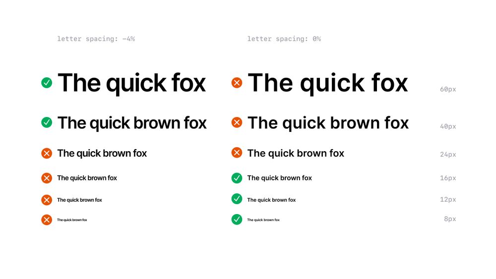
Strategy 4: adjust spacing dynamically with font size
There’s no one-size-fits-all value. A headline at 60px might need more negative spacing than one at 40px. Same goes for tiny caption text, a touch of extra spacing can go a long way.
There’s no one-size-fits-all value. A headline at 60px might need more negative spacing than one at 40px. Same goes for tiny caption text, a touch of extra spacing can go a long way.

July 17, 2025 at 7:31 PM
Strategy 4: adjust spacing dynamically with font size
There’s no one-size-fits-all value. A headline at 60px might need more negative spacing than one at 40px. Same goes for tiny caption text, a touch of extra spacing can go a long way.
There’s no one-size-fits-all value. A headline at 60px might need more negative spacing than one at 40px. Same goes for tiny caption text, a touch of extra spacing can go a long way.
Strategy 3: loosen spacing for tiny text
At small sizes, the letters can feel cramped. Adding a bit of positive spacing helps open things up and improves legibility.
At small sizes, the letters can feel cramped. Adding a bit of positive spacing helps open things up and improves legibility.

July 17, 2025 at 7:31 PM
Strategy 3: loosen spacing for tiny text
At small sizes, the letters can feel cramped. Adding a bit of positive spacing helps open things up and improves legibility.
At small sizes, the letters can feel cramped. Adding a bit of positive spacing helps open things up and improves legibility.
Strategy 2: tighten spacing for headlines
As you scale up your text, the space between letters grows too. So if you’re using a text font at large sizes (say, 20px or more), it often helps to reduce letter spacing a little to keep things looking balanced.
As you scale up your text, the space between letters grows too. So if you’re using a text font at large sizes (say, 20px or more), it often helps to reduce letter spacing a little to keep things looking balanced.

July 17, 2025 at 7:31 PM
Strategy 2: tighten spacing for headlines
As you scale up your text, the space between letters grows too. So if you’re using a text font at large sizes (say, 20px or more), it often helps to reduce letter spacing a little to keep things looking balanced.
As you scale up your text, the space between letters grows too. So if you’re using a text font at large sizes (say, 20px or more), it often helps to reduce letter spacing a little to keep things looking balanced.
Strategy 1: leave text fonts alone at body text sizes
Popular fonts like Inter or Poppins are designed to work well at common text sizes (usually between 14 and 18px) without any extra spacing tweaking.
That’s why they’re called “text fonts,” btw.
[Click the image to see the fonts at actual size]
Popular fonts like Inter or Poppins are designed to work well at common text sizes (usually between 14 and 18px) without any extra spacing tweaking.
That’s why they’re called “text fonts,” btw.
[Click the image to see the fonts at actual size]

July 17, 2025 at 7:31 PM
Strategy 1: leave text fonts alone at body text sizes
Popular fonts like Inter or Poppins are designed to work well at common text sizes (usually between 14 and 18px) without any extra spacing tweaking.
That’s why they’re called “text fonts,” btw.
[Click the image to see the fonts at actual size]
Popular fonts like Inter or Poppins are designed to work well at common text sizes (usually between 14 and 18px) without any extra spacing tweaking.
That’s why they’re called “text fonts,” btw.
[Click the image to see the fonts at actual size]
First, let’s talk about what’s off with recommending a fixed letter spacing for an entire font family.
The problem is, these tips often get read as “always use Font X with Spacing Y.” That might sound helpful, but it’s not how typography works.
The problem is, these tips often get read as “always use Font X with Spacing Y.” That might sound helpful, but it’s not how typography works.
July 17, 2025 at 7:31 PM
First, let’s talk about what’s off with recommending a fixed letter spacing for an entire font family.
The problem is, these tips often get read as “always use Font X with Spacing Y.” That might sound helpful, but it’s not how typography works.
The problem is, these tips often get read as “always use Font X with Spacing Y.” That might sound helpful, but it’s not how typography works.
Yep, that’s the one. Looks like they’ve updated it to the new design system.
June 24, 2025 at 12:17 PM
Yep, that’s the one. Looks like they’ve updated it to the new design system.