


Yep! Type Foundry
@yeptype.bsky.social
Practical typefaces with unlimited licensing • Innovator Grotesk → $1 /style for designers • $10 /style for startups
yeptype.com
yeptype.com
Currency symbols in Unifora are a bit smaller than the numbers, which helps prices look more balanced.
February 9, 2026 at 4:11 PM
Currency symbols in Unifora are a bit smaller than the numbers, which helps prices look more balanced.
Finished adding punctuation to Unifora—case-sensitive marks included.
Currency and symbol set coming soon.
Currency and symbol set coming soon.
January 26, 2026 at 11:07 AM
Finished adding punctuation to Unifora—case-sensitive marks included.
Currency and symbol set coming soon.
Currency and symbol set coming soon.
The double-storey g is another character alternate available in Unifora.
It adds a more humanist touch to Unifora’s otherwise industrial and brutalist feel.
It adds a more humanist touch to Unifora’s otherwise industrial and brutalist feel.
December 28, 2025 at 10:24 AM
The double-storey g is another character alternate available in Unifora.
It adds a more humanist touch to Unifora’s otherwise industrial and brutalist feel.
It adds a more humanist touch to Unifora’s otherwise industrial and brutalist feel.

Unifora includes 2 alternate forms of the glyph ‘a’: ‘a’ with a tail and a single‑storey ‘a.’
December 22, 2025 at 11:18 AM
Unifora includes 2 alternate forms of the glyph ‘a’: ‘a’ with a tail and a single‑storey ‘a.’
In Unifora, accents on capitals are shortened to improve the look and spacing of all-caps multilingual settings.
December 15, 2025 at 7:44 AM
In Unifora, accents on capitals are shortened to improve the look and spacing of all-caps multilingual settings.
Pick a paid font if you want your product to stand out.
Most your competitors use free fonts and end up looking the same. Spend a few dollars on type, and even plain black text on white will feel distinct.
Most your competitors use free fonts and end up looking the same. Spend a few dollars on type, and even plain black text on white will feel distinct.
December 13, 2025 at 2:15 PM
Pick a paid font if you want your product to stand out.
Most your competitors use free fonts and end up looking the same. Spend a few dollars on type, and even plain black text on white will feel distinct.
Most your competitors use free fonts and end up looking the same. Spend a few dollars on type, and even plain black text on white will feel distinct.
Calling sans-serif fonts “inhuman” is what’s actually inhuman.
December 11, 2025 at 2:22 PM
Calling sans-serif fonts “inhuman” is what’s actually inhuman.
One step closer: the Eszett aka sharp S aka double S is done. Both uppercase and lowercase took 14 extra masters each to get right.
December 1, 2025 at 1:51 PM
One step closer: the Eszett aka sharp S aka double S is done. Both uppercase and lowercase took 14 extra masters each to get right.
I love æ and œ, but they gave me a real challenge in Unifora’s uniwidth design 😅
November 16, 2025 at 9:05 AM
I love æ and œ, but they gave me a real challenge in Unifora’s uniwidth design 😅
A type designer’s dream: hi-res screens everywhere. No hinting headaches, clean edges, better readability.
uxdesign.cc/why-fonts-lo...
uxdesign.cc/why-fonts-lo...

Why fonts look better on macOS than on Windows
When art and science render the same word, it doesn’t always look the same.
uxdesign.cc
November 15, 2025 at 11:05 AM
A type designer’s dream: hi-res screens everywhere. No hinting headaches, clean edges, better readability.
uxdesign.cc/why-fonts-lo...
uxdesign.cc/why-fonts-lo...
Innovator Grotesk got a little spotlight in @freshfonts.io 😊

November 7, 2025 at 7:54 AM
Innovator Grotesk got a little spotlight in @freshfonts.io 😊
1/2
“The new licensing model strips away the usual complexity. Instead of tracking device counts, managing web traffic metrics, or navigating tiered user structures, it comes down to one question: how many people work at the company? That’s it.”
This is new licensing from the Displaay foundry.
“The new licensing model strips away the usual complexity. Instead of tracking device counts, managing web traffic metrics, or navigating tiered user structures, it comes down to one question: how many people work at the company? That’s it.”
This is new licensing from the Displaay foundry.
November 4, 2025 at 10:39 AM
1/2
“The new licensing model strips away the usual complexity. Instead of tracking device counts, managing web traffic metrics, or navigating tiered user structures, it comes down to one question: how many people work at the company? That’s it.”
This is new licensing from the Displaay foundry.
“The new licensing model strips away the usual complexity. Instead of tracking device counts, managing web traffic metrics, or navigating tiered user structures, it comes down to one question: how many people work at the company? That’s it.”
This is new licensing from the Displaay foundry.
Optical adjustment on / off
October 20, 2025 at 6:12 AM
Optical adjustment on / off
Unifora’s slant, weight, and width range makes it perfect for standout packaging and strong brand identities.
October 13, 2025 at 7:50 AM
Unifora’s slant, weight, and width range makes it perfect for standout packaging and strong brand identities.
Almost there with the Unifora diacritics.
September 29, 2025 at 8:20 AM
Almost there with the Unifora diacritics.
Time’s up—figures done.
August 31, 2025 at 7:42 PM
Time’s up—figures done.
Doing the numbers on Unifora

August 4, 2025 at 7:45 PM
Doing the numbers on Unifora
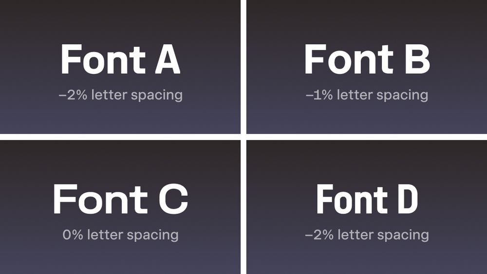
What’s wrong with these viral typography tips?
I get it, it’s a popular format that drives engagement. But as a type designer, I can tell you: following this kind of advice blindly can hurt your typography.
Below are 4 strategies for setting letter spacing that will help improve your design work.
I get it, it’s a popular format that drives engagement. But as a type designer, I can tell you: following this kind of advice blindly can hurt your typography.
Below are 4 strategies for setting letter spacing that will help improve your design work.
July 17, 2025 at 7:31 PM
What’s wrong with these viral typography tips?
I get it, it’s a popular format that drives engagement. But as a type designer, I can tell you: following this kind of advice blindly can hurt your typography.
Below are 4 strategies for setting letter spacing that will help improve your design work.
I get it, it’s a popular format that drives engagement. But as a type designer, I can tell you: following this kind of advice blindly can hurt your typography.
Below are 4 strategies for setting letter spacing that will help improve your design work.
This is a classic example of optical correction for intersecting lines in font design.
To make the diagonal appear straight at the center of the cross, the type designer slightly breaks and shifts it inward.
To make the diagonal appear straight at the center of the cross, the type designer slightly breaks and shifts it inward.
July 15, 2025 at 4:04 PM
This is a classic example of optical correction for intersecting lines in font design.
To make the diagonal appear straight at the center of the cross, the type designer slightly breaks and shifts it inward.
To make the diagonal appear straight at the center of the cross, the type designer slightly breaks and shifts it inward.
Innovator Grotesk in use: UI for Glow Finance’s website and apps.
June 29, 2025 at 3:26 PM
Innovator Grotesk in use: UI for Glow Finance’s website and apps.
Airbnb just unveiled their new typeface.
For iconic companies, creating custom fonts isn’t just a design choice, it’s a strategic one.
When all you have is black text on a white background, a distinctive typeface becomes one of the most powerful ways to stand out.
For iconic companies, creating custom fonts isn’t just a design choice, it’s a strategic one.
When all you have is black text on a white background, a distinctive typeface becomes one of the most powerful ways to stand out.

June 24, 2025 at 9:05 AM
Airbnb just unveiled their new typeface.
For iconic companies, creating custom fonts isn’t just a design choice, it’s a strategic one.
When all you have is black text on a white background, a distinctive typeface becomes one of the most powerful ways to stand out.
For iconic companies, creating custom fonts isn’t just a design choice, it’s a strategic one.
When all you have is black text on a white background, a distinctive typeface becomes one of the most powerful ways to stand out.
Arguing over whether 16px font size is better than 15 or 17 doesn’t really make sense: Inter and Times New Roman at the same font size will produce different actual character heights anyway.
Use any font size, even decimals, as long as the text is large enough to read comfortably.
Use any font size, even decimals, as long as the text is large enough to read comfortably.
June 16, 2025 at 8:23 AM
Arguing over whether 16px font size is better than 15 or 17 doesn’t really make sense: Inter and Times New Roman at the same font size will produce different actual character heights anyway.
Use any font size, even decimals, as long as the text is large enough to read comfortably.
Use any font size, even decimals, as long as the text is large enough to read comfortably.
Exactly one year ago, yeptype.com went live! 🎉
And what a year it’s been: launching Innovator Grotesk, rolling out the 1.1 update, and most recently, the soft launch of Unifora.
Huge thanks to all the customers—this journey has brought some of the happiest moments of my life!
And what a year it’s been: launching Innovator Grotesk, rolling out the 1.1 update, and most recently, the soft launch of Unifora.
Huge thanks to all the customers—this journey has brought some of the happiest moments of my life!
June 12, 2025 at 11:43 AM
Exactly one year ago, yeptype.com went live! 🎉
And what a year it’s been: launching Innovator Grotesk, rolling out the 1.1 update, and most recently, the soft launch of Unifora.
Huge thanks to all the customers—this journey has brought some of the happiest moments of my life!
And what a year it’s been: launching Innovator Grotesk, rolling out the 1.1 update, and most recently, the soft launch of Unifora.
Huge thanks to all the customers—this journey has brought some of the happiest moments of my life!
Unifora is a versatile new uniwidth sans-serif with an industrial edge.
One of its key features is an extended slant axis, supporting both italics and retalics up to ±18°.
It’s a powerful type family for expressive visuals and bold brand identities.
One of its key features is an extended slant axis, supporting both italics and retalics up to ±18°.
It’s a powerful type family for expressive visuals and bold brand identities.
May 31, 2025 at 4:56 PM
Unifora is a versatile new uniwidth sans-serif with an industrial edge.
One of its key features is an extended slant axis, supporting both italics and retalics up to ±18°.
It’s a powerful type family for expressive visuals and bold brand identities.
One of its key features is an extended slant axis, supporting both italics and retalics up to ±18°.
It’s a powerful type family for expressive visuals and bold brand identities.