


Vinicius Oike
@viniciusoike.bsky.social
Economist and Data Scientist | https://restateinsight.com/blog
São Paulo, Brazil
São Paulo, Brazil
When I say that Claude is very good at coding in R, there are caveats.

November 4, 2025 at 8:14 PM
When I say that Claude is very good at coding in R, there are caveats.
Claude can be savage at times

September 23, 2025 at 2:27 PM
Claude can be savage at times
What happens when you get lazy and don't follow your own advice...

September 19, 2025 at 6:56 PM
What happens when you get lazy and don't follow your own advice...
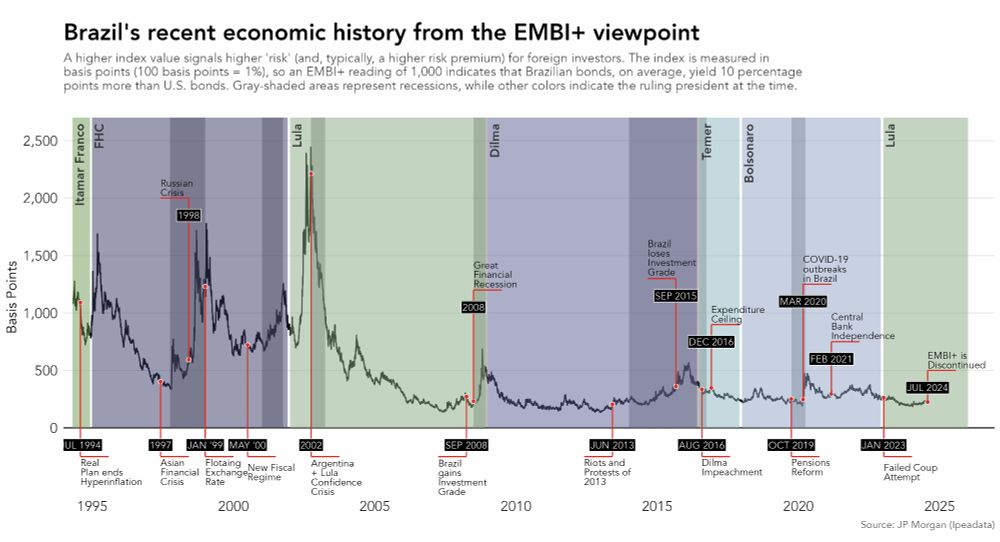
Still missing some plots, but wanted to share this one.
Day 25 #30DayChartChallenge | Uncertainties: Risk
The plot shows the "Brazil Risk" measured by the EMBI+ and highlights key economic/political events. This index broadly measures the risk that foreign investors face when investing in Brazil.
Day 25 #30DayChartChallenge | Uncertainties: Risk
The plot shows the "Brazil Risk" measured by the EMBI+ and highlights key economic/political events. This index broadly measures the risk that foreign investors face when investing in Brazil.
April 30, 2025 at 8:15 PM
Still missing some plots, but wanted to share this one.
Day 25 #30DayChartChallenge | Uncertainties: Risk
The plot shows the "Brazil Risk" measured by the EMBI+ and highlights key economic/political events. This index broadly measures the risk that foreign investors face when investing in Brazil.
Day 25 #30DayChartChallenge | Uncertainties: Risk
The plot shows the "Brazil Risk" measured by the EMBI+ and highlights key economic/political events. This index broadly measures the risk that foreign investors face when investing in Brazil.
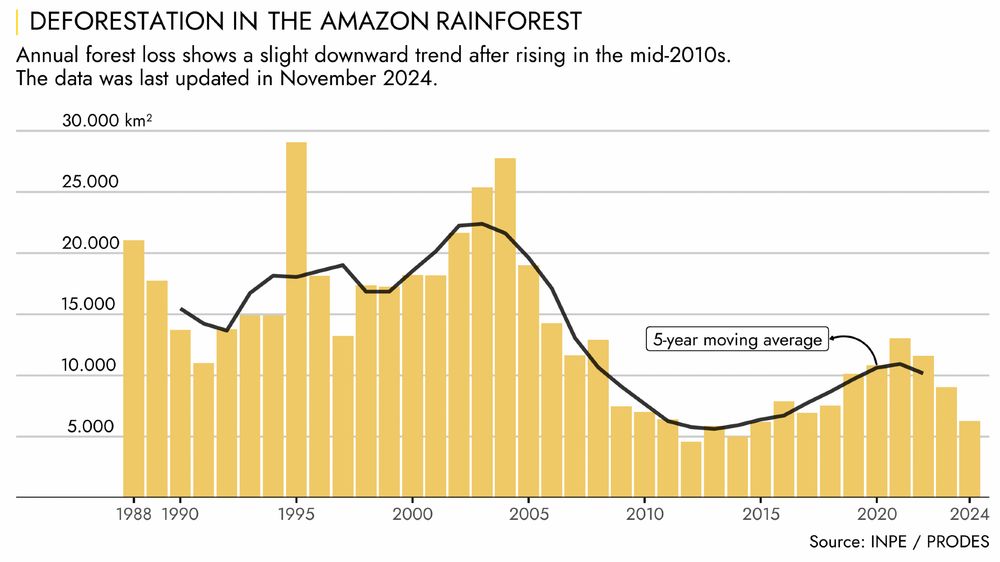
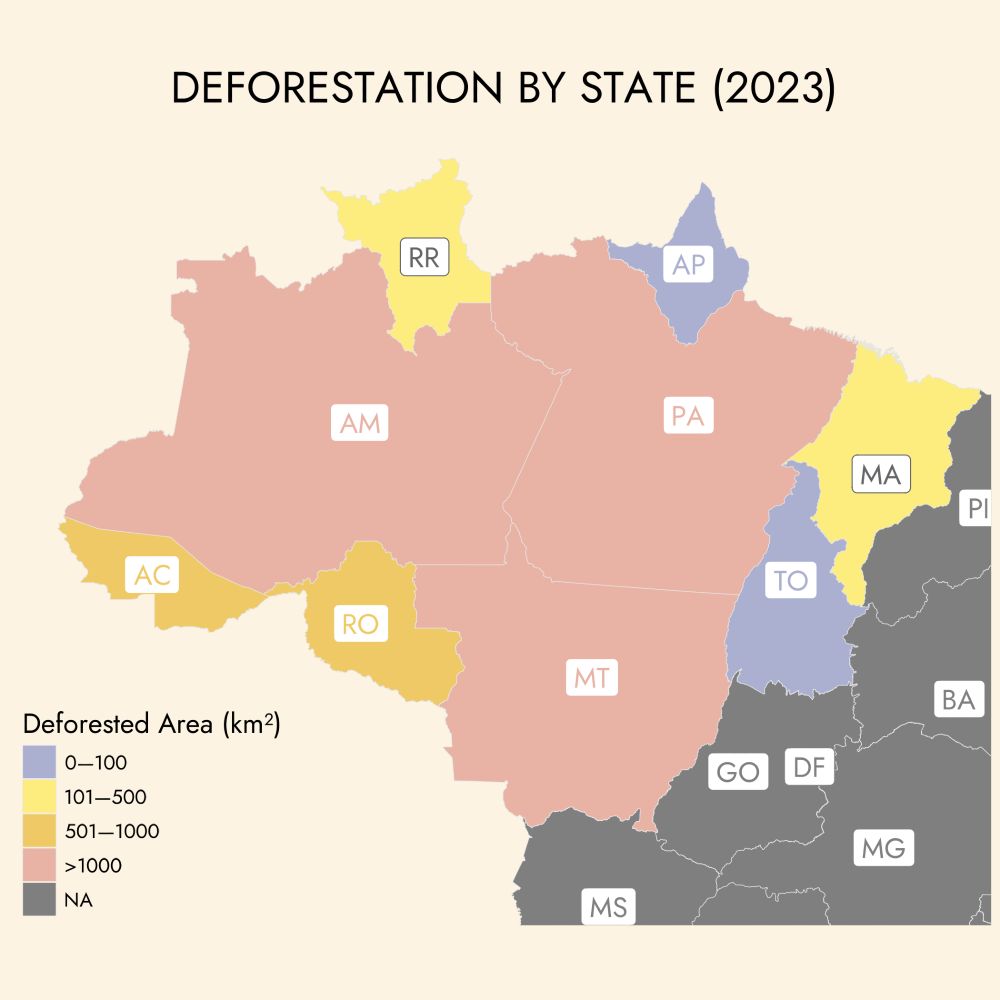
Day 30 #30DayChartChallenge | National Geographic
This chart shows the deforestation of the Amazon rainforest over the years, based on satellite imagery.
This year's COP30 will take place in Belém, Pará—a state that has consistently ranked among the top 2 in deforestation, since 1988.
This chart shows the deforestation of the Amazon rainforest over the years, based on satellite imagery.
This year's COP30 will take place in Belém, Pará—a state that has consistently ranked among the top 2 in deforestation, since 1988.
April 30, 2025 at 3:15 PM
Day 30 #30DayChartChallenge | National Geographic
This chart shows the deforestation of the Amazon rainforest over the years, based on satellite imagery.
This year's COP30 will take place in Belém, Pará—a state that has consistently ranked among the top 2 in deforestation, since 1988.
This chart shows the deforestation of the Amazon rainforest over the years, based on satellite imagery.
This year's COP30 will take place in Belém, Pará—a state that has consistently ranked among the top 2 in deforestation, since 1988.
Day 29 #30DayChartChallenge | Uncertainties: extraterrestrial
For day 29, I aggregated U.S. box office numbers for movies featuring aliens—any kind of extraterrestrial life counts. Alien sci-fi really dipped between 1986 and 1995 (Predator 2, Alien 3, Coneheads...).
For day 29, I aggregated U.S. box office numbers for movies featuring aliens—any kind of extraterrestrial life counts. Alien sci-fi really dipped between 1986 and 1995 (Predator 2, Alien 3, Coneheads...).

April 30, 2025 at 2:13 AM
Day 29 #30DayChartChallenge | Uncertainties: extraterrestrial
For day 29, I aggregated U.S. box office numbers for movies featuring aliens—any kind of extraterrestrial life counts. Alien sci-fi really dipped between 1986 and 1995 (Predator 2, Alien 3, Coneheads...).
For day 29, I aggregated U.S. box office numbers for movies featuring aliens—any kind of extraterrestrial life counts. Alien sci-fi really dipped between 1986 and 1995 (Predator 2, Alien 3, Coneheads...).
Day 4 #30DayChartChallenge | Comparisons: Big or Small
Choropleth maps of Brazil can be very deceiving. The Midwest and North regions cover about 65% of the country’s area but house only 16% of its population.
Maps show Aging Index: ratio of the pop. aged 65 and over to those aged 14 and under.
Choropleth maps of Brazil can be very deceiving. The Midwest and North regions cover about 65% of the country’s area but house only 16% of its population.
Maps show Aging Index: ratio of the pop. aged 65 and over to those aged 14 and under.


April 28, 2025 at 2:52 PM
Day 4 #30DayChartChallenge | Comparisons: Big or Small
Choropleth maps of Brazil can be very deceiving. The Midwest and North regions cover about 65% of the country’s area but house only 16% of its population.
Maps show Aging Index: ratio of the pop. aged 65 and over to those aged 14 and under.
Choropleth maps of Brazil can be very deceiving. The Midwest and North regions cover about 65% of the country’s area but house only 16% of its population.
Maps show Aging Index: ratio of the pop. aged 65 and over to those aged 14 and under.
Day 27 #30DayChartChallenge | Uncertainty: Noise
For day 27 I present several plots describing statistical properties of white noise.
For day 27 I present several plots describing statistical properties of white noise.

April 27, 2025 at 10:08 PM
Day 27 #30DayChartChallenge | Uncertainty: Noise
For day 27 I present several plots describing statistical properties of white noise.
For day 27 I present several plots describing statistical properties of white noise.
Day 15 #30DayChartChallenge | Relationships: Complicated
For day 15 I show the growing gap between rental prices and sales prices in Brazil. As of February 2025, house prices, on average, have increased 58% more than rental prices. This phenomenon is seen across several major Brazilian cities.
For day 15 I show the growing gap between rental prices and sales prices in Brazil. As of February 2025, house prices, on average, have increased 58% more than rental prices. This phenomenon is seen across several major Brazilian cities.

April 26, 2025 at 9:41 PM
Day 15 #30DayChartChallenge | Relationships: Complicated
For day 15 I show the growing gap between rental prices and sales prices in Brazil. As of February 2025, house prices, on average, have increased 58% more than rental prices. This phenomenon is seen across several major Brazilian cities.
For day 15 I show the growing gap between rental prices and sales prices in Brazil. As of February 2025, house prices, on average, have increased 58% more than rental prices. This phenomenon is seen across several major Brazilian cities.
Day 13 #30DayChartChallenge | Relationships: Clusters
The map shows the number of job opportunities accessible within a 30-minute drive during peak hours. The data comes from the AOP project (github.com/ipeaGIT/aopd...)
The map shows the number of job opportunities accessible within a 30-minute drive during peak hours. The data comes from the AOP project (github.com/ipeaGIT/aopd...)

April 26, 2025 at 9:40 PM
Day 13 #30DayChartChallenge | Relationships: Clusters
The map shows the number of job opportunities accessible within a 30-minute drive during peak hours. The data comes from the AOP project (github.com/ipeaGIT/aopd...)
The map shows the number of job opportunities accessible within a 30-minute drive during peak hours. The data comes from the AOP project (github.com/ipeaGIT/aopd...)
Day 11 #30DayChartChallenge | Distributions: Stripes
An updated version of the classic Ed Hawkins global warming stripes.
An updated version of the classic Ed Hawkins global warming stripes.

April 26, 2025 at 9:38 PM
Day 11 #30DayChartChallenge | Distributions: Stripes
An updated version of the classic Ed Hawkins global warming stripes.
An updated version of the classic Ed Hawkins global warming stripes.
Day 10 #30DayChartChallenge | Distributions: Multi-modal
Cars accidents are usually strongly correlated with rush hours. Even though, there's the usual early morning and late afternoon peaks, it feels like it's always rush hour if there's daylight in São Paulo.
Cars accidents are usually strongly correlated with rush hours. Even though, there's the usual early morning and late afternoon peaks, it feels like it's always rush hour if there's daylight in São Paulo.

April 26, 2025 at 9:37 PM
Day 10 #30DayChartChallenge | Distributions: Multi-modal
Cars accidents are usually strongly correlated with rush hours. Even though, there's the usual early morning and late afternoon peaks, it feels like it's always rush hour if there's daylight in São Paulo.
Cars accidents are usually strongly correlated with rush hours. Even though, there's the usual early morning and late afternoon peaks, it feels like it's always rush hour if there's daylight in São Paulo.
Day 7 #30DayChartChallenge | Distributions: Outliers
Wealth inequality is very high among Brazilian cities. Maricá, an oil royalty recipient, is 74 times wealthier than the poorest city on the list.
Wealth inequality is very high among Brazilian cities. Maricá, an oil royalty recipient, is 74 times wealthier than the poorest city on the list.

April 26, 2025 at 9:36 PM
Day 7 #30DayChartChallenge | Distributions: Outliers
Wealth inequality is very high among Brazilian cities. Maricá, an oil royalty recipient, is 74 times wealthier than the poorest city on the list.
Wealth inequality is very high among Brazilian cities. Maricá, an oil royalty recipient, is 74 times wealthier than the poorest city on the list.
Day 26 #30DayChartChallenge | Uncertainties: Monochrome
Economic recessions have decoupled electric energy consumption and real GDP in Brazil. A big gap appeared after the 2014-16 economic crisis.
Economic recessions have decoupled electric energy consumption and real GDP in Brazil. A big gap appeared after the 2014-16 economic crisis.

April 26, 2025 at 9:30 PM
Day 26 #30DayChartChallenge | Uncertainties: Monochrome
Economic recessions have decoupled electric energy consumption and real GDP in Brazil. A big gap appeared after the 2014-16 economic crisis.
Economic recessions have decoupled electric energy consumption and real GDP in Brazil. A big gap appeared after the 2014-16 economic crisis.
Day 9 #30DayChartChallenge | Distributions: Diverging
The charts show the geographical disparities in illiteracy rates across Brazil. Overall, cities in the Northeast show significantly higher rates than those in other regions.
The charts show the geographical disparities in illiteracy rates across Brazil. Overall, cities in the Northeast show significantly higher rates than those in other regions.


April 23, 2025 at 8:44 PM
Day 9 #30DayChartChallenge | Distributions: Diverging
The charts show the geographical disparities in illiteracy rates across Brazil. Overall, cities in the Northeast show significantly higher rates than those in other regions.
The charts show the geographical disparities in illiteracy rates across Brazil. Overall, cities in the Northeast show significantly higher rates than those in other regions.
Day 3 #30DayChartChallenge | Comparisons: Circular
Do people live near downtown?
I estimate the number of people living within a 6 km radius of their city's downtown.
The street colors represent nearby population density: darker shades indicate lower values, lighter shades represent higher.
Do people live near downtown?
I estimate the number of people living within a 6 km radius of their city's downtown.
The street colors represent nearby population density: darker shades indicate lower values, lighter shades represent higher.


April 23, 2025 at 8:42 PM
Day 3 #30DayChartChallenge | Comparisons: Circular
Do people live near downtown?
I estimate the number of people living within a 6 km radius of their city's downtown.
The street colors represent nearby population density: darker shades indicate lower values, lighter shades represent higher.
Do people live near downtown?
I estimate the number of people living within a 6 km radius of their city's downtown.
The street colors represent nearby population density: darker shades indicate lower values, lighter shades represent higher.
Day 19 #30DayChartChallenge | Time-series: Smooth
This plot shows the daily closing price of the S&P500 Index since October 2024 with several different smoothing and trend estimation techniques. Shoutout to base R (lots of convenient smoothers in stats) and TTR.
This plot shows the daily closing price of the S&P500 Index since October 2024 with several different smoothing and trend estimation techniques. Shoutout to base R (lots of convenient smoothers in stats) and TTR.

April 23, 2025 at 8:41 PM
Day 19 #30DayChartChallenge | Time-series: Smooth
This plot shows the daily closing price of the S&P500 Index since October 2024 with several different smoothing and trend estimation techniques. Shoutout to base R (lots of convenient smoothers in stats) and TTR.
This plot shows the daily closing price of the S&P500 Index since October 2024 with several different smoothing and trend estimation techniques. Shoutout to base R (lots of convenient smoothers in stats) and TTR.
Day 20 #30DayChartChallenge | Time-series: Urbanization
The rise of solo-living is a global trend and Brazil is following suit. Single family households have been increasing in all states. Currently, 18 million live by themselves in Brazil.
The rise of solo-living is a global trend and Brazil is following suit. Single family households have been increasing in all states. Currently, 18 million live by themselves in Brazil.

April 23, 2025 at 8:39 PM
Day 20 #30DayChartChallenge | Time-series: Urbanization
The rise of solo-living is a global trend and Brazil is following suit. Single family households have been increasing in all states. Currently, 18 million live by themselves in Brazil.
The rise of solo-living is a global trend and Brazil is following suit. Single family households have been increasing in all states. Currently, 18 million live by themselves in Brazil.
Day 21 #30DayChartChallenge | Time-series: Fossils
For day 21, I chose to make a plot showing the continued rise of global fossil fuel consumption.
For day 21, I chose to make a plot showing the continued rise of global fossil fuel consumption.

April 23, 2025 at 7:51 PM
Day 21 #30DayChartChallenge | Time-series: Fossils
For day 21, I chose to make a plot showing the continued rise of global fossil fuel consumption.
For day 21, I chose to make a plot showing the continued rise of global fossil fuel consumption.
Day 22 #30DayChartChallenge | Time-series: Stars
The plot shows sunspot cycles and the contraction cycles of the US economy in the past 150 years. The plot was made with ggplot2 and R.
The plot shows sunspot cycles and the contraction cycles of the US economy in the past 150 years. The plot was made with ggplot2 and R.

April 23, 2025 at 7:51 PM
Day 22 #30DayChartChallenge | Time-series: Stars
The plot shows sunspot cycles and the contraction cycles of the US economy in the past 150 years. The plot was made with ggplot2 and R.
The plot shows sunspot cycles and the contraction cycles of the US economy in the past 150 years. The plot was made with ggplot2 and R.
Day 23 #30DayChartChallenge | Time-series: Log-scale
Economists really love their logs and this love is justified. Despite the nasty log(x + 1), applying a logarithmic transformation helps modeling in too many ways to list. For most macroeconomic time series, logs are the way to go.
Economists really love their logs and this love is justified. Despite the nasty log(x + 1), applying a logarithmic transformation helps modeling in too many ways to list. For most macroeconomic time series, logs are the way to go.

April 23, 2025 at 7:50 PM
Day 23 #30DayChartChallenge | Time-series: Log-scale
Economists really love their logs and this love is justified. Despite the nasty log(x + 1), applying a logarithmic transformation helps modeling in too many ways to list. For most macroeconomic time series, logs are the way to go.
Economists really love their logs and this love is justified. Despite the nasty log(x + 1), applying a logarithmic transformation helps modeling in too many ways to list. For most macroeconomic time series, logs are the way to go.