


lissie
@lissmjm.bsky.social
🇬🇧🇫🇷🇸🇪 | talk and write about all things cycling, tennis, athletics and (occasionally) f1🚴🏽🏎🎾
#bikesky
#bikesky
now that the men’s Tour de France is over, my bingo cards are complete😌 as it turns out, my delusional one was clearly VERY delusional😭but at least my serious predictions were pretty good


July 27, 2025 at 6:03 PM
now that the men’s Tour de France is over, my bingo cards are complete😌 as it turns out, my delusional one was clearly VERY delusional😭but at least my serious predictions were pretty good
The first stage has already started and I forgot to post this beforehand, but I also decided to make a bingo card for the TDFF too😌

July 26, 2025 at 4:58 PM
The first stage has already started and I forgot to post this beforehand, but I also decided to make a bingo card for the TDFF too😌
we’ve now come to the end of week two, and here’s how my bingo cards are doing😭


July 21, 2025 at 6:35 AM
we’ve now come to the end of week two, and here’s how my bingo cards are doing😭
TDF weekend 1 is done, and whilst my serious bingo card is performing well, my delusional one is very much not😔


July 6, 2025 at 3:47 PM
TDF weekend 1 is done, and whilst my serious bingo card is performing well, my delusional one is very much not😔
I saw someone make one of these tierlists for the 2025 WT races on the other app and thought I’d share mine here😌

February 8, 2025 at 7:42 PM
I saw someone make one of these tierlists for the 2025 WT races on the other app and thought I’d share mine here😌
Now that Alpecin has released their kit, I believe we finally have all the new WT kits😌 so, as promised, I’ve created a tier list to rank them all against eachother (and I included a few ProTeams too)
If I’ve missed any though, pls do let me know😌
If I’ve missed any though, pls do let me know😌

January 18, 2025 at 11:41 AM
Now that Alpecin has released their kit, I believe we finally have all the new WT kits😌 so, as promised, I’ve created a tier list to rank them all against eachother (and I included a few ProTeams too)
If I’ve missed any though, pls do let me know😌
If I’ve missed any though, pls do let me know😌
Alpecin-Deceuninck
this is very boring, but at least it’s not blue I guess?
minus points because I don’t think the shade of blue for the deceuninck logo goes that well with the grey, and I’m annoyed they always make us wait so long to see the kit
6/10
this is very boring, but at least it’s not blue I guess?
minus points because I don’t think the shade of blue for the deceuninck logo goes that well with the grey, and I’m annoyed they always make us wait so long to see the kit
6/10

January 17, 2025 at 5:35 PM
Alpecin-Deceuninck
this is very boring, but at least it’s not blue I guess?
minus points because I don’t think the shade of blue for the deceuninck logo goes that well with the grey, and I’m annoyed they always make us wait so long to see the kit
6/10
this is very boring, but at least it’s not blue I guess?
minus points because I don’t think the shade of blue for the deceuninck logo goes that well with the grey, and I’m annoyed they always make us wait so long to see the kit
6/10
Q36.5 Pro Cycling
this is infinitely better than their old one🙏 very classy and sleek
my only criticism is that I’m not massively sold on the white sleeves, and so many teams this year are doing the blue & white combo, I’m bored
7/10
this is infinitely better than their old one🙏 very classy and sleek
my only criticism is that I’m not massively sold on the white sleeves, and so many teams this year are doing the blue & white combo, I’m bored
7/10

January 11, 2025 at 1:56 PM
Q36.5 Pro Cycling
this is infinitely better than their old one🙏 very classy and sleek
my only criticism is that I’m not massively sold on the white sleeves, and so many teams this year are doing the blue & white combo, I’m bored
7/10
this is infinitely better than their old one🙏 very classy and sleek
my only criticism is that I’m not massively sold on the white sleeves, and so many teams this year are doing the blue & white combo, I’m bored
7/10
Euskaltel-Euskadi & Laboral Kutxa-Fundación Euskadi
tbh I’m not really a big fan of either of these🤔
the men’s one is way more boring than their old one & it’s giving dutch national team jersey - 3/10
the women’s kit is funky and creative but also worse than last year’s in my opinion - 5/10
tbh I’m not really a big fan of either of these🤔
the men’s one is way more boring than their old one & it’s giving dutch national team jersey - 3/10
the women’s kit is funky and creative but also worse than last year’s in my opinion - 5/10

January 11, 2025 at 1:50 PM
Euskaltel-Euskadi & Laboral Kutxa-Fundación Euskadi
tbh I’m not really a big fan of either of these🤔
the men’s one is way more boring than their old one & it’s giving dutch national team jersey - 3/10
the women’s kit is funky and creative but also worse than last year’s in my opinion - 5/10
tbh I’m not really a big fan of either of these🤔
the men’s one is way more boring than their old one & it’s giving dutch national team jersey - 3/10
the women’s kit is funky and creative but also worse than last year’s in my opinion - 5/10
EF Education-Easypost/Oatly
this kit is a mega downgrade imo🥴 the shade of pink, the weird 3D effect diamonds, the awful font choice, and the weird icons…all of it together just looks so cheap
At least it’ll be distinctive, but most of their kits have been anyway🤷♀️this is definitely a chop
2/10
this kit is a mega downgrade imo🥴 the shade of pink, the weird 3D effect diamonds, the awful font choice, and the weird icons…all of it together just looks so cheap
At least it’ll be distinctive, but most of their kits have been anyway🤷♀️this is definitely a chop
2/10


January 7, 2025 at 7:15 PM
EF Education-Easypost/Oatly
this kit is a mega downgrade imo🥴 the shade of pink, the weird 3D effect diamonds, the awful font choice, and the weird icons…all of it together just looks so cheap
At least it’ll be distinctive, but most of their kits have been anyway🤷♀️this is definitely a chop
2/10
this kit is a mega downgrade imo🥴 the shade of pink, the weird 3D effect diamonds, the awful font choice, and the weird icons…all of it together just looks so cheap
At least it’ll be distinctive, but most of their kits have been anyway🤷♀️this is definitely a chop
2/10
Intermarché-Wanty
Noooo😭their usual jersey was fine, this just has way too much going on
I applaud them wanting to do something different, but this looks like they fused 3 jerseys into one and called it a day
(& I’m really not liking the amount of red we have in the peloton this year)
3/10
Noooo😭their usual jersey was fine, this just has way too much going on
I applaud them wanting to do something different, but this looks like they fused 3 jerseys into one and called it a day
(& I’m really not liking the amount of red we have in the peloton this year)
3/10

January 6, 2025 at 6:50 PM
Intermarché-Wanty
Noooo😭their usual jersey was fine, this just has way too much going on
I applaud them wanting to do something different, but this looks like they fused 3 jerseys into one and called it a day
(& I’m really not liking the amount of red we have in the peloton this year)
3/10
Noooo😭their usual jersey was fine, this just has way too much going on
I applaud them wanting to do something different, but this looks like they fused 3 jerseys into one and called it a day
(& I’m really not liking the amount of red we have in the peloton this year)
3/10
Tudor Pro Cycling
There’s nothing good about this. It’s pretty much the same jersey as last year but with a r*d b*ll logo, which makes it a mega downgrade😔
It’s v boring to me, even alaphilippe can’t save it
(& minus points because I couldn’t find a single clear picture of the kit anywhere)
2/10
There’s nothing good about this. It’s pretty much the same jersey as last year but with a r*d b*ll logo, which makes it a mega downgrade😔
It’s v boring to me, even alaphilippe can’t save it
(& minus points because I couldn’t find a single clear picture of the kit anywhere)
2/10

January 5, 2025 at 1:58 PM
Tudor Pro Cycling
There’s nothing good about this. It’s pretty much the same jersey as last year but with a r*d b*ll logo, which makes it a mega downgrade😔
It’s v boring to me, even alaphilippe can’t save it
(& minus points because I couldn’t find a single clear picture of the kit anywhere)
2/10
There’s nothing good about this. It’s pretty much the same jersey as last year but with a r*d b*ll logo, which makes it a mega downgrade😔
It’s v boring to me, even alaphilippe can’t save it
(& minus points because I couldn’t find a single clear picture of the kit anywhere)
2/10
Unibet Tietema Rockets
stunning😌 they’ve kept their familiar colour scheme but still come up with something different
the back also looks easily identifiable and I like the incorporation of the “rocket” - super dainty and stylish
(also bonus points for using tomáš kopećky as the model)
9.5/10
stunning😌 they’ve kept their familiar colour scheme but still come up with something different
the back also looks easily identifiable and I like the incorporation of the “rocket” - super dainty and stylish
(also bonus points for using tomáš kopećky as the model)
9.5/10


January 3, 2025 at 2:00 PM
Unibet Tietema Rockets
stunning😌 they’ve kept their familiar colour scheme but still come up with something different
the back also looks easily identifiable and I like the incorporation of the “rocket” - super dainty and stylish
(also bonus points for using tomáš kopećky as the model)
9.5/10
stunning😌 they’ve kept their familiar colour scheme but still come up with something different
the back also looks easily identifiable and I like the incorporation of the “rocket” - super dainty and stylish
(also bonus points for using tomáš kopećky as the model)
9.5/10
UAE Team ADQ
more purple😔 the kit itself actually looks quite cool, but I’m getting purple fatigue now, I’m afraid
I’m also not loving the prominence of the UAE flag and desert imagery - I already know it’s a sportswashing team, I don’t need it to be emphasised
6/10
more purple😔 the kit itself actually looks quite cool, but I’m getting purple fatigue now, I’m afraid
I’m also not loving the prominence of the UAE flag and desert imagery - I already know it’s a sportswashing team, I don’t need it to be emphasised
6/10

January 1, 2025 at 4:54 PM
UAE Team ADQ
more purple😔 the kit itself actually looks quite cool, but I’m getting purple fatigue now, I’m afraid
I’m also not loving the prominence of the UAE flag and desert imagery - I already know it’s a sportswashing team, I don’t need it to be emphasised
6/10
more purple😔 the kit itself actually looks quite cool, but I’m getting purple fatigue now, I’m afraid
I’m also not loving the prominence of the UAE flag and desert imagery - I already know it’s a sportswashing team, I don’t need it to be emphasised
6/10
Visma Lease-a-Bike
tbh I’m disappointed🫤the kit itself is fine, but I hate when teams don’t bother to come up with something new, it’s very lazy to me
I also don’t like the increasing prominence of whatever “yellow b” is supposed to be🙄
4/10
tbh I’m disappointed🫤the kit itself is fine, but I hate when teams don’t bother to come up with something new, it’s very lazy to me
I also don’t like the increasing prominence of whatever “yellow b” is supposed to be🙄
4/10

January 1, 2025 at 4:30 PM
Visma Lease-a-Bike
tbh I’m disappointed🫤the kit itself is fine, but I hate when teams don’t bother to come up with something new, it’s very lazy to me
I also don’t like the increasing prominence of whatever “yellow b” is supposed to be🙄
4/10
tbh I’m disappointed🫤the kit itself is fine, but I hate when teams don’t bother to come up with something new, it’s very lazy to me
I also don’t like the increasing prominence of whatever “yellow b” is supposed to be🙄
4/10
WC kit
Not a team kit, but it’s still a new 2025 kit so I’m gonna rate it😌
Now WHAT were they thinking??? There’s white shorts and then there’s THIS😔 he looks like an overgrown baby and I’m surprised he agreed to be photographed in this
Looks cheap, hope it’s a prototype that gets scrapped
0/10
Not a team kit, but it’s still a new 2025 kit so I’m gonna rate it😌
Now WHAT were they thinking??? There’s white shorts and then there’s THIS😔 he looks like an overgrown baby and I’m surprised he agreed to be photographed in this
Looks cheap, hope it’s a prototype that gets scrapped
0/10

December 29, 2024 at 7:28 PM
WC kit
Not a team kit, but it’s still a new 2025 kit so I’m gonna rate it😌
Now WHAT were they thinking??? There’s white shorts and then there’s THIS😔 he looks like an overgrown baby and I’m surprised he agreed to be photographed in this
Looks cheap, hope it’s a prototype that gets scrapped
0/10
Not a team kit, but it’s still a new 2025 kit so I’m gonna rate it😌
Now WHAT were they thinking??? There’s white shorts and then there’s THIS😔 he looks like an overgrown baby and I’m surprised he agreed to be photographed in this
Looks cheap, hope it’s a prototype that gets scrapped
0/10
Human Powered Health
This jersey looks quite cool and sleek, and it’s at least slightly different from last year’s, although with all the other purple kits in the women’s peloton, it might not be that distinctive from above🫤
Overall though, it looks nice enough I guess
7.5/10
This jersey looks quite cool and sleek, and it’s at least slightly different from last year’s, although with all the other purple kits in the women’s peloton, it might not be that distinctive from above🫤
Overall though, it looks nice enough I guess
7.5/10

December 28, 2024 at 5:14 PM
Human Powered Health
This jersey looks quite cool and sleek, and it’s at least slightly different from last year’s, although with all the other purple kits in the women’s peloton, it might not be that distinctive from above🫤
Overall though, it looks nice enough I guess
7.5/10
This jersey looks quite cool and sleek, and it’s at least slightly different from last year’s, although with all the other purple kits in the women’s peloton, it might not be that distinctive from above🫤
Overall though, it looks nice enough I guess
7.5/10
St Michel-Preference Home-Auber93
First of all, the new name is absolutely way too much, second of all, what is this kit?😭
It’s different from last year’s and I know some people love it, but to me, green and orange do NOT go together - and these shades make them look like highlighter pens
1/10
First of all, the new name is absolutely way too much, second of all, what is this kit?😭
It’s different from last year’s and I know some people love it, but to me, green and orange do NOT go together - and these shades make them look like highlighter pens
1/10

December 28, 2024 at 5:08 PM
St Michel-Preference Home-Auber93
First of all, the new name is absolutely way too much, second of all, what is this kit?😭
It’s different from last year’s and I know some people love it, but to me, green and orange do NOT go together - and these shades make them look like highlighter pens
1/10
First of all, the new name is absolutely way too much, second of all, what is this kit?😭
It’s different from last year’s and I know some people love it, but to me, green and orange do NOT go together - and these shades make them look like highlighter pens
1/10
TotalEnergies
Um…. this sure is something😅it looks incredibly low effort and bland, like it’s literally just a white jersey with sponsor logos slapped on and some little lines at the bottom
not to mention I assume they want a WC for the TDF? so they’re clearly gonna have to replace this
1/10
Um…. this sure is something😅it looks incredibly low effort and bland, like it’s literally just a white jersey with sponsor logos slapped on and some little lines at the bottom
not to mention I assume they want a WC for the TDF? so they’re clearly gonna have to replace this
1/10

December 27, 2024 at 1:17 PM
TotalEnergies
Um…. this sure is something😅it looks incredibly low effort and bland, like it’s literally just a white jersey with sponsor logos slapped on and some little lines at the bottom
not to mention I assume they want a WC for the TDF? so they’re clearly gonna have to replace this
1/10
Um…. this sure is something😅it looks incredibly low effort and bland, like it’s literally just a white jersey with sponsor logos slapped on and some little lines at the bottom
not to mention I assume they want a WC for the TDF? so they’re clearly gonna have to replace this
1/10
and they threw in a christmas olav kooij too? wow😌they’re feeling generous this year

December 24, 2024 at 3:14 PM
and they threw in a christmas olav kooij too? wow😌they’re feeling generous this year
SDWorx-Protime
this is super funky - I like how they’ve kept the same vibes as the old jersey, but still made it super different, and I like that it’s a bit darker too😌
this is for sure gonna be one of my favourite jerseys in the women’s peloton this year🤩
9/10
this is super funky - I like how they’ve kept the same vibes as the old jersey, but still made it super different, and I like that it’s a bit darker too😌
this is for sure gonna be one of my favourite jerseys in the women’s peloton this year🤩
9/10

December 23, 2024 at 8:06 PM
SDWorx-Protime
this is super funky - I like how they’ve kept the same vibes as the old jersey, but still made it super different, and I like that it’s a bit darker too😌
this is for sure gonna be one of my favourite jerseys in the women’s peloton this year🤩
9/10
this is super funky - I like how they’ve kept the same vibes as the old jersey, but still made it super different, and I like that it’s a bit darker too😌
this is for sure gonna be one of my favourite jerseys in the women’s peloton this year🤩
9/10
Equipo Kern Pharma
I really like this one! It’s not my ultimate fave, but it’s different from past jerseys and looks cool, and I love the colours - even the glasses look snazzy😌it’ll hopefully also be pretty easy to distinguish in the peloton
7.5/10
I really like this one! It’s not my ultimate fave, but it’s different from past jerseys and looks cool, and I love the colours - even the glasses look snazzy😌it’ll hopefully also be pretty easy to distinguish in the peloton
7.5/10

December 23, 2024 at 4:03 PM
Equipo Kern Pharma
I really like this one! It’s not my ultimate fave, but it’s different from past jerseys and looks cool, and I love the colours - even the glasses look snazzy😌it’ll hopefully also be pretty easy to distinguish in the peloton
7.5/10
I really like this one! It’s not my ultimate fave, but it’s different from past jerseys and looks cool, and I love the colours - even the glasses look snazzy😌it’ll hopefully also be pretty easy to distinguish in the peloton
7.5/10
Lotto
I had to wait ages for them to finally post a clear picture of the kit, but now she’s here, she’s stunning🤩
I do really like this kit, I think it looks so stylish - although I am worried about it looking the same as the other red kits, and don’t think it’ll be easy to distinguish😔
8/10
I had to wait ages for them to finally post a clear picture of the kit, but now she’s here, she’s stunning🤩
I do really like this kit, I think it looks so stylish - although I am worried about it looking the same as the other red kits, and don’t think it’ll be easy to distinguish😔
8/10

December 22, 2024 at 8:11 PM
Lotto
I had to wait ages for them to finally post a clear picture of the kit, but now she’s here, she’s stunning🤩
I do really like this kit, I think it looks so stylish - although I am worried about it looking the same as the other red kits, and don’t think it’ll be easy to distinguish😔
8/10
I had to wait ages for them to finally post a clear picture of the kit, but now she’s here, she’s stunning🤩
I do really like this kit, I think it looks so stylish - although I am worried about it looking the same as the other red kits, and don’t think it’ll be easy to distinguish😔
8/10
Fenix-Deceuninck
I like that they have three jerseys, but tbh I like the “special jerseys” miles better than the standard one they’ll mainly use :/
there’s nothing wrong with the blue jersey, but their jersey last year was much nicer, this one looks so bland and like 0 effort went into it
4/10
I like that they have three jerseys, but tbh I like the “special jerseys” miles better than the standard one they’ll mainly use :/
there’s nothing wrong with the blue jersey, but their jersey last year was much nicer, this one looks so bland and like 0 effort went into it
4/10

December 20, 2024 at 1:39 PM
Fenix-Deceuninck
I like that they have three jerseys, but tbh I like the “special jerseys” miles better than the standard one they’ll mainly use :/
there’s nothing wrong with the blue jersey, but their jersey last year was much nicer, this one looks so bland and like 0 effort went into it
4/10
I like that they have three jerseys, but tbh I like the “special jerseys” miles better than the standard one they’ll mainly use :/
there’s nothing wrong with the blue jersey, but their jersey last year was much nicer, this one looks so bland and like 0 effort went into it
4/10
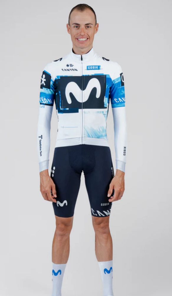
Movistar
We’ve already seen this thanks to the leak, but yeah it’s interesting for sure, and very different to their previous jerseys
I am slightly concerned by how white it is, given the new jersey rules, but oh well, at least it’s not 80% dark blue like most of the other jerseys🤷♀️
8/10
We’ve already seen this thanks to the leak, but yeah it’s interesting for sure, and very different to their previous jerseys
I am slightly concerned by how white it is, given the new jersey rules, but oh well, at least it’s not 80% dark blue like most of the other jerseys🤷♀️
8/10
December 19, 2024 at 10:34 AM
Movistar
We’ve already seen this thanks to the leak, but yeah it’s interesting for sure, and very different to their previous jerseys
I am slightly concerned by how white it is, given the new jersey rules, but oh well, at least it’s not 80% dark blue like most of the other jerseys🤷♀️
8/10
We’ve already seen this thanks to the leak, but yeah it’s interesting for sure, and very different to their previous jerseys
I am slightly concerned by how white it is, given the new jersey rules, but oh well, at least it’s not 80% dark blue like most of the other jerseys🤷♀️
8/10