


How To Read This Chart
@howtoreadthisch.art
A weekly newsletter about data, data visualizations and the aggregated weirdness of the world around us. A pbump.com project.
https://howtoreadthisch.art
https://howtoreadthisch.art
Here's how the Senate shutdown vote broke down by state vote in 2024 and senator ideology.
The two pink dots to the left of the Arizona senators are the senators from Nevada.
The two pink dots to the left of the Arizona senators are the senators from Nevada.

November 10, 2025 at 4:02 PM
Here's how the Senate shutdown vote broke down by state vote in 2024 and senator ideology.
The two pink dots to the left of the Arizona senators are the senators from Nevada.
The two pink dots to the left of the Arizona senators are the senators from Nevada.
This week, in the free-to-read newsletter:
1. The history of red and blue in TV campaign coverage.
www.howtoreadthisch.art/r/682c3344?m...
1. The history of red and blue in TV campaign coverage.
www.howtoreadthisch.art/r/682c3344?m...

November 8, 2025 at 4:01 PM
This week, in the free-to-read newsletter:
1. The history of red and blue in TV campaign coverage.
www.howtoreadthisch.art/r/682c3344?m...
1. The history of red and blue in TV campaign coverage.
www.howtoreadthisch.art/r/682c3344?m...
In this week’s newsletter: How red and blue came to represent Republicans and Democrats. And more!
www.howtoreadthisch.art/r/682c3344?m...
www.howtoreadthisch.art/r/682c3344?m...

Red versus blue. Versus yellow. Versus gray.
Chapter 1
It's (almost) all about TV
There was an election this week, I assume you heard, one in which the people who were unhappy last year became happy and vice versa. If you're one of the current ...
www.howtoreadthisch.art
November 8, 2025 at 3:06 PM
In this week’s newsletter: How red and blue came to represent Republicans and Democrats. And more!
www.howtoreadthisch.art/r/682c3344?m...
www.howtoreadthisch.art/r/682c3344?m...
Doing some math with the White House.
November 6, 2025 at 7:30 PM
Doing some math with the White House.
Here's how every county in Virginia has voted in gubernatorial and presidential elections since 2012.
www.pbump.net/o/what-chang...
www.pbump.net/o/what-chang...

November 6, 2025 at 3:57 AM
Here's how every county in Virginia has voted in gubernatorial and presidential elections since 2012.
www.pbump.net/o/what-chang...
www.pbump.net/o/what-chang...
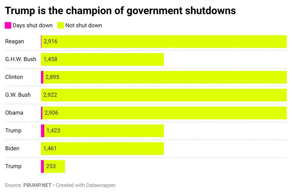
The government has been shutdown for more than 4 percent of the days Donald Trump has been president. The runner-up is Clinton, who saw the government shutdown for less than 1 percent.
November 5, 2025 at 6:50 PM
The government has been shutdown for more than 4 percent of the days Donald Trump has been president. The runner-up is Clinton, who saw the government shutdown for less than 1 percent.
Reposted by How To Read This Chart

There is a correlation between how much support Trump got in 2024 in each NY county and the growth in Tesla ownership in those counties.
www.howtoreadthisch.art/the-web-that...
www.howtoreadthisch.art/the-web-that...


November 2, 2025 at 1:35 PM
There is a correlation between how much support Trump got in 2024 in each NY county and the growth in Tesla ownership in those counties.
www.howtoreadthisch.art/the-web-that...
www.howtoreadthisch.art/the-web-that...
In the newsletter this week!
www.howtoreadthisch.art/r/46bb4a69?m...
1.
The web of connections revealed in subpoenas issued after Jan. 6.
www.howtoreadthisch.art/r/46bb4a69?m...
1.
The web of connections revealed in subpoenas issued after Jan. 6.

November 1, 2025 at 4:12 PM
In the newsletter this week!
www.howtoreadthisch.art/r/46bb4a69?m...
1.
The web of connections revealed in subpoenas issued after Jan. 6.
www.howtoreadthisch.art/r/46bb4a69?m...
1.
The web of connections revealed in subpoenas issued after Jan. 6.
This is how the organizations and people included in Jack Smith's 2020 subpoenas connect. See more (and close-ups) in this week's newsletter! www.howtoreadthisch.art/the-web-that...

November 1, 2025 at 2:13 PM
This is how the organizations and people included in Jack Smith's 2020 subpoenas connect. See more (and close-ups) in this week's newsletter! www.howtoreadthisch.art/the-web-that...
Reposted by How To Read This Chart
People who sponsor the newsletter will get an email with pictures of my dog in their inboxes tomorrow. It's a perk you can't get anywhere else — until my wife starts her own newsletter, I guess.
Anyway, still time to be part of the fun:
howtoreadthisch.art
Anyway, still time to be part of the fun:
howtoreadthisch.art

How To Read This Chart
37% data. 42% visualizations. 210% jokes.
howtoreadthisch.art
October 29, 2025 at 2:36 AM
People who sponsor the newsletter will get an email with pictures of my dog in their inboxes tomorrow. It's a perk you can't get anywhere else — until my wife starts her own newsletter, I guess.
Anyway, still time to be part of the fun:
howtoreadthisch.art
Anyway, still time to be part of the fun:
howtoreadthisch.art
The last time the House cast any votes was the Friday before Adelita Grijalva won her race. www.pbump.net/o/remember-t...

October 27, 2025 at 5:02 PM
The last time the House cast any votes was the Friday before Adelita Grijalva won her race. www.pbump.net/o/remember-t...
This week’s newsletter, a visual thread!
1. Religion in America!
www.howtoreadthisch.art/devotion-at-...
1. Religion in America!
www.howtoreadthisch.art/devotion-at-...

October 26, 2025 at 3:48 PM
This week’s newsletter, a visual thread!
1. Religion in America!
www.howtoreadthisch.art/devotion-at-...
1. Religion in America!
www.howtoreadthisch.art/devotion-at-...
Reposted by How To Read This Chart
Going into today, Ohio State had only the second-best point differential in college football. Or the Big Ten. Or the Midwest. www.howtoreadthisch.art/devotion-at-...

October 25, 2025 at 9:31 PM
Going into today, Ohio State had only the second-best point differential in college football. Or the Big Ten. Or the Midwest. www.howtoreadthisch.art/devotion-at-...
A look at the geographic boundaries of four major American religions. www.howtoreadthisch.art/r/444882ff?m...
October 25, 2025 at 2:08 PM
A look at the geographic boundaries of four major American religions. www.howtoreadthisch.art/r/444882ff?m...
Reposted by How To Read This Chart
When presidents have (and haven't) invoked the Insurrection Act. www.pbump.net/o/trump-want...

October 20, 2025 at 3:47 PM
When presidents have (and haven't) invoked the Insurrection Act. www.pbump.net/o/trump-want...
Reposted by How To Read This Chart
Through Oct. 19, 2017, Trump had spent all or part of 93 days at Trump Org properties and likely played golf on 57.
As of Oct. 19, 2025, he's spent all or part of 102 days at his private properties and likely played golf on 71 days.
www.pbump.net/o/an-officia...
As of Oct. 19, 2025, he's spent all or part of 102 days at his private properties and likely played golf on 71 days.
www.pbump.net/o/an-officia...

October 20, 2025 at 1:20 AM
Through Oct. 19, 2017, Trump had spent all or part of 93 days at Trump Org properties and likely played golf on 57.
As of Oct. 19, 2025, he's spent all or part of 102 days at his private properties and likely played golf on 71 days.
www.pbump.net/o/an-officia...
As of Oct. 19, 2025, he's spent all or part of 102 days at his private properties and likely played golf on 71 days.
www.pbump.net/o/an-officia...
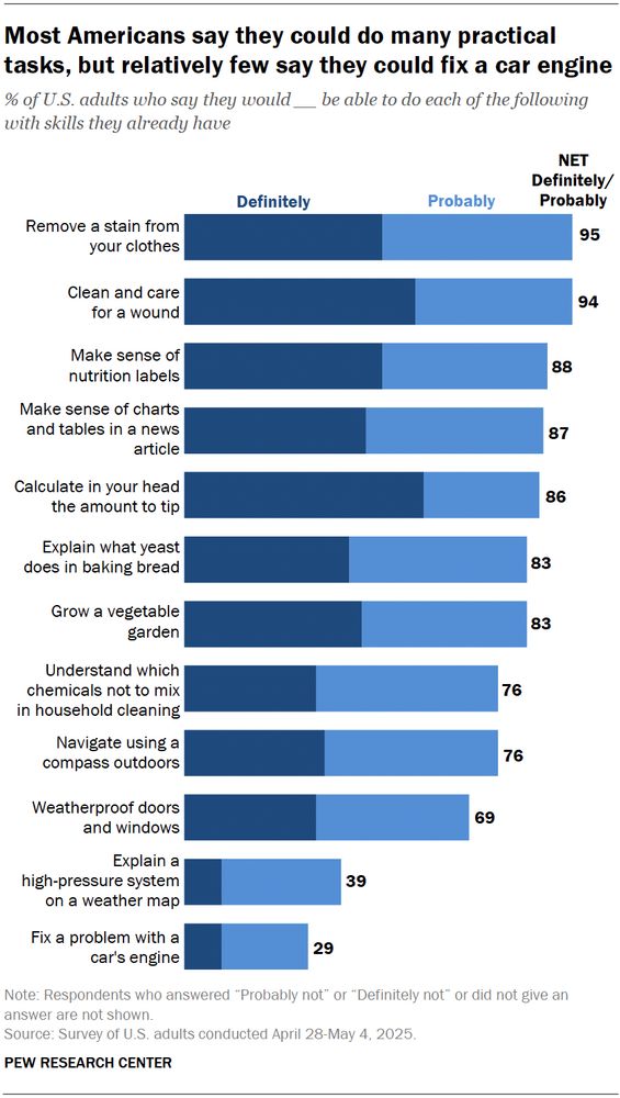
The newsletter features more than one link from the always great @kottke.org and this post from Pew’s Conrad Hackett.
You can probably guess why.
You can probably guess why.
What do you think everyone ought to be able to do that you definitely cannot?
October 18, 2025 at 10:29 PM
The newsletter features more than one link from the always great @kottke.org and this post from Pew’s Conrad Hackett.
You can probably guess why.
You can probably guess why.
𝐓𝐡𝐢𝐬 𝐰𝐞𝐞𝐤’𝐬 𝐧𝐞𝐰𝐬𝐥𝐞𝐭𝐭𝐞𝐫 (a four-part thread):
How the U.S. population has evolved.
www.howtoreadthisch.art/r/e0489c52?m...
How the U.S. population has evolved.
www.howtoreadthisch.art/r/e0489c52?m...
October 18, 2025 at 7:25 PM
𝐓𝐡𝐢𝐬 𝐰𝐞𝐞𝐤’𝐬 𝐧𝐞𝐰𝐬𝐥𝐞𝐭𝐭𝐞𝐫 (a four-part thread):
How the U.S. population has evolved.
www.howtoreadthisch.art/r/e0489c52?m...
How the U.S. population has evolved.
www.howtoreadthisch.art/r/e0489c52?m...
The newsletter is out. This week: Some Kings.
www.howtoreadthisch.art/the-ebbs-and...
www.howtoreadthisch.art/the-ebbs-and...

October 18, 2025 at 2:03 PM
The newsletter is out. This week: Some Kings.
www.howtoreadthisch.art/the-ebbs-and...
www.howtoreadthisch.art/the-ebbs-and...
Reposted by How To Read This Chart

This is the most accurate depiction of the Midwest to date. Wichita has always felt like the last Midwest city while also being the first plains city.

October 7, 2025 at 3:08 PM
This is the most accurate depiction of the Midwest to date. Wichita has always felt like the last Midwest city while also being the first plains city.
Reposted by How To Read This Chart

One of my favorite state fair creative activities objects this year: a quilted infographic documenting climate change.


September 1, 2025 at 5:50 PM
One of my favorite state fair creative activities objects this year: a quilted infographic documenting climate change.
Reposted by How To Read This Chart

Extreme views are heavily over-represented on social media
Social platforms’ tendency to reward hostile content creates incentives that systematically reward simplistic messages and extreme positions and this fuels populism www.ft.com/content/9251... via @jburnmurdoch.ft.com
Social platforms’ tendency to reward hostile content creates incentives that systematically reward simplistic messages and extreme positions and this fuels populism www.ft.com/content/9251... via @jburnmurdoch.ft.com

September 8, 2025 at 10:02 PM
Extreme views are heavily over-represented on social media
Social platforms’ tendency to reward hostile content creates incentives that systematically reward simplistic messages and extreme positions and this fuels populism www.ft.com/content/9251... via @jburnmurdoch.ft.com
Social platforms’ tendency to reward hostile content creates incentives that systematically reward simplistic messages and extreme positions and this fuels populism www.ft.com/content/9251... via @jburnmurdoch.ft.com
Reposted by How To Read This Chart

They were meant to be lasting reference sources. The hand lettering here is crazy.

September 2, 2025 at 2:43 PM
They were meant to be lasting reference sources. The hand lettering here is crazy.
Reposted by How To Read This Chart

LINK ROT: 38% webpages that existed in 2013 were no longer available 10 years later.
Even among pages that existed in 2021, 22% no longer accessible just two years later. This is often because individual page was deleted or removed on otherwise functional website.
Many implications for knowledge 🧪
Even among pages that existed in 2021, 22% no longer accessible just two years later. This is often because individual page was deleted or removed on otherwise functional website.
Many implications for knowledge 🧪

September 14, 2025 at 11:19 PM
LINK ROT: 38% webpages that existed in 2013 were no longer available 10 years later.
Even among pages that existed in 2021, 22% no longer accessible just two years later. This is often because individual page was deleted or removed on otherwise functional website.
Many implications for knowledge 🧪
Even among pages that existed in 2021, 22% no longer accessible just two years later. This is often because individual page was deleted or removed on otherwise functional website.
Many implications for knowledge 🧪
Will repost some of the charts included in the newsletter this week.


October 11, 2025 at 5:45 PM
Will repost some of the charts included in the newsletter this week.