


Till Hafermann
@hafertill.bsky.social
💼 Journalist @ WDR
💚 News, DDJ, data viz, Tech, Gaming, Sport
💚 News, DDJ, data viz, Tech, Gaming, Sport
Day 24 of #30DayChartChallenge: WHO data day.
Sucks to be sick in Switzerland.
Data: www.who.int/data/gho/dat...
Sucks to be sick in Switzerland.
Data: www.who.int/data/gho/dat...

April 24, 2025 at 3:05 PM
Day 24 of #30DayChartChallenge: WHO data day.
Sucks to be sick in Switzerland.
Data: www.who.int/data/gho/dat...
Sucks to be sick in Switzerland.
Data: www.who.int/data/gho/dat...
Day 23 of #30DayChartChallenge: Log-Scale.
Interactive version for all the labels: www.datawrapper.de/_/mun1B/
Data: thegamingsetup.com/console-powe...
Interactive version for all the labels: www.datawrapper.de/_/mun1B/
Data: thegamingsetup.com/console-powe...

April 23, 2025 at 6:58 PM
Day 23 of #30DayChartChallenge: Log-Scale.
Interactive version for all the labels: www.datawrapper.de/_/mun1B/
Data: thegamingsetup.com/console-powe...
Interactive version for all the labels: www.datawrapper.de/_/mun1B/
Data: thegamingsetup.com/console-powe...
Day 22 of #30DayChartChallenge: Stars.
I decided on a Star Trek chart and got a bit carried away trying to mimic the LCARS displays. 😅
Data: memory-alpha.fandom.com/wiki/Enterpr...
I decided on a Star Trek chart and got a bit carried away trying to mimic the LCARS displays. 😅
Data: memory-alpha.fandom.com/wiki/Enterpr...

April 22, 2025 at 10:06 PM
Day 22 of #30DayChartChallenge: Stars.
I decided on a Star Trek chart and got a bit carried away trying to mimic the LCARS displays. 😅
Data: memory-alpha.fandom.com/wiki/Enterpr...
I decided on a Star Trek chart and got a bit carried away trying to mimic the LCARS displays. 😅
Data: memory-alpha.fandom.com/wiki/Enterpr...
Day 21 of #30DayChartChallenge: Fossil.
This chart depicts the absence of "fossil" - the adoption of electric cars across different countries.
Data: ourworldindata.org/electric-car...
This chart depicts the absence of "fossil" - the adoption of electric cars across different countries.
Data: ourworldindata.org/electric-car...

April 21, 2025 at 7:53 PM
Day 21 of #30DayChartChallenge: Fossil.
This chart depicts the absence of "fossil" - the adoption of electric cars across different countries.
Data: ourworldindata.org/electric-car...
This chart depicts the absence of "fossil" - the adoption of electric cars across different countries.
Data: ourworldindata.org/electric-car...

April 20, 2025 at 10:01 PM
Day 19 of #30DayChartChallenge: Smooth.
Couldn't find more current data... Might be fun to repeat later.
Data: www.kaggle.com/datasets/leo...
Couldn't find more current data... Might be fun to repeat later.
Data: www.kaggle.com/datasets/leo...

April 20, 2025 at 8:38 PM
Day 19 of #30DayChartChallenge: Smooth.
Couldn't find more current data... Might be fun to repeat later.
Data: www.kaggle.com/datasets/leo...
Couldn't find more current data... Might be fun to repeat later.
Data: www.kaggle.com/datasets/leo...
Since I am still behind on the #30DayChartChallenge, this is a combined chart for "negative" (day 16) and "birds" (day 17). Nothing fancy, but a sad indicator of how we keep treating our planet.
Data covers 168 monitored species in 30 European countries. Source: pecbms.info/trends-and-i...
Data covers 168 monitored species in 30 European countries. Source: pecbms.info/trends-and-i...

April 18, 2025 at 10:10 PM
Since I am still behind on the #30DayChartChallenge, this is a combined chart for "negative" (day 16) and "birds" (day 17). Nothing fancy, but a sad indicator of how we keep treating our planet.
Data covers 168 monitored species in 30 European countries. Source: pecbms.info/trends-and-i...
Data covers 168 monitored species in 30 European countries. Source: pecbms.info/trends-and-i...
Late entry for #30DayChartChallenge Day 15: Complicated.
What's more complicated than millions of rows of IMDB data in a network? Had to analyze a specific subset because of hardware.
Data: developer.imdb.com/non-commerci...
Tools: R (tidygraph, ggraph, data.table), edited in Affinity Photo.
What's more complicated than millions of rows of IMDB data in a network? Had to analyze a specific subset because of hardware.
Data: developer.imdb.com/non-commerci...
Tools: R (tidygraph, ggraph, data.table), edited in Affinity Photo.

April 17, 2025 at 6:53 PM
Late entry for #30DayChartChallenge Day 15: Complicated.
What's more complicated than millions of rows of IMDB data in a network? Had to analyze a specific subset because of hardware.
Data: developer.imdb.com/non-commerci...
Tools: R (tidygraph, ggraph, data.table), edited in Affinity Photo.
What's more complicated than millions of rows of IMDB data in a network? Had to analyze a specific subset because of hardware.
Data: developer.imdb.com/non-commerci...
Tools: R (tidygraph, ggraph, data.table), edited in Affinity Photo.
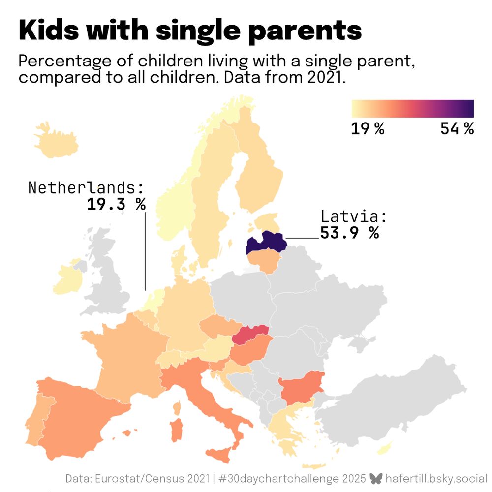
Day 14 of #30DayChartChallenge: Kinship.
Maybe not perfect for visualization category "relationships", but I found this interesting: The percentage of kids with single parents varies a lot in Europe.
Data: ec.europa.eu/CensusHub/
Tools: Data prep in R (mainly dplyr), viz with @datawrapper.de.
Maybe not perfect for visualization category "relationships", but I found this interesting: The percentage of kids with single parents varies a lot in Europe.
Data: ec.europa.eu/CensusHub/
Tools: Data prep in R (mainly dplyr), viz with @datawrapper.de.
April 14, 2025 at 10:54 PM
Day 14 of #30DayChartChallenge: Kinship.
Maybe not perfect for visualization category "relationships", but I found this interesting: The percentage of kids with single parents varies a lot in Europe.
Data: ec.europa.eu/CensusHub/
Tools: Data prep in R (mainly dplyr), viz with @datawrapper.de.
Maybe not perfect for visualization category "relationships", but I found this interesting: The percentage of kids with single parents varies a lot in Europe.
Data: ec.europa.eu/CensusHub/
Tools: Data prep in R (mainly dplyr), viz with @datawrapper.de.
My entry for day 13 of #30DayChartChallenge: Clusters.
Not super insightful, but a nice way to brush up my statistical analysis skills.
Data: www.kaggle.com/datasets/sky...
Tools: R(base and ggplot), edited in Affinity Designer, and some help on the way from ChatGPT.
Not super insightful, but a nice way to brush up my statistical analysis skills.
Data: www.kaggle.com/datasets/sky...
Tools: R(base and ggplot), edited in Affinity Designer, and some help on the way from ChatGPT.

April 14, 2025 at 3:52 PM
My entry for day 13 of #30DayChartChallenge: Clusters.
Not super insightful, but a nice way to brush up my statistical analysis skills.
Data: www.kaggle.com/datasets/sky...
Tools: R(base and ggplot), edited in Affinity Designer, and some help on the way from ChatGPT.
Not super insightful, but a nice way to brush up my statistical analysis skills.
Data: www.kaggle.com/datasets/sky...
Tools: R(base and ggplot), edited in Affinity Designer, and some help on the way from ChatGPT.
A little behind on the #30DayChartChallenge. So here is day 12: data.gov.
Data: www.ncei.noaa.gov/access/metad...
Tools: R(dplyr, zoo for rolling average, ggplot), edited in Affinity Designer.
Data: www.ncei.noaa.gov/access/metad...
Tools: R(dplyr, zoo for rolling average, ggplot), edited in Affinity Designer.

April 14, 2025 at 3:44 PM
A little behind on the #30DayChartChallenge. So here is day 12: data.gov.
Data: www.ncei.noaa.gov/access/metad...
Tools: R(dplyr, zoo for rolling average, ggplot), edited in Affinity Designer.
Data: www.ncei.noaa.gov/access/metad...
Tools: R(dplyr, zoo for rolling average, ggplot), edited in Affinity Designer.
Day 11 of #30DayChartChallenge: The prompt "stripes" made me think of cliché prisoners. So here we go.
Data: World Prison Brief www.prisonstudies.org/research-pub...
Made with Tabula, Google Sheets and @datawrapper.de - interactive version: www.datawrapper.de/_/jxfwa/
Data: World Prison Brief www.prisonstudies.org/research-pub...
Made with Tabula, Google Sheets and @datawrapper.de - interactive version: www.datawrapper.de/_/jxfwa/

April 11, 2025 at 7:26 PM
Day 11 of #30DayChartChallenge: The prompt "stripes" made me think of cliché prisoners. So here we go.
Data: World Prison Brief www.prisonstudies.org/research-pub...
Made with Tabula, Google Sheets and @datawrapper.de - interactive version: www.datawrapper.de/_/jxfwa/
Data: World Prison Brief www.prisonstudies.org/research-pub...
Made with Tabula, Google Sheets and @datawrapper.de - interactive version: www.datawrapper.de/_/jxfwa/
Day 10 of #30DayChartChallenge: Multimodal.
I tried my hand at a visualization video for the first time.
Data: trends.withgoogle.com/year-in-sear...
Tools: R(ggplot, ggridges, gganimate) and Da Vinci Resolve.
I tried my hand at a visualization video for the first time.
Data: trends.withgoogle.com/year-in-sear...
Tools: R(ggplot, ggridges, gganimate) and Da Vinci Resolve.
April 10, 2025 at 8:00 PM
Day 10 of #30DayChartChallenge: Multimodal.
I tried my hand at a visualization video for the first time.
Data: trends.withgoogle.com/year-in-sear...
Tools: R(ggplot, ggridges, gganimate) and Da Vinci Resolve.
I tried my hand at a visualization video for the first time.
Data: trends.withgoogle.com/year-in-sear...
Tools: R(ggplot, ggridges, gganimate) and Da Vinci Resolve.
Day 9 of #30DayChartChallenge: Diverging.
NFL teams spend a crazy amount of money on players' salaries - but being the biggest spender does not guarantee success. Unfortunately, being frugal doesn't either, as I've come to learn being a Steelers fan. 🫠
Data: www.spotrac.com/nfl/cash/
NFL teams spend a crazy amount of money on players' salaries - but being the biggest spender does not guarantee success. Unfortunately, being frugal doesn't either, as I've come to learn being a Steelers fan. 🫠
Data: www.spotrac.com/nfl/cash/

April 9, 2025 at 7:37 PM
Day 9 of #30DayChartChallenge: Diverging.
NFL teams spend a crazy amount of money on players' salaries - but being the biggest spender does not guarantee success. Unfortunately, being frugal doesn't either, as I've come to learn being a Steelers fan. 🫠
Data: www.spotrac.com/nfl/cash/
NFL teams spend a crazy amount of money on players' salaries - but being the biggest spender does not guarantee success. Unfortunately, being frugal doesn't either, as I've come to learn being a Steelers fan. 🫠
Data: www.spotrac.com/nfl/cash/
Day 8 of #30DayChartChallenge: Histogram. I took a look at one of my favorite books, The Lord of the Rings. I like how you can see the shifting narratives here. Have fun exploring! 🔎
Data: www.kaggle.com/datasets/ash...
Tools: R(tidytext, ggplot) and Affinity Designer.
Data: www.kaggle.com/datasets/ash...
Tools: R(tidytext, ggplot) and Affinity Designer.

April 8, 2025 at 10:22 PM
Day 8 of #30DayChartChallenge: Histogram. I took a look at one of my favorite books, The Lord of the Rings. I like how you can see the shifting narratives here. Have fun exploring! 🔎
Data: www.kaggle.com/datasets/ash...
Tools: R(tidytext, ggplot) and Affinity Designer.
Data: www.kaggle.com/datasets/ash...
Tools: R(tidytext, ggplot) and Affinity Designer.
Day 7 of #30DayChartChallenge: Outliers. 💸
Data: www.forbes.com.au/news/billion... and www.kaggle.com/datasets/shu...
Tools: R (dplyr, ggplot), edited in Affinity Designer.
Data: www.forbes.com.au/news/billion... and www.kaggle.com/datasets/shu...
Tools: R (dplyr, ggplot), edited in Affinity Designer.

April 7, 2025 at 6:37 PM
Day 7 of #30DayChartChallenge: Outliers. 💸
Data: www.forbes.com.au/news/billion... and www.kaggle.com/datasets/shu...
Tools: R (dplyr, ggplot), edited in Affinity Designer.
Data: www.forbes.com.au/news/billion... and www.kaggle.com/datasets/shu...
Tools: R (dplyr, ggplot), edited in Affinity Designer.
Day 6 of #30DayChartChallenge: Florence Nightingale Theme Day.
Maybe not the ideal way to display this data, but a fun challenge to mimic the original "rose chart".
Data: ourworldindata.org/emissions-by...
Made with R{owidapi, dplyr and ggplot2}, edited in Affinity Designer.
Maybe not the ideal way to display this data, but a fun challenge to mimic the original "rose chart".
Data: ourworldindata.org/emissions-by...
Made with R{owidapi, dplyr and ggplot2}, edited in Affinity Designer.

April 6, 2025 at 8:09 PM
Day 6 of #30DayChartChallenge: Florence Nightingale Theme Day.
Maybe not the ideal way to display this data, but a fun challenge to mimic the original "rose chart".
Data: ourworldindata.org/emissions-by...
Made with R{owidapi, dplyr and ggplot2}, edited in Affinity Designer.
Maybe not the ideal way to display this data, but a fun challenge to mimic the original "rose chart".
Data: ourworldindata.org/emissions-by...
Made with R{owidapi, dplyr and ggplot2}, edited in Affinity Designer.
Day 5 of #30DayChartChallenge: Ranking!
I used to think of borders as immovable. With what's happening in the world lately - not anymore. This chart shows that my original feeling was not so accurate to begin with.
Data: en.wikipedia.org/wiki/List_of...
Made in R, edited in Affinity Designer.
I used to think of borders as immovable. With what's happening in the world lately - not anymore. This chart shows that my original feeling was not so accurate to begin with.
Data: en.wikipedia.org/wiki/List_of...
Made in R, edited in Affinity Designer.

April 5, 2025 at 8:39 PM
Day 5 of #30DayChartChallenge: Ranking!
I used to think of borders as immovable. With what's happening in the world lately - not anymore. This chart shows that my original feeling was not so accurate to begin with.
Data: en.wikipedia.org/wiki/List_of...
Made in R, edited in Affinity Designer.
I used to think of borders as immovable. With what's happening in the world lately - not anymore. This chart shows that my original feeling was not so accurate to begin with.
Data: en.wikipedia.org/wiki/List_of...
Made in R, edited in Affinity Designer.
Day 4 of #30DayChartChallenge: Big or small.
I'll admit it is a bit crowded, but nonetheless interesting (hopefully): The Bundesliga is very unequal in terms of market value, and teams like Mainz and Gladbach are performing better than market value might suggest.
I'll admit it is a bit crowded, but nonetheless interesting (hopefully): The Bundesliga is very unequal in terms of market value, and teams like Mainz and Gladbach are performing better than market value might suggest.

April 4, 2025 at 7:58 PM
Day 4 of #30DayChartChallenge: Big or small.
I'll admit it is a bit crowded, but nonetheless interesting (hopefully): The Bundesliga is very unequal in terms of market value, and teams like Mainz and Gladbach are performing better than market value might suggest.
I'll admit it is a bit crowded, but nonetheless interesting (hopefully): The Bundesliga is very unequal in terms of market value, and teams like Mainz and Gladbach are performing better than market value might suggest.
And a look at all 13 studio albums.

April 3, 2025 at 3:34 PM
And a look at all 13 studio albums.
Day 3 of #30DayChartChallenge: Circular comparisons.
How does the sound of The Beatles change over time? Averages of Spotify indicators by album, I used the remastered versions for comparability.
Data: www.kaggle.com/datasets/art...
Data prep with Excel, chart made with Flourish and Photoshop.
How does the sound of The Beatles change over time? Averages of Spotify indicators by album, I used the remastered versions for comparability.
Data: www.kaggle.com/datasets/art...
Data prep with Excel, chart made with Flourish and Photoshop.

April 3, 2025 at 3:34 PM
Day 3 of #30DayChartChallenge: Circular comparisons.
How does the sound of The Beatles change over time? Averages of Spotify indicators by album, I used the remastered versions for comparability.
Data: www.kaggle.com/datasets/art...
Data prep with Excel, chart made with Flourish and Photoshop.
How does the sound of The Beatles change over time? Averages of Spotify indicators by album, I used the remastered versions for comparability.
Data: www.kaggle.com/datasets/art...
Data prep with Excel, chart made with Flourish and Photoshop.
Day 2 of #30DayChartChallenge: Slope. Playing around with IMDB data.

April 2, 2025 at 11:22 PM
Day 2 of #30DayChartChallenge: Slope. Playing around with IMDB data.
Thought I'd try my hand at this year's #30DayChartChallenge, mainly to stay in shape with my favorite data viz tools.
Day 1: Fractions.
Data: ourworldindata.org/grapher/shar...
Tools used: RStudio, main packages owidapi, dplyr, ggplot, then some editing in Affinity Designer.
Day 1: Fractions.
Data: ourworldindata.org/grapher/shar...
Tools used: RStudio, main packages owidapi, dplyr, ggplot, then some editing in Affinity Designer.

April 1, 2025 at 7:17 PM
Thought I'd try my hand at this year's #30DayChartChallenge, mainly to stay in shape with my favorite data viz tools.
Day 1: Fractions.
Data: ourworldindata.org/grapher/shar...
Tools used: RStudio, main packages owidapi, dplyr, ggplot, then some editing in Affinity Designer.
Day 1: Fractions.
Data: ourworldindata.org/grapher/shar...
Tools used: RStudio, main packages owidapi, dplyr, ggplot, then some editing in Affinity Designer.