💚 News, DDJ, data viz, Tech, Gaming, Sport
Sucks to be sick in Switzerland.
Data: www.who.int/data/gho/dat...

Sucks to be sick in Switzerland.
Data: www.who.int/data/gho/dat...
Interactive version for all the labels: www.datawrapper.de/_/mun1B/
Data: thegamingsetup.com/console-powe...

Interactive version for all the labels: www.datawrapper.de/_/mun1B/
Data: thegamingsetup.com/console-powe...
I decided on a Star Trek chart and got a bit carried away trying to mimic the LCARS displays. 😅
Data: memory-alpha.fandom.com/wiki/Enterpr...

I decided on a Star Trek chart and got a bit carried away trying to mimic the LCARS displays. 😅
Data: memory-alpha.fandom.com/wiki/Enterpr...
This chart depicts the absence of "fossil" - the adoption of electric cars across different countries.
Data: ourworldindata.org/electric-car...

This chart depicts the absence of "fossil" - the adoption of electric cars across different countries.
Data: ourworldindata.org/electric-car...

Couldn't find more current data... Might be fun to repeat later.
Data: www.kaggle.com/datasets/leo...

Couldn't find more current data... Might be fun to repeat later.
Data: www.kaggle.com/datasets/leo...
Data covers 168 monitored species in 30 European countries. Source: pecbms.info/trends-and-i...

Data covers 168 monitored species in 30 European countries. Source: pecbms.info/trends-and-i...
What's more complicated than millions of rows of IMDB data in a network? Had to analyze a specific subset because of hardware.
Data: developer.imdb.com/non-commerci...
Tools: R (tidygraph, ggraph, data.table), edited in Affinity Photo.

What's more complicated than millions of rows of IMDB data in a network? Had to analyze a specific subset because of hardware.
Data: developer.imdb.com/non-commerci...
Tools: R (tidygraph, ggraph, data.table), edited in Affinity Photo.
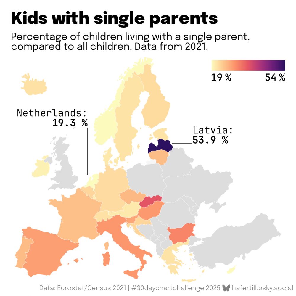
Maybe not perfect for visualization category "relationships", but I found this interesting: The percentage of kids with single parents varies a lot in Europe.
Data: ec.europa.eu/CensusHub/
Tools: Data prep in R (mainly dplyr), viz with @datawrapper.de.

Maybe not perfect for visualization category "relationships", but I found this interesting: The percentage of kids with single parents varies a lot in Europe.
Data: ec.europa.eu/CensusHub/
Tools: Data prep in R (mainly dplyr), viz with @datawrapper.de.
Not super insightful, but a nice way to brush up my statistical analysis skills.
Data: www.kaggle.com/datasets/sky...
Tools: R(base and ggplot), edited in Affinity Designer, and some help on the way from ChatGPT.

Not super insightful, but a nice way to brush up my statistical analysis skills.
Data: www.kaggle.com/datasets/sky...
Tools: R(base and ggplot), edited in Affinity Designer, and some help on the way from ChatGPT.
Data: www.ncei.noaa.gov/access/metad...
Tools: R(dplyr, zoo for rolling average, ggplot), edited in Affinity Designer.

Data: www.ncei.noaa.gov/access/metad...
Tools: R(dplyr, zoo for rolling average, ggplot), edited in Affinity Designer.
Data: World Prison Brief www.prisonstudies.org/research-pub...
Made with Tabula, Google Sheets and @datawrapper.de - interactive version: www.datawrapper.de/_/jxfwa/

Data: World Prison Brief www.prisonstudies.org/research-pub...
Made with Tabula, Google Sheets and @datawrapper.de - interactive version: www.datawrapper.de/_/jxfwa/
I tried my hand at a visualization video for the first time.
Data: trends.withgoogle.com/year-in-sear...
Tools: R(ggplot, ggridges, gganimate) and Da Vinci Resolve.
I tried my hand at a visualization video for the first time.
Data: trends.withgoogle.com/year-in-sear...
Tools: R(ggplot, ggridges, gganimate) and Da Vinci Resolve.
NFL teams spend a crazy amount of money on players' salaries - but being the biggest spender does not guarantee success. Unfortunately, being frugal doesn't either, as I've come to learn being a Steelers fan. 🫠
Data: www.spotrac.com/nfl/cash/

NFL teams spend a crazy amount of money on players' salaries - but being the biggest spender does not guarantee success. Unfortunately, being frugal doesn't either, as I've come to learn being a Steelers fan. 🫠
Data: www.spotrac.com/nfl/cash/
Data: www.kaggle.com/datasets/ash...
Tools: R(tidytext, ggplot) and Affinity Designer.

Data: www.kaggle.com/datasets/ash...
Tools: R(tidytext, ggplot) and Affinity Designer.
Data: www.forbes.com.au/news/billion... and www.kaggle.com/datasets/shu...
Tools: R (dplyr, ggplot), edited in Affinity Designer.

Data: www.forbes.com.au/news/billion... and www.kaggle.com/datasets/shu...
Tools: R (dplyr, ggplot), edited in Affinity Designer.
Maybe not the ideal way to display this data, but a fun challenge to mimic the original "rose chart".
Data: ourworldindata.org/emissions-by...
Made with R{owidapi, dplyr and ggplot2}, edited in Affinity Designer.

Maybe not the ideal way to display this data, but a fun challenge to mimic the original "rose chart".
Data: ourworldindata.org/emissions-by...
Made with R{owidapi, dplyr and ggplot2}, edited in Affinity Designer.
I used to think of borders as immovable. With what's happening in the world lately - not anymore. This chart shows that my original feeling was not so accurate to begin with.
Data: en.wikipedia.org/wiki/List_of...
Made in R, edited in Affinity Designer.

I used to think of borders as immovable. With what's happening in the world lately - not anymore. This chart shows that my original feeling was not so accurate to begin with.
Data: en.wikipedia.org/wiki/List_of...
Made in R, edited in Affinity Designer.
I'll admit it is a bit crowded, but nonetheless interesting (hopefully): The Bundesliga is very unequal in terms of market value, and teams like Mainz and Gladbach are performing better than market value might suggest.

I'll admit it is a bit crowded, but nonetheless interesting (hopefully): The Bundesliga is very unequal in terms of market value, and teams like Mainz and Gladbach are performing better than market value might suggest.
How does the sound of The Beatles change over time? Averages of Spotify indicators by album, I used the remastered versions for comparability.
Data: www.kaggle.com/datasets/art...
Data prep with Excel, chart made with Flourish and Photoshop.

How does the sound of The Beatles change over time? Averages of Spotify indicators by album, I used the remastered versions for comparability.
Data: www.kaggle.com/datasets/art...
Data prep with Excel, chart made with Flourish and Photoshop.

Day 1: Fractions.
Data: ourworldindata.org/grapher/shar...
Tools used: RStudio, main packages owidapi, dplyr, ggplot, then some editing in Affinity Designer.

Day 1: Fractions.
Data: ourworldindata.org/grapher/shar...
Tools used: RStudio, main packages owidapi, dplyr, ggplot, then some editing in Affinity Designer.

