


Data Design Dude
@datadesigner.bsky.social
DataViz Specialist 📊 Teaching Elegance & Excellence in Data Storytelling
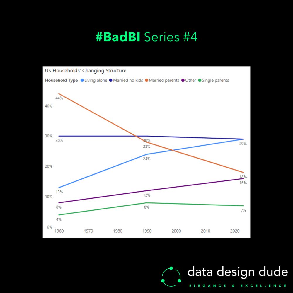
So remember this one and make your presentations and reports much better:
(𝗮𝗹𝗺𝗼𝘀𝘁 𝗮𝗹𝘄𝗮𝘆𝘀) 𝘂𝘀𝗲 𝗟𝗶𝗻𝗲 𝗰𝗵𝗮𝗿𝘁𝘀 𝘁𝗼 𝘀𝗵𝗼𝘄 𝘁𝗿𝗲𝗻𝗱𝘀 𝗼𝘃𝗲𝗿 𝗧𝗶𝗺𝗲 ⏳📈
(𝗮𝗹𝗺𝗼𝘀𝘁 𝗮𝗹𝘄𝗮𝘆𝘀) 𝘂𝘀𝗲 𝗟𝗶𝗻𝗲 𝗰𝗵𝗮𝗿𝘁𝘀 𝘁𝗼 𝘀𝗵𝗼𝘄 𝘁𝗿𝗲𝗻𝗱𝘀 𝗼𝘃𝗲𝗿 𝗧𝗶𝗺𝗲 ⏳📈
February 14, 2025 at 4:52 PM
So remember this one and make your presentations and reports much better:
(𝗮𝗹𝗺𝗼𝘀𝘁 𝗮𝗹𝘄𝗮𝘆𝘀) 𝘂𝘀𝗲 𝗟𝗶𝗻𝗲 𝗰𝗵𝗮𝗿𝘁𝘀 𝘁𝗼 𝘀𝗵𝗼𝘄 𝘁𝗿𝗲𝗻𝗱𝘀 𝗼𝘃𝗲𝗿 𝗧𝗶𝗺𝗲 ⏳📈
(𝗮𝗹𝗺𝗼𝘀𝘁 𝗮𝗹𝘄𝗮𝘆𝘀) 𝘂𝘀𝗲 𝗟𝗶𝗻𝗲 𝗰𝗵𝗮𝗿𝘁𝘀 𝘁𝗼 𝘀𝗵𝗼𝘄 𝘁𝗿𝗲𝗻𝗱𝘀 𝗼𝘃𝗲𝗿 𝗧𝗶𝗺𝗲 ⏳📈
These flaws aren’t exclusive to this particular chart; all stacked area charts have them.
Now look at the second chart I made (with data points for just three years) and see how each of the problems above go away.
Now look at the second chart I made (with data points for just three years) and see how each of the problems above go away.
February 14, 2025 at 4:51 PM
These flaws aren’t exclusive to this particular chart; all stacked area charts have them.
Now look at the second chart I made (with data points for just three years) and see how each of the problems above go away.
Now look at the second chart I made (with data points for just three years) and see how each of the problems above go away.
- We can’t see at what point a certain category overtook another.
- We can’t accurately compare the rate of change for a category in a certain period, against another category in the same period, or against itself/another in a different period.
I could go on.
- We can’t accurately compare the rate of change for a category in a certain period, against another category in the same period, or against itself/another in a different period.
I could go on.
February 14, 2025 at 4:50 PM
- We can’t see at what point a certain category overtook another.
- We can’t accurately compare the rate of change for a category in a certain period, against another category in the same period, or against itself/another in a different period.
I could go on.
- We can’t accurately compare the rate of change for a category in a certain period, against another category in the same period, or against itself/another in a different period.
I could go on.
- We can’t discern the value for any category at any point in time except the range’s start and end.
- We can’t tell the ranking of categories at any point in time except the first and last years… and even then, it’s not instantaneous for the first year.
- We can’t tell the ranking of categories at any point in time except the first and last years… and even then, it’s not instantaneous for the first year.
February 14, 2025 at 4:50 PM
- We can’t discern the value for any category at any point in time except the range’s start and end.
- We can’t tell the ranking of categories at any point in time except the first and last years… and even then, it’s not instantaneous for the first year.
- We can’t tell the ranking of categories at any point in time except the first and last years… and even then, it’s not instantaneous for the first year.
P.S. I dubbed the gesture an “𝘢𝘶𝘵𝘪𝘴𝘵𝘪𝘤 𝘴𝘩𝘶𝘳𝘪𝘬𝘦𝘯 𝘵𝘰𝘴𝘴” 🐱👤 [𝘵𝘳𝘢𝘥𝘦𝘮𝘢𝘳𝘬 𝘱𝘦𝘯𝘥𝘪𝘯𝘨 𝘭𝘰𝘭]
Regardless of if you thought the move was a NoT-C sAlo0t or not, I can guarantee you the world’s most minted doesn’t give 2 💩s… So let's not forget that bad press is good press! 💡
#BusinessIntelligence #Data #Analytics
Regardless of if you thought the move was a NoT-C sAlo0t or not, I can guarantee you the world’s most minted doesn’t give 2 💩s… So let's not forget that bad press is good press! 💡
#BusinessIntelligence #Data #Analytics
January 28, 2025 at 11:06 PM
P.S. I dubbed the gesture an “𝘢𝘶𝘵𝘪𝘴𝘵𝘪𝘤 𝘴𝘩𝘶𝘳𝘪𝘬𝘦𝘯 𝘵𝘰𝘴𝘴” 🐱👤 [𝘵𝘳𝘢𝘥𝘦𝘮𝘢𝘳𝘬 𝘱𝘦𝘯𝘥𝘪𝘯𝘨 𝘭𝘰𝘭]
Regardless of if you thought the move was a NoT-C sAlo0t or not, I can guarantee you the world’s most minted doesn’t give 2 💩s… So let's not forget that bad press is good press! 💡
#BusinessIntelligence #Data #Analytics
Regardless of if you thought the move was a NoT-C sAlo0t or not, I can guarantee you the world’s most minted doesn’t give 2 💩s… So let's not forget that bad press is good press! 💡
#BusinessIntelligence #Data #Analytics
I also reduced the 𝘀𝗮𝘁𝘂𝗿𝗮𝘁𝗶𝗼𝗻 of the red colour, so that it doesn’t take too much attention away from the overall visual.
Lastly, while the “part-to-whole” meaning is somewhat reduced by not using stacked bars, user's eyes no longer flit between the legend and chart to figure out the category. 👀
Lastly, while the “part-to-whole” meaning is somewhat reduced by not using stacked bars, user's eyes no longer flit between the legend and chart to figure out the category. 👀
January 28, 2025 at 11:05 PM
I also reduced the 𝘀𝗮𝘁𝘂𝗿𝗮𝘁𝗶𝗼𝗻 of the red colour, so that it doesn’t take too much attention away from the overall visual.
Lastly, while the “part-to-whole” meaning is somewhat reduced by not using stacked bars, user's eyes no longer flit between the legend and chart to figure out the category. 👀
Lastly, while the “part-to-whole” meaning is somewhat reduced by not using stacked bars, user's eyes no longer flit between the legend and chart to figure out the category. 👀
𝗣𝗿𝗼𝗯𝗹𝗲𝗺: The subconscious messaging of the colours is now correct, but it’s still quite hard to make out the blue ‘useful’ category when the difference is so much.
▶ 𝗩𝗲𝗿𝘀𝗶𝗼𝗻 𝟯
A simple horizontal Bar chart.
Now with the 𝘄𝗶𝗱𝗲𝗻𝗲𝗱 bars, even the very thin 1% one is more visible.
▶ 𝗩𝗲𝗿𝘀𝗶𝗼𝗻 𝟯
A simple horizontal Bar chart.
Now with the 𝘄𝗶𝗱𝗲𝗻𝗲𝗱 bars, even the very thin 1% one is more visible.
January 28, 2025 at 11:03 PM
𝗣𝗿𝗼𝗯𝗹𝗲𝗺: The subconscious messaging of the colours is now correct, but it’s still quite hard to make out the blue ‘useful’ category when the difference is so much.
▶ 𝗩𝗲𝗿𝘀𝗶𝗼𝗻 𝟯
A simple horizontal Bar chart.
Now with the 𝘄𝗶𝗱𝗲𝗻𝗲𝗱 bars, even the very thin 1% one is more visible.
▶ 𝗩𝗲𝗿𝘀𝗶𝗼𝗻 𝟯
A simple horizontal Bar chart.
Now with the 𝘄𝗶𝗱𝗲𝗻𝗲𝗱 bars, even the very thin 1% one is more visible.
𝗣𝗿𝗼𝗯𝗹𝗲𝗺: Blue and red respectively convey ‘good’ and ‘bad’ sentiment to us, but ‘not useful’ isn’t good and ‘useful’ isn’t bad.
▶ 𝗩𝗲𝗿𝘀𝗶𝗼𝗻 𝟮
The same 100% Stacked column chart, now with the colours reversed.
▶ 𝗩𝗲𝗿𝘀𝗶𝗼𝗻 𝟮
The same 100% Stacked column chart, now with the colours reversed.
January 28, 2025 at 11:03 PM
𝗣𝗿𝗼𝗯𝗹𝗲𝗺: Blue and red respectively convey ‘good’ and ‘bad’ sentiment to us, but ‘not useful’ isn’t good and ‘useful’ isn’t bad.
▶ 𝗩𝗲𝗿𝘀𝗶𝗼𝗻 𝟮
The same 100% Stacked column chart, now with the colours reversed.
▶ 𝗩𝗲𝗿𝘀𝗶𝗼𝗻 𝟮
The same 100% Stacked column chart, now with the colours reversed.
▶ 𝗩𝗲𝗿𝘀𝗶𝗼𝗻 𝟭
I used a simple 100% Stacked column chart to show the disparity between ‘useful’ and ‘not useful’ conversations regarding Elon…
(𝘐 𝘱𝘪𝘤𝘬𝘦𝘥 1% 𝘧𝘰𝘳 𝘵𝘩𝘦 ‘𝘶𝘴𝘦𝘧𝘶𝘭’ 𝘤𝘢𝘵𝘦𝘨𝘰𝘳𝘺 𝘵𝘰 𝘣𝘦 𝘢𝘣𝘭𝘦 𝘵𝘰 𝘴𝘩𝘰𝘸 𝘴𝘰𝘮𝘦𝘵𝘩𝘪𝘯𝘨, 𝘣𝘶𝘵 𝘐 𝘵𝘩𝘪𝘯𝘬 𝘪𝘵’𝘴 𝘳𝘦𝘢𝘭𝘭𝘺 0% 😂)
I used a simple 100% Stacked column chart to show the disparity between ‘useful’ and ‘not useful’ conversations regarding Elon…
(𝘐 𝘱𝘪𝘤𝘬𝘦𝘥 1% 𝘧𝘰𝘳 𝘵𝘩𝘦 ‘𝘶𝘴𝘦𝘧𝘶𝘭’ 𝘤𝘢𝘵𝘦𝘨𝘰𝘳𝘺 𝘵𝘰 𝘣𝘦 𝘢𝘣𝘭𝘦 𝘵𝘰 𝘴𝘩𝘰𝘸 𝘴𝘰𝘮𝘦𝘵𝘩𝘪𝘯𝘨, 𝘣𝘶𝘵 𝘐 𝘵𝘩𝘪𝘯𝘬 𝘪𝘵’𝘴 𝘳𝘦𝘢𝘭𝘭𝘺 0% 😂)
January 28, 2025 at 11:03 PM
▶ 𝗩𝗲𝗿𝘀𝗶𝗼𝗻 𝟭
I used a simple 100% Stacked column chart to show the disparity between ‘useful’ and ‘not useful’ conversations regarding Elon…
(𝘐 𝘱𝘪𝘤𝘬𝘦𝘥 1% 𝘧𝘰𝘳 𝘵𝘩𝘦 ‘𝘶𝘴𝘦𝘧𝘶𝘭’ 𝘤𝘢𝘵𝘦𝘨𝘰𝘳𝘺 𝘵𝘰 𝘣𝘦 𝘢𝘣𝘭𝘦 𝘵𝘰 𝘴𝘩𝘰𝘸 𝘴𝘰𝘮𝘦𝘵𝘩𝘪𝘯𝘨, 𝘣𝘶𝘵 𝘐 𝘵𝘩𝘪𝘯𝘬 𝘪𝘵’𝘴 𝘳𝘦𝘢𝘭𝘭𝘺 0% 😂)
I used a simple 100% Stacked column chart to show the disparity between ‘useful’ and ‘not useful’ conversations regarding Elon…
(𝘐 𝘱𝘪𝘤𝘬𝘦𝘥 1% 𝘧𝘰𝘳 𝘵𝘩𝘦 ‘𝘶𝘴𝘦𝘧𝘶𝘭’ 𝘤𝘢𝘵𝘦𝘨𝘰𝘳𝘺 𝘵𝘰 𝘣𝘦 𝘢𝘣𝘭𝘦 𝘵𝘰 𝘴𝘩𝘰𝘸 𝘴𝘰𝘮𝘦𝘵𝘩𝘪𝘯𝘨, 𝘣𝘶𝘵 𝘐 𝘵𝘩𝘪𝘯𝘬 𝘪𝘵’𝘴 𝘳𝘦𝘢𝘭𝘭𝘺 0% 😂)
I’ve found the discussions surrounding the recent controversy to be utterly 𝙪𝙨𝙚𝙡𝙚𝙨𝙨 time sinks, so I thought to make something 𝙪𝙨𝙚𝙛𝙪𝙡 out of them…
So I thought up a random hashtag#DataVisualization exercise to visualise it:
So I thought up a random hashtag#DataVisualization exercise to visualise it:
January 28, 2025 at 11:02 PM
I’ve found the discussions surrounding the recent controversy to be utterly 𝙪𝙨𝙚𝙡𝙚𝙨𝙨 time sinks, so I thought to make something 𝙪𝙨𝙚𝙛𝙪𝙡 out of them…
So I thought up a random hashtag#DataVisualization exercise to visualise it:
So I thought up a random hashtag#DataVisualization exercise to visualise it:
I have that too... I go out way less and sometimes when I'm out, I feel I should be hustling.
I call it "reverse fomo"... a friend/mentor yesterday told me it's just "ambition" :)
I call it "reverse fomo"... a friend/mentor yesterday told me it's just "ambition" :)
December 19, 2024 at 8:40 PM
I have that too... I go out way less and sometimes when I'm out, I feel I should be hustling.
I call it "reverse fomo"... a friend/mentor yesterday told me it's just "ambition" :)
I call it "reverse fomo"... a friend/mentor yesterday told me it's just "ambition" :)
no, bcuz their love is (almost) unconditional
December 18, 2024 at 11:36 PM
no, bcuz their love is (almost) unconditional
'YYYY-MM-DD' ? 😅
December 10, 2024 at 11:07 PM
'YYYY-MM-DD' ? 😅
preceding 𝘢𝘯𝘥 (lowercase) team, sorry ;)
December 10, 2024 at 1:29 AM
preceding 𝘢𝘯𝘥 (lowercase) team, sorry ;)
loooool. it was just the latest one)
just experimenting here with the least amount of effort possible)
just experimenting here with the least amount of effort possible)
December 10, 2024 at 1:28 AM
loooool. it was just the latest one)
just experimenting here with the least amount of effort possible)
just experimenting here with the least amount of effort possible)
So remember this principle and make your presentations and reports much more accurate instantaneously:
>> 𝗔𝗹𝘄𝗮𝘆𝘀 𝘀𝘁𝗮𝗿𝘁 𝘆𝗼𝘂𝗿 𝗮𝘅𝗶𝘀 𝘃𝗮𝗹𝘂𝗲𝘀 𝗳𝗿𝗼𝗺 𝟬 <<
>> 𝗔𝗹𝘄𝗮𝘆𝘀 𝘀𝘁𝗮𝗿𝘁 𝘆𝗼𝘂𝗿 𝗮𝘅𝗶𝘀 𝘃𝗮𝗹𝘂𝗲𝘀 𝗳𝗿𝗼𝗺 𝟬 <<
December 9, 2024 at 11:39 PM
So remember this principle and make your presentations and reports much more accurate instantaneously:
>> 𝗔𝗹𝘄𝗮𝘆𝘀 𝘀𝘁𝗮𝗿𝘁 𝘆𝗼𝘂𝗿 𝗮𝘅𝗶𝘀 𝘃𝗮𝗹𝘂𝗲𝘀 𝗳𝗿𝗼𝗺 𝟬 <<
>> 𝗔𝗹𝘄𝗮𝘆𝘀 𝘀𝘁𝗮𝗿𝘁 𝘆𝗼𝘂𝗿 𝗮𝘅𝗶𝘀 𝘃𝗮𝗹𝘂𝗲𝘀 𝗳𝗿𝗼𝗺 𝟬 <<
This is one of the most fundamental principles when designing any graph with a quantitative value axis, and as we can see here, forgetting it leads to communicating a very incorrect message to your reader.
December 9, 2024 at 11:39 PM
This is one of the most fundamental principles when designing any graph with a quantitative value axis, and as we can see here, forgetting it leads to communicating a very incorrect message to your reader.
In fact, by counting the grid squares you can see that this chart is telling our brains that March’s inflation was 𝟭𝟮𝘅 September’s inflation!! 😱
The reason for this is very simple… the Y-axis doesn’t start from zero.
The reason for this is very simple… the Y-axis doesn’t start from zero.
December 9, 2024 at 11:38 PM
In fact, by counting the grid squares you can see that this chart is telling our brains that March’s inflation was 𝟭𝟮𝘅 September’s inflation!! 😱
The reason for this is very simple… the Y-axis doesn’t start from zero.
The reason for this is very simple… the Y-axis doesn’t start from zero.
But actually, when you take a few moments to think about it, you realise that September’s value looks awfully close to 0, even though it’s not.
And while March’s value isn’t even double that of September’s (it’s 46% higher) it looks to be many times higher. 👀
And while March’s value isn’t even double that of September’s (it’s 46% higher) it looks to be many times higher. 👀
December 9, 2024 at 11:38 PM
But actually, when you take a few moments to think about it, you realise that September’s value looks awfully close to 0, even though it’s not.
And while March’s value isn’t even double that of September’s (it’s 46% higher) it looks to be many times higher. 👀
And while March’s value isn’t even double that of September’s (it’s 46% higher) it looks to be many times higher. 👀
The chart shows US inflation % from Oct '23 to Oct '24.
The Y-axis shows the inflation rate in intervals of 0.2%.
All looks good right? It’s simple and easy to read, and we can easily tell in a glance that March had the highest inflation (3.5%) and September had the lowest (2.4%).
The Y-axis shows the inflation rate in intervals of 0.2%.
All looks good right? It’s simple and easy to read, and we can easily tell in a glance that March had the highest inflation (3.5%) and September had the lowest (2.4%).
December 9, 2024 at 11:37 PM
The chart shows US inflation % from Oct '23 to Oct '24.
The Y-axis shows the inflation rate in intervals of 0.2%.
All looks good right? It’s simple and easy to read, and we can easily tell in a glance that March had the highest inflation (3.5%) and September had the lowest (2.4%).
The Y-axis shows the inflation rate in intervals of 0.2%.
All looks good right? It’s simple and easy to read, and we can easily tell in a glance that March had the highest inflation (3.5%) and September had the lowest (2.4%).