


@bleutrev.bsky.social
🕸️ For our final Observa-bite of the month we are adding radar charts (aka spider charts) to Observable Canvases. Check out radar charts, and all of our advanced chart types, available in canvases: buff.ly/l76pX6m
October 30, 2025 at 6:47 PM
😱 Horrified by the hours you've spent building dashboards that end up rotting in forgotten bookmarks? Observable Canvases simplify development, boost collaboration, & put interactive charts at your fingertips, so you can deliver better dashboards that stay alive for the long haul: buff.ly/43H8IKQ
October 10, 2025 at 1:24 AM
Are dashboards really dead? Thanks for the insights @allisonhorst.bsky.social
#dataviz #datavisualization #team-datafam
#dataviz #datavisualization #team-datafam
Despite claims that dashboards are dead, they remain a highly requested BI deliverable.
New features in Observable Canvases, like our streamlined viewer experience and control nodes, make dashboards easier to build and better to use, so they stay alive and well:
New features in Observable Canvases, like our streamlined viewer experience and control nodes, make dashboards easier to build and better to use, so they stay alive and well:

Building a better approach to dashboards in Observable Canvases
In Observable Canvases we’re building a new way to build dashboards that keeps your data workflow in one place, brings interactive charts to your fingertips, and consolidates collaboration to cut…
buff.ly
October 7, 2025 at 8:00 PM
Are dashboards really dead? Thanks for the insights @allisonhorst.bsky.social
#dataviz #datavisualization #team-datafam
#dataviz #datavisualization #team-datafam
Who said you can’t have your cake and eat it too… introducing fast tables by @mythmon.bsky.social
#dataviz #datavisualization #team-datafam
#dataviz #datavisualization #team-datafam
Slow-loading tables and overworked browsers can bog down analysis when you're exploring large datasets. In our new post, we explain how table virtualization in Observable Canvas keeps data work fast and fluid — even with big data, and when viewing complex, branching analyses: buff.ly/7cfqsQA
September 18, 2025 at 9:05 PM
Who said you can’t have your cake and eat it too… introducing fast tables by @mythmon.bsky.social
#dataviz #datavisualization #team-datafam
#dataviz #datavisualization #team-datafam
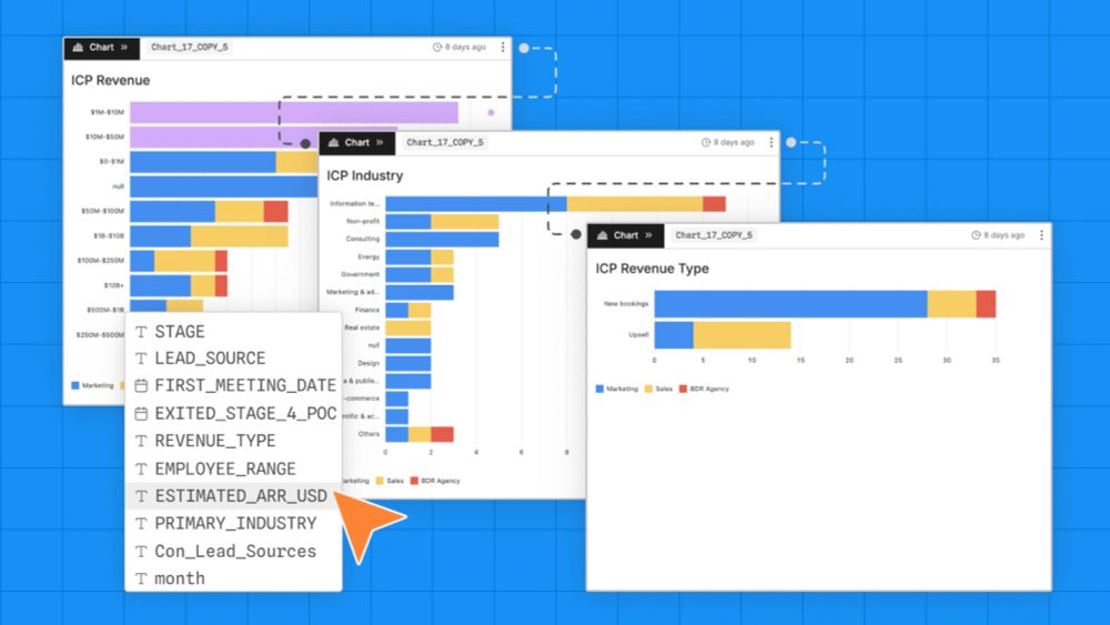
Bespoke charts in seconds...why not make several and pick the one that resonates the most. thanks @sethengelhard.com
#dataviz #datavisualization #team-datafam
#dataviz #datavisualization #team-datafam
Treemaps help you go beyond donut charts and stacked bars to visualize parts of a whole for hierarchical data. Learn how canvases put state-of-the-art, interactive charts like treemaps, Sankey diagrams, beeswarms, bump charts, and more at your fingertips: buff.ly/DaE8zgO
September 18, 2025 at 3:15 PM
Bespoke charts in seconds...why not make several and pick the one that resonates the most. thanks @sethengelhard.com
#dataviz #datavisualization #team-datafam
#dataviz #datavisualization #team-datafam
Reposted

Notebooks 2.0 is here! 📓🔮 Previewing today:
Notebook Kit, an open file format for notebooks with open-source tooling for generating static sites; and
Observable Desktop, a macOS desktop application for editing notebooks as local files, with a radical new approach to AI. observablehq.com/notebooks/2/
Observable Notebooks 2.0 Technology Preview | Observable
observablehq.com
July 29, 2025 at 2:38 PM
Notebooks 2.0 is here! 📓🔮 Previewing today:
Notebook Kit, an open file format for notebooks with open-source tooling for generating static sites; and
Observable Desktop, a macOS desktop application for editing notebooks as local files, with a radical new approach to AI. observablehq.com/notebooks/2/
Reposted

Big fan of @observablehq.com and since their preview release of Observable Notebooks 2.0 my team at Fora Health have integrated Notebook Kit into our app. Works really well so far. Quick demo ⬇️
screen.studio/share/TqvyfFbU
screen.studio/share/TqvyfFbU

Observable Notebooks 2.0 in Fora Health — Screen Studio
Observable Notebooks 2.0 in Fora Health — Created and shared with Screen Studio
screen.studio
September 9, 2025 at 2:28 PM
Big fan of @observablehq.com and since their preview release of Observable Notebooks 2.0 my team at Fora Health have integrated Notebook Kit into our app. Works really well so far. Quick demo ⬇️
screen.studio/share/TqvyfFbU
screen.studio/share/TqvyfFbU
For one of the most common operations in all of data wrangling, implementing UI-based data joins is anything but straightforward. Software engineer Tony Sullivan shares some unexpected challenges behind joins and how we handle them in Observable Canvases: buff.ly/4FRU9C9
September 4, 2025 at 8:27 PM
For one of the most common operations in all of data wrangling, implementing UI-based data joins is anything but straightforward. Software engineer Tony Sullivan shares some unexpected challenges behind joins and how we handle them in Observable Canvases: buff.ly/4FRU9C9
September 4, 2025 at 8:22 PM
Today’s new release of Observable Canvases includes embedded analytics, dashboards, editors/ viewers, version control, AI enhancements, additional bespoke chart types, and the flexibility to write SQL or JavaScript
#dataviz #datavisualization #team-datafam
#dataviz #datavisualization #team-datafam
📣 Today we’re announcing big updates in Observable Canvases. Learn about our growing suite of built-in, interactive charts (Sankey diagrams, arc maps, beeswarms + more), new embeds and dashboards for fast sharing, added Postgres and Databricks support, and more:

Observable Canvases: New chart types, dashboards, and easier ways to share
Our biggest release yet for Observable Canvases is here with new chart types, support for internal embedding, and dashboard creation.
buff.ly
August 26, 2025 at 7:04 PM
Today’s new release of Observable Canvases includes embedded analytics, dashboards, editors/ viewers, version control, AI enhancements, additional bespoke chart types, and the flexibility to write SQL or JavaScript
#dataviz #datavisualization #team-datafam
#dataviz #datavisualization #team-datafam
Grid cartograms trade realistic geospatial borders for geometric tiles that make small regions visible, and values more easily comparable. Read our new blog post for grid cartogram essentials, examples, pros/cons, and resources on how to build your own in Observable: buff.ly/HRj56yz

August 18, 2025 at 6:09 PM
Thank you Erinn for cultivating conditions to enable organic AI adoption
AI adoption doesn’t have to be top-down. At Observable, we’re supporting our team to explore and use AI tools in ways that work for them. The result? A culture where AI feels natural and useful, not forced.
👉 Learn how our team at Observable boosted AI adoption: buff.ly/t0J92IN
👉 Learn how our team at Observable boosted AI adoption: buff.ly/t0J92IN
August 13, 2025 at 9:39 PM
Thank you Erinn for cultivating conditions to enable organic AI adoption
Reposted

I've been playing with the new Observable Notebooks 2.0 over the past days and I'm amazed. While still a preview I think it's already a serious alternative to R or Jupyter notebooks. Love that it works locally now and that notebooks are just HTML files with vanilla JS observablehq.com/notebook-kit/
Observable Notebooks 2.0 Technology Preview | Observable
observablehq.com
August 2, 2025 at 10:26 AM
I've been playing with the new Observable Notebooks 2.0 over the past days and I'm amazed. While still a preview I think it's already a serious alternative to R or Jupyter notebooks. Love that it works locally now and that notebooks are just HTML files with vanilla JS observablehq.com/notebook-kit/
The wait is finally over, Notebooks 2.0! And that demo is mind blowing.
#dataviz #datavisualization #team-datafam
#dataviz #datavisualization #team-datafam
Notebooks 2.0 is here! 📓🔮 Previewing today:
Notebook Kit, an open file format for notebooks with open-source tooling for generating static sites; and
Observable Desktop, a macOS desktop application for editing notebooks as local files, with a radical new approach to AI. observablehq.com/notebooks/2/
Observable Notebooks 2.0 Technology Preview | Observable
observablehq.com
July 29, 2025 at 6:14 PM
The wait is finally over, Notebooks 2.0! And that demo is mind blowing.
#dataviz #datavisualization #team-datafam
#dataviz #datavisualization #team-datafam
Speaking with customers, I have been fascinated by the failed promise self-serve analytics.
In this post, I will explain the challenges and offer an alternative solution that actually works
#dataviz #datavisualization #team-datafam @observablehq.com
observablehq.com/blog/the-fai...
In this post, I will explain the challenges and offer an alternative solution that actually works
#dataviz #datavisualization #team-datafam @observablehq.com
observablehq.com/blog/the-fai...
Why has the promise of self-serve analytics failed?
There was so much hype around the promise of self-serve analytics: data-driven insights, efficiency gains and competitive advantage. In this post, we outline why self-service analytics has failed, and...
observablehq.com
July 23, 2025 at 2:36 PM
Speaking with customers, I have been fascinated by the failed promise self-serve analytics.
In this post, I will explain the challenges and offer an alternative solution that actually works
#dataviz #datavisualization #team-datafam @observablehq.com
observablehq.com/blog/the-fai...
In this post, I will explain the challenges and offer an alternative solution that actually works
#dataviz #datavisualization #team-datafam @observablehq.com
observablehq.com/blog/the-fai...
AI that is properly implemented and designed to operate intuitively—breaking down complex queries into clear, verifiable steps—has the potential to transform data analysis
#dataviz #datavisualization #team-datafam
#dataviz #datavisualization #team-datafam
AI in Observable Canvases is transparent, so you can boost your data analysis while maintaining confidence in the results. We expose the logic and code at each step for AI outputs that you can immediately verify, and more easily interpret. Learn how we’re doing AI differently:
Playing safely with fire: Building interpretable AI
AI in Observable Canvases supercharges your data analysis, while keeping you in the driver’s seat. Learn more in this blog post from our founder and co-CEO Mike Bostock.
buff.ly
July 15, 2025 at 7:38 PM
AI that is properly implemented and designed to operate intuitively—breaking down complex queries into clear, verifiable steps—has the potential to transform data analysis
#dataviz #datavisualization #team-datafam
#dataviz #datavisualization #team-datafam
The hardest part about reusing charts can be getting your data into the expected shape. Learn common data formats consumed by Plot & D3 — and how to transform your data to match — so you can quickly reuse thousands of stunning, interactive visualizations: buff.ly/rJaX6pT
June 26, 2025 at 9:30 PM
Histograms are incredibly useful, interpretable, and common in BI. But building histograms that work well out of the box — no matter the data — is trickier than it sounds. We share some of the challenges faced, and decisions made, when designing histograms for Observable Canvases:
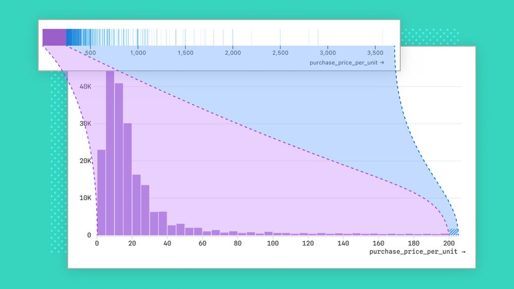
Designing better out-of-the-box histograms
Given how common histograms are in BI tools, you might think they’re easy to design. Think again. We share challenges we encountered, and how we handled them, while designing better out-of-the-box…
buff.ly
June 14, 2025 at 8:16 PM
Reposted

When working with big data for BI, data visualizations can be painfully slow to load. That stifles exploration and iteration, which means you might be missing out on business insights. In our new post, learn how we keep charts fast in Observable Canvases:
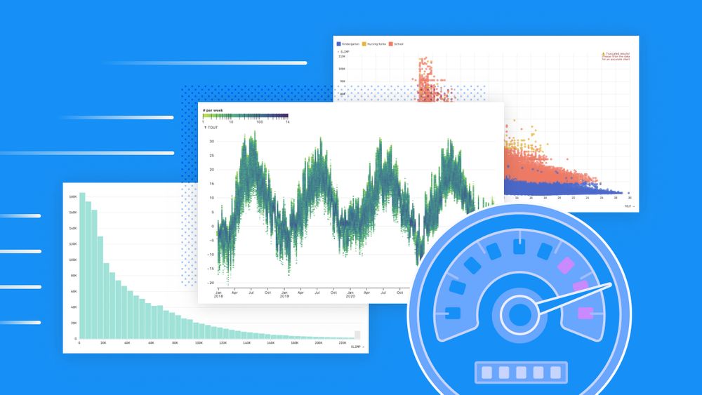
Big data, fast data visualizations
In Observable Canvases, charts representing millions of records are generated almost instantaneously. Learn how we keep data visualizations fast by limiting data returned by SQL queries and giving…
buff.ly
June 11, 2025 at 4:45 PM
When working with big data for BI, data visualizations can be painfully slow to load. That stifles exploration and iteration, which means you might be missing out on business insights. In our new post, learn how we keep charts fast in Observable Canvases: