


Alasdair Clift
@agent605.bsky.social
hey look I’m on the better twitter
21 year old depressed and very queer engineering student and train guy. reputation stan. bi/pan 🏳️🌈 (taken). can be suggestive. he/him. definitely not @neroderg.bsky.social >:3c🐉
My carrd: https://agent605.carrd.c
21 year old depressed and very queer engineering student and train guy. reputation stan. bi/pan 🏳️🌈 (taken). can be suggestive. he/him. definitely not @neroderg.bsky.social >:3c🐉
My carrd: https://agent605.carrd.c
Independent Alliance (Kent): 4/10
Looks more like a local village football club than a political party, but that sort of works for these local parties. The tree is overly detailed though and the signpost just looks weird.
Looks more like a local village football club than a political party, but that sort of works for these local parties. The tree is overly detailed though and the signpost just looks weird.

May 5, 2025 at 12:08 PM
Independent Alliance (Kent): 4/10
Looks more like a local village football club than a political party, but that sort of works for these local parties. The tree is overly detailed though and the signpost just looks weird.
Looks more like a local village football club than a political party, but that sort of works for these local parties. The tree is overly detailed though and the signpost just looks weird.
Scottish Socialist Party: 3/10
Did someone make this in word art? The font looks dated and the star just looks a bit crap. Looks more like the logo of a continuation party of a former Eastern European communist party that collapsed upon democratic elections being held
Did someone make this in word art? The font looks dated and the star just looks a bit crap. Looks more like the logo of a continuation party of a former Eastern European communist party that collapsed upon democratic elections being held

May 5, 2025 at 11:52 AM
Scottish Socialist Party: 3/10
Did someone make this in word art? The font looks dated and the star just looks a bit crap. Looks more like the logo of a continuation party of a former Eastern European communist party that collapsed upon democratic elections being held
Did someone make this in word art? The font looks dated and the star just looks a bit crap. Looks more like the logo of a continuation party of a former Eastern European communist party that collapsed upon democratic elections being held
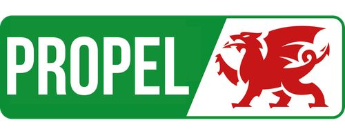
Propel: 7/10
Welsh dragon goes hard as always. Colours are good, font is nice. However the diagonal cuts a little too close to the wording and the dragon for my liking. Plus it loses points for not really fitting on a ballot paper
Welsh dragon goes hard as always. Colours are good, font is nice. However the diagonal cuts a little too close to the wording and the dragon for my liking. Plus it loses points for not really fitting on a ballot paper
May 5, 2025 at 11:40 AM
Propel: 7/10
Welsh dragon goes hard as always. Colours are good, font is nice. However the diagonal cuts a little too close to the wording and the dragon for my liking. Plus it loses points for not really fitting on a ballot paper
Welsh dragon goes hard as always. Colours are good, font is nice. However the diagonal cuts a little too close to the wording and the dragon for my liking. Plus it loses points for not really fitting on a ballot paper
Kingston Independent Residents Group: 5/10
Nice colours, font isn’t too bad. But what the fuck is going on with that hand 😭
Nice colours, font isn’t too bad. But what the fuck is going on with that hand 😭

May 5, 2025 at 11:33 AM
Kingston Independent Residents Group: 5/10
Nice colours, font isn’t too bad. But what the fuck is going on with that hand 😭
Nice colours, font isn’t too bad. But what the fuck is going on with that hand 😭
Workers Revolutionary Party: 2/10
They just typed out their name, then made the “W”, “R”, and “P” a slightly different shade. Perhaps the lowest effort yet. At least it has colour i guess 😒
They just typed out their name, then made the “W”, “R”, and “P” a slightly different shade. Perhaps the lowest effort yet. At least it has colour i guess 😒

May 4, 2025 at 10:42 AM
Workers Revolutionary Party: 2/10
They just typed out their name, then made the “W”, “R”, and “P” a slightly different shade. Perhaps the lowest effort yet. At least it has colour i guess 😒
They just typed out their name, then made the “W”, “R”, and “P” a slightly different shade. Perhaps the lowest effort yet. At least it has colour i guess 😒
Women’s Equality Party: 8/10
This one looks great, the big W and the more hidden E look cool, and the font is soooo nice. Suffragette colours are an extra bonus. Another one sadly consigned to history though, they dissolved last November ☹️
This one looks great, the big W and the more hidden E look cool, and the font is soooo nice. Suffragette colours are an extra bonus. Another one sadly consigned to history though, they dissolved last November ☹️

May 4, 2025 at 10:36 AM
Women’s Equality Party: 8/10
This one looks great, the big W and the more hidden E look cool, and the font is soooo nice. Suffragette colours are an extra bonus. Another one sadly consigned to history though, they dissolved last November ☹️
This one looks great, the big W and the more hidden E look cool, and the font is soooo nice. Suffragette colours are an extra bonus. Another one sadly consigned to history though, they dissolved last November ☹️
Animal Welfare Party: 4/10
It’s not too bad, but the middle looks more like a second A rather than a W. Plus, the font at the bottom does not match at all
It’s not too bad, but the middle looks more like a second A rather than a W. Plus, the font at the bottom does not match at all

May 4, 2025 at 10:25 AM
Animal Welfare Party: 4/10
It’s not too bad, but the middle looks more like a second A rather than a W. Plus, the font at the bottom does not match at all
It’s not too bad, but the middle looks more like a second A rather than a W. Plus, the font at the bottom does not match at all
Abolish the Welsh Assembly Party: 3/10
The font is alright, if a little silly, but that logo is boring af. It just looks meaningless, like they oppose the existence of squares. Still, at least it’s the right colour for them
The font is alright, if a little silly, but that logo is boring af. It just looks meaningless, like they oppose the existence of squares. Still, at least it’s the right colour for them

May 4, 2025 at 10:23 AM
Abolish the Welsh Assembly Party: 3/10
The font is alright, if a little silly, but that logo is boring af. It just looks meaningless, like they oppose the existence of squares. Still, at least it’s the right colour for them
The font is alright, if a little silly, but that logo is boring af. It just looks meaningless, like they oppose the existence of squares. Still, at least it’s the right colour for them
English Constitution Party: 2/10
What - no colour??? It literally has the St George’s flag, at least make that red. Plus there’s a big slogan around the outside. Pretty low effort. The shield is a nice shape, though, which is why it’s not a 1/10
What - no colour??? It literally has the St George’s flag, at least make that red. Plus there’s a big slogan around the outside. Pretty low effort. The shield is a nice shape, though, which is why it’s not a 1/10

May 4, 2025 at 10:21 AM
English Constitution Party: 2/10
What - no colour??? It literally has the St George’s flag, at least make that red. Plus there’s a big slogan around the outside. Pretty low effort. The shield is a nice shape, though, which is why it’s not a 1/10
What - no colour??? It literally has the St George’s flag, at least make that red. Plus there’s a big slogan around the outside. Pretty low effort. The shield is a nice shape, though, which is why it’s not a 1/10
The North East Party: 1/10
This is just their name (written twice for some reason), with a random photo of the Angel of the North. They could have *at least* used an icon of the Angel of the North. The fact they didn’t bother is not just bad, it’s offensive to my eyes
This is just their name (written twice for some reason), with a random photo of the Angel of the North. They could have *at least* used an icon of the Angel of the North. The fact they didn’t bother is not just bad, it’s offensive to my eyes

May 3, 2025 at 8:55 PM
The North East Party: 1/10
This is just their name (written twice for some reason), with a random photo of the Angel of the North. They could have *at least* used an icon of the Angel of the North. The fact they didn’t bother is not just bad, it’s offensive to my eyes
This is just their name (written twice for some reason), with a random photo of the Angel of the North. They could have *at least* used an icon of the Angel of the North. The fact they didn’t bother is not just bad, it’s offensive to my eyes
Alliance for Democracy & Freedom: 4/10
I mean, it does the job I guess. Just a bit boring tbh, and the randomly-placed family just seem like a bad attempt at copying the Scottish Family Party. If anything it looks more like a weird evangelical religious organisation. Not great
I mean, it does the job I guess. Just a bit boring tbh, and the randomly-placed family just seem like a bad attempt at copying the Scottish Family Party. If anything it looks more like a weird evangelical religious organisation. Not great

May 3, 2025 at 8:55 PM
Alliance for Democracy & Freedom: 4/10
I mean, it does the job I guess. Just a bit boring tbh, and the randomly-placed family just seem like a bad attempt at copying the Scottish Family Party. If anything it looks more like a weird evangelical religious organisation. Not great
I mean, it does the job I guess. Just a bit boring tbh, and the randomly-placed family just seem like a bad attempt at copying the Scottish Family Party. If anything it looks more like a weird evangelical religious organisation. Not great
True & Fair Party: 5/10
It looks modern at least, but the spiral of colours just looks messy and doesn’t give the party much identity. Plus, there’s a slogan on it. STOP PUTTING SLOGANS ON YOUR LOGO. Overall though, could be a lot worse, but needs to be a lot better
It looks modern at least, but the spiral of colours just looks messy and doesn’t give the party much identity. Plus, there’s a slogan on it. STOP PUTTING SLOGANS ON YOUR LOGO. Overall though, could be a lot worse, but needs to be a lot better

May 3, 2025 at 8:54 PM
True & Fair Party: 5/10
It looks modern at least, but the spiral of colours just looks messy and doesn’t give the party much identity. Plus, there’s a slogan on it. STOP PUTTING SLOGANS ON YOUR LOGO. Overall though, could be a lot worse, but needs to be a lot better
It looks modern at least, but the spiral of colours just looks messy and doesn’t give the party much identity. Plus, there’s a slogan on it. STOP PUTTING SLOGANS ON YOUR LOGO. Overall though, could be a lot worse, but needs to be a lot better
British Democrats: 2/10
Why is the Britannia so close in colour to the Union Jack? The Union Jack is already a busy enough design as it is, putting stuff on top of it doesn’t work. Plus, the font looks basic, the text is clearly an afterthought.
Why is the Britannia so close in colour to the Union Jack? The Union Jack is already a busy enough design as it is, putting stuff on top of it doesn’t work. Plus, the font looks basic, the text is clearly an afterthought.

May 3, 2025 at 8:53 PM
British Democrats: 2/10
Why is the Britannia so close in colour to the Union Jack? The Union Jack is already a busy enough design as it is, putting stuff on top of it doesn’t work. Plus, the font looks basic, the text is clearly an afterthought.
Why is the Britannia so close in colour to the Union Jack? The Union Jack is already a busy enough design as it is, putting stuff on top of it doesn’t work. Plus, the font looks basic, the text is clearly an afterthought.
South Devon Alliance: 7/10
Bit boring, but it works. Kinda looks like a green and black Pepsi logo. Text seems a bit random though, and is a bit small. Overall though, not bad
Bit boring, but it works. Kinda looks like a green and black Pepsi logo. Text seems a bit random though, and is a bit small. Overall though, not bad

May 3, 2025 at 8:52 PM
South Devon Alliance: 7/10
Bit boring, but it works. Kinda looks like a green and black Pepsi logo. Text seems a bit random though, and is a bit small. Overall though, not bad
Bit boring, but it works. Kinda looks like a green and black Pepsi logo. Text seems a bit random though, and is a bit small. Overall though, not bad
Climate Party: 6/10
It’s clean and modern. The font being in italics looks a bit silly though, and the logo is a bit too abstract for my liking. Like other green parties, looks a bit too much like an energy company
It’s clean and modern. The font being in italics looks a bit silly though, and the logo is a bit too abstract for my liking. Like other green parties, looks a bit too much like an energy company

May 3, 2025 at 8:52 PM
Climate Party: 6/10
It’s clean and modern. The font being in italics looks a bit silly though, and the logo is a bit too abstract for my liking. Like other green parties, looks a bit too much like an energy company
It’s clean and modern. The font being in italics looks a bit silly though, and the logo is a bit too abstract for my liking. Like other green parties, looks a bit too much like an energy company
Independent Oxford Alliance: 5/10
The handshake is basic af, but at least it’s done well. Colours are nice, if a bit too similar to UKIPs. The font of the text isn’t too bad, but the whole layout looks a bit silly and is hard to read.
The handshake is basic af, but at least it’s done well. Colours are nice, if a bit too similar to UKIPs. The font of the text isn’t too bad, but the whole layout looks a bit silly and is hard to read.

May 3, 2025 at 8:51 PM
Independent Oxford Alliance: 5/10
The handshake is basic af, but at least it’s done well. Colours are nice, if a bit too similar to UKIPs. The font of the text isn’t too bad, but the whole layout looks a bit silly and is hard to read.
The handshake is basic af, but at least it’s done well. Colours are nice, if a bit too similar to UKIPs. The font of the text isn’t too bad, but the whole layout looks a bit silly and is hard to read.
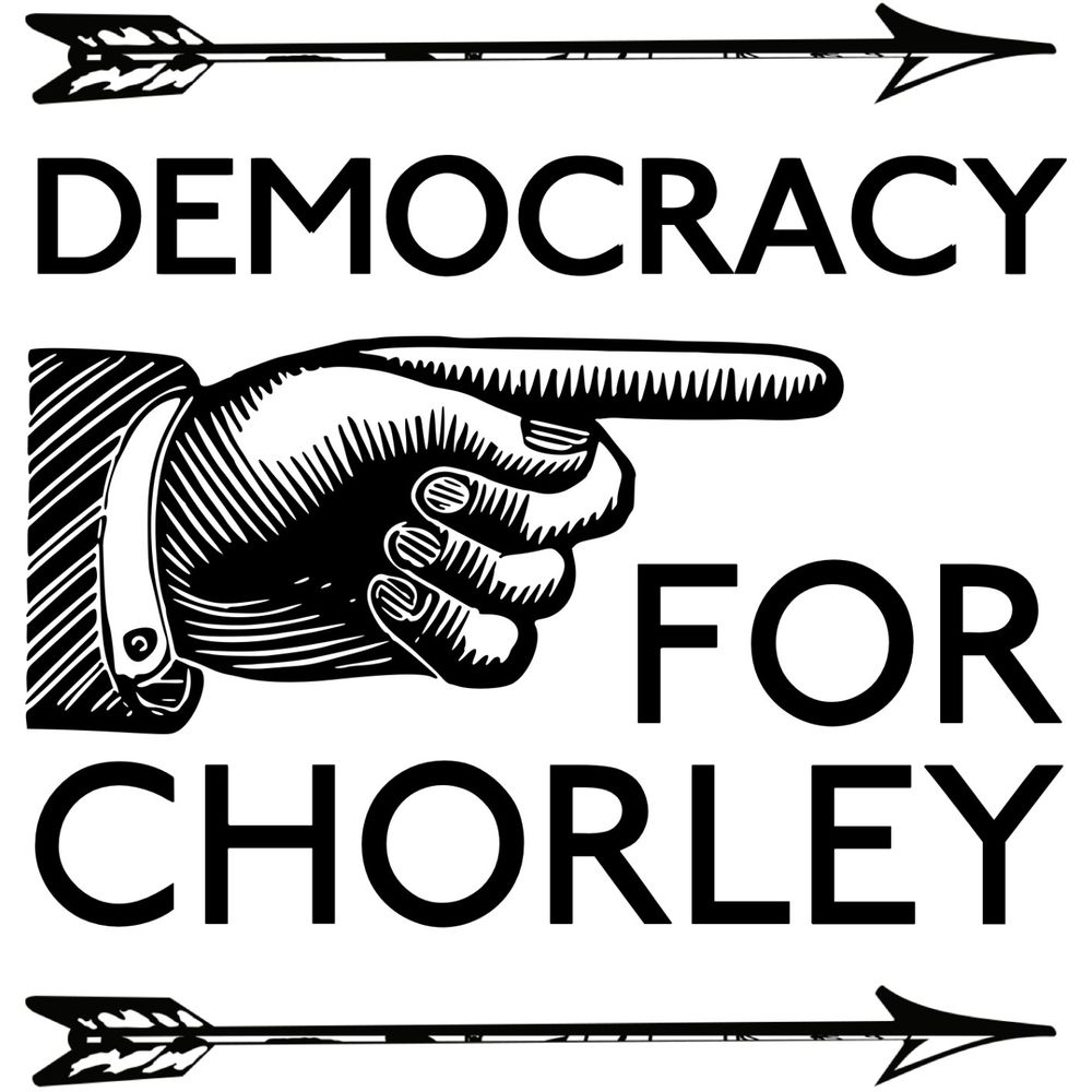
Democracy for Chorley: 8/10
Old fashioned, but in a damn good way. A rare example of a logo that does better without colour. It’s perhaps just a little busy, but still good. However, this logo is sadly consigned to history, as the party de-registered on the 24th of July 2024 ☹️
Old fashioned, but in a damn good way. A rare example of a logo that does better without colour. It’s perhaps just a little busy, but still good. However, this logo is sadly consigned to history, as the party de-registered on the 24th of July 2024 ☹️
May 3, 2025 at 8:51 PM
Democracy for Chorley: 8/10
Old fashioned, but in a damn good way. A rare example of a logo that does better without colour. It’s perhaps just a little busy, but still good. However, this logo is sadly consigned to history, as the party de-registered on the 24th of July 2024 ☹️
Old fashioned, but in a damn good way. A rare example of a logo that does better without colour. It’s perhaps just a little busy, but still good. However, this logo is sadly consigned to history, as the party de-registered on the 24th of July 2024 ☹️
Communist Party of Britain: 5/10
Hammer and Sickle ofc, and it looks awesome. The font is a nice match, too. But the yellow wavy flag looks weird, the logo is too flag to make it work. Plus they should REALLY reconsider abbreviating themselves as “CP” ffs
Hammer and Sickle ofc, and it looks awesome. The font is a nice match, too. But the yellow wavy flag looks weird, the logo is too flag to make it work. Plus they should REALLY reconsider abbreviating themselves as “CP” ffs

May 3, 2025 at 8:50 PM
Communist Party of Britain: 5/10
Hammer and Sickle ofc, and it looks awesome. The font is a nice match, too. But the yellow wavy flag looks weird, the logo is too flag to make it work. Plus they should REALLY reconsider abbreviating themselves as “CP” ffs
Hammer and Sickle ofc, and it looks awesome. The font is a nice match, too. But the yellow wavy flag looks weird, the logo is too flag to make it work. Plus they should REALLY reconsider abbreviating themselves as “CP” ffs
Hampshire Independents: 4/10
The arrows are okay, but I see a massive missed opportunity to move the red arrow to the right, to create a “H” for Hampshire. The font for “Independents” looks good, but “Hampshire” was obviously just tacked on there. It doesn’t even line up!
The arrows are okay, but I see a massive missed opportunity to move the red arrow to the right, to create a “H” for Hampshire. The font for “Independents” looks good, but “Hampshire” was obviously just tacked on there. It doesn’t even line up!

May 3, 2025 at 8:49 PM
Hampshire Independents: 4/10
The arrows are okay, but I see a massive missed opportunity to move the red arrow to the right, to create a “H” for Hampshire. The font for “Independents” looks good, but “Hampshire” was obviously just tacked on there. It doesn’t even line up!
The arrows are okay, but I see a massive missed opportunity to move the red arrow to the right, to create a “H” for Hampshire. The font for “Independents” looks good, but “Hampshire” was obviously just tacked on there. It doesn’t even line up!
Swale Independents: 3/10
The font for the “Si” looks a bit outdated, but not too bad. The outer ring though looks dumb, not just with their name at the top, but a SLOGAN too at the bottom. Ugh
And yes, this is the highest resolution version I could find
The font for the “Si” looks a bit outdated, but not too bad. The outer ring though looks dumb, not just with their name at the top, but a SLOGAN too at the bottom. Ugh
And yes, this is the highest resolution version I could find

May 3, 2025 at 8:49 PM
Swale Independents: 3/10
The font for the “Si” looks a bit outdated, but not too bad. The outer ring though looks dumb, not just with their name at the top, but a SLOGAN too at the bottom. Ugh
And yes, this is the highest resolution version I could find
The font for the “Si” looks a bit outdated, but not too bad. The outer ring though looks dumb, not just with their name at the top, but a SLOGAN too at the bottom. Ugh
And yes, this is the highest resolution version I could find
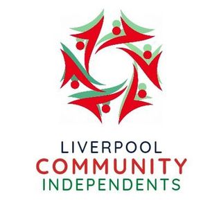
Liverpool Community Independents: 6/10
The fonts are nice, and colours are too. Spiral thing looks cool, but the green drop shadow kinda ruins it unfortunately. If they found a different way to incorporate the green it would be wayyy better
The fonts are nice, and colours are too. Spiral thing looks cool, but the green drop shadow kinda ruins it unfortunately. If they found a different way to incorporate the green it would be wayyy better
May 3, 2025 at 8:48 PM
Liverpool Community Independents: 6/10
The fonts are nice, and colours are too. Spiral thing looks cool, but the green drop shadow kinda ruins it unfortunately. If they found a different way to incorporate the green it would be wayyy better
The fonts are nice, and colours are too. Spiral thing looks cool, but the green drop shadow kinda ruins it unfortunately. If they found a different way to incorporate the green it would be wayyy better
Socialist Labour Party: 3/10
This looks like it’s from the 1960s, not 2024. Also the globe looks weird, even more weird when you realise ITS MISSING THE UK. THE COUNTRY THEY OPERATE IN. Also looks a bit too much like the old Starbucks logo.
This looks like it’s from the 1960s, not 2024. Also the globe looks weird, even more weird when you realise ITS MISSING THE UK. THE COUNTRY THEY OPERATE IN. Also looks a bit too much like the old Starbucks logo.

May 3, 2025 at 8:48 PM
Socialist Labour Party: 3/10
This looks like it’s from the 1960s, not 2024. Also the globe looks weird, even more weird when you realise ITS MISSING THE UK. THE COUNTRY THEY OPERATE IN. Also looks a bit too much like the old Starbucks logo.
This looks like it’s from the 1960s, not 2024. Also the globe looks weird, even more weird when you realise ITS MISSING THE UK. THE COUNTRY THEY OPERATE IN. Also looks a bit too much like the old Starbucks logo.
One Leicester: 6/10
Nice iconography, if a little basic. Font isn’t too bad either. Though it *really* could do with some colour. It’s also another one that looks like it could be a startup company, not a political party
Nice iconography, if a little basic. Font isn’t too bad either. Though it *really* could do with some colour. It’s also another one that looks like it could be a startup company, not a political party

May 3, 2025 at 8:47 PM
One Leicester: 6/10
Nice iconography, if a little basic. Font isn’t too bad either. Though it *really* could do with some colour. It’s also another one that looks like it could be a startup company, not a political party
Nice iconography, if a little basic. Font isn’t too bad either. Though it *really* could do with some colour. It’s also another one that looks like it could be a startup company, not a political party
Lincolnshire Independents: 4/10
Another logo out of 2004, the fonts look old and tired, and THERES ANOTHER BLOODY SLOGAN ON IT >:(. Still, the flag is nice, but then again that isn’t really thanks to them
Another logo out of 2004, the fonts look old and tired, and THERES ANOTHER BLOODY SLOGAN ON IT >:(. Still, the flag is nice, but then again that isn’t really thanks to them

May 3, 2025 at 8:47 PM
Lincolnshire Independents: 4/10
Another logo out of 2004, the fonts look old and tired, and THERES ANOTHER BLOODY SLOGAN ON IT >:(. Still, the flag is nice, but then again that isn’t really thanks to them
Another logo out of 2004, the fonts look old and tired, and THERES ANOTHER BLOODY SLOGAN ON IT >:(. Still, the flag is nice, but then again that isn’t really thanks to them
Party of Women: 3/10
The roses look nice, if a little overly-intricate. The colours aren’t bad, but would be better integrated into the logo. The font is okay too, but why isn’t it centred????? It immediately ruins this otherwise alright logo
The roses look nice, if a little overly-intricate. The colours aren’t bad, but would be better integrated into the logo. The font is okay too, but why isn’t it centred????? It immediately ruins this otherwise alright logo

May 3, 2025 at 8:46 PM
Party of Women: 3/10
The roses look nice, if a little overly-intricate. The colours aren’t bad, but would be better integrated into the logo. The font is okay too, but why isn’t it centred????? It immediately ruins this otherwise alright logo
The roses look nice, if a little overly-intricate. The colours aren’t bad, but would be better integrated into the logo. The font is okay too, but why isn’t it centred????? It immediately ruins this otherwise alright logo