


Reposted by Typotheque

For the Berlin conference, Fontstand offers a limited number of student tickets. Some attendees choose to pay more than the ticket price, and that extra money goes directly toward lowering the cost for students. There’s no promise, this only works if people who can afford more choose to contribute.🙏

January 15, 2026 at 4:15 PM
For the Berlin conference, Fontstand offers a limited number of student tickets. Some attendees choose to pay more than the ticket price, and that extra money goes directly toward lowering the cost for students. There’s no promise, this only works if people who can afford more choose to contribute.🙏
Who is coming to Berlin in April for the @fontstand.com conference?
The sixth Fontstand Conference is now open for registration!
Join us in Berlin, 🇩🇪 April 10-11, for the annual get-together of people interested in all aspects of type and typography.
#fontstandcon2026
fontstandcon2026.eventbrite.com
Join us in Berlin, 🇩🇪 April 10-11, for the annual get-together of people interested in all aspects of type and typography.
#fontstandcon2026
fontstandcon2026.eventbrite.com

January 14, 2026 at 6:16 PM
Who is coming to Berlin in April for the @fontstand.com conference?
As every year, we’re ending the year with a short overview of what happened at Typotheque. 2025 was busy: we released new typefaces, published new research, and spent a fair amount of time lecturing and presenting our work on three continents. www.typotheque.com/blog/2025-ou...

Typotheque: 2025: Our Year in Review
As every year, we’re ending the year with a short overview of what happened at Typotheque. 2025 was busy: we released new typefaces, published new research, and spent a fair amount of time lecturing a...
www.typotheque.com
January 1, 2026 at 6:11 AM
As every year, we’re ending the year with a short overview of what happened at Typotheque. 2025 was busy: we released new typefaces, published new research, and spent a fair amount of time lecturing and presenting our work on three continents. www.typotheque.com/blog/2025-ou...
Reposted by Typotheque

This season, I am fundraising for a program called Ready to Revitalize: a unique course run through @e-l-p.bsky.social for grassroots #language champions around the world.
It only costs $500 to sponsor a participant. Help us support language revitalization! #langsky
givebutter.com/elp2025/chas...
It only costs $500 to sponsor a participant. Help us support language revitalization! #langsky
givebutter.com/elp2025/chas...

Raise to Revitalize
Support Global Indigenous Language Revitalization
givebutter.com
December 3, 2025 at 11:22 PM
This season, I am fundraising for a program called Ready to Revitalize: a unique course run through @e-l-p.bsky.social for grassroots #language champions around the world.
It only costs $500 to sponsor a participant. Help us support language revitalization! #langsky
givebutter.com/elp2025/chas...
It only costs $500 to sponsor a participant. Help us support language revitalization! #langsky
givebutter.com/elp2025/chas...
This Black Friday week, (just as we do every year) 100% of all our revenue will go to support Doctor Without Borders. They provide medical care in places where it’s desperately needed. If you choose to buy something, you’re helping them do that work. Thank you. www.msf.org/donate
November 26, 2025 at 1:52 PM
This Black Friday week, (just as we do every year) 100% of all our revenue will go to support Doctor Without Borders. They provide medical care in places where it’s desperately needed. If you choose to buy something, you’re helping them do that work. Thank you. www.msf.org/donate
It seems to be surprisingly hard to find a solid A3 B&W laser printer. HP models have been discontinued here in the Netherlands. Currently looking at the Kyocera ECOSYS P4140dn. Anyone has first hand experience with it?
November 18, 2025 at 10:01 AM
It seems to be surprisingly hard to find a solid A3 B&W laser printer. HP models have been discontinued here in the Netherlands. Currently looking at the Kyocera ECOSYS P4140dn. Anyone has first hand experience with it?
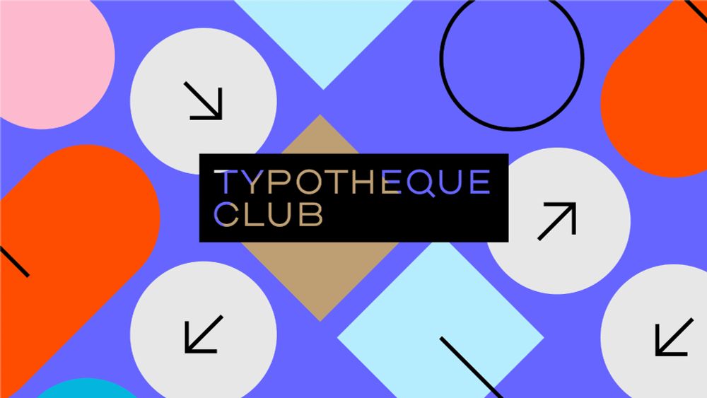
At 8pm (Amsterdam time) today, type designer Chris Skillern, a Cherokee Nation citizen, will discuss Cherokee script development and his type design research. Join the Typotheque Club for free to join this online talk. www.typotheque.com/club

November 17, 2025 at 4:36 PM
At 8pm (Amsterdam time) today, type designer Chris Skillern, a Cherokee Nation citizen, will discuss Cherokee script development and his type design research. Join the Typotheque Club for free to join this online talk. www.typotheque.com/club
Join us on Monday 17 November at 8pm for a 60-minute online talk. Type designer Chris Skillern, a Cherokee Nation citizen, will discuss the Typotheque Cherokee project, which is the culmination of over two years of in-depth work and research. Join the club for free. www.typotheque.com/club

Typotheque: Typotheque Club
Typotheque type foundry, get unique, high quality fonts for print and screens directly from the designers. We also create custom (bespoke) fonts for most world's languages.
www.typotheque.com
November 10, 2025 at 6:04 PM
Join us on Monday 17 November at 8pm for a 60-minute online talk. Type designer Chris Skillern, a Cherokee Nation citizen, will discuss the Typotheque Cherokee project, which is the culmination of over two years of in-depth work and research. Join the club for free. www.typotheque.com/club
Reposted by Typotheque
The Donald Knuth and Charles Bigelow Type Design Incubator invites students—especially from Digitally Disadvantaged Language communities—to explore typography in a supportive online program. Successful Applicants receive 100% Scholarship coverage! Learn more: kbitype.org @stanfordsilicon.bsky.social

October 28, 2025 at 3:30 PM
The Donald Knuth and Charles Bigelow Type Design Incubator invites students—especially from Digitally Disadvantaged Language communities—to explore typography in a supportive online program. Successful Applicants receive 100% Scholarship coverage! Learn more: kbitype.org @stanfordsilicon.bsky.social
Reposted by Typotheque
Club Lithographer from DJR caught Katerina Grushka’s eye, thanks to its notable contrast, unusual angle, and long, liquid-like serifs. The typeface stands out as a singular, expressive italic and you can read her review of it on Fontstand News, here: news.fontstand.com/font-reviews...


October 28, 2025 at 3:57 PM
Club Lithographer from DJR caught Katerina Grushka’s eye, thanks to its notable contrast, unusual angle, and long, liquid-like serifs. The typeface stands out as a singular, expressive italic and you can read her review of it on Fontstand News, here: news.fontstand.com/font-reviews...
People perceive thickness of letters very individually, and that’s why we are conducting Font Weight Survey to understand the regional preferences of font weight. Could we ask you for 10 min of your time? The findings will be published publicly once we have some results.
tptq.com/weight
tptq.com/weight

October 5, 2025 at 4:11 PM
People perceive thickness of letters very individually, and that’s why we are conducting Font Weight Survey to understand the regional preferences of font weight. Could we ask you for 10 min of your time? The findings will be published publicly once we have some results.
tptq.com/weight
tptq.com/weight
Reposted by Typotheque
Thrilled to be at WAVES 2025, the Global Indigenous Languages Summit by @ocil-ila.bsky.social to share the work of the Indigenous North American Type project @typotheque.com
Come visit our booth — the exhibit hall floor 3 & come to our collab session at 2 PM today in room 206! #WAVES2025 #langsky
Come visit our booth — the exhibit hall floor 3 & come to our collab session at 2 PM today in room 206! #WAVES2025 #langsky
August 13, 2025 at 1:46 PM
Thrilled to be at WAVES 2025, the Global Indigenous Languages Summit by @ocil-ila.bsky.social to share the work of the Indigenous North American Type project @typotheque.com
Come visit our booth — the exhibit hall floor 3 & come to our collab session at 2 PM today in room 206! #WAVES2025 #langsky
Come visit our booth — the exhibit hall floor 3 & come to our collab session at 2 PM today in room 206! #WAVES2025 #langsky
New Cherokee fonts developed by Chris Skillern (@tulseytype.bsky.social) and Osage fonts developed in collaboration with Dr. Jessica Harjo, which after five years of community-partnered research, marks a complete Indigenous North American Type collection!
www.typotheque.com/blog/novembe...
www.typotheque.com/blog/novembe...


August 9, 2025 at 10:28 PM
New Cherokee fonts developed by Chris Skillern (@tulseytype.bsky.social) and Osage fonts developed in collaboration with Dr. Jessica Harjo, which after five years of community-partnered research, marks a complete Indigenous North American Type collection!
www.typotheque.com/blog/novembe...
www.typotheque.com/blog/novembe...
Each summer, Typotheque takes time to recharge. Before our break, we share seven books from our studio shelves that continue to inspire our work. www.typotheque.com/blog/books-t...

Typotheque: Books That Inspire Us
Each summer, Typotheque takes time to recharge. Before our break, we share seven books from our studio shelves that continue to inspire our work.
www.typotheque.com
July 22, 2025 at 10:01 AM
Each summer, Typotheque takes time to recharge. Before our break, we share seven books from our studio shelves that continue to inspire our work. www.typotheque.com/blog/books-t...
Reposted by Typotheque
This is the final week of collecting responses regarding font users’ opinions on the current state of font licensing. The survey will close on Sunday 6 July at midnight CEST. Once the data has been analysed, we will share the findings publicly. Complete the survey today: fontstand.com/survey
June 30, 2025 at 1:17 PM
This is the final week of collecting responses regarding font users’ opinions on the current state of font licensing. The survey will close on Sunday 6 July at midnight CEST. Once the data has been analysed, we will share the findings publicly. Complete the survey today: fontstand.com/survey
Join us tonight at 8pm (Amsterdam time) for a presentation on the process of designing Terrassa typeface, with Nikola Djurek, Rafał Buchner, and Héctor Mangas.
Online talk for members only
Become a member for free
🔗 www.typotheque.com/club
Online talk for members only
Become a member for free
🔗 www.typotheque.com/club

June 19, 2025 at 1:00 PM
Join us tonight at 8pm (Amsterdam time) for a presentation on the process of designing Terrassa typeface, with Nikola Djurek, Rafał Buchner, and Héctor Mangas.
Online talk for members only
Become a member for free
🔗 www.typotheque.com/club
Online talk for members only
Become a member for free
🔗 www.typotheque.com/club
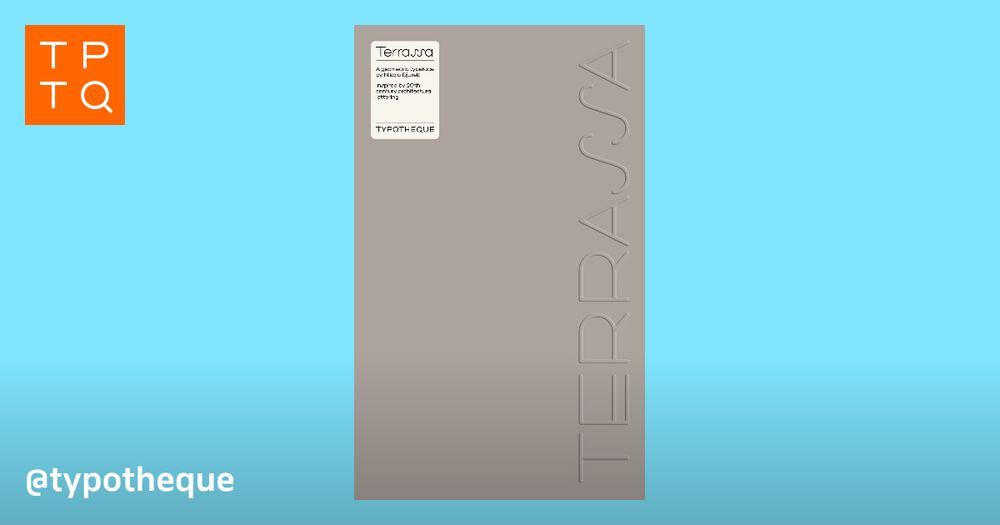
Have you seen the new type specimen presenting Terrassa typeface? www.typotheque.com/books/terras...


June 19, 2025 at 9:21 AM
Have you seen the new type specimen presenting Terrassa typeface? www.typotheque.com/books/terras...
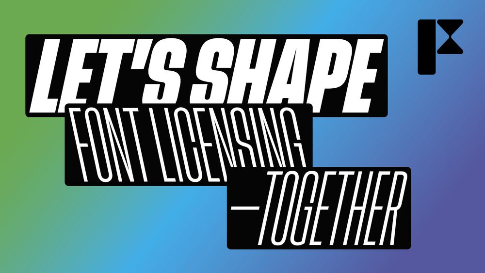
Fontstand is changing to be owned by indie type foundries, and Typotheque will be one of them. This is a significant change and effort to shape the future of type industry together. As part of it, we want to hear from people who use fonts what their experience is. Survey: fontstand.com/survey
The Font User Survey (14 min) by Fontstand
We are interested in learning more about the use of typography in the graphic design industry. How do you use type? How do you license it? And what do you value about it? Help us answer these question...
fontstand.com
June 17, 2025 at 9:36 AM
Fontstand is changing to be owned by indie type foundries, and Typotheque will be one of them. This is a significant change and effort to shape the future of type industry together. As part of it, we want to hear from people who use fonts what their experience is. Survey: fontstand.com/survey
Join us on Thursday for a free 50-minute online talk exploring the design and development of Terrassa, a typeface inspired by architectural lettering.
📅 19 June, 2025, 8pm Amsterdam time.
Exclusively for Typotheque Club members*
Become a member for free here.
www.typotheque.com/club
📅 19 June, 2025, 8pm Amsterdam time.
Exclusively for Typotheque Club members*
Become a member for free here.
www.typotheque.com/club
June 16, 2025 at 1:04 PM
Join us on Thursday for a free 50-minute online talk exploring the design and development of Terrassa, a typeface inspired by architectural lettering.
📅 19 June, 2025, 8pm Amsterdam time.
Exclusively for Typotheque Club members*
Become a member for free here.
www.typotheque.com/club
📅 19 June, 2025, 8pm Amsterdam time.
Exclusively for Typotheque Club members*
Become a member for free here.
www.typotheque.com/club
Reposted by Typotheque

Support the coop, if you use fonts do the survey!
We’re are launching an independent industry-wide survey for font users. We want to hear about your experiences: What works? What’s confusing or frustrating? What would you change? Your answers will help us decide how licensing works within the Fontstand Cooperative.
fontstand.com/survey
fontstand.com/survey
June 13, 2025 at 7:06 AM
Support the coop, if you use fonts do the survey!
Reposted by Typotheque
We’re are launching an independent industry-wide survey for font users. We want to hear about your experiences: What works? What’s confusing or frustrating? What would you change? Your answers will help us decide how licensing works within the Fontstand Cooperative.
fontstand.com/survey
fontstand.com/survey
June 11, 2025 at 3:55 PM
We’re are launching an independent industry-wide survey for font users. We want to hear about your experiences: What works? What’s confusing or frustrating? What would you change? Your answers will help us decide how licensing works within the Fontstand Cooperative.
fontstand.com/survey
fontstand.com/survey
Reposted by Typotheque

An article worth reading every year or so. www.typotheque.com/articles/ori...
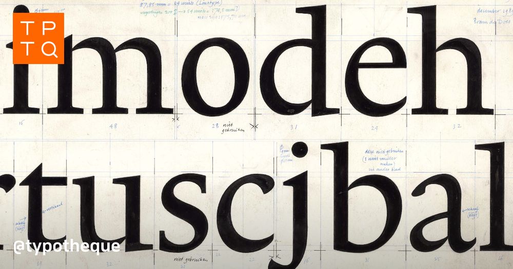
Typotheque: Originality and inspiration in Type Design
The article was triggered by the discussions with the late Gerard Unger about the nature of originality in the type design industry, highlighting the importance of historical continuity in creating ne...
www.typotheque.com
June 5, 2025 at 3:56 PM
An article worth reading every year or so. www.typotheque.com/articles/ori...
Reposted by Typotheque
NEW: Terrassa by @typotheque.com is a complex modular typeface inspired by architectural lettering, striking a balance between rational construction and visual rhythm. It comes with five variable axis, offering thousands of variations in Display and Gradient versions!
fontstand.com/fonts?search...
fontstand.com/fonts?search...


May 29, 2025 at 3:10 PM
NEW: Terrassa by @typotheque.com is a complex modular typeface inspired by architectural lettering, striking a balance between rational construction and visual rhythm. It comes with five variable axis, offering thousands of variations in Display and Gradient versions!
fontstand.com/fonts?search...
fontstand.com/fonts?search...
This printed type specimen, designed by Manera Estudi, presents the background and design thinking behind the Terrassa typeface. It features an in-depth essay by Manuel Sesma, as well as a prologue text by Nikola Djurek. www.typotheque.com/books/terras...
Typotheque: Typotheque specimen No. 24
This printed type specimen presents the background and design thinking behind the Terrassa typeface.
www.typotheque.com
May 28, 2025 at 3:24 PM
This printed type specimen, designed by Manera Estudi, presents the background and design thinking behind the Terrassa typeface. It features an in-depth essay by Manuel Sesma, as well as a prologue text by Nikola Djurek. www.typotheque.com/books/terras...
Terrassa Display and Gradient both contain five variable axes. We considered providing traditional static fonts, but that would produce over 10,000 variations, which would overwhelm your font menu. Instead, we deliver Terrassa Display and Gradient as variable fonts. typotheque.com/fonts/terrassa
May 27, 2025 at 2:43 PM
Terrassa Display and Gradient both contain five variable axes. We considered providing traditional static fonts, but that would produce over 10,000 variations, which would overwhelm your font menu. Instead, we deliver Terrassa Display and Gradient as variable fonts. typotheque.com/fonts/terrassa