


Martin Sutton 🌎
@teachgeogs.bsky.social
Does what it says on the tin. PGCE university subject leader and secondary school classroom practitioner. #GeographyTeacher #GeographyTeacherEducator 🌍
istheukhotrightnow.com
What a superb webpage!
aka “how much hotter is the UK right now?”
Click on a dot for stats breakdown of temp ‘now’ vs climatic average.
Dan Harris, Ed Hawkins, Uni of Reading.
What a superb webpage!
aka “how much hotter is the UK right now?”
Click on a dot for stats breakdown of temp ‘now’ vs climatic average.
Dan Harris, Ed Hawkins, Uni of Reading.


June 30, 2025 at 6:45 AM
istheukhotrightnow.com
What a superb webpage!
aka “how much hotter is the UK right now?”
Click on a dot for stats breakdown of temp ‘now’ vs climatic average.
Dan Harris, Ed Hawkins, Uni of Reading.
What a superb webpage!
aka “how much hotter is the UK right now?”
Click on a dot for stats breakdown of temp ‘now’ vs climatic average.
Dan Harris, Ed Hawkins, Uni of Reading.
Free #geographyteacher CPD!
Berkshire #GIS Teach Meet no.4 :
please register for a place using forms.office.com/e/HtVZJwwK0v
Berkshire #GIS Teach Meet no.4 :
please register for a place using forms.office.com/e/HtVZJwwK0v

June 20, 2025 at 5:59 AM
Free #geographyteacher CPD!
Berkshire #GIS Teach Meet no.4 :
please register for a place using forms.office.com/e/HtVZJwwK0v
Berkshire #GIS Teach Meet no.4 :
please register for a place using forms.office.com/e/HtVZJwwK0v

April 18, 2025 at 6:07 PM
#GAConf25
Here is my series of GIS “How to” videos that a colleague kindly plugged in their #GIS talk.
I aimed them at staff and also students, looking at procedural knowledge with @arcgis.bsky.social
youtube.com/@mrsuttongeo...
Here is my series of GIS “How to” videos that a colleague kindly plugged in their #GIS talk.
I aimed them at staff and also students, looking at procedural knowledge with @arcgis.bsky.social
youtube.com/@mrsuttongeo...

April 17, 2025 at 11:27 AM
#GAConf25
Here is my series of GIS “How to” videos that a colleague kindly plugged in their #GIS talk.
I aimed them at staff and also students, looking at procedural knowledge with @arcgis.bsky.social
youtube.com/@mrsuttongeo...
Here is my series of GIS “How to” videos that a colleague kindly plugged in their #GIS talk.
I aimed them at staff and also students, looking at procedural knowledge with @arcgis.bsky.social
youtube.com/@mrsuttongeo...
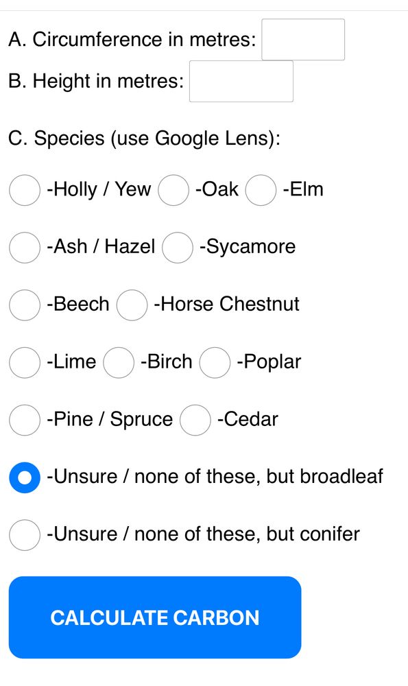
This is my tree Carbon calculator that I shared at my talk. #GAConf25 🌳
Have a go! Good for in the field crunching.
teachgeogs.com/treecarbon.php
Have a go! Good for in the field crunching.
teachgeogs.com/treecarbon.php
April 17, 2025 at 6:58 AM
This is my tree Carbon calculator that I shared at my talk. #GAConf25 🌳
Have a go! Good for in the field crunching.
teachgeogs.com/treecarbon.php
Have a go! Good for in the field crunching.
teachgeogs.com/treecarbon.php


ArcGIS Online - located bar charts
YouTube video by Mr Sutton Geography
youtu.be
January 29, 2025 at 8:13 AM

ArcGIS Online - proportional flow and desire lines
YouTube video by Mr Sutton Geography
youtu.be
January 27, 2025 at 6:45 AM
I’ve made some short video walkthroughs for ArcGIS Online:
✅ Proportional symbols
✅ Choropleth maps
✅ Wind direction and strength
✅ Pie charts
✅ Annotating and labelling
#GIS #geographyteacher #ArcGIS
youtube.com/@mrsuttongeo...
January 18, 2025 at 8:37 AM
I’ve made some short video walkthroughs for ArcGIS Online:
✅ Proportional symbols
✅ Choropleth maps
✅ Wind direction and strength
✅ Pie charts
✅ Annotating and labelling
#GIS #geographyteacher #ArcGIS
youtube.com/@mrsuttongeo...

Progress 8 and disadvantaged secondary school data from the DfE using ArcGISOnline #GIS
larger circle = higher % disadvantaged
red = higher P8
blue = lower P8
London is fascinating as is the simple distribution of schools.
Check it out:
teacher-training.maps.arcgis.com/apps/mapview...
larger circle = higher % disadvantaged
red = higher P8
blue = lower P8
London is fascinating as is the simple distribution of schools.
Check it out:
teacher-training.maps.arcgis.com/apps/mapview...
Map Viewer
teacher-training.maps.arcgis.com
December 17, 2024 at 6:07 PM
Progress 8 and disadvantaged secondary school data from the DfE using ArcGISOnline #GIS
larger circle = higher % disadvantaged
red = higher P8
blue = lower P8
London is fascinating as is the simple distribution of schools.
Check it out:
teacher-training.maps.arcgis.com/apps/mapview...
larger circle = higher % disadvantaged
red = higher P8
blue = lower P8
London is fascinating as is the simple distribution of schools.
Check it out:
teacher-training.maps.arcgis.com/apps/mapview...
