


Louis Charron
@louischarron.bsky.social
Designer specialized in science communication
https://www.louischarron.io
https://www.louischarron.io
Reposted by Louis Charron

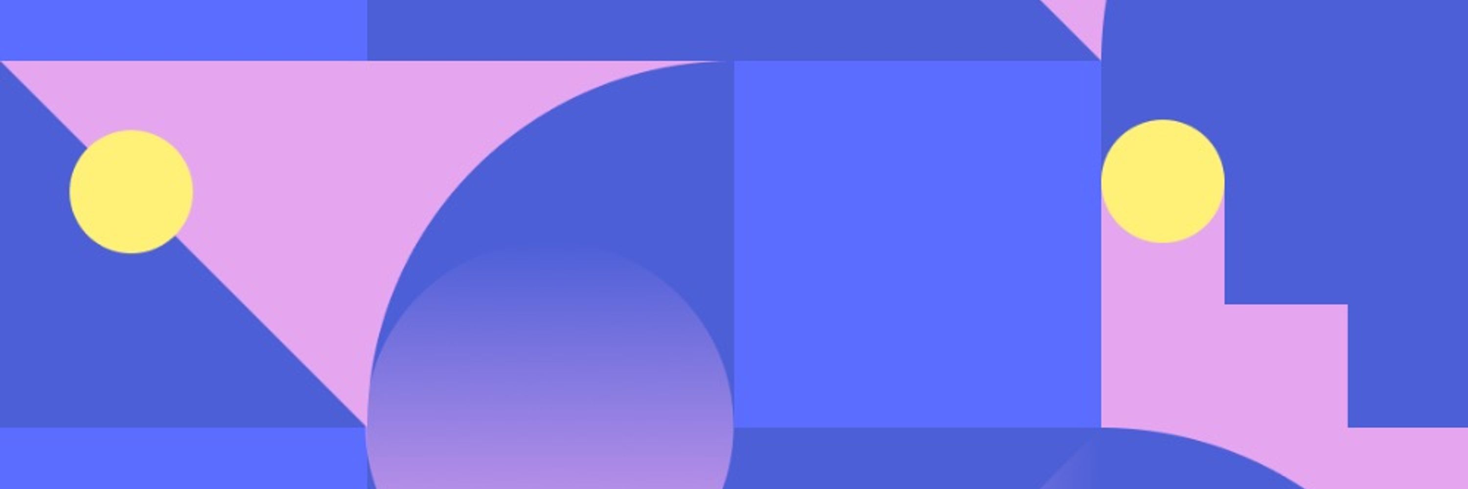
For the first time in 10 years, since Angel Hsu, PhD, founded our lab in 2016, we are introducing a new brand identity! Designed by Louis Charron, DDL’s refreshed identity expresses the centering of people in our work, transforming messy, complex datasets into clear, actionable insights.
New work! Branding and website for Data Driven EnviroLab, a research lab at UNC Chapel Hill turning complex environmental data into actionable policy.
The visual identity centers on turning messy datasets into clear insights, but with humanity at its core.
The visual identity centers on turning messy datasets into clear insights, but with humanity at its core.


December 1, 2025 at 3:59 PM
For the first time in 10 years, since Angel Hsu, PhD, founded our lab in 2016, we are introducing a new brand identity! Designed by Louis Charron, DDL’s refreshed identity expresses the centering of people in our work, transforming messy, complex datasets into clear, actionable insights.
New work! Branding and website for Data Driven EnviroLab, a research lab at UNC Chapel Hill turning complex environmental data into actionable policy.
The visual identity centers on turning messy datasets into clear insights, but with humanity at its core.
The visual identity centers on turning messy datasets into clear insights, but with humanity at its core.
December 1, 2025 at 2:47 PM
New work! Branding and website for Data Driven EnviroLab, a research lab at UNC Chapel Hill turning complex environmental data into actionable policy.
The visual identity centers on turning messy datasets into clear insights, but with humanity at its core.
The visual identity centers on turning messy datasets into clear insights, but with humanity at its core.
New branding work! Since January 2025, critical environmental datasets are being systematically removed from federal websites, information we all need to understand climate risks and protect public health.
September 3, 2025 at 1:12 PM
New branding work! Since January 2025, critical environmental datasets are being systematically removed from federal websites, information we all need to understand climate risks and protect public health.
For the Venice Architecture Biennale 2025, Katja Schechtner and Alex Putzer affiliated with IDRA and Università Ca' Foscari Venezia are challenging us to reconsider the rights of the Venice lagoon through a thoughtful Manifesto. #rightsofnature


May 13, 2025 at 1:43 PM
For the Venice Architecture Biennale 2025, Katja Schechtner and Alex Putzer affiliated with IDRA and Università Ca' Foscari Venezia are challenging us to reconsider the rights of the Venice lagoon through a thoughtful Manifesto. #rightsofnature
For years I've used visual metaphors without truly understanding how they work. After months of exploration, I think I've gained a better sense of what makes a good metaphor and why they're crucial for communicating complex ideas. #scicomm
March 4, 2025 at 2:35 PM
For years I've used visual metaphors without truly understanding how they work. After months of exploration, I think I've gained a better sense of what makes a good metaphor and why they're crucial for communicating complex ideas. #scicomm
Reposted by Louis Charron

You're scrolling through your feed when suddenly you stop, your eyes drawn to something fascinating!
You've got until noon ET TODAY (Feb 14) to register for the first Water Whys UA Visual SciComm Seminar speaker, freelance graphic designer @louischarron.bsky.social.
waterwhys.org/seminar/spri...
You've got until noon ET TODAY (Feb 14) to register for the first Water Whys UA Visual SciComm Seminar speaker, freelance graphic designer @louischarron.bsky.social.
waterwhys.org/seminar/spri...

February 14, 2025 at 2:53 PM
You're scrolling through your feed when suddenly you stop, your eyes drawn to something fascinating!
You've got until noon ET TODAY (Feb 14) to register for the first Water Whys UA Visual SciComm Seminar speaker, freelance graphic designer @louischarron.bsky.social.
waterwhys.org/seminar/spri...
You've got until noon ET TODAY (Feb 14) to register for the first Water Whys UA Visual SciComm Seminar speaker, freelance graphic designer @louischarron.bsky.social.
waterwhys.org/seminar/spri...
Reposted by Louis Charron
Can't wait to learn about this today for the @waterwhysua.bsky.social Visual SciComm Seminar! It's not too late for folks to register for this free virtual talk! waterwhys.org/seminar/spri...

SPRING 2025
Spring 2025 Visual SciComm Seminar
Join us for this virtual speaker series on a wide range of topics related to visual scientific communication.
The Spring series will take place on Fridays (see each...
waterwhys.org
February 14, 2025 at 2:45 PM
Can't wait to learn about this today for the @waterwhysua.bsky.social Visual SciComm Seminar! It's not too late for folks to register for this free virtual talk! waterwhys.org/seminar/spri...
Yesterday marked an exciting milestone: my first public lecture sharing insights from nearly a decade of design for science communication! At Quantum Creators Con at the City College of New York, I presented "How to Make Science Captivating"
#scicomm #quantumcomputing
#scicomm #quantumcomputing


February 5, 2025 at 2:36 PM
Yesterday marked an exciting milestone: my first public lecture sharing insights from nearly a decade of design for science communication! At Quantum Creators Con at the City College of New York, I presented "How to Make Science Captivating"
#scicomm #quantumcomputing
#scicomm #quantumcomputing
How do you tell the story of a database?
First, reveal why this data matters for both scientists and the public, and second, bring it to life through beautiful animation!
#scicomm
First, reveal why this data matters for both scientists and the public, and second, bring it to life through beautiful animation!
#scicomm

January 28, 2025 at 2:26 PM
How do you tell the story of a database?
First, reveal why this data matters for both scientists and the public, and second, bring it to life through beautiful animation!
#scicomm
First, reveal why this data matters for both scientists and the public, and second, bring it to life through beautiful animation!
#scicomm
Thrilled to share one of my favorite projects from 2024: the new visual identity and website for Yale Livable City Lab!
#visualidentity #branding #sciencecommunication
👇
#visualidentity #branding #sciencecommunication
👇


January 14, 2025 at 3:01 PM
Thrilled to share one of my favorite projects from 2024: the new visual identity and website for Yale Livable City Lab!
#visualidentity #branding #sciencecommunication
👇
#visualidentity #branding #sciencecommunication
👇
👀 Excited to share my very first interview about my work as a designer in science communication! I had a great conversation with @fromthelabbench.bsky.social we talked about the role of beauty, the importance of naivety and the power of metaphors. ↓

My inaugural blog post for “SciComm with Style,” a blog on scicommlexicon.com!
An interview with science designer Louis Charron and a discussion on why beauty, metaphors, and scientists collaborating with creatives matter.
scicommlexicon.com/blog/f/scien... #sciart #design #science #scicomm
An interview with science designer Louis Charron and a discussion on why beauty, metaphors, and scientists collaborating with creatives matter.
scicommlexicon.com/blog/f/scien... #sciart #design #science #scicomm

Science Design: Beauty is Undervalued
An interview with science designer Louis Charron
scicommlexicon.com
November 22, 2024 at 3:43 PM
👀 Excited to share my very first interview about my work as a designer in science communication! I had a great conversation with @fromthelabbench.bsky.social we talked about the role of beauty, the importance of naivety and the power of metaphors. ↓
Reposted by Louis Charron
So impressed with the results! Louis and the team really dug into the research and came up with a clear and insightful video translation 🔬
🧠📄 How do you turn a complex neuroscience paper into a 3-minute story everyone can understand?
New collaboration with @interactingminds.bsky.social reveals surprising links between early childhood & overcoming stereotypes. 👇
New collaboration with @interactingminds.bsky.social reveals surprising links between early childhood & overcoming stereotypes. 👇


November 15, 2024 at 12:21 AM
So impressed with the results! Louis and the team really dug into the research and came up with a clear and insightful video translation 🔬
🧠📄 How do you turn a complex neuroscience paper into a 3-minute story everyone can understand?
New collaboration with @interactingminds.bsky.social reveals surprising links between early childhood & overcoming stereotypes. 👇
New collaboration with @interactingminds.bsky.social reveals surprising links between early childhood & overcoming stereotypes. 👇
November 13, 2024 at 3:00 PM
🧠📄 How do you turn a complex neuroscience paper into a 3-minute story everyone can understand?
New collaboration with @interactingminds.bsky.social reveals surprising links between early childhood & overcoming stereotypes. 👇
New collaboration with @interactingminds.bsky.social reveals surprising links between early childhood & overcoming stereotypes. 👇
🌱 New work: how to brand environmental justice in tech?
I had so much fun working with the team at Rooted Futures Lab on creating their new visual identity combining AI schematics with vintage botanical imagery, blending tech aesthetics with grainy organic textures
I had so much fun working with the team at Rooted Futures Lab on creating their new visual identity combining AI schematics with vintage botanical imagery, blending tech aesthetics with grainy organic textures


October 8, 2024 at 3:16 PM
🌱 New work: how to brand environmental justice in tech?
I had so much fun working with the team at Rooted Futures Lab on creating their new visual identity combining AI schematics with vintage botanical imagery, blending tech aesthetics with grainy organic textures
I had so much fun working with the team at Rooted Futures Lab on creating their new visual identity combining AI schematics with vintage botanical imagery, blending tech aesthetics with grainy organic textures
How do we create symbols that represent science? As a designer working with scientists, I keep bumping into this question. So I decided to dive in and write about it.

September 3, 2024 at 1:07 PM
How do we create symbols that represent science? As a designer working with scientists, I keep bumping into this question. So I decided to dive in and write about it.
What happens in our brains when we come to consensus? I’m super excited to finally share the first video in a series of #neuroscience animated explainers for
@interactingminds.bsky.social
youtu.be/ZmgJdih0g3I
@interactingminds.bsky.social
youtu.be/ZmgJdih0g3I

Consensus aligns our brains
To find out what happens in our brains when we come to consensus, we designed an experiment, and we discovered something remarkable. This video is based on a research paper: Consensus-building conversation leads to neural alignment, published in Nature Communications in 2024 Researchers: Beau Sievers, Christopher Welker, Uri Hasson, Adam M. Kleinbaum, Thalia Wheatley Video production: Louis Charron, Janès Zabukovec, Thomas Deis, Beau Sievers © Consortium for Interacting Minds, Dartmouth, 2024
youtu.be
May 16, 2024 at 3:19 PM
What happens in our brains when we come to consensus? I’m super excited to finally share the first video in a series of #neuroscience animated explainers for
@interactingminds.bsky.social
youtu.be/ZmgJdih0g3I
@interactingminds.bsky.social
youtu.be/ZmgJdih0g3I
Working on a new poster series
01
Quote by Andrew Thaler
Fonts by Off Type & Pangram Pangram
01
Quote by Andrew Thaler
Fonts by Off Type & Pangram Pangram


February 21, 2024 at 3:15 PM
Working on a new poster series
01
Quote by Andrew Thaler
Fonts by Off Type & Pangram Pangram
01
Quote by Andrew Thaler
Fonts by Off Type & Pangram Pangram
✨ New work ✨ How to turn air quality data into an interesting story? Here is how we did it in this video with MIT Senseable City Lab:
youtu.be/eiwWCJdlfg0?...
#scicomm #AirQuality #sciencevideo
youtu.be/eiwWCJdlfg0?...
#scicomm #AirQuality #sciencevideo

MIT Senseable City Lab - Flatburn
FLATBURN: the open source city scannerhttps://senseable.mit.edu/flatburnFLATBURN is an open-source, low-cost, solar-powered sensing platform designed to moni...
youtu.be
January 22, 2024 at 4:56 PM
✨ New work ✨ How to turn air quality data into an interesting story? Here is how we did it in this video with MIT Senseable City Lab:
youtu.be/eiwWCJdlfg0?...
#scicomm #AirQuality #sciencevideo
youtu.be/eiwWCJdlfg0?...
#scicomm #AirQuality #sciencevideo
How do we get people to care about science? I wrote a few words on my practice as a designer working with scientists. #scicomm
medium.com/@louischarro...
medium.com/@louischarro...

How design can make science captivating
How do we get people to care about science? Here is how design and storytelling can help.
medium.com
January 8, 2024 at 3:27 PM
How do we get people to care about science? I wrote a few words on my practice as a designer working with scientists. #scicomm
medium.com/@louischarro...
medium.com/@louischarro...
✨ Some exciting news: I’m launching my very own, NYC based, design studio dedicated to help scientists communicate complex research beyond the scientific community. #scicomm
www.louischarron.io
www.louischarron.io

Louis Charron — design for science communication
I help scientists, research labs and companies to communicate complex ideas to broad audiences through storytelling and design.
www.louischarron.io
October 30, 2023 at 2:39 PM
✨ Some exciting news: I’m launching my very own, NYC based, design studio dedicated to help scientists communicate complex research beyond the scientific community. #scicomm
www.louischarron.io
www.louischarron.io
After more than a year using Midjourney I noticed that the images generated are becoming more similar and less surprising. So I wrote a few words on how the mystery and the poetry of the early AI images disappeared.
medium.com/@louischarro...
medium.com/@louischarro...

The case for AI hallucination
AI image generators can produce anything, so why should they produce photorealistic images by default?
medium.com
September 22, 2023 at 6:29 PM
After more than a year using Midjourney I noticed that the images generated are becoming more similar and less surprising. So I wrote a few words on how the mystery and the poetry of the early AI images disappeared.
medium.com/@louischarro...
medium.com/@louischarro...