


Kyle Walker
@kylewalker.bsky.social
Demographics | Geospatial | Data Science | Open Source
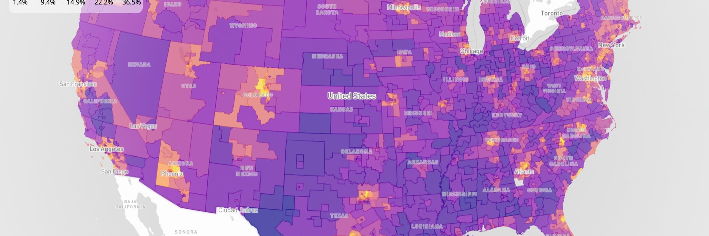
My most popular map ever, Educational Attainment in America, gets a fresh look for 2026:
- Updated to the 2024 ACS
- MapLibre via R's mapgl with built-in interactivity
- OpenFreeMap basemap, Cloudflare-hosted PMTiles (blazing fast!)
Explore your city: personal.tcu.edu/kylewalker/m...
- Updated to the 2024 ACS
- MapLibre via R's mapgl with built-in interactivity
- OpenFreeMap basemap, Cloudflare-hosted PMTiles (blazing fast!)
Explore your city: personal.tcu.edu/kylewalker/m...
February 10, 2026 at 2:52 PM
My most popular map ever, Educational Attainment in America, gets a fresh look for 2026:
- Updated to the 2024 ACS
- MapLibre via R's mapgl with built-in interactivity
- OpenFreeMap basemap, Cloudflare-hosted PMTiles (blazing fast!)
Explore your city: personal.tcu.edu/kylewalker/m...
- Updated to the 2024 ACS
- MapLibre via R's mapgl with built-in interactivity
- OpenFreeMap basemap, Cloudflare-hosted PMTiles (blazing fast!)
Explore your city: personal.tcu.edu/kylewalker/m...
It's easy to feel overwhelmed by the current pace of change in technology.
A useful counterpoint:
There are STILL organizations using ArcMap for their GIS even though ArcGIS Pro has been out for over a decade.
Technology moves fast; capacity for adoption, not always.
A useful counterpoint:
There are STILL organizations using ArcMap for their GIS even though ArcGIS Pro has been out for over a decade.
Technology moves fast; capacity for adoption, not always.
February 8, 2026 at 4:18 PM
It's easy to feel overwhelmed by the current pace of change in technology.
A useful counterpoint:
There are STILL organizations using ArcMap for their GIS even though ArcGIS Pro has been out for over a decade.
Technology moves fast; capacity for adoption, not always.
A useful counterpoint:
There are STILL organizations using ArcMap for their GIS even though ArcGIS Pro has been out for over a decade.
Technology moves fast; capacity for adoption, not always.
Showed my Advanced GIS students Claude Code this week.
We built this map of code compliance violations in Fort Worth; heatmap giving way to points on zoom.
Used the ArcGIS SDK for JavaScript.
Took 10 minutes.
I believe in Jevons Paradox.
But we need to be teaching skills for 2026, not for 2016.
We built this map of code compliance violations in Fort Worth; heatmap giving way to points on zoom.
Used the ArcGIS SDK for JavaScript.
Took 10 minutes.
I believe in Jevons Paradox.
But we need to be teaching skills for 2026, not for 2016.
February 6, 2026 at 3:09 PM
Showed my Advanced GIS students Claude Code this week.
We built this map of code compliance violations in Fort Worth; heatmap giving way to points on zoom.
Used the ArcGIS SDK for JavaScript.
Took 10 minutes.
I believe in Jevons Paradox.
But we need to be teaching skills for 2026, not for 2016.
We built this map of code compliance violations in Fort Worth; heatmap giving way to points on zoom.
Used the ArcGIS SDK for JavaScript.
Took 10 minutes.
I believe in Jevons Paradox.
But we need to be teaching skills for 2026, not for 2016.
West Texas energy infrastructure identified from satellite imagery using zero-shot image segmentation.
Shown:
Well pads from simple text prompts;
Draw a box around a wind turbine, find the others in the view;
Click a solar farm, segment the area.
Shown:
Well pads from simple text prompts;
Draw a box around a wind turbine, find the others in the view;
Click a solar farm, segment the area.


February 5, 2026 at 5:26 PM
West Texas energy infrastructure identified from satellite imagery using zero-shot image segmentation.
Shown:
Well pads from simple text prompts;
Draw a box around a wind turbine, find the others in the view;
Click a solar farm, segment the area.
Shown:
Well pads from simple text prompts;
Draw a box around a wind turbine, find the others in the view;
Click a solar farm, segment the area.

February 4, 2026 at 1:25 PM
In Feb 2024, I asked ChatGPT:
"What do income levels by neighborhood look like in Dallas, Texas? Make me a map of the results."
The result: the first nonsensical image.
Today I asked Claude that question - it made an accurate MapLibre map.
Wonder where we'll be in 2028...
"What do income levels by neighborhood look like in Dallas, Texas? Make me a map of the results."
The result: the first nonsensical image.
Today I asked Claude that question - it made an accurate MapLibre map.
Wonder where we'll be in 2028...


February 3, 2026 at 2:46 AM
In Feb 2024, I asked ChatGPT:
"What do income levels by neighborhood look like in Dallas, Texas? Make me a map of the results."
The result: the first nonsensical image.
Today I asked Claude that question - it made an accurate MapLibre map.
Wonder where we'll be in 2028...
"What do income levels by neighborhood look like in Dallas, Texas? Make me a map of the results."
The result: the first nonsensical image.
Today I asked Claude that question - it made an accurate MapLibre map.
Wonder where we'll be in 2028...
Quality-of-life improvements to the #rstats {geosam} package:
- Interactive swatches let you customize extraction color in the explorer;
- The explorer sidebar is now collapsible;
- The package installs the stable version of HuggingFace Transformers
walker-data.com/geosam
- Interactive swatches let you customize extraction color in the explorer;
- The explorer sidebar is now collapsible;
- The package installs the stable version of HuggingFace Transformers
walker-data.com/geosam
February 2, 2026 at 7:04 PM
Quality-of-life improvements to the #rstats {geosam} package:
- Interactive swatches let you customize extraction color in the explorer;
- The explorer sidebar is now collapsible;
- The package installs the stable version of HuggingFace Transformers
walker-data.com/geosam
- Interactive swatches let you customize extraction color in the explorer;
- The explorer sidebar is now collapsible;
- The package installs the stable version of HuggingFace Transformers
walker-data.com/geosam
Distributed energy is harder to map than centralized infrastructure, but cutting-edge AI tools can help.
Shown: identifying rooftop solar panels in a suburban neighborhood with Mapbox imagery, Meta's SAM3.
Useful for utilities, grid planners, and solar prospecting.
Shown: identifying rooftop solar panels in a suburban neighborhood with Mapbox imagery, Meta's SAM3.
Useful for utilities, grid planners, and solar prospecting.
February 1, 2026 at 5:53 PM
Distributed energy is harder to map than centralized infrastructure, but cutting-edge AI tools can help.
Shown: identifying rooftop solar panels in a suburban neighborhood with Mapbox imagery, Meta's SAM3.
Useful for utilities, grid planners, and solar prospecting.
Shown: identifying rooftop solar panels in a suburban neighborhood with Mapbox imagery, Meta's SAM3.
Useful for utilities, grid planners, and solar prospecting.
Mapped every pipeline in Texas: 368,000 miles of infrastructure at your fingertips.
For energy operators, midstream companies, and data center site selectors, understanding pipeline proximity matters.
Open data + modern GIS makes it accessible.
For energy operators, midstream companies, and data center site selectors, understanding pipeline proximity matters.
Open data + modern GIS makes it accessible.
January 31, 2026 at 4:14 PM
Mapped every pipeline in Texas: 368,000 miles of infrastructure at your fingertips.
For energy operators, midstream companies, and data center site selectors, understanding pipeline proximity matters.
Open data + modern GIS makes it accessible.
For energy operators, midstream companies, and data center site selectors, understanding pipeline proximity matters.
Open data + modern GIS makes it accessible.
It's 2024 5-year American Community Survey release day!
The ACS is the best resource for small-area analysis of US demographics.
In R, use tidycensus and mapgl to dive into the data right now.
Copy-paste the code below for an interactive income map with a legend filter:
The ACS is the best resource for small-area analysis of US demographics.
In R, use tidycensus and mapgl to dive into the data right now.
Copy-paste the code below for an interactive income map with a legend filter:
January 29, 2026 at 6:46 PM
It's 2024 5-year American Community Survey release day!
The ACS is the best resource for small-area analysis of US demographics.
In R, use tidycensus and mapgl to dive into the data right now.
Copy-paste the code below for an interactive income map with a legend filter:
The ACS is the best resource for small-area analysis of US demographics.
In R, use tidycensus and mapgl to dive into the data right now.
Copy-paste the code below for an interactive income map with a legend filter:
Reposted by Kyle Walker

{calcite} looking good 💅
🗺️ Esri's Calcite Design System in {shiny}? Yes, please!!!
Full-stack spatial in R keeps getting better.
github.com/r-arcgis/cal...
#rstats
🗺️ Esri's Calcite Design System in {shiny}? Yes, please!!!
Full-stack spatial in R keeps getting better.
github.com/r-arcgis/cal...
#rstats

January 28, 2026 at 8:14 PM
{calcite} looking good 💅
🗺️ Esri's Calcite Design System in {shiny}? Yes, please!!!
Full-stack spatial in R keeps getting better.
github.com/r-arcgis/cal...
#rstats
🗺️ Esri's Calcite Design System in {shiny}? Yes, please!!!
Full-stack spatial in R keeps getting better.
github.com/r-arcgis/cal...
#rstats
The big story coming out of yesterday's 2025 Census Population Estimates release: international migration declined in EVERY state in the past year.
The plot: international migration rates since 2021 (each year covers the previous 12 months).
Biggest drops: NY, NJ, CO, TX, UT
The plot: international migration rates since 2021 (each year covers the previous 12 months).
Biggest drops: NY, NJ, CO, TX, UT

January 28, 2026 at 7:00 PM
The big story coming out of yesterday's 2025 Census Population Estimates release: international migration declined in EVERY state in the past year.
The plot: international migration rates since 2021 (each year covers the previous 12 months).
Biggest drops: NY, NJ, CO, TX, UT
The plot: international migration rates since 2021 (each year covers the previous 12 months).
Biggest drops: NY, NJ, CO, TX, UT
The 2025 @uscensusbureau Population Estimates were released today. Some takeaways:
- Rapid growth in the Carolinas, Idaho, Texas;
- 17 states + PR had more deaths than births;
- Florida is #1 for international migration;
- SC ranks #1 for domestic migration rate; NY ranks last
- Rapid growth in the Carolinas, Idaho, Texas;
- 17 states + PR had more deaths than births;
- Florida is #1 for international migration;
- SC ranks #1 for domestic migration rate; NY ranks last


January 27, 2026 at 9:00 PM
Reposted by Kyle Walker

I merged a PR for mirai today (fixing an esoteric bug), that came with a performance boost that I'd never have thought existed. That means that on my laptop, the default (with dispatcher) round-trip performance now dips into sub-100 microseconds territory!! Get it now: `pak::pak("r-lib/mirai")`
January 26, 2026 at 9:04 PM
I merged a PR for mirai today (fixing an esoteric bug), that came with a performance boost that I'd never have thought existed. That means that on my laptop, the default (with dispatcher) round-trip performance now dips into sub-100 microseconds territory!! Get it now: `pak::pak("r-lib/mirai")`
Nearly 18 million California jobs in 2023, visualized by 2-digit NAICS category with block-level precision.
Open data and modern geospatial technology make powerful labor market analytics possible.
Open data and modern geospatial technology make powerful labor market analytics possible.
January 27, 2026 at 5:20 PM
Nearly 18 million California jobs in 2023, visualized by 2-digit NAICS category with block-level precision.
Open data and modern geospatial technology make powerful labor market analytics possible.
Open data and modern geospatial technology make powerful labor market analytics possible.
Identifying possible empty lots in Fort Worth's South Main district with Meta's Segment Anything Model 3.
Draw an "exemplar" prompt, find similar areas in the satellite image. Useful for urban redevelopment, real estate, and more.
Try out {geosam}: walker-data.com/geosam
Draw an "exemplar" prompt, find similar areas in the satellite image. Useful for urban redevelopment, real estate, and more.
Try out {geosam}: walker-data.com/geosam
January 26, 2026 at 6:39 PM
Identifying possible empty lots in Fort Worth's South Main district with Meta's Segment Anything Model 3.
Draw an "exemplar" prompt, find similar areas in the satellite image. Useful for urban redevelopment, real estate, and more.
Try out {geosam}: walker-data.com/geosam
Draw an "exemplar" prompt, find similar areas in the satellite image. Useful for urban redevelopment, real estate, and more.
Try out {geosam}: walker-data.com/geosam
Social media: "if you're not using {Ralph Wiggum|Clawdbot|next week's new framework} you're ngmi"
Now you're endlessly trying to optimize your workflows instead of doing the actual work you're avoiding.
Agents will get better and better but they don't substitute for agency.
Now you're endlessly trying to optimize your workflows instead of doing the actual work you're avoiding.
Agents will get better and better but they don't substitute for agency.
January 25, 2026 at 8:22 PM
Social media: "if you're not using {Ralph Wiggum|Clawdbot|next week's new framework} you're ngmi"
Now you're endlessly trying to optimize your workflows instead of doing the actual work you're avoiding.
Agents will get better and better but they don't substitute for agency.
Now you're endlessly trying to optimize your workflows instead of doing the actual work you're avoiding.
Agents will get better and better but they don't substitute for agency.
spopt for R implements the Max-P-compact regions algorithm. Draw contiguous regions that optimize both for attribute similarity and compactness.
Shown here: regular Max-P with queen weights (left), Max-P-compact with rook weights (right)
Learn more: walker-data.com/spopt-r/arti...
Shown here: regular Max-P with queen weights (left), Max-P-compact with rook weights (right)
Learn more: walker-data.com/spopt-r/arti...
January 25, 2026 at 3:06 PM
spopt for R implements the Max-P-compact regions algorithm. Draw contiguous regions that optimize both for attribute similarity and compactness.
Shown here: regular Max-P with queen weights (left), Max-P-compact with rook weights (right)
Learn more: walker-data.com/spopt-r/arti...
Shown here: regular Max-P with queen weights (left), Max-P-compact with rook weights (right)
Learn more: walker-data.com/spopt-r/arti...
LLMs both enable and impede innovation in open source software.
They help developers bring previously impossible ideas to life.
But they also recommend older solutions to users given their training data.
So even if a new innovation is better, users might not know about it.
They help developers bring previously impossible ideas to life.
But they also recommend older solutions to users given their training data.
So even if a new innovation is better, users might not know about it.
January 23, 2026 at 2:57 PM
LLMs both enable and impede innovation in open source software.
They help developers bring previously impossible ideas to life.
But they also recommend older solutions to users given their training data.
So even if a new innovation is better, users might not know about it.
They help developers bring previously impossible ideas to life.
But they also recommend older solutions to users given their training data.
So even if a new innovation is better, users might not know about it.
Nearly 1500 swimming pools found across a 10 square kilometer suburban area, all from a single text prompt.
Meta's SAM3 and Mapbox imagery combine for incredible zero-shot geospatial intelligence.
Meta's SAM3 and Mapbox imagery combine for incredible zero-shot geospatial intelligence.
January 22, 2026 at 8:22 PM
Nearly 1500 swimming pools found across a 10 square kilometer suburban area, all from a single text prompt.
Meta's SAM3 and Mapbox imagery combine for incredible zero-shot geospatial intelligence.
Meta's SAM3 and Mapbox imagery combine for incredible zero-shot geospatial intelligence.
On the blog: interactive legend filters and screenshot export in mapgl.
Try out the interactive examples in the post!
Try out the interactive examples in the post!

Interactive legends and screenshot export in mapgl – WALKER DATA
GIS, demographics, and data science consulting
walker-data.com
January 21, 2026 at 10:46 PM
On the blog: interactive legend filters and screenshot export in mapgl.
Try out the interactive examples in the post!
Try out the interactive examples in the post!
Vignette: solving facility location problems with realistic travel-times.
Use the r5 routing engine to generate a travel-time cost matrix from OSM data, then optimize facility locations with a lightning-fast Rust backend in spopt-r.
Learn how: walker-data.com/spop...
Use the r5 routing engine to generate a travel-time cost matrix from OSM data, then optimize facility locations with a lightning-fast Rust backend in spopt-r.
Learn how: walker-data.com/spop...


January 21, 2026 at 1:18 PM
Vignette: solving facility location problems with realistic travel-times.
Use the r5 routing engine to generate a travel-time cost matrix from OSM data, then optimize facility locations with a lightning-fast Rust backend in spopt-r.
Learn how: walker-data.com/spop...
Use the r5 routing engine to generate a travel-time cost matrix from OSM data, then optimize facility locations with a lightning-fast Rust backend in spopt-r.
Learn how: walker-data.com/spop...
The Huff model is the classic algorithm in retail spatial analysis - and you can now use it in R.
Predict:
- Which store a customer is likely to visit
- Sales potential per location
- How new stores reshape the competitive landscape
Learn more: walker-data.com/spop...
Predict:
- Which store a customer is likely to visit
- Sales potential per location
- How new stores reshape the competitive landscape
Learn more: walker-data.com/spop...


January 20, 2026 at 8:06 PM
The Huff model is the classic algorithm in retail spatial analysis - and you can now use it in R.
Predict:
- Which store a customer is likely to visit
- Sales potential per location
- How new stores reshape the competitive landscape
Learn more: walker-data.com/spop...
Predict:
- Which store a customer is likely to visit
- Sales potential per location
- How new stores reshape the competitive landscape
Learn more: walker-data.com/spop...
The Dunning-Kruger effect, Claude Code edition
(speaking as a massive Claude Code fan)
(speaking as a massive Claude Code fan)

January 18, 2026 at 8:36 PM
The Dunning-Kruger effect, Claude Code edition
(speaking as a massive Claude Code fan)
(speaking as a massive Claude Code fan)
A great use-case for Nano Banana Pro: creating #rstats hex logos.
It used to take me hours to put these logos together (I'm not a graphic designer), but logos really help with branding R packages.
With Nano Banana I feed Gemini the package spec, iterate, and get great results.
It used to take me hours to put these logos together (I'm not a graphic designer), but logos really help with branding R packages.
With Nano Banana I feed Gemini the package spec, iterate, and get great results.


January 16, 2026 at 2:16 PM
A great use-case for Nano Banana Pro: creating #rstats hex logos.
It used to take me hours to put these logos together (I'm not a graphic designer), but logos really help with branding R packages.
With Nano Banana I feed Gemini the package spec, iterate, and get great results.
It used to take me hours to put these logos together (I'm not a graphic designer), but logos really help with branding R packages.
With Nano Banana I feed Gemini the package spec, iterate, and get great results.